A2 media evalution. question 2
•Download as PPTX, PDF•
0 likes•135 views

The document discusses the process of creating ancillary media products for a pop/soul artist, including a CD digipack. The creator researched existing artists in the genre like Chris Brown and Justin Bieber to understand conventions. Photos from the music video shoot location, a skate park, were used as themes across the CD cover, back, insert and magazine ad to create synergy between the products and video. Consistency of color schemes, images and fonts helped market all the pieces as being from the same artist. Feedback on the digipack was positive as the products complemented the artist's image and interlinked the locations from the music video shoot.

Recommended
More Related Content
What's hot
Viewers also liked
Viewers also liked (18)
Similar to A2 media evalution. question 2
Similar to A2 media evalution. question 2 (20)
Recently uploaded
Recently uploaded (20)
A2 media evalution. question 2
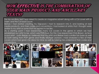
- 1. For my ancillary text I was asked to create an magazine advert along with a Cd cover with a insert, and the Cd back cover. Before I had started creating my Digi-pack I had to research into it, and looking at real media products, and their codes and conventions. I had looked at artists that I thought were similar to my artist or some that he aspired to be like. As a starting point I had researched many Cd covers in the genre in which we had established our artist to be, which was POP/Soul. For this I has researched Chris Brown as he is a soul artist , Justin Bieber as I believed that my artist and Bieber had a similar fan base as well as both being from POP genre and finally Michael Jackson. I had analysed a few of their covers which had given me ideas for mine as well as helping me understand their codes and conventions.
- 2. As I had figured out that each of their products had synergy with the music video of the bonus track or single that went with that album. I had decide that I wanted to construct a product in which they would interlink. So I thought that I would use one of the two locations that we had shot at to be my theme. The location that I had chosen was South Bank Skate park. I has chosen this because there was many images from which I could use for my products. For example I had taken quite a few images of the graffiti at the park. This came in handy when I had chosen for it to be the bases of my front cover and magazine advert. I had then started to construct my back cover for my Cd. In this I had used an image which I had taken of the evening sky and then added a tint of yellow. I thought that by adding that tint it would make it would make it something unique and different. This had given me the colour scheme for my whole ancillary texts. I added yellow and white text which seemed to have fit perfectly. To the back of my Cd cover as well as the track list I had added the
- 3. On the insert of the album there are images which were taken on the day of the video shoot. They are there so that it creates a sense of synergy. They are there to show how they all interlink. It would create synergy as the costume would be the same and so would the lighting. All the ancillary text follow the codes and conventions of a Pop genre. Therefore made it easier to market them. The poster I produced is very similar to the rest of my digipak, creating more consistency throughout my work. The only difference with my poster is that I used a different font to write the artists name. This was because the font was quite bold and I thought it would be good at drawing attention.
- 4. The products were constructed by keeping the target audience in mind. Which were 12-15 year old teenagers. According to the research carried out throughout the project. Due to the mixed feedback received about the video I had worried about what feedback I would receive about the Digi-pack. However the feedback received about this products was good. I think that keeping some kind of consistency throughout the music video & ancillary task is useful, as it means that straight away you can look at one piece of work and know that it relates to another piece, even if its just a font or a colour scheme. Its also a good way of trending and promoting something if consistency is used as it makes it easily recognisable and people can familiarise themselves with the products.
- 5. As a group we had all individually created a Digi- Pack but also as a group we had picked Kavitha’s Digi-pack as we believed that it had created better synergy. This is because it had the theme of UK going through it. It was created to compliment the artists image. Here products create good synergy as they interlink with the locations of the music video . As it was shot at South Bank Skate Park, across from Parliament. Also to create synergy it shows a image of the artist in all the media products. Another reason for choosing this combination for our main Digi-pack was that it shows the they are all from one artist.