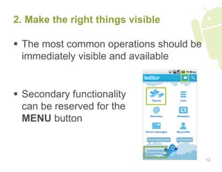
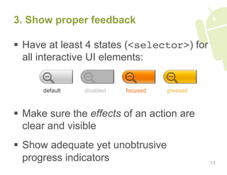
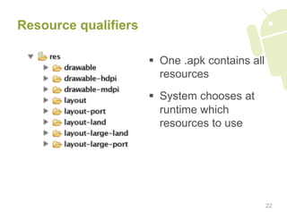
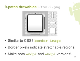
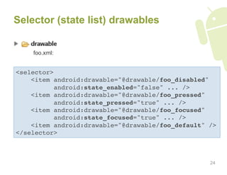
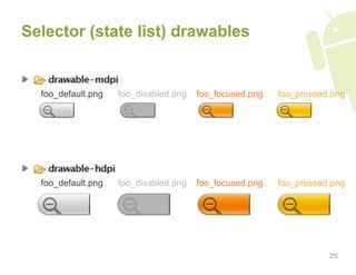
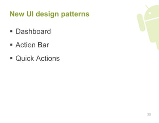
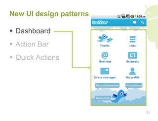
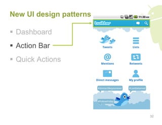
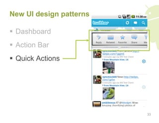
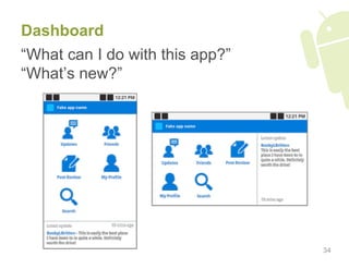
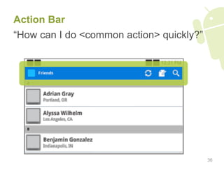
User Interface
Design Tips

July 2010
Why should I care about UI?

Better UI

  Perceived quality + polish

     Better ratings

       Better app ranking

            More installs/purchases
                                      2
Agenda – Android UI design tips

1.  Do’s and don’ts
2.  Design philosophy and considerations
3.  UI framework features you
    should definitely be using
4.  New UI design patterns
5.  Icons and guidelines

                                           3
Do’s and don’ts
  DON’T simply port         DON’T create rigid,
   your UI from other         absolute-positioned
   platforms                  layouts
   –  Users should
      feel right at home     DON’T use px units,
      with your app           use dp (or sp for text)
      on their device
   –  Balance your brand     DON’T use small font
      and platform look       sizes
  DON’T overuse
   modal progress &
   confirmation dialogs
                                                     5
  DO create versions of      DO support D-pad &
   all resources for high      trackball navigation
   density screens
                              DO properly manage
  DO make large,              the activity stack
   obvious tap targets
   (buttons, list items)      DO properly handle
                               orientation changes
  DO follow Android
   icon guidelines            DO use theme/style,
                               dimension, color
  DO use proper               resources to reduce
   margins and padding         redundancy
                                                      6
DO work with visual and
interaction designer(s)


                          7
Design philosophy
and considerations
Android design philosophy

  Clear vs. “simple”
  Content vs. chrome
  Consistent yet engaging
  –  Elegant variation

  Enhanced by the cloud
  –  Maintain user’s context
     across desktop and mobile


                                 9
Principles of good interface design*

1.  Focus on the user
2.  Make the right things visible
3.  Show proper feedback
4.  Be predictable
5.  Be fault-tolerant


* Some material borrowed from Donald Norman’s The Design of Everyday Things   10
1. Focus on the user

  Know your users
  –  Age, skill level, culture, disabilities, etc.
  –  What they want to do with your app
  –  What kinds of devices they’ll be using
  –  Where/when/how they’ll be using their devices

  Design with a ‘user-first’ mentality
  –  Users are generally task-driven

  Test on real users, early and often

                                                     11
2. Make the right things visible

  The most common operations should be
   immediately visible and available


  Secondary functionality
   can be reserved for the
   MENU button


                                          12
3. Show proper feedback

  Have at least 4 states (<selector>) for
   all interactive UI elements:


      default   disabled   focused   pressed


  Make sure the effects of an action are
   clear and visible
  Show adequate yet unobtrusive
   progress indicators                         13
4. Be predictable

  Do what the user expects
  –  Properly interact with the activity stack
  –  Show information and actions users expects to see
     (requires testing or observation)

  Use proper affordances
  –  If something is clickable, make sure it looks
     clickable!


                                                     14
If complex instructions
are required, rethink
your design.

                          15
5. Be fault tolerant

  Constrain possible operations to only
   those that make sense
  –  Disable UI elements when appropriate

  Limit the number of irreversible actions
  Prefer ‘undo’ to confirmation dialogs
  –  In fact, use as few modal dialogs as possible.
     They’re obtrusive.


                                                      16
“If an error is possible,
someone will make it.”
                    – Donald Norman, author,
               The Design of Everyday Things


                                               17
Design considerations

  Physical screen size
  Screen density
  Portrait & landscape orientations
  Primary UI interaction method
  –  Touch-screen
  –  D-pad/trackball

  Soft & physical keyboard
                                       18
Design considerations

  Awareness about the ways in which
   devices can vary is very important
  Read through the CDD to learn
   about possible device UI variations
  –  http://source.android.com/compatibility

  Screen size & density breakdown
  –  http://developer.android.com/resources/
     dashboard/screens.html

                                               19
UI framework features you
should definitely be using
<RelativeLayout>


                   21
Resource qualifiers

                        One .apk contains all
                         resources
                        System chooses at
                         runtime which
                         resources to use


                                                 22
9-patch drawables – foo.9.png


  Similar to CSS3 border-image
  Border pixels indicate stretchable regions
  Make both -mdpi and -hdpi versions!
                                            23
Selector (state list) drawables


    foo.xml:


<selector>
    <item android:drawable="@drawable/foo_disabled"
          android:state_enabled="false" ... />
    <item android:drawable="@drawable/foo_pressed"
          android:state_pressed="true" ... />
    <item android:drawable="@drawable/foo_focused"
          android:state_focused="true" ... />
    <item android:drawable="@drawable/foo_default" /> 
</selector> 


                                                   24
Selector (state list) drawables


  foo_default.png   foo_disabled.png   foo_focused.png   foo_pressed.png


  foo_default.png   foo_disabled.png   foo_focused.png   foo_pressed.png


                                                                    25
Layer drawables – XML + PNGs


                   +                    +   Drawable.setColorFilter(

                                                0xA4C639,

                                                ...);
foo_border.9.png       foo_mask.9.png


                                                                26
Layer drawables – XML + PNGs


           =
               Rendered output
               (resizable w/ 9-patch)


                                        27
New UI design patterns

Borrowed from the
Android UI design patterns
talk at Google I/O 2010

 http://code.google.com/events/io/2010/sessions/
 android-ui-design-patterns.html


                                                   29
New UI design patterns

  Dashboard
  Action Bar
  Quick Actions


                         30
New UI design patterns

  Dashboard
  Action Bar
  Quick Actions


                         31
New UI design patterns

  Dashboard
  Action Bar
  Quick Actions


                         32
New UI design patterns

  Dashboard
  Action Bar
  Quick Actions


                         33
Dashboard
“What can I do with this app?”
“What’s new?”


                                 34
Dashboard – Recommendations

  Focus on 3-6 most important app
   sections
  Highlight what’s new
  Be flavorful – it’s your first impression


                                               35
Action Bar
“How can I do <common action> quickly?”


                                          36
Action Bar – Recommendations

  Bring key, app-wide actions onscreen
  Help to convey a sense of place
  Use consistently within your app
  Provide ‘home’ mechanism – logo or
   dedicated button
  DON’T use for contextual actions

                                          37
Quick Actions
“What can I do with <this object>?”


                                      38
Icons and guidelines
New Android icon style


Tactile • Rendered • Forward Facing • Top-lit
  Synecdoche • Diverse shapes, materials
Icon guidelines

Guidelines and templates are available at:

  http://developer.android.com/guide/practices/
  ui_guidelines/icon_design.html


                                                  41
Questions?
Copyrights and Trademarks

  Android, Google are registered
   trademarks of Google Inc.
  All other trademarks and copyrights are
   the property of their respective owners.


                                              43

Android UI Design Tips

  • 1.
  • 2.
    Why should Icare about UI? Better UI Perceived quality + polish Better ratings Better app ranking More installs/purchases 2
  • 3.
    Agenda – AndroidUI design tips 1.  Do’s and don’ts 2.  Design philosophy and considerations 3.  UI framework features you should definitely be using 4.  New UI design patterns 5.  Icons and guidelines 3
  • 4.
  • 5.
      DON’T simplyport   DON’T create rigid, your UI from other absolute-positioned platforms layouts –  Users should feel right at home   DON’T use px units, with your app use dp (or sp for text) on their device –  Balance your brand   DON’T use small font and platform look sizes   DON’T overuse modal progress & confirmation dialogs 5
  • 6.
      DO createversions of   DO support D-pad & all resources for high trackball navigation density screens   DO properly manage   DO make large, the activity stack obvious tap targets (buttons, list items)   DO properly handle orientation changes   DO follow Android icon guidelines   DO use theme/style, dimension, color   DO use proper resources to reduce margins and padding redundancy 6
  • 7.
    DO work withvisual and interaction designer(s) 7
  • 8.
  • 9.
    Android design philosophy  Clear vs. “simple”   Content vs. chrome   Consistent yet engaging –  Elegant variation   Enhanced by the cloud –  Maintain user’s context across desktop and mobile 9
  • 10.
    Principles of goodinterface design* 1.  Focus on the user 2.  Make the right things visible 3.  Show proper feedback 4.  Be predictable 5.  Be fault-tolerant * Some material borrowed from Donald Norman’s The Design of Everyday Things 10
  • 11.
    1. Focus onthe user   Know your users –  Age, skill level, culture, disabilities, etc. –  What they want to do with your app –  What kinds of devices they’ll be using –  Where/when/how they’ll be using their devices   Design with a ‘user-first’ mentality –  Users are generally task-driven   Test on real users, early and often 11
  • 12.
    2. Make theright things visible   The most common operations should be immediately visible and available   Secondary functionality can be reserved for the MENU button 12
  • 13.
    3. Show properfeedback   Have at least 4 states (<selector>) for all interactive UI elements: default disabled focused pressed   Make sure the effects of an action are clear and visible   Show adequate yet unobtrusive progress indicators 13
  • 14.
    4. Be predictable  Do what the user expects –  Properly interact with the activity stack –  Show information and actions users expects to see (requires testing or observation)   Use proper affordances –  If something is clickable, make sure it looks clickable! 14
  • 15.
    If complex instructions arerequired, rethink your design. 15
  • 16.
    5. Be faulttolerant   Constrain possible operations to only those that make sense –  Disable UI elements when appropriate   Limit the number of irreversible actions   Prefer ‘undo’ to confirmation dialogs –  In fact, use as few modal dialogs as possible. They’re obtrusive. 16
  • 17.
    “If an erroris possible, someone will make it.” – Donald Norman, author, The Design of Everyday Things 17
  • 18.
    Design considerations   Physicalscreen size   Screen density   Portrait & landscape orientations   Primary UI interaction method –  Touch-screen –  D-pad/trackball   Soft & physical keyboard 18
  • 19.
    Design considerations   Awarenessabout the ways in which devices can vary is very important   Read through the CDD to learn about possible device UI variations –  http://source.android.com/compatibility   Screen size & density breakdown –  http://developer.android.com/resources/ dashboard/screens.html 19
  • 20.
    UI framework featuresyou should definitely be using
  • 21.
  • 22.
    Resource qualifiers   One .apk contains all resources   System chooses at runtime which resources to use 22
  • 23.
    9-patch drawables –foo.9.png   Similar to CSS3 border-image   Border pixels indicate stretchable regions   Make both -mdpi and -hdpi versions! 23
  • 24.
    Selector (state list)drawables foo.xml: <selector> <item android:drawable="@drawable/foo_disabled" android:state_enabled="false" ... /> <item android:drawable="@drawable/foo_pressed" android:state_pressed="true" ... /> <item android:drawable="@drawable/foo_focused" android:state_focused="true" ... /> <item android:drawable="@drawable/foo_default" /> </selector> 24
  • 25.
    Selector (state list)drawables foo_default.png foo_disabled.png foo_focused.png foo_pressed.png foo_default.png foo_disabled.png foo_focused.png foo_pressed.png 25
  • 26.
    Layer drawables –XML + PNGs + + Drawable.setColorFilter(
 0xA4C639,
 ...); foo_border.9.png foo_mask.9.png 26
  • 27.
    Layer drawables –XML + PNGs = Rendered output (resizable w/ 9-patch) 27
  • 28.
    New UI designpatterns
  • 29.
    New UI designpatterns Borrowed from the Android UI design patterns talk at Google I/O 2010 http://code.google.com/events/io/2010/sessions/ android-ui-design-patterns.html 29
  • 30.
    New UI designpatterns   Dashboard   Action Bar   Quick Actions 30
  • 31.
    New UI designpatterns   Dashboard   Action Bar   Quick Actions 31
  • 32.
    New UI designpatterns   Dashboard   Action Bar   Quick Actions 32
  • 33.
    New UI designpatterns   Dashboard   Action Bar   Quick Actions 33
  • 34.
    Dashboard “What can Ido with this app?” “What’s new?” 34
  • 35.
    Dashboard – Recommendations  Focus on 3-6 most important app sections   Highlight what’s new   Be flavorful – it’s your first impression 35
  • 36.
    Action Bar “How canI do <common action> quickly?” 36
  • 37.
    Action Bar –Recommendations   Bring key, app-wide actions onscreen   Help to convey a sense of place   Use consistently within your app   Provide ‘home’ mechanism – logo or dedicated button   DON’T use for contextual actions 37
  • 38.
    Quick Actions “What canI do with <this object>?” 38
  • 39.
  • 40.
    New Android iconstyle Tactile • Rendered • Forward Facing • Top-lit Synecdoche • Diverse shapes, materials
  • 41.
    Icon guidelines Guidelines andtemplates are available at: http://developer.android.com/guide/practices/ ui_guidelines/icon_design.html 41
  • 42.
  • 43.
    Copyrights and Trademarks  Android, Google are registered trademarks of Google Inc.   All other trademarks and copyrights are the property of their respective owners. 43