21. large stationary
Internet enabled treadmill. Currently considered a luxury product (...give it 18 months).
public short use
(sweaty) touch
Saturday, March 9, 13
22. stationarysocial
lean-back powerful (enough)remote (voice, gesture, app)
One of many Smart (internet enabled) TVs now shipping. Includes apps and a browser.
Some can be paired with a smartphone or tablet.
low-ish ppi
large
Saturday, March 9, 13
23. The new Tesla X with a internet-enabled touchscreen dashboard with apps and browser.
small touch, voice
fixed (but not stationary)
bandwidth constrained
Saturday, March 9, 13
24. Quantas A380 first class with 17” flat panel display.
(Tethered tablets will likely appear soon).
manipulation unknown
large(r)
fixed (but not stationary)
bandwidth constrained
public
Source: PC Mag
Saturday, March 9, 13
25. Shipping spring 2012 in Europe
LG’s EPD is a 6-inch, 1024×768 e-ink plastic screen. It’s
0.7mm thick, it weighs 14g, and LG
claims it’s resistantto scratches and drops from a 1.5 meter height.
constrained
flexible
small(-ish)
many unknown unknowns
Saturday, March 9, 13
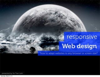
28. Responsive Web Design (RWD) is an approach to web
design in which a site is created to provide an optimal
viewing experience - easy reading and navigation -
adapt to a wide range of devices
(from desktop computer monitors to mobile phones)
Saturday, March 9, 13
36. Source: Compete quarterly smartphone report, Jan 2010 http://www.flickr.com/photos/wonderdawg777/662293238
76% use mobile while waiting
in queues or for appointments
Saturday, March 9, 13
40. yesterday
“go to the computer”
to use the web/Internet
today
“use mobile”
to use the web/Internet
Saturday, March 9, 13
41. InternetUsers(MM)Estimated
1000
2007 2008 2009 2010 2011 2012 2013 2014 2015
Desktop users
Source: Morgan Stanley Associates Internet Trends 2010 (PDF)
mobile users =
desktop users
2000
1500
500
Mobile users
the mobility era
0
2013 is the year of responsive web design
Saturday, March 9, 13
42. 1984 1990 1994 1998 2004 2007
display size/width
512 x 342
in the beginning
we had computers...
Saturday, March 9, 13
43. 1984 1990 1994 1998 2004 2007
640
800 1024 x 768512 x 342
1024
512
we came to expect
more and more every year...
display size/width
Saturday, March 9, 13
44. 240
320 x 480
1984 1990 1994 1998 2004 2007
640
800 1024 x 768512 x 342
1024
512
..one day in 2007
less became much more
display size/width
Saturday, March 9, 13
45. 768 x 1024
240
320 x 480
1984 1990 1994 1998 2004 2007
640
800 1024 x 768512 x 342
1024
512
480 x 800
today we seem to have
a lot less more...
display size/width
Saturday, March 9, 13
46. 1990 1994 1998 2004 2007 2011 2015
640
800
1280
1024 x 768
240
1440
600 x 1024
768 x 1024
with a lot more less
on the horizon...
public displays
1920 x 1080
1920
1024 320 x 480
480 x 800 360 x 640
display size/width
Saturday, March 9, 13
47. how to adapt websites to these
varied screens...?
Saturday, March 9, 13
48. you could not build all websites
http://www.flickr.com/photos/handwrite/3460075040
UNDESIRABLE
suitable for every devices...
Saturday, March 9, 13
62. bún đậu mắm tôm
http://www.flickr.com/photos/_ppo/2393063853
a client makes a request
to a server...
Saturday, March 9, 13
63. bún bò
phở
trà đá
cà phê
cơm
many clients could make
belong to the context
nước cam
http://www.flickr.com/photos/_ppo/
2393063853
varied requests...
Saturday, March 9, 13
64. 45K, nước cam...
5K, trà đá...
the server tailors each request
to each client...
30K, bún...
50K, cơm...
http://www.flickr.com/photos/_ppo/
2393063853Saturday, March 9, 13
74. width: 320 px... use what you can...
create profile
2
{
width:{
screen:320
}
}
a cookie
http://www.flickr.com/photos/wscullin/3770015203
PHP, Java, etc.
Saturday, March 9, 13
94. perhaps a bit ambitious?
...a bit late, no?
every stylesheet is not required
device detect early
typically
desktop scripts aren't suitable for mobile
@font support varies
3 columns, really?
...what about scripts & stylesheets
that aren't suitable?
Saturday, March 9, 13
95. ...too many HTTP requests
provide alternates?
unsupported
media formats...
...that's a lot of
JavaScript!
requests...
...is Flash even supported?
does every device get the same
Flash – if they support Flash?
...ah, that is Flash!
the right version of
Saturday, March 9, 13
96. http://www.w3.org/TR/html5/video.html
this only deals with codecs -
not context*...
...screen size?
...available bandwidth?
you just can't detect
...or factors that
...is orthogonal to...
c.2000...
Text
fsdfffSaturday, March 9, 13
103. panda.jpg panda@320.jpg
based on...
repeat process for each
<img> found in document...
panda@240.jpg
resolution_width: 240 device property
replace each image with a
more suitable alternate...
Saturday, March 9, 13
104. ...how many images are required?
other elements?
..what about slightly
"fuzzier" DOM elements?
...related elements?
panda@320.jpg panda@240.jpg
resolution_width: 240 device property
FAIL
panda.jpg
Saturday, March 9, 13
107. quickly got out of control...
yet revolting
*HACK*
PHP
{{mustache}} inspired...
slippery slope
to
XSLT!
...apologies to @stephenhay
FAIL
...an interesting idea that
hacked together in PHP
(should have been C for speed)...
almost
reinvented...
written in
Saturday, March 9, 13
109. ...use XSLT – after
all it was made to
style content!?
WTF?
yup, that's "99
Bottles of Beer"
in XSLT...?
found massive inspiration
for XSLT here!
FAIL
...we honestly tried,
but we @$*#& XSLT!
Saturday, March 9, 13
142. each style sheet augments the others
augment once
for another
device
A
B
C
xx px to xxx px
breakpoint
A
B
C
max xx px wide
(or unable to
understand further
instructions)
style sheet 1
breakpoint
Saturday, March 9, 13
143. A
B
C
xx px to xxx px
B
min xxx px wide
A
B
C
max xx px wide
(or unable to
understand further
instructions)
augment
once
again for
TVs etc.
breakpoint
each style sheet augments the others
breakpoint
style sheet 1
breakpoint
style sheet 2
C
A
Saturday, March 9, 13
144. using breakpoints
create breakpoints using media queries for various screens
technique
http://www.w3.org/TR/css3-mediaqueries/
Saturday, March 9, 13
145. a single css file is network
efficient, but includes
unnecessary style data that
all devices end up downloading
a common approach
@media {
(min-width: 320px)
styles.css
one style sheet with media
queries on the inside
@media {
(min-width: 480px)
}
@media {
(min-width: 640px)
}
@media {
(min-width: 768px)
}
Saturday, March 9, 13
146. MAJOR
BREAKPOINTS
IN DOCUMENT
HEAD mobile.css
@media {
(min-width: 640px)
}
desktop.cssbasic.css
typically)
no media
queries
@media {
(min-width: 480px)
}
@media {
(min-width: 1024px)
}
MINOR
BREAKPOINTS
WITHIN EACH
STYLE SHEET
a more robust option
multiple style sheets with
media queries on the inside
Saturday, March 9, 13
147. @media
screen
and
(min-‐width:1024px)
{
section
ul
li
{
width:20%;
}
}
<link
rel="stylesheet"
type="text/css"
href="stylesheets/base.css"
media="screen,handheld"
/>
<link
rel="stylesheet"
type="text/css"
href="stylesheets/desktop.css"
media="only
screen
and
(min-‐width:720px)"
/>
<link
rel="stylesheet"
type="text/css"
href="stylesheets/mobile.css"
media="only
screen
and
(min-‐width:320px)"
/>
MAJOR BREAKPOINTS IN DOCUMENT HEAD
MINOR BREAKPOINTSWITHIN EACH STYLE SHEET
Saturday, March 9, 13
148. (which will affect performance)
don’t multiple style sheets
cause multiple http requests?
Saturday, March 9, 13
149. min 320 px wide
and/or unable to
understand
further
instructions
Major Breakpoint 1
(media query in document head) Major Breakpoint 3
320 px to 720 px wide 720 px to 1024 px
Example
Major Breakpoint 2
(media query in document head)
720
(P) = Portrait
(L) = Landscape
(L*) = Landscape w/ native viewport adaptation
some tablets
most NetBooks
many DesktopsiPhone (P)
many Android (P)
many BlackBerry
S60 QWERTY
Most S60 (L)
320
major breakpoints
major layout changes
nothing is
here...but
that’s ok!
(media query in document head)
1024
Saturday, March 9, 13
157. 151
62.5% rule
• modern browsers have a 16px font default size
• body {font-size: 62.5%;} --> 16 x 62.5 = 10px
• p {font-size: 1.3em;}
• top and line-height should be em’s
• avoid nested em definitions
em2px
Saturday, March 9, 13
161. navigation suitable for each screen
responsive navigation
horizontal menu for
desktop screen
drop down list menu for
mobile device
Saturday, March 9, 13
165. 158
references
Ethan Marcotte
Author of Responsive Web Design
Brains behind the Boston Globe redesign
unstoppablerobotninja.com
Tuts+
Great web design tutorials and articles
webdesign.tutsplus.com
Saturday, March 9, 13
166. 158
references
Treehouse
Web Design and Development Learning Site
teamtreehouse.com
This Is Responsive
Patterns, resources and news
bradfrost.github.com/this-is-responsive
Ethan Marcotte
Author of Responsive Web Design
Brains behind the Boston Globe redesign
unstoppablerobotninja.com
Tuts+
Great web design tutorials and articles
webdesign.tutsplus.com
Saturday, March 9, 13
169. frameworks
Simple, fluid HTML/CSS/JS framework
from Twitter
Bootstrap
Flexible 6 and 12-grid framework.
Foundation
Fixed width for medium & large screens,
fluid single column for small
goldilocksapproach.com
Minimal responsive framework.
Includes Wordpress theme.
Skeleton
Saturday, March 9, 13
171. thank youlamvt@fpt.com.vn
please
say
@yiibu
the font used
is
many thanks
to
http://www.flickr.com/photos/tinou/453593446
http://www.exljbris.com/museo.html
http://www.flickr.com/creativecommons/by-2.0
Museo
flickr
http://.yiibu.com
xin
chào
Saturday, March 9, 13