1. Assignment
#2
Door,
Exterior
&
Entrance
Carey
SunnyCA
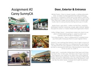
Whole
Foods
–
Door
is
closed,
mostly,
a
sliding
automa<c
door.
It
makes
me
feel
apprehensive
about
entering
because
it’s
cramped
in
there
just
as
you
walk
in,
with
the
cash
registers
right
in
front
of
you.
People
are
trying
to
push
their
way
out
a
single
narrow
door
as
you’re
trying
to
get
inside.
But
it’s
also
protec<ve
feeling
once
you’re
inside.
Apple
Store-‐
open
door
–
makes
me
feel
free,
powerful,
s<mulated.
Exterior
is
en<cing,
simple,
light
colored.
Makes
me
want
to
come
in.
It
looks
simple
and
organized
in
there.
Valley
Village
Liquor
–
closed
door
makes
me
check
to
see
who’s
in
there
before
going
in.
I
want
to
make
sure
nobody’s
drunk
inside
or
holding
it
up.
Farm
Boy
Grocery
–
Door
is
sliding
and
it’s
crowded
once
you
first
walk
in
because
there’s
a
cash
register
there.
Gelson’s
I
am
realizing
that
Gelson’s
has
it
right
in
terms
of
doors.
They
open
and
close
in
a
sliding
manner,
but
they’re
far
back
from
the
cash
registers
in
the
front,
which
makes
me
feel
in
command
of
the
store.
Merchandise
is
not
on
top
of
me
as
soon
as
I
walk
in.
Trader
Joe’s
–
automa<c
sliding
doors
that
open
and
close,
but
that’s
fine.
In
this
case,
the
doors
don’t
open
onto
the
cash
registers,
but
rather
to
an
open
area
surrounded
by
flowers
and
some
vegetables.
This
has
a
posi<ve
effect
that
makes
me
feel
in
command
of
the
store,
like
Gelson’s,
but
not
like
the
other
stores.
It
draws
me
in
with
its
exterior
displays.
2. Logo
/
Color
Whole
Foods
–
logo
colors
–
green
and
white:
makes
me
feel
healthy,
but
also
like
you
need
to
be
wealthy
to
shop
here,
which
is
true
because
it’s
so
pricey
Apple
Store-‐
white
and
grey
–
no
leXers
–
makes
it
feel
like
they
understand
me
here
(I’m
a
visual
processor).
Also,
I’m
visually
sensi<ve,
so
they’re
not
overs<mula<ng
me
with
color,
which
helps
me
think
more
clearly
and
feel
more
crea<ve,
iow,
“clean
slate”
feeling
Valley
Village
Liquor
–
white
and
red
–
makes
me
feel
like
this
place
is
old
and
outdated
and
base
Trader
Joe’s
–
red
and
white
color.
I
would
probably
like
green
beXer,
but
Trader
Joe’s
has
a
tropical
flower
next
to
it
that
reminds
me
of
vaca<on
and
the
interes<ng
things
you
find
when
you’re
in
a
foreign
land,
like
interes<ng
snacks
and
soaps
in
the
grocery
store.
Trader
Joe
carries
a
lot
of
reasonably
priced
imports,
so
this
is
a
good
reflec<on
of
that
“on
vaca<on”
feeling.
Gelson’s-‐
red
and
white,
but
some<mes
it’s
also
in
green.
The
font
makes
me
feel
like
it’s
upper
crust,
jazzy,
upscale.
Valley
Village
Liquor
–
white
block
leXers
on
green.
Very
plain
and
pragma<c.
Mom
and
Pop
shop
feeling.
Reliable
feeling.
Farm
Boy
–
again
with
the
red
leXers
on
white.
The
blocky
font
makes
me
feel
again,
like
this
is
a
mom
and
pop
shop
and
reliable.
3. Gelson’s
Farm
Boy
Brightness,
Interior
Décor
&
Products
Whole
Foods
–
not
that
bright
–
yellowish
<nge
inside.
Makes
me
feel
comfy,
cozy,
at
home.
Lots
of
wood.
Reminds
me
more
of
the
Farm
Boy
mom
and
pop
store
than
I
realized.
Inspires
trust
and
a
belief
the
people
have
good
values
and
the
products
are
wholesome
and
high
quality.
Apple
Store-‐
white
and
grey
walls
in
front,
but
lots
of
wood
tables
in
back
and
also
wood
shelving.
Whole
Foods
–
local
market
feel
Brightness
is
beXer
in
back
because
it’s
more
dim
and
homey.
Up
front,
it’s
a
liXle
too
white.
I
always
thought
it
was
really
bright
in
an
Apple
store.
But
with
all
the
light
pine
wood
tones,
it’s
kinda
homey.
Reminds
me
of
kindergarten
furniture.
Those
are
Angelina’s
kids
in
the
photo
to
the
le_,
btw.
Valley
Village
Liquor
–
fluorescents.
I
hate
fluorescents.
Too
much
junk
food,
not
well
displayed.
But
they
also
have
essen<als.
Typical
convenience
store
model.
But
pragma<c
and
works
well.
You
don’t
feel
like
you’re
overpaying
too
much
because
it’s
so
shabby.
So
that’s
a
small
comfort
anyway.
Farm
Boy
–
not
all
that
bright,
fluorescent
lights.
Store
is
packed
with
vegetables.
Not
a
lot
of
packaging,
aisles
packed
together.
Gives
feeling
of
inclusiveness
at
farmer’s
market
or
produce
yards.
Implies
you
won’t
overpay
and
quality
is
fresh.
The
nut
shelves
are
a
liXle
too
jammy.
Feels
like
a
store
in
another
country,
but
not
in
a
good
way.
Gelson’s
–
not
as
bright
as
a
typical
large
supermarket
like
Kroger’s,
Ralph’s
or
Von’s.
They
are
very
bright,
with
fluorescents,
which
cast
a
blue
light
on
everything.
Gelson’s
ligh<ng
is
more
mellow.
Also,
there’s
a
lot
of
product
packaging
and
they’re
on
shelves
in
a
very
neat
manner,
that
makes
me
think
things
are
going
to
be
expensive.
And
they
are.
It
has
a
“top
shelf,”
fancy
market
kind
of
feel.
Even
though
Whole
Foods
can
be
just
as
expensive.
Signs
are
all
printed
by
computer.
Trader
Joe’s
–
Also
has
a
homey
market
feel.
Standard
grocery
store
lights,
but
lots
of
wooden
(vs
steel)
shelves
and
also
smaller
stores
with
more
islands.
Products
messier
with
lots
of
hand
drawn
signs
to
give
more
of
a
small
market
feel.
This
inspires
trust,
makes
you
feel
like
you’re
gecng
quality
and
good
prices.
Apple
Store
interior
4. Customers
&
Cash
Registers
Whole
Foods
–
Right
in
the
front
–
you
prac<cally
trip
over
it
when
you
walk
in.
There’s
not
enough
space
to
stand
in
line.
I
like
Gelson’s
beXer.
It
feels
more
open.
Customers
hippies
health
foodies.
Leisurely
pace.
Apple
Store-‐
Cash
registers
are
everywhere
and
nowhere.
I
guess
Geniuses
use
those
hand-‐held
cash
registers.
Impression
is
it’s
a
display
room,
there’s
no
pressure
to
sell.
Also,
reminds
me
of
a
school
learning
center
or
elementary
school
library.
Feels
like
learning
and
understanding
are
promoted
Lindsay
Lohan
at
Trader
Joe’s
here,
even
for
dyslexic
/
feeler
/
crea<ve
Natalie
Portman
at
Gelson’s
people
(vs
le_
brainers).
Customers
s<cking
around
for
a
long
<me.
Sales
people
very
laid
back.
Valley
Village
Liquor
–
Front,
to
the
le_.
Right
where
it
should
be,
I
guess.
I
guess
people
might
probably
steal
a
lot
from
this
store
though
because
it’s
far
from
a
lot
of
the
cases.
Trader
Joe’s
everyone’s
having
fun
in
here.
Cash
registers
are
too
crowded
though.