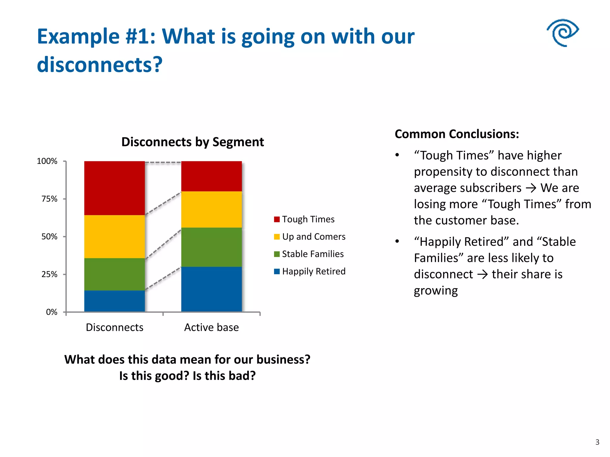
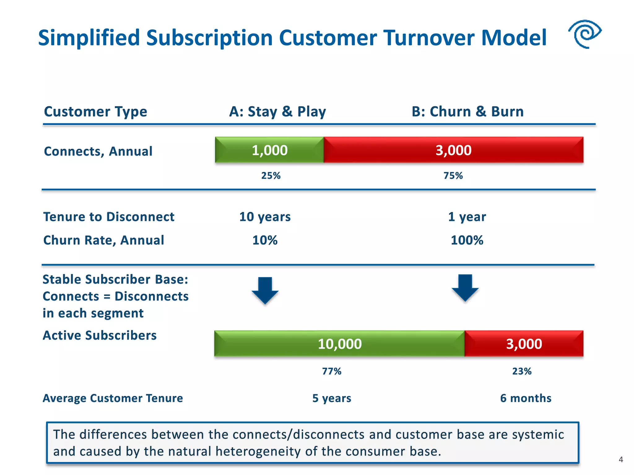
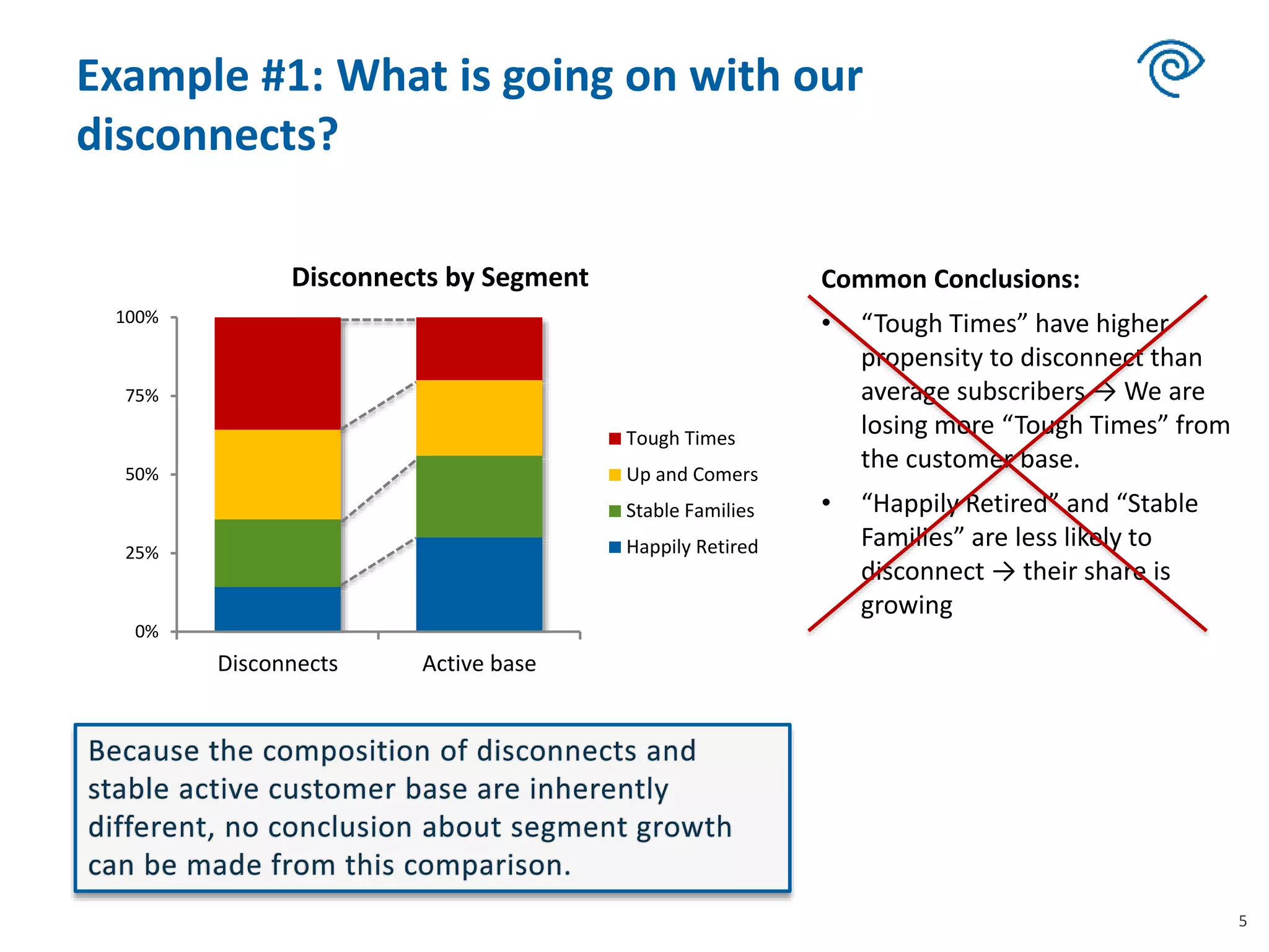
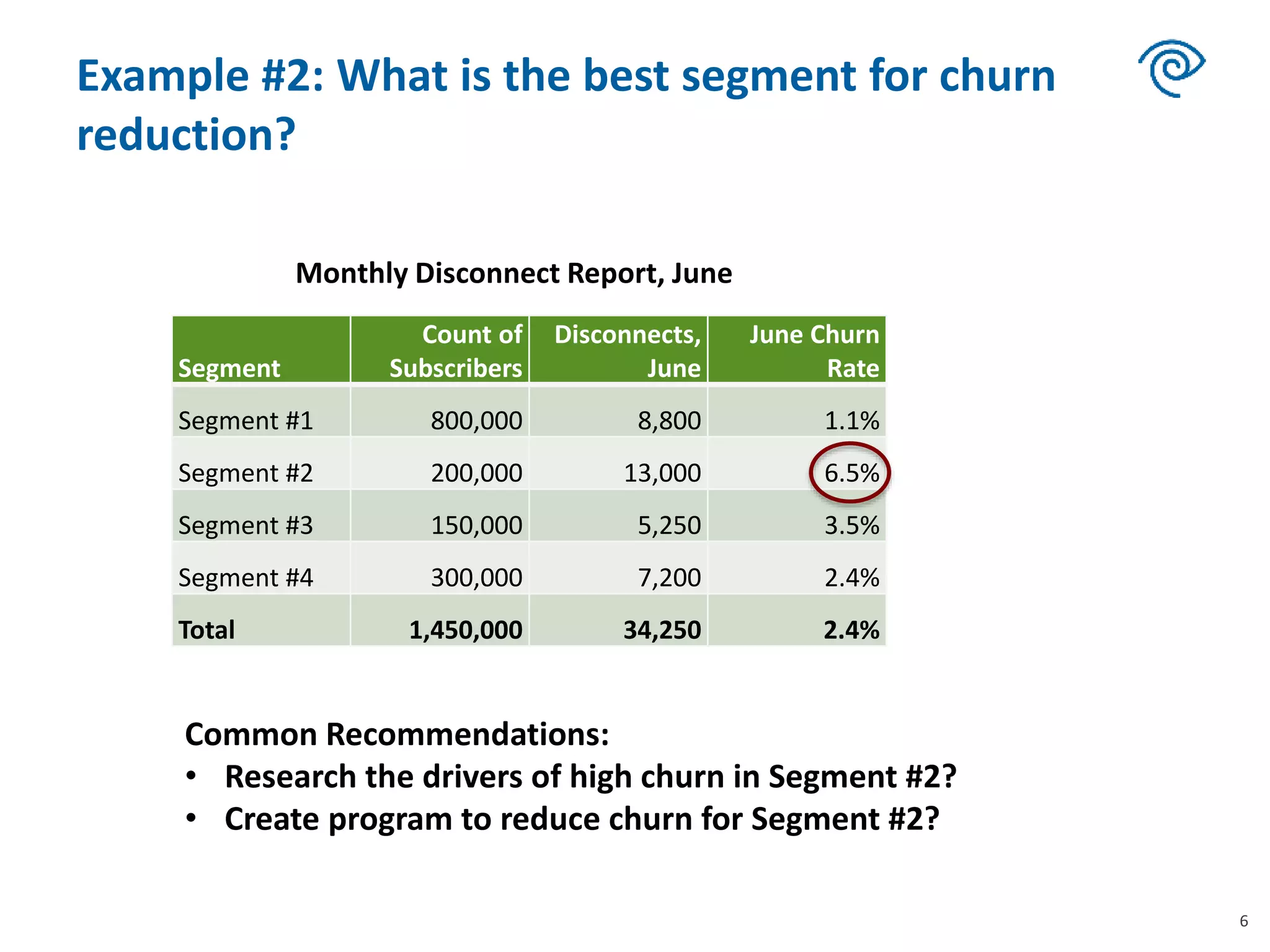
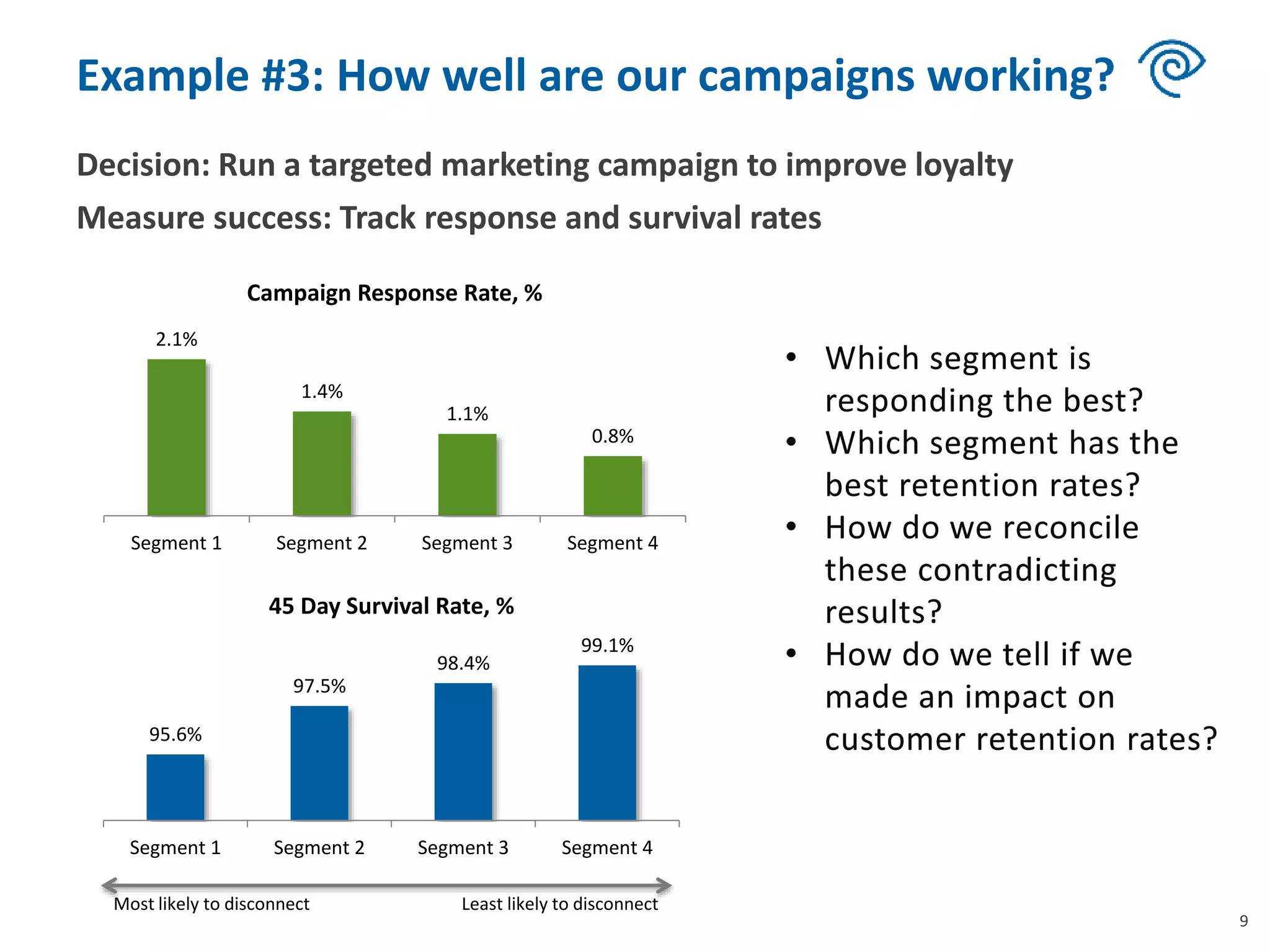
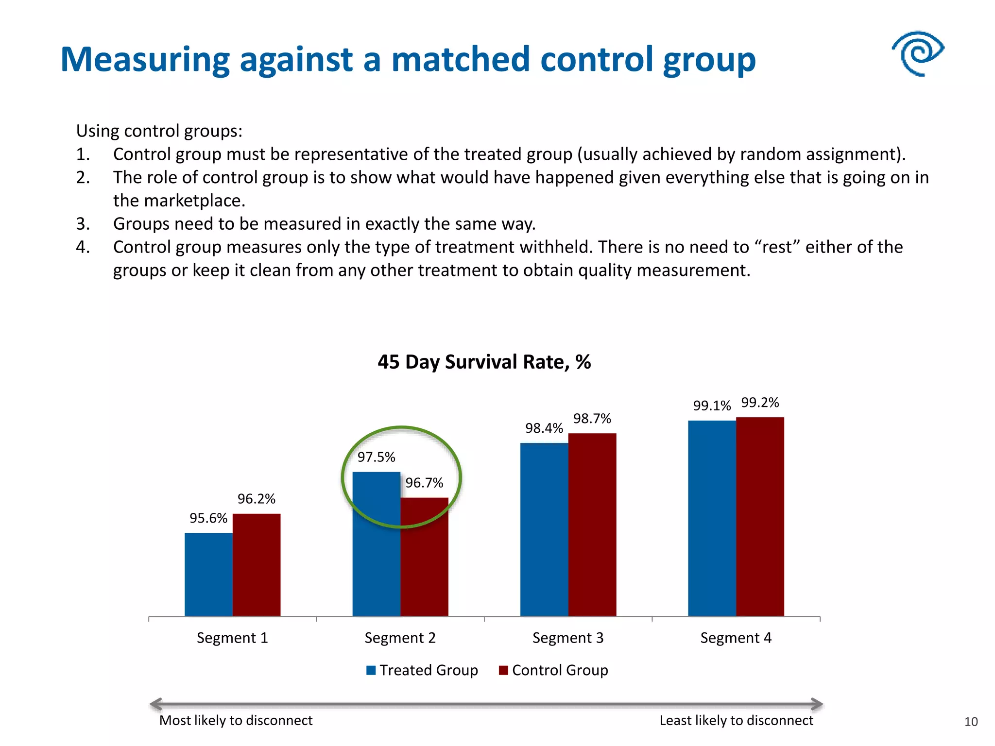
Subscriber Lifecycle and Turnover:
How to Interpret Your Data and Use It to
Reduce Churn
How do we use data to reduce disconnects in
subscription business?
Standard process to make data-driven decisions:
• Collect data
• Interpret the data
• Make better decisions
• Measure the results
2
Incorrect interpretations of the data are very common.
They lead to poor decisions.
Anything that can go wrong in this process?
Example #1: What is going on with our
disconnects?
0%
25%
50%
75%
100%
Disconnects
Disconnects by Segment
Tough Times
Up and Comers
Stable Families
Happily Retired
3
What does this data mean for our business?
Is this good? Is this bad?
0%
25%
50%
75%
100%
Disconnects Active base
Disconnects by Segment
Tough Times
Up and Comers
Stable Families
Happily Retired
Common Conclusions:
• “Tough Times” have higher
propensity to disconnect than
average subscribers → We are
losing more “Tough Times” from
the customer base.
• “Happily Retired” and “Stable
Families” are less likely to
disconnect → their share is
growing
Simplified Subscription Customer Turnover Model
4
10,000 3,000
1,000 3,000
Example #1: What is going on with our
disconnects?
5
0%
25%
50%
75%
100%
Disconnects Active base
Disconnects by Segment
Tough Times
Up and Comers
Stable Families
Happily Retired
Common Conclusions:
• “Tough Times” have higher
propensity to disconnect than
average subscribers → We are
losing more “Tough Times” from
the customer base.
• “Happily Retired” and “Stable
Families” are less likely to
disconnect → their share is
growing
Example #2: What is the best segment for churn
reduction?
Segment
Count of
Subscribers
Disconnects,
June
June Churn
Rate
Segment #1 800,000 8,800 1.1%
Segment #2 200,000 13,000 6.5%
Segment #3 150,000 5,250 3.5%
Segment #4 300,000 7,200 2.4%
Total 1,450,000 34,250 2.4%
6
Common Recommendations:
• Research the drivers of high churn in Segment #2?
• Create program to reduce churn for Segment #2?
Monthly Disconnect Report, June
Effects of Churn Reduction – Short Term
7
What impact would a 10% churn reduction for both group have on
the subscriber base?
Type A: Stay & Play Current
After 10%
Reduction
Churn Rate 10% 9%
Connects, annual 1,000 1,000
Disconnects, annual 1,000 900
Subscriber Growth, Year One 100
Type B: Churn & Burn Current
After 10%
Reduction
Churn Rate 100% 90%
Connects, annual 3,000 3,000
Disconnects, annual 3,000 2,700
Subscriber Growth, Year One 300
Effects of Churn Reduction – Long Term
8
0
200
400
600
800
1,000
1,200
1 3 5 7 9 11 13 15 17 19 21 23 25 27 29
Years
Cumulative Impact of 10% Churn Reduction
A: Stay & Play B: Churn & Burn
Type A: Stay & Play
Year Base
Connects
(annual)
Disconnects,
9% a year
Growth
(annual)
1 10,000 1,000 900 100
2 10,100 1,000 909 91
3 10,191 1,000 917 83
4 10,274 1,000 925 75
5 10,349 1,000 931 69
6 10,418 1,000 938 62
7 10,480 1,000 943 57
8 10,537 1,000 948 52
9 10,589 1,000 953 47
10 10,636 1,000 957 43
Type B: Churn & Burn
Year Base
Connects
(annual)
Disconnects,
90% a year
Growth
(annual)
1 3,000 3,000 2,700 300
2 3,300 3,000 2,970 30
3 3,330 3,000 2,997 3
4 3,333 3,000 3,000 0
5 3,333 3,000 3,000 0
6 3,333 3,000 3,000 0
7 3,333 3,000 3,000 0
8 3,333 3,000 3,000 0
9 3,333 3,000 3,000 0
10 3,333 3,000 3,000 0
Example #3: How well are our campaigns working?
Decision: Run a targeted marketing campaign to improve loyalty
Measure success: Track response and survival rates
9
2.1%
1.4%
1.1%
0.8%
Segment 1 Segment 2 Segment 3 Segment 4
Campaign Response Rate, %
95.6%
97.5%
98.4%
99.1%
Segment 1 Segment 2 Segment 3 Segment 4
45 Day Survival Rate, %
Most likely to disconnect Least likely to disconnect
Measuring against a matched control group
10
95.6%
97.5%
98.4%
99.1%
96.2%
96.7%
98.7%
99.2%
Segment 1 Segment 2 Segment 3 Segment 4
45 Day Survival Rate, %
Treated Group Control Group
Most likely to disconnect Least likely to disconnect
Using control groups:
1. Control group must be representative of the treated group (usually achieved by random assignment).
2. The role of control group is to show what would have happened given everything else that is going on in
the marketplace.
3. Groups need to be measured in exactly the same way.
4. Control group measures only the type of treatment withheld. There is no need to “rest” either of the
groups or keep it clean from any other treatment to obtain quality measurement.
Takeaways
• Most subscriber businesses have a lot of data.
• Making sense of the data can be challenging. Incorrect
interpretation is very common and leads to poor decisions.
• Understanding subscriber turnover cycles helps us interpret
the data correctly.
• The turnover model sheds a new light on which segments we
should target to grow our business over long term.
• To refine your targeted segments, use measurement against
control when implementing marketing programs.
11

Zyabkina telecoms iq miami 2015 - subscriber turnover

  • 1.
    Subscriber Lifecycle andTurnover: How to Interpret Your Data and Use It to Reduce Churn
  • 2.
    How do weuse data to reduce disconnects in subscription business? Standard process to make data-driven decisions: • Collect data • Interpret the data • Make better decisions • Measure the results 2 Incorrect interpretations of the data are very common. They lead to poor decisions. Anything that can go wrong in this process?
  • 3.
    Example #1: Whatis going on with our disconnects? 0% 25% 50% 75% 100% Disconnects Disconnects by Segment Tough Times Up and Comers Stable Families Happily Retired 3 What does this data mean for our business? Is this good? Is this bad? 0% 25% 50% 75% 100% Disconnects Active base Disconnects by Segment Tough Times Up and Comers Stable Families Happily Retired Common Conclusions: • “Tough Times” have higher propensity to disconnect than average subscribers → We are losing more “Tough Times” from the customer base. • “Happily Retired” and “Stable Families” are less likely to disconnect → their share is growing
  • 4.
    Simplified Subscription CustomerTurnover Model 4 10,000 3,000 1,000 3,000
  • 5.
    Example #1: Whatis going on with our disconnects? 5 0% 25% 50% 75% 100% Disconnects Active base Disconnects by Segment Tough Times Up and Comers Stable Families Happily Retired Common Conclusions: • “Tough Times” have higher propensity to disconnect than average subscribers → We are losing more “Tough Times” from the customer base. • “Happily Retired” and “Stable Families” are less likely to disconnect → their share is growing
  • 6.
    Example #2: Whatis the best segment for churn reduction? Segment Count of Subscribers Disconnects, June June Churn Rate Segment #1 800,000 8,800 1.1% Segment #2 200,000 13,000 6.5% Segment #3 150,000 5,250 3.5% Segment #4 300,000 7,200 2.4% Total 1,450,000 34,250 2.4% 6 Common Recommendations: • Research the drivers of high churn in Segment #2? • Create program to reduce churn for Segment #2? Monthly Disconnect Report, June
  • 7.
    Effects of ChurnReduction – Short Term 7 What impact would a 10% churn reduction for both group have on the subscriber base? Type A: Stay & Play Current After 10% Reduction Churn Rate 10% 9% Connects, annual 1,000 1,000 Disconnects, annual 1,000 900 Subscriber Growth, Year One 100 Type B: Churn & Burn Current After 10% Reduction Churn Rate 100% 90% Connects, annual 3,000 3,000 Disconnects, annual 3,000 2,700 Subscriber Growth, Year One 300
  • 8.
    Effects of ChurnReduction – Long Term 8 0 200 400 600 800 1,000 1,200 1 3 5 7 9 11 13 15 17 19 21 23 25 27 29 Years Cumulative Impact of 10% Churn Reduction A: Stay & Play B: Churn & Burn Type A: Stay & Play Year Base Connects (annual) Disconnects, 9% a year Growth (annual) 1 10,000 1,000 900 100 2 10,100 1,000 909 91 3 10,191 1,000 917 83 4 10,274 1,000 925 75 5 10,349 1,000 931 69 6 10,418 1,000 938 62 7 10,480 1,000 943 57 8 10,537 1,000 948 52 9 10,589 1,000 953 47 10 10,636 1,000 957 43 Type B: Churn & Burn Year Base Connects (annual) Disconnects, 90% a year Growth (annual) 1 3,000 3,000 2,700 300 2 3,300 3,000 2,970 30 3 3,330 3,000 2,997 3 4 3,333 3,000 3,000 0 5 3,333 3,000 3,000 0 6 3,333 3,000 3,000 0 7 3,333 3,000 3,000 0 8 3,333 3,000 3,000 0 9 3,333 3,000 3,000 0 10 3,333 3,000 3,000 0
  • 9.
    Example #3: Howwell are our campaigns working? Decision: Run a targeted marketing campaign to improve loyalty Measure success: Track response and survival rates 9 2.1% 1.4% 1.1% 0.8% Segment 1 Segment 2 Segment 3 Segment 4 Campaign Response Rate, % 95.6% 97.5% 98.4% 99.1% Segment 1 Segment 2 Segment 3 Segment 4 45 Day Survival Rate, % Most likely to disconnect Least likely to disconnect
  • 10.
    Measuring against amatched control group 10 95.6% 97.5% 98.4% 99.1% 96.2% 96.7% 98.7% 99.2% Segment 1 Segment 2 Segment 3 Segment 4 45 Day Survival Rate, % Treated Group Control Group Most likely to disconnect Least likely to disconnect Using control groups: 1. Control group must be representative of the treated group (usually achieved by random assignment). 2. The role of control group is to show what would have happened given everything else that is going on in the marketplace. 3. Groups need to be measured in exactly the same way. 4. Control group measures only the type of treatment withheld. There is no need to “rest” either of the groups or keep it clean from any other treatment to obtain quality measurement.
  • 11.
    Takeaways • Most subscriberbusinesses have a lot of data. • Making sense of the data can be challenging. Incorrect interpretation is very common and leads to poor decisions. • Understanding subscriber turnover cycles helps us interpret the data correctly. • The turnover model sheds a new light on which segments we should target to grow our business over long term. • To refine your targeted segments, use measurement against control when implementing marketing programs. 11