SlideShare a Scribd company logo
1
By Christopher B. Leinberger
& Patrick Lynch
The George Washington University
School of Business
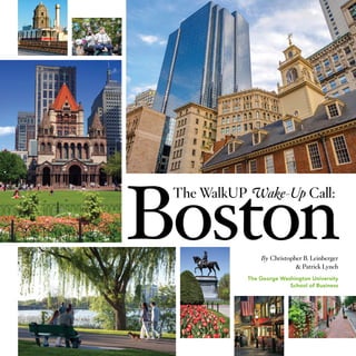
2 The WalkUP Wake-Up Call: Boston © The George Washington University School of Business 2015 3
I.	 EXECUTIVE SUMMARY  .  .  .  .  .  .  .  .  .  .  .  .  .  .  .  .  .  .  .  .  .  .  .  .  .  .  .  .  .  .  .  .  .  .  .  .  . 	 5
II.	 LAND USE DEFINED  .  .  .  .  .  .  .  .  .  .  .  .  .  .  .  .  .  .  .  .  .  .  .  .  .  .  .  .  .  .  .  .  .  .  .  .  .  .  . 	 7
	 The Rise of Walkable Urbanism .  .  .  .  .  .  .  .  .  .  .  .  .  .  .  .  .  .  .  .  .  .  .  .  .  .  .  .  .  .  .  .  .  . 	 8
	 Form Meets Function .  .  .  .  .  .  .  .  .  .  .  .  .  .  .  .  .  .  .  .  .  .  .  .  .  .  .  .  .  .  .  .  .  .  .  .  .  .  .  .  .  . 	 9
	 Methodology .  .  .  .  .  .  .  .  .  .  .  .  .  .  .  .  .  .  .  .  .  .  .  .  .  .  .  .  .  .  .  .  .  .  .  .  .  .  .  .  .  .  .  .  .  .  .  . 	10
	 WalkUP Types .  .  .  .  .  .  .  .  .  .  .  .  .  .  .  .  .  .  .  .  .  .  .  .  .  .  .  .  .  .  .  .  .  .  .  .  .  .  .  .  .  .  .  .  .  .  . 	12
III.	 LAND USE IN METRO BOSTON  .  .  .  .  .  .  .  .  .  .  .  .  .  .  .  .  .  .  .  .  .  .  .  .  .  .  .  .  . 	18
	 Where the WalkUPs Are  .  .  .  .  .  .  .  .  .  .  .  .  .  .  .  .  .  .  .  .  .  .  .  .  .  .  .  .  .  .  .  .  .  .  .  .  .  .  . 	20
	 Geographic Findings .  .  .  .  .  .  .  .  .  .  .  .  .  .  .  .  .  .  .  .  .  .  .  .  .  .  .  .  .  .  .  .  .  .  .  .  .  .  .  .  .  .  . 	22
	 Product Rankings .  .  .  .  .  .  .  .  .  .  .  .  .  .  .  .  .  .  .  .  .  .  .  .  .  .  .  .  .  .  .  .  .  .  .  .  .  .  .  .  .  .  .  .  . 	23
IV.	 WALKUP TRENDS  .  .  .  .  .  .  .  .  .  .  .  .  .  .  .  .  .  .  .  .  .  .  .  .  .  .  .  .  .  .  .  .  .  .  .  .  .  .  .  .  . 	26
	 Market Shifts Over Three Real Estate Cycles  .  .  .  .  .  .  .  .  .  .  .  .  .  .  .  .  .  .  .  .  .  .  . 	28
	 Walkable Uranism & Economic Development .  .  .  .  .  .  .  .  .  .  .  .  .  .  .  .  .  .  .  .  .  .  . 	30
V.	 WALKUP RANKINGS  .  .  .  .  .  .  .  .  .  .  .  .  .  .  .  .  .  .  .  .  .  .  .  .  .  .  .  .  .  .  .  .  .  .  .  .  .  .  . 	32
	 Economic Rankings  .  .  .  .  .  .  .  .  .  .  .  .  .  .  .  .  .  .  .  .  .  .  .  .  .  .  .  .  .  .  .  .  .  .  .  .  .  .  .  .  .  .  . 	34
	 Social Equity Rankings .  .  .  .  .  .  .  .  .  .  .  .  .  .  .  .  .  .  .  .  .  .  .  .  .  .  .  .  .  .  .  .  .  .  .  .  .  .  .  .  . 	39
VI.	 FUTURE WALKUPS  .  .  .  .  .  .  .  .  .  .  .  .  .  .  .  .  .  .  .  .  .  .  .  .  .  .  .  .  .  .  .  .  .  .  .  .  .  .  .  . 	45
	 WalkUPs: The Next Wave .  .  .  .  .  .  .  .  .  .  .  .  .  .  .  .  .  .  .  .  .  .  .  .  .  .  .  .  .  .  .  .  .  .  .  .  .  . 	46	
		
VII. 	 CONCLUSIONS & RECOMMENDATIONS  .  .  .  .  .  .  .  .  .  .  .  .  .  .  .  .  .  .  .  . 	48
VIII.	APPENDICES  .  .  .  .  .  .  .  .  .  .  .  .  .  .  .  .  .  .  .  .  .  .  .  .  .  .  .  .  .  .  .  .  .  .  .  .  .  .  .  .  .  .  .  .  .  . 	52
	 Endnotes  .  .  .  .  .  .  .  .  .  .  .  .  .  .  .  .  .  .  .  .  .  .  .  .  .  .  .  .  .  .  .  .  .  .  .  .  .  .  .  .  .  .  .  .  .  .  .  .  .  .  . 	53
	 Chart Data Sources  .  .  .  .  .  .  .  .  .  .  .  .  .  .  .  .  .  .  .  .  .  .  .  .  .  .  .  .  .  .  .  .  .  .  .  .  .  .  .  .  .  .  . 	54
	 Acknowledgments  .  .  .  .  .  .  .  .  .  .  .  .  .  .  .  .  .  .  .  .  .  .  .  .  .  .  .  .  .  .  .  .  .  .  .  .  .  .  .  .  .  .  .  . 	55
Table of Contents
The Center for Real Estate
and Urban Analysis
5
household
budget) than
households
in drivable
locations
(48 percent),
primarily
due to lower
transportation costs. In addition, property tax
revenues generated in walkable urban places are
substantially higher than in drivable locations on
a per acre basis.
Previous research has demonstrated the correla-
tion between walkable urban places and both
the education of the metropolitan work force
and the GDP per capita. The current research
confirms this finding: for example, since 2000,
70 percent of the population growth of young,
educated workers has occurred in the walkable
urban places of the Boston region.
Despite the strong momentum toward a more
walkable urban future for the region, there are
challenges and causes for concern. In many
walkable urban places, proximity to transit is a
major requirement for households and employ-
ers. However, increasing congestion in the core
transit system and system fragility in the face
of extreme events (such as was experienced
during the blizzards of 2015) diminish the value
of the system and present substantial risks that
may deter investors. As a result, public sector
investments in MBTA capacity and resiliency are
Metropolitan Boston is leading
the country toward a walkable
urban future.
In the Boston metropolitan area, walkable urban-
ism adds value. On average, all of the product
types studied, including office, retail, hotel, rental
apartments, and for-sale housing, have higher
values per square foot in walkable urban places
than in low-density drivable locations. These
price premiums of 20 to 134 percent per square
foot are strong indicators of pent-up demand for
walkable urbanism.
Walkable urban places are now gaining market
share over drivable locations for the first time in
at least half a century in hotel, office and rental
apartment development. This is good news for
people moving to those locations, since house-
holds in walkable urban places spent less on
housing and transportation (43 percent of total
prerequisites for the billions of dollars of private
sector capital seeking to flow into walkable urban
places over the coming decades.
Public transit, especially rail transit, activates
walkable urbanism’s potential for adding real
estate value, and as this report demonstrates,
that potential is ample. Therefore, policymakers
must weigh the costs of funding transit against
its power to increase tax revenues. With the right
value capture tools in place, the increased value
that transit supports could be used to fund at
least a portion of the system’s maintenance and
future expansion.
We should also be concerned that, given the flow
of capital into walkable urban places and the
price premiums, the affordability of these places
may be diminished. The resulting increased
displacement of low-income residents to less
accessible suburban locations would likely have
substantial negative impacts on social equity,
the environment and opportunity. As a result, it
is critical to establish policies that will preserve
existing affordable housing in walkable urban
places and leverage private sector investments
to enhance opportunities for disadvantaged fam-
ilies to live in high opportunity/high accessibility
places. However, the ultimate solution to high
housing and commercial costs is more walkable
urban inventory, which will occupy less than 10
percent of the metro area’s landmass. This new
inventory will eventually drive down land costs,
the primary reason for the price premiums.
That future is materializing on less than six percent of the
metropolitan area’s land —the same six percent that houses
37 percent of the region’s real estate square footage,
40 percent of its population, and 42 percent of employment.
EXECUTIVE
SUMMARY
INTRODUCTION
For decades, real estate practitioners, observers and
scholars studying land use have looked through
an urban-versus-suburban lens. It is not unlike the
classic social science joke about the tipsy guest who
drops his keys at the front door as he leaves a party.
While searching under a streetlight at the curb, he
is asked, “Why aren’t you looking where you lost the
keys?” He replies, “This is where the light is.”
We have watched and analyzed the urban/suburban
debate where the light was, even if that meant using
the wrong approach with the wrong datasets. Our lat-
est research, focused here on Metropolitan Boston,
challenges those connected with the built environ-
ment (real estate and infrastructure), including devel-
opers, investors, regulators, infrastructure providers,
social equity advocates, public sector managers, ac-
ademics and citizens, to rethink the way we manage
the 35 percent of our nation’s wealth that is invested
in the built environment.1
This is an important recali-
bration that affects how we live and work and where
we are educated, worship and entertained. To ignore
this structural change would be akin to ignoring the
impact of the drivable suburbs on the built environ-
ment more than a half-century ago.
This new research defines—in an entirely new way—
the form and function of all land use in Metropolitan
Boston’s 3,119 square miles. This study then ranks
performance for all land in the region based on two
criteria: economics and social equity. The economic
performance metric measures both the real estate
valuations, as a proxy for GDP (a GDP measure does
not exist below the metropolitan level) and the tax
assessment that drives most local government tax
revenues. The social equity performance metric mea-
sures access to economic opportunity and affordabil-
ity in terms of both housing and transportation costs.
Today, there are two broad forms of metropolitan
development:2
•	 Drivable Sub-urban: This development form has
the lowest development density in metropolitan
history. It features stand-alone real estate prod-
ucts, tends to be socially and racially segregated,
and relies upon cars and trucks as the only viable
form of transportation.
•	 Walkable Urban: This form of development has
much higher density, has multiple real estate
products (housing, office, retail, etc.) close to one
another, employs multiple modes of transporta-
tion that get people and goods to the place and
once there, is walkable.
Each form is found in both cities and suburbs. In the
case of Metropolitan Boston, drivable sub-urban
development can be found within Boston, in neigh-
borhoods such as West Roxbury and Hyde Park, the
many subdivisions throughout the suburbs. Likewise,
Boston’s Back Bay takes a walkable urban form, as
does the newly opened Assembly Row, a $1.3 billion
transit-oriented mixed-use development in a once
gritty, former industrial part of the city of Somerville.
Both drivable sub-urban and walkable urban forms
of development have market support and appeal.
Drivable sub-urban has been the dominant approach
to real estate development for over 60 years. Today,
that is reversing; the pendulum is swinging back to
walkable urban development. Market demand for
drivable sub-urban development, which became
overbuilt and was a major cause of the mortgage
meltdown that triggered the Great Recession, ap-
pears to be on the wane in the Boston metropolitan
area. Meanwhile, there is such pent-up demand for
walkable urban development—as demonstrated by
rental and sales price per square foot premiums—it
could take a generation of new construction to satisfy
the demand for walkable urban development.
Meeting this demand for new development in
walkable urban areas will be a boon to the econ-
omy. Much like drivable sub-urban development
benefited selected jurisdictions in the second half
of the 20th century, this shift back towards walkable
urbanism provides the opportunity that many urban
neighborhoods, long suffering from disinvestment,
have been waiting for. It will also put a foundation
under the Boston regional economy and boost
local government tax revenues, much like drivable
sub-urban development benefited the economy
and selected jurisdictions in the second half of the
20th century.
Walkable urban development calls for dramatically
different approaches than drivable sub-urban to
urban design and planning, regulation, financing
and construction. It also requires the introduction of
a new industry: place management. This new field
develops the strategy and provides the day-to-day
management for walkable urban places, creating a
distinctive “could only be here” place in which inves-
tors and residents invest for the long term.
The comparisons between different land use forms
will help direct private sector investment decisions,
public sector infrastructure investments, and public
policy and household decisions about where to
live, work and play. In addition, place management
organizations could use the metrics developed in
this report to assess year-over-year performance
and progress made in achieving strategic objectives.
Finally, the research can assist in setting urban policy
of the Commonwealth, especially for economic de-
velopment, housing and transportation.
KEY FINDINGS
• 	 The Boston market is showing substantial
and growing pent-up demand for walkable
urbanism, demonstrated by significant and
increasing real estate premiums on average for
walkable urban real estate over drivable sub-
urban in all product types.
	 Metro Boston is on the leading edge of the
national structural shift towards walkable
urbanism. The weighted-average valuation for
walkable urban real estate is 37 percent higher
than drivable sub-urban real estate in the region.
Executive Summary
6 The WalkUP Wake-Up Call: Boston © The George Washington University School of Business 2015
This premium has been growing since 2004 for
for-sale residential and office, and since 2007
for retail.
	 The 2014 valuation premiums of walkable
urban product types compared to drivable
sub-urban are:
•	 OFFICE .  .  .  .  .  .  .  .  .  .  .  .  .  .  .  .  .  .  .  .  .  .  .  .  .  .  .  .  .  .  .  .  .  .  .  .  .  . 134%
•	 HOTEL* .  .  .  .  .  .  .  .  .  .  .  .  .  .  .  .  .  .  .  .  .  .  .  .  .  .  .  .  .  .  .  .  .  .  .  .  . 120%
•	 RENTAL APARTMENTS .  .  .  .  .  .  .  .  .  .  .  .  .  .  .  .  .  .  . 54%
•	 RETAIL .  .  .  .  .  .  .  .  .  .  .  .  .  .  .  .  .  .  .  .  .  .  .  .  .  .  .  .  .  .  .  .  .  .  .  .  .  .  .  . 41%
•	 FOR-SALE RESIDENTIAL .  .  .  .  .  .  .  .  .  .  .  .  .  .  .  .  . 20%
•	 TOTAL .  .  .  .  .  .  .  .  .  .  .  .  .  .  .  .  .  .  .  .  .  .  .  .  .  .  .  .  .  .  .  .  .  .  .  .  .  .  .  . 37%
		 * (only WalkUP premium over Edge City available)
• 	 Walkable urbanism has successively increased its
market share of new income property develop-
ment (office, retail, hotel, rental apartments) over
the last three real estate cycles. From 1992-2000,
27 percent of the region’s new income property
development located in walkable urban places.
That share increased to 39 percent in the 2001-
2008 cycle, and stands at 46 percent for the most
recent cycle (2009-present).
	 Those overall numbers hide important distinctions
in walkable urbanism’s share by real estate prod-
uct type. Office and hotel development appear to
be leading the trend toward walkable urbanism
while rental apartments have just begun to trend
toward it. Retail continues to have a drivable
sub-urban orientation.
	 The key real estate product not included in income
property is for sale-residential. The available data
indicates that it, like retail, is maintaining a drivable
sub-urban orientation. Most for-sale residential
square footage, including single-family and con-
dominiums, continues to be developed in drivable
suburbs. However, the data also shows that the
home­building industry is not producing nearly as
many for-sale units as it has historically. Single-fam-
ily residen­tial permits are dramatically down from
historic peak levels during past economic expan-
sions. For example, as Metro Boston nears the top
of this economic cycle, single-family residential
permits per capita are lower than the trough in
the late 1980s and early 1990s recession. The 20
percent aver­age price premium for walkable ur-
ban for-sale residential may not be enough for the
regional homebuilders to change their business
model. The decline in single-family permits and
the rise in multifamily construction, mostly rental,
may also represent the consequence of demo-
graphic shifts. MAPC has projected that nearly
two-thirds of housing demand in the coming
decades could be for multifamily units.
• 	 The harsh winter of 2014-15 showed how
vulnerable the future of WalkUPs and Walkable
Neighborhoods are, given the years of deferred
maintenance and the need for expansion of the
MBTA rail and bus transit system. Nevertheless,
this research shows that the majority of economic
growth in the region will be in walkable urban
places. The lifeblood of this type of economic
development is rail and bus transit, as well as bike
friendliness and walkability. Not maintaining a
“state of good repair” and expanding rail transit,
but also bike and walking infrastructure, would
put the economic development future of the
region at risk.
ECONOMIC CONCLUSIONS
• 	 There is a wide spectrum of economic perfor-
mance among the WalkUPs. The most significant
and active WalkUPs are in the region’s Inner
Core adjacent to the MBTA rapid transit system.
They have seen significant investment during the
recent cycles and comprise a growing share of
office, hotel, and rental housing in the region.
• 	 From a public finance perspective, WalkUPs
generate 12 times more property tax revenue per
acre than Edge Cities. Walkable Neighborhoods
generate six times more property tax revenue
per acre than Drivable Sub-divisions. The above
numbers refer to gross tax revenues, as opposed
to net fiscal impact (revenues minus costs).
SOCIAL EQUITY CONCLUSIONS
• 	 WalkUPs tend to offer high levels of accessibility,
low transportation costs, and high opportunity in
terms of proximity to employment. However, the
cost of housing in WalkUPs is high and stan-
dardized test scores tend to be lower compared
to the rest of the region. In contrast, Walkable
Neighborhoods generally exchange higher
affordability for average accessibility and oppor-
tunity. Edge Cities have reasonable opportunity
levels, but low accessibility due to generally
requiring car ownership, causing a corresponding
increase in transportation costs. Drivable Sub-di-
visions are the least accessible, not particularly af-
fordable due to the high transportation costs, and
they do not provide many work opportunities as
compared to WalkUPs. Nonetheless, they do offer
lower housing costs for lower income families and
the highest standardized test scores.
• 	 Considering both housing and transportation
costs, WalkUPs and Walkable Neighborhoods
are more affordable than their drivable sub-ur-
ban counterparts. On average, a four-person
family earning the median income and living in
a WalkUP is projected to spend 42 percent of
their income on housing and transportation and
43 percent in Walkable Neighborhoods, versus
45 percent in Edge Cities and 48 percent in Driv-
able Sub-divisions.
• 	 There is large variation within the WalkUPs them-
selves on the various measures of social equity.
Generally, WalkUPs that are on the outer reaches
of the commuter rail are affordable to live in but
do not provide much work or school opportunity,
and have little access to other higher opportunity
areas. In contrast, WalkUPs near the Boston core
benefit from the MBTA transit system, where res-
idents can access many nearby WalkUPs quickly,
but frequently have unaffordable housing costs.
There is a clear tradeoff between accessibility/op-
portunity and housing affordability. Few WalkUPs
provide both relatively affordable housing and
good access to opportunities.
Executive Summary
LAND USE
DEFINED
34%
8 The WalkUP Wake-Up Call: Boston © The George Washington University School of Business 2015 9
Two potential economic functions and two land use forms yield a
four-cell matrix that categorizes 100 percent of metropolitan land.
Land Use DefinedLand Use Defined
The Rise of Walkable Urbanism
After decades of development in Edge Cities, the pendulum has swung back
in favor of walkable urban development. Now the dominant development
pattern in Metropolitan Boston—and many other metropolitan areas in
the country—walkable urbanism is the driving force in real estate.
During the second half of the 20th century, the dom-
inant development model was the familiar drivable
sub-urban approach, whether regionally significant
(Edge Cities) or local serving (Sub-divisions). Most
real estate developers and investors, government
regulators and financiers had come to understand
this model extremely well, turning it into a successful
development formula and economic and local gov-
ernment fiscal driver.
The best way of understanding this trend toward
drivable sub-urbanism is to examine the relative mar-
ket share of WalkUPs and Edge Cities. For example,
although the Edge Cities housed only 23 percent
of the region’s office inventory in 1992, 43 percent
of the region’s new office development located in
them from 1992-2000, meaning they were gaining
market share. WalkUP office space, which made up
49 percent of the region’s office inventory in 1992,
garnered only 17 percent of the region’s new office
development over the same period, a loss of market
share. This pattern of Edge City market share gain
at WalkUPs expense was likely just a continuation of
a trend that had begun in the 1950s and that was
typical of most office markets across the nation.
However, starting in the 2001-2008 real estate cycle,
the pendulum began slowly moving back towards
the market demanding walkable urban development.
Across the country in selective metros and in Boston,
downtowns began to revitalize, inner-ring Suburban
Town Centers redeveloped, and Inner Core Walkable
Neighborhoods saw substantial reinvestment.
Starting in the 2000s real estate cycle (2001-2008)
in Metro Boston, and accelerating in the current real
estate cycle (2009-present), there has been a shift
In metropolitan areas, the economic use of land is
categorized as either regionally significant or local
serving. Regionally significant places have concen-
trations of employment (base, or export, jobs and
regional serving employment), civic centers, insti-
tutions of higher education, major medical centers
and regional retail, as well as cultural, entertainment
and sports assets. Local-serving places are bedroom
communities dominated by residential development
that is complemented by local serving commer-
cial and civic uses, such as primary and secondary
schools, police and fire stations, and so on. Generally
speaking, regionally significant places are where the
metropolitan area earns its living while local serving
places are where people spend their non-work lives.
When form meets function, a simple matrix emerges
that shows how 100 percent of a metropolitan area’s
land is used.
Form Meets Function
towards walkable urbanism in most, though not all,
product types. George Washington University’s previ-
ous research on metropolitan Washington, D.C. and
metropolitan Atlanta found a similar shift in market
share in regionally significant income property devel-
opment (for-sale housing was not studied).
From 2009 to the present, 48 percent of metro Wash-
ington’s income property development occurred in
WalkUPs (0.9 percent of the land in the region), as
compared to only 24 percent from 1992-2000. Even
in metro Atlanta, which for many is the poster child of
sprawl, 50 percent of income property development
since 2009 has occurred in WalkUPs (one percent
of the land in the region), as compared to only 10
percent in the 1990s real estate cycle.
The increasing Boston regional market share for
walkable urbanism has also been accompanied by
rising rents and valuation premiums over the drivable
sub-urban counterparts. These premiums now occur
for all product types that we evaluated. Until more
walkable urbanism emerges, the premiums will likely
persist. This situation benefits walkable urban property
owners but raises critical issues of affordability, a topic
discussed in the social equity section of this report.
WALKUP
WALKABLE NEIGHBORHOOD
DRIVABLE EDGE CITY
DRIVABLE SUB-DIVISION
Key Metrics by Land Use
REGIONAL LAND
Share of Regional Land by Land Use Type:
92.1%
4.4%
1.2%
2.4%
WALKABLE URBAN
DRIVABLE SUB-URBAN
Share of Income Property During the Last Three Real Estate Cycles
Income Property = Office, Retail, Hotel, and Multifamily Apartments
1992-2000 2001-2008 2009-Present
46%39%
73%
61% 54%
27%
POPULATION
Share Residing in Each Land Use Type:
12% 28% 58%
2%
EMPLOYMENT
Share of Employment in Each Land Use Type:
26% 9%15% 49%
generally local serving jobs
& some base or export jobs
generally local
serving jobs
generally base
or export jobs
ASSESSED VALUE
Share of Region’s Total Assessed Value &
Property Tax Revenue by Each Land Use Type
18% 17% 62%
4%
OFFICE INVENTORY
Share of Region’s Office Inventory Housed in
Each Land Use Type:
47% 12% 19% 22%
REGIONALLY
SIGNIFICANT
LOCAL SERVING
WALKABLE
URBAN
WALKUP
(Walkable Urban Place)
WALKABLE
NEIGHBORHOOD
•	 Office Space ≥ 1.4M sq ft
•	 -OR-
•	 Retail Space ≥ 340,000 sq ft
•	 WalkScore ≥ 70.5
•	 Avg intersection density ≥
•	 100 per sq mile
•	 WalkScore ≥ 65
•	 Avg intersection density ≥
•	 100 per sq mile
DRIVABLE
SUB-URBAN
DRIVABLE
EDGE CITY
DRIVABLE
SUB-DIVISION
•	 Office Space ≥ 1.4M sq ft
•	 -OR-
•	 Retail Space ≥ 340,000 sq ft
•	 All land not allocated to other
•	 categories
Metropolitan Land Use Options in the United States
10 The WalkUP Wake-Up Call: Boston © The George Washington University School of Business 2015 11
Methodology
The Boston research team reviewed and compiled
data from CoStar, Cushman and Wakefield, and
parcel data provided by MAPC to make preliminary
identifications of major commercial concentrations.
These commercial concentrations were initially
separated into walkable and drivable by using Walk
Score. MAPC provided average Walk Scores by cen-
sus block, which had been averaged from sample
points provided by Walk Score. Those census blocks
within the commercial concentrations with average
Walk Scores over 70.5, the threshold established in
the Walk This Way report, were selected for further
study as WalkUPs. Those commercial concentrations
with Walk Scores below 70.5 were considered for
analysis as Edge Cities or Emerging WalkUPs.
For each WalkUP candidate, boundaries were refined
based on a review of aerial photographs, established
or commonly held neighborhood boundaries or
place-management districts and input from local
residents and real estate professionals. Ultimately
the boundaries were finalized by the experienced
judgment of our team, which included profession-
als from MAPC, Northeastern University’s Dukakis
Center and the Center for Real Estate and Urban
Analysis at George Washington University School of
Business. In addition, boundaries were drawn with
the recognition that a single walkable place tends
not to exceed 600 acres, based upon experience
and the limitations people are willing to walk, gener-
ally agreed to be between 1500 and 3000 feet.
In each case, the WalkUPs are made up of whole
census blocks. We made the decision to use census
blocks as the most basic components of each
defined geography to facilitate the data aggrega-
tion process.
After boundaries were established, average Walk
Scores and intersection densities for each Walk-
UP candidate were calculated, and data on the
commercial real estate inventory was aggregated
from CoStar. Average Walk Scores for each WalkUP
represent the weighted average Walk Score of each
census block within the WalkUP, weighted by the
land area of each census block. The average inter-
section density is derived from EPA’s Smart Location
Database, which provides estimates of the intersec-
tion density per square mile by census block group,
excluding those intersections that are primarily for
exclusive automobile-use, such as Interstate on and
off ramps, etc.
To be considered an established WalkUP, each can-
didate had to meet the following criteria:
•	 WALKSCORE: Average value ≥ 70.5
•	 INTERSECTION DENSITY: Average ≥ 100 per
square mile
•	 OFFICE & RETAIL SPACE:
	 •	 Office: ≥ 1.4 million square feet
		and/or
	 •	 Retail: ≥ 340,000 square feet
Candidates that did not meet the criteria were
reclassified as Edge Cities, emerging WalkUPs or
local-serving neighborhoods. For emerging Walk-
UPs, the minimum Walk Score criteria was reduced
to 65, the intersection density per acre threshold
reduced to 85, and the space requirements reduced
to 90 percent of the established number, e.g.
1,260,000 square feet of office or 306,000 square
feet of retail.
Edge Cities or regionally significant drivable loca-
tions were identified as places that had a minimum
of either 1.4 million square feet of office or 340,000
square feet of retail but did not meet walkability crite-
ria for Established or Emerging WalkUPs. Boundaries
were drawn based on a review of CoStar data and
aerial photographs for commercial concentrations.
Walkable Neighborhoods were identified as those
census blocks with average Walk Scores of at least
65 and intersection densities of at least 100 per
square mile within a quarter mile of the center of the
census block.
ECONOMIC RANKINGS:
METHODOLOGY & SOURCES
Building-level rent information was aggregated to
the defined geographies to generate the analysis of
rent premiums. For the office rent premium and in-
ventory analysis we used a combination of data from
Cushman and Wakefield and CoStar. In general,
where Cushman and Wakefield data for a particular
building was available, it was used. When not, the
CoStar data was substituted. All office rents repre-
sent the weighted average, full-service asking rent
per square foot. Averages were weighted according
to square feet, e.g. large buildings influenced the
average more than small buildings.
For rent and square footage information of the
remaining income property categories, including
retail, multifamily apartments, and hotels, we relied
on CoStar and STR. In a few cases, no rent data was
available for any buildings within a WalkUP geog-
raphy. In those cases, rents per square foot were
estimated based on the correlation between the
The methodology employed in this report has its basis in research
described in the Brookings Institution report, Walk This Way,3
and used in two prior WalkUP Wake-Up Call reports by the
GW School of Business focused on Washington, D.C.4
and Atlanta.5
average assessed value per square foot and aver-
age rents in geographies where rent information
was available.
For purposes of the economic rankings, for-sale
housing prices were converted into annual rents
per square foot by estimating the annual mortgage
payment, assuming a 30-year fixed mortgage at a
four percent interest rate, adding the property tax
associated with each jurisdiction, and a homeown-
ers’ insurance premium of $.50 per square foot.
Estimates of market value premiums for walkable
urban places, as described on page 24, are based
on the average rents per square foot for each
product type as determined above, and cap rates,
which we estimated based on transaction data
provided by Cushman and Wakefield. In each case,
we assumed that expenses as a percentage of rent
revenue were constant across both walkable urban
places and drivable locations. The average rent, less
the assumed expense ratio, divided by the average
cap rate, determined the valuation estimates. The
estimates of value premiums were compared to
actual differences in per-square-foot transaction
prices between walkable urban places and drivable
locations to ensure they were reasonable. To be
clear, these estimates represent averages based
on sample data—individual transaction values may
deviate significantly from these estimates.
Assessed value estimates and the estimate of the
total square footage in each geography are based
on the Massachusetts Land Parcel Database, a
state-level database that aggregates and attempts
to harmonize property assessment data from all the
various towns in Massachusetts. This dataset has
some limitations. Different towns do not always have
consistent standards for measuring square footage
and classifying land use. In addition, the dataset is
not entirely current—a few towns have only provided
data through 2009, while others are current through
2014. Nonetheless, it is the most comprehensive
source available for assessed values and residential
square footage.
SOCIAL EQUITY RANKINGS:
METHODOLOGY & SOURCES
The following data sources were used to calculate
the social equity metrics.
•	 Percentage of the region’s working-age popu-
lation accessible by transit: EPA Smart Location
Database
•	 Non-Car Commute Share: American Community
Survey 2007-2011
•	 Housing and Transportation Costs: The Depart-
ment of Housing and Urban Development’s
Location Affordability Portal. http://www.location-
affordability.info/
•	 School Proficiency: Massachusetts data on aver-
age reading proficiency by school, for elemen-
tary schools and middle schools. Each census
block was assigned the average proficiency of
the three nearest schools. Scores for all geog-
raphies are based on the average of all census
blocks in the geography weighted by each
block’s population. http://www.doe.mass.edu/
infoservices/reports/
•	 Housing Cost Burdens: The Department of Hous-
ing and Urban Development
Note that we considered using a variety of
additional measures in the social equity rankings,
such as accessibility to and from each geography by
automobile, the percentage of housing that is sub-
sidized, and the local unemployment rate, among
others. For the most part, these variables were
found to be highly correlated with the variables
listed above, such that they did not meaningfully
change the results.
Land Use DefinedLand Use Defined
12 The WalkUP Wake-Up Call: Boston © The George Washington University School of Business 2015 13
The Five Types of
WalkUPs in Boston
Based on previous analyses of other metropolitan
areas, there are seven types of possible WalkUPs
in a metropolitan area: Downtown, Downtown
Adjacent, Urban Commercial, Urban University, Re-
gional Urban Centers (referred to as Suburban Town
Center in previous studies), Redeveloped Drivable
Commercial, and Greenfield/Brownfield. Each of
these WalkUP types has a different history, product
mix, and transportation infrastructure, though all are
trending toward mixed-use, high-density walkable
urban places.
In Metro Boston, there are no established Redevel-
oped Drivable Sub-urban Commercial or Greenfield/
Brownfield developments, though the metro area
will soon have one. Assembly Square, located at the
Sommerville site of a former Ford assembly plant,
is now classified as emerging, but will quickly move
into the ranks of the established as it is built out.
There is also a sub-class of WalkUPs that is important
for future development, known as Innovation Dis-
tricts. These knowledge-economy, high-tech, maker-
and software-focused WalkUPs often co-locate
around universities. As defined by Bruce Katz and
Jennifer Wagner of the Brookings Institution, these
are “geographic areas where leading-edge anchor
institutions and companies cluster and connect with
startups, business incubators, and accelerators. They
are also physically compact, transit-accessible, and
technically-wired and offer mixed-use housing, of-
fice, and retail.”6
The best example in the metro area
is Kendall Square/MIT, one of the most important
models in the country of an Urban University-based
Innovation District. Another Innovation District is
the Seaport, a Downtown Adjacent WalkUP east of
Downtown Boston.
There are seven possible types of regionally significant
WalkUPs in any metropolitan area. Metro Boston has
only five of these WalkUP types.
Land Use Defined B
Examples: Downtown BID, Financial District
Downtowns are the original section of a metro area’s
principal city. In Boston, the Downtown Business
Improvement District and the Financial District are
combined to form the Downtown in the region as
defined by this research.
As is typical of Downtowns, office space is the
dominant use, though for-sale and rental residential
are the fastest growing uses in recent years and are
expected to continue to expand.
1 Downtown
Product Mix: Downtown
Average % of Total Square Footage
OFFICE:
77%
RENTAL RESIDENTIAL: 8%
RETAIL: 3%
FOR-SALE RESIDENTIAL: 9%
HOTEL: 3%
14 The WalkUP Wake-Up Call: Boston © The George Washington University School of Business 2015 15
Land Use Defined
Examples: Back Bay, Beacon Hill, Chinatown,
North End, Seaport, South End, West End
Immediately adjacent to Downtown Boston, these
WalkUPs usually have a lower density than Downtown
and possess a unique character from Downtown and
from one another. They have a more balanced mix
of space than Downtown, with almost equal portions
of residential and office/retail space. The result is
usually a lively, 24-hour environment.
2 Downtown Adjacent
A
C
I
Product Mix: DowntownAdjacent
Average % of Total Square Footage
OFFICE:
32%
RETAIL:
4%
HOTEL: 2%
INDUSTRIAL: 1%
CIVIC/OTHER:
11%
FOR-SALE
RESIDENTIAL:
22%
RENTAL RESIDENTIAL:
24%
UNIVERSITY &
HOSPITAL: 4%
Examples: Allston, Cambridgeport, Central Cambridge,
Charlestown, Coolidge Corner, Dudley Square, East Cam-
bridge, Fields Corner, Kenmore/Fenway, Mission Hill,
North Dorchester, North New Bedford/Acushnet Ave.,
Porter Square/Davis Square, Roxbury, South Boston
Historically local-serving neighborhood commercial,
Urban Commercial WalkUPs generally declined eco-
nomically after World War II but, in recent years, they
have found a new economic role.
Urban Commercial WalkUPs in Metro Boston are
dominated by residential real estate (58 percent) and
are marked by more retail and less office space than
Downtown or Downtown Adjacent places. The retail
in Urban Commercial WalkUPs is generally character-
ized as urban entertainment, such as restaurants and
nightclubs, but also, including boutique shops, and
furniture and home décor stores.
3 Urban Commercial
Product Mix: Urban Commercial
Average % of Total Square Footage
OFFICE: 14%
INDUSTRIAL: 1%
UNIVERSITY &
HOSPITAL: 4%
HOTEL: 2%
RETAIL: 5%
RENTAL
APARTMENTS:
16%
FOR-SALE
RESIDENTIAL:
42%
CIVIC/OTHER:
16%
16 The WalkUP Wake-Up Call: Boston © The George Washington University School of Business 2015 17
4 Urban University
Examples: Harvard Square, Longwood Medical Area,
Lower Allston, MIT/Kendall Square, Northeastern, Tufts
In these WalkUPs, universities and other institutional
owners, such as medical facilities or government
research centers, are the dominant landowners.
These landowners gauge the “success” of their de-
velopment not in terms of rent they may be able to
collect, but in their ability to attract talent (professors,
students, administrators, etc.).
The presence of these anchor institutions can also
present opportunities for Innovation Districts to
develop. As mentioned above, MIT/Kendall Square is
one of the country’s leading examples of an Innova-
tion District. University space (classrooms, laborato-
ries, hospitals, general office, and dorms) is the larg-
est use, followed by off-campus housing, both rental
and for-sale. Office space represents 17 percent,
showing the commercialization of university research
and desire to be near the university campus. Retail
is very small (one percent), which is an opportunity;
only Harvard Square has created a critical mass of
retail in this type of WalkUP.
Product Mix: Urban University
Average % of Total Square Footage
OFFICE: 17%
RETAIL: 1%
HOTEL: 1%
FOR-SALE
RESIDENTIAL:
24%
RENTAL
APARTMENTS:
8%
UNIVERSITY &
HOSPITAL:
42%
CIVIC/OTHER: 7%
Examples: Arlington, Attleboro, Brockton, Downtown
Beverly, Downtown Fall River, Downtown Gloucester,
Downtown New Bedford, Downtown Peabody, Downtown
Quincy, Downtown Salem, Downtown Worcester, Fitchburg,
Framingham, Haverhill, Lawrence, Lowell, Lynn/Central
Square, Malden Center, Marlborough, Newburyport,
Norwood, Plymouth, Taunton BID, Walkefield, Waltham,
Watertown, Woburn
Typical Regional Urban Centers (referred to as Sub-
urban Town Centers in previous reports) are 18th- or
19th-century towns that were swept up in the sprawl
of the metropolitan area after World War II. Laid out
before the automobile, they have a walkable urban
grid and historical buildings that preserve the mem-
ory of the place from the more vibrant pre-World
War II era. Following decades of decline, many have
found a new economic role.
Regional Urban Centers have less office space than
Downtown or Downtown Adjacent areas and rela-
tively more retail as a percentage of the total space.
Of all the WalkUPs, this is the only type to have any
appreciable industrial space, though this is likely due
to historical legacy more than anything. Increasing-
ly, these are becoming growing concentrations of
rental and for-sale residential, as well as the return
of employment and retail. These WalkUPs are also
concentrations of civic spaces.
5 Regional Urban Center
Product Mix: Regional Urban Center
Average % of Total Square Footage
OFFICE: 14%
INDUSTRIAL: 8%
UNIVERSITY &
HOSPITAL: 1%
RETAIL:
11%
RENTAL
APARTMENTS:
15%
FOR-SALE RESIDENTIAL:
25%
CIVIC/OTHER: 26%
NEW HAMPSHIRE
RHODE ISLAND
CONNECTICUT
VERMONT
BOSTON
LAND USE IN
METRO BOSTON
MAP KEY:
EMERGING WALKUP
MAJOR HIGHWAYS
WALKABLE NEIGHBORHOOD
MBTA COMMUTER RAIL
DRIVABLE EDGE CITY
MBTA ARC
DRIVABLE SUB-URBAN
OUTSIDE STUDY AREA
DOWNTOWN
DOWNTOWN ADJACENT
URBAN COMMERCIAL
URBAN UNIVERSITY
REGIONAL URBAN CENTER
ESTABLISHED WALKUPS:
OTHER:
20 The WalkUP Wake-Up Call: Boston © The George Washington University School of Business 2015 21
35
53
57
66
2
54
36
26
71
68
44
18
20
65
25
55
52
46
27
8
38
7
22
33
31
29
4
5
56 41
24
13
10
50
47
43
37
9 63
60
69
61
62
34
17
18
12
58
59
48
49
40
23
21
1
11
35
53
57
66
2
54
36
26
71
68
44
18
20
65
25
55
52
46
27
8
38
7
22
33
31
29
4
5
56 41
24
13
10
50
47
43
37
9 63
60
69
61
62
34
17
18
12
58
59
48
49
40
23
21
1
11
BOSTON
Where the WalkUPs Are
Metropolitan Boston’s 57 WalkUPs are concentrated inside
Route 128 and span 33 towns and cities.
MAP KEY:
EMERGING WALKUP
MAJOR HIGHWAYS
WALKABLE NEIGHBORHOOD
MBTA COMMUTER RAIL
DRIVABLE EDGE CITY
MBTA ARC
DRIVABLE SUB-URBAN
OUTSIDE STUDY AREA
DOWNTOWN
DOWNTOWN ADJACENT
URBAN COMMERCIAL
URBAN UNIVERSITY
REGIONAL URBAN CENTER
ESTABLISHED WALKUPS:
OTHER:
ID# ESTABLISHED WALKUPS ACRES
1 Allston 567.1
2 Arlington 246.3
3 Attleboro 206.3
4 Back Bay 468.6
5 Beacon Hill 195.6
6 Brockton 247.7
7 Cambridgeport 421.6
8 Central Cambridge 541.0
9 Charlestown 424.9
10 Chinatown 108.3
11 Coolidge Corner 691.0
12 Downtown Beverly 266.4
13 Downtown BID 95.1
14 Downtown Fall River 489.4
15 Downtown Gloucester 287.2
16 Downtown New Bedford 171.9
17 Downtown Peabody 214.8
18 Downtown Quincy 318.9
19 Downtown Salem 308.4
20 Downtown Worcester 518.2
21 Dudley Square 321.9
22 East Cambridge 275.7
23 Fields Corner 275.1
24 Financial District (Boston) 149.0
25 Fitchburg 290.4
26 Framingham 256.7
27 Harvard Square 676.6
28 Haverhill 286.4
29 Kenmore/Fenway 372.9
30 Lawrence 828.4
ID# ESTABLISHED WALKUPS ACRES
31 Longwood Medical Area 198.5
32 Lowell 689.5
33 Lower Allston 506.0
34 Lynn/Central Square 271.9
35 Malden Center 211.5
36 Marlborough 253.4
37 Mission Hill 323.1
38 MIT/Kendall Square 225.3
39 Newburyport 200.5
40 North Dorchester 396.1
41 North End 157.2
42 North New Bedford/
Acushnet Ave.
288.3
43 Northeastern 164.6
44 Norwood 193.7
45 Plymouth 123.4
46 Porter Square/Davis Square 600.2
47 Roxbury 335.9
48 Seaport 420.2
49 South Boston 469.0
50 South End 474.4
51 Taunton BID 95.5
52 Tufts 568.6
53 Wakefield 137.5
54 Waltham 600.6
55 Watertown 426.8
56 West End 157.8
57 Woburn 174.3
ID# EMERGING WALKUPS ACRES
58 Assembly Square 165.2
59 Brickbottom - Innerbelt 245.2
60 Brighton 298.6
61 Chelsea 194.2
62 Danvers 205.1
63 East Boston 492.3
64 Ipswich 143.2
65 Leominster 228.5
66 Lexington 188.8
67 Mansfield 115.0
68 Needham 193.8
69 Newmarket/Widett Cirle 404.7
70 North Attleborough 215.6
71 Wellesley Square 77.2
22 The WalkUP Wake-Up Call: Boston © The George Washington University School of Business 2015 23
Geographic Findings
Metropolitan Boston has more WalkUPs than any other metro area
in the U.S., due its large number of Regional Urban Center and
Urban Commercial WalkUPs.
For the first time ever, the size and share of all real estate products in
Metropolitan Boston has been tabulated.
• 	 There are 57 Established WalkUPs in Metro Bos-
ton in 2015. This equates to approximately one
WalkUP per 88,000 people. Established WalkUPs
range in size from 95 to 691 acres (average is 337
acres) and account for one percent of the total land
area in Metro Boston.
• 	 In addition, there are 14 Emerging WalkUPs.
These are places that do not yet contain a critical
mass of commercial square footage or walkability
to qualify as established WalkUPs. They repre-
sent 0.2 percent of the regional land area. Many
of these places are sufficiently walkable from a
Walk Score ranking, but miss the space quantity
thresholds. These include the walkable cores of
Lexington, Leominster, and Needham. In addition,
we identified several former industrial locations
in the Inner Core that nearly meet the walkability
and space criteria now and likely will in the future.
For example, Assembly Row in Somerville is a
new mixed-use development project in a former
drivable location, which recently completed its
first phase. Assembly Row does not quite have
enough space to meet the thresholds for estab-
lished WalkUPs but its second phase is about to
break ground, which will qualify it as established.
• 	 Established WalkUPs are the densest of all the
metropolitan development options, but they still
leave substantial opportunity for infill develop-
ment and redevelopment. The established Walk-
UPs have an average gross floor-area-ratio (FAR)
of .82 though it ranges widely, from .25 to 6.6. This
suggests that substantial opportunities remain for
infill development and/or redevelopment in nearly
all WalkUPs, even in places perceived to be built
out. For comparison, the average FARs of Edge Cit-
ies in Metro Boston is 0.14; meaning WalkUPs are
nearly six times denser. Walkable Neighborhoods
have a 0.33 FAR and are eight times denser than
Drivable Sub-divisions, which have a 0.04 FAR.
• 	 Twenty-six percent of the metropolitan area’s
jobs are located in WalkUPs and nine percent of
are located in Edge Cities. Given that approxi-
mately two-thirds of the entire region’s office in-
ventory and 30 percent of the industrial is located
in these regionally significant places, it is likely
that a majority of the region’s base, or export,
jobs, are located in them, using only 3.6 percent
of the region’s land. In other words, the metro-
politan area earns the bulk of its living in a small
percentage of its land mass. WalkUPs have the
highest job density, an average of 33.6 jobs per
acre, compared to only five jobs per acre for Edge
Cities, four for Walkable Neighborhoods, and 0.9
for Drivable Sub-divisions.
• 	 Seventy-five percent of established WalkUPs are
served by rail transit. The percentage rises to
nearly 100 percent for the WalkUPs ranked highly
for economic performance, underscoring the
importance of transit service to successful urban-
ism. Nonetheless, as the one-quarter of Boston
WalkUPs lacking transit demonstrate, rail transit is
not essential. Assuming a regional desire for more
economic growth, WalkUPs not served by transit
today make the most logical locations for future
transit stations when the system expands to insure
built-in ridership and promotion of that growth.
• 	 Residents and employees of WalkUPs and Walk-
able Neighborhoods likely get more physical
activity.7
The established WalkUPs have an aver-
age of 186 intersections per square mile, followed
by 118 for the Walkable Neighborhoods, drop-
ping to 33 for Edge Cities, and 22 for Drivable
Sub-divisions. Previous studies have shown that
intersection density is one of the strongest predic-
tors of walking and reduced driving, even more
so than population density, distance to transit,
and other factors.8
Intersection density positively
correlates with the amount of physical activity,
controlling for gender, age, and education.9
• 	 The average length of road per capita, which is
a proxy for infrastructure elements such as water
and sewer lines, electric power, broadband, and
most other infrastructure categories, is three
times more for drivable development versus
walkable development. Although established
WalkUPs have more road length on a per acre
basis than the other metropolitan development
options, on a per capita basis (residents and em-
ployees), WalkUPs have lower road length, there-
fore less overall infrastructure costs per capita.
On a per capita basis, Metro Boston’s Edge Cities
require 3.2 times more road length than Walk-
UPs.10
Drivable Sub-divisions require 2.6 times the
road length of Walkable Neighborhoods.
Land Use in Metro Boston
Product Findings
The product mix of WalkUPs and Edge Cities is sub-
stantially different. For Edge Cities, the three domi-
nant property types are retail, office, and industrial.
Together, they account for 69 percent of the total
square footage. For WalkUPs, residential, office, and
civic/institutional space are the major property types.
Edge Cities tend to be where people go to shop and
work. WalkUPs tend to be where people live, work,
shop, attend university, and engage in civic activities.
BY LAND USE OPTION
The 3,119 square miles that comprise Metropolitan
Boston contain approximately 5.5 billion square feet
of built square footage. Approximately 3.5 billion
(63.6 percent) of this total square footage is for-sale
housing: homes, two- and three- family homes, town-
houses, and condominiums. About six to 12 percent
of this for-sale housing is actually rented.
The remaining two billion square feet is either in-
come-producing real estate—office, retail, rental apart-
ments, industrial, flex space, hospitality, and health
care—or owner-occupied properties, such as govern-
ment buildings, universities, schools, and churches.
Metro Boston’s 5.5 billion square feet of real estate
breaks down into the following product types:11
Product Type	 Sq Ft 	 % of Total
FOR-SALE RESIDENTIAL .  .  .  .  .  .  .  .  . 3,440 MM  .  .  .  .  .  .  . 63%
RENTAL APARTMENTS .  .  .  .  .  .  .  .  .  .  .  .  . 293 MM .  .  .  .  .  .  .  . 5%
OFFICE .  .  .  .  .  .  .  .  .  .  .  .  .  .  .  .  .  .  .  .  .  .  .  .  .  . 326 MM .  .  .  .  .  .  .  . 6%
RETAIL .  .  .  .  .  .  .  .  .  .  .  .  .  .  .  .  .  .  .  .  .  .  .  .  .  .  . 222 MM .  .  .  .  .  .  .  . 4%
INDUSTRIAL .  .  .  .  .  .  .  .  .  .  .  .  .  .  .  .  .  .  .  .  .  . 283 MM .  .  .  .  .  .  .  . 5%
HOTEL .  .  .  .  .  .  .  .  .  .  .  .  .  .  .  .  .  .  .  .  .  .  .  .  .  .  .  . 40 MM .  .  .  .  .  .  .  . 1%
CIVIC/INSTITUTIONAL/OTHER12
 .  .  .  . 890 MM .  .  .  .  .  .  . 16%
TOTAL .  .  .  .  .  .  .  .  .  .  .  .  .  .  .  .  .  .  .  .  .  .  .  .  . 5,494 MM .  .  .  .  . 100%
Land Use in Metro Boston
Share of Square Footage of
Metropolitan Property Types in
WalkUPs vs. Edge Cities
REGIONALLY
SIGNIFICANT
LOCAL SERVING
WALKABLE
URBAN
WALKUPS
(Walkable Urban Place)
WALKABLE
NEIGHBORHOODS
•	 ESTABLISHED & EMERGING:
•	 13% of regional square footage in
•	 1.0% of the land•	
•	 23% of regional square footage in
•	 in 4.4% of the land
DRIVABLE
SUB-URBAN
DRIVABLE
EDGE CITIES
DRIVABLE
SUB-DIVISIONS
•	 6% of regional square footage in
•	 2.4% of the land
•	 59% of regional square footage in
•	 92% of the land
Share of Residential & Income-Producing
Square Footage by Land Use Type
WalkUPs
Edge Cities
OFFICE: 21%
OFFICE: 23%
INDUSTRIAL: 3%
INDUSTRIAL: 22%
HOTEL: 1%
HOTEL: 3%
UNIVERSITY &
HOSPITAL: 8%
UNIVERSITY &
HOSPITAL: 1%
RETAIL:
6%
RETAIL:
24%
RENTAL
APARTMENTS:
15%
RENTAL APARTMENTS:
7%
FOR-SALE
RESIDENTIAL:
30%
FOR-SALE RESIDENTIAL:
12%
CIVIC/OTHER: 16%
CIVIC/OTHER: 8%
Average Road Length per Capita
(Linear Feet)
WALKUPS
3.9
WALKABLE NEIGHBORHOODS
10.2
EDGE CITIES
12.4
DRIVABLE SUB-DIVISIONS
25.6
24 The WalkUP Wake-Up Call: Boston © The George Washington University School of Business 2015 25
$0
$50
$100
$150
$200
$250
$300
$350
$400
$450
2004 2006 2008 2009 2010 2011 2012 2013
$0
$50
$100
$150
$200
$250
$300
$350
$400
$450
2004 2006 2008 2009 2010 2011 2012 2013
Block Groups
Below Area
Median Income
Block Groups
ABOVE Area
Median Income
WALKABLE
NEIGHBORHOOD
PRODUCT TYPE
VALUATION PREMIUMS
The data in Metro Boston indicate a substantial
shift in new product delivery towards walkable
urban development over the past three real estate
cycles. WalkUPs, especially those in the Inner Core
of the metro area, are also showing strong and
growing rent and for-sale price premiums over
drivable sub-urban locations, both Edge Cities and
Sub-divisions. These premiums exists for all product
types studied: office, retail, rental apartments, and
for-sale residential. Walkable Neighborhoods seem
to enjoy slight premiums for residential space over
Sub-divisions, particularly when comparing areas of
similar median income. But so far no premium has
materialized for office or retail located in Walkable
Neighborhoods.
Increasing rent premiums also have social equity im-
plications, since they correspond to declining afford-
ability for low- and moderate-income households
who are already living in WalkUPs (or who would like
to move there.)
OFFICE
•	 WalkUP office rents average $39.55 per square
foot, which is 78 percent higher than Edge Cities
average of $22.34. In 2001, the gap between
WalkUPs and Edge Cities was already large—at ap-
proximately 61 percent—but clearly, it has grown.
•	 The office market preference for WalkUPs is also
demonstrated by prevailing capitalization rates,
known as “cap rates” in the real estate industry.
Cap rates are a means of valuing an annual stream
of income from a real estate asset.13
It is import-
ant to note that due to the mathematical method
of the calculation of cap rates, a lower cap rate
indicates higher valuation. Based on an analysis
of data provided by Cushman and Wakefield,
the average office cap rate in WalkUPs was 4.6
percent, versus 6.5 percent for offices in Edge
Cities, a 41 percent WalkUP cap rate premium.14
By combining both the rent and the cap rate
premiums, the value premium for office space in
WalkUPs is 150 percent over Edge Cities. Due to
a widening spread in cap rates between WalkUPs
and Edge Cities, as well as stronger rent growth in
WalkUPs, this valuation premium has grown since
2007, when it was 100 percent.15
•	 Office rents in Walkable Neighborhoods at
$18.59 per square foot are actually three percent
lower than in Drivable Sub-divisions. There is
currently no value premium for offices located in
Walkable Neighborhoods as compared to Drivable
Sub-divisions. Office rents in these local-serving
locations tends to be among the lowest in the
metro area due to the tenants served.
RETAIL
•	 Retail rents in WalkUPs are approximately 23
percent higher than in Edge Cities, up from
near parity in 2007. Based on an analysis of data
provided by Cushman and Wakefield, we estimate
that average cap rates in WalkUPs are 4.3 percent
versus 6.5 percent for Edge Cities and Sub-divi-
sions. The combination of lower cap rates and
higher rents in WalkUPs translates into a total
value premium of 85 percent over Edge Cities.
•	 Retail rents in Walkable Neighborhoods average
$17.44, very similar to the average for Drivable
Sub-divisions. We did not have sufficient data to
estimate cap rates for Walkable Neighborhoods
but they are likely to be similar to drivable areas.
The result is that retail values in Walkable
Neighborhoods and Drivable Sub-divisions are
about equal.
RENTAL APARTMENTS
•	 Average rental apartment rents per square foot
are 52 percent higher in WalkUPs than in Edge
Cities. Based on data provided by Cushman and
Wakefield, we estimate that the average cap rate
for WalkUP apartments is 4.5 percent versus 5.3
percent for Edge Cities and Sub-divisions. Com-
bining this cap rate premium and the higher rents
results in an overall value premium of 78 percent
for apartments in WalkUPs relative to Edge Cities.
•	 Average monthly apartment rents in Walkable
Neighborhoods are estimated to be $1.85 per
square foot, slightly higher than the $1.72 for
Drivable Sub-divisions. The data was insufficient
to determine any difference in cap rates between
Walkable Neighborhoods and Drivable Sub-divi-
sions and we suspect that there is little difference
at this time. As a result, multifamily rental apart-
ments in Walkable Neighborhoods have likely
only a small value premium of approximately
eight percent over those in Drivable Sub-divisions.
HOTELS
•	 For hotels, the average REVPAR (revenue per
available room) in WalkUPs is 81 percent higher
than in Edge Cities, with the caveat that this esti-
mate is based on a limited sample of hotels in a
few selected WalkUPs and Edge Cities where data
was available. Specific cap rate data was unavail-
able but the spread between Central Business
District and Suburban hotels is probably indica-
tive of the difference between WalkUPs and Edge
Cities. It ranges from 0.75 percent for “select
service” hotels to 2.5 percent for “full-service” ho-
tels.16
If we assume an average cap rate premium
of 1.5 percent for WalkUPs, the total WalkUP value
premium is 120 percent.17
Land Use in Metro Boston
FOR-SALE RESIDENTIAL
•	 The trend in for-sale housing prices has been
remarkable. Home prices in WalkUPs, and to a
lesser extent, Walkable Neighborhoods, weath-
ered the recession much better than Edge Cities
and Sub-divisions. As of 2013, the latest year data
was available, per square foot home prices in
Edge Cities and WalkUPs had recovered from the
recession to the point where they were about the
same as they were in 2004, in nominal dollars. In
WalkUPs, however, home prices in 2013 were 31
percent higher than in 2004. This has resulted in a
price per square foot premium of 80 percent for
WalkUPs over Edge Cities.18
•	 Prices in Walkable Neighborhoods tracked Driv-
able Sub-divisions very closely until 2010, when a
slight premium emerged. As of 2013, per square
foot home prices in Walkable Neighborhoods
were seven percent higher than in Drivable
Sub-divisions. However, if neighborhoods of simi-
lar incomes are compared, the premium becomes
more apparent. Looking only at lower income
places (block groups where the median income
is below the regional median of $79,000), the
average price per square foot in Walkable Neigh-
borhoods in 2004 was 10 percent lower than
Drivable Sub-divisions. By 2013, that discount had
melted to virtually nothing because prices in low-
er income Walkable Neighborhoods rose faster
than in Drivable Sub-divisions, (although prices
for both are still off their peak of 2006).
	 Comparing neighborhoods with median in-
comes higher than $79,000 shows a similar trend
although the starting point is different. Higher-
income Walkable Neighborhoods started with a
15 percent premium over Drivable Sub-divisions
in 2004 and this premium grew to 26 percent
by 2013.
Land Use in Metro Boston
Average Home Sale Price:
Above vs. Below Median Income
(Cost per Square Foot)
Average Home Sale Price:
(Cost per Square Foot)
WALKUP
WALKABLE
NEIGHBORHOOD
DRIVABLE
EDGE CITY
DRIVABLE
SUB-DIVISION
DRIVABLE
SUB-DIVISION
WALKUP
TRENDS
28 The WalkUP Wake-Up Call: Boston © The George Washington University School of Business 2015 29
apartments as Metro Boston builds more walkable
urban places, a hypothesis that should be studied
in the future. MAPC projections through 2040
indicates increased rental apartment demand.19
LAGGARDS:
RETAIL & FOR-SALE RESIDENTIAL
•	 The lagging product types that continue to
absorb more drivable sub-urban development
include Retail and For-Sale Residential. Both
types of product developers continue to embrace
the drivable sub-urban model of the last century
that requires the extensive consumption of land
for sub-divisions and one-story shopping centers
surrounded by acres of surface parking. This lag
may be due to the valuation premiums, that while
significant (41 percent for retail and 20 percent
for for-sale residential, as mentioned above), are
not sufficient for some developers to change their
business model.
•	 The issue is that business as usual may no longer
be viable in the future, particularly for homebuild-
ers. In 2014, the fifth year of this cycle and possi-
bly at its peak, slightly less than 5,000 single-fam-
ily for-sale permits were issued in the Boston
metro area. Although this represents a recovery
from all-time low levels of 2008 and 2009, it is still
lower than the permit issuance in any year from
1980-2007. This possible peak year for permits in
this cycle is even lower than the recessionary low
in 1989. In the most recent cycle, single-family
units have accounted for a minority of housing
permits, 47 percent, versus 53 percent for multi-
family. This may become the first real estate cycle
•	 Office is also a leading walkable urban product.
In the 1990s cycle, WalkUP office absorption
would have had to double just to maintain market
share. In both the 2000s and the current cycle,
office absorption has been evenly split between
WalkUPs and Edge Cities. The high valuation
premium for office space in WalkUPs, 150 percent
over Edge Cities, demonstrates the pent-up de-
mand for more walkable urban office space.
	
TRANSITIONAL:
RENTAL APARTMENTS
•	 Rental Apartments is the product type that seems
to be in transition from drivable to walkable ur-
ban. From 1992-2000, 50 percent of new apart-
ment development was located in either WalkUPs
or Walkable Neighborhoods. From 2001-2008,
walkable areas’ share fell to 41 percent but since
2009, it has risen once again to 50 percent. We
anticipate that walkable Boston will continue to
grow its market share of new apartment devel-
opment in the next cycle, and establish a clearer
trend. It is significant that for the first time in
decades, multi-family permits (both for-sale and
rental since this data has always been combined)
are now greater than for-sale residential in this
cycle. This may be a reflection of homeownership
rapidly dropping. It fell from 69 percent of total
households in 2005 to 64 percent in 2014 and
shows no signs of leveling off. Households in well-
known walkable urban places, such as Manhattan,
Paris and London, have a much higher propen-
sity to rent; generally 60-70 percent are renters.
Possibly there is a structural shift toward rental
The Last Three Real Estate Cycles:
Share of Metro Income Property Square Footage
Developed in WalkUPs & Walkable Neighborhoods20
Income Property = Office, Retail, Hotel, Rental Apartment, For-Sale Residential
10%
WalkUP Trends
The market shifts of the past 30 years demonstrate a general trend toward
walkable urban development, although each product type is different.
Some are leading the trend toward more walkable urban development,
some are laggards, and some are in between.
The late 20th century saw walkable urban real
estate product types lose market share as drivable
sub-urban development was in ascent. For example,
during this period walkable urban office absorption
in nearly every metropolitan area would have had to
double just to maintain market share. These declin-
ing market shares reflected the nationwide disinvest-
ment in American center cities—the locations of most
walkable urban places in the 20th century.
The last 30 years, however, have seen a shift back to-
ward walkable urban development. In Metro Boston,
there are three categories of real estate products
relevant to this walkable urban trend.
LEADERS:
HOTEL & OFFICE
•	 Both products have increased their market share
in the most recent real estate cycles.
•	 Hotel is the product in Metro Boston that has
shifted most aggressively to walkable urban de-
velopment. Of the hotel inventory located in re-
gionally significant places in 1991, 46 percent was
in WalkUPs, 54 percent was in Edge Cities. During
the 1990s cycle, Edge City hotels expanded their
market share (61 percent of the new hotel growth
in the cycle) over WalkUPs. In the 2000s cycle the
trend lines reversed with WalkUP hotel absorp-
tion being three times that of Edge City hotel
absorption. During the current cycle that started
in 2009, the WalkUP hotel market has grown even
faster, at 4.5 times the rate of Edge Cities.
since at least 1980, when this data first became
available, where multifamily permits outnum-
bered single-family. Compare that to 1992-2000,
when single-family units accounted for 84 percent
of permits. There are many factors affecting the
homebuilding industry’s weak recovery. However,
given the huge and growing price premiums in
walkable places and stagnant prices in drivable
locations, one hypothesis is that homebuilders are
simply not building the right products in the right
places that are attractive to a large and growing
portion of the market.
WalkUP Trends
Market Shifts Over
Three Real Estate Cycles
0
20%
10%
40%
30%
60%
50%
80%
90%
70%
100%
OFFICE RETAIL HOTEL RENTAL
APARTMENT
FOR-SALE
RESIDENTIAL
ShareofSquareFootage
1992-2000
2001-2008
2009-2014
30 The WalkUP Wake-Up Call: Boston © The George Washington University School of Business 2015 31
$0
$10k
$20k
$30k
$40k
$50k
$60k
$70k
$80k
$90k
0% 5% 10% 15% 20% 25% 30% 35% 40% 45% 50%
Correlation:
Educational Attainment & GDP Per Capita
(2013 per capita GDP, chained 2009 dollars)
% of Metro Population Age 25 and Over with Bachelor’s Degree or Higher
MetroperCapitaGDP
y=150,389.65x + 7,258.51
R2
= 0.62
$0
$10k
$20k
$30k
$40k
$50k
$60k
$70k
$80k
$90k
0% 5% 10% 15% 20% 25% 30% 35% 40% 45% 50%
Correlation:
Walkability & GDP Per Capita
(2013 per capita GDP, chained 2009 dollars)
% of Metro Region’s Office & Retail Space in WalkUPs
MetroperCapitaGDP
y=87,126.48x + 40,878.07
R2
= 0.61
The hypothesis many economic development professionals
and many business people subscribe to is that the U.S. has
been layering a “knowledge economy” over the 20th-century
industrial base. Backed by considerable research, the edu-
cation of the work force—best defined as the percentage of
the work force over age 25 with a college degree—is key to
the economic success of a business, a metropolitan area, and
ultimately the country.
The Milken institute, in its paper entitled A Matter of Degrees,
found that adding one year to the average year of schooling is
associated with an increase in real GDP per capita of 10.5 per-
cent and an increase in real wages per worker of 8.4 percent,
even after controlling for many other variables.21
As Edward
Glaeser, a professor of economics at Harvard University stated,
“The most successful economic development policy is to at-
tract and retain smart people and then get out of their way.”22
The connection between the educated work force and walk-
able urbanism has been best made by Richard Florida, director
of the Martin Prosperity Center at the University of Toronto
School of Management and originator of the concept of the
“creative class.” As Florida says in The Rise of the Creative Class
Revisited, “the Creative Class is ... the key force that is shaping
our geography, spearheading the movement back from out-
lying areas to urban centers and close-in walkable suburbs.”23
The City Observatory, a think tank focused on cities, confirmed
this general trend in a recent report, which found that 25-34
year olds with college degrees are migrating disproportionate-
ly towards close-in urban neighborhoods.
Our own survey of the largest 30 metropolitan areas, Foot
Traffic Ahead,24
found per capita GDP was strongly correlated
to walkable urbanism, as measured by the percentage of the
region’s office and retail space in WalkUPs and educational
attainment, as measured by the percentage of people over 25
with college degrees. These correlations are illustrated in the
Walkable Urbanism &
Economic Development
Correlations and findings indicate that across the largest 30 U.S.
metropolitan areas, walkable urban development, education, and economic
vitality are linked...somehow. This correlation appears to be true for Boston.
charts on pages 30 and 31. Of the 30 metro areas surveyed,
Boston had the third-highest amount of walkable urbanism, the
third-highest educational attainment, and ranked seventh in
per capita GDP.
These correlations do not prove causation and in fact,
causation may run both ways among these variables. For
example, metro areas with high per capita GDPs may attract
more educated people, who then demand walkable places,
just as walkable places may attract educated people, which
then increase GDP per capita. Also, there may well be addi-
tional variables driving the relationship. All of this warrants
further research.
Nonetheless, the ranks of the young and educated seem
particularly drawn to Boston’s walkable urban places. Since
2000, the Boston metropolitan area has added approximate-
ly 52,000 people under the age of 34 with college degrees.
We estimate that 41 percent of this population has chosen to
locate in a WalkUP and a further 28 percent in Walkable Neigh-
borhoods (as reported above, only 5.4 percent of the metro
area is walkable urban). This means that walkable urban places,
where 39 percent of all people live, have attracted nearly 70
percent of the growth in young, educated people in the Boston
metro area.25
WalkUP Trends WalkUP Trends
0%
5%
10%
15%
20%
25%
30%
35%
40%
45%
50%
0% 5% 10% 15% 20% 25% 30% 35% 40% 45% 50%
Correlation:
Educational Attainment & Walkability
% of Metro Region’s Office & Retail Space in WalkUPs
y=0.47x + 0.24
R2
= 0.65
%ofMetroPopulationAge25amdOver
withaBachelor’sDegreeorHigher
Since 2000, Boston’s walkable urban places,
which constitute just 5.4 percent of
metro area land, have attracted nearly
70 percent of Metro Boston’s growth in
young, college-educated people.
Walkable Urbanism,
Higher Education & Metropolitan GDP
in the Top 30 U.S. Metros
METROPOLITAN BOSTON
U.S. TOP 30 METROS
WALKUP
RANKINGS
34 The WalkUP Wake-Up Call: Boston © The George Washington University School of Business 2015 35
Average Key Metrics
Walk Score: 83
Intersection Density: 132
Gross FAR: 0.56
(Floor Area Ratio)
AssessedValue perAcre:
$1.49 million
The charts at the right show the
average rents and assessed values per acre
for each Metropolitan Boston’sWalkUPs
at each Economic Ranking level.
The charts also show the overall
averages for Metro Boston’s Edge Cities
as a point of comparison.
WalkUP Rankings
COPPER
SILVER
GOLD
PLATINUM
0
$10
$20
$30
$40
$50
$60
OFFICE RETAIL RENTAL
APARTMENT
FOR-SALE
RESIDENTIAL
OVERALL
Rent(orRentEquivalent)perSquareFoot
Economic Rankings
Square Footage
Breakdown by Use:
OFFICE:
13%
UNIV &
HOSPITAL:
1%
INDSTRL:
9%
CIVIC/OTHER:
28%
FOR-SALE
RESIDENTIAL:
25%
RENTAL
APTS:
14%
RETAIL:
10%
CHARACTERISTICS
The lowest level of economic performance, Copper WalkUPs in Boston primarily consist of Regional Urban
Centers that initially developed during the industrial revolution in the 19th century. Many of them are still
coping with the steady erosion of manufacturing as a source of employment, which has characterized the
U.S. economy for the last several decades. In some cases, there were misguided attempts in the 1970s at
urban renewal, which left unsightly scars and damaged the urban fabric. With the exception of Dudley
Square, all Copper WalkUPs are located beyond the Inner Core of the Boston metropolitan area (outside
Route 128). Their physical distance from Boston’s Inner Core, the epicenter of the metro area’s current
knowledge economy, has also limited spillover walkable urban development thus far.
Compared to Edge Cities, average rents in Copper WalkUPs are lower for all of the evaluated product
types. On a weighted average basis, Copper WalkUP rents are about 74 percent of the average for Edge
Cities. Despite lower rents, the assessed value per acre of these WalkUPs is still much higher than for
Edge Cities, because of their greater density.
OBSERVATIONS
Many of these places have strong potential for future economic growth. As WalkUPs in the Inner Core
become increasingly expensive, both for residents and businesses, the relative affordability of these places
will only increase. That should eventually bring new development and demand to these places, especially for
those with commuter rail service, such as Brockton and Wakefield, and/or those in the “favored quarter,”
such as Framingham. The favored quarter27
in Metro Boston generally extends to the west.
In addition, many of the Copper-ranked WalkUPs have inherited a street network devised before the rise
of the automobile, meaning they have the appropriate “bones” for future walkable urban development.
Given the costs of retroactively building such a network, this is not an insignificant asset. Unfortunately, some
of these WalkUPs do not have appropriate zoning for what the market wants, generally not allowing sufficient
density for new development and economic growth to emerge.
The Hamilton Canal District in Lowell, Mass, provides evidence of the potential for these places. The plan
calls for the redevelopment of a declining industrial district into a mixed-use, transit-oriented development
that will include 400,000 square feet of commercial space and the addition of more than 700 new housing
units, many affordable. Implementation is already underway.
COPPER
Attleboro
Brockton
Downtown Fall River
Downtown Gloucester
Downtown New Bedford
Downtown Peabody
Downtown Salem
Downtown Worcester
Downtown Beverly
Dudley Square
Fitchburg
Framingham
Haverhill
Lawrence
Lowell
Lynn/Central Square
Marlborough
North New Bedford/
Acushnet Ave.
Norwood
Plymouth
Taunton BID
Wakefield
$0
$10 MM
$20 MM
$30 MM
$40 MM
COPPER SILVER GOLD PLATINUM
$34.2 MM
$11.8 MM
$3.7 MM
$1.5 MM
$0.6 MM
EDGE CITIES
DRIVABLE
WalkUPs in Metropolitan Boston fall into
four levels when measured by economic
performance. Each WalkUP level has
different growth and investment potential.
Economic rankings for WalkUPs are based on the rents per
square foot achieved for four product types: office, retail, rental
apartments, and for-sale housing (translated into a rent per
square foot equivalent), and the total assessed value. Each Walk-
UP’s average rent per square foot was determined and weight-
ed according to the percentage of square feet by product type.
The assumption is that the amount the market is willing and able
to pay in terms of rent and value is a proxy for that WalkUP’s
economic performance. It is also a crucial metric for real estate
investors and developers trying to understand where the Walk-
UP stands on the risk-reward curve.
The average weighted rents per square foot range from $10.44
to $52.28 in Boston’s WalkUPs and the assessed value per acre
ranges from $745,000 to $60 million. A metal rankings system
for WalkUPs that ranks each metric equally has been deter-
mined, Platinum is the highest, while Gold is the second highest
and considered to be a place that has attained “critical mass.”26
Silver is the third highest and Copper is the lowest.
WalkUP Rankings
Annual Rent per Sq.Ft.
{$= $5}
OFFICE:
		 $17.48
RETAIL:
		 $12.95
RENTAL APARTMENTS:
		 $19.75
OVERALL AVERAGE:
		 $16.17
Housing per Sq.Ft. {$= $10}
FOR-SALE RESIDENTIAL:
			 $149.00
	
DRIVABLE
EDGE CITY
COPPER
SILVER
GOLD
PLATINUM
Average Rents by Product Type
Assessed Values per Acre
($ Millions)
36 The WalkUP Wake-Up Call: Boston © The George Washington University School of Business 2015 37
Average Key Metrics
Walk Score: 80
Intersection Density: 173
Gross FAR: 0.65
(Floor Area Ratio)
AssessedValue perAcre:
$3.71 million
Average Key Metrics
Walk Score: 89
Intersection Density: 299
Gross FAR: 1.05
(Floor Area Ratio)
AssessedValue perAcre:
$11.76 million
Square Footage
Breakdown by Use:
CHARACTERISTICS
The WalkUPs ranking in the Silver category are a diverse set and are all located inside Route 128, with the
exception of Newburyport. Silver WalkUPs have not yet achieved “critical mass,” defined as not requiring
government assistance or subsidy for new development. However, they have a trajectory that suggests they
will continue to develop into higher-performing walkable urban places.
Silver WalkUPs have rents that are 72 percent higher, on average, than Copper WalkUPs and 36 percent
higher than Edge Cities. The greatest difference is in the price of for-sale residential (and therefore its esti-
mated rental value), which is more than double that of Copper WalkUPs. Silver WalkUPs’ average Walk Score
is slightly lower at 80 than that of Copper WalkUPs (83), but both the average FAR and average intersection
density are higher than Copper WalkUPs. The average assessed value per acre of $3.7 million is 150 percent
higher than Copper WalkUPs and 6.6 times higher than Edge Cities.
OBSERVATIONS
Silver WalkUPs have the greatest value creation potential for investors and developers. They may still have an
image as being economically risky, which is reflected in their high capitalization rates and lower valuations,
as compared to the Gold and Platinum WalkUPs. These places are likely to be improved by more devel-
opment and place management. In time, WalkUPs that are ranked as Silver will yield the greatest relative
financial return of any of the ranked WalkUPs.
SILVER
Allston
Arlington
Charlestown
Downtown Quincy
Fields Corner
Lower Allston
Malden Center
Mission Hill
Newburyport
North Dorchester
Porter Square/
Davis Square
Roxbury
Tufts
Waltham
Watertown
Woburn
WalkUP Rankings
Annual Rent per Sq.Ft.
{$= $5}
OFFICE:
		 $27.03
RETAIL:
		 $24.81
RENTAL APARTMENTS:
		 $30.69
OVERALL AVERAGE:
		 $27.82
Housing per Sq.Ft. {$= $10}
FOR-SALE RESIDENTIAL:
			 $384.00
	
Square Footage
Breakdown by Use:
CHARACTERISTICS
Gold WalkUPs have achieved critical mass; there is a “there there.” Investors recognize this by lower
capitalization rates (increases valuations). Land prices are at a premium, reflecting the higher rents and
sale per-square-foot prices that have been achieved. Overall rents in Gold WalkUPs are 56 percent
higher than in Silver WalkUPs and 112 percent higher than in Edge Cities. Even when compared to the
five highest-performing Edge Cities, which have weighted-average rents of approximately $30, Gold
WalkUPs maintain a premium of 45 percent.
OBSERVATIONS
Developers are attracted to Gold WalkUPs since the market risk is lower and they are relatively assured
of “exit strategies” for selling stabilized projects to institutional investors. However, given the high land
prices, there is a smaller upside for investment returns. Institutional investors are more attracted to Gold
WalkUPs because there is some upside remaining in asset pricing (moving to Platinum), but low risk.
GOLD
Cambridgeport
Central Cambridge
Chinatown
Coolidge Corner
East Cambridge
Harvard Square
Kenmore/Fenway
Longwood Medical Area
Northeastern
North End
Seaport
South End
West End
WalkUP Rankings
Annual Rent per Sq.Ft.
{$= $5}
OFFICE:
		 $42.67
RETAIL:
		 $30.32
RENTAL APARTMENTS:
		 $42.45
OVERALL AVERAGE:
		 $43.41
Housing per Sq.Ft. {$= $10}
FOR-SALE RESIDENTIAL:
			 $670.00
	
OFFICE:
7%
UNIV &
HOSPITAL:
4%
INDSTRL:
1%
CIVIC/OTHER:
20%
FOR-SALE
RESIDENTIAL:
48%
RENTAL
APTS:
14%
RETAIL:
6%
OFFICE:
21%
UNIV &
HOSPITAL:
17%
HOTEL:
2%
CIVIC/OTHER:
10%
FOR-SALE
RESIDENTIAL:
26%
RENTAL
APTS:
20%
RETAIL:
4%
38 The WalkUP Wake-Up Call: Boston © The George Washington University School of Business 2015 39
Square Footage
Breakdown by Use:
CHARACTERISTICS
Only five of the 57 WalkUPs identified in Metropolitan Boston are ranked as Platinum. All are located either
in Downtown or nearby. Platinum WalkUPs are predominantly where large institutional owners, such as in-
surance companies, pension funds, sovereign wealth funds, and REITs, have chosen to invest, resulting in the
lowest capitalization rates and the highest valuations and land prices in the metropolitan area.
Platinum WalkUPs have average overall rents of $47.21 per square foot, nine percent higher than the
average for Gold WalkUPs and 130 percent higher than for Edge Cities. When compared to the five highest
performing Edge Cities, Platinum WalkUP rents are 57 percent higher. The average assessed value per acre
is $34.2 million—23 times higher than Copper WalkUPs and 61 times higher than the average for Edge Cities.
OBSERVATIONS
Institutional investors hold Platinum WalkUP assets over the long term. Due to the limited number of
Platinum WalkUPs and assets within them, owners do not tend to sell these assets very often. There also
is anecdotal evidence that over the past decade investors have increased their hold time of these assets,
much to the chagrin of mortgage and investment bankers who make their living trading properties. If this
becomes the norm, it would reverse the late 20th-century trend of institutional investors holding assets for
shorter time periods. For example, many insurance companies cut their average asset hold of about 10 years
in half during the 1990s. This would prove the theory that walkable urban assets improve as critical mass is
achieved and more urban vitality is built in a WalkUP. There is no reason to sell if the best investment in real
estate is a vital walkable urban place. Owners achieve an “upward spiral” of value creation just by maintain-
ing their property, propelled by other neighboring investors in the WalkUP.
PLATINUM
Back Bay
Beacon Hill
Downtown BID
Financial District
(Boston)
MIT/Kendall Square
WalkUP Rankings
Average Key Metrics
Walk Score: 91
Intersection Density: 344
Gross FAR: 2.20
(Floor Area Ratio)
AssessedValue perAcre:
$34.2 million
Annual Rent per Sq.Ft.
{$= $5}
OFFICE:
		 $45.24
RETAIL:
		 $45.91
RENTAL APARTMENTS:
		 $41.26
OVERALL AVERAGE:
		 $47.21
Housing per Sq.Ft. {$= $10}
FOR-SALE RESIDENTIAL:
			 $794.00
	
WalkUPs fall into the same four levels as
the economic rankings, although driven by
entirely different variables: Accessibility,
Opportunity, and Affordability.
While economic performance is obviously the principal objec-
tive of real estate, public policy must take into account a variety
of other concerns, and increasingly prominent among those is
the issue of social equity. From federal agencies to municipal
governments and community-based organizations, there is a
growing interest in ensuring that public policies and private
investments are oriented so as to improve economic opportuni-
ty for the disadvantaged; reduce disparate burdens on low-in-
come, minority, and immigrants; and minimize displacement
from areas experiencing reinvestment.
To better understand the social equity dimensions of the Walk-
UPs that have been defined, the research team developed social
equity rankings that characterize the extent to which low-income
and minority residents can benefit from housing and economic
opportunities in those places—and the extent to which existing
residents might be affected by escalating rents and sale prices.
COPPER
SILVER
GOLD
PLATINUM
Social Equity
Rankings
WalkUP Rankings
ACCESSIBILITY (1/3 of Social Equity ranking)
•	 Transit Accessibility
	 Proportion of the region’s working-age population that can access the WalkUP by transit within
45 minutes, a measure created by the EPA and available in the Smart Location Database. This
measure takes into account actual travel times by transit during the PM peak hours, and includes
walking, waiting, in-vehicle travel and transfer times. Accessibility by transit is an important measure
of access to the WalkUP for residents of the region, especially in WalkUPs close to the Boston/
Cambridge/Somerville area, where driving can be prohibitively expensive and inconvenient.
•	 ABC Commuting Accessibility
	 Proportion of the WalkUP’s residents that commute by non-car modes (i.e. Transit, Biking,
Walking),a measure available in the American Community Survey. This measure reports actual
commuting behavior; the presence of transit alone does not necessarily reflect its actual use. In
general, if people can and do reach their jobs by non-car modes, the WalkUP is considered more
accessible than one where transit is available but not well utilized.
OPPORTUNITY (1/3 of Social Equity ranking)
•	 Job Density
	 Calculated as a WalkUP’s average number of jobs per acre. For this report, the number of jobs
is approximated from the InfoUSA 2011 database due to the lack of availability of the commonly
used Longitudinal Employer-Household Dynamics (LEHD) survey in Massachusetts. This measure
is included as an opportunity for employment in the WalkUP.
•	 School Reading Proficiency
	 Percent of test takers in the WalkUP’s elementary and elementary/middle schools that score at
least proficient in reading, calculated using Massachusetts Comprehensive Assessment System
data. This measure is included as an opportunity for quality schools for resident families.
AFFORDABILITY (1/3 of Social Equity ranking)
•	 Location Affordability Index
	 Housing and transportation costs as a percentage of area median income, a measure developed
by HUD. Since housing and transportation costs are generally linked, especially if the household
has to “drive till you qualify,” exchanging lower housing costs for higher transportation costs, this
measure combines the overall expenses paid by the WalkUP’s residents on both of these living
expense categories.
•	 Housing Cost Burden
	 Proportion of households under 100% Area Median Income that are severely housing cost-
burdened (50%+ of income spent on housing), a measure we calculated using data provided by
HUD as part of the Comprehensive Housing Affordability Strategy (CHAS) dataset. This measure
provides the level of cost burden that comes specifically from housing. It is included both to pro-
vide an alternative source of housing costs and to reflect the reality that housing costs alone can
frequently be crippling for residents whose income is less than the Area Median Income.
Metrics Used to Determine Social Equity
In examining social equity, we looked at nationally available measures of accessibility,
opportunity and affordability.The final six measures (four in accessibility/opportunity
and two in affordability) selected include the following:
OFFICE:
56%
UNIV & HOSP:
1%
HOTEL: 4%
CIVIC/OTHER:
4%
FOR-SALE
RESIDENTIAL:
19%
RENTAL
APTS:
12% RETAIL:
4%
40 The WalkUP Wake-Up Call: Boston © The George Washington University School of Business 2015
Our Social Equity rankings are based on two compo-
nents: Accessibility/Opportunity and Affordability. A
WalkUP ranks high on accessibility/opportunity if it is
easy to reach for a large share of the region’s popu-
lation and accessible by non-driving modes, and if it
provides opportunities for jobs and good schools. A
WalkUP ranks high on affordability if it is not severely
cost-burdened by housing and transportation costs.
On these measures, WalkUPs tend to be more acces-
sible, and have higher work opportunities than the
rest of the region. The cost of that opportunity seems
to vary depending on the data source and meth-
odology. While HUD’s Location Affordability Index
indicates that average housing and transportation
costs are both lower in WalkUPs than in Edge Cities
and Sub-divisions, the proportion of households
earning less than Area Median Income with severe
housing cost burdens is clearly higher in WalkUPs
than anywhere else. The ranking incorporates both
measures and the result is that WalkUPs tend to have
significantly more accessibility and opportunity than
Edge Cities or Sub-divisions but are less affordable.
Walkable Neighborhoods tend to be both more
affordable and offer slightly more opportunity than
either Edge Cities or Sub-divisions. However, as with
economic rankings, the summary is hiding a lot of
variation in social equity within each category.
The accessibility and opportunity measures are cor-
related with each other; generally, WalkUPs that are
accessible also have higher opportunity and those
that are less accessible have lower levels of opportu-
nity. Therefore, they are combined into one scale of
accessibility/opportunity. The affordability measure is
also correlated with accessibility and opportunity, but
in opposite directions (places with high affordability
tend to be inaccessible and vice versa), reflecting a
different dimension of social equity. The measures
within accessibility, opportunity, and affordability are
weighted equally.
The scatterplot on pages 40 and 41 shows the
tradeoffs between affordability and accessibility/op-
portunity; WalkUPs in the Inner Core, like the Down-
town and Financial District are accessible but not
affordable. In contrast, WalkUPs on the outer edges
of the commuter rail system, like Worcester, New
Bedford, and Fall River, are affordable but difficult
to acces.
The WalkUPs that provide some combination of
affordability, accessibility, and good work and school
opportunities are ranked as Platinum on the social
equity scale. Those that are relatively unaffordable,
not easily accessible, or do not provide good op-
portunities are ranked Copper. The rest are ranked
either Silver or Gold, depending on their levels;
however, a WalkUP will not rank as Gold or Platinum
if it scores Copper in either of the two component
measures. For instance, a WalkUP with an extremely
high accessibility/opportunity score, like the Financial
District, cannot overcome its Copper affordability
score, and ends up being scored a Silver. Conversely,
if a WalkUP scores a Platinum on either measure, it is
ranked at least at Silver.
As rankings go from Copper to Platinum, for exam-
ple, the transit coverage (percent of region’s popu-
lation accessible to the WalkUP within 45 minutes by
transit) goes up from four percent to 18 percent. This
reflects the easier access to the WalkUP from the rest
of the region due to higher quality and frequency
of transit. At the same time, however, the housing
cost burden (percent of low income households that
spend at least 50 percent of income on housing)
does not decrease substantially until Platinum levels.
Even then it remains quite high, reflecting the conflict
between affordability and access.
WalkUPs as a group pay a large premium in housing
costs at all levels. The combination of affordability
and accessibility/opportunity despite the inherent
tradeoffs make the Gold and Platinum WalkUPs more
socially equitable than the Copper and Silver ones.
Unfortunately, many WalkUPs that rank high on the
Economic scale fall into the lower ranks of the Social
Equity scale and vice versa.
WalkUP Rankings
-2.5-3.0 -2.0 -1.5 -1.0 -0.5 0 0.5 1.0 1.5 2.0 2.5
4.0
3.5
3.0
2.0
2.5
1.5
1.0
0.5
0
-0.5
-1.0
-1.5
-2.0
PLACE TYPES
WALKABLE NEIGHBORHOOD
DRIVABLE EDGE CITY
DRIVABLE SUB-DIVISION
DOWNTOWN
DOWNTOWN ADJACENT
URBAN COMMERCIAL
URBAN UNIVERSITY
REGIONAL URBAN CENTER
WALKUPS:
OTHER:
2
1
3
4
5
6
7
9
60
59
19
10
8
12
42
48
55
13
14
15
16
17
58
51
34
44
20
18
21
43
57
22
23
46
24
25
26
37
45
49
27
28
29
36
35
53
39
47
30
32
38
54
52
50
40
31
41
33
56
11
7
22
50
Scatterplot Showing Distribution of
Accessibility/Opportunity vs. Affordability
of Metropolitan Boston’s Regionally Significant WalkUPs
Affordability
more affordableless affordable
Accessibility/Opportunity
greateraccessibility&opportunitylessaccessibility&opportunity
ID# WALKUPS
1 Allston
2 Arlington
3 Attleboro
4 Back Bay
5 Beacon Hill
6 Brockton
7 Cambridgeport
8 Central Cambridge
9 Charlestown
10 Chinatown
11 Coolidge Corner
12 Downtown Beverly
13 Downtown BID
14 Downtown Fall River
15 Downtown Gloucester
16 Downtown New Bedford
17 Downtown Peabody
18 Downtown Quincy
19 Downtown Salem
20 Downtown Worcester
21 Dudley Square
22 East Cambridge
23 Fields Corner
24 Financial District (Boston)
25 Fitchburg
26 Framingham
27 Harvard Square
28 Haverhill
29 Kenmore/Fenway
30 Lawrence
31 Longwood Medical Area
32 Lowell
33 Lower Allston
34 Lynn/Central Square
35 Malden Center
36 Marlborough
37 Mission Hill
38 MIT/Kendall Square
39 Newburyport
40 North Dorchester
41 North End
42 North New Bedford/Acushnet Ave.
43 Northeastern
44 Norwood
45 Plymouth
46 Porter Square/Davis Square
47 Roxbury
48 Seaport
49 South Boston
50 South End
51 Taunton BID
52 Tufts
53 Wakefield
54 Waltham
55 Watertown
56 West End
57 Woburn
58 Drivable Sub-division
59 Walkable Neighborhood
60 Drivable Edge Cities
42 The WalkUP Wake-Up Call: Boston © The George Washington University School of Business 2015 43
SILVER
The 26 Silver-ranked WalkUPs are a diverse set, largely due to the rule that a Copper ranking in either
affordability or accessibility/opportunity disqualifies a WalkUP from achieving a Gold or Platinum ranking.
There are several balanced WalkUPs, like Allston, Fields Corner, and Dorchester, with Silver rankings in both
sub-categories. But the majority of these WalkUPs show a large discrepancy between affordability and ac-
cessibility/opportunity. This discrepancy, especially in places like Beacon Hill and Downtown BID, which are
among the least affordable but the most accessible, show the tradeoff that frequently exists between accessi-
bility and livability. The places with the highest access and opportunity demand a higher cost premium.
Conversely, affordable places like Taunton and Fitchburg are very difficult to get to because they are fre-
quently on the outer reaches of the commuter rail system. They provide an affordable living situation, but
little opportunity within the WalkUP and low access to other WalkUPs in the region.
The averages on the metrics for the Silver WalkUPs are hiding important differences between the three
types of WalkUPs in this category: (1) balanced WalkUPs, (2) affordable-but-inaccessible WalkUPs, and
(3) accessible-but-unaffordable WalkUPs. In order to improve their social equity ranking, these WalkUPs
need to address their specific deficiencies.
In addition, the unemployment rate in the Silver WalkUPs averages 10 percent, a strong improvement over
Copper. But once again, similar to the job density measure, this average does not reflect the wide range of
unemployment rates within this category.
Allston
Back Bay
Beacon Hill
Downtown Beverly
Downtown BID
Downtown Fall River
Downtown New Bedford
Downtown Peabody
Downtown Quincy
Downtown Worcester
Fields Corner
Financial District
(Boston)
Fitchburg
Framingham
Harvard Square
Malden Center
North Dorchester
North End
Plymouth
Seaport
South Boston
Taunton BID
Wakefield
Waltham
West End
Woburn
Average Key Metrics
Housing &
Transportation Costs:
(As a % of median income for
Metropolitan Boston)
Housing Cost Burden: 48%
(% of low income households
that spend at least 50% of
income on housing)
Job Density: 65 per acre
School Quality: 51%
(% of students with proficient
or higher reading level)
TransitAccessibility: 12%
(Share of population that
can access the WalkUP by
transit within 45 minutes)
ABC Commuting: 38%
(Non-car mode commutes)
WalkUP Rankings
Brockton
Downtown Gloucester
Downtown Salem
Dudley Square
Haverhill
Lawrence
Lowell
Lower Allston
Marlborough
North New Bedford/
Acushnet Ave.
Of the 57 WalkUPs in the Boston area, 10 score a Copper on the social equity scale. Copper-ranked WalkUPs
are primarily located outside of the Inner Core of the Boston metropolitan area (with the exception of Dudley
Square and Lower Allston). They are mostly served only by commuter rail and/or regional transit service and
have relatively few job opportunities. However, almost all are in fact affordable for their residents. Since af-
fordability accounts for one-third of the final score, a Gold ranking in that category is insufficient to overcome
the Copper ranking in the measures of accessibility/opportunity. This categorization reflects the reality that
affordable living conditions without access to higher opportunity areas is inequitable.
In addition, the average unemployment rate in Copper WalkUPs is 17 percent, an extremely high level for the
region, which further supports the low opportunity assessment. Similarly, the low level of affordability (due to
the high cost of housing relative to income) is exacerbated by a lack of subsidized housing. On average, just
over one percent of the units in these WalkUPs are subsidized.
No WalkUPs have Copper rankings in both accessibility/opportunity and affordability. Most rank as Gold
in affordability, so most WalkUPs in this region would be best served by addressing their transit quality and
opportunity metrics while striving to maintain affordability.
COPPER
Average Key Metrics
Housing &
Transportation Costs:
(As a % of median income for
Metropolitan Boston)
Housing Cost Burden: 48%
(% of low income households
that spend at least 50% of
income on housing)
Job Density: 13 per acre
School Quality: 43%
(% of students with proficient
or higher reading level)
TransitAccessibility: 4%
(Share of population that
can access the WalkUP by
transit within 45 minutes)
ABC Commuting: 24%
(Non-car mode commutes)
WalkUP Rankings
39% 42%
44 The WalkUP Wake-Up Call: Boston © The George Washington University School of Business 2015
GOLD
The 11 Gold WalkUPs reflect a much-improved state
of social equity in that they have at least a Silver
rating in both affordability and accessibility/oppor-
tunity. These WalkUPs can be broken down into two
types: reasonable affordability with high access, like
Cambridge, Coolidge Corner, and the South End,
and terrific affordability with reasonable access.
Gold-ranked WalkUPs are mostly commuter rail-
served communities located fairly close to Boston,
such as Lynn. Thus, in this category there is still
frequently a tradeoff between affordability and
accessibility. But overall, these places are centrally
located and/or relatively accessible from the region
via multiple modes of transportation. They support
households with a wide range of incomes and pro-
vide reasonable work and school opportunities.
Attleboro
Cambridgeport
Central Cambridge
Coolidge Corner
East Cambridge
Kenmore/Fenway
Longwood Medical Area
Lynn/Central Square
Norwood
Porter Square/Davis Square
South End
WalkUP Rankings
Average Key Metrics
Housing &
Transportation Costs:
(As a % of median income for
Metropolitan Boston)
Housing Cost Burden: 49%
(% of low income households
that spend at least 50% of
income on housing)
Job Density: 34 per acre
School Quality: 53%
(% of students with proficient
or higher reading level)
TransitAccessibility: 15%
(Share of population that
can access the WalkUP by
transit within 45 minutes)
ABC Commuting: 51%
(Non-car mode commutes)
Arlington
Charlestown
Chinatown
Mission Hill
MIT/Kendall Square
Newburyport
Northeastern
Roxbury
Tufts
Watertown
PLATINUM
CHARACTERISTICS
Ten of the 57 WalkUPs identified in Boston are
ranked as Platinum on the social equity scale.
Almost all are Inner Core communities very close to
the financial and job centers of the region. But they
also have remained somewhat affordable to their
residents through inclusion of subsidized housing or
by retaining traditionally affordable units.
Even here, however, there are tradeoffs between
affordability and accessibility; there is not one Walk-
UP that manages to score Platinum on both sub-
scales. Scoring Gold in both categories is enough to
place a WalkUP into the overall Platinum category
due to this tradeoff, as happens, for example, with
Arlington, Watertown, and Roxbury.
Average Key Metrics
Housing &
Transportation Costs:
(As a % of median income for
Metropolitan Boston)
Housing Cost Burden: 43%
(% of low income households
that spend at least 50% of
income on housing)
Job Density: 41 per acre
School Quality: 67%
(% of students with proficient
or higher reading level)
TransitAccessibility: 18%
(Share of population that
can access the WalkUP by
transit within 45 minutes)
ABC Commuting: 49%
(Non-car mode commutes)
42% 41%
FUTURE
WALKUPS
walkup-wake-up-call-boston

More Related Content

Similar to walkup-wake-up-call-boston

The WalkUP Wake-Up Call: Atlanta The Poster Child of Sprawl Builds a Walkable...
The WalkUP Wake-Up Call: Atlanta The Poster Child of Sprawl Builds a Walkable...The WalkUP Wake-Up Call: Atlanta The Poster Child of Sprawl Builds a Walkable...
The WalkUP Wake-Up Call: Atlanta The Poster Child of Sprawl Builds a Walkable...
Jesse Budlong
 
Dr Calzada contribution to 2016 Strategic Innovation Summit on Smart Cities i...
Dr Calzada contribution to 2016 Strategic Innovation Summit on Smart Cities i...Dr Calzada contribution to 2016 Strategic Innovation Summit on Smart Cities i...
Dr Calzada contribution to 2016 Strategic Innovation Summit on Smart Cities i...
Dr Igor Calzada, MBA, FeRSA
 
Tecnología para la acción climática en América Latina y el Caribe. Cómo las s...
Tecnología para la acción climática en América Latina y el Caribe. Cómo las s...Tecnología para la acción climática en América Latina y el Caribe. Cómo las s...
Tecnología para la acción climática en América Latina y el Caribe. Cómo las s...
Digital Policy and Law Consulting
 
IPDI_Pioneers_in_Online_Politics
IPDI_Pioneers_in_Online_PoliticsIPDI_Pioneers_in_Online_Politics
IPDI_Pioneers_in_Online_Politicsjgraf
 
Hr&a edd np final draft report 12-31-12
Hr&a edd np final draft report 12-31-12Hr&a edd np final draft report 12-31-12
Hr&a edd np final draft report 12-31-12EmpowerLA
 
Enabling the Data Revolution
Enabling  the Data RevolutionEnabling  the Data Revolution
Enabling the Data Revolution
Teo Krawczyk
 
2016 ASEAN Digital Revolution_ATK
2016 ASEAN Digital Revolution_ATK2016 ASEAN Digital Revolution_ATK
2016 ASEAN Digital Revolution_ATKJeffry Anwar Sani
 
Toward a New Social Contract – Taking on Distributional Tensions in Europe an...
Toward a New Social Contract – Taking on Distributional Tensions in Europe an...Toward a New Social Contract – Taking on Distributional Tensions in Europe an...
Toward a New Social Contract – Taking on Distributional Tensions in Europe an...
Stockholm Institute of Transition Economics
 
Telecottage_Handbook__How_to_Establish_and_Run_a_Successful_Telecentre
Telecottage_Handbook__How_to_Establish_and_Run_a_Successful_TelecentreTelecottage_Handbook__How_to_Establish_and_Run_a_Successful_Telecentre
Telecottage_Handbook__How_to_Establish_and_Run_a_Successful_TelecentreYuri Misnikov
 
Sustainability and Corporate Responsibility Report 2015
Sustainability and Corporate Responsibility Report 2015Sustainability and Corporate Responsibility Report 2015
Sustainability and Corporate Responsibility Report 2015
Ericsson
 
Analysis of International Funding to Tackle IWT
Analysis of International Funding to Tackle IWTAnalysis of International Funding to Tackle IWT
Analysis of International Funding to Tackle IWThasita
 
Five-Year Economic Development Strategy for the District of Columbia
Five-Year Economic Development Strategy for the District of ColumbiaFive-Year Economic Development Strategy for the District of Columbia
Five-Year Economic Development Strategy for the District of Columbia
Washington, DC Economic Partnership
 
Rand rr4322
Rand rr4322Rand rr4322
Rand rr4322
BookStoreLib
 
Financing for development Post 2015
Financing for development Post 2015Financing for development Post 2015
Financing for development Post 2015
Dr Lendy Spires
 
Ethiopia_National_Digital_Payment_Strategy_2021-2024 English.pdf
Ethiopia_National_Digital_Payment_Strategy_2021-2024 English.pdfEthiopia_National_Digital_Payment_Strategy_2021-2024 English.pdf
Ethiopia_National_Digital_Payment_Strategy_2021-2024 English.pdf
AlemayhuTefire1
 
The European Union and the Right to Community Living
The European Union and the  Right to Community LivingThe European Union and the  Right to Community Living
The European Union and the Right to Community Living
Scott Rains
 
Rethinking power sector reform in the developing world
Rethinking power sector reform in the developing worldRethinking power sector reform in the developing world
Rethinking power sector reform in the developing world
PRAMODTIWARI67
 
Global Sustainable Development Report 2019
Global Sustainable Development Report 2019Global Sustainable Development Report 2019
Global Sustainable Development Report 2019
Energy for One World
 
Compstat challenges and opportunities
Compstat challenges and opportunitiesCompstat challenges and opportunities
Compstat challenges and opportunitiesFrank Smilda
 

Similar to walkup-wake-up-call-boston (20)

The WalkUP Wake-Up Call: Atlanta The Poster Child of Sprawl Builds a Walkable...
The WalkUP Wake-Up Call: Atlanta The Poster Child of Sprawl Builds a Walkable...The WalkUP Wake-Up Call: Atlanta The Poster Child of Sprawl Builds a Walkable...
The WalkUP Wake-Up Call: Atlanta The Poster Child of Sprawl Builds a Walkable...
 
Dr Calzada contribution to 2016 Strategic Innovation Summit on Smart Cities i...
Dr Calzada contribution to 2016 Strategic Innovation Summit on Smart Cities i...Dr Calzada contribution to 2016 Strategic Innovation Summit on Smart Cities i...
Dr Calzada contribution to 2016 Strategic Innovation Summit on Smart Cities i...
 
Tecnología para la acción climática en América Latina y el Caribe. Cómo las s...
Tecnología para la acción climática en América Latina y el Caribe. Cómo las s...Tecnología para la acción climática en América Latina y el Caribe. Cómo las s...
Tecnología para la acción climática en América Latina y el Caribe. Cómo las s...
 
IPDI_Pioneers_in_Online_Politics
IPDI_Pioneers_in_Online_PoliticsIPDI_Pioneers_in_Online_Politics
IPDI_Pioneers_in_Online_Politics
 
Hr&a edd np final draft report 12-31-12
Hr&a edd np final draft report 12-31-12Hr&a edd np final draft report 12-31-12
Hr&a edd np final draft report 12-31-12
 
Enabling the Data Revolution
Enabling  the Data RevolutionEnabling  the Data Revolution
Enabling the Data Revolution
 
2016 ASEAN Digital Revolution_ATK
2016 ASEAN Digital Revolution_ATK2016 ASEAN Digital Revolution_ATK
2016 ASEAN Digital Revolution_ATK
 
Toward a New Social Contract – Taking on Distributional Tensions in Europe an...
Toward a New Social Contract – Taking on Distributional Tensions in Europe an...Toward a New Social Contract – Taking on Distributional Tensions in Europe an...
Toward a New Social Contract – Taking on Distributional Tensions in Europe an...
 
Telecottage_Handbook__How_to_Establish_and_Run_a_Successful_Telecentre
Telecottage_Handbook__How_to_Establish_and_Run_a_Successful_TelecentreTelecottage_Handbook__How_to_Establish_and_Run_a_Successful_Telecentre
Telecottage_Handbook__How_to_Establish_and_Run_a_Successful_Telecentre
 
Sustainability and Corporate Responsibility Report 2015
Sustainability and Corporate Responsibility Report 2015Sustainability and Corporate Responsibility Report 2015
Sustainability and Corporate Responsibility Report 2015
 
Analysis of International Funding to Tackle IWT
Analysis of International Funding to Tackle IWTAnalysis of International Funding to Tackle IWT
Analysis of International Funding to Tackle IWT
 
Five-Year Economic Development Strategy for the District of Columbia
Five-Year Economic Development Strategy for the District of ColumbiaFive-Year Economic Development Strategy for the District of Columbia
Five-Year Economic Development Strategy for the District of Columbia
 
Christos_Vassis_2011
Christos_Vassis_2011Christos_Vassis_2011
Christos_Vassis_2011
 
Rand rr4322
Rand rr4322Rand rr4322
Rand rr4322
 
Financing for development Post 2015
Financing for development Post 2015Financing for development Post 2015
Financing for development Post 2015
 
Ethiopia_National_Digital_Payment_Strategy_2021-2024 English.pdf
Ethiopia_National_Digital_Payment_Strategy_2021-2024 English.pdfEthiopia_National_Digital_Payment_Strategy_2021-2024 English.pdf
Ethiopia_National_Digital_Payment_Strategy_2021-2024 English.pdf
 
The European Union and the Right to Community Living
The European Union and the  Right to Community LivingThe European Union and the  Right to Community Living
The European Union and the Right to Community Living
 
Rethinking power sector reform in the developing world
Rethinking power sector reform in the developing worldRethinking power sector reform in the developing world
Rethinking power sector reform in the developing world
 
Global Sustainable Development Report 2019
Global Sustainable Development Report 2019Global Sustainable Development Report 2019
Global Sustainable Development Report 2019
 
Compstat challenges and opportunities
Compstat challenges and opportunitiesCompstat challenges and opportunities
Compstat challenges and opportunities
 

walkup-wake-up-call-boston

  • 1. 1 By Christopher B. Leinberger & Patrick Lynch The George Washington University School of Business
  • 2. 2 The WalkUP Wake-Up Call: Boston © The George Washington University School of Business 2015 3 I. EXECUTIVE SUMMARY . . . . . . . . . . . . . . . . . . . . . . . . . . . . . . . . . . . . . 5 II. LAND USE DEFINED . . . . . . . . . . . . . . . . . . . . . . . . . . . . . . . . . . . . . . . 7 The Rise of Walkable Urbanism . . . . . . . . . . . . . . . . . . . . . . . . . . . . . . . . . . 8 Form Meets Function . . . . . . . . . . . . . . . . . . . . . . . . . . . . . . . . . . . . . . . . . . 9 Methodology . . . . . . . . . . . . . . . . . . . . . . . . . . . . . . . . . . . . . . . . . . . . . . . . 10 WalkUP Types . . . . . . . . . . . . . . . . . . . . . . . . . . . . . . . . . . . . . . . . . . . . . . . 12 III. LAND USE IN METRO BOSTON . . . . . . . . . . . . . . . . . . . . . . . . . . . . . 18 Where the WalkUPs Are . . . . . . . . . . . . . . . . . . . . . . . . . . . . . . . . . . . . . . . 20 Geographic Findings . . . . . . . . . . . . . . . . . . . . . . . . . . . . . . . . . . . . . . . . . . . 22 Product Rankings . . . . . . . . . . . . . . . . . . . . . . . . . . . . . . . . . . . . . . . . . . . . . 23 IV. WALKUP TRENDS . . . . . . . . . . . . . . . . . . . . . . . . . . . . . . . . . . . . . . . . . 26 Market Shifts Over Three Real Estate Cycles . . . . . . . . . . . . . . . . . . . . . . . 28 Walkable Uranism & Economic Development . . . . . . . . . . . . . . . . . . . . . . . 30 V. WALKUP RANKINGS . . . . . . . . . . . . . . . . . . . . . . . . . . . . . . . . . . . . . . . 32 Economic Rankings . . . . . . . . . . . . . . . . . . . . . . . . . . . . . . . . . . . . . . . . . . . 34 Social Equity Rankings . . . . . . . . . . . . . . . . . . . . . . . . . . . . . . . . . . . . . . . . . 39 VI. FUTURE WALKUPS . . . . . . . . . . . . . . . . . . . . . . . . . . . . . . . . . . . . . . . . 45 WalkUPs: The Next Wave . . . . . . . . . . . . . . . . . . . . . . . . . . . . . . . . . . . . . . 46 VII. CONCLUSIONS & RECOMMENDATIONS . . . . . . . . . . . . . . . . . . . . 48 VIII. APPENDICES . . . . . . . . . . . . . . . . . . . . . . . . . . . . . . . . . . . . . . . . . . . . . . 52 Endnotes . . . . . . . . . . . . . . . . . . . . . . . . . . . . . . . . . . . . . . . . . . . . . . . . . . . 53 Chart Data Sources . . . . . . . . . . . . . . . . . . . . . . . . . . . . . . . . . . . . . . . . . . . 54 Acknowledgments . . . . . . . . . . . . . . . . . . . . . . . . . . . . . . . . . . . . . . . . . . . . 55 Table of Contents The Center for Real Estate and Urban Analysis
  • 3. 5 household budget) than households in drivable locations (48 percent), primarily due to lower transportation costs. In addition, property tax revenues generated in walkable urban places are substantially higher than in drivable locations on a per acre basis. Previous research has demonstrated the correla- tion between walkable urban places and both the education of the metropolitan work force and the GDP per capita. The current research confirms this finding: for example, since 2000, 70 percent of the population growth of young, educated workers has occurred in the walkable urban places of the Boston region. Despite the strong momentum toward a more walkable urban future for the region, there are challenges and causes for concern. In many walkable urban places, proximity to transit is a major requirement for households and employ- ers. However, increasing congestion in the core transit system and system fragility in the face of extreme events (such as was experienced during the blizzards of 2015) diminish the value of the system and present substantial risks that may deter investors. As a result, public sector investments in MBTA capacity and resiliency are Metropolitan Boston is leading the country toward a walkable urban future. In the Boston metropolitan area, walkable urban- ism adds value. On average, all of the product types studied, including office, retail, hotel, rental apartments, and for-sale housing, have higher values per square foot in walkable urban places than in low-density drivable locations. These price premiums of 20 to 134 percent per square foot are strong indicators of pent-up demand for walkable urbanism. Walkable urban places are now gaining market share over drivable locations for the first time in at least half a century in hotel, office and rental apartment development. This is good news for people moving to those locations, since house- holds in walkable urban places spent less on housing and transportation (43 percent of total prerequisites for the billions of dollars of private sector capital seeking to flow into walkable urban places over the coming decades. Public transit, especially rail transit, activates walkable urbanism’s potential for adding real estate value, and as this report demonstrates, that potential is ample. Therefore, policymakers must weigh the costs of funding transit against its power to increase tax revenues. With the right value capture tools in place, the increased value that transit supports could be used to fund at least a portion of the system’s maintenance and future expansion. We should also be concerned that, given the flow of capital into walkable urban places and the price premiums, the affordability of these places may be diminished. The resulting increased displacement of low-income residents to less accessible suburban locations would likely have substantial negative impacts on social equity, the environment and opportunity. As a result, it is critical to establish policies that will preserve existing affordable housing in walkable urban places and leverage private sector investments to enhance opportunities for disadvantaged fam- ilies to live in high opportunity/high accessibility places. However, the ultimate solution to high housing and commercial costs is more walkable urban inventory, which will occupy less than 10 percent of the metro area’s landmass. This new inventory will eventually drive down land costs, the primary reason for the price premiums. That future is materializing on less than six percent of the metropolitan area’s land —the same six percent that houses 37 percent of the region’s real estate square footage, 40 percent of its population, and 42 percent of employment. EXECUTIVE SUMMARY INTRODUCTION For decades, real estate practitioners, observers and scholars studying land use have looked through an urban-versus-suburban lens. It is not unlike the classic social science joke about the tipsy guest who drops his keys at the front door as he leaves a party. While searching under a streetlight at the curb, he is asked, “Why aren’t you looking where you lost the keys?” He replies, “This is where the light is.” We have watched and analyzed the urban/suburban debate where the light was, even if that meant using the wrong approach with the wrong datasets. Our lat- est research, focused here on Metropolitan Boston, challenges those connected with the built environ- ment (real estate and infrastructure), including devel- opers, investors, regulators, infrastructure providers, social equity advocates, public sector managers, ac- ademics and citizens, to rethink the way we manage the 35 percent of our nation’s wealth that is invested in the built environment.1 This is an important recali- bration that affects how we live and work and where we are educated, worship and entertained. To ignore this structural change would be akin to ignoring the impact of the drivable suburbs on the built environ- ment more than a half-century ago. This new research defines—in an entirely new way— the form and function of all land use in Metropolitan Boston’s 3,119 square miles. This study then ranks performance for all land in the region based on two criteria: economics and social equity. The economic performance metric measures both the real estate valuations, as a proxy for GDP (a GDP measure does not exist below the metropolitan level) and the tax assessment that drives most local government tax revenues. The social equity performance metric mea- sures access to economic opportunity and affordabil- ity in terms of both housing and transportation costs. Today, there are two broad forms of metropolitan development:2 • Drivable Sub-urban: This development form has the lowest development density in metropolitan history. It features stand-alone real estate prod- ucts, tends to be socially and racially segregated, and relies upon cars and trucks as the only viable form of transportation. • Walkable Urban: This form of development has much higher density, has multiple real estate products (housing, office, retail, etc.) close to one another, employs multiple modes of transporta- tion that get people and goods to the place and once there, is walkable. Each form is found in both cities and suburbs. In the case of Metropolitan Boston, drivable sub-urban development can be found within Boston, in neigh- borhoods such as West Roxbury and Hyde Park, the many subdivisions throughout the suburbs. Likewise, Boston’s Back Bay takes a walkable urban form, as does the newly opened Assembly Row, a $1.3 billion transit-oriented mixed-use development in a once gritty, former industrial part of the city of Somerville. Both drivable sub-urban and walkable urban forms of development have market support and appeal. Drivable sub-urban has been the dominant approach to real estate development for over 60 years. Today, that is reversing; the pendulum is swinging back to walkable urban development. Market demand for drivable sub-urban development, which became overbuilt and was a major cause of the mortgage meltdown that triggered the Great Recession, ap- pears to be on the wane in the Boston metropolitan area. Meanwhile, there is such pent-up demand for walkable urban development—as demonstrated by rental and sales price per square foot premiums—it could take a generation of new construction to satisfy the demand for walkable urban development. Meeting this demand for new development in walkable urban areas will be a boon to the econ- omy. Much like drivable sub-urban development benefited selected jurisdictions in the second half of the 20th century, this shift back towards walkable urbanism provides the opportunity that many urban neighborhoods, long suffering from disinvestment, have been waiting for. It will also put a foundation under the Boston regional economy and boost local government tax revenues, much like drivable sub-urban development benefited the economy and selected jurisdictions in the second half of the 20th century. Walkable urban development calls for dramatically different approaches than drivable sub-urban to urban design and planning, regulation, financing and construction. It also requires the introduction of a new industry: place management. This new field develops the strategy and provides the day-to-day management for walkable urban places, creating a distinctive “could only be here” place in which inves- tors and residents invest for the long term. The comparisons between different land use forms will help direct private sector investment decisions, public sector infrastructure investments, and public policy and household decisions about where to live, work and play. In addition, place management organizations could use the metrics developed in this report to assess year-over-year performance and progress made in achieving strategic objectives. Finally, the research can assist in setting urban policy of the Commonwealth, especially for economic de- velopment, housing and transportation. KEY FINDINGS • The Boston market is showing substantial and growing pent-up demand for walkable urbanism, demonstrated by significant and increasing real estate premiums on average for walkable urban real estate over drivable sub- urban in all product types. Metro Boston is on the leading edge of the national structural shift towards walkable urbanism. The weighted-average valuation for walkable urban real estate is 37 percent higher than drivable sub-urban real estate in the region. Executive Summary
  • 4. 6 The WalkUP Wake-Up Call: Boston © The George Washington University School of Business 2015 This premium has been growing since 2004 for for-sale residential and office, and since 2007 for retail. The 2014 valuation premiums of walkable urban product types compared to drivable sub-urban are: • OFFICE . . . . . . . . . . . . . . . . . . . . . . . . . . . . . . . . . . . . . . 134% • HOTEL* . . . . . . . . . . . . . . . . . . . . . . . . . . . . . . . . . . . . . 120% • RENTAL APARTMENTS . . . . . . . . . . . . . . . . . . . 54% • RETAIL . . . . . . . . . . . . . . . . . . . . . . . . . . . . . . . . . . . . . . . . 41% • FOR-SALE RESIDENTIAL . . . . . . . . . . . . . . . . . 20% • TOTAL . . . . . . . . . . . . . . . . . . . . . . . . . . . . . . . . . . . . . . . . 37% * (only WalkUP premium over Edge City available) • Walkable urbanism has successively increased its market share of new income property develop- ment (office, retail, hotel, rental apartments) over the last three real estate cycles. From 1992-2000, 27 percent of the region’s new income property development located in walkable urban places. That share increased to 39 percent in the 2001- 2008 cycle, and stands at 46 percent for the most recent cycle (2009-present). Those overall numbers hide important distinctions in walkable urbanism’s share by real estate prod- uct type. Office and hotel development appear to be leading the trend toward walkable urbanism while rental apartments have just begun to trend toward it. Retail continues to have a drivable sub-urban orientation. The key real estate product not included in income property is for sale-residential. The available data indicates that it, like retail, is maintaining a drivable sub-urban orientation. Most for-sale residential square footage, including single-family and con- dominiums, continues to be developed in drivable suburbs. However, the data also shows that the home­building industry is not producing nearly as many for-sale units as it has historically. Single-fam- ily residen­tial permits are dramatically down from historic peak levels during past economic expan- sions. For example, as Metro Boston nears the top of this economic cycle, single-family residential permits per capita are lower than the trough in the late 1980s and early 1990s recession. The 20 percent aver­age price premium for walkable ur- ban for-sale residential may not be enough for the regional homebuilders to change their business model. The decline in single-family permits and the rise in multifamily construction, mostly rental, may also represent the consequence of demo- graphic shifts. MAPC has projected that nearly two-thirds of housing demand in the coming decades could be for multifamily units. • The harsh winter of 2014-15 showed how vulnerable the future of WalkUPs and Walkable Neighborhoods are, given the years of deferred maintenance and the need for expansion of the MBTA rail and bus transit system. Nevertheless, this research shows that the majority of economic growth in the region will be in walkable urban places. The lifeblood of this type of economic development is rail and bus transit, as well as bike friendliness and walkability. Not maintaining a “state of good repair” and expanding rail transit, but also bike and walking infrastructure, would put the economic development future of the region at risk. ECONOMIC CONCLUSIONS • There is a wide spectrum of economic perfor- mance among the WalkUPs. The most significant and active WalkUPs are in the region’s Inner Core adjacent to the MBTA rapid transit system. They have seen significant investment during the recent cycles and comprise a growing share of office, hotel, and rental housing in the region. • From a public finance perspective, WalkUPs generate 12 times more property tax revenue per acre than Edge Cities. Walkable Neighborhoods generate six times more property tax revenue per acre than Drivable Sub-divisions. The above numbers refer to gross tax revenues, as opposed to net fiscal impact (revenues minus costs). SOCIAL EQUITY CONCLUSIONS • WalkUPs tend to offer high levels of accessibility, low transportation costs, and high opportunity in terms of proximity to employment. However, the cost of housing in WalkUPs is high and stan- dardized test scores tend to be lower compared to the rest of the region. In contrast, Walkable Neighborhoods generally exchange higher affordability for average accessibility and oppor- tunity. Edge Cities have reasonable opportunity levels, but low accessibility due to generally requiring car ownership, causing a corresponding increase in transportation costs. Drivable Sub-di- visions are the least accessible, not particularly af- fordable due to the high transportation costs, and they do not provide many work opportunities as compared to WalkUPs. Nonetheless, they do offer lower housing costs for lower income families and the highest standardized test scores. • Considering both housing and transportation costs, WalkUPs and Walkable Neighborhoods are more affordable than their drivable sub-ur- ban counterparts. On average, a four-person family earning the median income and living in a WalkUP is projected to spend 42 percent of their income on housing and transportation and 43 percent in Walkable Neighborhoods, versus 45 percent in Edge Cities and 48 percent in Driv- able Sub-divisions. • There is large variation within the WalkUPs them- selves on the various measures of social equity. Generally, WalkUPs that are on the outer reaches of the commuter rail are affordable to live in but do not provide much work or school opportunity, and have little access to other higher opportunity areas. In contrast, WalkUPs near the Boston core benefit from the MBTA transit system, where res- idents can access many nearby WalkUPs quickly, but frequently have unaffordable housing costs. There is a clear tradeoff between accessibility/op- portunity and housing affordability. Few WalkUPs provide both relatively affordable housing and good access to opportunities. Executive Summary LAND USE DEFINED
  • 5. 34% 8 The WalkUP Wake-Up Call: Boston © The George Washington University School of Business 2015 9 Two potential economic functions and two land use forms yield a four-cell matrix that categorizes 100 percent of metropolitan land. Land Use DefinedLand Use Defined The Rise of Walkable Urbanism After decades of development in Edge Cities, the pendulum has swung back in favor of walkable urban development. Now the dominant development pattern in Metropolitan Boston—and many other metropolitan areas in the country—walkable urbanism is the driving force in real estate. During the second half of the 20th century, the dom- inant development model was the familiar drivable sub-urban approach, whether regionally significant (Edge Cities) or local serving (Sub-divisions). Most real estate developers and investors, government regulators and financiers had come to understand this model extremely well, turning it into a successful development formula and economic and local gov- ernment fiscal driver. The best way of understanding this trend toward drivable sub-urbanism is to examine the relative mar- ket share of WalkUPs and Edge Cities. For example, although the Edge Cities housed only 23 percent of the region’s office inventory in 1992, 43 percent of the region’s new office development located in them from 1992-2000, meaning they were gaining market share. WalkUP office space, which made up 49 percent of the region’s office inventory in 1992, garnered only 17 percent of the region’s new office development over the same period, a loss of market share. This pattern of Edge City market share gain at WalkUPs expense was likely just a continuation of a trend that had begun in the 1950s and that was typical of most office markets across the nation. However, starting in the 2001-2008 real estate cycle, the pendulum began slowly moving back towards the market demanding walkable urban development. Across the country in selective metros and in Boston, downtowns began to revitalize, inner-ring Suburban Town Centers redeveloped, and Inner Core Walkable Neighborhoods saw substantial reinvestment. Starting in the 2000s real estate cycle (2001-2008) in Metro Boston, and accelerating in the current real estate cycle (2009-present), there has been a shift In metropolitan areas, the economic use of land is categorized as either regionally significant or local serving. Regionally significant places have concen- trations of employment (base, or export, jobs and regional serving employment), civic centers, insti- tutions of higher education, major medical centers and regional retail, as well as cultural, entertainment and sports assets. Local-serving places are bedroom communities dominated by residential development that is complemented by local serving commer- cial and civic uses, such as primary and secondary schools, police and fire stations, and so on. Generally speaking, regionally significant places are where the metropolitan area earns its living while local serving places are where people spend their non-work lives. When form meets function, a simple matrix emerges that shows how 100 percent of a metropolitan area’s land is used. Form Meets Function towards walkable urbanism in most, though not all, product types. George Washington University’s previ- ous research on metropolitan Washington, D.C. and metropolitan Atlanta found a similar shift in market share in regionally significant income property devel- opment (for-sale housing was not studied). From 2009 to the present, 48 percent of metro Wash- ington’s income property development occurred in WalkUPs (0.9 percent of the land in the region), as compared to only 24 percent from 1992-2000. Even in metro Atlanta, which for many is the poster child of sprawl, 50 percent of income property development since 2009 has occurred in WalkUPs (one percent of the land in the region), as compared to only 10 percent in the 1990s real estate cycle. The increasing Boston regional market share for walkable urbanism has also been accompanied by rising rents and valuation premiums over the drivable sub-urban counterparts. These premiums now occur for all product types that we evaluated. Until more walkable urbanism emerges, the premiums will likely persist. This situation benefits walkable urban property owners but raises critical issues of affordability, a topic discussed in the social equity section of this report. WALKUP WALKABLE NEIGHBORHOOD DRIVABLE EDGE CITY DRIVABLE SUB-DIVISION Key Metrics by Land Use REGIONAL LAND Share of Regional Land by Land Use Type: 92.1% 4.4% 1.2% 2.4% WALKABLE URBAN DRIVABLE SUB-URBAN Share of Income Property During the Last Three Real Estate Cycles Income Property = Office, Retail, Hotel, and Multifamily Apartments 1992-2000 2001-2008 2009-Present 46%39% 73% 61% 54% 27% POPULATION Share Residing in Each Land Use Type: 12% 28% 58% 2% EMPLOYMENT Share of Employment in Each Land Use Type: 26% 9%15% 49% generally local serving jobs & some base or export jobs generally local serving jobs generally base or export jobs ASSESSED VALUE Share of Region’s Total Assessed Value & Property Tax Revenue by Each Land Use Type 18% 17% 62% 4% OFFICE INVENTORY Share of Region’s Office Inventory Housed in Each Land Use Type: 47% 12% 19% 22% REGIONALLY SIGNIFICANT LOCAL SERVING WALKABLE URBAN WALKUP (Walkable Urban Place) WALKABLE NEIGHBORHOOD • Office Space ≥ 1.4M sq ft • -OR- • Retail Space ≥ 340,000 sq ft • WalkScore ≥ 70.5 • Avg intersection density ≥ • 100 per sq mile • WalkScore ≥ 65 • Avg intersection density ≥ • 100 per sq mile DRIVABLE SUB-URBAN DRIVABLE EDGE CITY DRIVABLE SUB-DIVISION • Office Space ≥ 1.4M sq ft • -OR- • Retail Space ≥ 340,000 sq ft • All land not allocated to other • categories Metropolitan Land Use Options in the United States
  • 6. 10 The WalkUP Wake-Up Call: Boston © The George Washington University School of Business 2015 11 Methodology The Boston research team reviewed and compiled data from CoStar, Cushman and Wakefield, and parcel data provided by MAPC to make preliminary identifications of major commercial concentrations. These commercial concentrations were initially separated into walkable and drivable by using Walk Score. MAPC provided average Walk Scores by cen- sus block, which had been averaged from sample points provided by Walk Score. Those census blocks within the commercial concentrations with average Walk Scores over 70.5, the threshold established in the Walk This Way report, were selected for further study as WalkUPs. Those commercial concentrations with Walk Scores below 70.5 were considered for analysis as Edge Cities or Emerging WalkUPs. For each WalkUP candidate, boundaries were refined based on a review of aerial photographs, established or commonly held neighborhood boundaries or place-management districts and input from local residents and real estate professionals. Ultimately the boundaries were finalized by the experienced judgment of our team, which included profession- als from MAPC, Northeastern University’s Dukakis Center and the Center for Real Estate and Urban Analysis at George Washington University School of Business. In addition, boundaries were drawn with the recognition that a single walkable place tends not to exceed 600 acres, based upon experience and the limitations people are willing to walk, gener- ally agreed to be between 1500 and 3000 feet. In each case, the WalkUPs are made up of whole census blocks. We made the decision to use census blocks as the most basic components of each defined geography to facilitate the data aggrega- tion process. After boundaries were established, average Walk Scores and intersection densities for each Walk- UP candidate were calculated, and data on the commercial real estate inventory was aggregated from CoStar. Average Walk Scores for each WalkUP represent the weighted average Walk Score of each census block within the WalkUP, weighted by the land area of each census block. The average inter- section density is derived from EPA’s Smart Location Database, which provides estimates of the intersec- tion density per square mile by census block group, excluding those intersections that are primarily for exclusive automobile-use, such as Interstate on and off ramps, etc. To be considered an established WalkUP, each can- didate had to meet the following criteria: • WALKSCORE: Average value ≥ 70.5 • INTERSECTION DENSITY: Average ≥ 100 per square mile • OFFICE & RETAIL SPACE: • Office: ≥ 1.4 million square feet and/or • Retail: ≥ 340,000 square feet Candidates that did not meet the criteria were reclassified as Edge Cities, emerging WalkUPs or local-serving neighborhoods. For emerging Walk- UPs, the minimum Walk Score criteria was reduced to 65, the intersection density per acre threshold reduced to 85, and the space requirements reduced to 90 percent of the established number, e.g. 1,260,000 square feet of office or 306,000 square feet of retail. Edge Cities or regionally significant drivable loca- tions were identified as places that had a minimum of either 1.4 million square feet of office or 340,000 square feet of retail but did not meet walkability crite- ria for Established or Emerging WalkUPs. Boundaries were drawn based on a review of CoStar data and aerial photographs for commercial concentrations. Walkable Neighborhoods were identified as those census blocks with average Walk Scores of at least 65 and intersection densities of at least 100 per square mile within a quarter mile of the center of the census block. ECONOMIC RANKINGS: METHODOLOGY & SOURCES Building-level rent information was aggregated to the defined geographies to generate the analysis of rent premiums. For the office rent premium and in- ventory analysis we used a combination of data from Cushman and Wakefield and CoStar. In general, where Cushman and Wakefield data for a particular building was available, it was used. When not, the CoStar data was substituted. All office rents repre- sent the weighted average, full-service asking rent per square foot. Averages were weighted according to square feet, e.g. large buildings influenced the average more than small buildings. For rent and square footage information of the remaining income property categories, including retail, multifamily apartments, and hotels, we relied on CoStar and STR. In a few cases, no rent data was available for any buildings within a WalkUP geog- raphy. In those cases, rents per square foot were estimated based on the correlation between the The methodology employed in this report has its basis in research described in the Brookings Institution report, Walk This Way,3 and used in two prior WalkUP Wake-Up Call reports by the GW School of Business focused on Washington, D.C.4 and Atlanta.5 average assessed value per square foot and aver- age rents in geographies where rent information was available. For purposes of the economic rankings, for-sale housing prices were converted into annual rents per square foot by estimating the annual mortgage payment, assuming a 30-year fixed mortgage at a four percent interest rate, adding the property tax associated with each jurisdiction, and a homeown- ers’ insurance premium of $.50 per square foot. Estimates of market value premiums for walkable urban places, as described on page 24, are based on the average rents per square foot for each product type as determined above, and cap rates, which we estimated based on transaction data provided by Cushman and Wakefield. In each case, we assumed that expenses as a percentage of rent revenue were constant across both walkable urban places and drivable locations. The average rent, less the assumed expense ratio, divided by the average cap rate, determined the valuation estimates. The estimates of value premiums were compared to actual differences in per-square-foot transaction prices between walkable urban places and drivable locations to ensure they were reasonable. To be clear, these estimates represent averages based on sample data—individual transaction values may deviate significantly from these estimates. Assessed value estimates and the estimate of the total square footage in each geography are based on the Massachusetts Land Parcel Database, a state-level database that aggregates and attempts to harmonize property assessment data from all the various towns in Massachusetts. This dataset has some limitations. Different towns do not always have consistent standards for measuring square footage and classifying land use. In addition, the dataset is not entirely current—a few towns have only provided data through 2009, while others are current through 2014. Nonetheless, it is the most comprehensive source available for assessed values and residential square footage. SOCIAL EQUITY RANKINGS: METHODOLOGY & SOURCES The following data sources were used to calculate the social equity metrics. • Percentage of the region’s working-age popu- lation accessible by transit: EPA Smart Location Database • Non-Car Commute Share: American Community Survey 2007-2011 • Housing and Transportation Costs: The Depart- ment of Housing and Urban Development’s Location Affordability Portal. http://www.location- affordability.info/ • School Proficiency: Massachusetts data on aver- age reading proficiency by school, for elemen- tary schools and middle schools. Each census block was assigned the average proficiency of the three nearest schools. Scores for all geog- raphies are based on the average of all census blocks in the geography weighted by each block’s population. http://www.doe.mass.edu/ infoservices/reports/ • Housing Cost Burdens: The Department of Hous- ing and Urban Development Note that we considered using a variety of additional measures in the social equity rankings, such as accessibility to and from each geography by automobile, the percentage of housing that is sub- sidized, and the local unemployment rate, among others. For the most part, these variables were found to be highly correlated with the variables listed above, such that they did not meaningfully change the results. Land Use DefinedLand Use Defined
  • 7. 12 The WalkUP Wake-Up Call: Boston © The George Washington University School of Business 2015 13 The Five Types of WalkUPs in Boston Based on previous analyses of other metropolitan areas, there are seven types of possible WalkUPs in a metropolitan area: Downtown, Downtown Adjacent, Urban Commercial, Urban University, Re- gional Urban Centers (referred to as Suburban Town Center in previous studies), Redeveloped Drivable Commercial, and Greenfield/Brownfield. Each of these WalkUP types has a different history, product mix, and transportation infrastructure, though all are trending toward mixed-use, high-density walkable urban places. In Metro Boston, there are no established Redevel- oped Drivable Sub-urban Commercial or Greenfield/ Brownfield developments, though the metro area will soon have one. Assembly Square, located at the Sommerville site of a former Ford assembly plant, is now classified as emerging, but will quickly move into the ranks of the established as it is built out. There is also a sub-class of WalkUPs that is important for future development, known as Innovation Dis- tricts. These knowledge-economy, high-tech, maker- and software-focused WalkUPs often co-locate around universities. As defined by Bruce Katz and Jennifer Wagner of the Brookings Institution, these are “geographic areas where leading-edge anchor institutions and companies cluster and connect with startups, business incubators, and accelerators. They are also physically compact, transit-accessible, and technically-wired and offer mixed-use housing, of- fice, and retail.”6 The best example in the metro area is Kendall Square/MIT, one of the most important models in the country of an Urban University-based Innovation District. Another Innovation District is the Seaport, a Downtown Adjacent WalkUP east of Downtown Boston. There are seven possible types of regionally significant WalkUPs in any metropolitan area. Metro Boston has only five of these WalkUP types. Land Use Defined B Examples: Downtown BID, Financial District Downtowns are the original section of a metro area’s principal city. In Boston, the Downtown Business Improvement District and the Financial District are combined to form the Downtown in the region as defined by this research. As is typical of Downtowns, office space is the dominant use, though for-sale and rental residential are the fastest growing uses in recent years and are expected to continue to expand. 1 Downtown Product Mix: Downtown Average % of Total Square Footage OFFICE: 77% RENTAL RESIDENTIAL: 8% RETAIL: 3% FOR-SALE RESIDENTIAL: 9% HOTEL: 3%
  • 8. 14 The WalkUP Wake-Up Call: Boston © The George Washington University School of Business 2015 15 Land Use Defined Examples: Back Bay, Beacon Hill, Chinatown, North End, Seaport, South End, West End Immediately adjacent to Downtown Boston, these WalkUPs usually have a lower density than Downtown and possess a unique character from Downtown and from one another. They have a more balanced mix of space than Downtown, with almost equal portions of residential and office/retail space. The result is usually a lively, 24-hour environment. 2 Downtown Adjacent A C I Product Mix: DowntownAdjacent Average % of Total Square Footage OFFICE: 32% RETAIL: 4% HOTEL: 2% INDUSTRIAL: 1% CIVIC/OTHER: 11% FOR-SALE RESIDENTIAL: 22% RENTAL RESIDENTIAL: 24% UNIVERSITY & HOSPITAL: 4% Examples: Allston, Cambridgeport, Central Cambridge, Charlestown, Coolidge Corner, Dudley Square, East Cam- bridge, Fields Corner, Kenmore/Fenway, Mission Hill, North Dorchester, North New Bedford/Acushnet Ave., Porter Square/Davis Square, Roxbury, South Boston Historically local-serving neighborhood commercial, Urban Commercial WalkUPs generally declined eco- nomically after World War II but, in recent years, they have found a new economic role. Urban Commercial WalkUPs in Metro Boston are dominated by residential real estate (58 percent) and are marked by more retail and less office space than Downtown or Downtown Adjacent places. The retail in Urban Commercial WalkUPs is generally character- ized as urban entertainment, such as restaurants and nightclubs, but also, including boutique shops, and furniture and home décor stores. 3 Urban Commercial Product Mix: Urban Commercial Average % of Total Square Footage OFFICE: 14% INDUSTRIAL: 1% UNIVERSITY & HOSPITAL: 4% HOTEL: 2% RETAIL: 5% RENTAL APARTMENTS: 16% FOR-SALE RESIDENTIAL: 42% CIVIC/OTHER: 16%
  • 9. 16 The WalkUP Wake-Up Call: Boston © The George Washington University School of Business 2015 17 4 Urban University Examples: Harvard Square, Longwood Medical Area, Lower Allston, MIT/Kendall Square, Northeastern, Tufts In these WalkUPs, universities and other institutional owners, such as medical facilities or government research centers, are the dominant landowners. These landowners gauge the “success” of their de- velopment not in terms of rent they may be able to collect, but in their ability to attract talent (professors, students, administrators, etc.). The presence of these anchor institutions can also present opportunities for Innovation Districts to develop. As mentioned above, MIT/Kendall Square is one of the country’s leading examples of an Innova- tion District. University space (classrooms, laborato- ries, hospitals, general office, and dorms) is the larg- est use, followed by off-campus housing, both rental and for-sale. Office space represents 17 percent, showing the commercialization of university research and desire to be near the university campus. Retail is very small (one percent), which is an opportunity; only Harvard Square has created a critical mass of retail in this type of WalkUP. Product Mix: Urban University Average % of Total Square Footage OFFICE: 17% RETAIL: 1% HOTEL: 1% FOR-SALE RESIDENTIAL: 24% RENTAL APARTMENTS: 8% UNIVERSITY & HOSPITAL: 42% CIVIC/OTHER: 7% Examples: Arlington, Attleboro, Brockton, Downtown Beverly, Downtown Fall River, Downtown Gloucester, Downtown New Bedford, Downtown Peabody, Downtown Quincy, Downtown Salem, Downtown Worcester, Fitchburg, Framingham, Haverhill, Lawrence, Lowell, Lynn/Central Square, Malden Center, Marlborough, Newburyport, Norwood, Plymouth, Taunton BID, Walkefield, Waltham, Watertown, Woburn Typical Regional Urban Centers (referred to as Sub- urban Town Centers in previous reports) are 18th- or 19th-century towns that were swept up in the sprawl of the metropolitan area after World War II. Laid out before the automobile, they have a walkable urban grid and historical buildings that preserve the mem- ory of the place from the more vibrant pre-World War II era. Following decades of decline, many have found a new economic role. Regional Urban Centers have less office space than Downtown or Downtown Adjacent areas and rela- tively more retail as a percentage of the total space. Of all the WalkUPs, this is the only type to have any appreciable industrial space, though this is likely due to historical legacy more than anything. Increasing- ly, these are becoming growing concentrations of rental and for-sale residential, as well as the return of employment and retail. These WalkUPs are also concentrations of civic spaces. 5 Regional Urban Center Product Mix: Regional Urban Center Average % of Total Square Footage OFFICE: 14% INDUSTRIAL: 8% UNIVERSITY & HOSPITAL: 1% RETAIL: 11% RENTAL APARTMENTS: 15% FOR-SALE RESIDENTIAL: 25% CIVIC/OTHER: 26%
  • 10. NEW HAMPSHIRE RHODE ISLAND CONNECTICUT VERMONT BOSTON LAND USE IN METRO BOSTON MAP KEY: EMERGING WALKUP MAJOR HIGHWAYS WALKABLE NEIGHBORHOOD MBTA COMMUTER RAIL DRIVABLE EDGE CITY MBTA ARC DRIVABLE SUB-URBAN OUTSIDE STUDY AREA DOWNTOWN DOWNTOWN ADJACENT URBAN COMMERCIAL URBAN UNIVERSITY REGIONAL URBAN CENTER ESTABLISHED WALKUPS: OTHER:
  • 11. 20 The WalkUP Wake-Up Call: Boston © The George Washington University School of Business 2015 21 35 53 57 66 2 54 36 26 71 68 44 18 20 65 25 55 52 46 27 8 38 7 22 33 31 29 4 5 56 41 24 13 10 50 47 43 37 9 63 60 69 61 62 34 17 18 12 58 59 48 49 40 23 21 1 11 35 53 57 66 2 54 36 26 71 68 44 18 20 65 25 55 52 46 27 8 38 7 22 33 31 29 4 5 56 41 24 13 10 50 47 43 37 9 63 60 69 61 62 34 17 18 12 58 59 48 49 40 23 21 1 11 BOSTON Where the WalkUPs Are Metropolitan Boston’s 57 WalkUPs are concentrated inside Route 128 and span 33 towns and cities. MAP KEY: EMERGING WALKUP MAJOR HIGHWAYS WALKABLE NEIGHBORHOOD MBTA COMMUTER RAIL DRIVABLE EDGE CITY MBTA ARC DRIVABLE SUB-URBAN OUTSIDE STUDY AREA DOWNTOWN DOWNTOWN ADJACENT URBAN COMMERCIAL URBAN UNIVERSITY REGIONAL URBAN CENTER ESTABLISHED WALKUPS: OTHER: ID# ESTABLISHED WALKUPS ACRES 1 Allston 567.1 2 Arlington 246.3 3 Attleboro 206.3 4 Back Bay 468.6 5 Beacon Hill 195.6 6 Brockton 247.7 7 Cambridgeport 421.6 8 Central Cambridge 541.0 9 Charlestown 424.9 10 Chinatown 108.3 11 Coolidge Corner 691.0 12 Downtown Beverly 266.4 13 Downtown BID 95.1 14 Downtown Fall River 489.4 15 Downtown Gloucester 287.2 16 Downtown New Bedford 171.9 17 Downtown Peabody 214.8 18 Downtown Quincy 318.9 19 Downtown Salem 308.4 20 Downtown Worcester 518.2 21 Dudley Square 321.9 22 East Cambridge 275.7 23 Fields Corner 275.1 24 Financial District (Boston) 149.0 25 Fitchburg 290.4 26 Framingham 256.7 27 Harvard Square 676.6 28 Haverhill 286.4 29 Kenmore/Fenway 372.9 30 Lawrence 828.4 ID# ESTABLISHED WALKUPS ACRES 31 Longwood Medical Area 198.5 32 Lowell 689.5 33 Lower Allston 506.0 34 Lynn/Central Square 271.9 35 Malden Center 211.5 36 Marlborough 253.4 37 Mission Hill 323.1 38 MIT/Kendall Square 225.3 39 Newburyport 200.5 40 North Dorchester 396.1 41 North End 157.2 42 North New Bedford/ Acushnet Ave. 288.3 43 Northeastern 164.6 44 Norwood 193.7 45 Plymouth 123.4 46 Porter Square/Davis Square 600.2 47 Roxbury 335.9 48 Seaport 420.2 49 South Boston 469.0 50 South End 474.4 51 Taunton BID 95.5 52 Tufts 568.6 53 Wakefield 137.5 54 Waltham 600.6 55 Watertown 426.8 56 West End 157.8 57 Woburn 174.3 ID# EMERGING WALKUPS ACRES 58 Assembly Square 165.2 59 Brickbottom - Innerbelt 245.2 60 Brighton 298.6 61 Chelsea 194.2 62 Danvers 205.1 63 East Boston 492.3 64 Ipswich 143.2 65 Leominster 228.5 66 Lexington 188.8 67 Mansfield 115.0 68 Needham 193.8 69 Newmarket/Widett Cirle 404.7 70 North Attleborough 215.6 71 Wellesley Square 77.2
  • 12. 22 The WalkUP Wake-Up Call: Boston © The George Washington University School of Business 2015 23 Geographic Findings Metropolitan Boston has more WalkUPs than any other metro area in the U.S., due its large number of Regional Urban Center and Urban Commercial WalkUPs. For the first time ever, the size and share of all real estate products in Metropolitan Boston has been tabulated. • There are 57 Established WalkUPs in Metro Bos- ton in 2015. This equates to approximately one WalkUP per 88,000 people. Established WalkUPs range in size from 95 to 691 acres (average is 337 acres) and account for one percent of the total land area in Metro Boston. • In addition, there are 14 Emerging WalkUPs. These are places that do not yet contain a critical mass of commercial square footage or walkability to qualify as established WalkUPs. They repre- sent 0.2 percent of the regional land area. Many of these places are sufficiently walkable from a Walk Score ranking, but miss the space quantity thresholds. These include the walkable cores of Lexington, Leominster, and Needham. In addition, we identified several former industrial locations in the Inner Core that nearly meet the walkability and space criteria now and likely will in the future. For example, Assembly Row in Somerville is a new mixed-use development project in a former drivable location, which recently completed its first phase. Assembly Row does not quite have enough space to meet the thresholds for estab- lished WalkUPs but its second phase is about to break ground, which will qualify it as established. • Established WalkUPs are the densest of all the metropolitan development options, but they still leave substantial opportunity for infill develop- ment and redevelopment. The established Walk- UPs have an average gross floor-area-ratio (FAR) of .82 though it ranges widely, from .25 to 6.6. This suggests that substantial opportunities remain for infill development and/or redevelopment in nearly all WalkUPs, even in places perceived to be built out. For comparison, the average FARs of Edge Cit- ies in Metro Boston is 0.14; meaning WalkUPs are nearly six times denser. Walkable Neighborhoods have a 0.33 FAR and are eight times denser than Drivable Sub-divisions, which have a 0.04 FAR. • Twenty-six percent of the metropolitan area’s jobs are located in WalkUPs and nine percent of are located in Edge Cities. Given that approxi- mately two-thirds of the entire region’s office in- ventory and 30 percent of the industrial is located in these regionally significant places, it is likely that a majority of the region’s base, or export, jobs, are located in them, using only 3.6 percent of the region’s land. In other words, the metro- politan area earns the bulk of its living in a small percentage of its land mass. WalkUPs have the highest job density, an average of 33.6 jobs per acre, compared to only five jobs per acre for Edge Cities, four for Walkable Neighborhoods, and 0.9 for Drivable Sub-divisions. • Seventy-five percent of established WalkUPs are served by rail transit. The percentage rises to nearly 100 percent for the WalkUPs ranked highly for economic performance, underscoring the importance of transit service to successful urban- ism. Nonetheless, as the one-quarter of Boston WalkUPs lacking transit demonstrate, rail transit is not essential. Assuming a regional desire for more economic growth, WalkUPs not served by transit today make the most logical locations for future transit stations when the system expands to insure built-in ridership and promotion of that growth. • Residents and employees of WalkUPs and Walk- able Neighborhoods likely get more physical activity.7 The established WalkUPs have an aver- age of 186 intersections per square mile, followed by 118 for the Walkable Neighborhoods, drop- ping to 33 for Edge Cities, and 22 for Drivable Sub-divisions. Previous studies have shown that intersection density is one of the strongest predic- tors of walking and reduced driving, even more so than population density, distance to transit, and other factors.8 Intersection density positively correlates with the amount of physical activity, controlling for gender, age, and education.9 • The average length of road per capita, which is a proxy for infrastructure elements such as water and sewer lines, electric power, broadband, and most other infrastructure categories, is three times more for drivable development versus walkable development. Although established WalkUPs have more road length on a per acre basis than the other metropolitan development options, on a per capita basis (residents and em- ployees), WalkUPs have lower road length, there- fore less overall infrastructure costs per capita. On a per capita basis, Metro Boston’s Edge Cities require 3.2 times more road length than Walk- UPs.10 Drivable Sub-divisions require 2.6 times the road length of Walkable Neighborhoods. Land Use in Metro Boston Product Findings The product mix of WalkUPs and Edge Cities is sub- stantially different. For Edge Cities, the three domi- nant property types are retail, office, and industrial. Together, they account for 69 percent of the total square footage. For WalkUPs, residential, office, and civic/institutional space are the major property types. Edge Cities tend to be where people go to shop and work. WalkUPs tend to be where people live, work, shop, attend university, and engage in civic activities. BY LAND USE OPTION The 3,119 square miles that comprise Metropolitan Boston contain approximately 5.5 billion square feet of built square footage. Approximately 3.5 billion (63.6 percent) of this total square footage is for-sale housing: homes, two- and three- family homes, town- houses, and condominiums. About six to 12 percent of this for-sale housing is actually rented. The remaining two billion square feet is either in- come-producing real estate—office, retail, rental apart- ments, industrial, flex space, hospitality, and health care—or owner-occupied properties, such as govern- ment buildings, universities, schools, and churches. Metro Boston’s 5.5 billion square feet of real estate breaks down into the following product types:11 Product Type Sq Ft % of Total FOR-SALE RESIDENTIAL . . . . . . . . . 3,440 MM . . . . . . . 63% RENTAL APARTMENTS . . . . . . . . . . . . . 293 MM . . . . . . . . 5% OFFICE . . . . . . . . . . . . . . . . . . . . . . . . . . 326 MM . . . . . . . . 6% RETAIL . . . . . . . . . . . . . . . . . . . . . . . . . . . 222 MM . . . . . . . . 4% INDUSTRIAL . . . . . . . . . . . . . . . . . . . . . . 283 MM . . . . . . . . 5% HOTEL . . . . . . . . . . . . . . . . . . . . . . . . . . . . 40 MM . . . . . . . . 1% CIVIC/INSTITUTIONAL/OTHER12 . . . . 890 MM . . . . . . . 16% TOTAL . . . . . . . . . . . . . . . . . . . . . . . . . 5,494 MM . . . . . 100% Land Use in Metro Boston Share of Square Footage of Metropolitan Property Types in WalkUPs vs. Edge Cities REGIONALLY SIGNIFICANT LOCAL SERVING WALKABLE URBAN WALKUPS (Walkable Urban Place) WALKABLE NEIGHBORHOODS • ESTABLISHED & EMERGING: • 13% of regional square footage in • 1.0% of the land• • 23% of regional square footage in • in 4.4% of the land DRIVABLE SUB-URBAN DRIVABLE EDGE CITIES DRIVABLE SUB-DIVISIONS • 6% of regional square footage in • 2.4% of the land • 59% of regional square footage in • 92% of the land Share of Residential & Income-Producing Square Footage by Land Use Type WalkUPs Edge Cities OFFICE: 21% OFFICE: 23% INDUSTRIAL: 3% INDUSTRIAL: 22% HOTEL: 1% HOTEL: 3% UNIVERSITY & HOSPITAL: 8% UNIVERSITY & HOSPITAL: 1% RETAIL: 6% RETAIL: 24% RENTAL APARTMENTS: 15% RENTAL APARTMENTS: 7% FOR-SALE RESIDENTIAL: 30% FOR-SALE RESIDENTIAL: 12% CIVIC/OTHER: 16% CIVIC/OTHER: 8% Average Road Length per Capita (Linear Feet) WALKUPS 3.9 WALKABLE NEIGHBORHOODS 10.2 EDGE CITIES 12.4 DRIVABLE SUB-DIVISIONS 25.6
  • 13. 24 The WalkUP Wake-Up Call: Boston © The George Washington University School of Business 2015 25 $0 $50 $100 $150 $200 $250 $300 $350 $400 $450 2004 2006 2008 2009 2010 2011 2012 2013 $0 $50 $100 $150 $200 $250 $300 $350 $400 $450 2004 2006 2008 2009 2010 2011 2012 2013 Block Groups Below Area Median Income Block Groups ABOVE Area Median Income WALKABLE NEIGHBORHOOD PRODUCT TYPE VALUATION PREMIUMS The data in Metro Boston indicate a substantial shift in new product delivery towards walkable urban development over the past three real estate cycles. WalkUPs, especially those in the Inner Core of the metro area, are also showing strong and growing rent and for-sale price premiums over drivable sub-urban locations, both Edge Cities and Sub-divisions. These premiums exists for all product types studied: office, retail, rental apartments, and for-sale residential. Walkable Neighborhoods seem to enjoy slight premiums for residential space over Sub-divisions, particularly when comparing areas of similar median income. But so far no premium has materialized for office or retail located in Walkable Neighborhoods. Increasing rent premiums also have social equity im- plications, since they correspond to declining afford- ability for low- and moderate-income households who are already living in WalkUPs (or who would like to move there.) OFFICE • WalkUP office rents average $39.55 per square foot, which is 78 percent higher than Edge Cities average of $22.34. In 2001, the gap between WalkUPs and Edge Cities was already large—at ap- proximately 61 percent—but clearly, it has grown. • The office market preference for WalkUPs is also demonstrated by prevailing capitalization rates, known as “cap rates” in the real estate industry. Cap rates are a means of valuing an annual stream of income from a real estate asset.13 It is import- ant to note that due to the mathematical method of the calculation of cap rates, a lower cap rate indicates higher valuation. Based on an analysis of data provided by Cushman and Wakefield, the average office cap rate in WalkUPs was 4.6 percent, versus 6.5 percent for offices in Edge Cities, a 41 percent WalkUP cap rate premium.14 By combining both the rent and the cap rate premiums, the value premium for office space in WalkUPs is 150 percent over Edge Cities. Due to a widening spread in cap rates between WalkUPs and Edge Cities, as well as stronger rent growth in WalkUPs, this valuation premium has grown since 2007, when it was 100 percent.15 • Office rents in Walkable Neighborhoods at $18.59 per square foot are actually three percent lower than in Drivable Sub-divisions. There is currently no value premium for offices located in Walkable Neighborhoods as compared to Drivable Sub-divisions. Office rents in these local-serving locations tends to be among the lowest in the metro area due to the tenants served. RETAIL • Retail rents in WalkUPs are approximately 23 percent higher than in Edge Cities, up from near parity in 2007. Based on an analysis of data provided by Cushman and Wakefield, we estimate that average cap rates in WalkUPs are 4.3 percent versus 6.5 percent for Edge Cities and Sub-divi- sions. The combination of lower cap rates and higher rents in WalkUPs translates into a total value premium of 85 percent over Edge Cities. • Retail rents in Walkable Neighborhoods average $17.44, very similar to the average for Drivable Sub-divisions. We did not have sufficient data to estimate cap rates for Walkable Neighborhoods but they are likely to be similar to drivable areas. The result is that retail values in Walkable Neighborhoods and Drivable Sub-divisions are about equal. RENTAL APARTMENTS • Average rental apartment rents per square foot are 52 percent higher in WalkUPs than in Edge Cities. Based on data provided by Cushman and Wakefield, we estimate that the average cap rate for WalkUP apartments is 4.5 percent versus 5.3 percent for Edge Cities and Sub-divisions. Com- bining this cap rate premium and the higher rents results in an overall value premium of 78 percent for apartments in WalkUPs relative to Edge Cities. • Average monthly apartment rents in Walkable Neighborhoods are estimated to be $1.85 per square foot, slightly higher than the $1.72 for Drivable Sub-divisions. The data was insufficient to determine any difference in cap rates between Walkable Neighborhoods and Drivable Sub-divi- sions and we suspect that there is little difference at this time. As a result, multifamily rental apart- ments in Walkable Neighborhoods have likely only a small value premium of approximately eight percent over those in Drivable Sub-divisions. HOTELS • For hotels, the average REVPAR (revenue per available room) in WalkUPs is 81 percent higher than in Edge Cities, with the caveat that this esti- mate is based on a limited sample of hotels in a few selected WalkUPs and Edge Cities where data was available. Specific cap rate data was unavail- able but the spread between Central Business District and Suburban hotels is probably indica- tive of the difference between WalkUPs and Edge Cities. It ranges from 0.75 percent for “select service” hotels to 2.5 percent for “full-service” ho- tels.16 If we assume an average cap rate premium of 1.5 percent for WalkUPs, the total WalkUP value premium is 120 percent.17 Land Use in Metro Boston FOR-SALE RESIDENTIAL • The trend in for-sale housing prices has been remarkable. Home prices in WalkUPs, and to a lesser extent, Walkable Neighborhoods, weath- ered the recession much better than Edge Cities and Sub-divisions. As of 2013, the latest year data was available, per square foot home prices in Edge Cities and WalkUPs had recovered from the recession to the point where they were about the same as they were in 2004, in nominal dollars. In WalkUPs, however, home prices in 2013 were 31 percent higher than in 2004. This has resulted in a price per square foot premium of 80 percent for WalkUPs over Edge Cities.18 • Prices in Walkable Neighborhoods tracked Driv- able Sub-divisions very closely until 2010, when a slight premium emerged. As of 2013, per square foot home prices in Walkable Neighborhoods were seven percent higher than in Drivable Sub-divisions. However, if neighborhoods of simi- lar incomes are compared, the premium becomes more apparent. Looking only at lower income places (block groups where the median income is below the regional median of $79,000), the average price per square foot in Walkable Neigh- borhoods in 2004 was 10 percent lower than Drivable Sub-divisions. By 2013, that discount had melted to virtually nothing because prices in low- er income Walkable Neighborhoods rose faster than in Drivable Sub-divisions, (although prices for both are still off their peak of 2006). Comparing neighborhoods with median in- comes higher than $79,000 shows a similar trend although the starting point is different. Higher- income Walkable Neighborhoods started with a 15 percent premium over Drivable Sub-divisions in 2004 and this premium grew to 26 percent by 2013. Land Use in Metro Boston Average Home Sale Price: Above vs. Below Median Income (Cost per Square Foot) Average Home Sale Price: (Cost per Square Foot) WALKUP WALKABLE NEIGHBORHOOD DRIVABLE EDGE CITY DRIVABLE SUB-DIVISION DRIVABLE SUB-DIVISION
  • 15. 28 The WalkUP Wake-Up Call: Boston © The George Washington University School of Business 2015 29 apartments as Metro Boston builds more walkable urban places, a hypothesis that should be studied in the future. MAPC projections through 2040 indicates increased rental apartment demand.19 LAGGARDS: RETAIL & FOR-SALE RESIDENTIAL • The lagging product types that continue to absorb more drivable sub-urban development include Retail and For-Sale Residential. Both types of product developers continue to embrace the drivable sub-urban model of the last century that requires the extensive consumption of land for sub-divisions and one-story shopping centers surrounded by acres of surface parking. This lag may be due to the valuation premiums, that while significant (41 percent for retail and 20 percent for for-sale residential, as mentioned above), are not sufficient for some developers to change their business model. • The issue is that business as usual may no longer be viable in the future, particularly for homebuild- ers. In 2014, the fifth year of this cycle and possi- bly at its peak, slightly less than 5,000 single-fam- ily for-sale permits were issued in the Boston metro area. Although this represents a recovery from all-time low levels of 2008 and 2009, it is still lower than the permit issuance in any year from 1980-2007. This possible peak year for permits in this cycle is even lower than the recessionary low in 1989. In the most recent cycle, single-family units have accounted for a minority of housing permits, 47 percent, versus 53 percent for multi- family. This may become the first real estate cycle • Office is also a leading walkable urban product. In the 1990s cycle, WalkUP office absorption would have had to double just to maintain market share. In both the 2000s and the current cycle, office absorption has been evenly split between WalkUPs and Edge Cities. The high valuation premium for office space in WalkUPs, 150 percent over Edge Cities, demonstrates the pent-up de- mand for more walkable urban office space. TRANSITIONAL: RENTAL APARTMENTS • Rental Apartments is the product type that seems to be in transition from drivable to walkable ur- ban. From 1992-2000, 50 percent of new apart- ment development was located in either WalkUPs or Walkable Neighborhoods. From 2001-2008, walkable areas’ share fell to 41 percent but since 2009, it has risen once again to 50 percent. We anticipate that walkable Boston will continue to grow its market share of new apartment devel- opment in the next cycle, and establish a clearer trend. It is significant that for the first time in decades, multi-family permits (both for-sale and rental since this data has always been combined) are now greater than for-sale residential in this cycle. This may be a reflection of homeownership rapidly dropping. It fell from 69 percent of total households in 2005 to 64 percent in 2014 and shows no signs of leveling off. Households in well- known walkable urban places, such as Manhattan, Paris and London, have a much higher propen- sity to rent; generally 60-70 percent are renters. Possibly there is a structural shift toward rental The Last Three Real Estate Cycles: Share of Metro Income Property Square Footage Developed in WalkUPs & Walkable Neighborhoods20 Income Property = Office, Retail, Hotel, Rental Apartment, For-Sale Residential 10% WalkUP Trends The market shifts of the past 30 years demonstrate a general trend toward walkable urban development, although each product type is different. Some are leading the trend toward more walkable urban development, some are laggards, and some are in between. The late 20th century saw walkable urban real estate product types lose market share as drivable sub-urban development was in ascent. For example, during this period walkable urban office absorption in nearly every metropolitan area would have had to double just to maintain market share. These declin- ing market shares reflected the nationwide disinvest- ment in American center cities—the locations of most walkable urban places in the 20th century. The last 30 years, however, have seen a shift back to- ward walkable urban development. In Metro Boston, there are three categories of real estate products relevant to this walkable urban trend. LEADERS: HOTEL & OFFICE • Both products have increased their market share in the most recent real estate cycles. • Hotel is the product in Metro Boston that has shifted most aggressively to walkable urban de- velopment. Of the hotel inventory located in re- gionally significant places in 1991, 46 percent was in WalkUPs, 54 percent was in Edge Cities. During the 1990s cycle, Edge City hotels expanded their market share (61 percent of the new hotel growth in the cycle) over WalkUPs. In the 2000s cycle the trend lines reversed with WalkUP hotel absorp- tion being three times that of Edge City hotel absorption. During the current cycle that started in 2009, the WalkUP hotel market has grown even faster, at 4.5 times the rate of Edge Cities. since at least 1980, when this data first became available, where multifamily permits outnum- bered single-family. Compare that to 1992-2000, when single-family units accounted for 84 percent of permits. There are many factors affecting the homebuilding industry’s weak recovery. However, given the huge and growing price premiums in walkable places and stagnant prices in drivable locations, one hypothesis is that homebuilders are simply not building the right products in the right places that are attractive to a large and growing portion of the market. WalkUP Trends Market Shifts Over Three Real Estate Cycles 0 20% 10% 40% 30% 60% 50% 80% 90% 70% 100% OFFICE RETAIL HOTEL RENTAL APARTMENT FOR-SALE RESIDENTIAL ShareofSquareFootage 1992-2000 2001-2008 2009-2014
  • 16. 30 The WalkUP Wake-Up Call: Boston © The George Washington University School of Business 2015 31 $0 $10k $20k $30k $40k $50k $60k $70k $80k $90k 0% 5% 10% 15% 20% 25% 30% 35% 40% 45% 50% Correlation: Educational Attainment & GDP Per Capita (2013 per capita GDP, chained 2009 dollars) % of Metro Population Age 25 and Over with Bachelor’s Degree or Higher MetroperCapitaGDP y=150,389.65x + 7,258.51 R2 = 0.62 $0 $10k $20k $30k $40k $50k $60k $70k $80k $90k 0% 5% 10% 15% 20% 25% 30% 35% 40% 45% 50% Correlation: Walkability & GDP Per Capita (2013 per capita GDP, chained 2009 dollars) % of Metro Region’s Office & Retail Space in WalkUPs MetroperCapitaGDP y=87,126.48x + 40,878.07 R2 = 0.61 The hypothesis many economic development professionals and many business people subscribe to is that the U.S. has been layering a “knowledge economy” over the 20th-century industrial base. Backed by considerable research, the edu- cation of the work force—best defined as the percentage of the work force over age 25 with a college degree—is key to the economic success of a business, a metropolitan area, and ultimately the country. The Milken institute, in its paper entitled A Matter of Degrees, found that adding one year to the average year of schooling is associated with an increase in real GDP per capita of 10.5 per- cent and an increase in real wages per worker of 8.4 percent, even after controlling for many other variables.21 As Edward Glaeser, a professor of economics at Harvard University stated, “The most successful economic development policy is to at- tract and retain smart people and then get out of their way.”22 The connection between the educated work force and walk- able urbanism has been best made by Richard Florida, director of the Martin Prosperity Center at the University of Toronto School of Management and originator of the concept of the “creative class.” As Florida says in The Rise of the Creative Class Revisited, “the Creative Class is ... the key force that is shaping our geography, spearheading the movement back from out- lying areas to urban centers and close-in walkable suburbs.”23 The City Observatory, a think tank focused on cities, confirmed this general trend in a recent report, which found that 25-34 year olds with college degrees are migrating disproportionate- ly towards close-in urban neighborhoods. Our own survey of the largest 30 metropolitan areas, Foot Traffic Ahead,24 found per capita GDP was strongly correlated to walkable urbanism, as measured by the percentage of the region’s office and retail space in WalkUPs and educational attainment, as measured by the percentage of people over 25 with college degrees. These correlations are illustrated in the Walkable Urbanism & Economic Development Correlations and findings indicate that across the largest 30 U.S. metropolitan areas, walkable urban development, education, and economic vitality are linked...somehow. This correlation appears to be true for Boston. charts on pages 30 and 31. Of the 30 metro areas surveyed, Boston had the third-highest amount of walkable urbanism, the third-highest educational attainment, and ranked seventh in per capita GDP. These correlations do not prove causation and in fact, causation may run both ways among these variables. For example, metro areas with high per capita GDPs may attract more educated people, who then demand walkable places, just as walkable places may attract educated people, which then increase GDP per capita. Also, there may well be addi- tional variables driving the relationship. All of this warrants further research. Nonetheless, the ranks of the young and educated seem particularly drawn to Boston’s walkable urban places. Since 2000, the Boston metropolitan area has added approximate- ly 52,000 people under the age of 34 with college degrees. We estimate that 41 percent of this population has chosen to locate in a WalkUP and a further 28 percent in Walkable Neigh- borhoods (as reported above, only 5.4 percent of the metro area is walkable urban). This means that walkable urban places, where 39 percent of all people live, have attracted nearly 70 percent of the growth in young, educated people in the Boston metro area.25 WalkUP Trends WalkUP Trends 0% 5% 10% 15% 20% 25% 30% 35% 40% 45% 50% 0% 5% 10% 15% 20% 25% 30% 35% 40% 45% 50% Correlation: Educational Attainment & Walkability % of Metro Region’s Office & Retail Space in WalkUPs y=0.47x + 0.24 R2 = 0.65 %ofMetroPopulationAge25amdOver withaBachelor’sDegreeorHigher Since 2000, Boston’s walkable urban places, which constitute just 5.4 percent of metro area land, have attracted nearly 70 percent of Metro Boston’s growth in young, college-educated people. Walkable Urbanism, Higher Education & Metropolitan GDP in the Top 30 U.S. Metros METROPOLITAN BOSTON U.S. TOP 30 METROS
  • 18. 34 The WalkUP Wake-Up Call: Boston © The George Washington University School of Business 2015 35 Average Key Metrics Walk Score: 83 Intersection Density: 132 Gross FAR: 0.56 (Floor Area Ratio) AssessedValue perAcre: $1.49 million The charts at the right show the average rents and assessed values per acre for each Metropolitan Boston’sWalkUPs at each Economic Ranking level. The charts also show the overall averages for Metro Boston’s Edge Cities as a point of comparison. WalkUP Rankings COPPER SILVER GOLD PLATINUM 0 $10 $20 $30 $40 $50 $60 OFFICE RETAIL RENTAL APARTMENT FOR-SALE RESIDENTIAL OVERALL Rent(orRentEquivalent)perSquareFoot Economic Rankings Square Footage Breakdown by Use: OFFICE: 13% UNIV & HOSPITAL: 1% INDSTRL: 9% CIVIC/OTHER: 28% FOR-SALE RESIDENTIAL: 25% RENTAL APTS: 14% RETAIL: 10% CHARACTERISTICS The lowest level of economic performance, Copper WalkUPs in Boston primarily consist of Regional Urban Centers that initially developed during the industrial revolution in the 19th century. Many of them are still coping with the steady erosion of manufacturing as a source of employment, which has characterized the U.S. economy for the last several decades. In some cases, there were misguided attempts in the 1970s at urban renewal, which left unsightly scars and damaged the urban fabric. With the exception of Dudley Square, all Copper WalkUPs are located beyond the Inner Core of the Boston metropolitan area (outside Route 128). Their physical distance from Boston’s Inner Core, the epicenter of the metro area’s current knowledge economy, has also limited spillover walkable urban development thus far. Compared to Edge Cities, average rents in Copper WalkUPs are lower for all of the evaluated product types. On a weighted average basis, Copper WalkUP rents are about 74 percent of the average for Edge Cities. Despite lower rents, the assessed value per acre of these WalkUPs is still much higher than for Edge Cities, because of their greater density. OBSERVATIONS Many of these places have strong potential for future economic growth. As WalkUPs in the Inner Core become increasingly expensive, both for residents and businesses, the relative affordability of these places will only increase. That should eventually bring new development and demand to these places, especially for those with commuter rail service, such as Brockton and Wakefield, and/or those in the “favored quarter,” such as Framingham. The favored quarter27 in Metro Boston generally extends to the west. In addition, many of the Copper-ranked WalkUPs have inherited a street network devised before the rise of the automobile, meaning they have the appropriate “bones” for future walkable urban development. Given the costs of retroactively building such a network, this is not an insignificant asset. Unfortunately, some of these WalkUPs do not have appropriate zoning for what the market wants, generally not allowing sufficient density for new development and economic growth to emerge. The Hamilton Canal District in Lowell, Mass, provides evidence of the potential for these places. The plan calls for the redevelopment of a declining industrial district into a mixed-use, transit-oriented development that will include 400,000 square feet of commercial space and the addition of more than 700 new housing units, many affordable. Implementation is already underway. COPPER Attleboro Brockton Downtown Fall River Downtown Gloucester Downtown New Bedford Downtown Peabody Downtown Salem Downtown Worcester Downtown Beverly Dudley Square Fitchburg Framingham Haverhill Lawrence Lowell Lynn/Central Square Marlborough North New Bedford/ Acushnet Ave. Norwood Plymouth Taunton BID Wakefield $0 $10 MM $20 MM $30 MM $40 MM COPPER SILVER GOLD PLATINUM $34.2 MM $11.8 MM $3.7 MM $1.5 MM $0.6 MM EDGE CITIES DRIVABLE WalkUPs in Metropolitan Boston fall into four levels when measured by economic performance. Each WalkUP level has different growth and investment potential. Economic rankings for WalkUPs are based on the rents per square foot achieved for four product types: office, retail, rental apartments, and for-sale housing (translated into a rent per square foot equivalent), and the total assessed value. Each Walk- UP’s average rent per square foot was determined and weight- ed according to the percentage of square feet by product type. The assumption is that the amount the market is willing and able to pay in terms of rent and value is a proxy for that WalkUP’s economic performance. It is also a crucial metric for real estate investors and developers trying to understand where the Walk- UP stands on the risk-reward curve. The average weighted rents per square foot range from $10.44 to $52.28 in Boston’s WalkUPs and the assessed value per acre ranges from $745,000 to $60 million. A metal rankings system for WalkUPs that ranks each metric equally has been deter- mined, Platinum is the highest, while Gold is the second highest and considered to be a place that has attained “critical mass.”26 Silver is the third highest and Copper is the lowest. WalkUP Rankings Annual Rent per Sq.Ft. {$= $5} OFFICE: $17.48 RETAIL: $12.95 RENTAL APARTMENTS: $19.75 OVERALL AVERAGE: $16.17 Housing per Sq.Ft. {$= $10} FOR-SALE RESIDENTIAL: $149.00 DRIVABLE EDGE CITY COPPER SILVER GOLD PLATINUM Average Rents by Product Type Assessed Values per Acre ($ Millions)
  • 19. 36 The WalkUP Wake-Up Call: Boston © The George Washington University School of Business 2015 37 Average Key Metrics Walk Score: 80 Intersection Density: 173 Gross FAR: 0.65 (Floor Area Ratio) AssessedValue perAcre: $3.71 million Average Key Metrics Walk Score: 89 Intersection Density: 299 Gross FAR: 1.05 (Floor Area Ratio) AssessedValue perAcre: $11.76 million Square Footage Breakdown by Use: CHARACTERISTICS The WalkUPs ranking in the Silver category are a diverse set and are all located inside Route 128, with the exception of Newburyport. Silver WalkUPs have not yet achieved “critical mass,” defined as not requiring government assistance or subsidy for new development. However, they have a trajectory that suggests they will continue to develop into higher-performing walkable urban places. Silver WalkUPs have rents that are 72 percent higher, on average, than Copper WalkUPs and 36 percent higher than Edge Cities. The greatest difference is in the price of for-sale residential (and therefore its esti- mated rental value), which is more than double that of Copper WalkUPs. Silver WalkUPs’ average Walk Score is slightly lower at 80 than that of Copper WalkUPs (83), but both the average FAR and average intersection density are higher than Copper WalkUPs. The average assessed value per acre of $3.7 million is 150 percent higher than Copper WalkUPs and 6.6 times higher than Edge Cities. OBSERVATIONS Silver WalkUPs have the greatest value creation potential for investors and developers. They may still have an image as being economically risky, which is reflected in their high capitalization rates and lower valuations, as compared to the Gold and Platinum WalkUPs. These places are likely to be improved by more devel- opment and place management. In time, WalkUPs that are ranked as Silver will yield the greatest relative financial return of any of the ranked WalkUPs. SILVER Allston Arlington Charlestown Downtown Quincy Fields Corner Lower Allston Malden Center Mission Hill Newburyport North Dorchester Porter Square/ Davis Square Roxbury Tufts Waltham Watertown Woburn WalkUP Rankings Annual Rent per Sq.Ft. {$= $5} OFFICE: $27.03 RETAIL: $24.81 RENTAL APARTMENTS: $30.69 OVERALL AVERAGE: $27.82 Housing per Sq.Ft. {$= $10} FOR-SALE RESIDENTIAL: $384.00 Square Footage Breakdown by Use: CHARACTERISTICS Gold WalkUPs have achieved critical mass; there is a “there there.” Investors recognize this by lower capitalization rates (increases valuations). Land prices are at a premium, reflecting the higher rents and sale per-square-foot prices that have been achieved. Overall rents in Gold WalkUPs are 56 percent higher than in Silver WalkUPs and 112 percent higher than in Edge Cities. Even when compared to the five highest-performing Edge Cities, which have weighted-average rents of approximately $30, Gold WalkUPs maintain a premium of 45 percent. OBSERVATIONS Developers are attracted to Gold WalkUPs since the market risk is lower and they are relatively assured of “exit strategies” for selling stabilized projects to institutional investors. However, given the high land prices, there is a smaller upside for investment returns. Institutional investors are more attracted to Gold WalkUPs because there is some upside remaining in asset pricing (moving to Platinum), but low risk. GOLD Cambridgeport Central Cambridge Chinatown Coolidge Corner East Cambridge Harvard Square Kenmore/Fenway Longwood Medical Area Northeastern North End Seaport South End West End WalkUP Rankings Annual Rent per Sq.Ft. {$= $5} OFFICE: $42.67 RETAIL: $30.32 RENTAL APARTMENTS: $42.45 OVERALL AVERAGE: $43.41 Housing per Sq.Ft. {$= $10} FOR-SALE RESIDENTIAL: $670.00 OFFICE: 7% UNIV & HOSPITAL: 4% INDSTRL: 1% CIVIC/OTHER: 20% FOR-SALE RESIDENTIAL: 48% RENTAL APTS: 14% RETAIL: 6% OFFICE: 21% UNIV & HOSPITAL: 17% HOTEL: 2% CIVIC/OTHER: 10% FOR-SALE RESIDENTIAL: 26% RENTAL APTS: 20% RETAIL: 4%
  • 20. 38 The WalkUP Wake-Up Call: Boston © The George Washington University School of Business 2015 39 Square Footage Breakdown by Use: CHARACTERISTICS Only five of the 57 WalkUPs identified in Metropolitan Boston are ranked as Platinum. All are located either in Downtown or nearby. Platinum WalkUPs are predominantly where large institutional owners, such as in- surance companies, pension funds, sovereign wealth funds, and REITs, have chosen to invest, resulting in the lowest capitalization rates and the highest valuations and land prices in the metropolitan area. Platinum WalkUPs have average overall rents of $47.21 per square foot, nine percent higher than the average for Gold WalkUPs and 130 percent higher than for Edge Cities. When compared to the five highest performing Edge Cities, Platinum WalkUP rents are 57 percent higher. The average assessed value per acre is $34.2 million—23 times higher than Copper WalkUPs and 61 times higher than the average for Edge Cities. OBSERVATIONS Institutional investors hold Platinum WalkUP assets over the long term. Due to the limited number of Platinum WalkUPs and assets within them, owners do not tend to sell these assets very often. There also is anecdotal evidence that over the past decade investors have increased their hold time of these assets, much to the chagrin of mortgage and investment bankers who make their living trading properties. If this becomes the norm, it would reverse the late 20th-century trend of institutional investors holding assets for shorter time periods. For example, many insurance companies cut their average asset hold of about 10 years in half during the 1990s. This would prove the theory that walkable urban assets improve as critical mass is achieved and more urban vitality is built in a WalkUP. There is no reason to sell if the best investment in real estate is a vital walkable urban place. Owners achieve an “upward spiral” of value creation just by maintain- ing their property, propelled by other neighboring investors in the WalkUP. PLATINUM Back Bay Beacon Hill Downtown BID Financial District (Boston) MIT/Kendall Square WalkUP Rankings Average Key Metrics Walk Score: 91 Intersection Density: 344 Gross FAR: 2.20 (Floor Area Ratio) AssessedValue perAcre: $34.2 million Annual Rent per Sq.Ft. {$= $5} OFFICE: $45.24 RETAIL: $45.91 RENTAL APARTMENTS: $41.26 OVERALL AVERAGE: $47.21 Housing per Sq.Ft. {$= $10} FOR-SALE RESIDENTIAL: $794.00 WalkUPs fall into the same four levels as the economic rankings, although driven by entirely different variables: Accessibility, Opportunity, and Affordability. While economic performance is obviously the principal objec- tive of real estate, public policy must take into account a variety of other concerns, and increasingly prominent among those is the issue of social equity. From federal agencies to municipal governments and community-based organizations, there is a growing interest in ensuring that public policies and private investments are oriented so as to improve economic opportuni- ty for the disadvantaged; reduce disparate burdens on low-in- come, minority, and immigrants; and minimize displacement from areas experiencing reinvestment. To better understand the social equity dimensions of the Walk- UPs that have been defined, the research team developed social equity rankings that characterize the extent to which low-income and minority residents can benefit from housing and economic opportunities in those places—and the extent to which existing residents might be affected by escalating rents and sale prices. COPPER SILVER GOLD PLATINUM Social Equity Rankings WalkUP Rankings ACCESSIBILITY (1/3 of Social Equity ranking) • Transit Accessibility Proportion of the region’s working-age population that can access the WalkUP by transit within 45 minutes, a measure created by the EPA and available in the Smart Location Database. This measure takes into account actual travel times by transit during the PM peak hours, and includes walking, waiting, in-vehicle travel and transfer times. Accessibility by transit is an important measure of access to the WalkUP for residents of the region, especially in WalkUPs close to the Boston/ Cambridge/Somerville area, where driving can be prohibitively expensive and inconvenient. • ABC Commuting Accessibility Proportion of the WalkUP’s residents that commute by non-car modes (i.e. Transit, Biking, Walking),a measure available in the American Community Survey. This measure reports actual commuting behavior; the presence of transit alone does not necessarily reflect its actual use. In general, if people can and do reach their jobs by non-car modes, the WalkUP is considered more accessible than one where transit is available but not well utilized. OPPORTUNITY (1/3 of Social Equity ranking) • Job Density Calculated as a WalkUP’s average number of jobs per acre. For this report, the number of jobs is approximated from the InfoUSA 2011 database due to the lack of availability of the commonly used Longitudinal Employer-Household Dynamics (LEHD) survey in Massachusetts. This measure is included as an opportunity for employment in the WalkUP. • School Reading Proficiency Percent of test takers in the WalkUP’s elementary and elementary/middle schools that score at least proficient in reading, calculated using Massachusetts Comprehensive Assessment System data. This measure is included as an opportunity for quality schools for resident families. AFFORDABILITY (1/3 of Social Equity ranking) • Location Affordability Index Housing and transportation costs as a percentage of area median income, a measure developed by HUD. Since housing and transportation costs are generally linked, especially if the household has to “drive till you qualify,” exchanging lower housing costs for higher transportation costs, this measure combines the overall expenses paid by the WalkUP’s residents on both of these living expense categories. • Housing Cost Burden Proportion of households under 100% Area Median Income that are severely housing cost- burdened (50%+ of income spent on housing), a measure we calculated using data provided by HUD as part of the Comprehensive Housing Affordability Strategy (CHAS) dataset. This measure provides the level of cost burden that comes specifically from housing. It is included both to pro- vide an alternative source of housing costs and to reflect the reality that housing costs alone can frequently be crippling for residents whose income is less than the Area Median Income. Metrics Used to Determine Social Equity In examining social equity, we looked at nationally available measures of accessibility, opportunity and affordability.The final six measures (four in accessibility/opportunity and two in affordability) selected include the following: OFFICE: 56% UNIV & HOSP: 1% HOTEL: 4% CIVIC/OTHER: 4% FOR-SALE RESIDENTIAL: 19% RENTAL APTS: 12% RETAIL: 4%
  • 21. 40 The WalkUP Wake-Up Call: Boston © The George Washington University School of Business 2015 Our Social Equity rankings are based on two compo- nents: Accessibility/Opportunity and Affordability. A WalkUP ranks high on accessibility/opportunity if it is easy to reach for a large share of the region’s popu- lation and accessible by non-driving modes, and if it provides opportunities for jobs and good schools. A WalkUP ranks high on affordability if it is not severely cost-burdened by housing and transportation costs. On these measures, WalkUPs tend to be more acces- sible, and have higher work opportunities than the rest of the region. The cost of that opportunity seems to vary depending on the data source and meth- odology. While HUD’s Location Affordability Index indicates that average housing and transportation costs are both lower in WalkUPs than in Edge Cities and Sub-divisions, the proportion of households earning less than Area Median Income with severe housing cost burdens is clearly higher in WalkUPs than anywhere else. The ranking incorporates both measures and the result is that WalkUPs tend to have significantly more accessibility and opportunity than Edge Cities or Sub-divisions but are less affordable. Walkable Neighborhoods tend to be both more affordable and offer slightly more opportunity than either Edge Cities or Sub-divisions. However, as with economic rankings, the summary is hiding a lot of variation in social equity within each category. The accessibility and opportunity measures are cor- related with each other; generally, WalkUPs that are accessible also have higher opportunity and those that are less accessible have lower levels of opportu- nity. Therefore, they are combined into one scale of accessibility/opportunity. The affordability measure is also correlated with accessibility and opportunity, but in opposite directions (places with high affordability tend to be inaccessible and vice versa), reflecting a different dimension of social equity. The measures within accessibility, opportunity, and affordability are weighted equally. The scatterplot on pages 40 and 41 shows the tradeoffs between affordability and accessibility/op- portunity; WalkUPs in the Inner Core, like the Down- town and Financial District are accessible but not affordable. In contrast, WalkUPs on the outer edges of the commuter rail system, like Worcester, New Bedford, and Fall River, are affordable but difficult to acces. The WalkUPs that provide some combination of affordability, accessibility, and good work and school opportunities are ranked as Platinum on the social equity scale. Those that are relatively unaffordable, not easily accessible, or do not provide good op- portunities are ranked Copper. The rest are ranked either Silver or Gold, depending on their levels; however, a WalkUP will not rank as Gold or Platinum if it scores Copper in either of the two component measures. For instance, a WalkUP with an extremely high accessibility/opportunity score, like the Financial District, cannot overcome its Copper affordability score, and ends up being scored a Silver. Conversely, if a WalkUP scores a Platinum on either measure, it is ranked at least at Silver. As rankings go from Copper to Platinum, for exam- ple, the transit coverage (percent of region’s popu- lation accessible to the WalkUP within 45 minutes by transit) goes up from four percent to 18 percent. This reflects the easier access to the WalkUP from the rest of the region due to higher quality and frequency of transit. At the same time, however, the housing cost burden (percent of low income households that spend at least 50 percent of income on housing) does not decrease substantially until Platinum levels. Even then it remains quite high, reflecting the conflict between affordability and access. WalkUPs as a group pay a large premium in housing costs at all levels. The combination of affordability and accessibility/opportunity despite the inherent tradeoffs make the Gold and Platinum WalkUPs more socially equitable than the Copper and Silver ones. Unfortunately, many WalkUPs that rank high on the Economic scale fall into the lower ranks of the Social Equity scale and vice versa. WalkUP Rankings -2.5-3.0 -2.0 -1.5 -1.0 -0.5 0 0.5 1.0 1.5 2.0 2.5 4.0 3.5 3.0 2.0 2.5 1.5 1.0 0.5 0 -0.5 -1.0 -1.5 -2.0 PLACE TYPES WALKABLE NEIGHBORHOOD DRIVABLE EDGE CITY DRIVABLE SUB-DIVISION DOWNTOWN DOWNTOWN ADJACENT URBAN COMMERCIAL URBAN UNIVERSITY REGIONAL URBAN CENTER WALKUPS: OTHER: 2 1 3 4 5 6 7 9 60 59 19 10 8 12 42 48 55 13 14 15 16 17 58 51 34 44 20 18 21 43 57 22 23 46 24 25 26 37 45 49 27 28 29 36 35 53 39 47 30 32 38 54 52 50 40 31 41 33 56 11 7 22 50 Scatterplot Showing Distribution of Accessibility/Opportunity vs. Affordability of Metropolitan Boston’s Regionally Significant WalkUPs Affordability more affordableless affordable Accessibility/Opportunity greateraccessibility&opportunitylessaccessibility&opportunity ID# WALKUPS 1 Allston 2 Arlington 3 Attleboro 4 Back Bay 5 Beacon Hill 6 Brockton 7 Cambridgeport 8 Central Cambridge 9 Charlestown 10 Chinatown 11 Coolidge Corner 12 Downtown Beverly 13 Downtown BID 14 Downtown Fall River 15 Downtown Gloucester 16 Downtown New Bedford 17 Downtown Peabody 18 Downtown Quincy 19 Downtown Salem 20 Downtown Worcester 21 Dudley Square 22 East Cambridge 23 Fields Corner 24 Financial District (Boston) 25 Fitchburg 26 Framingham 27 Harvard Square 28 Haverhill 29 Kenmore/Fenway 30 Lawrence 31 Longwood Medical Area 32 Lowell 33 Lower Allston 34 Lynn/Central Square 35 Malden Center 36 Marlborough 37 Mission Hill 38 MIT/Kendall Square 39 Newburyport 40 North Dorchester 41 North End 42 North New Bedford/Acushnet Ave. 43 Northeastern 44 Norwood 45 Plymouth 46 Porter Square/Davis Square 47 Roxbury 48 Seaport 49 South Boston 50 South End 51 Taunton BID 52 Tufts 53 Wakefield 54 Waltham 55 Watertown 56 West End 57 Woburn 58 Drivable Sub-division 59 Walkable Neighborhood 60 Drivable Edge Cities
  • 22. 42 The WalkUP Wake-Up Call: Boston © The George Washington University School of Business 2015 43 SILVER The 26 Silver-ranked WalkUPs are a diverse set, largely due to the rule that a Copper ranking in either affordability or accessibility/opportunity disqualifies a WalkUP from achieving a Gold or Platinum ranking. There are several balanced WalkUPs, like Allston, Fields Corner, and Dorchester, with Silver rankings in both sub-categories. But the majority of these WalkUPs show a large discrepancy between affordability and ac- cessibility/opportunity. This discrepancy, especially in places like Beacon Hill and Downtown BID, which are among the least affordable but the most accessible, show the tradeoff that frequently exists between accessi- bility and livability. The places with the highest access and opportunity demand a higher cost premium. Conversely, affordable places like Taunton and Fitchburg are very difficult to get to because they are fre- quently on the outer reaches of the commuter rail system. They provide an affordable living situation, but little opportunity within the WalkUP and low access to other WalkUPs in the region. The averages on the metrics for the Silver WalkUPs are hiding important differences between the three types of WalkUPs in this category: (1) balanced WalkUPs, (2) affordable-but-inaccessible WalkUPs, and (3) accessible-but-unaffordable WalkUPs. In order to improve their social equity ranking, these WalkUPs need to address their specific deficiencies. In addition, the unemployment rate in the Silver WalkUPs averages 10 percent, a strong improvement over Copper. But once again, similar to the job density measure, this average does not reflect the wide range of unemployment rates within this category. Allston Back Bay Beacon Hill Downtown Beverly Downtown BID Downtown Fall River Downtown New Bedford Downtown Peabody Downtown Quincy Downtown Worcester Fields Corner Financial District (Boston) Fitchburg Framingham Harvard Square Malden Center North Dorchester North End Plymouth Seaport South Boston Taunton BID Wakefield Waltham West End Woburn Average Key Metrics Housing & Transportation Costs: (As a % of median income for Metropolitan Boston) Housing Cost Burden: 48% (% of low income households that spend at least 50% of income on housing) Job Density: 65 per acre School Quality: 51% (% of students with proficient or higher reading level) TransitAccessibility: 12% (Share of population that can access the WalkUP by transit within 45 minutes) ABC Commuting: 38% (Non-car mode commutes) WalkUP Rankings Brockton Downtown Gloucester Downtown Salem Dudley Square Haverhill Lawrence Lowell Lower Allston Marlborough North New Bedford/ Acushnet Ave. Of the 57 WalkUPs in the Boston area, 10 score a Copper on the social equity scale. Copper-ranked WalkUPs are primarily located outside of the Inner Core of the Boston metropolitan area (with the exception of Dudley Square and Lower Allston). They are mostly served only by commuter rail and/or regional transit service and have relatively few job opportunities. However, almost all are in fact affordable for their residents. Since af- fordability accounts for one-third of the final score, a Gold ranking in that category is insufficient to overcome the Copper ranking in the measures of accessibility/opportunity. This categorization reflects the reality that affordable living conditions without access to higher opportunity areas is inequitable. In addition, the average unemployment rate in Copper WalkUPs is 17 percent, an extremely high level for the region, which further supports the low opportunity assessment. Similarly, the low level of affordability (due to the high cost of housing relative to income) is exacerbated by a lack of subsidized housing. On average, just over one percent of the units in these WalkUPs are subsidized. No WalkUPs have Copper rankings in both accessibility/opportunity and affordability. Most rank as Gold in affordability, so most WalkUPs in this region would be best served by addressing their transit quality and opportunity metrics while striving to maintain affordability. COPPER Average Key Metrics Housing & Transportation Costs: (As a % of median income for Metropolitan Boston) Housing Cost Burden: 48% (% of low income households that spend at least 50% of income on housing) Job Density: 13 per acre School Quality: 43% (% of students with proficient or higher reading level) TransitAccessibility: 4% (Share of population that can access the WalkUP by transit within 45 minutes) ABC Commuting: 24% (Non-car mode commutes) WalkUP Rankings 39% 42%
  • 23. 44 The WalkUP Wake-Up Call: Boston © The George Washington University School of Business 2015 GOLD The 11 Gold WalkUPs reflect a much-improved state of social equity in that they have at least a Silver rating in both affordability and accessibility/oppor- tunity. These WalkUPs can be broken down into two types: reasonable affordability with high access, like Cambridge, Coolidge Corner, and the South End, and terrific affordability with reasonable access. Gold-ranked WalkUPs are mostly commuter rail- served communities located fairly close to Boston, such as Lynn. Thus, in this category there is still frequently a tradeoff between affordability and accessibility. But overall, these places are centrally located and/or relatively accessible from the region via multiple modes of transportation. They support households with a wide range of incomes and pro- vide reasonable work and school opportunities. Attleboro Cambridgeport Central Cambridge Coolidge Corner East Cambridge Kenmore/Fenway Longwood Medical Area Lynn/Central Square Norwood Porter Square/Davis Square South End WalkUP Rankings Average Key Metrics Housing & Transportation Costs: (As a % of median income for Metropolitan Boston) Housing Cost Burden: 49% (% of low income households that spend at least 50% of income on housing) Job Density: 34 per acre School Quality: 53% (% of students with proficient or higher reading level) TransitAccessibility: 15% (Share of population that can access the WalkUP by transit within 45 minutes) ABC Commuting: 51% (Non-car mode commutes) Arlington Charlestown Chinatown Mission Hill MIT/Kendall Square Newburyport Northeastern Roxbury Tufts Watertown PLATINUM CHARACTERISTICS Ten of the 57 WalkUPs identified in Boston are ranked as Platinum on the social equity scale. Almost all are Inner Core communities very close to the financial and job centers of the region. But they also have remained somewhat affordable to their residents through inclusion of subsidized housing or by retaining traditionally affordable units. Even here, however, there are tradeoffs between affordability and accessibility; there is not one Walk- UP that manages to score Platinum on both sub- scales. Scoring Gold in both categories is enough to place a WalkUP into the overall Platinum category due to this tradeoff, as happens, for example, with Arlington, Watertown, and Roxbury. Average Key Metrics Housing & Transportation Costs: (As a % of median income for Metropolitan Boston) Housing Cost Burden: 43% (% of low income households that spend at least 50% of income on housing) Job Density: 41 per acre School Quality: 67% (% of students with proficient or higher reading level) TransitAccessibility: 18% (Share of population that can access the WalkUP by transit within 45 minutes) ABC Commuting: 49% (Non-car mode commutes) 42% 41% FUTURE WALKUPS