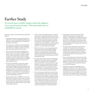
The WalkUP Wake-Up Call:

Atlanta
By Christopher B. Leinberger
Mason Austin
The George Washington University
School of Business

1
The Center for Real Estate
and Urban Analysis

Table of Contents
I.	


3

 .  .  .  .  .  .  .  .  .  .  .  .  .  .  .  .  .  .  .  .  .  .  .  .  .  .  .  .  .  .  .  .  .  .  .  .  .  .  .  .  .  .  .  .  .  .  .  .  .  .  .  . 	

6

EXECUTIVE SUMMARY  .  .  .  .  .  .  .  .  .  .  .  .  .  .  .  .  .  .  .  .  .  .  .  .  .  .  .  .  .  .  .  .  .  .  .  .  .  .  .  .  .  .

II.	INTRODUCTION

III.	 WALKUPS DEFINED  .  .  .  .  .  .  .  .  .  .  .  .  .  .  .  .  .  .  .  .  .  .  .  .  .  .  .  .  .  .  .  .  .  .  .  .  .  .  .  .  .  .  .  .  .  .  .


The Rise of the WalkUP  .  .  .  .  .  .  .  .  .  .  .  .  .  .  .  .  .  .  .  .  .  .  .  .  .  .  .  .  .  .  .  .  .  .  .  .  .  .  .  .  .  .  .  .  .  .  .  .
Form Meets Function  .  .  .  .  .  .  .  .  .  .  .  .  .  .  .  .  .  .  .  .  .  .  .  .  .  .  .  .  .  .  .  .  .  .  .  .  .  .  .  .  .  .  .  .  .  .  .  .  .  .
Methodology  .  .  .  .  .  .  .  .  .  .  .  .  .  .  .  .  .  .  .  .  .  .  .  .  .  .  .  .  .  .  .  .  .  .  .  .  .  .  .  .  .  .  .  .  .  .  .  .  .  .  .  .  .  .  .  .  .  .  .  .
The 7 Types of WalkUPs .  .  .  .  .  .  .  .  .  .  .  .  .  .  .  .  .  .  .  .  .  .  .  .  .  .  .  .  .  .  .  .  .  .  .  .  .  .  .  .  .  .  .  .  .  .  .  .


21
Atlanta’s WalkUPs & Map  .  .  .  .  .  .  .  .  .  .  .  .  .  .  .  .  .  .  .  .  .  .  .  .  .  .  .  .  .  .  .  .  .  .  .  .  .  .  .  .  .  .  .  .  . 	 22
Geographic Findings  .  .  .  .  .  .  .  .  .  .  .  .  .  .  .  .  .  .  .  .  .  .  .  .  .  .  .  .  .  .  .  .  .  .  .  .  .  .  .  .  .  .  .  .  .  .  .  .  .  . 	 24
Product Findings  .  .  .  .  .  .  .  .  .  .  .  .  .  .  .  .  .  .  .  .  .  .  .  .  .  .  .  .  .  .  .  .  .  .  .  .  .  .  .  .  .  .  .  .  .  .  .  .  .  .  .  .  .  .  .  . 	 26

IV.	 WALKUPS IN METRO ATLANTA


9	
10
11
12
14

 .  .  .  .  .  .  .  .  .  .  .  .  .  .  .  .  .  .  .  .  .  .  .  .  .  .  .  . 	

V. 	 WALKUP TRENDS  .  .  .  .  .  .  .  .  .  .  .  .  .  .  .  .  .  .  .  .  .  .  .  .  .  .  .  .  .  .  .  .  .  .  .  .  .  .  .  .  .  .  .  .  .  .  .  .  .  . 	 27


Thanks to:

The Last Three Real Estate Cycles .  .  .  .  .  .  .  .  .  .  .  .  .  .  .  .  .  .  .  .  .  .  .  .  .  .  .  .  .  .  .  .  .  .  .
Atlanta: A Region Continually in Flux .  .  .  .  .  .  .  .  .  .  .  .  .  .  .  .  .  .  .  .  .  .  .  .  .  .  .  .  .  .
Metro Atlanta & Metro DC: Peas in a Pod .  .  .  .  .  .  .  .  .  .  .  .  .  .  .  .  .  .  .  .  .  .  .  .  .
Hypothesis: An Educated Workforce Matters .  .  .  .  .  .  .  .  .  .  .  .  .  .  .  .  .  .  .  .

		
VI. 	 WALKUP RANKINGS  .  .  .  .  .  .  .  .  .  .  .  .  .  .  .  .  .  .  .  .  .  .  .  .  .  .  .  .  .  .  .  .  .  .  .  .  .  .  .  .  .  .  .  .  .
	
Economic Rankings  .  .  .  .  .  .  .  .  .  .  .  .  .  .  .  .  .  .  .  .  .  .  .  .  .  .  .  .  .  .  .  .  .  .  .  .  .  .  .  .  .  .  .  .  .  .  .  .  .  .  .  .
	
Social Equity Rankings  .  .  .  .  .  .  .  .  .  .  .  .  .  .  .  .  .  .  .  .  .  .  .  .  .  .  .  .  .  .  .  .  .  .  .  .  .  .  .  .  .  .  .  .  .  .  .  .
		
VII. 	FUTURE WALKUPS  .  .  .  .  .  .  .  .  .  .  .  .  .  .  .  .  .  .  .  .  .  .  .  .  .  .  .  .  .  .  .  .  .  .  .  .  .  .  .  .  .  .  .  .  .  .  .  .
	
WalkUPS: The Next Wave  .  .  .  .  .  .  .  .  .  .  .  .  .  .  .  .  .  .  .  .  .  .  .  .  .  .  .  .  .  .  .  .  .  .  .  .  .  .  .  .  .  .  .  .

28
	 30
	 31
	 33
	

35
	 36
	 43


49
50

VIII.	NEXT STEPS  .  .  .  .  .  .  .  .  .  .  .  .  .  .  .  .  .  .  .  .  .  .  .  .  .  .  .  .  .  .  .  .  .  .  .  .  .  .  .  .  .  .  .  .  .  .  .  .  .  .  .  .  .  .  .  .  .  .  . 	 53


Conclusions & Recommendations  .  .  .  .  .  .  .  .  .  .  .  .  .  .  .  .  .  .  .  .  .  .  .  .  .  .  .  .  .  .  .  .  .  . 	 54
Further Study  .  .  .  .  .  .  .  .  .  .  .  .  .  .  .  .  .  .  .  .  .  .  .  .  .  .  .  .  .  .  .  .  .  .  .  .  .  .  .  .  .  .  .  .  .  .  .  .  .  .  .  .  .  .  .  .  .  .  .  .  . 	 59

IX.	APPENDICES

 .  .  .  .  .  .  .  .  .  .  .  .  .  .  .  .  .  .  .  .  .  .  .  .  .  .  .  .  .  .  .  .  .  .  .  .  .  .  .  .  .  .  .  .  .  .  .  .  .  .  .  .  .  .  .  .  . 	 60

	
Endnotes  .  .  .  .  .  .  .  .  .  .  .  .  .  .  .  .  .  .  .  .  .  .  .  .  .  .  .  .  .  .  .  .  .  .  .  .  .  .  .  .  .  .  .  .  .  .  .  .  .  .  .  .  .  .  .  .  .  .  .  .  .  .  .  .  .  . 	 61
	Acknowledgments  .  .  .  .  .  .  .  .  .  .  .  .  .  .  .  .  .  .  .  .  .  .  .  .  .  .  .  .  .  .  .  .  .  .  .  .  .  .  .  .  .  .  .  .  .  .  .  .  .  .  .  .  . 	 63
2

The WalkUP Wake-Up Call: Atlanta © The George Washington University School of Business 2013
I. Executive
Summary
During the second half of the 20th century, the
dominant development model has been the familiar drivable sub-urban approach. Most real estate
developers and investors, government regulators,
and financiers have come to understand this model
extremely well, turning it into a successful development formula and economic driver. There are few
metro areas of which this has been more true than
metropolitan Atlanta. However, starting in the mid1990s, the pendulum has begun to move back toward
building the opposite—walkable urbanism.
This research has found the surprising and overwhelming recent emergence of walkable urban
development and places in metropolitan Atlanta.
Walkable urban development represents not only
a growing share of new development in the Atlanta
region, but recently the majority of most real estate

development. Walkable urban real estate projects
now command an impressive rent premium over
their drivable sub-urban competition. The amount
of walkable urban square feet built in each of the last
three real estate cycles in metropolitan Atlanta has
mushroomed, growing from a small fraction in the
1990s to a majority in the current real estate cycle.
The market has spoken—it is now time for public
policy to reflect this new market demand by putting
in the necessary infrastructure and zoning as well as
encouraging place management entities, such as the
Community Improvement Districts (CIDs), which
will be the location of most future economic growth
and development.
Metropolitan Atlanta, “the poster child of sprawl,”
is now experiencing the end of sprawl.
3
Executive Summary

BACKGROUND

KEY FINDINGS

In metropolitan areas, land use is categorized as playing one of two economic functions: either regionally
significant or local-serving. Regionally significant
places have concentrations of employment, civic centers, institutions of higher education, major medical
centers, and regional retail, as well as one-of-a-kind
cultural, entertainment, and sports assets. Local-serving places are bedroom communities dominated by
residential development that is supported by
local-serving commercial (e.g., grocery stores) and
civic uses, such as primary and secondary schools,
police and fire stations, and so on.

• 	 There are 27 Established WalkUPs in metro
Atlanta in 2013. Combined, these WalkUPs
account for only 0.55 percent of the total land in
the metro area.1 In addition, we have identified
nine Emerging WalkUPs totaling 0.33 percent of
the region’s land mass. Together, these Established and Emerging WalkUPs total 0.88 percent
of the region.

Land use in metropolitan areas can also be divided
between the form that it takes: drivable sub-urban
and walkable urban. Drivable sub-urban development is low density and relies on stand-alone real estate products and spatially segregated development
patterns that are connected nearly exclusively by one
form of transportation: highways for cars and trucks.
In contrast, walkable urban places have much higher
density, integrate many different real estate products
in the same place, and employ multiple modes of
transportation—rail and bus-transit, biking, highways—
but once one is there, everything is walkable.
Both drivable sub-urban and walkable urban forms
of development have market support and appeal; it
is not as if one is “better” than the other, it is only a
matter of current and future supply and demand. It
is important to note that each form can be found in
both center cities and suburbs. Drivable sub-urban
development and walkable urban places are found in
both in the city of Atlanta as well as in its suburbs.
This research report focuses on regionally significant
walkable urban places, referred to as WalkUPs. It
suggests that these places will be the loci of both the
growth of real estate and wealth-creating employment in metro Atlanta for decades to come.

4

• 	 The densities of the 27 Established WalkUPs
average 0.60 gross floor-area ratio (FAR).2
The gross FAR for the region, excluding WalkUPs,
is only 0.04. In other words, WalkUPs are over
16 times more dense than the rest of the region.
• 	 Nearly 19 percent of total metropolitan jobs are
located in Established WalkUPs, with another
three percent located in Emerging WalkUPs.
Overall, Established WalkUPs have an employment density of 36.5 jobs per acre; the region as
a whole, not including Established and Emerging
WalkUPs, has an employment density of only 0.8
jobs/acre.
• 	 Seventy-four percent of Established WalkUPs in
the region are within the city of Atlanta. However,
all nine Emerging WalkUPs are in the suburbs and
eight of the ten Potential WalkUPs identified in the
study are outside of the city. The city of Atlanta
contains 83 percent of the total real estate square
footage in the Established WalkUPs.
• 	 Sixteen of the 27 regionally significant WalkUPs,
or 59 percent, have rail transit. The remaining 11
WalkUPs have no rail service and none have rail
transit funding.
• 	 Average rent in all real estate products in Established WalkUPs is 112 percent higher on a rentper-square-foot basis than drivable sub-urban
real estate.
• 	 The market share of the region’s development
within Established WalkUPs over the past three
real estate cycles (1992 to 2000, 2001 to 2008,
and 2009 to the present) has steadily and rapidly
increased; from a market share of 10 percent

The WalkUP Wake-Up Call: Atlanta © The George Washington University School of Business 2013

share in the 1990s cycle3, it doubled to 22 percent
in the 2000s and then more than doubled again
to 50 percent in the current cycle.
• 	 In the current real estate cycle, more than 60
percent of income-producing property in the
region was developed in Established or Emerging
WalkUPs, which account for less than one percent
of the region’s land mass.
• 	 Within both Established and Emerging WalkUPs,
the vast majority of recent development has
gone to those areas that are served by MARTA
rail. In the current 2009-2013 real estate cycle, 73
percent of development in Established WalkUPs
went to the MARTA-served places. Even more
dramatic, 85 percent of development in Emerging
WalkUPs went to places with rail transit.
• 	 Multifamily rental housing was the most significant driver of real estate growth in regionally
significant WalkUPs, which is consistent with national trends. In the 1990s, less than nine percent
of income-producing real estate captured by
Established WalkUPs was multifamily rental housing. In the early 2000s, this rose to 28 percent and
has skyrocketed to 88 percent in the current real
estate cycle.
• 	 Following rental housing, office space was the
second most important factor in the trend toward
walkable urbanism. Only 19 percent of the office
space delivered in the 1990s cycle was built in
then-Established WalkUPs. This increased to 31
percent in the 2000s, and again to 50 percent in
the current cycle that began in 2009.
• 	 Despite higher rents, development of new retail
space in WalkUPs lags. Only six percent of new
retail space developed in the region in the 1990s
was located in WalkUPs. During the early 2000s, it
rose slightly to seven percent but has since fallen
to only two percent for the cycle starting in 2009.
Executive Summary

ECONOMIC CONCLUSIONS
• 	 There are two factors that explain 70 percent of
the variation in economic performance among
the 24 metro Atlanta WalkUPs that were economically ranked (the three WalkUPs classified
as Urban University were not ranked due to lack
of data). The first factor is educational attainment
(share of the population over 25 years of age with
a college degree), and the second is the share of
jobs concentrated in knowledge industries.
• 	 Since the two most significant indicators of economic performance were related to the presence
of knowledge-based workers, the building of
walkable urban places is the most effective economic development strategy that a CID, the city,
and the region can pursue.
• 	 The public policy response to these market
trends should be to encourage the growth of
WalkUPs and the resulting benefits to jurisdictions’ tax base. Monitoring the economic and
fiscal performance of a jurisdiction’s WalkUPs will
assist in gaining the political support for the needed investment in infrastructure and the required
zoning changes.
• 	 Lower economically performing WalkUPs may
require special attention from the jurisdiction
to increase economic and fiscal performance.
When dealing with specific projects, long-term
public sector investments (e.g. equity invested in
real estate), as opposed to upfront subsidies (e.g.
grants and low-interest, soft-second loans), are
more effective to obtain project financing as well
as fiscal benefits.
• 	 In contrast, higher economic performing WalkUPs
are likely to need less in the way of special public
financing programs to encourage new development. Their relatively high rents are, in most cases,
sufficient inducement for new walkable urban
development. In fact, there is the possibility of employing “value capture” strategies—the voluntary
sharing of private sector economic returns resulting from public improvements, such as a street car
line—that could partially fund public investments.

• 	 Metropolitan Atlanta has been under-investing in
the rail transit transportation infrastructure that
greatly assists the walkable urban development
the market and the economy is now demanding.
Today, investing in rail transit in the early 21st
century is as important as the building of freeways
in the 1960s and 1970s was for the economic
growth of the Atlanta region 50 years ago. The
City of Atlanta has made important steps in this
direction with the construction of the Atlanta
Streetcar and the development of the Atlanta BeltLine, but the region is continuing to fall
behind, as the failure of the 2012 transportation
funding ballot measure demonstrated.

SOCIAL EQUITY CONCLUSIONS
• 	 Stronger economic performance by metro Atlanta WalkUPs was associated with lower measures
of social equity. However, there are exceptions
to this phenomenon and there are lessons from
those Atlanta WalkUPs that do well on both measures, such as Midtown, Peachtree Center, and
Downtown Decatur.

• 	 A critical component of the solution to affordable
housing is simple: build more walkable urban
product. Greater land values and cost is the most
significant driver of higher costs for walkable
urban places—having more walkable urban land
will reduce those costs.
• 	 NIMBY (Not In My Back Yard) opposition to
high-density development is equally responsible
for the land shortage. One of the proven ways of
overcoming NIMBY opposition is to have multiple
examples in the region of great walkable urban
places that increase consumer desire for this type
of development near where they live.
• 	 The very economic success of WalkUPs may play
a key role in paying for walkable urban infrastructure, such as rail transit, and increased social
equity performance. Harnessing a portion of the
profits and tax-base increases from gentrification
to help pay for infrastructure and affordable and/
or workforce housing is becoming a possibility for
metro Atlanta WalkUPs.

• 	 In a recently released national economic mobility
study by Harvard/Berkeley researchers, metro
Atlanta performed second worst in income mobility among major metro areas, and exhibited
extremely low rates of income growth for poorer
young people over their lifetimes.4 Reflecting on
the Harvard/Berkeley study, The New York Times
economic columnist Paul Krugman wrote that metro Atlanta “may just be too spread out, so that job
opportunities are literally out of reach for people
stranded in the wrong neighborhoods. Sprawl may
be killing Horatio Alger.” 5
• 	 What is needed is a conscious strategy for each
WalkUP to create and maintain affordable and
workforce housing, as well as to increase physical
accessibility.

5
II Introduction
I..Introduction
The Walkable Urban
Structural Shift
There is a game-changing structural shift
underway in real estate.
New research reveals how walkable urban
places and projects will drive tomorrow’s real
estate industry and the economy.
Different public policy and real estate strategies are needed to take advantage of these
market trends.
What was perceived as a niche market has
become the market.
6

The WalkUP Wake-Up Call: Atlanta © The George Washington University School of Business 2013
Introduction

The research in this report takes
an in-depth look at metro Atlanta,
which has frequently been referred to as “the poster
child of sprawl.” 6 It examines how metropolitan
Atlanta is transitioning from one of the forerunners
of post-World War II, auto-oriented development to
a future that combines the metro area’s conventional
development with 21st-century walkable urbanism.
We examined Atlanta’s regionally significant walkable urban places to identify where development has
recently occurred, and will occur, to understand how
this differs from the suburban development of the
late 20th century. We will illustrate the economic and
social impact that this structural shift toward walkable
urban development will have in metropolitan Atlanta.
Surprisingly, this research has found that sprawl in
metro Atlanta is approaching an end. Assuming these
trends continue and Atlanta is a harbinger for the
country, the end of sprawl is the end of an era that is
nearly as significant as the “closing of the frontier,” as
proclaimed by the historian Fredrick Jackson Turner
following the release of the 1890 Census.
This research challenges policy makers, real estate
developers, investors, the new field of place management, academics, and citizens to rethink the way we
manage the 35 percent of our nation’s wealth that is
invested in real estate and infrastructure—the built
environment.7 This is an important recalibration that
affects how most of us live, work, and are entertained.
To ignore this structural change would be akin to
ignoring the impact roads and cars had on the built
environment nearly a century ago.
This “new” development model is walkable urban
development, which is not actually new but is the rediscovery of how cities and metropolitan areas were
planned and built for the vast majority of the 6,000
years since cities first emerged. Despite Atlanta’s
reputation as a sprawling, auto-oriented region, the
metropolitan area has already begun adjusting to the
walkable urban trend on the ground in a surprisingly
rapid manner.

For decades, real estate practitioners, observers, and
scholars have looked through an urban-versus-suburban lens. This can be traced to the U.S. Census, which
serves as the platform for much of the research on the
built environment. The Census separates its data into
“principal city” and “outlying counties.” It is not unlike
the classic social science joke about the tipsy guest
who drops his keys at the front door as he leaves a
party. Discovered searching under a streetlight at the
curb, he is asked, “Why aren’t you looking where you
lost the keys?” He replies, “This is where the light is.”

Both drivable sub-urban and walkable urban forms
of development have market support and appeal,
and each are found in both center cities and suburbs.
In the case of metropolitan Atlanta, examples of
drivable sub-urban development include both the
City of Atlanta’s Tuxedo Park neighborhood and
Cherokee County’s exurban subdivisions. Likewise,
Downtown Decatur and Downtown Roswell, both
outside the Atlanta city limits, are examples of walkable urban development just as Atlanta’s Midtown or
Peachtree Center.

Surprisingly, this research has found that sprawl in metro Atlanta is approaching
an end. Assuming Atlanta is a harbinger for the country, the end of sprawl is the
end of an era that is nearly as significant as the “closing of the frontier.”

Thus, in recent decades researchers have analyzed
the urban/suburban debate where “the light was,”
based on crude geographic distinctions between
center city and suburbs without any differentiation
between different forms of the built environment.
In the 21st century, we have come to realize that
regardless of the Census-defined location within
the metropolitan area, there are two broad forms of
metropolitan development: 8
•	 Drivable Sub-Urban: This development has the
lowest development density in the history of
building metropolitan areas. It relies on standalone real estate products and segregated
development patterns that are connected nearly
exclusively by one form of transportation: highways for cars and trucks. This geographic segregation exacerbates the current de facto racial and
socioeconomic segregation.
•	 Walkable Urban: This form of development has
much higher density, employs multiple modes of
transportation that get people and goods to walkable environments, and integrates many different
real estate products in the same place.

Drivable sub-urban has been the dominant approach
to real estate development during the late 20th century. There was pent-up market demand for this form
of development following the Second World War,
and the real estate industry and required infrastructure were put in place to meet that market demand.
Today, that is reversing; the pendulum is swinging
back to walkable urban development.
The reasons for this shift back include significant
demographic changes (decreased percentages of
households with children and increased one and
two-person households), absolute increase suburban
traffic congestion, proportional increase in household transportation costs, and an increased appreciation for the convenience, diversity, creativity, and
health benefits associated with walkable urban lifestyles. As a result, drivable sub-urban development
has become overbuilt, and this overbuilding was
one of the primary market causes of the mortgage
meltdown that triggered the Great Recession.
There is strong pent-up demand for walkable urban
development in Atlanta, as evidenced generally
by the ability of walkable urban places to hold

7
Introduction

value better than outer suburban locations during
the Great Recession as well as the price premiums
shown in this research. Although some of the area’s
shopping malls and office parks continue to command high rents, the degree of rental and sales price
premiums per square foot and capitalization rates for
walkable urban development suggest it could take
a generation of new construction for this demand to
be satisfied.

Given that Atlanta’s primary reason for economic
success over the past 175 years has been as the
transportation hub of the Southeast U.S., this lack of
investment is disappointing. It is as if the reason for
the region’s very existence, transportation, has been
forgotten. The overwhelming defeat of the July 2012
transportation ballot measure is just the latest example of a blind eye being turned to the very reason for
Atlanta’s economic success.

Walkable urban development calls for radically different approaches to urban
design and planning, regulation, financing, and construction.
It also requires the introduction a new industry: place management.
This shift is extremely good news for the beleaguered real estate industry and the economy as a
whole, which appears to be stuck at a sub-par 2.0
percent GDP growth rate. It will put a foundation
under the metropolitan economy and increase tax
revenues, much like drivable sub-urban development
benefited the economy and selected jurisdictions in
the second half of the 20th century.
Walkable urban development calls for dramatically
different approaches to urban design and planning,
regulation, financing, and construction. It also requires the introduction of a new industry: place management. This new field develops the strategy and
provides the day-to-day management for walkable
urban places (referred to in short-hand as WalkUPs),
creating a distinctive “could only be here” place in
which investors and residents are willing to invest for
the long term.
Most importantly, this trend reinforces the need for
metropolitan Atlanta to substantially invest in rail
transportation, biking, and walking infrastructure.
The funds required to just maintain an over-extended
and congested highway system will be a challenge in
and of itself. However, the MARTA system has been
starved of funding, as well as the other “alternative”
transportation systems9 like biking and walking.
8

However, there are also signs of the region embracing the walkable urban future the market is demanding. The most hopeful of these signs is the BeltLine,
the 22-mile circumnavigation rail, bike, and walking
loop around greater center city. Similar to the Perimeter highway and other beltways around major metro
areas worldwide, the BeltLine is a lateral connection
between the radial MARTA rail lines extending out of
downtown Atlanta. As the first of its kind in the country, the BeltLine is the most important next phase of
transit development in the country. Many metro areas
will use the BeltLine as a model of future transportation infrastructure; only Atlanta will have been “first,”
a role it has played for much our country’s transportation history. This is appropriate for a city whose early
name was Terminus, reflecting the role transportation
has always played.
This new research defines—for the first time—where
the Established WalkUPs are in the metropolitan
Atlanta region. It shows specific locations, the
physical size of the places, their product mix, transportation options, and so forth. This research also
identifies the Emerging and Potential WalkUPs in
the region, since it appears there is more pent-up
demand than the Established WalkUPs can satisfy.

The WalkUP Wake-Up Call: Atlanta © The George Washington University School of Business 2013

This study then ranks the performance of the
WalkUPs based on two criteria: economics and social
equity. The economic performance metrics enable
WalkUPs to be compared against each other and
help different kinds of investors determine where
they should invest their capital. Meanwhile, the social
equity performance metrics demonstrate whether
a broad cross-section of metropolitan residents can
afford to live in, and have access to, each WalkUP.
This is our second effort at quantifying the economics and social equity of WalkUPs in a metropolitan
region. It builds on our last report, D.C.: The WalkUP
Wake-UP Call, which was released in September
of 2012.10 Both research reports are based on
research methodology, titled Walk This Way, which
Dr. Mariela Alfonzo and I developed at the Brookings
Institution.11 The methodology has been modified
and improved to encourage easier replication in
other metros areas. Over time, we expect the results
and methods will continue to evolve. This is not
only anticipated, but it is encouraged as the field of
urbanism and the real estate industry make strides
in better understanding how to build and manage
great places.
Sincerely,

Christopher B. Leinberger
Charles Bendit Distinguished Scholar and
Research Professor of Urban Real Estate
George Washington University School of Business

Chair
GW Center for Real Estate and Urban Analysis

Mason Austin
Senior Research Associate/Research Manager
GW Center for Real Estate and Urban Analysis
III. WalkUPs
Defined

9
WalkUPs Defined

The Rise of the WalkUP
Starting in the mid-1990s, walkable urbanism has become the dominant
development pattern in Atlanta—and many other metropolitan areas in the
country. Going forward, walkable urbanism is the driving force in real estate.

Evidence of growing market demand for WalkUPs
was first observed nearly two decades ago in U.S.
metropolitan areas, as selective downtowns began to
revitalize, inner-ring suburbs started to become more
urbanized, and New Urbanism gave birth to high
profile developments such as Seaside in Florida.

Starting in the mid-1990s, however, the pendulum
began to swing back toward building walkable urbanism, which had been the dominant development
pattern prior to the 1930s Great Depression in the
Atlanta metro area, as well as in virtually every other
metropolitan area in the country.

Today, WalkUPs promise to be a powerful driver of
the economy, if the appropriate infrastructure, legal
regime, and financing mechanisms are put in place.
In the late 19th and early 20th centuries, Atlanta
had such mechanisms in place when it constructed
an extensive network of streetcar suburbs. Though
the streetcars are long gone, the legacy of walkable
urbanism in places like Midtown and Inman Park has
led in their revitalization. Today the question is, what
can Atlanta’s leaders do to support both the established and the next generation of WalkUPs?

Our work in metropolitan Washington, D.C., found
that during the real estate cycle in the first decade
of this century and the current cycle, real estate
developers, investors, government regulators, and
financiers have become quite experienced developing and managing walkable urban projects.
While this degree of understanding is not yet the
case in the Atlanta region, its walkable urban places
are surprisingly attracting a growing share of new
development and command an impressive rent premium over drivable sub-urban areas. The market has
spoken—it’s only a matter of time before most of the
region’s policymakers and real estate professionals
catch up with this new reality.

During the second half of the 20th century, the
dominant development model has been the familiar
drivable sub-urban approach. Most real estate
developers and investors, government regulators,
and financiers have come to understand this model
extremely well, turning it into a successful development formula and economic driver in the late 20th
century, particularly in metropolitan Atlanta. It not
only provided a super-charging for the economy,
but “fueled” the dominant industry of the industrial
era—trucks and automobiles—plus the road-building, finance, insurance and oil industries, that were
essential supports. Metro Atlanta directly benefited,
as two major car assembly plants supported the
drivable sub-urban development. The era’s resulting
real estate boom lead the region to become known
as “Hotlanta.”

10

The amount of walkable urban square feet built in
each of the last three real estate cycles in metropolitan Atlanta mushroomed, growing from a small fraction of the total regional net growth in office, retail,
rental housing, and for-sale housing, to a majority
in the current real estate cycle. This growth matches
the experience of metropolitan Washington, a region
ranked as having the most WalkUPs in the country by
a 2007 Brookings Institution study.12
It is now time for public policy to match this market
demand by encouraging the real estate industry to
build these places and to multiply and strengthen
the place management entities, such as the Commu-

The WalkUP Wake-Up Call: Atlanta © The George Washington University School of Business 2013

nity Improvement Districts (CIDs), that will guide their
future development.

34%

48%
WalkUPs Defined

Form Meets Function
Regionally significant WalkUPs will be the primary location
of economic growth in metropolitan Atlanta.

In metropolitan areas, land use is categorized as
playing one of two economic functions, either
regionally significant or local-serving. Regionally significant places have concentrations of employment
(particularly in base/export or regional-serving businesses and jobs), civic centers, institutions of higher
education, major medical centers and regional retail,
as well as one-of-a-kind cultural, entertainment and
sports assets. Local-serving places are bedroom
communities dominated by residential development
that is complemented by local-serving commercial
(e.g., grocery stores) and civic uses, such as primary
and secondary schools, police and fire stations, and

so on. Generally speaking, regionally significant places are where the metropolitan area earns its living
while local-serving places are where most residents
spend their non-work lives.
The research in this report focuses on regionally
significant WalkUPs, represented by the upper-left
quadrant of the matrix. This is where the Atlanta
region will attract much of its wealth-creating employment in future decades. This framework does not
imply that the driveable sub-urban areas that have
dominated the late 20th-century have become obsolete. Instead, it rests on the observation that the sup-

U. S. Me t ro po li ta n L a n d Us e O pti o n s
REGIONALLY
SIGNIFICANT

LOCAL SERVING

WALKUP

NEIGHBORHOOD

1% of Metro Area Acreage

3-7% of Metro Area Acreage

EDGE CITY

BEDROOM
COMMUNITY

(Walkable Urban Place)
WALKABLE URBAN

5-7% of Metro Area Acreage
DRIVABLE SUB-URBAN

80-85% of Metro Area Acreage

ply has already met (and, some places, outstripped)
the demand for development of this type. While
many of these auto-oriented places will continue to
do well economically, some fringe drivable sub-urban areas already exhibit early signs of economic
decline and face an uncertain future. The pent-up
demand is for walkable urban places.
Future research will focus on local-serving neighborhoods, represented by the top right cell of the matrix.
For the Atlanta region, this includes neighborhoods
such as Virginia Highland, Little Five Points, East Atlanta Village, and Cabbagetown, as well as places outside of Atlanta like Stone Mountain and Woodstock.
There is a major gap in this and all other research
about metropolitan development patterns: the location and size of “owner-user” space is not included.13
Owner-user space is defined as office, retail, industrial,
civic, higher education, medical facilities, etc., that is
owned by the user of that space. For example, the
federal and state governments mainly occupy the office and other space that they own. Universities, such
as Emory, and medical centers, such as Northside
Hospital, are also owner-occupied. Because no regional or national database of owner-occupied space
exists, this results in as much as 30 to 40 percent of
all employment space not being known in terms of
size and location.
The only way to understand the location and size
of these major facilities would through conducting primary research. But like nearly every ranking
system, this methodology relies upon databases that
are national in scope, which allows for comparisons
between different metropolitan areas.
The 2012 Brookings Institution report, Walk This Way,
developed a methodology to define WalkUPs geographically and by product mix, and to rank them using separate economic and social equity performance
metrics. The Brookings research statistically defined
regional significance as having a minimum of 1.4
million square feet of office space and/or a minimum
of 340,000 square feet of retail space.14 These metrics
were used to rank the WalkUPs that emerged from
the metropolitan Atlanta research and create four
levels of economic and social equity performance.

11
WalkUPs Defined

Methodology
The methodology employed in this report has its basis in research described in the Brookings Institution
report, Walk This Way, and was first applied systematically in the GW School of Business report,
DC: The WalkUP Wake-Up Call. That method is outlined below.

Identifying
REGIONALLY SIGNIFICANT PLACES

Identifying
WALKABLE URBAN PLACES

•	 The Atlanta research team began this process
with a list of 114 potential places for inclusion as
regionally significant WalkUPs. This list was drawn
from a variety of sources, but was based most
directly on Livable Centers Initiative applications
and grants. This list was augmented as a result
of comments and suggestions from members of
the research team and from participants in a
forum where the preliminary findings of this
report were presented in April 2013.

•	 Walkability was determined using Walk Score.
This metric was developed to estimate how
easy it is, in a given place, to live a lifestyle with
minimal automobile use, not including work-related commutes. Using the public street grid to
determine walking distance, Walk Score takes
into account the accessibility of key community
services and amenities (including grocery stores,
schools, parks, restaurants, and retail) to a pedestrian. Urban design factors, such as block length
and intersection density, also influence the Walk
Score of a given place.

•	 The boundaries of these places were refined
to include only the areas that currently are, or
have the potential to become, walkable urban in
their development form. To the extent possible,
single-family detached homes were excluded
from these places. Many of these places were
subdivided to adhere to the guideline that,
based upon the metro Washington research,
walkable urban places tend to not exceed 600
acres in total land area, a little less than a square
mile. The reason for this is this is the extent that
people want to walk before considering an alternative means of transportation.
•	 Once boundaries were set, we conducted an initial real estate analysis to determine which places
met the criteria for being considered “regionally
significant.” All places that had neither 340,000
square feet of retail space nor 1.4 million square
feet of office space were eliminated. What
remained was a list of 53 regionally significant
places; additional places were later added and
place boundaries adjusted as a result of input
and suggestions made at the April forum.
12


•	


Walk Score measures walkability from the 	
perspective of lifestyle and the concept of 	
“complete communities.” It assesses whether 	
the daily needs of residents and workers can 	
be met within a reasonable walking distance 	
or, alternatively, if land uses are spatially seg-	
regated, necessitating a car to get around.


•	


Notably, Walk Score does not measure the 	
quality of the pedestrian environment. Factors 	
such as pedestrian infrastructure, community 	
design, safety, topography, weather—each of 	
these has a significant influence on the experi-	
ence of pedestrians and on whether workers 	
and residents will choose to walk, rather
than drive.


•	


A high-quality, successful WalkUP requires 	
both high levels of pedestrian accessibility 	
(what Walk Score measures) and a pleasing 	
pedestrian environment (what it does not 	
measure). However, they play different roles 	

The WalkUP Wake-Up Call: Atlanta © The George Washington University School of Business 2013


in that success. A positive pedestrian experi-	
ence may encourage those who might otherwise choose not to walk to venture out on 	
foot. Furthermore, those who prefer the
option of walking are likely to be drawn to 	
places where it is more pleasant to travel 	
on foot. However, a place that lacks pedestri-	
an-accessible services and amenities can 	
never be walkable, no matter how much is 	
invested in pedestrian infrastructure; there is 	
no number of street trees that will encourage 	
residents to walk if they have nowhere to go. 	
It is for this reason that we have chosen to 	
focus on accessibility as a “first principle” of 	
walkability, and the metric used to designate 	
walkable urban places.

•	


An assessment of pedestrian environment,
including urban design and pedestrian infrastructure for selected metro Atlanta CIDs, was
also conducted during this research, though 	
not included in this report.

•	 The geographies of each of the regionally significant places determined in the previous step were
submitted to Walkscore.com for scoring. Scores
were generated in the form of a grid of “sample”
scores throughout the WalkUP. This grid was
translated into a grid of polygons; census data
was used to determine the total population and
employment of each polygon. Finally, within each
area, the “sample” Walk Scores were weighted by
total population and employment and then averaged to derive an overall Walk Score for the place.
•	 Using the benchmark developed in Walk This
Way, we identified the 27 Established WalkUPs as
those that have overall Walk Scores above 70.5.
WalkUPs Defined

•	 In studying the Walk Scores of the other metro
Atlanta places, we found a natural break at 57.0.
The nine places with Walk Scores from 57.0 to
70.5 were categorized as Emerging WalkUPs.


•	 The 10 Potential WalkUPs were identified based
on factors discussed in more detail later in this
report, including MARTA rail accessibility, major
redevelopment opportunities, the presence of
walkability-supportive place management entities, and/or on-going investments in pedestrian
infrastructure.

•	 Social Equity is based on a composite index of
affordability and accessibility, described in greater detail later in this report.

•	 Note: Maps of the precise geographic boundaries
of all 46 Established, Emerging, and Potential
WalkUPs can be found at the following address:
http://business.gwu.edu/walkup/atlanta2013.

These rents were then weighted by the relative
presence of each of the product types within the
WalkUP and averaged to determine an overall
rent for the area.

Walkability/Walk Score does not factor directly into
either of these rankings—it is used only as a means
of sorting places into walkable urban and drivable
sub-urban.

RANKING ESTABLISHED WALKUPS
The 27 Established WalkUPs were ranked on two
independent performance metrics: Economics and
Social Equity.
•	 Economic Performance is based on effective
rents on real estate, assuming that the amount
the market is willing to pay for space is a proxy
for economic performance. (The ideal would be
developing a WalkUP GDP, but currently GDP estimations are only available at the national, state,
and metropolitan levels.)
	

Rent or rent-equivalents were found for four
product types within each WalkUP:


•	
•	
•	
•	

Office
Retail
Rental Residential
For-Sale Residential
13
WalkUPs Defined

The Seven Types of
WalkUPs
There are seven types of regionally significant
WalkUPs in any metropolitan area. Metro Atlanta
has at least one example of each.
A

1

Downtown

Examples: GSU-Government Center, Peachtree Center
As the original downtown sections of a metro area’s
principal city, Downtown WalkUPs are dominated by
office space. In Atlanta, however, this is much less
true—only 56 percent of total square footage in its
Downtown WalkUPs is occupied by offices. Two factors account for the comparatively small percentage
of office space: (1) Georgia State University’s campus,
which serves 32,000 students, is located downtown
and includes dorms, libraries, classroom space, athletic facilities, and a major hospital complex, and
(2) the prevalence of large commercial parking garages, which serve the majority of Downtown workers
(only three percent in the region commute via public
transit). While the garages themselves do not prevent
Downtown areas from being the region’s most walkable, they do occupy real estate that could be used
otherwise and also reinforce Atlanta’s reputation as a
city where car use—and ownership—is necessary.

C

A. Underground Atlanta
adjacent to Five Points
MARTA station
B. Fenestration and flowers
C. Tourists, students, workers
and residents mingle at Five
Points
D. Segway tours of
downtown

F. Peachtree divides Decatur
and Marietta Streets at Five
Points
G. An icon of an Atlanta
institution

G

H. Chess in Woodruff Park
I. The Georgia State Capitol

E

Average % of Total Square Footage

OFFICE:

56%
FOR-SALE
RESIDENTIAL:

3%

RENTAL RESIDENTIAL: 6%
RETAIL: 3%

The WalkUP Wake-Up Call: Atlanta © The George Washington University School of Business 2013

B

E. Woodruff Park near Five
Points

H

1. Downtown
Product M i x: Downtown

14

PHOTOS:
Raftermen Photography

I

F

D
C

B

D

E

A

2

Downtown Adjacent

Examples: Castleberry Hill, Centennial Olympic Park ,
Midtown, SoNo, Sweet Auburn
G

F

Immediately adjacent to, and surrounding downtown
on all sides, Downtown Adjacent WalkUPs are usually
older mixed-use neighborhoods that have a lower
density than downtown, reasonably well-connected
street grids, and their own unique character.
These WalkUPs also have a substantial amount of
office space—33 percent in the Atlanta metro area.
This is significantly less than the 58 percent found in
D.C. metro Downtown Adjacent places, and is partly
the result of the more than six million square feet of
hotel, sports/entertainment, and convention space in
Centennial Olympic Park. In addition, Downtown
Adjacent WalkUPs have significant residential
(37 percent) and some retail development (three
percent). The result, in most cases, is a lively, nearly
24-hour environment.
Downtown Adjacent
Product2.Mix: Downtown-Adjacent
Average % of Total Square Footage

PHOTOS:
Raftermen Photography

A. Multi-modal transport in
Castleberry Hill
B. Pedestrians and transit
connect at one of Midtown
Atlanta’s three MARTA
stations
C. Taking advantage of Trees
Atlanta shade tree program
adjacent to Centennial
Olympic Park
D. Appreciating an urban
troubadour in Castleberry
Hill
E. Spray painting squid art in
Castleberry Hill

H

F. Outdoor dining on the
streets of Midtown

I

G. Celebrating Civil Rights in
Sweet Auburn
H. Legacy of the 1996
Centennial Olympics—Centennial Olympic Park and
continued development

OFFICE:

33%

FOR-SALE
RESIDENTIAL:

15%

RENTAL RESIDENTIAL: 22%

I. Midtown street scene
J. Young boys on a walk in
Sweet Auburn

RETAIL: 3%

J

15
WalkUPs Defined

B

A

C

3

Urban Commercial

J

D

PHOTOS:
Raftermen Photography

A. & G. BeltLine–driven infill
townhome development in
Inman Park

Examples: Arts Center, Buckhead Village, Inman Park ,
Ponce, Upper Westside, West End

B. Family stroll on Atlanta’s
burgeoning Westside

Historically based around local-serving neighborhood retail and services, these places declined after
World War II, but have found a new economic role in
recent years.

C. Award-winning Fourth
Ward Park and the development that is following
D. The Westside’s proximity
to the Downtown job market

E

E. Adaptive reuse of Sears
warehouse becoming
mixed-use Ponce City Market

Urban Commercial WalkUPs in metro Atlanta have
a large amount of residential property (50 percent)
and are marked by more retail (12 percent) and
less office space (25 percent) than Downtown or
Downtown Adjacent WalkUPs. The retail in Urban
Commercial WalkUPs includes businesses that draw
customers from the wider region (such as boutique
shops, restaurants, bars and nightclubs, and furniture
and home decor stores), but also retains some space
devoted to local-serving uses, such as grocery stores.

F

F. Tony Hawk-designed skate
park adjacent to BeltLine’s
Eastside Trail
H. Enjoying a book and a
coffee at Ponce City Market’s
Dancing Goats Coffee Bar
I. Highland Ave. street scene
J. Typical sunny day on the
BeltLine’s Eastside Trail

3. Urban Commercial
Product Mix : Urban Commercial

G

Average % of Total Square Footage
OFFICE:

25%
FOR-SALE
RESIDENTIAL:

21%

RETAIL:

12%
RENTAL
RESIDENTIAL:

29%

16

I

The WalkUP Wake-Up Call: Atlanta © The George Washington University School of Business 2013

H
A

B

4

F

Urban University

D

C

Examples: Atlanta University Center, Emory, Georgia Tech

D

Previously not recognized as a distinct WalkUP type,
Urban University WalkUPs present a unique set of
conditions and opportunities for walkability.
In these areas, the majority of land is controlled by a
small number of owners, such as universities, medical
facilities, or government research centers. These land
owners gauge the “success” of their development
not only in terms of rent they may be able to collect,
but also in their ability to attract talent. Thus, the vast
majority of economic activity is aimed at benefiting
the students and employees of these institutions.

E
G

PHOTOS:
Raftermen Photography

The predominance of owner-user space makes real
estate analysis difficult for these areas. However, the
institutions’ centralized control of land and progressive natures mean that these places are, or can be,
models of walkable urban development. Increasingly, many also lead in developing measures such as
“bikability” that increase accessibility to their facilities
and reduce auto dependence.

A. Preferred wheeled transportation at Emory University
B. The environment created
at Emory when cars were relegated to the campus edge
C., F. & H. Students at Atlanta
University Center
D. View of Emory’s campus

Since the bulk of the space is owner-user and the
data not available for standardized collection, the
product mix presented below is not reliable. Thus,
most of the Urban University WalkUPs cannot be
ranked at this time, but we acknowledge their existence and importance to the regional economy.

E. & G. Students on campus
at Georgia Tech
I. Entrance to Emory Village
J. Biking the class commute
at Georgia Tech

4. Urban University
Product Mi x: Urban University

H

Average % of Total Square Footage
OFFICE:

26%

I

RETAIL:

3%

FOR-SALE
RESIDENTIAL:

12%

RENTAL
RESIDENTIAL:

30%

J

17
WalkUPs Defined

C

D

E

A

B

5

PHOTOS:
Raftermen Photography

Suburban Town Center

Examples: Downtown Decatur, Downtown Marietta,
Downtown Roswell

A. Street musician in
Downtown Marietta

Typical Suburban Town Centers are 19th-century
towns that were swept up in the sprawl of the metropolitan area after World War II. Laid out before the
automobile, they have a walkable urban grid and,
in many cases, historic buildings that preserve the
memory of the place from a more vibrant era. Following decades of decline, many have found a new
regionally significant economic role.

C. Picturesque Downtown
Roswell

Suburban Town Centers tend to have a significant
office component (30 percent in the Atlanta metro
area). In contrast to many downtowns, however, Suburban Town Centers are also major centers for retail
(17 percent) and residential space (30 percent).

G. Appealing public space
that is both inviting and
functional at Decatur’s
MARTA Rail Station

B. Outdoor dining in Decatur

D. Marietta Square farmers
market
E. The intersection of Ponce
de Leon and Commerce in
Decatur
F. Strolling in Glover Park at
Marietta Square

H. & I. Dog walking and
hanging out in Downtown
Marietta
J. Scooters in Decatur

5. Suburban Town Center
Product Mix: Suburban Town Center

F
H

Average % of Total Square Footage

OFFICE:

30%

J

FOR-SALE
RESIDENTIAL:

16%

RETAIL:
RENTAL RESIDENTIAL:

14%

18

17%

I

The WalkUP Wake-Up Call: Atlanta © The George Washington University School of Business 2013

G
A

B

C

D

6

Drivable Sub-Urban
Commercial
Redevelopment

Examples: Buckhead, Buckhead Triangle, CumberlandCore, Lindbergh, Perimeter at The Center, Sandy Springs,
South Buckhead

E
PHOTOS:
Raftermen Photography

These WalkUPs are mid-to-late 20th-century drivable
sub-urban commercial areas that are evolving into
higher density walkable urban places.
Drivable Sub-Urban Commercial Redevelopment
WalkUPs are similar in real estate mix and form to
Suburban Town Centers, albeit with somewhat more
office space. And whereas Suburban Town Centers
are often oriented around a central node, Drivable
Sub-Urban Commercial Redevelopment WalkUPs
are more linear; developed around a major auto
corridor, they also integrate walkable infrastructure
into the rights of way.

A. Runners on the
Cumberland Connector trail
B. Enjoying Buckhead’s new
Peachtree Road street life
from a great vantage point
C. & D. The MARTA headquarters and station at
Lindbergh Center
E. Peachtree Road’s transformation to a “complete
street” in Buckhead

K

F. Trader Joe’s in Sandy
Springs

F

G. Walking on Atlanta’s
“Main Street” in Buckhead

Many of these WalkUPs include regional malls,
which have proven to be key redevelopment opportunities in recent years—nationally, 31 enclosed
shopping malls in the U.S. have been redeveloped
into more walkable places, with another 43 in various
stages of planning.15 This type of WalkUP will be the
major focus of walkable urban development over
the next generation.

H. Conversation at the fountain at Cumberland Mall
I. & J. Bike lanes make way
for urban biking in Buckhead
K. New townhouse construction in Sandy Springs
G

Pro duct M i x:
6 Drivable Sub-Urban Commercial Redevelopment
Drivable Sub-Urban Commercial Redevelopment

H

Average % of Total Square Footage

FOR-SALE
RESIDENTIAL:

OFFICE:

9%

40%

RENTAL
RESIDENTIAL:

18%

RETAIL: 18%

J

I

19
B

A

7

Greenfield & Brownfield

G

Example: Atlantic Station
Greenfield and Brownfield WalkUPs are found where
major investment has turned formerly undeveloped
or contaminated land into a walkable urban place.

PHOTOS:
Raftermen Photography

Among Atlanta’s Established WalkUPs, Atlantic
Station, planned and developed as a single project
on the former grounds of the Atlantic Steel mill, is the
only example of this place type. However, several of
the region’s Potential WalkUPs will join this category
if current plans are fully implemented.

A. Free outdoor yoga classes
during Wellness Wednesdays in Atlantic Station
C
D

Usually planned and built by a master developer,
these WalkUPs have the potential for a balanced
product mix. Atlantic Station, for instance, is 21 percent office, 19 percent retail, and 50 percent residential. The large upfront capital costs required for these
WalkUPs and subsequent high market risk mean few
will probably be attempted in the next generation.

Average % of Total Square Footage

G. The 16-screen Regal
Cinemas multiplex inside
Atlantic Station

OFFICE:

21%

10%

RETAIL:

19%

39%

F

20 The WalkUP Wake-Up Call: Atlanta © The George Washington University School of Business 2013

E. View of spectators at the
BB&T Atlantic Open
F. Strolling and shopping
along 18th St NW

Product 7. Greenfield/Brownfield
Mix: Greenfield & Brownfield

RENTAL
RESIDENTIAL:

C. A sunset tennis match
during the 2013 BB&T
Atlantic Open
D. Tennis fans take a break
and head to Atlantic Station’s
shops many shops and
restaurants

E

FOR-SALE
RESIDENTIAL:

B. Outdoor screening of
The Wizard of Oz in Atlantic
Station’s Central Park
IV. WalkUPs in
Metro Atlanta

21
WalkUPs in Metro Atlanta

Atlanta’s Established,
Emerging & Potential WalkUPs
While Established WalkUPs are concentrated in the Favored Quarter and within the central city,
Emerging and Potential WalkUPs are developing throughout the core of the Atlanta metro area.
ID#

ESTABLISHED WALKUPS

Acres

1

Downtown Roswell

536.6

2

Downtown Marietta

410.6

3

Sandy Springs

560.9

28

North Point

713.2

4

Perimeter at The Center

628.3

29

Town Center

874.8

5

Cumberland-Core

509.6

30

Gwinnett

6

Buckhead

625.9

31

Perimeter West at 400

427.8

Perimeter East

248.9

ID#

EMERGING WALKUPS

Acres

2,002.6

7

Buckhead Triangle

291.2

32

8

Buckhead Village

391.9

33

Perimeter Summit

249.6

9

Lindbergh

293.1

34

Doraville

484.9

10

South Buckhead

188.2

35

Brookhaven

575.3

11

Emory

353.0

36

Hapeville

530.5

12

Atlantic Station

181.3

13

Arts Center

168.3

14

Midtown

474.1

15

Upper Westside

489.7

16

Georgia Tech

350.5

37

West Windward

17

Ponce

548.7

38

Encore Park

1,156.5

18

Downtown Decatur

461.8

39

Cumberland-Powers Ferry

1,169.9

Kensington Station

870.0

ID#

POTENTIAL WALKUPS

Acres
968.0

19

351.9

20

SoNo

207.8

41

Turner Field

123.4

21

Centennial Olympic Park

268.5

42

Ft. McPherson

624.9

22

Peachtree Center

369.5

43

College Park

762.2

23

Sweet Auburn

230.7

44

Serenbe

398.8

24

Atlanta University Center

478.9

45

Morrow-Southlake

25

West End

338.9

46

East Windward

26

Castleberry Hill

144.1

27

22

Inman Park

40

GSU-Government Center

245.9

The WalkUP Wake-Up Call: Atlanta © The George Washington University School of Business 2013

526.1
1,046.2
CHEROKEE

37

46

38
28
1

KEY

29

WalkUP Type:

30

2

3

COBB

32

31 4

33

5

GWINNETT

34

39

ESTABLISHED WALKUP

EMERGING WALKUP

35

POTENTIAL WALKUP
7

6

8

Other:

9
10
12
15

13

11

16 14

17
20 19
21 22
24 26 27 23

DOUGLAS

25

FULTON

18

40

DEKALB

MARTA RAIL LINES

41

HIGHWAYS

42

43

FAVORED QUARTER

BELTLINE (planned)

36

ROCKDALE

CLAYTON
45

HENRY
44

FAYETTE

0

6

12 Miles

23
WalkUPs in Metro Atlanta

Geographic Findings
There are a surprising number of Established, Emerging,
and Potential WalkUPs in Metropolitan Atlanta for a region
known as the “poster child of sprawl.”

• 	 There are 27 Established WalkUPs in metro Atlanta in 2013. Combined, these WalkUPs account
for only 0.55 percent of the total land in the metro
area. Their sizes range from 144 to 628 acres with
an average of 374 acres, which is consistent with
the 408-acre average size in metropolitan Washington. Since WalkUPs are bound within the comfortable walking distance from a central node, it is
rare that a WalkUP will exceed the area of a circle
with a half-mile radius (roughly 500 acres).
• 	 In addition, we have identified nine Emerging
WalkUPs. These are regionally significant places
that have long been auto-oriented, but are in the
process of intentionally developing into walkable
urban places. They do not yet meet the walkability
criteria necessary to be included in the list of
Established WalkUPs, which includes size of developed square footage (defined by the Brookings
methodology mentioned above) and the level of
walkability (measured by Walk Score16), but it is
likely that they will achieve that designation in the
near future if they continue their current trajectory.
Combined, these WalkUPs account for another
0.33 percent of the total land in the metro area.
Their sizes range from 249 to 2,003 acres with an
average of 679 acres. Because these areas are not
yet fully pedestrian-oriented, their edges are less
well defined and their central nodes less distinct.
As a consequence, many of them are significantly
larger than the 27 Established WalkUPs described
above.17 As the Emerging WalkUPs continue to
develop with a more walkable character, some
of these WalkUPs will become smaller than their
current boundaries; others may split into several
sub-areas, some of which may become a separate
WalkUP. In total, the Established and Emerging

WalkUPs only use 0.88 percent of the region’s
land mass.
• 	 Finally, we have defined 10 Potential WalkUPs.
These areas require significant redevelopment if
they are to become truly walkable urban places.
However, each of these places has a set of assets
(transit access, land assembly, supportive policies,
planned development, recent/planned infrastructure investments, etc.) that make it probable that
such redevelopment will eventually occur. Importantly, each of these 10 places has the intention of
becoming a walkable urban place, as indicated by
local planning and implementation efforts and/or
the presence of place management organizations.
• 	 The densities of the 27 Established WalkUPs
average 0.60 gross floor-area ratio (FAR), ranging
from 0.13 to 2.91. The gross FAR for the region,
excluding these 27 Established WalkUPs and the
nine Emerging WalkUPs, is only 0.04. In other
words, the regionally significant WalkUPs are
over 16 times denser than the rest of the region.
The built-in capacity of WalkUPs to use much less
land has many environmental, social, and economic benefits, including the far more efficient
use of infrastructure, even including the capital
costs of rail transit. While definitive research has
not been completed on this issue, it is likely that
the cost per supportable square foot of walkable urban development in most categories of
infrastructure is significantly less than for drivable
sub-urban development.18
• 	 The WalkUPs cluster in the northern portion of the
metropolitan area, especially along the corridor
surrounding Peachtree Street/Peachtree Road/
Route 9. This is the core of Atlanta’s “Favored

24 The WalkUP Wake-Up Call: Atlanta © The George Washington University School of Business 2013

Quarter,” the portion of the region where wealth
and employment growth has been concentrated
since at least World War II.19 Only one of the
Established WalkUPs (the West End) is located
south of Interstate 20, outside the Favored Quarter. I-20 is a commonly recognized demarcation
between the northern (wealthier and predominately white) and southern (poorer with a higher
percentage of black residents) portions of the
region. The experience in metropolitan Washington, an early walkable urban-adopting region, saw
a continuation of development in the Favored
Quarter, which goes to the northwest, though
there are indications in the current real estate cycle of walkable urban development going outside
it to the northeast and southeast.
• 	 Nearly 19 percent of total metropolitan jobs are
located in Established WalkUPs, with another
three percent located in Emerging WalkUPs.
Local-serving jobs (grocery clerks, teachers, police
officers, firefighters, and sanitation workers, etc.),
which account for approximately 35 percent of
all jobs, are least likely to locate in WalkUPs.20
Therefore, the share of base (or export) and regional jobs that are found in metro Atlanta WalkUPs is probably closer to 30 percent, meaning
these jobs are disproportionately concentrated in
these places.
• 	 Overall, Established WalkUPs have an employment density of 36.5 jobs per acre; the region as
a whole, not including Established and Emerging
WalkUPs, has an employment density of only
0.8 jobs/acre.
• 	 Twenty-seven percent of the Atlanta region’s jobs
in knowledge industries are in Established Walk-
WalkUPs in Metro Atlanta

UPs, while another four percent are located in
Emerging WalkUPs. In addition, about 52 percent
of the region’s jobs in public administration are
in Established WalkUPs, due to the propensity of
government jobs to cluster in places like downtown where the state and federal office complexes are concentrated.
• 	 Seventy-four percent of Established WalkUPs in
the region are within the city of Atlanta. However,
all nine Emerging WalkUPs are in the suburbs, and
eight of the 10 Potential WalkUPs are outside of
the city. The city of Atlanta has 83 percent of the
total real estate square footage in WalkUPs. This
is a key difference from our findings in the D.C.
metro area, in which both the number of WalkUPs
and the square footage was a slight majority in
the suburbs, a surprising and significant finding.
If this is indicative of the future, it could mean
that the urbanization of the Atlanta suburbs will
be major part of the trend in the future, similar to
metro D.C.
• 	 Sixteen of the 27 regionally significant WalkUPs,
or 59 percent, have rail transit. The remaining 11
WalkUPs have no rail service and none currently
funded. Rail transit is highly correlated to the
development of walkable urban places, as it
provides increased transportation options for residents, workers, and visitors. In metropolitan Washington, 80 percent of WalkUPs have rail transit.
It also means there is less need for the building
of even more costly parking within the WalkUP.
However, there is no proven causal connection
between rail transit and the development of
walkable urban places, only correlation. The metro
Atlanta WalkUPs without rail demonstrate that it is
possible to foster walkable urbanism without rail.

• 	 There is about one regionally significant WalkUP
for every 150,000 residents in the 10-county
area for which the Atlanta Regional Commission
serves as the regional planning and intergovernmental coordination agency. This is the equivalent of six to seven WalkUPs per million residents
(4.1 million residents in the core of the metro area
divided by 27 places). As a ratio, this is 80 percent
of what we found in the D.C. metro area (where
there was one WalkUP for every 120,000 residents, though the metro D.C. WalkUPs are much
larger in square footage per WalkUP). Working
under the assumption that metropolitan Washington is the model for how the country is developing the built environment, this would suggest that,
in addition to increasing the density and walkability of its Established WalkUPs, the Atlanta metro
area could support at least another eight WalkUPs. However, it is too early to say with confidence
that this formula will hold as the WalkUPs trend
matures. In the 1960s, when regional malls were
first being developed, there was similar uncertainty
about the population needed to support each mall.

25
WalkUPs in Metro Atlanta

Product Findings
Despite Atlanta’s reputation as an auto-oriented region,
the market for walkable urban real estate is remarkably robust,
particularly in the current cycle.

•	 There is 3.2 billion square feet of real estate in
the Atlanta region. However, this figure notably
omits “owner-user” space (i.e. government, corporate, and institutional-owned space).

•	 Local-serving WalkUPs are not included in product breakdown numbers, so total WalkUP market
share is higher for some of these product types:

•	 The amount of space in regionally significant
WalkUPs is 11.6 percent of the total.

WalkUPs v s. Drivable Sub - Urban

•	 Average rent in all real estate products in Established WalkUPs is 112 percent higher on a rentper-square-foot basis than drivable sub-urban
real estate.

$30

•	 For-sale residential (single-family, townhouses,
and condominiums) account for 54 percent of all
real estate in the region. Less than two percent of
this inventory is in Established WalkUPs. The rest is
split between drivable sub-urban and local-serving WalkUPs, although it is likely that the majority
is in drivable sub-urban locations. The remaining
46 percent of metro Atlanta’s real estate is in the
form of income-producing property types.
•	 Disaggregated by product-type, the share of the
region’s income-producing real estate in Established WalkUPs varies from a low of 1.3 percent
to a high of 64 percent:
>	 Industrial  .  .  .  .  .  .  .  .  .  .  .  .  .  .  .  . 1.3 percent
>	 Flex .  .  .  .  .  .  .  .  .  .  .  .  .  .  .  .  .  .  .  .  .  . 2.8 percent
>	 Retail .  .  .  .  .  .  .  .  .  .  .  .  .  .  .  .  .  .  .  . 9.1 percent
>	 Health Care  .  .  .  .  .  .  .  .  .  .  .  . 17.4 percent
>	 Rental Residential  .  .  .  .  .  . 19.4 percent
>	 Office .  .  .  .  .  .  .  .  .  .  .  .  .  .  .  .  .  .  . 35.4 percent
>	 Hospitality .  .  .  .  .  .  .  .  .  .  .  .  .  . 37.0 percent
>	 Sports/Convention  .  .  .  .  . 64.3 percent

Comparing Average Rents per Sq. Ft.

for this is the more highly utilized transit system
in the Washington metro area. Transit-accessible
locations in metro D.C. have significantly greater
access to a highly skilled workforce. MARTA has
been stereotyped as being used only by the poor,
though growth in ridership since the 2008 may
have reversed this perception.
•	 Despite the modest rent premium, valuations of
office space are significantly higher in WalkUPs.
Annual office rental income in the region totals
$4.4 billion; 41 percent of these rents are generated by regionally significant WalkUPs.

$25

$20

$15

$10

$5

$0
OFFICE

RETAIL

RENTAL FOR-SALE OVERALL
HOUSING HOUSING

WalkUPs
Drivable Sub-Urban

•	 Average annual office rent in Established
WalkUPs is $18.55 per square foot, compared
to $14.23 for drivable sub-urban office rents,
a 30-percent rental premium. This is a lower
differential than in metro D.C., where there was a
75 percent office premium. One potential reason

26 The WalkUP Wake-Up Call: Atlanta © The George Washington University School of Business 2013

•	 While retail space in drivable sub-urban areas
of Atlanta had an average vacancy-adjusted
rent of $10.42 per square foot, Established
WalkUPs retail rented for an average of $25.71
per square foot. This represents a premium of
over 144 percent. While some of this is attributable to the large and highly successful Lenox
Square Mall and Phipps Plaza in Buckhead, and
to other regional malls in Perimeter and Cumberland, the average retail rent in WalkUPs is still
nearly double that of drivable sub-urban areas
($20.20) even when these three WalkUPs are
removed from the calculation.
•	 Rental housing in regionally significant WalkUPs
has an average vacancy-adjusted rent of $14.67
per square foot. In contrast, drivable sub-urban
areas averaged $13.07 per square foot for this
product type—a 12 percent premium.
•	 The price premium is much greater in for-sale
housing. In the drivable sub-urban areas of the
Atlanta region, homes are valued at $60.06 per
square foot; in Established WalkUPs, values are
161 percent higher, at $156.46 per square foot.
V. WalkUP
Trends

27
WalkUP Trends

The Last Three Real Estate Cycles
There are big questions facing developers, investors and public officials:
Where is the Atlanta real estate market headed? Established and Emerging
WalkUPs are an increasingly larger slice of the pie.

Compared to what we found in metro Washington,
Atlanta has fewer WalkUPs per capita, though in
general there is a surprisingly greater real estate
rental premium associated with walkability. And
when plotted over the course of the last three real
estate cycles, it is increasingly clear, as shown in
Chart 11, that it is rapidly moving toward a walkable
urban future.

S h a re o f In c o m e Pro p er ty i n E s ta bli sh ed & Em erg i ng
Wa l k U Ps O v er th e La s t 3 Real Estat e Cyc les
Income Property = Office, Retail, Apartment, and Hotel

1992-2000

The market share of the region’s development within
WalkUPs over the past three real estate cycles (1992
to 2000, 2001 to 2008, and 2009 to the present)
illustrates where different real estate products have
been built over time. While these data only cover
income-producing property (office, retail, multifamily
rental housing, hotels, etc.), it is the development
of these product types that is the best barometer of
economic success for a WalkUP.
As mentioned, data are available only for regionally
significant WalkUPs, the balance being both drivable sub-urban locations and local-serving WalkUPs.
These data, therefore, understate the amount of
walkable urban product developed during each
cycle since local-serving WalkUPs are lumped in
with drivable sub-urban. Finally, there has been a
judgment made regarding which of the Established
WalkUPs was actually walkable urban in the past two
real estate cycles. For example, Sandy Springs did
not consider itself, nor did the market consider it, to
be walkable urban in the 1990s cycle so it was reclassified as drivable sub-urban.

10%

2001-2008
4%
22%
4%

2009-Present

ESTABLISHED
WALKUP

50%

EMERGING
WALKUP

10%

28

The WalkUP Wake-Up Call: Atlanta © The George Washington University School of Business 2013
WalkUP Trends

REAL ESTATE CYCLES QUANTIFIED
•	 The share of the income-producing property
development (office, retail, apartment and hotel)
occurring in Established WalkUPs increased
steadily over the past three real estate cycles.
In the 1990s cycle, only 10 percent of the region’s
new development in these four categories
occurred in WalkUPs.3 In the 2000s cycle, however, it doubled to 22 percent and it has more than
doubled again in the current cycle, reaching
50 percent.
•	 Emerging WalkUPs exhibit a similar trend, albeit
on a smaller scale. In the 1990s and 2000s cycles,
the share of income-producing property development occurring in Emerging WalkUPs held steady
at four percent.21 In the current cycle, however, it
has vaulted to 10 percent. Taken together, from
2009-2013, more than 60 percent of income-producing property in the region was developed in
Established or Emerging WalkUPs.
•	 The vast majority of recent development in
Established and Emerging WalkUPs has been
concentrated in areas served by the MARTA rail.
In the 2009-2013 real estate cycle, 73 percent of
development in Established WalkUPs went to the
MARTA-served places. Even more dramatic, 85
percent of development in Emerging WalkUPs
(nine percent of total regional development) went
to places with rail transit.
•	 Multifamily rental housing has been the most
significant driver of growth in regionally significant WalkUPs. In the 1990s, only nine percent
of multifamily rental housing was captured by
Established WalkUPs. In the early 2000s, this rose

to 28 percent but has skyrocketed to 88 percent
in the current cycle. In fact, multifamily rental
housing built in Established WalkUPs accounted
for 18 percent of all income-producing property
developed in the Atlanta region from 2009-2013.
The volume of rental apartments in local-serving
WalkUPs has further increased the walkable urban
rental apartment market share considerably in
recent years, although we do not have the data
on local serving places. There are two reasons for
this boom in rental apartments in this cycle. First,
it was the real estate product type that has led the
way out of the Great Recession throughout the
country, following the for-sale housing crash.
Second, and less understood, experience has
shown that households in walkable urban places
have historically had a higher propensity to rent
than to own. It is not understood why this is the
case, but this has been observed around the
world as well as in this country.
•	 Following rental housing, office space has been
the second most important factor in Atlanta’s
trend toward walkable urbanism. Only 19 percent
of the office space delivered in the 1990s cycle
was built in Atlanta’s then-Established WalkUPs.
This increased to 31 percent in the 2000s and
again to 50 percent in the current cycle that started in 2009.

tively higher parking requirements for retail, may
be a factor. However, another likely reason is that
many—though not all—retail tenants have not yet
figured out how to build walkable urban retail formats, particularly when it comes to big-box stores.
Many smaller specialty stores, such as Urban Outfitters and Brooks Brothers, and grocery stores like
Publix and Whole Foods, etc. have walkable urban
formats. These retailers, however, have not taken
this format to metropolitan Atlanta as widely as in
other regions. Big-box walkable urban pioneers,
such as Target and Home Depot, only have five
or so years of experience with this format, while
Wal-Mart is only recently attempting walkable
urban locations. Adding local-serving WalkUPs
to these product totals will probably significantly
increase the percentage of retail that is walkable
urban in the current cycle once we have this data.
In the metro D.C. area, the most significant type
of development in this cycle has been 200 to
300-unit rental apartments over grocery stores in
regionally significant and local-serving WalkUPs.

•	 Despite higher rents, development of new retail
space in WalkUPs lags. Only six percent of the
retail space developed in the region during the
1990s was located in WalkUPs. In the early 2000s,
it rose slightly to seven percent but has fallen to
only two percent for the cycle starting in 2009.
The higher cost of parking in WalkUPs, and rela-

29
WalkUP Trends

A Region Continually in
Economic and Land Use Flux
Starting with one of Atlanta’s early names, Terminus,
transportation has been essential to the region’s economy,
driving continual changes in economic growth and land use.

Public policy initiatives on the regional and local levels
are creating conditions to respond to and encourage
the development of WalkUPs. The Atlanta Regional
Commission (ARC) administers the Livable Centers
Initiative (LCI), which was launched in 1999 as a way to
provide an alternative to prevailing development patterns. Through the LCI program, planning grants are
provided to local governments and non-profit organizations, giving them the resources to prepare plans
for the enhancement of existing town centers, activity
centers, and corridors. The grants enable these areas
to take advantage of the infrastructure and private
investments already committed in these jurisdictions,
resulting in more balanced regional development and
reductions in vehicle miles traveled, which improves
air quality. After initial plans are completed, more
money is made available to the jurisdictions that can
help implement these plans.

tion of public infrastructure investments in transit, trails
and green space, incentives for affordable housing
and economic development, and a land use and
zoning scheme that will create more urban walkable
destinations. The project is built on a 22-mile loop of
old rail corridors that are two to four miles from the
Downtown and Midtown WalkUPs. This program will
be a model for the country as a whole.

Atlanta is also building its first new streetcar line
downtown, which will connect Centennial Olympic
Park with the Sweet Auburn district, home of the Martin Luther King Jr. historic site, and also to the Atlanta
BeltLine. This is the first expansion of the region’s rail
transit system in more than a decade, and it is the
beginning of a new streetcar network that will better
serve mobility needs within the City of Atlanta.

ARC established the LCI program in 1999. To date,
more than $195 million in planning and transportation
funds have been allocated to over a 110 distinct areas
in the region. Livable Communities Coalition, Georgia
Conservancy, the Congress for New Urbanism-Atlanta,
and the Urban Land Institute-Atlanta are other important organizations that work to advance walkable
urbanism throughout the region.
With the Atlanta BeltLine, the City of Atlanta is developing one of the most comprehensive programs in
the country with real potential to create several new
regional and locally significant WalkUPs. Originally
proposed in a graduate thesis at Georgia Tech by
Ryan Gravel, the Atlanta BeltLine is the most ambitious
effort in the City’s history to catalyze its WalkUP future
and will guide private real estate development for
decades to come. The program consists of a combina-

PHOTO: Raftermen Photography

The Atlanta BeltLine is being built on a 22-mile loop of old rail corridors that encircle the city’s Downtown & Midtown WalkUPs.

30 The WalkUP Wake-Up Call: Atlanta © The George Washington University School of Business 2013
WalkUP Trends

Metro Atlanta & Metro DC:
Peas in a Pod
As comparable as any two metropolitan areas in the country,
these two cities can learn much from each other.

Our first WalkUP study looked at metropolitan Washington which, based upon 2007 Brookings research,
is the leading metropolitan area for walkable urban
development in the nation. For many observers, metropolitan Washington, D.C., is an improbable model
for the future of the built environment. As the nation’s
capital, it benefits from a one-of-a-kind economic and
employment base, namely the federal government,
which provides a recession-resistant foundation.
Yet every metro area has a unique economic base
upon which it earns its living. Metro D.C. does have
the federal government as its economic base, though
it also includes many high tech and biotech sectors
and a cluster of corporate headquarters for the hospitality industry. And the federal government is not always resistant to economic contractions, as the current
budget cuts due to the “sequester” demonstrate.
Detroit’s economic base continues to be autos. In Seattle, it is aircraft, the port, and software. In Columbus,
it is state government and insurance. In Atlanta, the
economic base, besides the state and federal governments, includes transportation (rail, highway, pipeline,
and air based), which has led to Atlanta becoming
home to major logistics centers (e.g., UPS), other Fortune 500 headquarters, and the world’s largest airline,
Delta. The concentration in metro Atlanta of higher
education, media, telecommunications, and research
shows the growth of its knowledge economy as well.
This section will postulate a hypothesis that metro
Atlanta is tracking the same walkable urban land
development pattern as metro Washington. Atlanta is
somewhat behind, but gaining rapidly. This hypothesis
is based upon the most critical input into the knowledge economy: an educated work force.

First, it is important to point out the many similarities
between metro Washington and metro Atlanta. On
the surface it may not be obvious, but these two metro
areas may be as comparable as any two large metropolitan areas in the country, as shown by:

•	 African American Middle Class: These metro areas are the first- and second-most favored regions
by African Americans, having the two largest
concentrations of black middle class households.
There are many differences as well:

•	 Population: Atlanta and DC share the same
population in the Metropolitan Statistical Area
(MSA)—metro Atlanta is 5.4 million versus metro
Washington at 5.7 million (2011 estimates).
•	 Character: Both are historically sleepy Southern
metropolitan areas that economically boomed in
the late 20th century, primarily from being “invaded” by Northerners.
•	 Development Form: For most of the late 20th
century, both metro areas were at the cutting
edge of the then new drivable sub-urban development patterns, inventing some of the most
famous “edge cities,” such as Perimeter Center
and Tysons Corner.

•	 Scale of Government: The federal government is
a far larger economic presence in metro Washington than the combination of the state and federal
presence in metro Atlanta.
•	 Sports Teams: Atlanta has had consistently better
performing sports teams. While this is a mildly
tongue-in-cheek comment, it reflects an important
but difficult-to-measure characteristic: confidence.
The Atlanta business community has a level of
civic engagement, confidence, and swagger that
makes it a better-than-even match for the metro
D.C. business community, which is in the shadow
of the federal government.

•	 Traffic: As a result of the development boom,
these two metropolitan areas had consistently the
worst traffic congestion in the nation, repeatedly
ranked in the top 10 most congested by the Texas
Transportation Institute.

However, metro Washington was a first-mover in
the trend toward walkable urbanism, starting in the
mid-1990s with the early turnaround of downtown
D.C. and the urbanization of selected suburbs such as
Arlington, as verified by the D.C. research report. The
differences include:

•	 Rail Transit: These regions received two of the
three federally funded heavy-rail passenger transit
systems in the 1970s.22

•	 Forty-three WalkUPs in metro D.C. versus 27 in
metro Atlanta.

•	 Government Capitals: Both are capitals, one a
state capital and the other the federal capital,
which puts a stabilizing foundation under both
metro economies.

•	 The average size of metro Washington’s WalkUPs
is 408 acres versus 374 in metro Atlanta.
•	 The economic performance ranking of the WalkUPs in each metro area was relative to the area; a
platinum ranking in Atlanta is probably a gold or
even silver ranking in metro D.C.

31
WalkUP Trends

•	 One of the major conclusions in the metro D.C.
WalkUPs report is that there was a positive
correlation between Walk Score and economic
performance; one Walk Score point increase
was associated with a $0.62 increase per square
foot in annual rent for office. While the Atlanta
WalkUPs have a dramatic average price premium
(112 percent) over drivable sub-urban product,
in Atlanta there is no correlation within WalkUPs
between Walk Score and economic performance.
Surprisingly, there was a correlation between
the social equity performance and Walk Score in
metro Atlanta but not in metro D.C.
•	 While both MARTA and D.C.’s Metro rail systems
started out approximately the same in size, number of stations, and length in 1980, today Metro
is 2.4 times larger than MARTA in these categories. This reflects reasonably consistent investment
in the expansion of Metro over the decades, including the huge new Silver Line to Dulles airport
and beyond, currently under construction.

•	 In metro Washington, only 42 percent of the
WalkUPs and 49 percent of the square footage
are in the center city (District of Columbia), while
74 percent of the WalkUPs and 83 percent of the
square footage is in the city of Atlanta. The major
opportunity for metro Atlanta is the urbanization
of the suburbs. Every Emerging WalkUP and nine
of the ten Potential WalkUPs identified in the study
are in the suburbs—metro Atlanta’s next frontier of
walkable urbanism.
•	 There are approximately 120,000 people supporting each WalkUP in the core of the metro
D.C. region (eight and one-half per million of
population) but 150,000 people per WalkUP in
the core of the Atlanta region (six and one-half
per million).23 It is too early in the trend to know
how many people will eventually be needed to
support a WalkUP, but there is certainly room to
grow many more in Atlanta.

•	 Metro rail riders reflect the demographic profile
of the region as a whole much better than MARTA.
This means that Metro appeals to all income
classes and races and therefore has sparked
dramatically more walkable urban activity around
the stations than MARTA in metro Atlanta. For the
past half century, much of the Atlanta region has
turned its back on MARTA and its potentially huge
economic development impact, though this is
now changing as this research shows.
•	 Eighty percent of metro D.C. WalkUPs are railserved versus 59 percent in metro Atlanta. Metro
D.C. leads metro Atlanta in the walkable urban
trend, but there is more opportunity in Atlanta.

32

The WalkUP Wake-Up Call: Atlanta © The George Washington University School of Business 2013
WalkUP Trends

Hypothesis:
An Educated Workforce Matters
In the 21st-century knowledge economy, it is widely agreed that
a highly educated workforce is essential to economic success.

The hypothesis most economic development professionals and many business people subscribe to is
that the U.S. economy has been layering a “knowledge economy” over the 20th-century industrial
and 19th-century agricultural base. Therefore, the
education of the work force—best defined as the percentage of the workforce over age 25 with a college
degree—is key to the economic success of a business, a metropolitan area, and ultimately, the country.
This hypothesis has not been definitively proven, but
it has been accepted by many observers.

used as a model for the future of the built environment because it is also the farthest along in adjusting
to the demands of the knowledge economy and its
highly educated workers. The graph on the following
page shows four sets of data about the percentage
of the workforce over 25 with a college degree in
1990, 2000, and 2010:

Richard Florida, director of the Martin Prosperity Center at the University of Toronto School of
Management and originator of the concept of the
“creative class,” has most clearly demonstrated this
connection. As Florida says in the recently revised
The Rise of the Creative Class,24 ”the Creative Class
is…the key force that is shaping our geography,
spearheading the movement back from outlying areas to urban centers and close-in walkable suburbs.”
He quotes Carly Fiorina, then-CEO of Hewlett-Packard Co., as saying, “Keep your tax incentives and
highway interchanges; we will go to where highly
skilled people are.”

•	 Metropolitan Atlanta

Florida’s research demonstrates that most highly
skilled, highly educated creative class workers want
to work and live in walkable urban places. The creative class is driving the current and future knowledge economy and, in turn, also driving the demand
for walkable urban places.
Notably, metro D.C.’s population holds more college
degrees per capita than anywhere else in the nation.
And knowledge workers want walkable urban options. In short, metropolitan Washington, D.C., can be

•	 Metropolitan Washington
•	 The Next Five Most Walkable Metro Areas
(of the 30 largest U.S. metros, based on Brookings
research referred to earlier in this report)
•	 The Nation
Metro D.C. has the most educated workforce and the
most WalkUPs in the nation, according to the Brookings study. Even more than metro New York, where
the vast majority of walkable urban places are located
in Manhattan and Brooklyn (where about 10 percent
of its population resides); its suburbs have not urbanized as much as those in metro D.C.
Of the country’s 30 largest metropolitan areas, the
next five most walkable metro areas have college educated populations in 2010 that were equivalent to
metro D.C.’s in 1990. A plausible assumption can be
made regarding education levels: that the next five
most walkable metro areas are 10 to 20 years ahead
of both metro Atlanta and the nation.
Further, assume that metro D.C. is roughly 20-30
years ahead of the nation as a whole. It is possible
that the country will follow the trajectory of metro
D.C. and the five most walkable metro areas over the
next few decades as education levels continue to

increase, the country’s knowledge economy further
evolves, and the walkable urban trend therefore
continues.
Metro Atlanta’s knowledge workforce falls between
the next highest five metros and the national average. The hypothesis would therefore be that metro
Atlanta lags 15 to 20 years behind metro D.C. However, the speed with which metro Atlanta is delivering walkable urban development (its market share
in this real estate cycle is nearly as high as in metro
D.C.) shows that metro Atlanta is adopting much
more rapidly to this new development trend. It is a
plausible conclusion that metro Atlanta is only between five and ten years behind metro Washington.
In 1990, metro D.C. had few meaningful walkable
urban areas. Its downtown, like many city centers
across the nation, was abandoned and considered
dangerous. No suburban-located walkable urban
places had yet emerged, except for Old Town
Alexandria and Rosslyn. When Joel Garreau wrote
Edge City in 1989, the seminal book about the rise
of drivable sub-urbanism, his prime example was
Tysons Corner in suburban Virginia. It was the world’s
largest drivable sub-urban concentration of commercial enterprises; now it is on the path to becoming
walkable urban.
A rise in highly educated knowledge workers has
powered the explosion in demand for, and development of, walkable urban places in metro D.C. and
elsewhere. These highly educated creative class
workers, especially the young Millennials (born
between 1982 and 2004), want to live and work in
walkable urban places. Since metro D.C. has relatively more of these workers than any other metropolitan

33
WalkUP Trends

Growt h o f C o lle ge - E d u c a ted Po p u l a ti o n
% of Adults 25 or Older in Select U.S. Metro Areas with at Least a Four-Year Degree
55%
D.C.’s % of college
educated adults is
20 years ahaead of
the next 5 most
walkable metro
areas

50%

45%

% COLLEGE EDUCATED IN:
DC REGION

40%

NEXT 5 MOST
WALKABLE
METRO AREAS

35%
ATLANTA REGION

Similarly, Atlanta’s
% of college
educated adults is
about 15 years
ahead of the
nation as a whole

30%

NATION
PROJECTED
% COLLEGE EDUCATED IN:

25%

NEXT 5 MOST
WALKABLE
METRO AREAS

20%

ATLANTA REGION
15%

NATION

10%
1990

2000

2010

2020

2030

2040

2050

34 The WalkUP Wake-Up Call: Atlanta © The George Washington University School of Business 2013

area, it is not surprising that it leads the WalkUPs
phenomenon. As these Millennials age, many seem
to be moving to or near suburban WalkUPs, such as
Arlington and Bethesda. When it comes to developing suburban WalkUPs, metro D.C. has a substantial
lead over all other U.S. areas.
The trajectory for large metropolitan areas—and the
country as a whole—is toward a better-educated
population, greater participation in the knowledge
economy, and growing demand for more walkable
urban places. Metro D.C. just happened to get there
first. However, this research reveals that metro Atlanta
is not far behind.
VI. WalkUP
Rankings

35
WalkUP Rankings

COPPER

Economic Rankings
Based on the Brookings methodology,
WalkUPs in the Atlanta region fall into four
levels when measured by economic performance. Each WalkUP level has different
growth and investment potential.

DRIVABLE
SUB-URBAN
DRIVABLE
SUB-URBAN
COPPER

$30

COPPER

$30

SILVER
SILVER
$20

GOLD

$20

GOLD
PLATINUM
PLATINUM

$10

$10

0
Office

0

Office

95

The ranges for overall weighted rents in Atlanta are vastly different than those in D.C. Annual rents for WalkUPs in metro Atlanta
range from $11.21 to $25.28 versus a range of $14.07 to $46.73
in metro D.C. Because of this disparity, we graded Atlanta’s
WalkUPs “on a curve.” Therefore, the economic performance of
WalkUPs in Atlanta cannot be directly compared with their counterparts in D.C. In future studies, however, they will be directly
compared, as they will be adjusted for relative GDP per capita.

36 The WalkUP Wake-Up Call: Atlanta © The George Washington University School of Business 2013

Residential
(Rental)

Residential

Residential
(Ownership)

Residential

(Rental)

(Ownership)

Overall
Overall

Wal k S core & FAR by C a t egory
Wal k S core & FAR by Ca t egory

1.0
1.0

95

0.9
0.9

90

0.8

90

Walk Score

0.8

Walk Score

Economic rankings are based on the rents achieved for four
product types: office, retail, rental apartment, and for-sale housing.25 Each WalkUP’s average rent per square foot was determined and weighted according to the percentage of square feet
per product type. The assumption is that the amount the market
is willing and able to pay in rent is a proxy for that WalkUP’s economic performance. Rent is a proxy, but the best proxy we have
at the moment since there is no calculation of gross domestic
product (GDP) below the metropolitan level.

Retail
Retail

0.7

85

0.7

85

0.6

0.6

80

0.5

80

0.5
0.4
75

0.4

75

0.3
0.3
70

0.2

70

0.2
COPPER
COPPER

SILVER
SILVER

GOLD
GOLD

PLATINUM
PLATINUM

WALK
SCORE
WALK
SCORE
GROSS FAR*
*Floor Area Ratio,
GROSS FAR*
a Measure of Density
*Floor Area Ratio,
a Measure of Density

F AR

Even so, we know the amount of square
footage in those three W
alkUPs surpasses the
minimum required and their W Scores
alk
were sufficient to qualify.

$40

FAR

PLATINUM

The three “Urban Universities” W
alkUPs
were omitted due to lack of data concerning
owner-user space.

Rents by P roduct T y p e
Rents by P roduct Ty p e

$40

Ren t ( or Ren t E q ui v alen t ) per S q uare F oot

GOLD

The charts to the right summarize, by level,
the relative rent, W Score, and FAR of
alk
24 of the 27 Established W
alkUPs.
Ren t ( or Ren t E q ui v alen t ) per Sq uare F oot

SILVER
WalkUP Rankings

COPPER
Castleberry Hill
GSU-Government Center
West End

CHARACTERISTICS
The lowest level of economic performance, Copper
WalkUPs have generally demonstrated the intention
to be walkable urban. These include some of the
densest, most walkable areas of the entire region
and are concentrated in and adjacent to downtown
Atlanta. Though these WalkUPs have attracted a
great deal of new development in recent years,
Atlanta’s downtown neighborhoods continue to
struggle economically, achieving lower rents than
most other WalkUPs in the region. However, as further explored in the social equity rankings, WalkUPs
in the Copper tier of economic performance tend
to have some of the highest levels of social equity in
metropolitan Atlanta.
Compared to the portions of the region that are not
walkable urban in nature (i.e., are not within Established or Emerging WalkUPs), office and housing
rents are lower in Copper WalkUPs: office rents
are only 82 percent of the average in non-WalkUPs
and housing rents are only 89 percent of drivable
sub-urban values. However, Copper WalkUPs do
have higher retail rents (22 percent greater) and
for-sale housing values (27 percent greater) than the
average for non-WalkUPs.

Columbia University in New York City, University
of Pennsylvania in Philadelphia, and the George
Washington University in Washington, D.C.

Average Key Metrics
Walk Score: 89.3
Gross FAR: 0.56
(Floor Area Ratio)

Annual Rent per Sq. Ft .
{ $ = $5 }
OFFICE:
		

$12.08

RETAIL:
		

$12.67

RENTAL HOUSING:
		
$10.90
OVERALL AVERAGE:
		
$11.49

Housing per Sq. Ft. { $= $5 }

OBSERVATIONS
Copper WalkUPs include GSU-Government Center.
Here there is reason for optimism for increased
economic performance in the near future. Georgia
State University has invested significant resources
in its transition from being a primarily commuter
school to one with a large residential component.
New school-owned residences have also encouraged the development of private residences to
accommodate the expanding student population.
These developments should bring new wealth and
activity to the downtown area and will provide a
built-in market for new retail and entertainment,
as has been experienced with other Downtown or
Downtown Adjacent universities such as NYU and

FOR-SALE HOUSING:
			
$73.71
	

Square Footage
COPPER
Breakdown by Use:

Copper WalkUPs also include Downtown Adjacent
Castleberry Hill, the West End, and if we had data
so as to rank it, probably Atlanta University Center.
Castleberry Hill was an industrial and warehouse
district that is becoming an arts community with
lofts and other uses aimed at young urbanites, as
well as potential new entertainment and hospitality
venues associated with a new stadium.
Given the pervasive trend toward the re-population and revitalization of Downtown and Downtown Adjacent places across the nation, increased
demand for housing and retail real estate in similar
locales in Atlanta is highly likely. These three places
have the lowest median incomes and the largest
African-American majorities among the 27 Established WalkUPs. Potentially undervalued due to demographics and the legacy of racial segregation,
these areas are both well-served by transit and
close to the employment centers of downtown.
Atlanta University Center can leverage the
presence of four significant institutions of higher
education to spur neighborhood change, as has
happened with other urban universities, including
historically African American universities such as
Howard in Washington, D.C. The West End will
benefit from the development of the Atlanta BeltLine with both its linear park system and the future
rail line. Consequently, these WalkUPs are well-positioned to offer the significant returns to investors
in walkable urban development opportunities that
have been seen in many similar metropolitan areas.

OFFICE:

41%
FOR-SALE
HOUSING:

10%
RENTAL
HOUSING:

9%

RETAIL:

10%

37
WalkUP Rankings

SILVER
Centennial Olympic Park
Downtown Marietta
Downtown Roswell
Lindbergh
Sandy Springs
SoNo
South Buckhead
Sweet Auburn
Upper Westside

CHARACTERISTICS

OBSERVATIONS

The WalkUPs ranking in the Silver category are a
diverse set, including both Downtown Adjacent
and Urban Commercial places that have recently
attracted significant new real estate development
as well as suburban places that have long been auto-dependent. Silver WalkUPs have not yet achieved
“critical mass,” defined as not requiring any special
government assistance or subsidy, but they have a
trajectory that suggests they will continue to develop into higher performing walkable urban places.

This tier includes four areas adjacent to or near
downtown: Upper Westside, SoNo, Sweet Auburn,
and Centennial Olympic Park.

Silver WalkUPs have the greatest value-creation
potential for investors and developers if they
continue to evolve and achieve critical mass. While
they may still have an image as being somewhat
economically risky, as evidenced by their high
capitalization rates and relatively lower valuations,
this will likely be relatively improved with more
development and place management. These
WalkUPs have begun to achieve a “buzz” in recent
years and speculation that they are “gentrifying.”
The eventual result should be lower capitalization
rates over time and, therefore, higher valuations as
they move into the Gold tier, mostly affecting the
underlying land values.
Silver WalkUPs have 31 percent higher overall rents
than Copper WalkUPs. This includes a 28 percent
increase in office rents, a 26 percent increase in
retail rents, a 23 percent increase in residential rents,
and a 71 percent increase in for-sale housing values.
As compared to drivable sub-urban portions of
the region, Silver WalkUPs have five percent higher
office rents, 54 percent higher retail rents, nine percent higher housing rents, and more than double
(117 percent higher) for-sale housing values. Silver
WalkUPs are both 71 percent as dense (measured
by gross FAR) than Copper WalkUPs and achieve a
lower Walk Score (-7.1 points) on average. The lack
of density is a reflection that most of these WalkUPs
are still in the redevelopment process, so there is
significant new development land available.

38

The WalkUP Wake-Up Call: Atlanta © The George Washington University School of Business 2013

Average Key Metrics
Walk Score: 82.2
Gross FAR: 0.40
(Floor Area Ratio)

Annual Rent per Sq. Ft .
{ $ = $5 }
OFFICE:
		

$15.42

RETAIL:
		

$16.00

RENTAL HOUSING:
		
$13.44
OVERALL AVERAGE:
		
$15.01

Housing per Sq. Ft. { $= $5 }
FOR-SALE HOUSING:
			
$134.16
	

SILVER
Square Footage
Breakdown by Use:
OFFICE:

19%
RETAIL:

11%

FOR-SALE
HOUSING:

6%

RENTAL
HOUSING:

18%

Traditionally a center for light industry, the Upper
Westside has undergone significant change in
recent years. Older buildings have been rehabilitated and put to new use as retail and restaurants,
while new multifamily housing rentals and for-sale
housing has also been built. The impact of the
Atlanta BeltLine is already being felt, although no
physical improvements are yet in place yet.
“SoNo,” or South of North Avenue, is the area that
connects Downtown to Midtown. This was one of
Downtown’s earliest redeveloped residential areas,
with a variety of single-family homes, town homes,
apartments, high-rise condos, and garden-style
condos. However, much of the 1980s redevelopment of this area actually reduced walkability
through the installation of superblocks and large
suburban garden apartment complexes. This WalkUP also contains Emory Midtown Hospital.
Sweet Auburn, the area centered along Auburn
Avenue, is a Downtown Adjacent place that was
the historic center of African American business
and culture in Atlanta. It was the birthplace of
Martin Luther King, Jr., and includes three historic churches and storied fraternal organizations among its cultural assets, many of which
are managed by the National Park Service. The
construction of Interstates 75 and 85 in the 1950s
cut off the community from Downtown, and since
then it has suffered significant disinvestment and
currently contains many underutilized properties.
Revitalization is slowly emerging in some parts of
Sweet Auburn, and the streetcar line opening in
2014 will provide a major catalyst to spur a quicker
pace of investment. A variety of mostly one- and
two-story storefront buildings retains the character
of the area and will be an important historic asset
WalkUP Rankings

in any development. As a WalkUP in between large
GSU-Government Center to the west and the economically vital Inman Park to the east, it will probably
be an in-fill opportunity. Finally, while highly walkable
and directly adjacent to Atlanta’s downtown core,
much of the land in the Centennial Olympic Park
WalkUP is devoted to large, multi-block uses, which
depresses its vibrancy.
Lindbergh and South Buckhead are both Strip Commercial WalkUPs, located further north from downtown, within Atlanta’s favored quarter. Lindbergh
Center includes a major 51 acre, master-planned site
with 2.7 million square feet of office space, 330,000
square feet of retail space, 566 apartments, and 388
condominiums—all built over the course of the last
decade. This has spurred new development on nearby sites and, as such, Lindbergh is on a rapid upward
economic trajectory. South Buckhead is anchored by
Piedmont Hospital, and the continuing transformation of auto-oriented Peachtree Street into Peachtree
Boulevard will drive more walkable redevelopment
in this WalkUP.
This tier also includes three suburban areas that lie
beyond Atlanta’s Perimeter highway: Downtown
Marietta, Downtown Roswell, and Sandy Springs.
Sandy Springs is a Drivable Sub-Urban Commercial
Redevelopment WalkUP that is investing in new
infrastructure to increase its walkability. The city of
Sandy Springs, the first of a spate of new cities that
have recently formed in formerly unincorporated
Fulton County, is actively pursuing the development
of a town center that it currently lacks. Downtown
Marietta and Downtown Roswell are Suburban Town
Centers that are becoming more vibrant with smaller
shops and restaurants and additional residential
development. Downtown Marietta would benefit
from the development of a Bus Rapid Transit (BRT)
corridor, currently being planned (but not yet funded), which would connect to the MARTA rail transit
system. Roswell has a long-established and growing
bicycle infrastructure and would benefit from future
MARTA rail transit expansion up the GA 400 corridor.

Finally, though unranked due to lack of available data
on its predominantly owner-occupied real estate,
what data is available suggests that Emory would
likely be ranked in the Silver tier. This WalkUP is
home to a significant research university and a large
concentration of owner-user offices and research facilities occupied by Centers for Disease Control and
Prevention and two hospitals. The presence of these
major institutions and employers, each of which relies on its ability to attract students and workers in the
knowledge economy, offer opportunities for more
walkable development patterns in the WalkUP.
Emory, however, has not yet leveraged its location
to support walkable urban vitality to the degree that
many urban universities have done in the last 15
years. While it is probable that this WalkUP has significant economic potential, neighborhood opposition
has thus far limited the extent to which this potential
has been realized. While Emory serves a regional—even international—function, it has the visual
character of a local-serving place. The development
of Emory Point, which includes 80,000 square feet
of urban-oriented retail and 443 units of multifamily
housing, may be a signal that this is changing.

39
WalkUP Rankings

GOLD
Atlantic Station
Arts Center
Buckhead Triangle
Buckhead Village
Downtown Decatur
Inman Park
Peachtree Center
Ponce

CHARACTERISTICS
These places have achieved critical mass; there is
a “there, there” and there is generally no need for
public sector intervention for projects to get financed
and built. Investors recognize this by lower capitalization rates (increasing valuations). Land prices are at a
premium, reflecting the higher rents and selling prices per square foot that have been achieved as well as
the anticipated increases in rents/selling prices due
to the upside potential as these WalkUPs continue to
evolve. Developers are attracted to Gold WalkUPs,
since their market risk is lower than Silver or Copper
WalkUPs and the relatively assured “exit strategies”
for selling stabilized projects to institutional investors.
In metropolitan Atlanta, average rents for Gold WalkUPs are 23 percent higher than those of Silver WalkUPs, their average Walk Score is somewhat higher
(1.8 points), and they are twice as dense. Office rents
in Gold WalkUPs are 16 percent higher than in Silver
WalkUPs, retail rents are 57 percent higher, housing
rents are five percent higher, and for-sale housing
values are 22 percent greater. As compared to the
drivable sub-urban portions of the region, Gold
WalkUPs have 22 percent higher office rents, 141
percent higher retail rents, 15 percent higher housing rents, and 165 percent higher housing values.

OBSERVATIONS
Peachtree Center is the historic core and bestperforming portion of Atlanta’s downtown. It has
attracted a significant amount of new development
in the last decade and is (along with Centennial
Olympic Park, SoNo, and portions of GSU-Government Center and Sweet Auburn) managed by the
Atlanta Downtown Improvement District. Peachtree
Center has the highest Walk Score in the Atlanta
metropolitan area and is at the nexus of MARTA’s
rail system; it is well positioned for economic performance improvement.

Average Key Metrics
Walk Score: 84.0
Gross FAR: 0.80
(Floor Area Ratio)

Annual Rent per Sq. Ft .
{ $ = $5 }
OFFICE:
		

$17.92

RETAIL:
		

$25.12

RENTAL HOUSING:
		
$14.18
OVERALL AVERAGE:
		
$18.45

Housing per Sq. Ft. { $= $5 }
FOR-SALE HOUSING:
			
$157.11
	

Square Footage
Gold
Breakdown by Use:

OFFICE:

FOR-SALE
HOUSING:

41%

13%
RENTAL
HOUSING:

18%

40 The WalkUP Wake-Up Call: Atlanta © The George Washington University School of Business 2013

RETAIL:

8%

Inman Park and Ponce are Urban Commercial
WalkUPs that have attracted a great deal of private
investment in recent years, which is in no small part
due to public investment in the Atlanta BeltLine as
well as the relative scarcity of walkable urban places
that attract a broad audience. These places abut
the portions of the Atlanta BeltLine that have been
first developed as a linear park, and new multifamily housing has been developed to accommodate
the fresh interest that the parks and trails have
generated. The Ponce City Market, currently under
construction, has the potential to further catalyze
development and enhance Ponce’s walkable character, providing a needed “100 percent” location for
the WalkUP.
The Gold Tier includes the region’s only Established Greenfield/Brownfield WalkUP: Atlantic
Station. This master-planned development has
been hailed as a national model for walkable urban
in-fill development, and includes a destination
retail center, high-rise office construction, and a
variety of housing options ranging from high-rises
to townhomes. A pedestrian/car bridge to Midtown and a free shuttle service connecting to MARTA was an essential part of the project. Its success
is evident in its rents—at an overall average of
$19.60 per square foot, Atlantic Station is only
slightly below the cutoff for a Platinum economic
ranking. Its development did have a difficult early
phase, reflecting the expense and risk inherent in
developing Greenfield/Brownfield WalkUPs. The
first phase must be large and include significant
infrastructure for subsequent phases.
Buckhead Village and Buckhead Triangle benefit
from both their proximity to Platinum-ranked Buckhead and their location in the heart of the favored
quarter. However, they have become WalkUPs in
their own right as a consequence of active management and investment from the Buckhead CID. Both
of these areas have been rezoned in recent years,
with emphasis on walkability and place-making. The
form-based codes are encouraging a healthy mix of
WalkUP Rankings

PLATINUM
uses, with a great deal of multi-family housing being
added to the office, retail, and entertainment product
in each of these areas.
Decatur, categorized as a Suburban Town Center,
has been a leader in regional walkable urbanism for
decades. Laid out in the 19th century, it boasts many
historic buildings and a pedestrian-oriented grid of
streets. Supportive land-use policies and investments
in pedestrian and bicycle infrastructure have paid off
for Downtown Decatur, with housing values that are
among the highest in the region on a square foot-basis. Decatur’s vibrant downtown, linked to the region
by MARTA, help to make this WalkUP a regional
destination in its own right.
Arts Center is home to the Woodruff Arts Center, a
major visual and performing arts center that is home
to the Atlanta Symphony Orchestra and also includes
the High Museum of Art and the Alliance Theatre.
These institutions are complemented by the Atlanta
campus of the Savannah College of Art and Design,
which adds to the vitality of the place. The concentration of restaurants and high-income housing (which
includes both high density areas and the Ansley Park
neighborhood immediately adjacent) add to this
early example of a WalkUP in the region.

Buckhead
Cumberland-Core
Midtown
Perimeter at The Center

CHARACTERISTICS
This ranking has been achieved by only four of
the 27 WalkUPs, but they represent a wide array
of walkable urbanism. Despite their varied geographical and historical positions, all four Platinum
WalkUPs share one key characteristic: aggressive
place management.
Platinum WalkUPs are predominantly places where
large institutional owners, such as insurance companies, pension funds, sovereign wealth funds, and
REITs, have chosen to invest, resulting in the lowest
capitalization rates and highest valuations and
land prices.
The Platinum WalkUPs have the highest rents, 21
percent above Gold. Rents for office, retail, and
housing are 20, 40, and 17 percent higher than in
Gold WalkUPs, respectively, and for-sale housing
values 15 percent greater as well. When compared to drivable sub-urban areas, the difference
is dramatic: office rents, retail rents, and housing
rents and for-sale housing values are 78 percent,
178 percent, 53 percent, and 140 percent greater,
respectively. The average density is 13 percent
higher than in Gold WalkUPs, but this tier has a
lower average Walk Score (79.2). This is due, in part,
to the highly successful regional malls in Buckhead,
Cumberland-Core, and Perimeter at The Center,
which depress walkability but enhance overall
economic performance.

Average Key Metrics
Walk Score: 79.2
Gross FAR: 0.91
(Floor Area Ratio)

Annual Rent per Sq. Ft .
{ $= $5 }
OFFICE:
		

$21.53

RETAIL:
		

$35.21

RENTAL HOUSING:
		
$16.64
OVERALL AVERAGE:
		
$22.27

Housing per Sq. Ft. { $ = $5 }
FOR-SALE HOUSING:
			
$182.63
	

OBSERVATIONS
The WalkUPs that achieved a Platinum economic ranking in Atlanta are of a strikingly different
character than those that with this ranking in our
Washington, D.C., research. In that earlier research,
there was a tight association between common
measures of urbanness (walkability, density, etc.)
and economic performance. In Atlanta, however,
that connection is somewhat more loose. While the
redevelopment efforts of the last two decades have

Square Footage
Gold
Breakdown by Use:

OFFICE:

FOR-SALE
HOUSING:

43%

12%
RENTAL
RESIDENTIAL:

19%

RETAIL:

11%

41
WalkUP Rankings

transformed Midtown into a highly walkable place,
this process is not as far along in the other three
members of this ranking category (despite active
management by CIDs that have invested significantly
toward achieving that goal). In fact, the retail sectors
in Buckhead, Cumberland-Core, and Perimeter at
The Center are all anchored by highly successful, but
auto-oriented, enclosed regional malls. In each case,
the malls help to buoy the overall rents of the places,
though each also has a thriving office market. The
malls may be valuable, cash-producing assets today,
but national trends suggest that the era of this retail
model is coming to a close; every year more malls
are redeveloped as connected, gridded places. The
CIDs that manage these places will need to help with
this transition, whenever it occurs, if they are to maintain their Platinum-level economic performance.
Midtown, located just north of Atlanta’s downtown,
was a nine-to-five office alternative to downtown two
decades ago. Guided by the Midtown Alliance’s Blueprint Midtown, nearly 13 million square feet of new
real estate has been developed in this area since 2001,
all with an eye toward the creation of a vital walkable
urban place. The success of Midtown has doubtlessly
had a positive impact on its adjacent WalkUPs (Arts
Center, Ponce, SoNo, and Georgia Tech).

Historically an auto-oriented Edge City, in the mold
of D.C. metro’s Tysons Corner, Cumberland-Core is
one of the largest employment concentrations in the
entire state of Georgia. Aggressive place management and investment in pedestrian infrastructure
have helped this area begin the transition to a more
walkable environment. Cumberland-Core is currently
undertaking a rezoning process to support more
walkable development, and an under-utilized, 50acre parcel with an oversized surface parking lot may
be a key opportunity for catalytic redevelopment that
advances this transition. However, there is a neartotal absence of for-sale housing and rental housing
prices are very low. The development of additional
housing of both types could help further advance the
vitality and economic performance of this WalkUP. 26
Perimeter at The Center is a former Edge City with
a major concentration of employment and a major
regional mall, similar to Cumberland. Unlike Cumberland, however, Perimeter has the advantage of being
connected to the MARTA rail system, with two stations
within its boundaries. Like Cumberland, there is a
paucity of both rental and for-sale housing. Additional
residential development would help this WalkUP better leverage its infrastructure (becoming an “origin” in
addition to a “destination”) and help support community-serving retail, services, and other amenities.

When Buckhead emerged to regional prominence,
it was due to the distinctly suburban-style development of the luxury Lenox Square mall in 1959. Initially
developed as a drivable sub-urban office and retail
district, its current success is due to investment in
an aggressive program to activate its streets and
promote walkable urban development. Although
Buckhead must still contend with high-capacity traffic
streets such as Peachtree Road, Piedmont Road, and
Lenox Road, and significant drivable sub-urban-style
retail (including Lenox Square), the place has made
significant strides. Recently, the entire area was rezoned to encourage more walkable urbanism.

42 The WalkUP Wake-Up Call: Atlanta © The George Washington University School of Business 2013
WalkUP Rankings

COPPER

SILVER

GOLD

PLATINUM

Social Equity
Rankings

S ocial Equity M easures b y C a t egory
100

WalkUPs fall into the same four levels as
the economic rankings, although driven by
entirely different variables.

50%

95

40%

90

Our work in metropolitan Washington was our first attempt at
operationalizing social equity performance rankings for WalkUPs, and was based on the 2012 Brookings research report,
Walk This Way. Since the release of the resulting D.C. report,
DC: The WalkUP Wake-Up Call, later that year, we have taken
into account reaction and insight from commentators and
refined our social equity metric, particularly with regard to the
concept of “access.” In general, we consider a regionally significant WalkUP to be more socially equitable to the extent that it
meets the following two conditions:

30%

85

20%

80

10%

75

0%

70

1.	 The WalkUP is accessible to as wide a range of potential
	 workers and consumers as possible
2.	 The WalkUP is affordable to as wide a range of potential
	 residents as possible
These criteria exclude a great many potential factors in evaluating social equity, including quality of public services, safety, and

COPPER

SILVER

HOUSING &
TRANSPORTATION COSTS
as a % of Area Median Income

GOLD

SHARE OF JOBS IN
THE REGION
Accessible in 45 Minutes

W a lk Sc ore

60%

PLATINUM

DIVERSITY INDEX (2010)

43
WalkUP Rankings

public and environmental health to name just a few.
The decision to exclude these factors was partly a
function of data availability. Much of this data is not
available at the micro-level we require and/or from
nationally replicable sources that allow it to be used
for comparison purposes across U.S. metropolitan areas. However, we recognize that this ranking is, by its
very nature, controversial. It is hoped that the release
of these rankings will provoke lively discussion and
further research, as well as eventual consensus on
how to measure social equity—something there is no
agreement upon today.
Our social equity metric is a composite of the
following data:
•	 Household housing and transportation costs as
a percentage of the metropolitan area median
income: Since housing and transportation are
intimately linked, this is used to measure actual
household affordability—especially since many
lower and middle-income households have to
“drive until you qualify,” the current U.S. affordable housing strategy. The Center for Neighborhood Technology, which developed this metric,
pegs 45 percent as the maximum share of a
household’s budget that should be devoted to
H+T before it ceases to be affordable.27 This metric factors into both elements of “access” considered in our definition of equity, since the transportation costs of living in a place are related to
those of working in that place. Relative weighting
is equal to 20 percent of total score.
•	 Racial Diversity Index: This measures how evenly
split the population of a WalkUP is between four
major racial categories: Hispanic, non-Hispanic
white, non-Hispanic black, and non-Hispanic

Asian.28 A higher racial diversity index means a
WalkUP’s population is less concentrated among
a single race. For instance, a high-diversity place
like Lindbergh has no racial majority: 42 percent
of its population is Hispanic, 33 percent of its
population is non-Hispanic white, 17 percent of
its population is non-Hispanic black, and seven
percent of its population is non-Hispanic Asian. In
contrast, in a low-diversity place, the vast majority
of the population is in a single racial group: in the
West End, for instance, 90 percent of the population is non-Hispanic black and no other racial
group constitutes more than 10 percent. This
serves as a measure of a common non-economic barrier to housing access—a racially diverse
neighborhood is an indication that residents, brokers, and landlords facilitate an inclusive environment. Relative weighting is equal to 15 percent of
the total score.
•	 Income Diversity Index: This measures the
breadth of the distribution of household incomes
within the WalkUP—the higher the index, the
greater the degree to which the income distribution of the WalkUP matches that of the Atlanta
region as a whole. This is a proxy for measuring
the range of housing options and the accessibility
of housing in the area to potential residents of
each income class. Relative weighting is equal to
15 percent of the total score.
•	 Share of housing units receiving public subsidy:
While the preservation of “market-rate affordable
housing” is a widely held goal to achieve social
equity, it is often difficult to meet this goal while
also striving for local economic development. The
provision of subsidized, rent-restricted housing
is a means of maintaining long-term housing

44 The WalkUP Wake-Up Call: Atlanta © The George Washington University School of Business 2013

accessibility, thus allowing lower-income residents to live in a WalkUP even after the price of
market-rate housing rises out of their reach.29 As
such, this measure accounts not only for current
affordability (which is reflected in other metrics
used here), but also future affordability. In calculating this measure, we also included subsidized
units within a quarter-mile of the WalkUPs’ boundaries, as those living within an easy walk of the
neighborhood can also easily access its jobs and
services. Relative weighting is equal to 10 percent
of the total score.
•	 Share of the population that can access the
WalkUP by transit within 45 minutes: Regionally significant WalkUPs are chiefly employment
centers so this measure of access to the area
was determined to be crucial for social equity.30
Strong transit access to employment centers
opens opportunities to transit-dependent workers, fosters the development of transit “riders-ofchoice,” and can play a critical role in sustainable
regional development. Relative weighting is equal
to 25 percent of the total score.
•	 Share of the population that can access the
WalkUP by car within 20 minutes: While transit
is favored as a more sustainable and equitable
mode of commuting, we recognize that the
automobile is the dominant mode of transport in
the Atlanta region and is likely to remain so for the
foreseeable future. However, shorter auto commutes are also valuable as a means of addressing
employment access and sustainability. Relative
weighting is equal to 15 percent of the total score.
WalkUP Rankings

COPPER
Arts Center
Atlantic Station
Buckhead
Buckhead Triangle
Downtown Roswell
Emory
Perimeter at The Center
Sandy Springs
South Buckhead

Average Key Metrics
Housing &
Copper
Transportation Costs:

(As a % of median income for
metropolitan Atlanta)

55%

Subsidized Housing: 3%
Income Diversity: 0.55
(Breadth of income distribution)
Racial Diversity: 0.50

(Higher scores indicate
greater diversity)

Walk Score: 77.9
Transit Accessibility: 4%

(Share of population that
can access the WalkUP by
transit within 45 minutes)

Auto Accessibility: 4%

(Share of population that
can access the WalkUP by
car within 20 minutes)

CHARACTERISTICS
The lowest level of social equity, the nine Copperranked WalkUPs have on average:
•	 The highest household housing and transportation costs of any WalkUPs (56 percent of average metro household income). As an average,
this is significantly higher than the benchmark
for neighborhood affordability established by
the Center for Neighborhood Technology (45
percent). In Arts Center, the least affordable
of these WalkUPs, housing and transportation
costs consume 67 percent of an average Atlanta
area household’s budget. In contrast, we found
in D.C. that living in the least affordable WalkUP,
Georgetown, would require an average Washington-area household to spend 84 percent of
its budget on housing and transportation.
•	 The second lowest average level of racial
diversity, albeit with significant variability within
the Copper rankings; this ranking level includes
both Emory, which has one of the highest levels
of racial diversity among WalkUPs (likely due to
the racially integrated student population), and
Sandy Springs, which has one of the lowest.
•	 Counterintuitively, the greatest average income
diversity. However, this set does includes
WalkUPs that do not perform well on this measure, such as Emory (which is skewed toward
lower-income households due to its student
population).

bility. Only four percent of the population is able to reach these destinations
by transit in less than 45 minutes and by auto within 20 minutes. Buckhead and
Buckhead Triangle are the only WalkUPs accessible to more than 10 percent of
the population via transit within 45 minutes, and no Copper WalkUP is accessible to more than five percent of the population via car in 20 minutes.
•	 The lowest Walk Scores, averaging 77.9 (compared to 82.5, the average for all
WalkUPs in the Atlanta region).

OBSERVATIONS
Five of the nine WalkUPs in this tier lack access to MARTA rail transit, with three
being located in the suburbs, outside of the I-285 beltway. This significantly limits
access to the jobs and services located in these areas. Atlanta’s long-range transit
plan includes building regional rail to serve Emory, light rail to serve Emory and
Sandy Springs, a streetcar to serve South Buckhead and Buckhead Triangle, and
bus rapid transit (BRT) to serve Sandy Springs and Downtown Roswell. None of
these projects has been funded, however, and the most recent transportation
ballot measure in July 2012 was overwhelmingly defeated.
The two WalkUPs in this category that are best linked to the regional transit network, Buckhead and Arts Center, are also the least affordable. However, as the loci
of a great deal of ongoing construction and future development interest, they may
also have the greatest opportunities to foster greater equity through inclusionary
housing agreements that will increase affordable housing. The same is true of
Perimeter at The Center, one of the other WalkUPs in this category that is served
by MARTA rail.

•	 The lowest provision of affordable housing,
with an average of only 3.3 percent of units
receiving subsidy.
•	 The lowest levels of transit- and auto-accessi45
WalkUP Rankings

SILVER
Buckhead Village
Cumberland-Core
Georgia Tech
Inman Park
Downtown Marietta
Ponce
Upper Westside
West End

Average Key Metrics
Housing &
Transportation Costs:
Silver

(As a % of median income for
metropolitan Atlanta)

46%

Subsidized Housing: 11%
Income Diversity: 0.51
(Breadth of income distribution)
Racial Diversity: 0.49

(Higher scores indicate
greater diversity)

Walk Score: 78.1
Transit Accessibility: 7%

(Share of population that
can access the WalkUP by
transit within 45 minutes)

Auto Accessibility: 5%

CHARACTERISTICS

OBSERVATIONS

With the second lowest level of social equity, the
eight Silver-ranked WalkUPs have on average:

Six of the eight WalkUPs in this tier (Georgia Tech, Downtown Marietta, Ponce,
Cumberland- Core, Upper Westside, and Buckhead Village) lack access to MARTA
rail transit, but they are, on average, better connected than those in the Copper
tier. Of those six, four (Georgia Tech, Ponce, Buckhead Village, and Upper Westside) are within a short bus ride or long walk to MARTA.

•	 The second highest household housing and
transportation costs (46 percent of average
metro household income).
•	 A significantly greater provision of subsidized
housing than Copper WalkUPs (11.1 percent),
and better transit- and auto-accessibility, as
defined by our metrics (seven and five percent
of the region’s population, respectively).
•	 Slightly lesser racial diversity than Copper
WalkUPs, though results vary widely within the
category. With a population that is 90 percent
African-American, West End has the lowest
diversity among all WalkUPs, while Inman Park
has relatively high levels of diversity.
•	 Somewhat worse income diversity than
Copper WalkUPs, though once again, this varies
widely within the category. The Silver-ranked
places include the WalkUP with the greatest
income diversity (Ponce) as well as the least
(West End).
•	 Slightly higher Walk Scores than Copper
WalkUPs (78.1).
•	 Greater accessibility than Copper WalkUPs,
with, on average, seven percent of the population reaching these places by transit within
45 minutes and five percent by auto within 20
minutes.

(Share of population that
can access the WalkUP by
car within 20 minutes)

46 The WalkUP Wake-Up Call: Atlanta © The George Washington University School of Business 2013

Most problematic in this tier is Cumberland-Core, one of the most important employment centers in the state, but with a location at the Perimeter that is inaccessible to a substantial portion of the region’s population (only five percent can access
it by transit and only five percent with a short car trip, as defined by the metrics
earlier in this section). However, bus rapid transit (BRT) service is among the priorities for future transit expansion in the region.
Downtown Marietta, which is currently among the least accessible WalkUPs in the
region, is also targeted for BRT service.
WalkUP Rankings

GOLD
Atlanta University Center

CHARACTERISTICS

OBSERVATIONS

Centennial Olympic Park

Ranked at the second highest level of social equity,
these seven Gold WalkUPs have on average:

Overall, we found there was an inverse relationship between a WalkUP’s social
equity and economic performance (a phenomenon that was also true of WalkUPs
in the D.C. metro area), which makes intuitive sense; the better the economic performance, the lower the social equity performance.

Castleberry Hill
Downtown Decatur
Midtown
Lindbergh
Sweet Auburn

Average Key Metrics
Housing &
Transportation Costs:
Gold

(As a % of median income for
metropolitan Atlanta)

40%

Subsidized Housing: 16%
Income Diversity: 0.49
(Breadth of income distribution)
Racial Diversity: 0.56

•	 Among the lowest housing and transportation
costs (40 percent of average metro household
income), substantially below those of Copper
or Silver WalkUPs. The presence of MARTA rail
transit in all seven places and the location of
four within the region’s core are significant factors in the lower average transportation costs.
•	 A much greater provision of affordable housing
units than Silver WalkUPs. In these WalkUPS, an
average of 16 percent of units are subsidized—
and in four of the five (Centennial Olympic Park,
Castleberry Hill, Decatur, and Atlanta University
Center), more than 20 percent of units receive
subsidy.
•	 Much better transit accessibility (14 percent)
than Silver WalkUPs, and slightly better auto
accessibility, with six percent of the population
able to reach the WalkUPs by that mode.

Downtown Decatur and Midtown are important exceptions to this rule. In addition to achieving Gold rankings in social equity, Decatur also ranked as Gold and
Midtown as Platinum in economic performance. In addition to having one of the
largest provisions of affordable housing among all WalkUPs, Downtown Decatur
also has among the highest sales-per-square-foot values of for-sale housing prices. The presence of both affordable housing and highly sought-after market-rate
units accounts for it also having one of the greatest degrees of income diversity.
Midtown has the greatest income diversity in the region and among the highest
levels of transit accessibility, as well as the highest residential rents in the region.
The only social equity category in which Midtown is below the regional average is
in the provision of affordable housing. As with Buckhead, the intensity of interest
in new development may present an opportunity to address this concern through
inclusionary housing agreements in new developments.

•	 Significantly higher Walk Scores than Copper
WalkUPs (87.8).

(Higher scores indicate
greater diversity)

Walk Score: 87.8
Transit Accessibility: 14%

(Share of population that
can access the WalkUP by
transit within 45 minutes)

Auto Accessibility: 6%

(Share of population that
can access the WalkUP by
car within 20 minutes)

47
WalkUP Rankings

PLATINUM
GSU-Government Center
Peachtree Center
SoNo

CHARACTERISTICS

OBSERVATIONS

With the highest level of social equity, these three
Platinum WalkUPs have on average:

All three Silver-ranked WalkUPs are highly walkable and transit-accessible.
While those characteristics in Atlanta have not proven as surefire a path to
economic performance as in D.C. where economic rankings are driven by walkability, there is strong reason for optimism that this will soon change. As such,
these very socially equitable places are well positioned to continue improving
their economic performance.

•	 Much greater transit accessibility than Gold
WalkUPs. An average of 20 percent of the
region’s population is located within 45 minutes
of these WalkUPs. In comparison, six percent of
the population can reach these places within 20
minutes via auto.

Average Key Metrics
Housing &
Platinum
Transportation Costs:

(As a % of median income for
metropolitan Atlanta)

40%

Subsidized Housing: 22%

•	 Dramatically higher Walk Scores than Gold
WalkUPs, including some of the most walkable
neighborhoods in the region (94.2).
•	 Comparable housing and transportation costs to
Gold WalkUPs (40 percent AMI), still below the
threshold for affordability set by the Center for
Neighborhood Technology (45 percent).
•	 Somewhat greater provisions of subsidized
housing units (22 percent), much greater levels
of racial diversity, and slightly higher levels of
income diversity than Gold WalkUPs.

Income Diversity: 0.51
(Breadth of income distribution)
Racial Diversity: 0.77

(Higher scores indicate
greater diversity)

Walk Score: 94.2
Transit Accessibility: 20%

(Share of population that
can access the WalkUP by
transit within 45 minutes)

Auto Accessibility: 6%

(Share of population that
can access the WalkUP by
car within 20 minutes)

48 The WalkUP Wake-Up Call: Atlanta © The George Washington University School of Business 2013

With proper policies in place, Atlanta has the potential to host more WalkUPs that
are both highly valuable and highly equitable. Peachtree Center ranked as
Platinum in social equity and Gold in economic performance. A healthy and
expansive office market—coupled with the greatest racial diversity and transitaccessibility in the region—are critical factors in this achievement.
VII. Future WalkUPs

49
Future WalkUPs

WalkUPs: The Next Wave
There are more WalkUPs in metropolitan Atlanta waiting in the wings,
the vast majority in the suburbs.

EMERGING WALKUPS

In addition to identifying the Atlanta region’s 27 Established WalkUPs, we also
wanted to determine where its next WalkUPs are likely to emerge. Our resulting
analysis found 19 additional places that are either emerging as regionally significant WalkUPs or have a set of assets (land, supportive policy, place management,
infrastructure, etc.) that position them well to redevelop as WalkUPs at some point
in the future.

Brookhaven
Doraville
Gwinnett Place
Hapeville

Of the 19 places, nine are classified as Emerging WalkUPs. These are places that
have sufficient allotment of commercial real estate to be considered regionally
significant. Most have also made significant investments in walkable infrastructure
and have active place management entities that have helped them to make great
strides in transitioning from drivable sub-urban to walkable urban development.
However, all nine are characterized by diffuse, auto-oriented street layouts that
result in lower Walk Scores that from 57.0 to 69.3—below the 70.5 threshold for
WalkUPs based upon the Walk This Way Brookings research.
The remaining 10 are Potential WalkUPs. These places require significant development and/or redevelopment in order to become either Emerging or Established
WalkUPs. However, each have some combination of the following assets critical to
the rapid development of newly walkable urban places:
• 	 Major opportunity sites (e.g. Fort McPherson)
• 	 Strong transit accessibility (e.g. College Park)
• 	 Supportive land use policies (e.g. Serenbe)
• 	 Ongoing investment in pedestrian infrastructure (e.g. Encore Park)
• 	 Existing walkable development planned, proposed, and/or under
construction (e.g. Encore Park)
• 	 Strong place management entity (e.g. East Windward)
• 	 Long-term vision and early development of a walkable urban form that
requires more scale (e.g. Serenbe)

50 The WalkUP Wake-Up Call: Atlanta © The George Washington University School of Business 2013

North Point
Perimeter East
Perimeter Summit
	

Perimeter West at
400 Town Center

All 19 places identified as Emerging WalkUPs lie
outside of the Atlanta’s city limits, with six located
either largely or entirely outside of the Perimeter
beltway. However, four are currently served by
MARTA rail and six are managed by Community
Improvement Districts, with plans for a seventh CID
under consideration in Brookhaven. As such, these
places have better regional access and more tools
for achieving walkable urbanism than many drivable
sub-urban areas.
On average, the Emerging WalkUPs have much
larger retail components than any of the Established
WalkUP place types, with 31 percent of square footage in dedicated to that use. This is largely due to
the presence of major regional malls in North Point,
Gwinnett Place, and Town Center. Office space
occupies an average of 21 percent of the total
square footage, while residential uses constitute an
average of 23 percent, the smallest share outside of
downtown Atlanta. A greater provision of residential
real estate would help encourage the development
of more resident-serving retail and services, which
are an essential element in the advancement of walkable urbanism.
While real estate in Emerging WalkUPs rents on average for $15.09 per square foot (compared to $18.45
for Established WalkUPs), these places span the full
range of economic performance in the region. At
the high end, North Point would qualify as a Platinum WalkUP if it were able to achieve the necessary
walkability benchmarks; at the low end, Hapeville and
Gwinnett Place would be ranked in the Copper tier.
Future WalkUPs

POTENTIAL WALKUPS
On social equity measurements, however, Emerging WalkUPs perform almost
uniformly poorly: six of the nine would be ranked as Copper and the other three
as Silver, with none reaching either of the upper two tiers. Most of these areas are
relatively diverse in terms of race and income (with a notable exception being
Brookhaven, which is very skewed toward higher income households due to the
presence of Brookhaven Club). However, none have more than six percent of their
units in the form of subsidized housing, and seven of the nine have no such units
at all. In addition, the peripheral locations of most of these areas hurt their performance in transit- and auto-accessibility.
While Emerging WalkUPs have not yet met the walkability criteria, active Community Improvement Districts (CIDs) have helped many make great strides. For
instance, Perimeter CID has invested millions of dollars in sidewalk improvement,
while North Fulton CID has plans to replace the Encore Parkway Bridge and add
pedestrian/bicycle facilities to that roadway in North Point. These infrastructure
enhancements are critical to improving walkability and will lay the groundwork for
more walkable urban development. The advancement of supportive land use policies and assistance with recruiting and implementing high-quality development
is another function CIDs are playing in aiding the transformation of these places.
Currently, CIDs manage the emerging WalkUPs of Gwinnett, North Point, Town
Center, and all three sub-areas of Perimeter.
In addition to current investments, there are plans and major opportunities related
to each of these areas, which may help them become more walkable in the long
term. There are unfunded plans to extend MARTA rail to Hapeville and to implement other high-capacity transit lines to North Point, Perimeter Center, and Gwinnett, which will improve their regional accessibility and help support development
that leverages pedestrian activity. In Hapeville, there is a 130-acre, mixed-use development planned at the former Ford assembly plant that will include Porsche’s
new North American headquarters. Similarly, there are plans for a mixed-use town
center on the site of the now-shuttered GM facility in Doraville. Future opportunity site may include the regional malls that are present in four of these Emerging
WalkUPs; in other communities throughout the country, regional malls have been
the focus of catalytic walkable urban redevelopment.

College Park
Cumberland-Powers
	Ferry
East Windward
Encore Park
Ft. McPherson
Kensington Station
Morrow-Southlake
Serenbe
Turner Field
West Windward

Potential WalkUPs are places in the region that currently have significant under-utilized land and sparse,
auto-oriented street grids, and lack supportive retail,
services, or community amenities as well as the critical mass to achieve walkability. However, each place
possesses some combination of assets that present
strong opportunities to attract walkable urban development and become first an Emerging, and then an
Established, WalkUP in the future.
East Windward, West Windward, Encore Park, and
Cumberland-Powers Ferry were all originally developed as highway-oriented, low-density drivable
sub-urban districts. However, they are also all managed by Community Improvement Districts committed to their transformation into more walkable urban
places. North Fulton CID, which includes Encore Park
and the two Windwards, has made major investments
into improvements in mobility and pedestrian infrastructure and has played an important role in supporting updated land use policies at the municipal level.
This type of advocacy has borne fruit, as the City of
Milton adopted a transfer of development rights ordinance and form-based code for its portion of West
Windward. In addition, development is underway for
a new walkable community near Encore Park, which
will include 350 units of housing, 750,000 square
feet of office space, more than 600,000 square feet
of retail, two hotels, and a new campus for Gwinnett
Technical College. Cumberland-Powers Ferry, managed by Cumberland CID, has also been the focus
of major planning efforts, and there are plans to
construct a BRT line with a station located in this area.

51
Future WalkUPs

Found a t i o n s f o r D e ve lo pm en t i n Poten ti a l Wa l k U Ps

X

X

F

X

X

X

F

X

X

X

X

Plans/Visioning

College Park

X

Cumberland-Powers Ferry

X

East Windward

X

Encore Park

X

X

Ft. McPherson

X

X

Kensington Station

X

X

Morrow-Southlake

X

F

Serenbe

X

Turner Field

X

West Windward

X

Infrastructure Investment

F

WalkUP Name

Zoning in Place

Place Management Entity

F

Major Opportunity Sites

X

Pipeline Development

Rail/Bus Rapid Transit Accessibility

Fou n da t i o n s f o r D e velopme nt in
Pot e n t ia l Wa lkUPs

X

X

X

X
X

X

X

F
F

X

X

F = PLANNED FOR FUTURE
X = CURRENTLY IN PLACE

52

Three of the 10 Potential WalkUPs are composed of
major, publicly owned opportunity sites, two of which
are adjacent to existing MARTA rail stations. Fort
McPherson was closed as an Army base in 2011, and
plans have been crafted by the McPherson Planning
Local Redevelopment Authority to redevelop the
area into a mixed-use, transit-oriented community.
The first phase of this development is intended to include 3.5 million square feet of lab and office space
and 1,747 units of residential development; subsequent phases may include a high-density retail district, a historic district, open space, and an additional
4,000+ units of housing. An experienced walkable
urban development team has been selected, which
includes Atlanta-based Cousins Properties and Forest
City Enterprises, one of the largest walkable urban
developers in the country. Kensington Station has a
large vacant parking lot and older residential properties. The DeKalb County government owns a large
amount of land nearby and is looking to redevelop
that area into a walkable urban community consisting
of as much as 2,000 housing units, 150,000 square
feet of retail, and 930,000 square feet of office. Finally, a 55-acre surplus of parking lots at Turner Field,
adjacent to the redeveloped local-serving Grant Park,
represents a significant in-fill development opportunity for which the City of Atlanta has been evaluating
development options.
Located in the southern portion of the region near
the regional employment center at Hartsfield-Jackson Airport, College Park and Morrow-Southlake are
also looking to redevelop as more walkable urban areas. College Park, with its existing MARTA rail station
and plans to develop over 500 new housing units
and 350,000 square feet of new commercial space,
may be better positioned to become a WalkUP in
the near term. The lead developer is Jacoby Group,

The WalkUP Wake-Up Call: Atlanta © The George Washington University School of Business 2013

the original developer of Atlantic Station. There
are also plans to build a commuter rail station at
Morrow-Southlake. The Southlake Mall represents an
opportunity for catalytic redevelopment, if that plan
is implemented.
Serenbe is an innovative Greenfield WalkUP development located at the southern edge of Fulton County.
With its focus on walkability, diverse architecture, access to nature, and premier restaurants, it has already
become a regional destination for local tourism.
While it lacks the critical mass to be an Established
WalkUP, plans to attract more employment uses and
develop nearby communities in a similar mold might
allow Serenbe to become a regional model for walkable urbanism.
Finally, the potential developments on the BeltLine
may prove to be the catalyst for many yet-to-be
defined WalkUPs. Acting as a rail transit perimeter,
similar to the highway perimeter, the BeltLine is
probably the most important rail transit project in
the country. The number of WalkUPs resulting from
this investment has not been defined, but could be
between two and four.
VIII. Next Steps

53
Next Steps

Conclusions &
Recommendations
The metropolitan landscape in Atlanta has never before been systemically
categorized by walkable urban versus drivable sub-urban. There is much to learn.
Even this first glimpse reveals startling differences in economic and social equity
performance between the two forms of development.
ECONOMIC CONCLUSIONS
Increases in
Average Key Metrics
As the average Metro
Atlanta WalkUP’s
economic level moves
from Copper to Silver,
Silver to Gold, and Gold
to Platinum, there are
substantial increases in
performance:

Office Rent:

+$3.15/square foot annually

Statistical analysis shows that there are two factors
that explain 70 percent of the increased economic
performance in the 24 Atlanta WalkUPs.

EDUCATIONAL ATTAINMENT
The share of the residential population 25 years or
older that has a bachelor’s degree or more is a
positive indicator of economic performance.
By itself, this variable predicts 57 percent of the
variability in average rent among WalkUPs.

Retail Rent:

+$7.51/square foot annually

Rental Apartment Rent:
+$1.91/square foot annually

For-Sale Housing Price:
+$33.31/square foot

INDUSTRY PROFILE
The share of jobs concentrated in knowledge
industries (NAICS codes 51-55) is a positive
indicator of economic performance.
Adding this to the educational attainment explains
70 percent of the increase in rents.

WalkUP place managers and investors/
developers would improve their economic
returns by increasing the density of jobs
in knowledge industries as well as the
education levels of the work force.

54

The WalkUP Wake-Up Call: Atlanta © The George Washington University School of Business 2013

The 27 Established WalkUPs yield an average 112 percent rent premium on a
price-per square-foot-basis over the rest of the metropolitan area across all four
product types studied: office, retail, rental residential, and for-sale residential.
Broken out individually, these product-type rent premiums are: 30 percent for
office, 147 percent for retail, 12 percent for rental residential, and 161 percent for
for-sale residential.
Walkability, on its own, was not found to be a significant predictor of variations
in economic performance among the 27 Atlanta WalkUPs. This contrasts with
the D.C. study, where Walk Score was by far the strongest factor in the relative
economic performance of WalkUPs. According to a Brookings institution survey
in 2007 (which will be updated in late 2013), when compared to the largest 30
metro areas in the country, metro D.C. was found to be home to the greatest
number of walkable urban places per capita, while metro Atlanta ranked 14th.
These two findings may be linked, reflecting Atlanta’s nascent transition toward
walkable urban development. When more walkable places are established and
their inherent amenities become more widely accepted and appreciated, Walk
Score may prove a more robust indicator. Rome was not built in a day. Even in a
good year, new buildings represent only two percent of the metropolitan urban
fabric; considering that much of this new development adds to, not replaces, old
structures, it can take many decades for a metro area to fundamentally change.
However, the long-term development of walkable urban places, both regionally
significant and local-serving, will put an economic foundation under the metropolitan economy for a generation or more—just as the building of drivable
sub-urban districts and neighborhood did during the late 20th century.
We did find that both Educational Attainment and Industry Profile—the two most
significant indicators of economic performance—were related to the presence
of knowledge-based workers. Given that our D.C. WalkUP Wake Up Call report
found that education and the knowledge economy are the primary drivers of the
growth of walkable urban places, emphasis on this kind of development may
prove to be the most effective economic development strategy a CID, the city,
and the region could pursue. Many studies show the propensity of knowledge
workers and the “creative class” to demand walkable urban places, which in turn
promotes new ideas, business contacts, and the lifestyle these workers prefer.
Next Steps

The challenge is that while the percentage of the
work force in Atlanta that is college educated is higher than the national average (35 percent in metro Atlanta versus 28 percent for the U.S.), many competitor
regions rank higher. Metro Denver, Portland, Seattle,
Boston, and San Francisco ranked two through six
in the 2007 walkability survey, and an average of 39
percent of their workers over the age of 25 are college educated. In the nation’s most walkable region,
metropolitan Washington, 48 percent of the workforce over age 25 is college educated. The development of more walkable urban places will probably be
one catalyst that will attract a more highly educated
workforce, lifting economic performance.

WALKUP INVESTMENT CRITERIA
Investors and developers looking for new opportunities should understand the dynamics of these
various place types before investing, matching their
risk tolerance and the implicit market risk implied by
these rankings, such as:
•	 Investing in a Copper WalkUP means that a longterm time frame is required to maximize returns,
though entry prices are relatively modest. Place
strategy and management for a Copper WalkUP
is particularly important to ensure economic
performance.
•	 Silver WalkUPs are prime for growth in the
existing real estate cycle and there is opportunity
for improvement to a Gold ranking, increasing
returns substantially.
•	 Investing in Gold or Platinum WalkUPs is much
less risky, but the high price of entry reflects this.
The upside of Platinum investments might be relatively less but more stable and, thus, attractive
to institutional investors (insurance companies,
pension funds, REITs, etc.).
The public policy response to these market trends
should be to encourage the economic and tax-base
growth and increased quality of life that results from
WalkUP development. The first step needed to make
this happen is to monitor the increasing economic
performance of the jurisdiction’s WalkUPs, so as
to understand the fiscal impact on government
revenues. The second step is to ensure zoning is in
place. Crucially, the appropriate infrastructure must

be planned and financed in order to make a place
more walkable, increase its job density, and attract an
educated workforce.
Lower economically performing WalkUPs may
require special attention from the jurisdiction to
increase economic and fiscal performance. When
dealing with specific projects, long-term, public-sector investments (i.e. equity invested in real estate),
as opposed to upfront subsidies (i.e. grants and
low-interest, soft-seconds loans), are more effective.
A public investment approach helps a project get
financing as productively as a subsidy, but it also carries a hoped-for return of capital, plus profit from the
investment, that the government can then re-invest.
In contrast, Gold and Platinum WalkUPs are likely
to need less in the way of special public financing
programs to encourage new development—their relatively high rents are, in most cases, sufficient inducement for high-quality walkable urban development.
In fact, there is the possibility of engaging in “value
capture,” where sharing the private sector upside returns from public improvements, like a street car line,
could help fund those public investments or social
programs, like affordable housing. Value capture is
essentially a private sector Tax Increment Financing
(TIF) program. This is similar to how most rail transit
was built in Atlanta a century ago by private developers, using the profits from land development to
subsidize the rail transits used to get their customers
to the development.

55
Next Steps

TRANSPORTATION
INFRASTRUCTURE
In the built environment, it is well know that transportation drives development. For the 6,000 years
humans have been building cities, the transportation system the society selects dictates the form
of the built environment. Atlanta knows this far
better than other metropolitan areas in the U.S.,
since it has no logical reason to be where it is. The
only reason Atlanta exists is that its far-sighted
founders and subsequent civic leaders invested
massively in transportation, including freight and
passenger rail, highways, and eventually, airports.
That one of the early names of the city was Terminus
shows the importance transportation has played in
the region’s economic history.
However, metropolitan Atlanta has been under-investing in transportation in the 21st century, disturbingly so in rail transit. And to create the walkable
urban developments the market and the economy
now demand, rail transit transportation infrastructure
is critical. In the 1970s, the Atlanta region received
one of three federal investments in heavy rail transit
to build the MARTA system. But this rail system has
not been expanded enough or properly maintained,
and thus not encouraged live up to its full economic
development potential. MARTA’s sister system, Metro in Washington, D.C., has played the dominant role
in driving the District’s economic development for
the past 20 years. Unfortunately, the Atlanta region
has not seen billions of private-sector development
in WalkUPs, an unknowable loss of economic development because the rail transit system has not been
highly prioritized.
56

Investing in rail transit in the early 21st century is
as important as building the freeways was in the
1960s and 1970s for the economic growth of the
Atlanta region. The City of Atlanta has taken important steps in this direction with the construction of
the Atlanta Streetcar and the development of the
Atlanta BeltLine.

SOCIAL EQUITY CONCLUSIONS
Since no agreed-upon measure of social equity
exists, the development of our social equity performance metric in this report will hopefully allow for
more equitable development and management of
Established, Emerging, and Potential WalkUPs. If you
cannot measure, you cannot manage.

perform well on both measures. Midtown is the only
WalkUP to score Platinum on economic performance
while still performing well in social equity. Peachtree
Center ranked as Platinum on social equity, but also
scored well in economic performance. In addition,
Downtown Decatur achieved Gold status on both
rankings. These are all older WalkUPs that have
seen significant new development in recent years,
but have retained many of their smaller and older
buildings; their rents and sales prices ranging from
modest to the very highest. This could just be a stage
in their evolution from a mix of high-to-low rents
today to complete gentrification tomorrow, but the
significant provision of subsidized housing units in
Downtown Decatur and Peachtree suggests that
those areas will stay affordable in the long term.

One obvious conclusion is that increased economic performance
is associated with lower social equity outcomes.
One obvious conclusion is that increased economic
performance is associated with lower social equity
outcomes. Buckhead and Perimeter at The Center
epitomize this with Platinum economic rankings and
Copper social equity rankings. On the other hand,
many WalkUPs with high social equity have lower
economic performance: GSU-Government Center
achieved Platinum in social equity and Copper in
the economic rankings.
However, there are exceptions to this phenomenon,
and there are lessons to learn from WalkUPs that

The WalkUP Wake-Up Call: Atlanta © The George Washington University School of Business 2013

In their recently released study on regional variations in the likelihood of children of low-income
families to rise out of poverty, Chetty, et al. found
that class mobility was correlated to several of the
factors included in our social equity metric.4 The degree to which regions were racially and income-segregated was strongly correlated with the likelihood
that children raised in the lowest economic quintile
would rise to the highest. In addition, a comparison
between the regional rankings in mobility and a
2007 ranking of regional walkability suggests that
those two variables are also related.12 The Atlanta
Next Steps

region’s poor performance in this study of economic mobility (the second worst among regions with
more than one million residents) makes consideration of these factors in walkable development all
the more critical.
What is needed is a conscious strategy for each
WalkUP to create and maintain affordable and
workforce housing, as well as to increase accessibility. Having social equity measures will provide place
managers and their jurisdictions with goals to which
they can aspire. Implementation of social equity
goals should be the responsibility of the place
management organization and part of its charter
from the local jurisdiction. An excellent example of
a deliberate strategy to encourage social equity is
the establishment of the Atlanta BeltLine affordable
housing trust fund and its accompanying policies.

the house was at least 50 percent. In most drivable
sub-urban housing, however, this cost is less than 20
percent. The shortage of walkable urban residential land, especially for townhouses and small-lot,
single-family housing, is driving up land prices. This
makes no sense in the United States, where there is
no shortage of land. What we do not have is enough
walkable urban land.
Public policy that creates more in-fill residential land
(brownfield, rezoned, assembling small parcels,
knocking down obsolete uses, etc.) is the most significant way to address social equity concerns.

The ultimate solution to affordable housing is to
build more walkable urban product. There are two
reasons why walkable urban housing costs more
than the drivable sub-urban product. The first is the
higher quality of construction required for walkable
urban product (better foundations, serious architecture, buildings right up to the sidewalk, etc.).
Most people compensate for this additional cost by
occupying a smaller amount of space, thinking that
the amount of urban amenities outside the home
will compensate.

NIMBY (Not In My Back Yard) opposition to highdensity development is equally responsible for
the land shortage. An education campaign must
be undertaken to turn the opposition into YIMBYs
(Yes In My Back Yard). Recent research now demonstrates that single-family neighborhoods adjacent
to successful WalkUPs achieve for-sale, price-persquare-foot premiums of between 40 and 100 percent. This is because these households are located
in suburban splendor, yet enjoy urban excitement
(restaurants, retail, transit, and maybe work) within
walking distance, which increases quality of life.
However, single-family households, say surrounding
Emory University, do not understand the potential
quality of life and home value premiums at this
point in time.

The second and more important reason for higher
costs for walkable urban places is land values. Our
work in metro D.C. found, for instance, that in Platinum-level WalkUPs, the land cost as a percentage of

One of the proven ways of overcoming NIMBY opposition is by having multiple examples in the region
of great walkable urban places. People working and
living in drivable sub-urban districts and neighbor-

hoods will end up visiting these WalkUPs for an
evening out “on the town,” strolling down a crowded
street after dinner or a show. Eventually they will ask,
“Why can’t my jurisdiction have a place like this?”
Given a growing understanding of how economically successful WalkUPs can be, we may be able to
take advantage of this rising tide of economic activity to pay for social equity performance. Harnessing a portion of the profits and tax-base increases
from gentrification to address social equity (a form
of “value capture”), could be a strategy to fund
affordable housing or pay for needed rail transit
infrastructure.
Most importantly, we should recognize that economic success in walkable urban development does
not preclude achieving social equity. On the following page we have summarized the performance
rankings of the 27 WalkUPs on both economic and
social equity in a scatterplot. That Midtown has
achieved Platinum on the economic ranking and
Gold on social equity, that Peachtree Center ranks
Platinum on social equity and Gold in economic performance, while Downtown Decatur has achieved
Gold rankings on both, demonstrates it can be
done. Now that we have the metrics to measure
performance—something not available before—the
WalkUPs in Atlanta can manage for success in both
areas. However, conscious management toward increasing social equity is required for improvements
to be made. It is natural to strive for increased economic performance. It takes the intention to balance
economic and social equity performance to move to
the upper right hand corner of our scatterplot.

57
S o c i a l E qu i ty v s. E c o n o m i c R a n k i n g s
Scatterplot Showing the Distribution of the Metro Atlanta WalkUPs
on Both Economic and Social Equity Rankings
ID# ESTABLISHED WALKUPS
1 Downtown Roswell
2 Downtown Marietta

PLATINUM

3 Sandy Springs
4 Perimeter at The Center
5 Cumberland-Core
6 Buckhead

27

7 Buckhead Triangle
8 Buckhead Village

22

20

9 Lindbergh
10 South Buckhead
11 Emory*
12 Atlantic Station
13 Arts Center

14

GOLD

9

14 Midtown

21

26

15 Upper Westside
16 Georgia Tech*

Downtown:

17 Ponce

GSU-Government Center

18 Downtown Decatur

18

Peachtree Center

19 Inman Park
20 SoNo
21 Centennial Olympic Park

15

Downtown Adjacent

SILVER

S o c ia l Equ ity Ra nk ings

23

22 Peachtree Center
23 Sweet Auburn

Castleberry Hill,
19

24 Atlanta University Center*

Centennial Olympic Park,8
2

Midtown,

25

25 West End

17

5

27 GSU-Government Center

SoNo,
Sweet Auburn
13

26 Castleberry Hill

12

7
6

10

1

4

PLACE TYPE
3

DOWNTOWN

COPPER

DOWNTOWN ADJACENT
URBAN COMMERCIAL
URBAN UNIVERSITY*
SUBURBAN TOWN CENTER
DRIVABLE SUBURBAN
COMMERCIAL REDEVELOPMENT
GREENFIELD & BROWNFIELD
*The three Urban University places
(Atlanta University Center, Emory, and
Georgia Tech were not ranked on the
economic scale due to insufficient data.

COPPER

SILVER

GOLD

Ec o no m ic Ra nk ings
58

The WalkUP Wake-Up Call: Atlanta © The George Washington University School of Business 2013

PLATINUM
Next Steps

Further Study
No research report would be complete without the obligatory
“more research needs to be done.” This is particularly the case
with WalkUPs research.

There are a number of areas that require expanded
research:
•	 This research focused on regionally significant
WalkUPs. Local-serving WalkUPs (walkable urban
bedroom communities) need to be quantified
and better understood.
•	 This research is a snapshot in time (early 2013),
but longitudinal research will help understand
what actions are needed to improve economic
and social equity performance over time.
•	 This is the second of what will hopefully be a
series of many more studies of walkable urban
places in the U.S. and other countries. Comparisons to other metropolitan areas will provide
insights into how this market trend is unfolding,
as well as a larger universe of the seven different
types of WalkUPs from which to learn how to
improve performance.
•	 The lack of knowledge of owner-user space is
a major handicap in understanding where a
significant percentage of business, government,
non-profits, and other organizations locate, and
employees work. It could be that any where from
30-50 percent of all employment is not known
at present—a huge hole in our understanding of
the built environment, infrastructure provision,
and the metropolitan economy.
•	 Optimal product mix in a WalkUP is a much debated topic in urbanism circles. How much retail
or housing is best for economic or social equity
performance? The urbanism field contains many
opinions about the optimal product mix, but few
measurable principles.

•	 There is need to quantify the illusive concept of
critical mass, colloquially referred to (using Gertrude Stein’s masterful phrase) as having a “there,
there.” We can sense when a place is at critical
mass, but this feeling has not been quantified.
Our definition is that a WalkUP is not yet at critical mass if the local jurisdiction needs to provide
subsidies or special investment programs to
make the next real estate project happen.
•	 What can be done to encourage development
to the south and on the west side of Atlanta,
outside of its Favored Quarter? Metro Washington has recently experienced regionally
significant market-rate development outside its
own Favored Quarter, a very positive social and
development trend.
•	 Economic performance metrics should include
development of a GDP measure for a WalkUP.
GDP can be measured at the metropolitan
level, but no further. It is time to push this “gold
standard” of economic performance measurement to the WalkUP level as well. We used rent
per square foot, or the equivalent for for-sale
housing values, as a proxy for economic activity,
but this is not as robust as a GDP calculation.
•	 In this analysis we looked how the share of residents that walked or took transit to work affects
the economic performance of an area, and we
found that the two variables are weakly correlated. However, we did not consider the influence
of mode split by the workers or customers in an
area. In the future, we hope to examine this as
a means of testing the hypothesis that there is
a value associated with being able to attract a
workforce that prefers non auto-based travel.

•	 Social equity measures need to be further
refined. There are clear and agreed-upon
definitions of affordable and workforce housing,
but there is no agreed-upon measure of social
equity. The only thing we can guarantee about
the measure we developed in this study is that it
will be challenged and modified with more input
and experience.
•	 The fiscal returns resulting from government
investment in infrastructure and operating
programs should be constantly measured and
analyzed. Measurement of additional government revenues resulting from new investments
should be calculated continually, just as in the
private sector.
•	 Since most of the economic returns from public
sector investments tend to accrue to the private
sector, we need to understand more about the
potential of “value capture.” These private sector,
TIF-like arrangements can help fund infrastructure and social programs.
•	 Infrastructure costs per supportable square
footage for drivable sub-urban districts versus
walkable urban places is not understood. Preliminary research shows that drivable sub-urban infrastructure, since it is so spread out, costs many
times more than walkable urban infrastructure,
even when rail transit is included in the equation.

59
IX. Appendices

60 The WalkUP Wake-Up Call: Atlanta © The George Washington University School of Business 2013
Appendices

Endnotes
1.	 	 Metro Atlanta has been defined as the
“10-county Atlanta area, including Cherokee,
Clayton, Cobb, DeKalb, Douglas, Fayette,
Fulton, Gwinnett, Henry and Rockdale counties,
as well as the City of Atlanta” that comprises the
Atlanta Regional Commission.
2.	 	 FAR is a common measure of density. It involves
a simple ratio of improved building square
footage divided into the amount of land that it
sits on in square feet. If 10,000 square feet of
building (not counting parking) sits on 100,000
square feet of land, it has an FAR of 0.10. If
100,000 square feet of land sits on 100,000
square feet of land, it has an FAR of 1.0, and so
on. Gross FAR, used here, is slightly different
as it includes not only parcels of developable
land, but also infrastructure such as streets and
parks in the denominator. Therefore, the gross
FAR of a place will be inherently lower than an
FAR that only includes building parcels.
3.	 	 In the 1990s real estate cycle, we included only
Arts Center, Buckhead, Buckhead Triangle,
Buckhead Village, Castleberry Hill, Centennial
Olympic Park, Emory, GSU-Government Center,
Midtown, Peachtree Center, SoNo, and Sweet
Auburn among Established WalkUPs, as the
other places had not yet developed as walkable urban. The latter two real estate cycles
used the same designations as listed elsewhere
in this report.
4.	 	 “The Economic Impact of Tax Expenditures:
Evidence from Spatial Variation across the U.S.,”
March 2013. http://obs.rc.fas.harvard.edu/chetty/tax_expenditure_soi_whitepaper.pdf.
5.	 	 Krugman, Paul, The New York Times, July 29,
2013 (http://www.nytimes.com/2013/07/29/
opinion/krugman-stranded-by-sprawl.html?partner=rssnyt&emc=rss).

6.	 	 One of the first uses of this phrase in relation to
Atlanta was in the CNN documentary in 2000,
“Democracy in America” (http://www.timewarner.com/newsroom/press-releases/2000/09/
DEMOCRACY_IN_AMERICA_Examines_Where_
We_Live_Americas_09-27-2000.php), and it
has over one million entries in a recent Google
search of “Atlanta, the poster child of sprawl.”
7.	 	 The built environment represents the largest
asset class in the economy. Its economic power
has been repeatedly demonstrated both by
real estate booms that helped propel the
nation’s economy and by real estate busts that
caused two of the past three recessions. The
built environment comprises two broad types
of real estate products, income property and
for-sale housing, as well as the infrastructure
that supports real estate. That infrastructure
encompasses transportation, water and sewer,
public safety, electricity, and broadband,
among other categories.
8.	 	 These two terms employ the logic that “transportation drives development,” a principle
that has been at work through the 6,000-year
history of city/metropolitan building. The
construction of these descriptive terms starts
with the transportation system (drivable and
walkable) and continues with the form that
results (sub-urban and urban). There is a third
form of the built environment, drivable urban,
pioneered in theory by the Swiss architect,
Le Corbusier. Best known in this country as
“skyscrapers in the park,” it was infamously
adopted for much of 20th century public
housing and has been judged to be a massive
failure, as the demolition of these “vertical
slums” demonstrates. China’s rapid urbanization is predicated on this form of development,
and the jury is out on whether this will result in
a similar tragedy or not.

9.	 	 “Alternative” transportation is a federal term
used in many transportation bills, and it refers to
and includes every form of transportation
except highways. This ghettoizes the many forms
of transportation that have been employed to
build civilization for thousands of years.
10.	 “DC: The WalkUP Wake-UP Call ,The Nation’s
Capital As a National Model for Walkable Urban
Places,” September 2012. http://business.gwu.
edu/walkup/.
11.	 “Walk This Way: The Economic Promise of
Walkable Places in Metropolitan Washington,”
May 2012. http://www.brookings.edu/research/
papers/2012/05/25-walkable-places-leinberger.
12.	 “Footloose and Fancy Free: A Field Study of the
Walkable Urban Places in the Top 30 U.S. Metropolitan Areas,” December 2007.
http://www.brookings.edu/research/papers/
2007/12/1128-walkableurbanism-leinberger.
13.	 The long-time lack of a national data source for
owner-occupied real estate is a major gap in
the research. The real estate data sources used
in this research have only come into existence
over the past 15 years, some in just the last five
years. Efforts continue to add owner-user space
to the database.
14.	 The data sources for real estate products in that
report included Co-Star (office, retail, sports/
convention, health care, institutional, industrial,
and flex), REIS (rental apartment), Zillow (forsale housing) and hotel (Smith Travel). This
report used Co-Star (office, retail, sports/convention, health care, industrial, hospitality, and
flex), REIS (rental apartments), and county tax
records (for-sale housing).

61
Appendices

Endnotes
15.	 Arthur C. Nelson, Reshaping Metropolitan America: Trends and Opportunities to 2030. Washington, D.C., Island Press, 2012.
16.	 Walk Score is the most popular and widely
available measure of walkability. It is also the
metric researchers have most used to measure
not just walkability but economics of walkability. It is available throughout the country by
specific address and neighborhood at www.
walkscore.com.
17.	 Boundaries and names of all WalkUPs were
determined in consultation with the Atlanta
Regional Commission, based in part on Livable
Centers Initiative applications and on land use
patterns, with single-family residential development excluded from these WalkUPs, to the
extent possible.
18.	 Many studies support that walkable urban place
infrastructure is less than drivable sub-urban
on a supportable price-per-square-foot basis.
The most recent is a survey of the literature by
Smart Growth America at http://www.smartgrowthamerica.org/documents/building-better-budgets.pdf.
19.	 The Favored Quarter of any metropolitan area
is a 90-degree arc originating in downtown and
characterized by a concentration of upper-middle housing that is primarily white. Local
minority housing is concentrated on the other
side of the metro region. (Race has always
been a major factor in how U.S. metro areas
developed.) The Favored Quarter is also where
most job growth occurred and the site of most
infrastructure development.
20.	 The “Washington DC Regional Economy Current Conditions and Outlook” presentation to
the Richmond Region of the Federal Reserve,
by Dr. Lisa A. Sturtevant, assistant research pro-

fessor at the School of Public Policy at George
Mason University and deputy director of the
Center for Regional Analysis at George Mason
University, August 1, 2012.
21.	 In the 1990s cycle, we included only Atlanta
University Center, Atlantic Station, Cumberland,
Downtown Decatur, Downtown Marietta, Downtown Roswell, Georgia Tech, Inman Park, Lindbergh, Perimeter at The Center, Ponce, Sandy
Springs, South Buckhead, Upper Westside, and
the West End as Emerging WalkUPs. Again, the
latter two real estate cycles used the same designations as listed elsewhere in this report.
22.	 The Bay Area Rapid Transit system in California
was also constructed during this period but was
primarily locally funded.
23.	 Here “core of the region” is defined as the area
under the administration of the relevant regional planning agency.
24.	 Richard Florida, The Rise of the Creative Class.
New York, Basic Books, 2012.
25.	 A rent-equivalent of for-sale values was calculated by estimating the monthly payments on
a mortgage (including principal, interest, taxes,
and insurance) for a home of that value. These
mortgages were calculated assuming zero percent down payment, since the value associated
with building equity and the opportunity cost of
that capital investment are not included in the
rents for any other product type. Other assumptions included 30-year, fixed-rate mortgages at
4.39 percent interest (the average rate available
at the time of this research). In addition, homeowners insurance was estimated at $0.50 per
square foot annually, mortgage insurance was
estimated at 1.35 percent, and property taxes
were calculated based on the millage rates for
the relevant municipality.

62 The WalkUP Wake-Up Call: Atlanta © The George Washington University School of Business 2013

26.	 While our data shows low apartment rental
rates within the WalkUP boundaries, an RCLCO
Market Analysis conducted for the Cumberland
CID shows that, within a larger geography,
apartment rents compare favorably to the rest
of Cobb County and the region as a whole,
especially among Class A apartments. This suggests that there may be apartments with higher
rents just outside our WalkUP boundaries.
27.	 Center for Neighborhood Technology, http://
htaindex.cnt.org/.
28.	 Both diversity indices were calculated using the
Shannon diversity index.
29.	 Data was collected from The National Housing
Preservation Database, created by the Public
and Affordable Housing Research Corporation
and the National Low Income Housing Coalition,
http://www.preservationdatabase.org/.
30.	 Travel time data for both transit and automobiles was provided by the Atlanta Regional
Commission.
Acknowledgments

There are two partner institutions in this research that need to be highlighted:
The Atlanta Regional Commission (ARC) and the School of Architecture at the Georgia Institute of Technology.
In addition to providing valuable professional resources to this project, ARC deserves recognition as a forward-looking
Metropolitan Planning Organization that has been working to support walkable urbanism for many years.
Its innovative and award-winning Livable Centers Initiative has helped over 100 Atlanta communities plan how to become
walkable urban and less auto-dependent.
In particular, we would like to thank Jared Lombard, Principal Planner at ARC. Ellen Dunham-Jones, professor of
Architecture and Urban Design at Georgia Tech and co-author of Retrofitting Suburbia: Urban Design Solutions for
Redesigning Suburbs, added to the academic rigor this research demanded. In addition, Ellen and her team of graduate
students, Lauren Cardoni, Chen Feng, and Alice Vialard provided creativity, hard work, and commitment.
Without ARC’s and Georgia Tech’s input, guidance, and research this report could not have been completed.
We want to especially thank Jim Durrett, executive director of the Buckhead Community Improvement District,
former head of ULI-Atlanta, the Livable Communities Coalition, immediate past chair of MARTA’s board, and one of the most
influential civic leaders in the metro area. Jim encouraged the Atlanta region’s Community Improvement Districts (CIDs)
to fund this study, provided invaluable counsel, and brought his laser-sharp editing skills to bear.
Seven CIDs—Buckhead CID, Central Atlanta Progress, Cumberland CID, Midtown Alliance, North Fulton CID, Perimeter CIDs,
and Town Center Area CID—provided the local funding that matched national foundation funding.
The Summit Foundation of Washington, D.C., provided the national matching funding for this and previous research.
The Rockefeller Foundation, Prince Trust, and the Forest City Foundation provided additional funding for the previous
research upon which the Atlanta research was built. These foundations are crucial resources that have allowed us all to
“peek over the horizon” at the future of metropolitan development in this country.
We also want to extend special thanks to Christine Patton of the GW School of Business for providing the design and
editing of the report. Christine’s inspiration resulted in the name WalkUPs, which is infinitely better than the
previous shorthand of “WUPs.”
Any mistakes in this report are entirely ours—the efforts of Ellen, Jared, and Jim are not to be faulted.

63
The Center for Real Estate
and Urban Analysis

64

The WalkUP Wake-Up Call: Atlanta The Poster Child of Sprawl Builds a Walkable Urban Future

  • 1.
    The WalkUP Wake-UpCall: Atlanta By Christopher B. Leinberger Mason Austin The George Washington University School of Business 1
  • 2.
    The Center forReal Estate and Urban Analysis Table of Contents I. 3 . . . . . . . . . . . . . . . . . . . . . . . . . . . . . . . . . . . . . . . . . . . . . . . . . . . . 6 EXECUTIVE SUMMARY . . . . . . . . . . . . . . . . . . . . . . . . . . . . . . . . . . . . . . . . . . II. INTRODUCTION III. WALKUPS DEFINED . . . . . . . . . . . . . . . . . . . . . . . . . . . . . . . . . . . . . . . . . . . . . . . The Rise of the WalkUP . . . . . . . . . . . . . . . . . . . . . . . . . . . . . . . . . . . . . . . . . . . . . . . . Form Meets Function . . . . . . . . . . . . . . . . . . . . . . . . . . . . . . . . . . . . . . . . . . . . . . . . . . Methodology . . . . . . . . . . . . . . . . . . . . . . . . . . . . . . . . . . . . . . . . . . . . . . . . . . . . . . . . . . . . The 7 Types of WalkUPs . . . . . . . . . . . . . . . . . . . . . . . . . . . . . . . . . . . . . . . . . . . . . . . . 21 Atlanta’s WalkUPs & Map . . . . . . . . . . . . . . . . . . . . . . . . . . . . . . . . . . . . . . . . . . . . . 22 Geographic Findings . . . . . . . . . . . . . . . . . . . . . . . . . . . . . . . . . . . . . . . . . . . . . . . . . . 24 Product Findings . . . . . . . . . . . . . . . . . . . . . . . . . . . . . . . . . . . . . . . . . . . . . . . . . . . . . . . . 26 IV. WALKUPS IN METRO ATLANTA 9 10 11 12 14 . . . . . . . . . . . . . . . . . . . . . . . . . . . . V. WALKUP TRENDS . . . . . . . . . . . . . . . . . . . . . . . . . . . . . . . . . . . . . . . . . . . . . . . . . . 27 Thanks to: The Last Three Real Estate Cycles . . . . . . . . . . . . . . . . . . . . . . . . . . . . . . . . . . . Atlanta: A Region Continually in Flux . . . . . . . . . . . . . . . . . . . . . . . . . . . . . . Metro Atlanta & Metro DC: Peas in a Pod . . . . . . . . . . . . . . . . . . . . . . . . . Hypothesis: An Educated Workforce Matters . . . . . . . . . . . . . . . . . . . . VI. WALKUP RANKINGS . . . . . . . . . . . . . . . . . . . . . . . . . . . . . . . . . . . . . . . . . . . . . Economic Rankings . . . . . . . . . . . . . . . . . . . . . . . . . . . . . . . . . . . . . . . . . . . . . . . . . . . . Social Equity Rankings . . . . . . . . . . . . . . . . . . . . . . . . . . . . . . . . . . . . . . . . . . . . . . . . VII. FUTURE WALKUPS . . . . . . . . . . . . . . . . . . . . . . . . . . . . . . . . . . . . . . . . . . . . . . . . WalkUPS: The Next Wave . . . . . . . . . . . . . . . . . . . . . . . . . . . . . . . . . . . . . . . . . . . . 28 30 31 33 35 36 43 49 50 VIII. NEXT STEPS . . . . . . . . . . . . . . . . . . . . . . . . . . . . . . . . . . . . . . . . . . . . . . . . . . . . . . . . . . . 53 Conclusions & Recommendations . . . . . . . . . . . . . . . . . . . . . . . . . . . . . . . . . . 54 Further Study . . . . . . . . . . . . . . . . . . . . . . . . . . . . . . . . . . . . . . . . . . . . . . . . . . . . . . . . . . . . . 59 IX. APPENDICES . . . . . . . . . . . . . . . . . . . . . . . . . . . . . . . . . . . . . . . . . . . . . . . . . . . . . . . . . 60 Endnotes . . . . . . . . . . . . . . . . . . . . . . . . . . . . . . . . . . . . . . . . . . . . . . . . . . . . . . . . . . . . . . . . . . 61 Acknowledgments . . . . . . . . . . . . . . . . . . . . . . . . . . . . . . . . . . . . . . . . . . . . . . . . . . . . . 63 2 The WalkUP Wake-Up Call: Atlanta © The George Washington University School of Business 2013
  • 3.
    I. Executive Summary During thesecond half of the 20th century, the dominant development model has been the familiar drivable sub-urban approach. Most real estate developers and investors, government regulators, and financiers have come to understand this model extremely well, turning it into a successful development formula and economic driver. There are few metro areas of which this has been more true than metropolitan Atlanta. However, starting in the mid1990s, the pendulum has begun to move back toward building the opposite—walkable urbanism. This research has found the surprising and overwhelming recent emergence of walkable urban development and places in metropolitan Atlanta. Walkable urban development represents not only a growing share of new development in the Atlanta region, but recently the majority of most real estate development. Walkable urban real estate projects now command an impressive rent premium over their drivable sub-urban competition. The amount of walkable urban square feet built in each of the last three real estate cycles in metropolitan Atlanta has mushroomed, growing from a small fraction in the 1990s to a majority in the current real estate cycle. The market has spoken—it is now time for public policy to reflect this new market demand by putting in the necessary infrastructure and zoning as well as encouraging place management entities, such as the Community Improvement Districts (CIDs), which will be the location of most future economic growth and development. Metropolitan Atlanta, “the poster child of sprawl,” is now experiencing the end of sprawl. 3
  • 4.
    Executive Summary BACKGROUND KEY FINDINGS Inmetropolitan areas, land use is categorized as playing one of two economic functions: either regionally significant or local-serving. Regionally significant places have concentrations of employment, civic centers, institutions of higher education, major medical centers, and regional retail, as well as one-of-a-kind cultural, entertainment, and sports assets. Local-serving places are bedroom communities dominated by residential development that is supported by local-serving commercial (e.g., grocery stores) and civic uses, such as primary and secondary schools, police and fire stations, and so on. • There are 27 Established WalkUPs in metro Atlanta in 2013. Combined, these WalkUPs account for only 0.55 percent of the total land in the metro area.1 In addition, we have identified nine Emerging WalkUPs totaling 0.33 percent of the region’s land mass. Together, these Established and Emerging WalkUPs total 0.88 percent of the region. Land use in metropolitan areas can also be divided between the form that it takes: drivable sub-urban and walkable urban. Drivable sub-urban development is low density and relies on stand-alone real estate products and spatially segregated development patterns that are connected nearly exclusively by one form of transportation: highways for cars and trucks. In contrast, walkable urban places have much higher density, integrate many different real estate products in the same place, and employ multiple modes of transportation—rail and bus-transit, biking, highways— but once one is there, everything is walkable. Both drivable sub-urban and walkable urban forms of development have market support and appeal; it is not as if one is “better” than the other, it is only a matter of current and future supply and demand. It is important to note that each form can be found in both center cities and suburbs. Drivable sub-urban development and walkable urban places are found in both in the city of Atlanta as well as in its suburbs. This research report focuses on regionally significant walkable urban places, referred to as WalkUPs. It suggests that these places will be the loci of both the growth of real estate and wealth-creating employment in metro Atlanta for decades to come. 4 • The densities of the 27 Established WalkUPs average 0.60 gross floor-area ratio (FAR).2 The gross FAR for the region, excluding WalkUPs, is only 0.04. In other words, WalkUPs are over 16 times more dense than the rest of the region. • Nearly 19 percent of total metropolitan jobs are located in Established WalkUPs, with another three percent located in Emerging WalkUPs. Overall, Established WalkUPs have an employment density of 36.5 jobs per acre; the region as a whole, not including Established and Emerging WalkUPs, has an employment density of only 0.8 jobs/acre. • Seventy-four percent of Established WalkUPs in the region are within the city of Atlanta. However, all nine Emerging WalkUPs are in the suburbs and eight of the ten Potential WalkUPs identified in the study are outside of the city. The city of Atlanta contains 83 percent of the total real estate square footage in the Established WalkUPs. • Sixteen of the 27 regionally significant WalkUPs, or 59 percent, have rail transit. The remaining 11 WalkUPs have no rail service and none have rail transit funding. • Average rent in all real estate products in Established WalkUPs is 112 percent higher on a rentper-square-foot basis than drivable sub-urban real estate. • The market share of the region’s development within Established WalkUPs over the past three real estate cycles (1992 to 2000, 2001 to 2008, and 2009 to the present) has steadily and rapidly increased; from a market share of 10 percent The WalkUP Wake-Up Call: Atlanta © The George Washington University School of Business 2013 share in the 1990s cycle3, it doubled to 22 percent in the 2000s and then more than doubled again to 50 percent in the current cycle. • In the current real estate cycle, more than 60 percent of income-producing property in the region was developed in Established or Emerging WalkUPs, which account for less than one percent of the region’s land mass. • Within both Established and Emerging WalkUPs, the vast majority of recent development has gone to those areas that are served by MARTA rail. In the current 2009-2013 real estate cycle, 73 percent of development in Established WalkUPs went to the MARTA-served places. Even more dramatic, 85 percent of development in Emerging WalkUPs went to places with rail transit. • Multifamily rental housing was the most significant driver of real estate growth in regionally significant WalkUPs, which is consistent with national trends. In the 1990s, less than nine percent of income-producing real estate captured by Established WalkUPs was multifamily rental housing. In the early 2000s, this rose to 28 percent and has skyrocketed to 88 percent in the current real estate cycle. • Following rental housing, office space was the second most important factor in the trend toward walkable urbanism. Only 19 percent of the office space delivered in the 1990s cycle was built in then-Established WalkUPs. This increased to 31 percent in the 2000s, and again to 50 percent in the current cycle that began in 2009. • Despite higher rents, development of new retail space in WalkUPs lags. Only six percent of new retail space developed in the region in the 1990s was located in WalkUPs. During the early 2000s, it rose slightly to seven percent but has since fallen to only two percent for the cycle starting in 2009.
  • 5.
    Executive Summary ECONOMIC CONCLUSIONS • There are two factors that explain 70 percent of the variation in economic performance among the 24 metro Atlanta WalkUPs that were economically ranked (the three WalkUPs classified as Urban University were not ranked due to lack of data). The first factor is educational attainment (share of the population over 25 years of age with a college degree), and the second is the share of jobs concentrated in knowledge industries. • Since the two most significant indicators of economic performance were related to the presence of knowledge-based workers, the building of walkable urban places is the most effective economic development strategy that a CID, the city, and the region can pursue. • The public policy response to these market trends should be to encourage the growth of WalkUPs and the resulting benefits to jurisdictions’ tax base. Monitoring the economic and fiscal performance of a jurisdiction’s WalkUPs will assist in gaining the political support for the needed investment in infrastructure and the required zoning changes. • Lower economically performing WalkUPs may require special attention from the jurisdiction to increase economic and fiscal performance. When dealing with specific projects, long-term public sector investments (e.g. equity invested in real estate), as opposed to upfront subsidies (e.g. grants and low-interest, soft-second loans), are more effective to obtain project financing as well as fiscal benefits. • In contrast, higher economic performing WalkUPs are likely to need less in the way of special public financing programs to encourage new development. Their relatively high rents are, in most cases, sufficient inducement for new walkable urban development. In fact, there is the possibility of employing “value capture” strategies—the voluntary sharing of private sector economic returns resulting from public improvements, such as a street car line—that could partially fund public investments. • Metropolitan Atlanta has been under-investing in the rail transit transportation infrastructure that greatly assists the walkable urban development the market and the economy is now demanding. Today, investing in rail transit in the early 21st century is as important as the building of freeways in the 1960s and 1970s was for the economic growth of the Atlanta region 50 years ago. The City of Atlanta has made important steps in this direction with the construction of the Atlanta Streetcar and the development of the Atlanta BeltLine, but the region is continuing to fall behind, as the failure of the 2012 transportation funding ballot measure demonstrated. SOCIAL EQUITY CONCLUSIONS • Stronger economic performance by metro Atlanta WalkUPs was associated with lower measures of social equity. However, there are exceptions to this phenomenon and there are lessons from those Atlanta WalkUPs that do well on both measures, such as Midtown, Peachtree Center, and Downtown Decatur. • A critical component of the solution to affordable housing is simple: build more walkable urban product. Greater land values and cost is the most significant driver of higher costs for walkable urban places—having more walkable urban land will reduce those costs. • NIMBY (Not In My Back Yard) opposition to high-density development is equally responsible for the land shortage. One of the proven ways of overcoming NIMBY opposition is to have multiple examples in the region of great walkable urban places that increase consumer desire for this type of development near where they live. • The very economic success of WalkUPs may play a key role in paying for walkable urban infrastructure, such as rail transit, and increased social equity performance. Harnessing a portion of the profits and tax-base increases from gentrification to help pay for infrastructure and affordable and/ or workforce housing is becoming a possibility for metro Atlanta WalkUPs. • In a recently released national economic mobility study by Harvard/Berkeley researchers, metro Atlanta performed second worst in income mobility among major metro areas, and exhibited extremely low rates of income growth for poorer young people over their lifetimes.4 Reflecting on the Harvard/Berkeley study, The New York Times economic columnist Paul Krugman wrote that metro Atlanta “may just be too spread out, so that job opportunities are literally out of reach for people stranded in the wrong neighborhoods. Sprawl may be killing Horatio Alger.” 5 • What is needed is a conscious strategy for each WalkUP to create and maintain affordable and workforce housing, as well as to increase physical accessibility. 5
  • 6.
    II Introduction I..Introduction The WalkableUrban Structural Shift There is a game-changing structural shift underway in real estate. New research reveals how walkable urban places and projects will drive tomorrow’s real estate industry and the economy. Different public policy and real estate strategies are needed to take advantage of these market trends. What was perceived as a niche market has become the market. 6 The WalkUP Wake-Up Call: Atlanta © The George Washington University School of Business 2013
  • 7.
    Introduction The research inthis report takes an in-depth look at metro Atlanta, which has frequently been referred to as “the poster child of sprawl.” 6 It examines how metropolitan Atlanta is transitioning from one of the forerunners of post-World War II, auto-oriented development to a future that combines the metro area’s conventional development with 21st-century walkable urbanism. We examined Atlanta’s regionally significant walkable urban places to identify where development has recently occurred, and will occur, to understand how this differs from the suburban development of the late 20th century. We will illustrate the economic and social impact that this structural shift toward walkable urban development will have in metropolitan Atlanta. Surprisingly, this research has found that sprawl in metro Atlanta is approaching an end. Assuming these trends continue and Atlanta is a harbinger for the country, the end of sprawl is the end of an era that is nearly as significant as the “closing of the frontier,” as proclaimed by the historian Fredrick Jackson Turner following the release of the 1890 Census. This research challenges policy makers, real estate developers, investors, the new field of place management, academics, and citizens to rethink the way we manage the 35 percent of our nation’s wealth that is invested in real estate and infrastructure—the built environment.7 This is an important recalibration that affects how most of us live, work, and are entertained. To ignore this structural change would be akin to ignoring the impact roads and cars had on the built environment nearly a century ago. This “new” development model is walkable urban development, which is not actually new but is the rediscovery of how cities and metropolitan areas were planned and built for the vast majority of the 6,000 years since cities first emerged. Despite Atlanta’s reputation as a sprawling, auto-oriented region, the metropolitan area has already begun adjusting to the walkable urban trend on the ground in a surprisingly rapid manner. For decades, real estate practitioners, observers, and scholars have looked through an urban-versus-suburban lens. This can be traced to the U.S. Census, which serves as the platform for much of the research on the built environment. The Census separates its data into “principal city” and “outlying counties.” It is not unlike the classic social science joke about the tipsy guest who drops his keys at the front door as he leaves a party. Discovered searching under a streetlight at the curb, he is asked, “Why aren’t you looking where you lost the keys?” He replies, “This is where the light is.” Both drivable sub-urban and walkable urban forms of development have market support and appeal, and each are found in both center cities and suburbs. In the case of metropolitan Atlanta, examples of drivable sub-urban development include both the City of Atlanta’s Tuxedo Park neighborhood and Cherokee County’s exurban subdivisions. Likewise, Downtown Decatur and Downtown Roswell, both outside the Atlanta city limits, are examples of walkable urban development just as Atlanta’s Midtown or Peachtree Center. Surprisingly, this research has found that sprawl in metro Atlanta is approaching an end. Assuming Atlanta is a harbinger for the country, the end of sprawl is the end of an era that is nearly as significant as the “closing of the frontier.” Thus, in recent decades researchers have analyzed the urban/suburban debate where “the light was,” based on crude geographic distinctions between center city and suburbs without any differentiation between different forms of the built environment. In the 21st century, we have come to realize that regardless of the Census-defined location within the metropolitan area, there are two broad forms of metropolitan development: 8 • Drivable Sub-Urban: This development has the lowest development density in the history of building metropolitan areas. It relies on standalone real estate products and segregated development patterns that are connected nearly exclusively by one form of transportation: highways for cars and trucks. This geographic segregation exacerbates the current de facto racial and socioeconomic segregation. • Walkable Urban: This form of development has much higher density, employs multiple modes of transportation that get people and goods to walkable environments, and integrates many different real estate products in the same place. Drivable sub-urban has been the dominant approach to real estate development during the late 20th century. There was pent-up market demand for this form of development following the Second World War, and the real estate industry and required infrastructure were put in place to meet that market demand. Today, that is reversing; the pendulum is swinging back to walkable urban development. The reasons for this shift back include significant demographic changes (decreased percentages of households with children and increased one and two-person households), absolute increase suburban traffic congestion, proportional increase in household transportation costs, and an increased appreciation for the convenience, diversity, creativity, and health benefits associated with walkable urban lifestyles. As a result, drivable sub-urban development has become overbuilt, and this overbuilding was one of the primary market causes of the mortgage meltdown that triggered the Great Recession. There is strong pent-up demand for walkable urban development in Atlanta, as evidenced generally by the ability of walkable urban places to hold 7
  • 8.
    Introduction value better thanouter suburban locations during the Great Recession as well as the price premiums shown in this research. Although some of the area’s shopping malls and office parks continue to command high rents, the degree of rental and sales price premiums per square foot and capitalization rates for walkable urban development suggest it could take a generation of new construction for this demand to be satisfied. Given that Atlanta’s primary reason for economic success over the past 175 years has been as the transportation hub of the Southeast U.S., this lack of investment is disappointing. It is as if the reason for the region’s very existence, transportation, has been forgotten. The overwhelming defeat of the July 2012 transportation ballot measure is just the latest example of a blind eye being turned to the very reason for Atlanta’s economic success. Walkable urban development calls for radically different approaches to urban design and planning, regulation, financing, and construction. It also requires the introduction a new industry: place management. This shift is extremely good news for the beleaguered real estate industry and the economy as a whole, which appears to be stuck at a sub-par 2.0 percent GDP growth rate. It will put a foundation under the metropolitan economy and increase tax revenues, much like drivable sub-urban development benefited the economy and selected jurisdictions in the second half of the 20th century. Walkable urban development calls for dramatically different approaches to urban design and planning, regulation, financing, and construction. It also requires the introduction of a new industry: place management. This new field develops the strategy and provides the day-to-day management for walkable urban places (referred to in short-hand as WalkUPs), creating a distinctive “could only be here” place in which investors and residents are willing to invest for the long term. Most importantly, this trend reinforces the need for metropolitan Atlanta to substantially invest in rail transportation, biking, and walking infrastructure. The funds required to just maintain an over-extended and congested highway system will be a challenge in and of itself. However, the MARTA system has been starved of funding, as well as the other “alternative” transportation systems9 like biking and walking. 8 However, there are also signs of the region embracing the walkable urban future the market is demanding. The most hopeful of these signs is the BeltLine, the 22-mile circumnavigation rail, bike, and walking loop around greater center city. Similar to the Perimeter highway and other beltways around major metro areas worldwide, the BeltLine is a lateral connection between the radial MARTA rail lines extending out of downtown Atlanta. As the first of its kind in the country, the BeltLine is the most important next phase of transit development in the country. Many metro areas will use the BeltLine as a model of future transportation infrastructure; only Atlanta will have been “first,” a role it has played for much our country’s transportation history. This is appropriate for a city whose early name was Terminus, reflecting the role transportation has always played. This new research defines—for the first time—where the Established WalkUPs are in the metropolitan Atlanta region. It shows specific locations, the physical size of the places, their product mix, transportation options, and so forth. This research also identifies the Emerging and Potential WalkUPs in the region, since it appears there is more pent-up demand than the Established WalkUPs can satisfy. The WalkUP Wake-Up Call: Atlanta © The George Washington University School of Business 2013 This study then ranks the performance of the WalkUPs based on two criteria: economics and social equity. The economic performance metrics enable WalkUPs to be compared against each other and help different kinds of investors determine where they should invest their capital. Meanwhile, the social equity performance metrics demonstrate whether a broad cross-section of metropolitan residents can afford to live in, and have access to, each WalkUP. This is our second effort at quantifying the economics and social equity of WalkUPs in a metropolitan region. It builds on our last report, D.C.: The WalkUP Wake-UP Call, which was released in September of 2012.10 Both research reports are based on research methodology, titled Walk This Way, which Dr. Mariela Alfonzo and I developed at the Brookings Institution.11 The methodology has been modified and improved to encourage easier replication in other metros areas. Over time, we expect the results and methods will continue to evolve. This is not only anticipated, but it is encouraged as the field of urbanism and the real estate industry make strides in better understanding how to build and manage great places. Sincerely, Christopher B. Leinberger Charles Bendit Distinguished Scholar and Research Professor of Urban Real Estate George Washington University School of Business Chair GW Center for Real Estate and Urban Analysis Mason Austin Senior Research Associate/Research Manager GW Center for Real Estate and Urban Analysis
  • 9.
  • 10.
    WalkUPs Defined The Riseof the WalkUP Starting in the mid-1990s, walkable urbanism has become the dominant development pattern in Atlanta—and many other metropolitan areas in the country. Going forward, walkable urbanism is the driving force in real estate. Evidence of growing market demand for WalkUPs was first observed nearly two decades ago in U.S. metropolitan areas, as selective downtowns began to revitalize, inner-ring suburbs started to become more urbanized, and New Urbanism gave birth to high profile developments such as Seaside in Florida. Starting in the mid-1990s, however, the pendulum began to swing back toward building walkable urbanism, which had been the dominant development pattern prior to the 1930s Great Depression in the Atlanta metro area, as well as in virtually every other metropolitan area in the country. Today, WalkUPs promise to be a powerful driver of the economy, if the appropriate infrastructure, legal regime, and financing mechanisms are put in place. In the late 19th and early 20th centuries, Atlanta had such mechanisms in place when it constructed an extensive network of streetcar suburbs. Though the streetcars are long gone, the legacy of walkable urbanism in places like Midtown and Inman Park has led in their revitalization. Today the question is, what can Atlanta’s leaders do to support both the established and the next generation of WalkUPs? Our work in metropolitan Washington, D.C., found that during the real estate cycle in the first decade of this century and the current cycle, real estate developers, investors, government regulators, and financiers have become quite experienced developing and managing walkable urban projects. While this degree of understanding is not yet the case in the Atlanta region, its walkable urban places are surprisingly attracting a growing share of new development and command an impressive rent premium over drivable sub-urban areas. The market has spoken—it’s only a matter of time before most of the region’s policymakers and real estate professionals catch up with this new reality. During the second half of the 20th century, the dominant development model has been the familiar drivable sub-urban approach. Most real estate developers and investors, government regulators, and financiers have come to understand this model extremely well, turning it into a successful development formula and economic driver in the late 20th century, particularly in metropolitan Atlanta. It not only provided a super-charging for the economy, but “fueled” the dominant industry of the industrial era—trucks and automobiles—plus the road-building, finance, insurance and oil industries, that were essential supports. Metro Atlanta directly benefited, as two major car assembly plants supported the drivable sub-urban development. The era’s resulting real estate boom lead the region to become known as “Hotlanta.” 10 The amount of walkable urban square feet built in each of the last three real estate cycles in metropolitan Atlanta mushroomed, growing from a small fraction of the total regional net growth in office, retail, rental housing, and for-sale housing, to a majority in the current real estate cycle. This growth matches the experience of metropolitan Washington, a region ranked as having the most WalkUPs in the country by a 2007 Brookings Institution study.12 It is now time for public policy to match this market demand by encouraging the real estate industry to build these places and to multiply and strengthen the place management entities, such as the Commu- The WalkUP Wake-Up Call: Atlanta © The George Washington University School of Business 2013 nity Improvement Districts (CIDs), that will guide their future development. 34% 48%
  • 11.
    WalkUPs Defined Form MeetsFunction Regionally significant WalkUPs will be the primary location of economic growth in metropolitan Atlanta. In metropolitan areas, land use is categorized as playing one of two economic functions, either regionally significant or local-serving. Regionally significant places have concentrations of employment (particularly in base/export or regional-serving businesses and jobs), civic centers, institutions of higher education, major medical centers and regional retail, as well as one-of-a-kind cultural, entertainment and sports assets. Local-serving places are bedroom communities dominated by residential development that is complemented by local-serving commercial (e.g., grocery stores) and civic uses, such as primary and secondary schools, police and fire stations, and so on. Generally speaking, regionally significant places are where the metropolitan area earns its living while local-serving places are where most residents spend their non-work lives. The research in this report focuses on regionally significant WalkUPs, represented by the upper-left quadrant of the matrix. This is where the Atlanta region will attract much of its wealth-creating employment in future decades. This framework does not imply that the driveable sub-urban areas that have dominated the late 20th-century have become obsolete. Instead, it rests on the observation that the sup- U. S. Me t ro po li ta n L a n d Us e O pti o n s REGIONALLY SIGNIFICANT LOCAL SERVING WALKUP NEIGHBORHOOD 1% of Metro Area Acreage 3-7% of Metro Area Acreage EDGE CITY BEDROOM COMMUNITY (Walkable Urban Place) WALKABLE URBAN 5-7% of Metro Area Acreage DRIVABLE SUB-URBAN 80-85% of Metro Area Acreage ply has already met (and, some places, outstripped) the demand for development of this type. While many of these auto-oriented places will continue to do well economically, some fringe drivable sub-urban areas already exhibit early signs of economic decline and face an uncertain future. The pent-up demand is for walkable urban places. Future research will focus on local-serving neighborhoods, represented by the top right cell of the matrix. For the Atlanta region, this includes neighborhoods such as Virginia Highland, Little Five Points, East Atlanta Village, and Cabbagetown, as well as places outside of Atlanta like Stone Mountain and Woodstock. There is a major gap in this and all other research about metropolitan development patterns: the location and size of “owner-user” space is not included.13 Owner-user space is defined as office, retail, industrial, civic, higher education, medical facilities, etc., that is owned by the user of that space. For example, the federal and state governments mainly occupy the office and other space that they own. Universities, such as Emory, and medical centers, such as Northside Hospital, are also owner-occupied. Because no regional or national database of owner-occupied space exists, this results in as much as 30 to 40 percent of all employment space not being known in terms of size and location. The only way to understand the location and size of these major facilities would through conducting primary research. But like nearly every ranking system, this methodology relies upon databases that are national in scope, which allows for comparisons between different metropolitan areas. The 2012 Brookings Institution report, Walk This Way, developed a methodology to define WalkUPs geographically and by product mix, and to rank them using separate economic and social equity performance metrics. The Brookings research statistically defined regional significance as having a minimum of 1.4 million square feet of office space and/or a minimum of 340,000 square feet of retail space.14 These metrics were used to rank the WalkUPs that emerged from the metropolitan Atlanta research and create four levels of economic and social equity performance. 11
  • 12.
    WalkUPs Defined Methodology The methodologyemployed in this report has its basis in research described in the Brookings Institution report, Walk This Way, and was first applied systematically in the GW School of Business report, DC: The WalkUP Wake-Up Call. That method is outlined below. Identifying REGIONALLY SIGNIFICANT PLACES Identifying WALKABLE URBAN PLACES • The Atlanta research team began this process with a list of 114 potential places for inclusion as regionally significant WalkUPs. This list was drawn from a variety of sources, but was based most directly on Livable Centers Initiative applications and grants. This list was augmented as a result of comments and suggestions from members of the research team and from participants in a forum where the preliminary findings of this report were presented in April 2013. • Walkability was determined using Walk Score. This metric was developed to estimate how easy it is, in a given place, to live a lifestyle with minimal automobile use, not including work-related commutes. Using the public street grid to determine walking distance, Walk Score takes into account the accessibility of key community services and amenities (including grocery stores, schools, parks, restaurants, and retail) to a pedestrian. Urban design factors, such as block length and intersection density, also influence the Walk Score of a given place. • The boundaries of these places were refined to include only the areas that currently are, or have the potential to become, walkable urban in their development form. To the extent possible, single-family detached homes were excluded from these places. Many of these places were subdivided to adhere to the guideline that, based upon the metro Washington research, walkable urban places tend to not exceed 600 acres in total land area, a little less than a square mile. The reason for this is this is the extent that people want to walk before considering an alternative means of transportation. • Once boundaries were set, we conducted an initial real estate analysis to determine which places met the criteria for being considered “regionally significant.” All places that had neither 340,000 square feet of retail space nor 1.4 million square feet of office space were eliminated. What remained was a list of 53 regionally significant places; additional places were later added and place boundaries adjusted as a result of input and suggestions made at the April forum. 12 • Walk Score measures walkability from the perspective of lifestyle and the concept of “complete communities.” It assesses whether the daily needs of residents and workers can be met within a reasonable walking distance or, alternatively, if land uses are spatially seg- regated, necessitating a car to get around. • Notably, Walk Score does not measure the quality of the pedestrian environment. Factors such as pedestrian infrastructure, community design, safety, topography, weather—each of these has a significant influence on the experi- ence of pedestrians and on whether workers and residents will choose to walk, rather than drive. • A high-quality, successful WalkUP requires both high levels of pedestrian accessibility (what Walk Score measures) and a pleasing pedestrian environment (what it does not measure). However, they play different roles The WalkUP Wake-Up Call: Atlanta © The George Washington University School of Business 2013 in that success. A positive pedestrian experi- ence may encourage those who might otherwise choose not to walk to venture out on foot. Furthermore, those who prefer the option of walking are likely to be drawn to places where it is more pleasant to travel on foot. However, a place that lacks pedestri- an-accessible services and amenities can never be walkable, no matter how much is invested in pedestrian infrastructure; there is no number of street trees that will encourage residents to walk if they have nowhere to go. It is for this reason that we have chosen to focus on accessibility as a “first principle” of walkability, and the metric used to designate walkable urban places. • An assessment of pedestrian environment, including urban design and pedestrian infrastructure for selected metro Atlanta CIDs, was also conducted during this research, though not included in this report. • The geographies of each of the regionally significant places determined in the previous step were submitted to Walkscore.com for scoring. Scores were generated in the form of a grid of “sample” scores throughout the WalkUP. This grid was translated into a grid of polygons; census data was used to determine the total population and employment of each polygon. Finally, within each area, the “sample” Walk Scores were weighted by total population and employment and then averaged to derive an overall Walk Score for the place. • Using the benchmark developed in Walk This Way, we identified the 27 Established WalkUPs as those that have overall Walk Scores above 70.5.
  • 13.
    WalkUPs Defined • Instudying the Walk Scores of the other metro Atlanta places, we found a natural break at 57.0. The nine places with Walk Scores from 57.0 to 70.5 were categorized as Emerging WalkUPs. • The 10 Potential WalkUPs were identified based on factors discussed in more detail later in this report, including MARTA rail accessibility, major redevelopment opportunities, the presence of walkability-supportive place management entities, and/or on-going investments in pedestrian infrastructure. • Social Equity is based on a composite index of affordability and accessibility, described in greater detail later in this report. • Note: Maps of the precise geographic boundaries of all 46 Established, Emerging, and Potential WalkUPs can be found at the following address: http://business.gwu.edu/walkup/atlanta2013. These rents were then weighted by the relative presence of each of the product types within the WalkUP and averaged to determine an overall rent for the area. Walkability/Walk Score does not factor directly into either of these rankings—it is used only as a means of sorting places into walkable urban and drivable sub-urban. RANKING ESTABLISHED WALKUPS The 27 Established WalkUPs were ranked on two independent performance metrics: Economics and Social Equity. • Economic Performance is based on effective rents on real estate, assuming that the amount the market is willing to pay for space is a proxy for economic performance. (The ideal would be developing a WalkUP GDP, but currently GDP estimations are only available at the national, state, and metropolitan levels.) Rent or rent-equivalents were found for four product types within each WalkUP: • • • • Office Retail Rental Residential For-Sale Residential 13
  • 14.
    WalkUPs Defined The SevenTypes of WalkUPs There are seven types of regionally significant WalkUPs in any metropolitan area. Metro Atlanta has at least one example of each. A 1 Downtown Examples: GSU-Government Center, Peachtree Center As the original downtown sections of a metro area’s principal city, Downtown WalkUPs are dominated by office space. In Atlanta, however, this is much less true—only 56 percent of total square footage in its Downtown WalkUPs is occupied by offices. Two factors account for the comparatively small percentage of office space: (1) Georgia State University’s campus, which serves 32,000 students, is located downtown and includes dorms, libraries, classroom space, athletic facilities, and a major hospital complex, and (2) the prevalence of large commercial parking garages, which serve the majority of Downtown workers (only three percent in the region commute via public transit). While the garages themselves do not prevent Downtown areas from being the region’s most walkable, they do occupy real estate that could be used otherwise and also reinforce Atlanta’s reputation as a city where car use—and ownership—is necessary. C A. Underground Atlanta adjacent to Five Points MARTA station B. Fenestration and flowers C. Tourists, students, workers and residents mingle at Five Points D. Segway tours of downtown F. Peachtree divides Decatur and Marietta Streets at Five Points G. An icon of an Atlanta institution G H. Chess in Woodruff Park I. The Georgia State Capitol E Average % of Total Square Footage OFFICE: 56% FOR-SALE RESIDENTIAL: 3% RENTAL RESIDENTIAL: 6% RETAIL: 3% The WalkUP Wake-Up Call: Atlanta © The George Washington University School of Business 2013 B E. Woodruff Park near Five Points H 1. Downtown Product M i x: Downtown 14 PHOTOS: Raftermen Photography I F D
  • 15.
    C B D E A 2 Downtown Adjacent Examples: CastleberryHill, Centennial Olympic Park , Midtown, SoNo, Sweet Auburn G F Immediately adjacent to, and surrounding downtown on all sides, Downtown Adjacent WalkUPs are usually older mixed-use neighborhoods that have a lower density than downtown, reasonably well-connected street grids, and their own unique character. These WalkUPs also have a substantial amount of office space—33 percent in the Atlanta metro area. This is significantly less than the 58 percent found in D.C. metro Downtown Adjacent places, and is partly the result of the more than six million square feet of hotel, sports/entertainment, and convention space in Centennial Olympic Park. In addition, Downtown Adjacent WalkUPs have significant residential (37 percent) and some retail development (three percent). The result, in most cases, is a lively, nearly 24-hour environment. Downtown Adjacent Product2.Mix: Downtown-Adjacent Average % of Total Square Footage PHOTOS: Raftermen Photography A. Multi-modal transport in Castleberry Hill B. Pedestrians and transit connect at one of Midtown Atlanta’s three MARTA stations C. Taking advantage of Trees Atlanta shade tree program adjacent to Centennial Olympic Park D. Appreciating an urban troubadour in Castleberry Hill E. Spray painting squid art in Castleberry Hill H F. Outdoor dining on the streets of Midtown I G. Celebrating Civil Rights in Sweet Auburn H. Legacy of the 1996 Centennial Olympics—Centennial Olympic Park and continued development OFFICE: 33% FOR-SALE RESIDENTIAL: 15% RENTAL RESIDENTIAL: 22% I. Midtown street scene J. Young boys on a walk in Sweet Auburn RETAIL: 3% J 15
  • 16.
    WalkUPs Defined B A C 3 Urban Commercial J D PHOTOS: RaftermenPhotography A. & G. BeltLine–driven infill townhome development in Inman Park Examples: Arts Center, Buckhead Village, Inman Park , Ponce, Upper Westside, West End B. Family stroll on Atlanta’s burgeoning Westside Historically based around local-serving neighborhood retail and services, these places declined after World War II, but have found a new economic role in recent years. C. Award-winning Fourth Ward Park and the development that is following D. The Westside’s proximity to the Downtown job market E E. Adaptive reuse of Sears warehouse becoming mixed-use Ponce City Market Urban Commercial WalkUPs in metro Atlanta have a large amount of residential property (50 percent) and are marked by more retail (12 percent) and less office space (25 percent) than Downtown or Downtown Adjacent WalkUPs. The retail in Urban Commercial WalkUPs includes businesses that draw customers from the wider region (such as boutique shops, restaurants, bars and nightclubs, and furniture and home decor stores), but also retains some space devoted to local-serving uses, such as grocery stores. F F. Tony Hawk-designed skate park adjacent to BeltLine’s Eastside Trail H. Enjoying a book and a coffee at Ponce City Market’s Dancing Goats Coffee Bar I. Highland Ave. street scene J. Typical sunny day on the BeltLine’s Eastside Trail 3. Urban Commercial Product Mix : Urban Commercial G Average % of Total Square Footage OFFICE: 25% FOR-SALE RESIDENTIAL: 21% RETAIL: 12% RENTAL RESIDENTIAL: 29% 16 I The WalkUP Wake-Up Call: Atlanta © The George Washington University School of Business 2013 H
  • 17.
    A B 4 F Urban University D C Examples: AtlantaUniversity Center, Emory, Georgia Tech D Previously not recognized as a distinct WalkUP type, Urban University WalkUPs present a unique set of conditions and opportunities for walkability. In these areas, the majority of land is controlled by a small number of owners, such as universities, medical facilities, or government research centers. These land owners gauge the “success” of their development not only in terms of rent they may be able to collect, but also in their ability to attract talent. Thus, the vast majority of economic activity is aimed at benefiting the students and employees of these institutions. E G PHOTOS: Raftermen Photography The predominance of owner-user space makes real estate analysis difficult for these areas. However, the institutions’ centralized control of land and progressive natures mean that these places are, or can be, models of walkable urban development. Increasingly, many also lead in developing measures such as “bikability” that increase accessibility to their facilities and reduce auto dependence. A. Preferred wheeled transportation at Emory University B. The environment created at Emory when cars were relegated to the campus edge C., F. & H. Students at Atlanta University Center D. View of Emory’s campus Since the bulk of the space is owner-user and the data not available for standardized collection, the product mix presented below is not reliable. Thus, most of the Urban University WalkUPs cannot be ranked at this time, but we acknowledge their existence and importance to the regional economy. E. & G. Students on campus at Georgia Tech I. Entrance to Emory Village J. Biking the class commute at Georgia Tech 4. Urban University Product Mi x: Urban University H Average % of Total Square Footage OFFICE: 26% I RETAIL: 3% FOR-SALE RESIDENTIAL: 12% RENTAL RESIDENTIAL: 30% J 17
  • 18.
    WalkUPs Defined C D E A B 5 PHOTOS: Raftermen Photography SuburbanTown Center Examples: Downtown Decatur, Downtown Marietta, Downtown Roswell A. Street musician in Downtown Marietta Typical Suburban Town Centers are 19th-century towns that were swept up in the sprawl of the metropolitan area after World War II. Laid out before the automobile, they have a walkable urban grid and, in many cases, historic buildings that preserve the memory of the place from a more vibrant era. Following decades of decline, many have found a new regionally significant economic role. C. Picturesque Downtown Roswell Suburban Town Centers tend to have a significant office component (30 percent in the Atlanta metro area). In contrast to many downtowns, however, Suburban Town Centers are also major centers for retail (17 percent) and residential space (30 percent). G. Appealing public space that is both inviting and functional at Decatur’s MARTA Rail Station B. Outdoor dining in Decatur D. Marietta Square farmers market E. The intersection of Ponce de Leon and Commerce in Decatur F. Strolling in Glover Park at Marietta Square H. & I. Dog walking and hanging out in Downtown Marietta J. Scooters in Decatur 5. Suburban Town Center Product Mix: Suburban Town Center F H Average % of Total Square Footage OFFICE: 30% J FOR-SALE RESIDENTIAL: 16% RETAIL: RENTAL RESIDENTIAL: 14% 18 17% I The WalkUP Wake-Up Call: Atlanta © The George Washington University School of Business 2013 G
  • 19.
    A B C D 6 Drivable Sub-Urban Commercial Redevelopment Examples: Buckhead,Buckhead Triangle, CumberlandCore, Lindbergh, Perimeter at The Center, Sandy Springs, South Buckhead E PHOTOS: Raftermen Photography These WalkUPs are mid-to-late 20th-century drivable sub-urban commercial areas that are evolving into higher density walkable urban places. Drivable Sub-Urban Commercial Redevelopment WalkUPs are similar in real estate mix and form to Suburban Town Centers, albeit with somewhat more office space. And whereas Suburban Town Centers are often oriented around a central node, Drivable Sub-Urban Commercial Redevelopment WalkUPs are more linear; developed around a major auto corridor, they also integrate walkable infrastructure into the rights of way. A. Runners on the Cumberland Connector trail B. Enjoying Buckhead’s new Peachtree Road street life from a great vantage point C. & D. The MARTA headquarters and station at Lindbergh Center E. Peachtree Road’s transformation to a “complete street” in Buckhead K F. Trader Joe’s in Sandy Springs F G. Walking on Atlanta’s “Main Street” in Buckhead Many of these WalkUPs include regional malls, which have proven to be key redevelopment opportunities in recent years—nationally, 31 enclosed shopping malls in the U.S. have been redeveloped into more walkable places, with another 43 in various stages of planning.15 This type of WalkUP will be the major focus of walkable urban development over the next generation. H. Conversation at the fountain at Cumberland Mall I. & J. Bike lanes make way for urban biking in Buckhead K. New townhouse construction in Sandy Springs G Pro duct M i x: 6 Drivable Sub-Urban Commercial Redevelopment Drivable Sub-Urban Commercial Redevelopment H Average % of Total Square Footage FOR-SALE RESIDENTIAL: OFFICE: 9% 40% RENTAL RESIDENTIAL: 18% RETAIL: 18% J I 19
  • 20.
    B A 7 Greenfield & Brownfield G Example:Atlantic Station Greenfield and Brownfield WalkUPs are found where major investment has turned formerly undeveloped or contaminated land into a walkable urban place. PHOTOS: Raftermen Photography Among Atlanta’s Established WalkUPs, Atlantic Station, planned and developed as a single project on the former grounds of the Atlantic Steel mill, is the only example of this place type. However, several of the region’s Potential WalkUPs will join this category if current plans are fully implemented. A. Free outdoor yoga classes during Wellness Wednesdays in Atlantic Station C D Usually planned and built by a master developer, these WalkUPs have the potential for a balanced product mix. Atlantic Station, for instance, is 21 percent office, 19 percent retail, and 50 percent residential. The large upfront capital costs required for these WalkUPs and subsequent high market risk mean few will probably be attempted in the next generation. Average % of Total Square Footage G. The 16-screen Regal Cinemas multiplex inside Atlantic Station OFFICE: 21% 10% RETAIL: 19% 39% F 20 The WalkUP Wake-Up Call: Atlanta © The George Washington University School of Business 2013 E. View of spectators at the BB&T Atlantic Open F. Strolling and shopping along 18th St NW Product 7. Greenfield/Brownfield Mix: Greenfield & Brownfield RENTAL RESIDENTIAL: C. A sunset tennis match during the 2013 BB&T Atlantic Open D. Tennis fans take a break and head to Atlantic Station’s shops many shops and restaurants E FOR-SALE RESIDENTIAL: B. Outdoor screening of The Wizard of Oz in Atlantic Station’s Central Park
  • 21.
  • 22.
    WalkUPs in MetroAtlanta Atlanta’s Established, Emerging & Potential WalkUPs While Established WalkUPs are concentrated in the Favored Quarter and within the central city, Emerging and Potential WalkUPs are developing throughout the core of the Atlanta metro area. ID# ESTABLISHED WALKUPS Acres 1 Downtown Roswell 536.6 2 Downtown Marietta 410.6 3 Sandy Springs 560.9 28 North Point 713.2 4 Perimeter at The Center 628.3 29 Town Center 874.8 5 Cumberland-Core 509.6 30 Gwinnett 6 Buckhead 625.9 31 Perimeter West at 400 427.8 Perimeter East 248.9 ID# EMERGING WALKUPS Acres 2,002.6 7 Buckhead Triangle 291.2 32 8 Buckhead Village 391.9 33 Perimeter Summit 249.6 9 Lindbergh 293.1 34 Doraville 484.9 10 South Buckhead 188.2 35 Brookhaven 575.3 11 Emory 353.0 36 Hapeville 530.5 12 Atlantic Station 181.3 13 Arts Center 168.3 14 Midtown 474.1 15 Upper Westside 489.7 16 Georgia Tech 350.5 37 West Windward 17 Ponce 548.7 38 Encore Park 1,156.5 18 Downtown Decatur 461.8 39 Cumberland-Powers Ferry 1,169.9 Kensington Station 870.0 ID# POTENTIAL WALKUPS Acres 968.0 19 351.9 20 SoNo 207.8 41 Turner Field 123.4 21 Centennial Olympic Park 268.5 42 Ft. McPherson 624.9 22 Peachtree Center 369.5 43 College Park 762.2 23 Sweet Auburn 230.7 44 Serenbe 398.8 24 Atlanta University Center 478.9 45 Morrow-Southlake 25 West End 338.9 46 East Windward 26 Castleberry Hill 144.1 27 22 Inman Park 40 GSU-Government Center 245.9 The WalkUP Wake-Up Call: Atlanta © The George Washington University School of Business 2013 526.1 1,046.2
  • 23.
    CHEROKEE 37 46 38 28 1 KEY 29 WalkUP Type: 30 2 3 COBB 32 31 4 33 5 GWINNETT 34 39 ESTABLISHEDWALKUP EMERGING WALKUP 35 POTENTIAL WALKUP 7 6 8 Other: 9 10 12 15 13 11 16 14 17 20 19 21 22 24 26 27 23 DOUGLAS 25 FULTON 18 40 DEKALB MARTA RAIL LINES 41 HIGHWAYS 42 43 FAVORED QUARTER BELTLINE (planned) 36 ROCKDALE CLAYTON 45 HENRY 44 FAYETTE 0 6 12 Miles 23
  • 24.
    WalkUPs in MetroAtlanta Geographic Findings There are a surprising number of Established, Emerging, and Potential WalkUPs in Metropolitan Atlanta for a region known as the “poster child of sprawl.” • There are 27 Established WalkUPs in metro Atlanta in 2013. Combined, these WalkUPs account for only 0.55 percent of the total land in the metro area. Their sizes range from 144 to 628 acres with an average of 374 acres, which is consistent with the 408-acre average size in metropolitan Washington. Since WalkUPs are bound within the comfortable walking distance from a central node, it is rare that a WalkUP will exceed the area of a circle with a half-mile radius (roughly 500 acres). • In addition, we have identified nine Emerging WalkUPs. These are regionally significant places that have long been auto-oriented, but are in the process of intentionally developing into walkable urban places. They do not yet meet the walkability criteria necessary to be included in the list of Established WalkUPs, which includes size of developed square footage (defined by the Brookings methodology mentioned above) and the level of walkability (measured by Walk Score16), but it is likely that they will achieve that designation in the near future if they continue their current trajectory. Combined, these WalkUPs account for another 0.33 percent of the total land in the metro area. Their sizes range from 249 to 2,003 acres with an average of 679 acres. Because these areas are not yet fully pedestrian-oriented, their edges are less well defined and their central nodes less distinct. As a consequence, many of them are significantly larger than the 27 Established WalkUPs described above.17 As the Emerging WalkUPs continue to develop with a more walkable character, some of these WalkUPs will become smaller than their current boundaries; others may split into several sub-areas, some of which may become a separate WalkUP. In total, the Established and Emerging WalkUPs only use 0.88 percent of the region’s land mass. • Finally, we have defined 10 Potential WalkUPs. These areas require significant redevelopment if they are to become truly walkable urban places. However, each of these places has a set of assets (transit access, land assembly, supportive policies, planned development, recent/planned infrastructure investments, etc.) that make it probable that such redevelopment will eventually occur. Importantly, each of these 10 places has the intention of becoming a walkable urban place, as indicated by local planning and implementation efforts and/or the presence of place management organizations. • The densities of the 27 Established WalkUPs average 0.60 gross floor-area ratio (FAR), ranging from 0.13 to 2.91. The gross FAR for the region, excluding these 27 Established WalkUPs and the nine Emerging WalkUPs, is only 0.04. In other words, the regionally significant WalkUPs are over 16 times denser than the rest of the region. The built-in capacity of WalkUPs to use much less land has many environmental, social, and economic benefits, including the far more efficient use of infrastructure, even including the capital costs of rail transit. While definitive research has not been completed on this issue, it is likely that the cost per supportable square foot of walkable urban development in most categories of infrastructure is significantly less than for drivable sub-urban development.18 • The WalkUPs cluster in the northern portion of the metropolitan area, especially along the corridor surrounding Peachtree Street/Peachtree Road/ Route 9. This is the core of Atlanta’s “Favored 24 The WalkUP Wake-Up Call: Atlanta © The George Washington University School of Business 2013 Quarter,” the portion of the region where wealth and employment growth has been concentrated since at least World War II.19 Only one of the Established WalkUPs (the West End) is located south of Interstate 20, outside the Favored Quarter. I-20 is a commonly recognized demarcation between the northern (wealthier and predominately white) and southern (poorer with a higher percentage of black residents) portions of the region. The experience in metropolitan Washington, an early walkable urban-adopting region, saw a continuation of development in the Favored Quarter, which goes to the northwest, though there are indications in the current real estate cycle of walkable urban development going outside it to the northeast and southeast. • Nearly 19 percent of total metropolitan jobs are located in Established WalkUPs, with another three percent located in Emerging WalkUPs. Local-serving jobs (grocery clerks, teachers, police officers, firefighters, and sanitation workers, etc.), which account for approximately 35 percent of all jobs, are least likely to locate in WalkUPs.20 Therefore, the share of base (or export) and regional jobs that are found in metro Atlanta WalkUPs is probably closer to 30 percent, meaning these jobs are disproportionately concentrated in these places. • Overall, Established WalkUPs have an employment density of 36.5 jobs per acre; the region as a whole, not including Established and Emerging WalkUPs, has an employment density of only 0.8 jobs/acre. • Twenty-seven percent of the Atlanta region’s jobs in knowledge industries are in Established Walk-
  • 25.
    WalkUPs in MetroAtlanta UPs, while another four percent are located in Emerging WalkUPs. In addition, about 52 percent of the region’s jobs in public administration are in Established WalkUPs, due to the propensity of government jobs to cluster in places like downtown where the state and federal office complexes are concentrated. • Seventy-four percent of Established WalkUPs in the region are within the city of Atlanta. However, all nine Emerging WalkUPs are in the suburbs, and eight of the 10 Potential WalkUPs are outside of the city. The city of Atlanta has 83 percent of the total real estate square footage in WalkUPs. This is a key difference from our findings in the D.C. metro area, in which both the number of WalkUPs and the square footage was a slight majority in the suburbs, a surprising and significant finding. If this is indicative of the future, it could mean that the urbanization of the Atlanta suburbs will be major part of the trend in the future, similar to metro D.C. • Sixteen of the 27 regionally significant WalkUPs, or 59 percent, have rail transit. The remaining 11 WalkUPs have no rail service and none currently funded. Rail transit is highly correlated to the development of walkable urban places, as it provides increased transportation options for residents, workers, and visitors. In metropolitan Washington, 80 percent of WalkUPs have rail transit. It also means there is less need for the building of even more costly parking within the WalkUP. However, there is no proven causal connection between rail transit and the development of walkable urban places, only correlation. The metro Atlanta WalkUPs without rail demonstrate that it is possible to foster walkable urbanism without rail. • There is about one regionally significant WalkUP for every 150,000 residents in the 10-county area for which the Atlanta Regional Commission serves as the regional planning and intergovernmental coordination agency. This is the equivalent of six to seven WalkUPs per million residents (4.1 million residents in the core of the metro area divided by 27 places). As a ratio, this is 80 percent of what we found in the D.C. metro area (where there was one WalkUP for every 120,000 residents, though the metro D.C. WalkUPs are much larger in square footage per WalkUP). Working under the assumption that metropolitan Washington is the model for how the country is developing the built environment, this would suggest that, in addition to increasing the density and walkability of its Established WalkUPs, the Atlanta metro area could support at least another eight WalkUPs. However, it is too early to say with confidence that this formula will hold as the WalkUPs trend matures. In the 1960s, when regional malls were first being developed, there was similar uncertainty about the population needed to support each mall. 25
  • 26.
    WalkUPs in MetroAtlanta Product Findings Despite Atlanta’s reputation as an auto-oriented region, the market for walkable urban real estate is remarkably robust, particularly in the current cycle. • There is 3.2 billion square feet of real estate in the Atlanta region. However, this figure notably omits “owner-user” space (i.e. government, corporate, and institutional-owned space). • Local-serving WalkUPs are not included in product breakdown numbers, so total WalkUP market share is higher for some of these product types: • The amount of space in regionally significant WalkUPs is 11.6 percent of the total. WalkUPs v s. Drivable Sub - Urban • Average rent in all real estate products in Established WalkUPs is 112 percent higher on a rentper-square-foot basis than drivable sub-urban real estate. $30 • For-sale residential (single-family, townhouses, and condominiums) account for 54 percent of all real estate in the region. Less than two percent of this inventory is in Established WalkUPs. The rest is split between drivable sub-urban and local-serving WalkUPs, although it is likely that the majority is in drivable sub-urban locations. The remaining 46 percent of metro Atlanta’s real estate is in the form of income-producing property types. • Disaggregated by product-type, the share of the region’s income-producing real estate in Established WalkUPs varies from a low of 1.3 percent to a high of 64 percent: > Industrial . . . . . . . . . . . . . . . . 1.3 percent > Flex . . . . . . . . . . . . . . . . . . . . . . 2.8 percent > Retail . . . . . . . . . . . . . . . . . . . . 9.1 percent > Health Care . . . . . . . . . . . . 17.4 percent > Rental Residential . . . . . . 19.4 percent > Office . . . . . . . . . . . . . . . . . . . 35.4 percent > Hospitality . . . . . . . . . . . . . . 37.0 percent > Sports/Convention . . . . . 64.3 percent Comparing Average Rents per Sq. Ft. for this is the more highly utilized transit system in the Washington metro area. Transit-accessible locations in metro D.C. have significantly greater access to a highly skilled workforce. MARTA has been stereotyped as being used only by the poor, though growth in ridership since the 2008 may have reversed this perception. • Despite the modest rent premium, valuations of office space are significantly higher in WalkUPs. Annual office rental income in the region totals $4.4 billion; 41 percent of these rents are generated by regionally significant WalkUPs. $25 $20 $15 $10 $5 $0 OFFICE RETAIL RENTAL FOR-SALE OVERALL HOUSING HOUSING WalkUPs Drivable Sub-Urban • Average annual office rent in Established WalkUPs is $18.55 per square foot, compared to $14.23 for drivable sub-urban office rents, a 30-percent rental premium. This is a lower differential than in metro D.C., where there was a 75 percent office premium. One potential reason 26 The WalkUP Wake-Up Call: Atlanta © The George Washington University School of Business 2013 • While retail space in drivable sub-urban areas of Atlanta had an average vacancy-adjusted rent of $10.42 per square foot, Established WalkUPs retail rented for an average of $25.71 per square foot. This represents a premium of over 144 percent. While some of this is attributable to the large and highly successful Lenox Square Mall and Phipps Plaza in Buckhead, and to other regional malls in Perimeter and Cumberland, the average retail rent in WalkUPs is still nearly double that of drivable sub-urban areas ($20.20) even when these three WalkUPs are removed from the calculation. • Rental housing in regionally significant WalkUPs has an average vacancy-adjusted rent of $14.67 per square foot. In contrast, drivable sub-urban areas averaged $13.07 per square foot for this product type—a 12 percent premium. • The price premium is much greater in for-sale housing. In the drivable sub-urban areas of the Atlanta region, homes are valued at $60.06 per square foot; in Established WalkUPs, values are 161 percent higher, at $156.46 per square foot.
  • 27.
  • 28.
    WalkUP Trends The LastThree Real Estate Cycles There are big questions facing developers, investors and public officials: Where is the Atlanta real estate market headed? Established and Emerging WalkUPs are an increasingly larger slice of the pie. Compared to what we found in metro Washington, Atlanta has fewer WalkUPs per capita, though in general there is a surprisingly greater real estate rental premium associated with walkability. And when plotted over the course of the last three real estate cycles, it is increasingly clear, as shown in Chart 11, that it is rapidly moving toward a walkable urban future. S h a re o f In c o m e Pro p er ty i n E s ta bli sh ed & Em erg i ng Wa l k U Ps O v er th e La s t 3 Real Estat e Cyc les Income Property = Office, Retail, Apartment, and Hotel 1992-2000 The market share of the region’s development within WalkUPs over the past three real estate cycles (1992 to 2000, 2001 to 2008, and 2009 to the present) illustrates where different real estate products have been built over time. While these data only cover income-producing property (office, retail, multifamily rental housing, hotels, etc.), it is the development of these product types that is the best barometer of economic success for a WalkUP. As mentioned, data are available only for regionally significant WalkUPs, the balance being both drivable sub-urban locations and local-serving WalkUPs. These data, therefore, understate the amount of walkable urban product developed during each cycle since local-serving WalkUPs are lumped in with drivable sub-urban. Finally, there has been a judgment made regarding which of the Established WalkUPs was actually walkable urban in the past two real estate cycles. For example, Sandy Springs did not consider itself, nor did the market consider it, to be walkable urban in the 1990s cycle so it was reclassified as drivable sub-urban. 10% 2001-2008 4% 22% 4% 2009-Present ESTABLISHED WALKUP 50% EMERGING WALKUP 10% 28 The WalkUP Wake-Up Call: Atlanta © The George Washington University School of Business 2013
  • 29.
    WalkUP Trends REAL ESTATECYCLES QUANTIFIED • The share of the income-producing property development (office, retail, apartment and hotel) occurring in Established WalkUPs increased steadily over the past three real estate cycles. In the 1990s cycle, only 10 percent of the region’s new development in these four categories occurred in WalkUPs.3 In the 2000s cycle, however, it doubled to 22 percent and it has more than doubled again in the current cycle, reaching 50 percent. • Emerging WalkUPs exhibit a similar trend, albeit on a smaller scale. In the 1990s and 2000s cycles, the share of income-producing property development occurring in Emerging WalkUPs held steady at four percent.21 In the current cycle, however, it has vaulted to 10 percent. Taken together, from 2009-2013, more than 60 percent of income-producing property in the region was developed in Established or Emerging WalkUPs. • The vast majority of recent development in Established and Emerging WalkUPs has been concentrated in areas served by the MARTA rail. In the 2009-2013 real estate cycle, 73 percent of development in Established WalkUPs went to the MARTA-served places. Even more dramatic, 85 percent of development in Emerging WalkUPs (nine percent of total regional development) went to places with rail transit. • Multifamily rental housing has been the most significant driver of growth in regionally significant WalkUPs. In the 1990s, only nine percent of multifamily rental housing was captured by Established WalkUPs. In the early 2000s, this rose to 28 percent but has skyrocketed to 88 percent in the current cycle. In fact, multifamily rental housing built in Established WalkUPs accounted for 18 percent of all income-producing property developed in the Atlanta region from 2009-2013. The volume of rental apartments in local-serving WalkUPs has further increased the walkable urban rental apartment market share considerably in recent years, although we do not have the data on local serving places. There are two reasons for this boom in rental apartments in this cycle. First, it was the real estate product type that has led the way out of the Great Recession throughout the country, following the for-sale housing crash. Second, and less understood, experience has shown that households in walkable urban places have historically had a higher propensity to rent than to own. It is not understood why this is the case, but this has been observed around the world as well as in this country. • Following rental housing, office space has been the second most important factor in Atlanta’s trend toward walkable urbanism. Only 19 percent of the office space delivered in the 1990s cycle was built in Atlanta’s then-Established WalkUPs. This increased to 31 percent in the 2000s and again to 50 percent in the current cycle that started in 2009. tively higher parking requirements for retail, may be a factor. However, another likely reason is that many—though not all—retail tenants have not yet figured out how to build walkable urban retail formats, particularly when it comes to big-box stores. Many smaller specialty stores, such as Urban Outfitters and Brooks Brothers, and grocery stores like Publix and Whole Foods, etc. have walkable urban formats. These retailers, however, have not taken this format to metropolitan Atlanta as widely as in other regions. Big-box walkable urban pioneers, such as Target and Home Depot, only have five or so years of experience with this format, while Wal-Mart is only recently attempting walkable urban locations. Adding local-serving WalkUPs to these product totals will probably significantly increase the percentage of retail that is walkable urban in the current cycle once we have this data. In the metro D.C. area, the most significant type of development in this cycle has been 200 to 300-unit rental apartments over grocery stores in regionally significant and local-serving WalkUPs. • Despite higher rents, development of new retail space in WalkUPs lags. Only six percent of the retail space developed in the region during the 1990s was located in WalkUPs. In the early 2000s, it rose slightly to seven percent but has fallen to only two percent for the cycle starting in 2009. The higher cost of parking in WalkUPs, and rela- 29
  • 30.
    WalkUP Trends A RegionContinually in Economic and Land Use Flux Starting with one of Atlanta’s early names, Terminus, transportation has been essential to the region’s economy, driving continual changes in economic growth and land use. Public policy initiatives on the regional and local levels are creating conditions to respond to and encourage the development of WalkUPs. The Atlanta Regional Commission (ARC) administers the Livable Centers Initiative (LCI), which was launched in 1999 as a way to provide an alternative to prevailing development patterns. Through the LCI program, planning grants are provided to local governments and non-profit organizations, giving them the resources to prepare plans for the enhancement of existing town centers, activity centers, and corridors. The grants enable these areas to take advantage of the infrastructure and private investments already committed in these jurisdictions, resulting in more balanced regional development and reductions in vehicle miles traveled, which improves air quality. After initial plans are completed, more money is made available to the jurisdictions that can help implement these plans. tion of public infrastructure investments in transit, trails and green space, incentives for affordable housing and economic development, and a land use and zoning scheme that will create more urban walkable destinations. The project is built on a 22-mile loop of old rail corridors that are two to four miles from the Downtown and Midtown WalkUPs. This program will be a model for the country as a whole. Atlanta is also building its first new streetcar line downtown, which will connect Centennial Olympic Park with the Sweet Auburn district, home of the Martin Luther King Jr. historic site, and also to the Atlanta BeltLine. This is the first expansion of the region’s rail transit system in more than a decade, and it is the beginning of a new streetcar network that will better serve mobility needs within the City of Atlanta. ARC established the LCI program in 1999. To date, more than $195 million in planning and transportation funds have been allocated to over a 110 distinct areas in the region. Livable Communities Coalition, Georgia Conservancy, the Congress for New Urbanism-Atlanta, and the Urban Land Institute-Atlanta are other important organizations that work to advance walkable urbanism throughout the region. With the Atlanta BeltLine, the City of Atlanta is developing one of the most comprehensive programs in the country with real potential to create several new regional and locally significant WalkUPs. Originally proposed in a graduate thesis at Georgia Tech by Ryan Gravel, the Atlanta BeltLine is the most ambitious effort in the City’s history to catalyze its WalkUP future and will guide private real estate development for decades to come. The program consists of a combina- PHOTO: Raftermen Photography The Atlanta BeltLine is being built on a 22-mile loop of old rail corridors that encircle the city’s Downtown & Midtown WalkUPs. 30 The WalkUP Wake-Up Call: Atlanta © The George Washington University School of Business 2013
  • 31.
    WalkUP Trends Metro Atlanta& Metro DC: Peas in a Pod As comparable as any two metropolitan areas in the country, these two cities can learn much from each other. Our first WalkUP study looked at metropolitan Washington which, based upon 2007 Brookings research, is the leading metropolitan area for walkable urban development in the nation. For many observers, metropolitan Washington, D.C., is an improbable model for the future of the built environment. As the nation’s capital, it benefits from a one-of-a-kind economic and employment base, namely the federal government, which provides a recession-resistant foundation. Yet every metro area has a unique economic base upon which it earns its living. Metro D.C. does have the federal government as its economic base, though it also includes many high tech and biotech sectors and a cluster of corporate headquarters for the hospitality industry. And the federal government is not always resistant to economic contractions, as the current budget cuts due to the “sequester” demonstrate. Detroit’s economic base continues to be autos. In Seattle, it is aircraft, the port, and software. In Columbus, it is state government and insurance. In Atlanta, the economic base, besides the state and federal governments, includes transportation (rail, highway, pipeline, and air based), which has led to Atlanta becoming home to major logistics centers (e.g., UPS), other Fortune 500 headquarters, and the world’s largest airline, Delta. The concentration in metro Atlanta of higher education, media, telecommunications, and research shows the growth of its knowledge economy as well. This section will postulate a hypothesis that metro Atlanta is tracking the same walkable urban land development pattern as metro Washington. Atlanta is somewhat behind, but gaining rapidly. This hypothesis is based upon the most critical input into the knowledge economy: an educated work force. First, it is important to point out the many similarities between metro Washington and metro Atlanta. On the surface it may not be obvious, but these two metro areas may be as comparable as any two large metropolitan areas in the country, as shown by: • African American Middle Class: These metro areas are the first- and second-most favored regions by African Americans, having the two largest concentrations of black middle class households. There are many differences as well: • Population: Atlanta and DC share the same population in the Metropolitan Statistical Area (MSA)—metro Atlanta is 5.4 million versus metro Washington at 5.7 million (2011 estimates). • Character: Both are historically sleepy Southern metropolitan areas that economically boomed in the late 20th century, primarily from being “invaded” by Northerners. • Development Form: For most of the late 20th century, both metro areas were at the cutting edge of the then new drivable sub-urban development patterns, inventing some of the most famous “edge cities,” such as Perimeter Center and Tysons Corner. • Scale of Government: The federal government is a far larger economic presence in metro Washington than the combination of the state and federal presence in metro Atlanta. • Sports Teams: Atlanta has had consistently better performing sports teams. While this is a mildly tongue-in-cheek comment, it reflects an important but difficult-to-measure characteristic: confidence. The Atlanta business community has a level of civic engagement, confidence, and swagger that makes it a better-than-even match for the metro D.C. business community, which is in the shadow of the federal government. • Traffic: As a result of the development boom, these two metropolitan areas had consistently the worst traffic congestion in the nation, repeatedly ranked in the top 10 most congested by the Texas Transportation Institute. However, metro Washington was a first-mover in the trend toward walkable urbanism, starting in the mid-1990s with the early turnaround of downtown D.C. and the urbanization of selected suburbs such as Arlington, as verified by the D.C. research report. The differences include: • Rail Transit: These regions received two of the three federally funded heavy-rail passenger transit systems in the 1970s.22 • Forty-three WalkUPs in metro D.C. versus 27 in metro Atlanta. • Government Capitals: Both are capitals, one a state capital and the other the federal capital, which puts a stabilizing foundation under both metro economies. • The average size of metro Washington’s WalkUPs is 408 acres versus 374 in metro Atlanta. • The economic performance ranking of the WalkUPs in each metro area was relative to the area; a platinum ranking in Atlanta is probably a gold or even silver ranking in metro D.C. 31
  • 32.
    WalkUP Trends • Oneof the major conclusions in the metro D.C. WalkUPs report is that there was a positive correlation between Walk Score and economic performance; one Walk Score point increase was associated with a $0.62 increase per square foot in annual rent for office. While the Atlanta WalkUPs have a dramatic average price premium (112 percent) over drivable sub-urban product, in Atlanta there is no correlation within WalkUPs between Walk Score and economic performance. Surprisingly, there was a correlation between the social equity performance and Walk Score in metro Atlanta but not in metro D.C. • While both MARTA and D.C.’s Metro rail systems started out approximately the same in size, number of stations, and length in 1980, today Metro is 2.4 times larger than MARTA in these categories. This reflects reasonably consistent investment in the expansion of Metro over the decades, including the huge new Silver Line to Dulles airport and beyond, currently under construction. • In metro Washington, only 42 percent of the WalkUPs and 49 percent of the square footage are in the center city (District of Columbia), while 74 percent of the WalkUPs and 83 percent of the square footage is in the city of Atlanta. The major opportunity for metro Atlanta is the urbanization of the suburbs. Every Emerging WalkUP and nine of the ten Potential WalkUPs identified in the study are in the suburbs—metro Atlanta’s next frontier of walkable urbanism. • There are approximately 120,000 people supporting each WalkUP in the core of the metro D.C. region (eight and one-half per million of population) but 150,000 people per WalkUP in the core of the Atlanta region (six and one-half per million).23 It is too early in the trend to know how many people will eventually be needed to support a WalkUP, but there is certainly room to grow many more in Atlanta. • Metro rail riders reflect the demographic profile of the region as a whole much better than MARTA. This means that Metro appeals to all income classes and races and therefore has sparked dramatically more walkable urban activity around the stations than MARTA in metro Atlanta. For the past half century, much of the Atlanta region has turned its back on MARTA and its potentially huge economic development impact, though this is now changing as this research shows. • Eighty percent of metro D.C. WalkUPs are railserved versus 59 percent in metro Atlanta. Metro D.C. leads metro Atlanta in the walkable urban trend, but there is more opportunity in Atlanta. 32 The WalkUP Wake-Up Call: Atlanta © The George Washington University School of Business 2013
  • 33.
    WalkUP Trends Hypothesis: An EducatedWorkforce Matters In the 21st-century knowledge economy, it is widely agreed that a highly educated workforce is essential to economic success. The hypothesis most economic development professionals and many business people subscribe to is that the U.S. economy has been layering a “knowledge economy” over the 20th-century industrial and 19th-century agricultural base. Therefore, the education of the work force—best defined as the percentage of the workforce over age 25 with a college degree—is key to the economic success of a business, a metropolitan area, and ultimately, the country. This hypothesis has not been definitively proven, but it has been accepted by many observers. used as a model for the future of the built environment because it is also the farthest along in adjusting to the demands of the knowledge economy and its highly educated workers. The graph on the following page shows four sets of data about the percentage of the workforce over 25 with a college degree in 1990, 2000, and 2010: Richard Florida, director of the Martin Prosperity Center at the University of Toronto School of Management and originator of the concept of the “creative class,” has most clearly demonstrated this connection. As Florida says in the recently revised The Rise of the Creative Class,24 ”the Creative Class is…the key force that is shaping our geography, spearheading the movement back from outlying areas to urban centers and close-in walkable suburbs.” He quotes Carly Fiorina, then-CEO of Hewlett-Packard Co., as saying, “Keep your tax incentives and highway interchanges; we will go to where highly skilled people are.” • Metropolitan Atlanta Florida’s research demonstrates that most highly skilled, highly educated creative class workers want to work and live in walkable urban places. The creative class is driving the current and future knowledge economy and, in turn, also driving the demand for walkable urban places. Notably, metro D.C.’s population holds more college degrees per capita than anywhere else in the nation. And knowledge workers want walkable urban options. In short, metropolitan Washington, D.C., can be • Metropolitan Washington • The Next Five Most Walkable Metro Areas (of the 30 largest U.S. metros, based on Brookings research referred to earlier in this report) • The Nation Metro D.C. has the most educated workforce and the most WalkUPs in the nation, according to the Brookings study. Even more than metro New York, where the vast majority of walkable urban places are located in Manhattan and Brooklyn (where about 10 percent of its population resides); its suburbs have not urbanized as much as those in metro D.C. Of the country’s 30 largest metropolitan areas, the next five most walkable metro areas have college educated populations in 2010 that were equivalent to metro D.C.’s in 1990. A plausible assumption can be made regarding education levels: that the next five most walkable metro areas are 10 to 20 years ahead of both metro Atlanta and the nation. Further, assume that metro D.C. is roughly 20-30 years ahead of the nation as a whole. It is possible that the country will follow the trajectory of metro D.C. and the five most walkable metro areas over the next few decades as education levels continue to increase, the country’s knowledge economy further evolves, and the walkable urban trend therefore continues. Metro Atlanta’s knowledge workforce falls between the next highest five metros and the national average. The hypothesis would therefore be that metro Atlanta lags 15 to 20 years behind metro D.C. However, the speed with which metro Atlanta is delivering walkable urban development (its market share in this real estate cycle is nearly as high as in metro D.C.) shows that metro Atlanta is adopting much more rapidly to this new development trend. It is a plausible conclusion that metro Atlanta is only between five and ten years behind metro Washington. In 1990, metro D.C. had few meaningful walkable urban areas. Its downtown, like many city centers across the nation, was abandoned and considered dangerous. No suburban-located walkable urban places had yet emerged, except for Old Town Alexandria and Rosslyn. When Joel Garreau wrote Edge City in 1989, the seminal book about the rise of drivable sub-urbanism, his prime example was Tysons Corner in suburban Virginia. It was the world’s largest drivable sub-urban concentration of commercial enterprises; now it is on the path to becoming walkable urban. A rise in highly educated knowledge workers has powered the explosion in demand for, and development of, walkable urban places in metro D.C. and elsewhere. These highly educated creative class workers, especially the young Millennials (born between 1982 and 2004), want to live and work in walkable urban places. Since metro D.C. has relatively more of these workers than any other metropolitan 33
  • 34.
    WalkUP Trends Growt ho f C o lle ge - E d u c a ted Po p u l a ti o n % of Adults 25 or Older in Select U.S. Metro Areas with at Least a Four-Year Degree 55% D.C.’s % of college educated adults is 20 years ahaead of the next 5 most walkable metro areas 50% 45% % COLLEGE EDUCATED IN: DC REGION 40% NEXT 5 MOST WALKABLE METRO AREAS 35% ATLANTA REGION Similarly, Atlanta’s % of college educated adults is about 15 years ahead of the nation as a whole 30% NATION PROJECTED % COLLEGE EDUCATED IN: 25% NEXT 5 MOST WALKABLE METRO AREAS 20% ATLANTA REGION 15% NATION 10% 1990 2000 2010 2020 2030 2040 2050 34 The WalkUP Wake-Up Call: Atlanta © The George Washington University School of Business 2013 area, it is not surprising that it leads the WalkUPs phenomenon. As these Millennials age, many seem to be moving to or near suburban WalkUPs, such as Arlington and Bethesda. When it comes to developing suburban WalkUPs, metro D.C. has a substantial lead over all other U.S. areas. The trajectory for large metropolitan areas—and the country as a whole—is toward a better-educated population, greater participation in the knowledge economy, and growing demand for more walkable urban places. Metro D.C. just happened to get there first. However, this research reveals that metro Atlanta is not far behind.
  • 35.
  • 36.
    WalkUP Rankings COPPER Economic Rankings Basedon the Brookings methodology, WalkUPs in the Atlanta region fall into four levels when measured by economic performance. Each WalkUP level has different growth and investment potential. DRIVABLE SUB-URBAN DRIVABLE SUB-URBAN COPPER $30 COPPER $30 SILVER SILVER $20 GOLD $20 GOLD PLATINUM PLATINUM $10 $10 0 Office 0 Office 95 The ranges for overall weighted rents in Atlanta are vastly different than those in D.C. Annual rents for WalkUPs in metro Atlanta range from $11.21 to $25.28 versus a range of $14.07 to $46.73 in metro D.C. Because of this disparity, we graded Atlanta’s WalkUPs “on a curve.” Therefore, the economic performance of WalkUPs in Atlanta cannot be directly compared with their counterparts in D.C. In future studies, however, they will be directly compared, as they will be adjusted for relative GDP per capita. 36 The WalkUP Wake-Up Call: Atlanta © The George Washington University School of Business 2013 Residential (Rental) Residential Residential (Ownership) Residential (Rental) (Ownership) Overall Overall Wal k S core & FAR by C a t egory Wal k S core & FAR by Ca t egory 1.0 1.0 95 0.9 0.9 90 0.8 90 Walk Score 0.8 Walk Score Economic rankings are based on the rents achieved for four product types: office, retail, rental apartment, and for-sale housing.25 Each WalkUP’s average rent per square foot was determined and weighted according to the percentage of square feet per product type. The assumption is that the amount the market is willing and able to pay in rent is a proxy for that WalkUP’s economic performance. Rent is a proxy, but the best proxy we have at the moment since there is no calculation of gross domestic product (GDP) below the metropolitan level. Retail Retail 0.7 85 0.7 85 0.6 0.6 80 0.5 80 0.5 0.4 75 0.4 75 0.3 0.3 70 0.2 70 0.2 COPPER COPPER SILVER SILVER GOLD GOLD PLATINUM PLATINUM WALK SCORE WALK SCORE GROSS FAR* *Floor Area Ratio, GROSS FAR* a Measure of Density *Floor Area Ratio, a Measure of Density F AR Even so, we know the amount of square footage in those three W alkUPs surpasses the minimum required and their W Scores alk were sufficient to qualify. $40 FAR PLATINUM The three “Urban Universities” W alkUPs were omitted due to lack of data concerning owner-user space. Rents by P roduct T y p e Rents by P roduct Ty p e $40 Ren t ( or Ren t E q ui v alen t ) per S q uare F oot GOLD The charts to the right summarize, by level, the relative rent, W Score, and FAR of alk 24 of the 27 Established W alkUPs. Ren t ( or Ren t E q ui v alen t ) per Sq uare F oot SILVER
  • 37.
    WalkUP Rankings COPPER Castleberry Hill GSU-GovernmentCenter West End CHARACTERISTICS The lowest level of economic performance, Copper WalkUPs have generally demonstrated the intention to be walkable urban. These include some of the densest, most walkable areas of the entire region and are concentrated in and adjacent to downtown Atlanta. Though these WalkUPs have attracted a great deal of new development in recent years, Atlanta’s downtown neighborhoods continue to struggle economically, achieving lower rents than most other WalkUPs in the region. However, as further explored in the social equity rankings, WalkUPs in the Copper tier of economic performance tend to have some of the highest levels of social equity in metropolitan Atlanta. Compared to the portions of the region that are not walkable urban in nature (i.e., are not within Established or Emerging WalkUPs), office and housing rents are lower in Copper WalkUPs: office rents are only 82 percent of the average in non-WalkUPs and housing rents are only 89 percent of drivable sub-urban values. However, Copper WalkUPs do have higher retail rents (22 percent greater) and for-sale housing values (27 percent greater) than the average for non-WalkUPs. Columbia University in New York City, University of Pennsylvania in Philadelphia, and the George Washington University in Washington, D.C. Average Key Metrics Walk Score: 89.3 Gross FAR: 0.56 (Floor Area Ratio) Annual Rent per Sq. Ft . { $ = $5 } OFFICE: $12.08 RETAIL: $12.67 RENTAL HOUSING: $10.90 OVERALL AVERAGE: $11.49 Housing per Sq. Ft. { $= $5 } OBSERVATIONS Copper WalkUPs include GSU-Government Center. Here there is reason for optimism for increased economic performance in the near future. Georgia State University has invested significant resources in its transition from being a primarily commuter school to one with a large residential component. New school-owned residences have also encouraged the development of private residences to accommodate the expanding student population. These developments should bring new wealth and activity to the downtown area and will provide a built-in market for new retail and entertainment, as has been experienced with other Downtown or Downtown Adjacent universities such as NYU and FOR-SALE HOUSING: $73.71 Square Footage COPPER Breakdown by Use: Copper WalkUPs also include Downtown Adjacent Castleberry Hill, the West End, and if we had data so as to rank it, probably Atlanta University Center. Castleberry Hill was an industrial and warehouse district that is becoming an arts community with lofts and other uses aimed at young urbanites, as well as potential new entertainment and hospitality venues associated with a new stadium. Given the pervasive trend toward the re-population and revitalization of Downtown and Downtown Adjacent places across the nation, increased demand for housing and retail real estate in similar locales in Atlanta is highly likely. These three places have the lowest median incomes and the largest African-American majorities among the 27 Established WalkUPs. Potentially undervalued due to demographics and the legacy of racial segregation, these areas are both well-served by transit and close to the employment centers of downtown. Atlanta University Center can leverage the presence of four significant institutions of higher education to spur neighborhood change, as has happened with other urban universities, including historically African American universities such as Howard in Washington, D.C. The West End will benefit from the development of the Atlanta BeltLine with both its linear park system and the future rail line. Consequently, these WalkUPs are well-positioned to offer the significant returns to investors in walkable urban development opportunities that have been seen in many similar metropolitan areas. OFFICE: 41% FOR-SALE HOUSING: 10% RENTAL HOUSING: 9% RETAIL: 10% 37
  • 38.
    WalkUP Rankings SILVER Centennial OlympicPark Downtown Marietta Downtown Roswell Lindbergh Sandy Springs SoNo South Buckhead Sweet Auburn Upper Westside CHARACTERISTICS OBSERVATIONS The WalkUPs ranking in the Silver category are a diverse set, including both Downtown Adjacent and Urban Commercial places that have recently attracted significant new real estate development as well as suburban places that have long been auto-dependent. Silver WalkUPs have not yet achieved “critical mass,” defined as not requiring any special government assistance or subsidy, but they have a trajectory that suggests they will continue to develop into higher performing walkable urban places. This tier includes four areas adjacent to or near downtown: Upper Westside, SoNo, Sweet Auburn, and Centennial Olympic Park. Silver WalkUPs have the greatest value-creation potential for investors and developers if they continue to evolve and achieve critical mass. While they may still have an image as being somewhat economically risky, as evidenced by their high capitalization rates and relatively lower valuations, this will likely be relatively improved with more development and place management. These WalkUPs have begun to achieve a “buzz” in recent years and speculation that they are “gentrifying.” The eventual result should be lower capitalization rates over time and, therefore, higher valuations as they move into the Gold tier, mostly affecting the underlying land values. Silver WalkUPs have 31 percent higher overall rents than Copper WalkUPs. This includes a 28 percent increase in office rents, a 26 percent increase in retail rents, a 23 percent increase in residential rents, and a 71 percent increase in for-sale housing values. As compared to drivable sub-urban portions of the region, Silver WalkUPs have five percent higher office rents, 54 percent higher retail rents, nine percent higher housing rents, and more than double (117 percent higher) for-sale housing values. Silver WalkUPs are both 71 percent as dense (measured by gross FAR) than Copper WalkUPs and achieve a lower Walk Score (-7.1 points) on average. The lack of density is a reflection that most of these WalkUPs are still in the redevelopment process, so there is significant new development land available. 38 The WalkUP Wake-Up Call: Atlanta © The George Washington University School of Business 2013 Average Key Metrics Walk Score: 82.2 Gross FAR: 0.40 (Floor Area Ratio) Annual Rent per Sq. Ft . { $ = $5 } OFFICE: $15.42 RETAIL: $16.00 RENTAL HOUSING: $13.44 OVERALL AVERAGE: $15.01 Housing per Sq. Ft. { $= $5 } FOR-SALE HOUSING: $134.16 SILVER Square Footage Breakdown by Use: OFFICE: 19% RETAIL: 11% FOR-SALE HOUSING: 6% RENTAL HOUSING: 18% Traditionally a center for light industry, the Upper Westside has undergone significant change in recent years. Older buildings have been rehabilitated and put to new use as retail and restaurants, while new multifamily housing rentals and for-sale housing has also been built. The impact of the Atlanta BeltLine is already being felt, although no physical improvements are yet in place yet. “SoNo,” or South of North Avenue, is the area that connects Downtown to Midtown. This was one of Downtown’s earliest redeveloped residential areas, with a variety of single-family homes, town homes, apartments, high-rise condos, and garden-style condos. However, much of the 1980s redevelopment of this area actually reduced walkability through the installation of superblocks and large suburban garden apartment complexes. This WalkUP also contains Emory Midtown Hospital. Sweet Auburn, the area centered along Auburn Avenue, is a Downtown Adjacent place that was the historic center of African American business and culture in Atlanta. It was the birthplace of Martin Luther King, Jr., and includes three historic churches and storied fraternal organizations among its cultural assets, many of which are managed by the National Park Service. The construction of Interstates 75 and 85 in the 1950s cut off the community from Downtown, and since then it has suffered significant disinvestment and currently contains many underutilized properties. Revitalization is slowly emerging in some parts of Sweet Auburn, and the streetcar line opening in 2014 will provide a major catalyst to spur a quicker pace of investment. A variety of mostly one- and two-story storefront buildings retains the character of the area and will be an important historic asset
  • 39.
    WalkUP Rankings in anydevelopment. As a WalkUP in between large GSU-Government Center to the west and the economically vital Inman Park to the east, it will probably be an in-fill opportunity. Finally, while highly walkable and directly adjacent to Atlanta’s downtown core, much of the land in the Centennial Olympic Park WalkUP is devoted to large, multi-block uses, which depresses its vibrancy. Lindbergh and South Buckhead are both Strip Commercial WalkUPs, located further north from downtown, within Atlanta’s favored quarter. Lindbergh Center includes a major 51 acre, master-planned site with 2.7 million square feet of office space, 330,000 square feet of retail space, 566 apartments, and 388 condominiums—all built over the course of the last decade. This has spurred new development on nearby sites and, as such, Lindbergh is on a rapid upward economic trajectory. South Buckhead is anchored by Piedmont Hospital, and the continuing transformation of auto-oriented Peachtree Street into Peachtree Boulevard will drive more walkable redevelopment in this WalkUP. This tier also includes three suburban areas that lie beyond Atlanta’s Perimeter highway: Downtown Marietta, Downtown Roswell, and Sandy Springs. Sandy Springs is a Drivable Sub-Urban Commercial Redevelopment WalkUP that is investing in new infrastructure to increase its walkability. The city of Sandy Springs, the first of a spate of new cities that have recently formed in formerly unincorporated Fulton County, is actively pursuing the development of a town center that it currently lacks. Downtown Marietta and Downtown Roswell are Suburban Town Centers that are becoming more vibrant with smaller shops and restaurants and additional residential development. Downtown Marietta would benefit from the development of a Bus Rapid Transit (BRT) corridor, currently being planned (but not yet funded), which would connect to the MARTA rail transit system. Roswell has a long-established and growing bicycle infrastructure and would benefit from future MARTA rail transit expansion up the GA 400 corridor. Finally, though unranked due to lack of available data on its predominantly owner-occupied real estate, what data is available suggests that Emory would likely be ranked in the Silver tier. This WalkUP is home to a significant research university and a large concentration of owner-user offices and research facilities occupied by Centers for Disease Control and Prevention and two hospitals. The presence of these major institutions and employers, each of which relies on its ability to attract students and workers in the knowledge economy, offer opportunities for more walkable development patterns in the WalkUP. Emory, however, has not yet leveraged its location to support walkable urban vitality to the degree that many urban universities have done in the last 15 years. While it is probable that this WalkUP has significant economic potential, neighborhood opposition has thus far limited the extent to which this potential has been realized. While Emory serves a regional—even international—function, it has the visual character of a local-serving place. The development of Emory Point, which includes 80,000 square feet of urban-oriented retail and 443 units of multifamily housing, may be a signal that this is changing. 39
  • 40.
    WalkUP Rankings GOLD Atlantic Station ArtsCenter Buckhead Triangle Buckhead Village Downtown Decatur Inman Park Peachtree Center Ponce CHARACTERISTICS These places have achieved critical mass; there is a “there, there” and there is generally no need for public sector intervention for projects to get financed and built. Investors recognize this by lower capitalization rates (increasing valuations). Land prices are at a premium, reflecting the higher rents and selling prices per square foot that have been achieved as well as the anticipated increases in rents/selling prices due to the upside potential as these WalkUPs continue to evolve. Developers are attracted to Gold WalkUPs, since their market risk is lower than Silver or Copper WalkUPs and the relatively assured “exit strategies” for selling stabilized projects to institutional investors. In metropolitan Atlanta, average rents for Gold WalkUPs are 23 percent higher than those of Silver WalkUPs, their average Walk Score is somewhat higher (1.8 points), and they are twice as dense. Office rents in Gold WalkUPs are 16 percent higher than in Silver WalkUPs, retail rents are 57 percent higher, housing rents are five percent higher, and for-sale housing values are 22 percent greater. As compared to the drivable sub-urban portions of the region, Gold WalkUPs have 22 percent higher office rents, 141 percent higher retail rents, 15 percent higher housing rents, and 165 percent higher housing values. OBSERVATIONS Peachtree Center is the historic core and bestperforming portion of Atlanta’s downtown. It has attracted a significant amount of new development in the last decade and is (along with Centennial Olympic Park, SoNo, and portions of GSU-Government Center and Sweet Auburn) managed by the Atlanta Downtown Improvement District. Peachtree Center has the highest Walk Score in the Atlanta metropolitan area and is at the nexus of MARTA’s rail system; it is well positioned for economic performance improvement. Average Key Metrics Walk Score: 84.0 Gross FAR: 0.80 (Floor Area Ratio) Annual Rent per Sq. Ft . { $ = $5 } OFFICE: $17.92 RETAIL: $25.12 RENTAL HOUSING: $14.18 OVERALL AVERAGE: $18.45 Housing per Sq. Ft. { $= $5 } FOR-SALE HOUSING: $157.11 Square Footage Gold Breakdown by Use: OFFICE: FOR-SALE HOUSING: 41% 13% RENTAL HOUSING: 18% 40 The WalkUP Wake-Up Call: Atlanta © The George Washington University School of Business 2013 RETAIL: 8% Inman Park and Ponce are Urban Commercial WalkUPs that have attracted a great deal of private investment in recent years, which is in no small part due to public investment in the Atlanta BeltLine as well as the relative scarcity of walkable urban places that attract a broad audience. These places abut the portions of the Atlanta BeltLine that have been first developed as a linear park, and new multifamily housing has been developed to accommodate the fresh interest that the parks and trails have generated. The Ponce City Market, currently under construction, has the potential to further catalyze development and enhance Ponce’s walkable character, providing a needed “100 percent” location for the WalkUP. The Gold Tier includes the region’s only Established Greenfield/Brownfield WalkUP: Atlantic Station. This master-planned development has been hailed as a national model for walkable urban in-fill development, and includes a destination retail center, high-rise office construction, and a variety of housing options ranging from high-rises to townhomes. A pedestrian/car bridge to Midtown and a free shuttle service connecting to MARTA was an essential part of the project. Its success is evident in its rents—at an overall average of $19.60 per square foot, Atlantic Station is only slightly below the cutoff for a Platinum economic ranking. Its development did have a difficult early phase, reflecting the expense and risk inherent in developing Greenfield/Brownfield WalkUPs. The first phase must be large and include significant infrastructure for subsequent phases. Buckhead Village and Buckhead Triangle benefit from both their proximity to Platinum-ranked Buckhead and their location in the heart of the favored quarter. However, they have become WalkUPs in their own right as a consequence of active management and investment from the Buckhead CID. Both of these areas have been rezoned in recent years, with emphasis on walkability and place-making. The form-based codes are encouraging a healthy mix of
  • 41.
    WalkUP Rankings PLATINUM uses, witha great deal of multi-family housing being added to the office, retail, and entertainment product in each of these areas. Decatur, categorized as a Suburban Town Center, has been a leader in regional walkable urbanism for decades. Laid out in the 19th century, it boasts many historic buildings and a pedestrian-oriented grid of streets. Supportive land-use policies and investments in pedestrian and bicycle infrastructure have paid off for Downtown Decatur, with housing values that are among the highest in the region on a square foot-basis. Decatur’s vibrant downtown, linked to the region by MARTA, help to make this WalkUP a regional destination in its own right. Arts Center is home to the Woodruff Arts Center, a major visual and performing arts center that is home to the Atlanta Symphony Orchestra and also includes the High Museum of Art and the Alliance Theatre. These institutions are complemented by the Atlanta campus of the Savannah College of Art and Design, which adds to the vitality of the place. The concentration of restaurants and high-income housing (which includes both high density areas and the Ansley Park neighborhood immediately adjacent) add to this early example of a WalkUP in the region. Buckhead Cumberland-Core Midtown Perimeter at The Center CHARACTERISTICS This ranking has been achieved by only four of the 27 WalkUPs, but they represent a wide array of walkable urbanism. Despite their varied geographical and historical positions, all four Platinum WalkUPs share one key characteristic: aggressive place management. Platinum WalkUPs are predominantly places where large institutional owners, such as insurance companies, pension funds, sovereign wealth funds, and REITs, have chosen to invest, resulting in the lowest capitalization rates and highest valuations and land prices. The Platinum WalkUPs have the highest rents, 21 percent above Gold. Rents for office, retail, and housing are 20, 40, and 17 percent higher than in Gold WalkUPs, respectively, and for-sale housing values 15 percent greater as well. When compared to drivable sub-urban areas, the difference is dramatic: office rents, retail rents, and housing rents and for-sale housing values are 78 percent, 178 percent, 53 percent, and 140 percent greater, respectively. The average density is 13 percent higher than in Gold WalkUPs, but this tier has a lower average Walk Score (79.2). This is due, in part, to the highly successful regional malls in Buckhead, Cumberland-Core, and Perimeter at The Center, which depress walkability but enhance overall economic performance. Average Key Metrics Walk Score: 79.2 Gross FAR: 0.91 (Floor Area Ratio) Annual Rent per Sq. Ft . { $= $5 } OFFICE: $21.53 RETAIL: $35.21 RENTAL HOUSING: $16.64 OVERALL AVERAGE: $22.27 Housing per Sq. Ft. { $ = $5 } FOR-SALE HOUSING: $182.63 OBSERVATIONS The WalkUPs that achieved a Platinum economic ranking in Atlanta are of a strikingly different character than those that with this ranking in our Washington, D.C., research. In that earlier research, there was a tight association between common measures of urbanness (walkability, density, etc.) and economic performance. In Atlanta, however, that connection is somewhat more loose. While the redevelopment efforts of the last two decades have Square Footage Gold Breakdown by Use: OFFICE: FOR-SALE HOUSING: 43% 12% RENTAL RESIDENTIAL: 19% RETAIL: 11% 41
  • 42.
    WalkUP Rankings transformed Midtowninto a highly walkable place, this process is not as far along in the other three members of this ranking category (despite active management by CIDs that have invested significantly toward achieving that goal). In fact, the retail sectors in Buckhead, Cumberland-Core, and Perimeter at The Center are all anchored by highly successful, but auto-oriented, enclosed regional malls. In each case, the malls help to buoy the overall rents of the places, though each also has a thriving office market. The malls may be valuable, cash-producing assets today, but national trends suggest that the era of this retail model is coming to a close; every year more malls are redeveloped as connected, gridded places. The CIDs that manage these places will need to help with this transition, whenever it occurs, if they are to maintain their Platinum-level economic performance. Midtown, located just north of Atlanta’s downtown, was a nine-to-five office alternative to downtown two decades ago. Guided by the Midtown Alliance’s Blueprint Midtown, nearly 13 million square feet of new real estate has been developed in this area since 2001, all with an eye toward the creation of a vital walkable urban place. The success of Midtown has doubtlessly had a positive impact on its adjacent WalkUPs (Arts Center, Ponce, SoNo, and Georgia Tech). Historically an auto-oriented Edge City, in the mold of D.C. metro’s Tysons Corner, Cumberland-Core is one of the largest employment concentrations in the entire state of Georgia. Aggressive place management and investment in pedestrian infrastructure have helped this area begin the transition to a more walkable environment. Cumberland-Core is currently undertaking a rezoning process to support more walkable development, and an under-utilized, 50acre parcel with an oversized surface parking lot may be a key opportunity for catalytic redevelopment that advances this transition. However, there is a neartotal absence of for-sale housing and rental housing prices are very low. The development of additional housing of both types could help further advance the vitality and economic performance of this WalkUP. 26 Perimeter at The Center is a former Edge City with a major concentration of employment and a major regional mall, similar to Cumberland. Unlike Cumberland, however, Perimeter has the advantage of being connected to the MARTA rail system, with two stations within its boundaries. Like Cumberland, there is a paucity of both rental and for-sale housing. Additional residential development would help this WalkUP better leverage its infrastructure (becoming an “origin” in addition to a “destination”) and help support community-serving retail, services, and other amenities. When Buckhead emerged to regional prominence, it was due to the distinctly suburban-style development of the luxury Lenox Square mall in 1959. Initially developed as a drivable sub-urban office and retail district, its current success is due to investment in an aggressive program to activate its streets and promote walkable urban development. Although Buckhead must still contend with high-capacity traffic streets such as Peachtree Road, Piedmont Road, and Lenox Road, and significant drivable sub-urban-style retail (including Lenox Square), the place has made significant strides. Recently, the entire area was rezoned to encourage more walkable urbanism. 42 The WalkUP Wake-Up Call: Atlanta © The George Washington University School of Business 2013
  • 43.
    WalkUP Rankings COPPER SILVER GOLD PLATINUM Social Equity Rankings Social Equity M easures b y C a t egory 100 WalkUPs fall into the same four levels as the economic rankings, although driven by entirely different variables. 50% 95 40% 90 Our work in metropolitan Washington was our first attempt at operationalizing social equity performance rankings for WalkUPs, and was based on the 2012 Brookings research report, Walk This Way. Since the release of the resulting D.C. report, DC: The WalkUP Wake-Up Call, later that year, we have taken into account reaction and insight from commentators and refined our social equity metric, particularly with regard to the concept of “access.” In general, we consider a regionally significant WalkUP to be more socially equitable to the extent that it meets the following two conditions: 30% 85 20% 80 10% 75 0% 70 1. The WalkUP is accessible to as wide a range of potential workers and consumers as possible 2. The WalkUP is affordable to as wide a range of potential residents as possible These criteria exclude a great many potential factors in evaluating social equity, including quality of public services, safety, and COPPER SILVER HOUSING & TRANSPORTATION COSTS as a % of Area Median Income GOLD SHARE OF JOBS IN THE REGION Accessible in 45 Minutes W a lk Sc ore 60% PLATINUM DIVERSITY INDEX (2010) 43
  • 44.
    WalkUP Rankings public andenvironmental health to name just a few. The decision to exclude these factors was partly a function of data availability. Much of this data is not available at the micro-level we require and/or from nationally replicable sources that allow it to be used for comparison purposes across U.S. metropolitan areas. However, we recognize that this ranking is, by its very nature, controversial. It is hoped that the release of these rankings will provoke lively discussion and further research, as well as eventual consensus on how to measure social equity—something there is no agreement upon today. Our social equity metric is a composite of the following data: • Household housing and transportation costs as a percentage of the metropolitan area median income: Since housing and transportation are intimately linked, this is used to measure actual household affordability—especially since many lower and middle-income households have to “drive until you qualify,” the current U.S. affordable housing strategy. The Center for Neighborhood Technology, which developed this metric, pegs 45 percent as the maximum share of a household’s budget that should be devoted to H+T before it ceases to be affordable.27 This metric factors into both elements of “access” considered in our definition of equity, since the transportation costs of living in a place are related to those of working in that place. Relative weighting is equal to 20 percent of total score. • Racial Diversity Index: This measures how evenly split the population of a WalkUP is between four major racial categories: Hispanic, non-Hispanic white, non-Hispanic black, and non-Hispanic Asian.28 A higher racial diversity index means a WalkUP’s population is less concentrated among a single race. For instance, a high-diversity place like Lindbergh has no racial majority: 42 percent of its population is Hispanic, 33 percent of its population is non-Hispanic white, 17 percent of its population is non-Hispanic black, and seven percent of its population is non-Hispanic Asian. In contrast, in a low-diversity place, the vast majority of the population is in a single racial group: in the West End, for instance, 90 percent of the population is non-Hispanic black and no other racial group constitutes more than 10 percent. This serves as a measure of a common non-economic barrier to housing access—a racially diverse neighborhood is an indication that residents, brokers, and landlords facilitate an inclusive environment. Relative weighting is equal to 15 percent of the total score. • Income Diversity Index: This measures the breadth of the distribution of household incomes within the WalkUP—the higher the index, the greater the degree to which the income distribution of the WalkUP matches that of the Atlanta region as a whole. This is a proxy for measuring the range of housing options and the accessibility of housing in the area to potential residents of each income class. Relative weighting is equal to 15 percent of the total score. • Share of housing units receiving public subsidy: While the preservation of “market-rate affordable housing” is a widely held goal to achieve social equity, it is often difficult to meet this goal while also striving for local economic development. The provision of subsidized, rent-restricted housing is a means of maintaining long-term housing 44 The WalkUP Wake-Up Call: Atlanta © The George Washington University School of Business 2013 accessibility, thus allowing lower-income residents to live in a WalkUP even after the price of market-rate housing rises out of their reach.29 As such, this measure accounts not only for current affordability (which is reflected in other metrics used here), but also future affordability. In calculating this measure, we also included subsidized units within a quarter-mile of the WalkUPs’ boundaries, as those living within an easy walk of the neighborhood can also easily access its jobs and services. Relative weighting is equal to 10 percent of the total score. • Share of the population that can access the WalkUP by transit within 45 minutes: Regionally significant WalkUPs are chiefly employment centers so this measure of access to the area was determined to be crucial for social equity.30 Strong transit access to employment centers opens opportunities to transit-dependent workers, fosters the development of transit “riders-ofchoice,” and can play a critical role in sustainable regional development. Relative weighting is equal to 25 percent of the total score. • Share of the population that can access the WalkUP by car within 20 minutes: While transit is favored as a more sustainable and equitable mode of commuting, we recognize that the automobile is the dominant mode of transport in the Atlanta region and is likely to remain so for the foreseeable future. However, shorter auto commutes are also valuable as a means of addressing employment access and sustainability. Relative weighting is equal to 15 percent of the total score.
  • 45.
    WalkUP Rankings COPPER Arts Center AtlanticStation Buckhead Buckhead Triangle Downtown Roswell Emory Perimeter at The Center Sandy Springs South Buckhead Average Key Metrics Housing & Copper Transportation Costs: (As a % of median income for metropolitan Atlanta) 55% Subsidized Housing: 3% Income Diversity: 0.55 (Breadth of income distribution) Racial Diversity: 0.50 (Higher scores indicate greater diversity) Walk Score: 77.9 Transit Accessibility: 4% (Share of population that can access the WalkUP by transit within 45 minutes) Auto Accessibility: 4% (Share of population that can access the WalkUP by car within 20 minutes) CHARACTERISTICS The lowest level of social equity, the nine Copperranked WalkUPs have on average: • The highest household housing and transportation costs of any WalkUPs (56 percent of average metro household income). As an average, this is significantly higher than the benchmark for neighborhood affordability established by the Center for Neighborhood Technology (45 percent). In Arts Center, the least affordable of these WalkUPs, housing and transportation costs consume 67 percent of an average Atlanta area household’s budget. In contrast, we found in D.C. that living in the least affordable WalkUP, Georgetown, would require an average Washington-area household to spend 84 percent of its budget on housing and transportation. • The second lowest average level of racial diversity, albeit with significant variability within the Copper rankings; this ranking level includes both Emory, which has one of the highest levels of racial diversity among WalkUPs (likely due to the racially integrated student population), and Sandy Springs, which has one of the lowest. • Counterintuitively, the greatest average income diversity. However, this set does includes WalkUPs that do not perform well on this measure, such as Emory (which is skewed toward lower-income households due to its student population). bility. Only four percent of the population is able to reach these destinations by transit in less than 45 minutes and by auto within 20 minutes. Buckhead and Buckhead Triangle are the only WalkUPs accessible to more than 10 percent of the population via transit within 45 minutes, and no Copper WalkUP is accessible to more than five percent of the population via car in 20 minutes. • The lowest Walk Scores, averaging 77.9 (compared to 82.5, the average for all WalkUPs in the Atlanta region). OBSERVATIONS Five of the nine WalkUPs in this tier lack access to MARTA rail transit, with three being located in the suburbs, outside of the I-285 beltway. This significantly limits access to the jobs and services located in these areas. Atlanta’s long-range transit plan includes building regional rail to serve Emory, light rail to serve Emory and Sandy Springs, a streetcar to serve South Buckhead and Buckhead Triangle, and bus rapid transit (BRT) to serve Sandy Springs and Downtown Roswell. None of these projects has been funded, however, and the most recent transportation ballot measure in July 2012 was overwhelmingly defeated. The two WalkUPs in this category that are best linked to the regional transit network, Buckhead and Arts Center, are also the least affordable. However, as the loci of a great deal of ongoing construction and future development interest, they may also have the greatest opportunities to foster greater equity through inclusionary housing agreements that will increase affordable housing. The same is true of Perimeter at The Center, one of the other WalkUPs in this category that is served by MARTA rail. • The lowest provision of affordable housing, with an average of only 3.3 percent of units receiving subsidy. • The lowest levels of transit- and auto-accessi45
  • 46.
    WalkUP Rankings SILVER Buckhead Village Cumberland-Core GeorgiaTech Inman Park Downtown Marietta Ponce Upper Westside West End Average Key Metrics Housing & Transportation Costs: Silver (As a % of median income for metropolitan Atlanta) 46% Subsidized Housing: 11% Income Diversity: 0.51 (Breadth of income distribution) Racial Diversity: 0.49 (Higher scores indicate greater diversity) Walk Score: 78.1 Transit Accessibility: 7% (Share of population that can access the WalkUP by transit within 45 minutes) Auto Accessibility: 5% CHARACTERISTICS OBSERVATIONS With the second lowest level of social equity, the eight Silver-ranked WalkUPs have on average: Six of the eight WalkUPs in this tier (Georgia Tech, Downtown Marietta, Ponce, Cumberland- Core, Upper Westside, and Buckhead Village) lack access to MARTA rail transit, but they are, on average, better connected than those in the Copper tier. Of those six, four (Georgia Tech, Ponce, Buckhead Village, and Upper Westside) are within a short bus ride or long walk to MARTA. • The second highest household housing and transportation costs (46 percent of average metro household income). • A significantly greater provision of subsidized housing than Copper WalkUPs (11.1 percent), and better transit- and auto-accessibility, as defined by our metrics (seven and five percent of the region’s population, respectively). • Slightly lesser racial diversity than Copper WalkUPs, though results vary widely within the category. With a population that is 90 percent African-American, West End has the lowest diversity among all WalkUPs, while Inman Park has relatively high levels of diversity. • Somewhat worse income diversity than Copper WalkUPs, though once again, this varies widely within the category. The Silver-ranked places include the WalkUP with the greatest income diversity (Ponce) as well as the least (West End). • Slightly higher Walk Scores than Copper WalkUPs (78.1). • Greater accessibility than Copper WalkUPs, with, on average, seven percent of the population reaching these places by transit within 45 minutes and five percent by auto within 20 minutes. (Share of population that can access the WalkUP by car within 20 minutes) 46 The WalkUP Wake-Up Call: Atlanta © The George Washington University School of Business 2013 Most problematic in this tier is Cumberland-Core, one of the most important employment centers in the state, but with a location at the Perimeter that is inaccessible to a substantial portion of the region’s population (only five percent can access it by transit and only five percent with a short car trip, as defined by the metrics earlier in this section). However, bus rapid transit (BRT) service is among the priorities for future transit expansion in the region. Downtown Marietta, which is currently among the least accessible WalkUPs in the region, is also targeted for BRT service.
  • 47.
    WalkUP Rankings GOLD Atlanta UniversityCenter CHARACTERISTICS OBSERVATIONS Centennial Olympic Park Ranked at the second highest level of social equity, these seven Gold WalkUPs have on average: Overall, we found there was an inverse relationship between a WalkUP’s social equity and economic performance (a phenomenon that was also true of WalkUPs in the D.C. metro area), which makes intuitive sense; the better the economic performance, the lower the social equity performance. Castleberry Hill Downtown Decatur Midtown Lindbergh Sweet Auburn Average Key Metrics Housing & Transportation Costs: Gold (As a % of median income for metropolitan Atlanta) 40% Subsidized Housing: 16% Income Diversity: 0.49 (Breadth of income distribution) Racial Diversity: 0.56 • Among the lowest housing and transportation costs (40 percent of average metro household income), substantially below those of Copper or Silver WalkUPs. The presence of MARTA rail transit in all seven places and the location of four within the region’s core are significant factors in the lower average transportation costs. • A much greater provision of affordable housing units than Silver WalkUPs. In these WalkUPS, an average of 16 percent of units are subsidized— and in four of the five (Centennial Olympic Park, Castleberry Hill, Decatur, and Atlanta University Center), more than 20 percent of units receive subsidy. • Much better transit accessibility (14 percent) than Silver WalkUPs, and slightly better auto accessibility, with six percent of the population able to reach the WalkUPs by that mode. Downtown Decatur and Midtown are important exceptions to this rule. In addition to achieving Gold rankings in social equity, Decatur also ranked as Gold and Midtown as Platinum in economic performance. In addition to having one of the largest provisions of affordable housing among all WalkUPs, Downtown Decatur also has among the highest sales-per-square-foot values of for-sale housing prices. The presence of both affordable housing and highly sought-after market-rate units accounts for it also having one of the greatest degrees of income diversity. Midtown has the greatest income diversity in the region and among the highest levels of transit accessibility, as well as the highest residential rents in the region. The only social equity category in which Midtown is below the regional average is in the provision of affordable housing. As with Buckhead, the intensity of interest in new development may present an opportunity to address this concern through inclusionary housing agreements in new developments. • Significantly higher Walk Scores than Copper WalkUPs (87.8). (Higher scores indicate greater diversity) Walk Score: 87.8 Transit Accessibility: 14% (Share of population that can access the WalkUP by transit within 45 minutes) Auto Accessibility: 6% (Share of population that can access the WalkUP by car within 20 minutes) 47
  • 48.
    WalkUP Rankings PLATINUM GSU-Government Center PeachtreeCenter SoNo CHARACTERISTICS OBSERVATIONS With the highest level of social equity, these three Platinum WalkUPs have on average: All three Silver-ranked WalkUPs are highly walkable and transit-accessible. While those characteristics in Atlanta have not proven as surefire a path to economic performance as in D.C. where economic rankings are driven by walkability, there is strong reason for optimism that this will soon change. As such, these very socially equitable places are well positioned to continue improving their economic performance. • Much greater transit accessibility than Gold WalkUPs. An average of 20 percent of the region’s population is located within 45 minutes of these WalkUPs. In comparison, six percent of the population can reach these places within 20 minutes via auto. Average Key Metrics Housing & Platinum Transportation Costs: (As a % of median income for metropolitan Atlanta) 40% Subsidized Housing: 22% • Dramatically higher Walk Scores than Gold WalkUPs, including some of the most walkable neighborhoods in the region (94.2). • Comparable housing and transportation costs to Gold WalkUPs (40 percent AMI), still below the threshold for affordability set by the Center for Neighborhood Technology (45 percent). • Somewhat greater provisions of subsidized housing units (22 percent), much greater levels of racial diversity, and slightly higher levels of income diversity than Gold WalkUPs. Income Diversity: 0.51 (Breadth of income distribution) Racial Diversity: 0.77 (Higher scores indicate greater diversity) Walk Score: 94.2 Transit Accessibility: 20% (Share of population that can access the WalkUP by transit within 45 minutes) Auto Accessibility: 6% (Share of population that can access the WalkUP by car within 20 minutes) 48 The WalkUP Wake-Up Call: Atlanta © The George Washington University School of Business 2013 With proper policies in place, Atlanta has the potential to host more WalkUPs that are both highly valuable and highly equitable. Peachtree Center ranked as Platinum in social equity and Gold in economic performance. A healthy and expansive office market—coupled with the greatest racial diversity and transitaccessibility in the region—are critical factors in this achievement.
  • 49.
  • 50.
    Future WalkUPs WalkUPs: TheNext Wave There are more WalkUPs in metropolitan Atlanta waiting in the wings, the vast majority in the suburbs. EMERGING WALKUPS In addition to identifying the Atlanta region’s 27 Established WalkUPs, we also wanted to determine where its next WalkUPs are likely to emerge. Our resulting analysis found 19 additional places that are either emerging as regionally significant WalkUPs or have a set of assets (land, supportive policy, place management, infrastructure, etc.) that position them well to redevelop as WalkUPs at some point in the future. Brookhaven Doraville Gwinnett Place Hapeville Of the 19 places, nine are classified as Emerging WalkUPs. These are places that have sufficient allotment of commercial real estate to be considered regionally significant. Most have also made significant investments in walkable infrastructure and have active place management entities that have helped them to make great strides in transitioning from drivable sub-urban to walkable urban development. However, all nine are characterized by diffuse, auto-oriented street layouts that result in lower Walk Scores that from 57.0 to 69.3—below the 70.5 threshold for WalkUPs based upon the Walk This Way Brookings research. The remaining 10 are Potential WalkUPs. These places require significant development and/or redevelopment in order to become either Emerging or Established WalkUPs. However, each have some combination of the following assets critical to the rapid development of newly walkable urban places: • Major opportunity sites (e.g. Fort McPherson) • Strong transit accessibility (e.g. College Park) • Supportive land use policies (e.g. Serenbe) • Ongoing investment in pedestrian infrastructure (e.g. Encore Park) • Existing walkable development planned, proposed, and/or under construction (e.g. Encore Park) • Strong place management entity (e.g. East Windward) • Long-term vision and early development of a walkable urban form that requires more scale (e.g. Serenbe) 50 The WalkUP Wake-Up Call: Atlanta © The George Washington University School of Business 2013 North Point Perimeter East Perimeter Summit Perimeter West at 400 Town Center All 19 places identified as Emerging WalkUPs lie outside of the Atlanta’s city limits, with six located either largely or entirely outside of the Perimeter beltway. However, four are currently served by MARTA rail and six are managed by Community Improvement Districts, with plans for a seventh CID under consideration in Brookhaven. As such, these places have better regional access and more tools for achieving walkable urbanism than many drivable sub-urban areas. On average, the Emerging WalkUPs have much larger retail components than any of the Established WalkUP place types, with 31 percent of square footage in dedicated to that use. This is largely due to the presence of major regional malls in North Point, Gwinnett Place, and Town Center. Office space occupies an average of 21 percent of the total square footage, while residential uses constitute an average of 23 percent, the smallest share outside of downtown Atlanta. A greater provision of residential real estate would help encourage the development of more resident-serving retail and services, which are an essential element in the advancement of walkable urbanism. While real estate in Emerging WalkUPs rents on average for $15.09 per square foot (compared to $18.45 for Established WalkUPs), these places span the full range of economic performance in the region. At the high end, North Point would qualify as a Platinum WalkUP if it were able to achieve the necessary walkability benchmarks; at the low end, Hapeville and Gwinnett Place would be ranked in the Copper tier.
  • 51.
    Future WalkUPs POTENTIAL WALKUPS Onsocial equity measurements, however, Emerging WalkUPs perform almost uniformly poorly: six of the nine would be ranked as Copper and the other three as Silver, with none reaching either of the upper two tiers. Most of these areas are relatively diverse in terms of race and income (with a notable exception being Brookhaven, which is very skewed toward higher income households due to the presence of Brookhaven Club). However, none have more than six percent of their units in the form of subsidized housing, and seven of the nine have no such units at all. In addition, the peripheral locations of most of these areas hurt their performance in transit- and auto-accessibility. While Emerging WalkUPs have not yet met the walkability criteria, active Community Improvement Districts (CIDs) have helped many make great strides. For instance, Perimeter CID has invested millions of dollars in sidewalk improvement, while North Fulton CID has plans to replace the Encore Parkway Bridge and add pedestrian/bicycle facilities to that roadway in North Point. These infrastructure enhancements are critical to improving walkability and will lay the groundwork for more walkable urban development. The advancement of supportive land use policies and assistance with recruiting and implementing high-quality development is another function CIDs are playing in aiding the transformation of these places. Currently, CIDs manage the emerging WalkUPs of Gwinnett, North Point, Town Center, and all three sub-areas of Perimeter. In addition to current investments, there are plans and major opportunities related to each of these areas, which may help them become more walkable in the long term. There are unfunded plans to extend MARTA rail to Hapeville and to implement other high-capacity transit lines to North Point, Perimeter Center, and Gwinnett, which will improve their regional accessibility and help support development that leverages pedestrian activity. In Hapeville, there is a 130-acre, mixed-use development planned at the former Ford assembly plant that will include Porsche’s new North American headquarters. Similarly, there are plans for a mixed-use town center on the site of the now-shuttered GM facility in Doraville. Future opportunity site may include the regional malls that are present in four of these Emerging WalkUPs; in other communities throughout the country, regional malls have been the focus of catalytic walkable urban redevelopment. College Park Cumberland-Powers Ferry East Windward Encore Park Ft. McPherson Kensington Station Morrow-Southlake Serenbe Turner Field West Windward Potential WalkUPs are places in the region that currently have significant under-utilized land and sparse, auto-oriented street grids, and lack supportive retail, services, or community amenities as well as the critical mass to achieve walkability. However, each place possesses some combination of assets that present strong opportunities to attract walkable urban development and become first an Emerging, and then an Established, WalkUP in the future. East Windward, West Windward, Encore Park, and Cumberland-Powers Ferry were all originally developed as highway-oriented, low-density drivable sub-urban districts. However, they are also all managed by Community Improvement Districts committed to their transformation into more walkable urban places. North Fulton CID, which includes Encore Park and the two Windwards, has made major investments into improvements in mobility and pedestrian infrastructure and has played an important role in supporting updated land use policies at the municipal level. This type of advocacy has borne fruit, as the City of Milton adopted a transfer of development rights ordinance and form-based code for its portion of West Windward. In addition, development is underway for a new walkable community near Encore Park, which will include 350 units of housing, 750,000 square feet of office space, more than 600,000 square feet of retail, two hotels, and a new campus for Gwinnett Technical College. Cumberland-Powers Ferry, managed by Cumberland CID, has also been the focus of major planning efforts, and there are plans to construct a BRT line with a station located in this area. 51
  • 52.
    Future WalkUPs Found at i o n s f o r D e ve lo pm en t i n Poten ti a l Wa l k U Ps X X F X X X F X X X X Plans/Visioning College Park X Cumberland-Powers Ferry X East Windward X Encore Park X X Ft. McPherson X X Kensington Station X X Morrow-Southlake X F Serenbe X Turner Field X West Windward X Infrastructure Investment F WalkUP Name Zoning in Place Place Management Entity F Major Opportunity Sites X Pipeline Development Rail/Bus Rapid Transit Accessibility Fou n da t i o n s f o r D e velopme nt in Pot e n t ia l Wa lkUPs X X X X X X X F F X X F = PLANNED FOR FUTURE X = CURRENTLY IN PLACE 52 Three of the 10 Potential WalkUPs are composed of major, publicly owned opportunity sites, two of which are adjacent to existing MARTA rail stations. Fort McPherson was closed as an Army base in 2011, and plans have been crafted by the McPherson Planning Local Redevelopment Authority to redevelop the area into a mixed-use, transit-oriented community. The first phase of this development is intended to include 3.5 million square feet of lab and office space and 1,747 units of residential development; subsequent phases may include a high-density retail district, a historic district, open space, and an additional 4,000+ units of housing. An experienced walkable urban development team has been selected, which includes Atlanta-based Cousins Properties and Forest City Enterprises, one of the largest walkable urban developers in the country. Kensington Station has a large vacant parking lot and older residential properties. The DeKalb County government owns a large amount of land nearby and is looking to redevelop that area into a walkable urban community consisting of as much as 2,000 housing units, 150,000 square feet of retail, and 930,000 square feet of office. Finally, a 55-acre surplus of parking lots at Turner Field, adjacent to the redeveloped local-serving Grant Park, represents a significant in-fill development opportunity for which the City of Atlanta has been evaluating development options. Located in the southern portion of the region near the regional employment center at Hartsfield-Jackson Airport, College Park and Morrow-Southlake are also looking to redevelop as more walkable urban areas. College Park, with its existing MARTA rail station and plans to develop over 500 new housing units and 350,000 square feet of new commercial space, may be better positioned to become a WalkUP in the near term. The lead developer is Jacoby Group, The WalkUP Wake-Up Call: Atlanta © The George Washington University School of Business 2013 the original developer of Atlantic Station. There are also plans to build a commuter rail station at Morrow-Southlake. The Southlake Mall represents an opportunity for catalytic redevelopment, if that plan is implemented. Serenbe is an innovative Greenfield WalkUP development located at the southern edge of Fulton County. With its focus on walkability, diverse architecture, access to nature, and premier restaurants, it has already become a regional destination for local tourism. While it lacks the critical mass to be an Established WalkUP, plans to attract more employment uses and develop nearby communities in a similar mold might allow Serenbe to become a regional model for walkable urbanism. Finally, the potential developments on the BeltLine may prove to be the catalyst for many yet-to-be defined WalkUPs. Acting as a rail transit perimeter, similar to the highway perimeter, the BeltLine is probably the most important rail transit project in the country. The number of WalkUPs resulting from this investment has not been defined, but could be between two and four.
  • 53.
  • 54.
    Next Steps Conclusions & Recommendations Themetropolitan landscape in Atlanta has never before been systemically categorized by walkable urban versus drivable sub-urban. There is much to learn. Even this first glimpse reveals startling differences in economic and social equity performance between the two forms of development. ECONOMIC CONCLUSIONS Increases in Average Key Metrics As the average Metro Atlanta WalkUP’s economic level moves from Copper to Silver, Silver to Gold, and Gold to Platinum, there are substantial increases in performance: Office Rent: +$3.15/square foot annually Statistical analysis shows that there are two factors that explain 70 percent of the increased economic performance in the 24 Atlanta WalkUPs. EDUCATIONAL ATTAINMENT The share of the residential population 25 years or older that has a bachelor’s degree or more is a positive indicator of economic performance. By itself, this variable predicts 57 percent of the variability in average rent among WalkUPs. Retail Rent: +$7.51/square foot annually Rental Apartment Rent: +$1.91/square foot annually For-Sale Housing Price: +$33.31/square foot INDUSTRY PROFILE The share of jobs concentrated in knowledge industries (NAICS codes 51-55) is a positive indicator of economic performance. Adding this to the educational attainment explains 70 percent of the increase in rents. WalkUP place managers and investors/ developers would improve their economic returns by increasing the density of jobs in knowledge industries as well as the education levels of the work force. 54 The WalkUP Wake-Up Call: Atlanta © The George Washington University School of Business 2013 The 27 Established WalkUPs yield an average 112 percent rent premium on a price-per square-foot-basis over the rest of the metropolitan area across all four product types studied: office, retail, rental residential, and for-sale residential. Broken out individually, these product-type rent premiums are: 30 percent for office, 147 percent for retail, 12 percent for rental residential, and 161 percent for for-sale residential. Walkability, on its own, was not found to be a significant predictor of variations in economic performance among the 27 Atlanta WalkUPs. This contrasts with the D.C. study, where Walk Score was by far the strongest factor in the relative economic performance of WalkUPs. According to a Brookings institution survey in 2007 (which will be updated in late 2013), when compared to the largest 30 metro areas in the country, metro D.C. was found to be home to the greatest number of walkable urban places per capita, while metro Atlanta ranked 14th. These two findings may be linked, reflecting Atlanta’s nascent transition toward walkable urban development. When more walkable places are established and their inherent amenities become more widely accepted and appreciated, Walk Score may prove a more robust indicator. Rome was not built in a day. Even in a good year, new buildings represent only two percent of the metropolitan urban fabric; considering that much of this new development adds to, not replaces, old structures, it can take many decades for a metro area to fundamentally change. However, the long-term development of walkable urban places, both regionally significant and local-serving, will put an economic foundation under the metropolitan economy for a generation or more—just as the building of drivable sub-urban districts and neighborhood did during the late 20th century. We did find that both Educational Attainment and Industry Profile—the two most significant indicators of economic performance—were related to the presence of knowledge-based workers. Given that our D.C. WalkUP Wake Up Call report found that education and the knowledge economy are the primary drivers of the growth of walkable urban places, emphasis on this kind of development may prove to be the most effective economic development strategy a CID, the city, and the region could pursue. Many studies show the propensity of knowledge workers and the “creative class” to demand walkable urban places, which in turn promotes new ideas, business contacts, and the lifestyle these workers prefer.
  • 55.
    Next Steps The challengeis that while the percentage of the work force in Atlanta that is college educated is higher than the national average (35 percent in metro Atlanta versus 28 percent for the U.S.), many competitor regions rank higher. Metro Denver, Portland, Seattle, Boston, and San Francisco ranked two through six in the 2007 walkability survey, and an average of 39 percent of their workers over the age of 25 are college educated. In the nation’s most walkable region, metropolitan Washington, 48 percent of the workforce over age 25 is college educated. The development of more walkable urban places will probably be one catalyst that will attract a more highly educated workforce, lifting economic performance. WALKUP INVESTMENT CRITERIA Investors and developers looking for new opportunities should understand the dynamics of these various place types before investing, matching their risk tolerance and the implicit market risk implied by these rankings, such as: • Investing in a Copper WalkUP means that a longterm time frame is required to maximize returns, though entry prices are relatively modest. Place strategy and management for a Copper WalkUP is particularly important to ensure economic performance. • Silver WalkUPs are prime for growth in the existing real estate cycle and there is opportunity for improvement to a Gold ranking, increasing returns substantially. • Investing in Gold or Platinum WalkUPs is much less risky, but the high price of entry reflects this. The upside of Platinum investments might be relatively less but more stable and, thus, attractive to institutional investors (insurance companies, pension funds, REITs, etc.). The public policy response to these market trends should be to encourage the economic and tax-base growth and increased quality of life that results from WalkUP development. The first step needed to make this happen is to monitor the increasing economic performance of the jurisdiction’s WalkUPs, so as to understand the fiscal impact on government revenues. The second step is to ensure zoning is in place. Crucially, the appropriate infrastructure must be planned and financed in order to make a place more walkable, increase its job density, and attract an educated workforce. Lower economically performing WalkUPs may require special attention from the jurisdiction to increase economic and fiscal performance. When dealing with specific projects, long-term, public-sector investments (i.e. equity invested in real estate), as opposed to upfront subsidies (i.e. grants and low-interest, soft-seconds loans), are more effective. A public investment approach helps a project get financing as productively as a subsidy, but it also carries a hoped-for return of capital, plus profit from the investment, that the government can then re-invest. In contrast, Gold and Platinum WalkUPs are likely to need less in the way of special public financing programs to encourage new development—their relatively high rents are, in most cases, sufficient inducement for high-quality walkable urban development. In fact, there is the possibility of engaging in “value capture,” where sharing the private sector upside returns from public improvements, like a street car line, could help fund those public investments or social programs, like affordable housing. Value capture is essentially a private sector Tax Increment Financing (TIF) program. This is similar to how most rail transit was built in Atlanta a century ago by private developers, using the profits from land development to subsidize the rail transits used to get their customers to the development. 55
  • 56.
    Next Steps TRANSPORTATION INFRASTRUCTURE In thebuilt environment, it is well know that transportation drives development. For the 6,000 years humans have been building cities, the transportation system the society selects dictates the form of the built environment. Atlanta knows this far better than other metropolitan areas in the U.S., since it has no logical reason to be where it is. The only reason Atlanta exists is that its far-sighted founders and subsequent civic leaders invested massively in transportation, including freight and passenger rail, highways, and eventually, airports. That one of the early names of the city was Terminus shows the importance transportation has played in the region’s economic history. However, metropolitan Atlanta has been under-investing in transportation in the 21st century, disturbingly so in rail transit. And to create the walkable urban developments the market and the economy now demand, rail transit transportation infrastructure is critical. In the 1970s, the Atlanta region received one of three federal investments in heavy rail transit to build the MARTA system. But this rail system has not been expanded enough or properly maintained, and thus not encouraged live up to its full economic development potential. MARTA’s sister system, Metro in Washington, D.C., has played the dominant role in driving the District’s economic development for the past 20 years. Unfortunately, the Atlanta region has not seen billions of private-sector development in WalkUPs, an unknowable loss of economic development because the rail transit system has not been highly prioritized. 56 Investing in rail transit in the early 21st century is as important as building the freeways was in the 1960s and 1970s for the economic growth of the Atlanta region. The City of Atlanta has taken important steps in this direction with the construction of the Atlanta Streetcar and the development of the Atlanta BeltLine. SOCIAL EQUITY CONCLUSIONS Since no agreed-upon measure of social equity exists, the development of our social equity performance metric in this report will hopefully allow for more equitable development and management of Established, Emerging, and Potential WalkUPs. If you cannot measure, you cannot manage. perform well on both measures. Midtown is the only WalkUP to score Platinum on economic performance while still performing well in social equity. Peachtree Center ranked as Platinum on social equity, but also scored well in economic performance. In addition, Downtown Decatur achieved Gold status on both rankings. These are all older WalkUPs that have seen significant new development in recent years, but have retained many of their smaller and older buildings; their rents and sales prices ranging from modest to the very highest. This could just be a stage in their evolution from a mix of high-to-low rents today to complete gentrification tomorrow, but the significant provision of subsidized housing units in Downtown Decatur and Peachtree suggests that those areas will stay affordable in the long term. One obvious conclusion is that increased economic performance is associated with lower social equity outcomes. One obvious conclusion is that increased economic performance is associated with lower social equity outcomes. Buckhead and Perimeter at The Center epitomize this with Platinum economic rankings and Copper social equity rankings. On the other hand, many WalkUPs with high social equity have lower economic performance: GSU-Government Center achieved Platinum in social equity and Copper in the economic rankings. However, there are exceptions to this phenomenon, and there are lessons to learn from WalkUPs that The WalkUP Wake-Up Call: Atlanta © The George Washington University School of Business 2013 In their recently released study on regional variations in the likelihood of children of low-income families to rise out of poverty, Chetty, et al. found that class mobility was correlated to several of the factors included in our social equity metric.4 The degree to which regions were racially and income-segregated was strongly correlated with the likelihood that children raised in the lowest economic quintile would rise to the highest. In addition, a comparison between the regional rankings in mobility and a 2007 ranking of regional walkability suggests that those two variables are also related.12 The Atlanta
  • 57.
    Next Steps region’s poorperformance in this study of economic mobility (the second worst among regions with more than one million residents) makes consideration of these factors in walkable development all the more critical. What is needed is a conscious strategy for each WalkUP to create and maintain affordable and workforce housing, as well as to increase accessibility. Having social equity measures will provide place managers and their jurisdictions with goals to which they can aspire. Implementation of social equity goals should be the responsibility of the place management organization and part of its charter from the local jurisdiction. An excellent example of a deliberate strategy to encourage social equity is the establishment of the Atlanta BeltLine affordable housing trust fund and its accompanying policies. the house was at least 50 percent. In most drivable sub-urban housing, however, this cost is less than 20 percent. The shortage of walkable urban residential land, especially for townhouses and small-lot, single-family housing, is driving up land prices. This makes no sense in the United States, where there is no shortage of land. What we do not have is enough walkable urban land. Public policy that creates more in-fill residential land (brownfield, rezoned, assembling small parcels, knocking down obsolete uses, etc.) is the most significant way to address social equity concerns. The ultimate solution to affordable housing is to build more walkable urban product. There are two reasons why walkable urban housing costs more than the drivable sub-urban product. The first is the higher quality of construction required for walkable urban product (better foundations, serious architecture, buildings right up to the sidewalk, etc.). Most people compensate for this additional cost by occupying a smaller amount of space, thinking that the amount of urban amenities outside the home will compensate. NIMBY (Not In My Back Yard) opposition to highdensity development is equally responsible for the land shortage. An education campaign must be undertaken to turn the opposition into YIMBYs (Yes In My Back Yard). Recent research now demonstrates that single-family neighborhoods adjacent to successful WalkUPs achieve for-sale, price-persquare-foot premiums of between 40 and 100 percent. This is because these households are located in suburban splendor, yet enjoy urban excitement (restaurants, retail, transit, and maybe work) within walking distance, which increases quality of life. However, single-family households, say surrounding Emory University, do not understand the potential quality of life and home value premiums at this point in time. The second and more important reason for higher costs for walkable urban places is land values. Our work in metro D.C. found, for instance, that in Platinum-level WalkUPs, the land cost as a percentage of One of the proven ways of overcoming NIMBY opposition is by having multiple examples in the region of great walkable urban places. People working and living in drivable sub-urban districts and neighbor- hoods will end up visiting these WalkUPs for an evening out “on the town,” strolling down a crowded street after dinner or a show. Eventually they will ask, “Why can’t my jurisdiction have a place like this?” Given a growing understanding of how economically successful WalkUPs can be, we may be able to take advantage of this rising tide of economic activity to pay for social equity performance. Harnessing a portion of the profits and tax-base increases from gentrification to address social equity (a form of “value capture”), could be a strategy to fund affordable housing or pay for needed rail transit infrastructure. Most importantly, we should recognize that economic success in walkable urban development does not preclude achieving social equity. On the following page we have summarized the performance rankings of the 27 WalkUPs on both economic and social equity in a scatterplot. That Midtown has achieved Platinum on the economic ranking and Gold on social equity, that Peachtree Center ranks Platinum on social equity and Gold in economic performance, while Downtown Decatur has achieved Gold rankings on both, demonstrates it can be done. Now that we have the metrics to measure performance—something not available before—the WalkUPs in Atlanta can manage for success in both areas. However, conscious management toward increasing social equity is required for improvements to be made. It is natural to strive for increased economic performance. It takes the intention to balance economic and social equity performance to move to the upper right hand corner of our scatterplot. 57
  • 58.
    S o ci a l E qu i ty v s. E c o n o m i c R a n k i n g s Scatterplot Showing the Distribution of the Metro Atlanta WalkUPs on Both Economic and Social Equity Rankings ID# ESTABLISHED WALKUPS 1 Downtown Roswell 2 Downtown Marietta PLATINUM 3 Sandy Springs 4 Perimeter at The Center 5 Cumberland-Core 6 Buckhead 27 7 Buckhead Triangle 8 Buckhead Village 22 20 9 Lindbergh 10 South Buckhead 11 Emory* 12 Atlantic Station 13 Arts Center 14 GOLD 9 14 Midtown 21 26 15 Upper Westside 16 Georgia Tech* Downtown: 17 Ponce GSU-Government Center 18 Downtown Decatur 18 Peachtree Center 19 Inman Park 20 SoNo 21 Centennial Olympic Park 15 Downtown Adjacent SILVER S o c ia l Equ ity Ra nk ings 23 22 Peachtree Center 23 Sweet Auburn Castleberry Hill, 19 24 Atlanta University Center* Centennial Olympic Park,8 2 Midtown, 25 25 West End 17 5 27 GSU-Government Center SoNo, Sweet Auburn 13 26 Castleberry Hill 12 7 6 10 1 4 PLACE TYPE 3 DOWNTOWN COPPER DOWNTOWN ADJACENT URBAN COMMERCIAL URBAN UNIVERSITY* SUBURBAN TOWN CENTER DRIVABLE SUBURBAN COMMERCIAL REDEVELOPMENT GREENFIELD & BROWNFIELD *The three Urban University places (Atlanta University Center, Emory, and Georgia Tech were not ranked on the economic scale due to insufficient data. COPPER SILVER GOLD Ec o no m ic Ra nk ings 58 The WalkUP Wake-Up Call: Atlanta © The George Washington University School of Business 2013 PLATINUM
  • 59.
    Next Steps Further Study Noresearch report would be complete without the obligatory “more research needs to be done.” This is particularly the case with WalkUPs research. There are a number of areas that require expanded research: • This research focused on regionally significant WalkUPs. Local-serving WalkUPs (walkable urban bedroom communities) need to be quantified and better understood. • This research is a snapshot in time (early 2013), but longitudinal research will help understand what actions are needed to improve economic and social equity performance over time. • This is the second of what will hopefully be a series of many more studies of walkable urban places in the U.S. and other countries. Comparisons to other metropolitan areas will provide insights into how this market trend is unfolding, as well as a larger universe of the seven different types of WalkUPs from which to learn how to improve performance. • The lack of knowledge of owner-user space is a major handicap in understanding where a significant percentage of business, government, non-profits, and other organizations locate, and employees work. It could be that any where from 30-50 percent of all employment is not known at present—a huge hole in our understanding of the built environment, infrastructure provision, and the metropolitan economy. • Optimal product mix in a WalkUP is a much debated topic in urbanism circles. How much retail or housing is best for economic or social equity performance? The urbanism field contains many opinions about the optimal product mix, but few measurable principles. • There is need to quantify the illusive concept of critical mass, colloquially referred to (using Gertrude Stein’s masterful phrase) as having a “there, there.” We can sense when a place is at critical mass, but this feeling has not been quantified. Our definition is that a WalkUP is not yet at critical mass if the local jurisdiction needs to provide subsidies or special investment programs to make the next real estate project happen. • What can be done to encourage development to the south and on the west side of Atlanta, outside of its Favored Quarter? Metro Washington has recently experienced regionally significant market-rate development outside its own Favored Quarter, a very positive social and development trend. • Economic performance metrics should include development of a GDP measure for a WalkUP. GDP can be measured at the metropolitan level, but no further. It is time to push this “gold standard” of economic performance measurement to the WalkUP level as well. We used rent per square foot, or the equivalent for for-sale housing values, as a proxy for economic activity, but this is not as robust as a GDP calculation. • In this analysis we looked how the share of residents that walked or took transit to work affects the economic performance of an area, and we found that the two variables are weakly correlated. However, we did not consider the influence of mode split by the workers or customers in an area. In the future, we hope to examine this as a means of testing the hypothesis that there is a value associated with being able to attract a workforce that prefers non auto-based travel. • Social equity measures need to be further refined. There are clear and agreed-upon definitions of affordable and workforce housing, but there is no agreed-upon measure of social equity. The only thing we can guarantee about the measure we developed in this study is that it will be challenged and modified with more input and experience. • The fiscal returns resulting from government investment in infrastructure and operating programs should be constantly measured and analyzed. Measurement of additional government revenues resulting from new investments should be calculated continually, just as in the private sector. • Since most of the economic returns from public sector investments tend to accrue to the private sector, we need to understand more about the potential of “value capture.” These private sector, TIF-like arrangements can help fund infrastructure and social programs. • Infrastructure costs per supportable square footage for drivable sub-urban districts versus walkable urban places is not understood. Preliminary research shows that drivable sub-urban infrastructure, since it is so spread out, costs many times more than walkable urban infrastructure, even when rail transit is included in the equation. 59
  • 60.
    IX. Appendices 60 TheWalkUP Wake-Up Call: Atlanta © The George Washington University School of Business 2013
  • 61.
    Appendices Endnotes 1. MetroAtlanta has been defined as the “10-county Atlanta area, including Cherokee, Clayton, Cobb, DeKalb, Douglas, Fayette, Fulton, Gwinnett, Henry and Rockdale counties, as well as the City of Atlanta” that comprises the Atlanta Regional Commission. 2. FAR is a common measure of density. It involves a simple ratio of improved building square footage divided into the amount of land that it sits on in square feet. If 10,000 square feet of building (not counting parking) sits on 100,000 square feet of land, it has an FAR of 0.10. If 100,000 square feet of land sits on 100,000 square feet of land, it has an FAR of 1.0, and so on. Gross FAR, used here, is slightly different as it includes not only parcels of developable land, but also infrastructure such as streets and parks in the denominator. Therefore, the gross FAR of a place will be inherently lower than an FAR that only includes building parcels. 3. In the 1990s real estate cycle, we included only Arts Center, Buckhead, Buckhead Triangle, Buckhead Village, Castleberry Hill, Centennial Olympic Park, Emory, GSU-Government Center, Midtown, Peachtree Center, SoNo, and Sweet Auburn among Established WalkUPs, as the other places had not yet developed as walkable urban. The latter two real estate cycles used the same designations as listed elsewhere in this report. 4. “The Economic Impact of Tax Expenditures: Evidence from Spatial Variation across the U.S.,” March 2013. http://obs.rc.fas.harvard.edu/chetty/tax_expenditure_soi_whitepaper.pdf. 5. Krugman, Paul, The New York Times, July 29, 2013 (http://www.nytimes.com/2013/07/29/ opinion/krugman-stranded-by-sprawl.html?partner=rssnyt&emc=rss). 6. One of the first uses of this phrase in relation to Atlanta was in the CNN documentary in 2000, “Democracy in America” (http://www.timewarner.com/newsroom/press-releases/2000/09/ DEMOCRACY_IN_AMERICA_Examines_Where_ We_Live_Americas_09-27-2000.php), and it has over one million entries in a recent Google search of “Atlanta, the poster child of sprawl.” 7. The built environment represents the largest asset class in the economy. Its economic power has been repeatedly demonstrated both by real estate booms that helped propel the nation’s economy and by real estate busts that caused two of the past three recessions. The built environment comprises two broad types of real estate products, income property and for-sale housing, as well as the infrastructure that supports real estate. That infrastructure encompasses transportation, water and sewer, public safety, electricity, and broadband, among other categories. 8. These two terms employ the logic that “transportation drives development,” a principle that has been at work through the 6,000-year history of city/metropolitan building. The construction of these descriptive terms starts with the transportation system (drivable and walkable) and continues with the form that results (sub-urban and urban). There is a third form of the built environment, drivable urban, pioneered in theory by the Swiss architect, Le Corbusier. Best known in this country as “skyscrapers in the park,” it was infamously adopted for much of 20th century public housing and has been judged to be a massive failure, as the demolition of these “vertical slums” demonstrates. China’s rapid urbanization is predicated on this form of development, and the jury is out on whether this will result in a similar tragedy or not. 9. “Alternative” transportation is a federal term used in many transportation bills, and it refers to and includes every form of transportation except highways. This ghettoizes the many forms of transportation that have been employed to build civilization for thousands of years. 10. “DC: The WalkUP Wake-UP Call ,The Nation’s Capital As a National Model for Walkable Urban Places,” September 2012. http://business.gwu. edu/walkup/. 11. “Walk This Way: The Economic Promise of Walkable Places in Metropolitan Washington,” May 2012. http://www.brookings.edu/research/ papers/2012/05/25-walkable-places-leinberger. 12. “Footloose and Fancy Free: A Field Study of the Walkable Urban Places in the Top 30 U.S. Metropolitan Areas,” December 2007. http://www.brookings.edu/research/papers/ 2007/12/1128-walkableurbanism-leinberger. 13. The long-time lack of a national data source for owner-occupied real estate is a major gap in the research. The real estate data sources used in this research have only come into existence over the past 15 years, some in just the last five years. Efforts continue to add owner-user space to the database. 14. The data sources for real estate products in that report included Co-Star (office, retail, sports/ convention, health care, institutional, industrial, and flex), REIS (rental apartment), Zillow (forsale housing) and hotel (Smith Travel). This report used Co-Star (office, retail, sports/convention, health care, industrial, hospitality, and flex), REIS (rental apartments), and county tax records (for-sale housing). 61
  • 62.
    Appendices Endnotes 15. Arthur C.Nelson, Reshaping Metropolitan America: Trends and Opportunities to 2030. Washington, D.C., Island Press, 2012. 16. Walk Score is the most popular and widely available measure of walkability. It is also the metric researchers have most used to measure not just walkability but economics of walkability. It is available throughout the country by specific address and neighborhood at www. walkscore.com. 17. Boundaries and names of all WalkUPs were determined in consultation with the Atlanta Regional Commission, based in part on Livable Centers Initiative applications and on land use patterns, with single-family residential development excluded from these WalkUPs, to the extent possible. 18. Many studies support that walkable urban place infrastructure is less than drivable sub-urban on a supportable price-per-square-foot basis. The most recent is a survey of the literature by Smart Growth America at http://www.smartgrowthamerica.org/documents/building-better-budgets.pdf. 19. The Favored Quarter of any metropolitan area is a 90-degree arc originating in downtown and characterized by a concentration of upper-middle housing that is primarily white. Local minority housing is concentrated on the other side of the metro region. (Race has always been a major factor in how U.S. metro areas developed.) The Favored Quarter is also where most job growth occurred and the site of most infrastructure development. 20. The “Washington DC Regional Economy Current Conditions and Outlook” presentation to the Richmond Region of the Federal Reserve, by Dr. Lisa A. Sturtevant, assistant research pro- fessor at the School of Public Policy at George Mason University and deputy director of the Center for Regional Analysis at George Mason University, August 1, 2012. 21. In the 1990s cycle, we included only Atlanta University Center, Atlantic Station, Cumberland, Downtown Decatur, Downtown Marietta, Downtown Roswell, Georgia Tech, Inman Park, Lindbergh, Perimeter at The Center, Ponce, Sandy Springs, South Buckhead, Upper Westside, and the West End as Emerging WalkUPs. Again, the latter two real estate cycles used the same designations as listed elsewhere in this report. 22. The Bay Area Rapid Transit system in California was also constructed during this period but was primarily locally funded. 23. Here “core of the region” is defined as the area under the administration of the relevant regional planning agency. 24. Richard Florida, The Rise of the Creative Class. New York, Basic Books, 2012. 25. A rent-equivalent of for-sale values was calculated by estimating the monthly payments on a mortgage (including principal, interest, taxes, and insurance) for a home of that value. These mortgages were calculated assuming zero percent down payment, since the value associated with building equity and the opportunity cost of that capital investment are not included in the rents for any other product type. Other assumptions included 30-year, fixed-rate mortgages at 4.39 percent interest (the average rate available at the time of this research). In addition, homeowners insurance was estimated at $0.50 per square foot annually, mortgage insurance was estimated at 1.35 percent, and property taxes were calculated based on the millage rates for the relevant municipality. 62 The WalkUP Wake-Up Call: Atlanta © The George Washington University School of Business 2013 26. While our data shows low apartment rental rates within the WalkUP boundaries, an RCLCO Market Analysis conducted for the Cumberland CID shows that, within a larger geography, apartment rents compare favorably to the rest of Cobb County and the region as a whole, especially among Class A apartments. This suggests that there may be apartments with higher rents just outside our WalkUP boundaries. 27. Center for Neighborhood Technology, http:// htaindex.cnt.org/. 28. Both diversity indices were calculated using the Shannon diversity index. 29. Data was collected from The National Housing Preservation Database, created by the Public and Affordable Housing Research Corporation and the National Low Income Housing Coalition, http://www.preservationdatabase.org/. 30. Travel time data for both transit and automobiles was provided by the Atlanta Regional Commission.
  • 63.
    Acknowledgments There are twopartner institutions in this research that need to be highlighted: The Atlanta Regional Commission (ARC) and the School of Architecture at the Georgia Institute of Technology. In addition to providing valuable professional resources to this project, ARC deserves recognition as a forward-looking Metropolitan Planning Organization that has been working to support walkable urbanism for many years. Its innovative and award-winning Livable Centers Initiative has helped over 100 Atlanta communities plan how to become walkable urban and less auto-dependent. In particular, we would like to thank Jared Lombard, Principal Planner at ARC. Ellen Dunham-Jones, professor of Architecture and Urban Design at Georgia Tech and co-author of Retrofitting Suburbia: Urban Design Solutions for Redesigning Suburbs, added to the academic rigor this research demanded. In addition, Ellen and her team of graduate students, Lauren Cardoni, Chen Feng, and Alice Vialard provided creativity, hard work, and commitment. Without ARC’s and Georgia Tech’s input, guidance, and research this report could not have been completed. We want to especially thank Jim Durrett, executive director of the Buckhead Community Improvement District, former head of ULI-Atlanta, the Livable Communities Coalition, immediate past chair of MARTA’s board, and one of the most influential civic leaders in the metro area. Jim encouraged the Atlanta region’s Community Improvement Districts (CIDs) to fund this study, provided invaluable counsel, and brought his laser-sharp editing skills to bear. Seven CIDs—Buckhead CID, Central Atlanta Progress, Cumberland CID, Midtown Alliance, North Fulton CID, Perimeter CIDs, and Town Center Area CID—provided the local funding that matched national foundation funding. The Summit Foundation of Washington, D.C., provided the national matching funding for this and previous research. The Rockefeller Foundation, Prince Trust, and the Forest City Foundation provided additional funding for the previous research upon which the Atlanta research was built. These foundations are crucial resources that have allowed us all to “peek over the horizon” at the future of metropolitan development in this country. We also want to extend special thanks to Christine Patton of the GW School of Business for providing the design and editing of the report. Christine’s inspiration resulted in the name WalkUPs, which is infinitely better than the previous shorthand of “WUPs.” Any mistakes in this report are entirely ours—the efforts of Ellen, Jared, and Jim are not to be faulted. 63
  • 64.
    The Center forReal Estate and Urban Analysis 64