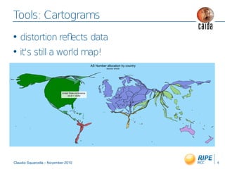
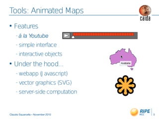
The document discusses visualizing geolocated internet measurement data through interactive maps and tools. It notes there is lots of measurement data collected from various network nodes with some geographical data explicitly provided and some inferred. The visualization aims to convey trends in the large amounts of geographical data through dynamic maps that distort maps based on measurements and allow animation of changes over time in an intuitive interface for analysis. Tools discussed include cartograms that distort map sizes based on data amounts and animated maps in an interactive web-based format.