Download to read offline
![Uber_Trips_Visualizations.R
aymansiraj
Mon Aug 15 10:28:32 2016
# load required packages
suppressMessages(library(ggplot2))
suppressMessages(library(data.table))
suppressMessages(library(lubridate))
suppressMessages(library(scales))
suppressMessages(library(stringr))
suppressMessages(library(zoo))
suppressMessages(library(dplyr))
# load file and clean
setwd("/Users/aymansiraj/Google Drive/ix 2016 /RUber")
Uber <- read.csv("trip-history.csv")
Uber$trip_id <- NULL
Uber$date_time <- NULL
Uber$driver <- NULL
Uber$payment_method <- NULL
Uber$start_address <- NULL
Uber$end_address <- NULL
Uber <- Uber %>% subset(price != "")
# format data types currently
Uber$date <- as.character(Uber$date)
Uber$datenew <- parse_date_time(Uber$date, c('mdy'))
Uber$Month <- months(Uber$datenew)
Uber$Year <- year(Uber$datenew)
# create new columns to plot graphs
Uber$MonthYear = as.factor(paste(Uber$Month, Uber$Year, sep="-"))
Uber$currency<- as.factor(gsub("[0-9.]","", Uber$price))
Uber$pricenew <- as.numeric(gsub("[^0-9.]","", Uber$price))
# calculate amount spent on each currency
costpercurrency <- Uber %>%
group_by(currency) %>%
summarise(TotalCost = sum(pricenew))](https://image.slidesharecdn.com/1d3f5ac2-a71b-45e4-829c-96b209d1f0fe-160815083843/85/Uber_Trips_Visualizations-1-320.jpg)
![Uber_Trips_Visualizations.R
aymansiraj
Mon Aug 15 10:28:32 2016
# load required packages
suppressMessages(library(ggplot2))
suppressMessages(library(data.table))
suppressMessages(library(lubridate))
suppressMessages(library(scales))
suppressMessages(library(stringr))
suppressMessages(library(zoo))
suppressMessages(library(dplyr))
# load file and clean
setwd("/Users/aymansiraj/Google Drive/ix 2016 /RUber")
Uber <- read.csv("trip-history.csv")
Uber$trip_id <- NULL
Uber$date_time <- NULL
Uber$driver <- NULL
Uber$payment_method <- NULL
Uber$start_address <- NULL
Uber$end_address <- NULL
Uber <- Uber %>% subset(price != "")
# format data types currently
Uber$date <- as.character(Uber$date)
Uber$datenew <- parse_date_time(Uber$date, c('mdy'))
Uber$Month <- months(Uber$datenew)
Uber$Year <- year(Uber$datenew)
# create new columns to plot graphs
Uber$MonthYear = as.factor(paste(Uber$Month, Uber$Year, sep="-"))
Uber$currency<- as.factor(gsub("[0-9.]","", Uber$price))
Uber$pricenew <- as.numeric(gsub("[^0-9.]","", Uber$price))
# calculate amount spent on each currency
costpercurrency <- Uber %>%
group_by(currency) %>%
summarise(TotalCost = sum(pricenew))](https://image.slidesharecdn.com/1d3f5ac2-a71b-45e4-829c-96b209d1f0fe-160815083843/75/Uber_Trips_Visualizations-1-2048.jpg)
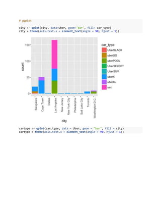
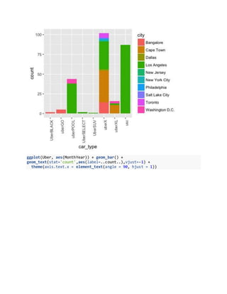
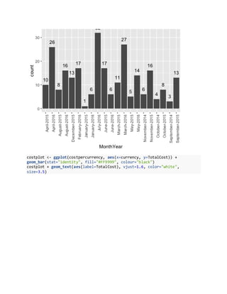
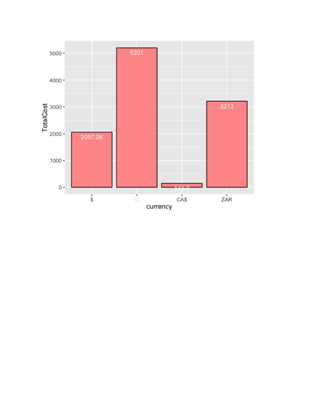

This document contains R code to analyze and visualize Uber trip data. It loads required packages, reads in a CSV file containing Uber trip data, cleans the data by removing unnecessary columns and formatting date fields. It then creates new columns to group the data by month/year and currency. Finally, it generates several ggplot visualizations including bar plots of trips by city and vehicle type, a bar plot of trips grouped by month/year, and a bar plot of total costs by currency.