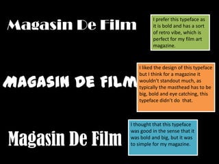
This document discusses a typeface being considered for a film art magazine masthead. While the typeface has a retro vibe, bold style, and is simple, it is deemed too simple and wouldn't stand out enough as a magazine masthead needs to be big, bold, and eye-catching to capture attention. A different, more attention-grabbing typeface would be better suited for the magazine.