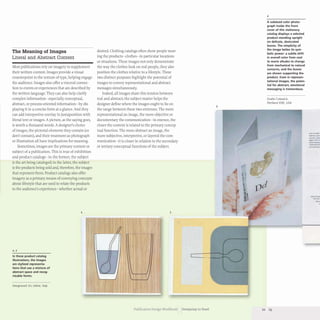
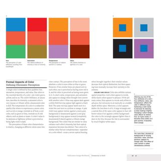
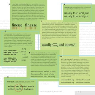
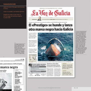
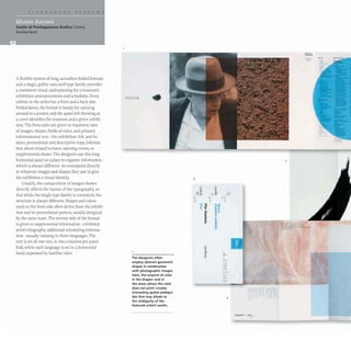
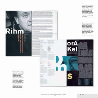
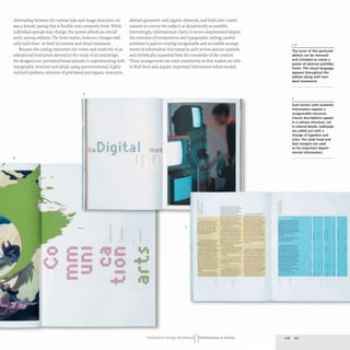
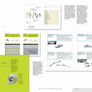
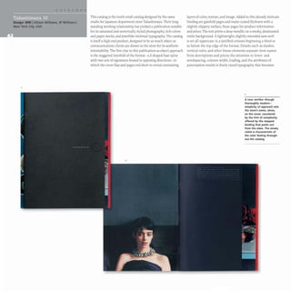
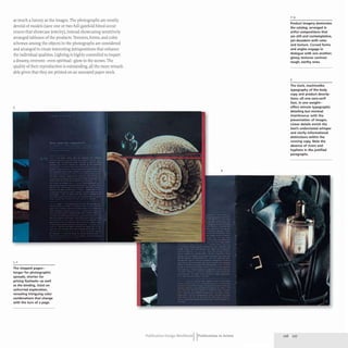
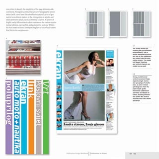
The document discusses the enduring relevance of print in a digital age, highlighting how printed materials continue to serve as vital sources of information and community connection. It chronicles the history of printing, from early block printing to Gutenberg's movable type, emphasizing the evolution of publication design and the role of graphic designers in creating engaging print media. Despite advancements in digital technology, the tactile experience and clarity of print remain essential, underscoring the ongoing demand for printed publications.


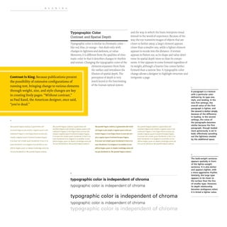
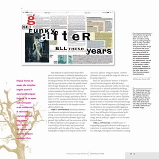
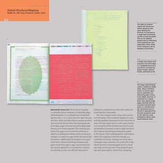
![The Optimal Paragraph
A desirable paragraph setting is one in which
a constellation of variables achieves a harmonic
balance. Since extended running text is such
an important consideration for a publication,
finding the optimal paragraph is one way to
begin to develop overall typographic structure.
A designer might first make some assumptions
about the text typeface based on his or her
sense of its appropriateness from a conceptual
standpoint and based on its visual attributes-
the relative height of the lowercase letters, the
general weight of the strokes and any contrast
within them, the height of the ascenders and
descenders-and set a text paragraph at an arbi-
trary width and arbitrary text size. Judging from
this first attempt, the designer may opt to adjust
the size of the text, loosen or tighten its overall
spacing, open or close up the leading, and
change the width in successive studies.
By comparing the results of these variations,
the designer will be able to determine the most
comfortable text setting for extended reading.
At what point is the type size too small-or
uncomfortably large? Are the lines relatively
even in length or do they vary a lot? Is there
excessive hyphenation, indicating that the para-
graph is too narrow to allow a useful character
count? Is the leading creating too dense a field
of text to feel comfortable? During this study,
it may become clear that several options for
width and leading are optimal, but the designer
must choose only one as a standard for the
publication. This choice has implications for the
page size, the number of columns of text that
may fit on it, and optimal sizes for other text
groupings, such as captions, callouts, and so on.
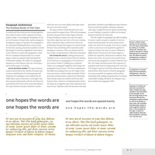
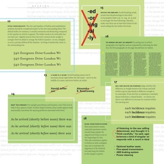
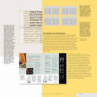
3
A At vero eos et accusarn et justo duo dolores et ea reburn. Stet dita kasd
gubergren, no sea takirnata sanctus est Lorem ipsum dolor sit amet.
Lorern ipsurll dolor sit arnet, consetetur sadipscillg clitr; sed diarn 1101]-
umy eirmod tempor invidunt ut labore et dolore magna alifJuyam erato
sed diarn voluptua. At vero eos et accusarn et justo duo dolores et ea
rehum.
B .1 n'IU cos el a("("usalll el juslo duo dolores el ea rehum. SIcI dila kasd guhergren. no
sea lakilllala wnctus esl Lorelll ipsulll dolor sil alllet. Lorelll ipsulll dolor sil anwt.
consetelur sadipscing elitl~ sed diam nonumy eirlllod lempor im'idunl ut labore el
dolort, magna aliquyalll erat. sed dialll ·oluptua. 1 eIU eos et accusam et justo duo
dolores el ea rebum.
C AI' vero eos er accusalll et jusro duo dolores et ea rebulll. Srer dita kasd gubergren,
no sea takilllata sanctus est Lorelll ipsulll dolor sit alller. Lorelll ipsulll dolor sit
alller, consetetur sadipscing elitr, sed dialll nonulllY eirlllod telllpor invidunr ut
labore er dolore magna aliquyam erat, sed diam voluprua. At vero eos er accusam er
jusro duo dolores er ea rebum.
D AI' vero eos er accusam er jusro duo dolores er ea rebum. Srer clira kasd gubergren,
no sea rakimara sanctus esr Lorem ipsum dolor sir amer. Lorem ipsum dolor sir
alller, conseterur sadipscing elitr, sed dialll nonumy eirlllod tempor invidunr ut
labore er dolore Illagna aliquyalll eraI', sed diam voluptua. AI' vero eos et accusam er
jusro duo dolores er ea rebum.
E At vera eos et accusam et justa duo dolores et ea rebum. Stet dita
kasd gubergren, no sea rakimata sancrus est Lorem ipsum dolor
sit amer. Lorem ipsum dolor sir amer, consererur sadipscing elitr,
sed diam nonumy eirmod tempor invidunt ut labore et dolore
magna aliquyam erat, sed diam voluptua. At vero eos et accusam
er justa duo dolores et ea rebum.
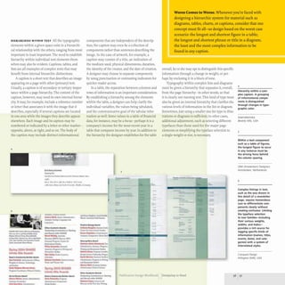
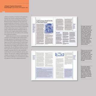
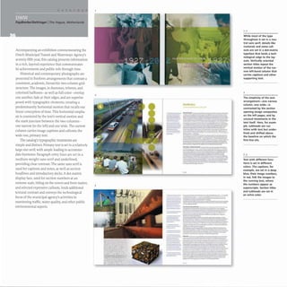
3
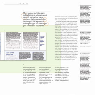
In this study of a para-
graph. the variables of
type size, spacing, leading,
and paragraph width are
tested to arrive at a text
setting that results in the
most comfortable spacing.
the least hyphenation.
and a decisive rag.
A Initial setting: solid
leading. larger type size
B Solid leading. smaller
type size: more than
optimal character count
for width
C Same size and leading,
but substitution of a face
with shallower ascents
and descents
D Increased leading:
more comfortable, but the
paragraph is still too wide
and the substituted face
too small
E The paragraph width
is narrowed and the type
size increased by a point:
optimal character count.
decisive rag. and comfort-
able leading
Publication Design Workbook Designing to Read 38 39](https://image.slidesharecdn.com/timothysamarapublicationdesignworkbookarebookzz-220828062339-223be1a2/85/Timothy_Samara-_Publication_Design_Workbook_A_Re-BookZZ-org-pdf-41-320.jpg)


![READING
Developing Informational Hierarchy
Whether in a newsletter, annual report, or magazine, information must be
given an order that allows the viewer to navigate it. This order, called the
hierarchy of the information, is based on the level of importance the designer
assigns to each part of the text. (Importance means the part that should be
read first, second, third, and so on; it also refers to the distinction of function
among the parts: running text [the body of writing] versus other elements
like page folios, titles and subheads, captions, and the like.)
Determining a hierarchy is the result of reading the
text and asking some simple questions about the
various parts.The answers to these questions are
often common sense. On a publication's cover, for
example,the masthead or title is most important,
so it makes sense that it should be the first type the
viewer sees. In a table of financial information, the
viewer needs to understand the context of figures
being presented, so the headers, which describe the
meaning of the figures, need to be easily located.
Within a publication's pages, where running text
may interact with captions, callouts, and other
details, the running text needs to occupy a consis-
tent area and be visually noted as different from
these other elements. The effect of these decisions
becomes simultaneously verbal and visual.
At first appearance, all text looks equally impor-
tant in raw form. If placed on a page as is, the words
form a uniform field of texture. By manipulating
the spaces around and between text, the designer's
distinguish the importance of elements but also
their function. The primary text for reading is
located in a prominent, central area of the page-
it is the focus of the format, the reason the format
first option is to create levels of importance through exists and exists in a particular shape. The title
spatial distinction. The designer may group the for a section of text also appears in a specific loca-
majority of elements together, for instance, but tion. As a result, it is clearly not running text,
separate a specific element- maybe a title- and regardless of size or other treatment. The running
give it more space. The uniformity that is usually head, foot, or side is obviously not a title, because
desirable to keep the reader moving is thereby it is not in proximity to the beginning of the run-
purposely broken, creating a fixation point. The ning text. Its distance from these elements signifies
fixation point is interpreted as deserving attention its function as an element that is of secondary or
and therefore as more important than the other tertiary importance.
elements around it.
In a complex compositional framework, like
a publication, spatial differentiations not only
II Investigate the Content. What are the distinguishable parts
ofthe information to be designed? What should be the main
focus ofthe reader's attention? How do the parts that are not
the main focus relate to each other? Does the viewer need to
see a certain grouping ofwords before they begin to focus on
the main part?
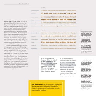
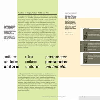
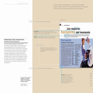
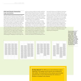
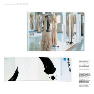
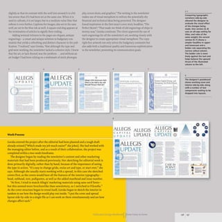
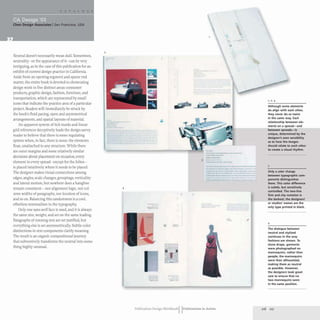
llJ
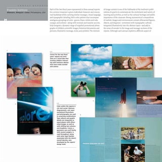
Title, publication date. and
company name exhibit a
clear hierarchy in the cover
of this annual report. The
larger title type contrasts
in color, linearity, and size
with its surrounding
imagery. bringing it to the
top of the hierarchy; the
vertical orientation of the
company name at the right
edge, as well as its smaller
size, decrease its presence
on the surface, making it
less important. Color and
weight change within the
company name itself cre-
ate an internal hierarchy
among the elements; some
of the words are more
prominent than the others.
Allemann, Almquist + Jones
Philadelphia, USA](https://image.slidesharecdn.com/timothysamarapublicationdesignworkbookarebookzz-220828062339-223be1a2/85/Timothy_Samara-_Publication_Design_Workbook_A_Re-BookZZ-org-pdf-56-320.jpg)
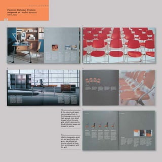
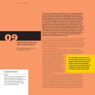
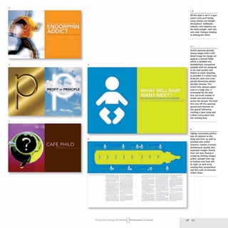
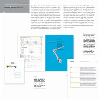
![BUILDING
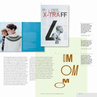
The Format's Conceptual Potential
An Overall Shape for the Message
Format plays an enormous role in the experience
of a publication; its size and shape sets the stage for
content and how it feels to the reader. The sense
ofspace, tension, and movement in a given format
changes as its proportions change.A square format
exhibits a neutral space without tension.A vertical
format mirrors the human body, creating upward
visual thrust that is tense and active. In contrast, a
horizontal format is restful, reflecting the landscape;
its thrust is less dynamic and creates movement left
and right. A choice of one over another, even at this
level, has implications for the communication.
The extreme to which a designer pushes a for-
mat's proportions has an impact on perception. An
exceptionally narrow or large format, for example,
may communicate a particular attitude- unconven-
tional or exclusive. The calming effect ofa horizontal
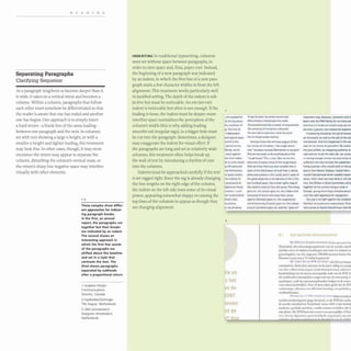
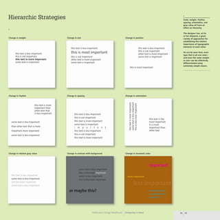
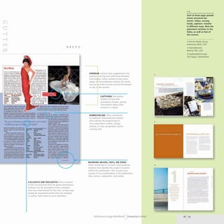
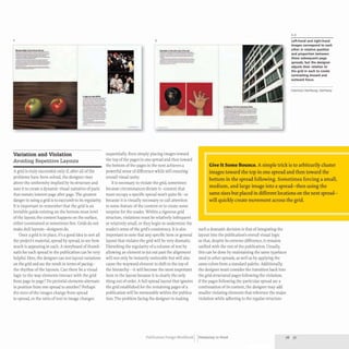
2
LETTER TABLOID A6
A5
17 X 22"
format might enhance a subject such as gardening
or health care. Harmonic mathematical relation-
ships, first noted by the ancient Greeks and
commonly used between the fourteenth and nine-
teenth centuries, impart a sense of precision that
may be appropriate for journals of math or science.
However, purposely refuting a conventional
format choice may add meaning and originality:
for example, a format derived from the golden
section or other numerical system for an exhibition
catalog or a yoga newsletter. A designer may also
explore formats based on the content's typographic
necessities. As noted earlier, text legibility, spacing,
hierarchy, and structure may direct the designer's
consideration of the format. Some designers
begin by exploring various text settings to deter-
mine how much space the text will need and
what page structure will best suit it, organically
building the page outward from this internal
typographic architecture.
A4 A2
A3
Ai
6
BSCE
f U. ,. "'iii" ... .•
1,2
The United States and
European Union follow
standard format systems.
The U.S. Imperial Letter
(8.5 x 11" [21.6 x27.9 cm])
and Tabloid (11 x 17"
[27.9 x 43.2 cm]) sizes (left)
form the basis of American
publication formats; these
sizes are left over from
colonial English printing
paper sizes. Tabloid is
twice the width of Letter,
and their aspect ratios are
different. The European
DIN or ISO standard (right)
uses a proportional system
based on a square meter
of paper (AO size) whose
aspect ratio has been engi-
neered 50 that when it is
folded in half, the folded
size retains the same
aspect ratio as the parent
sheet. The A4 letter meas-
ures 210 x 297 mm, (about
8'1, x 11'1,'). The aspect
ratio in ISO sheets is
consistently 1:1.414 (the
square root of two),
I • • " . . . . ... .
Plans unvclilld for the Now
BSC£ Perfonnina Arts Theatre
at Fonner Warehouse](https://image.slidesharecdn.com/timothysamarapublicationdesignworkbookarebookzz-220828062339-223be1a2/85/Timothy_Samara-_Publication_Design_Workbook_A_Re-BookZZ-org-pdf-64-320.jpg)

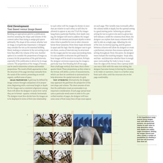
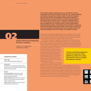

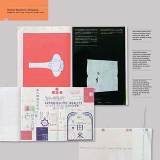
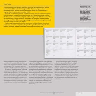
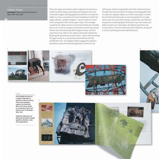
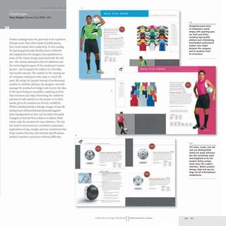
![Hybrid Brochure/Magalog
Graph Co., Ltd. Iissay Kitagawa, Hyogo, Japan
diagrams, the text overall is set in one size; all of
the text is set in the same weight of the same face.
The austerity of the typography and the considered
use of the grid structure combine to create an
informational document that is easy for customers
to navigate and that highlights Graph's credibility
as functionally concerned, service-oriented designers
and printers. The choice of a brilliant white,
matte-coated stock for the catalog sheet contrasts
the newsprint stock of the brochure/magalog and
draws attention to the catalog sheet.
GREETING CARDS Folded into the catalog sheet
(which is folded over the brochure/magalog cover)
are sample greeting cards, representing the product
that drives the overall publication. Their propor-
tions inform all of the components of the system,
from the foldout sheet to the brochure/magalog.
They are printed in standard process (eMYK)
color on a selection of glossy, matte, and mirrored
card stocks, offering examples of these options for
potential customers. Some of the cards included
are also shown in the brochure/magalog, creating
an interesting conceptual connection- from catalog
presentation of the product to concrete sample.
This intermingling of sample product and
actual product echoes the working process quali-
ties of the brochure/magalog, tying the three
components of the publication into a complex,
yet coherent, whole.
GfiWttt.o-f~~.,........ ~<O:'II" r:
IIIII!.
.b]ff.~"d~'C~lt"
.,. t -. "" •••
'J' ~ ,.~ ... ...
~-. at.
-1'-))".
- 7''101'"
-,...,:,.a.,.
.,,,....
........,....::-~ ..
The foldout catalog sheet
breaks sections of informa-
tion into horizontal bands
defined by its folds; an
eight-column modular
grid. proportionally based
on the diagrams of the
greeting cards, lends
additional structure to the
text and images.
GRAI
..;0...-+., :J.a ...1t••C"~ 'IIU.'''' GRA11't ~~
atilt-B,.uP! .,...,...:J"''''-~;I. . Tl1'H..U
Il'.... ....• ,I.......!
t tu ' .. • .... . - ,••
.. ..""',,-.....,
~AI-__~ ·,.,M1tlt-f-l).!A.
I"U,D 1",O
il. _ ••,. TT_
...." ..
,., .,~ a'1M
ItU,B'IJ<,m.
..
•• •
~. .".......... au..•
_ _ ~ . ... t ..
. .", . . . ..."ft, . . . -, . .........," ... t .., iii ........,. .....x»u",.....
• :-7. U ... ·tt ..... • ........ "
'1'.1't-...,-~.- -)o·,.,II',Jt.-.. ·"~lI-U' IIIft7••"'::;tlll_"'/1i
'4'''''*.(Cl'1'~ U: ••~j",»- ..JI%ft,>yf70.t
~.,."t" T :ttlttf't;'IlGAAf"Kb-F~"''''''' W'U,:f,,,(r:t·
~"f't "1t......r4l'.-f.-4-.' .......... '_f.~ ....,.. "'....,.iW"
...,1A . ~ It)
.....,••q" ...,t
--D
~.
I ·,A. new....
..... .,..... ' l·.1Ob
t ,OOOtr "".JSO V'UH'
....... ..~.o1O ¥~.
~.. ....... "lI.f~
.'''-;'- ...,.... Q .••1o::M
7"'f~" i ...(
,.;;
...
--r..,,,,,,, l"'u.a
..... "11.000 140fI v'.,l$O
, ooott .'u.* JOO4tt .,'..tIO
~ooo tt "~OIO MOil .... .400
...... ......050 1.000& V,.,5O
. ~'M .Ir,.a"-_u; ..,.,.}••!".".'1II •••"......"" ..
n...,.·"t·...... u · ..........
... .... ". I. ,,.~ • • l1li.-......
,....:, .., ......
..,"'...........
e'1 t _ ... . ....~II
,......... 1..............-...:
k'1 .t'u.!~*,:. u .. ,"'.
"".
.....
'..."
......
10000
,'.
f -'A.
'......
"JO..so
......'..
.......
'Q".....l'I"", ............"'.. '.":1-'.' ••
• -,.. tI ............" • .............at..:lto.......... ' ... .
..,. ,-nu~... '41" ... ....., ......,.
'f~ · I •• , .. 111
. a&k........... ...... ....
r..aa... .,
•••
f · JJ.II
..... .......
..... ...· .100
:toooit "" 1.400
.-0 ~""00
".~
-
'0000
._.
1 .....
.-
•
'.,J...
" '!I,~
""Ltoo
'-21','N(I
"'....a.ao
•
IJ "~ U.I.."?'·
..e; t:tt.••
;Io.,•• AIU)W._
.11 •__.aa
.-to:""iIfG.a,.](https://image.slidesharecdn.com/timothysamarapublicationdesignworkbookarebookzz-220828062339-223be1a2/85/Timothy_Samara-_Publication_Design_Workbook_A_Re-BookZZ-org-pdf-104-320.jpg)
![3
6
9
Sometimes it is used upper-and lowercase as a secondary deck.
The Poynter serif italic appears as callouts and deck paragraphs
in all contexts.Two slab serifs, one lighter and extremely con-
densed, the other a slightly extended extrabold weight, are used
for labels that tag sidebars, callouts, and other informationally
subordinate text elements. While the type families are very
closely related in width and general structure, they offer enough
color and textural contrast to keep the details in the pages visually
interesting without becoming a self-conscious distraction.
open, and consistent; important points of interest (set off with
the high contrast slab serifs or a thick rule) are startlingly easy to
find. Indents in body text are decisive but unobtrusive, and bold
square bullets punctuate the lead paragraphs of feature stories.
The interrelationship of the sizes and densities of the spacing for
each kind of typographic treatment in the hierarchy seems
incredibly harmonious.Even on pages where there are multiple
instances of text styles, the overall presence of the type is light,
v _
- ---- 0
._-
-- .--=::=:~
---
---
-.- -- -.-
- ;.:---: --
=-- -"'-'-'--
.....- ==
= -.
--
-- _
..
-._... -"
-- ...- -_.
--.-- -
- l1li:."-
- --
- ~I
-.... ..- - ..10-
-~ --- - -..
--- .._.- ~-
-TO
=---:-- -- - "
.-- _.-
:-..:--= ..~..- --
- - ,
. ---
--- -
-~- =--
.-
1f' =
---- ..-
_
............-.-...- --------
------------
==..-~~~:=-
---.--__.-
1_ _.. - -
...-
._-
It . .. ...
--......--_
........-
-
- . 0 .
--
...._ _ _111...~.
-.-....-
--
-----
,---........
C==_
._----
._...
jIOI-'---
-_..-
-
*_..-
--
--.--
--
4
•
7
..
10
•
-- ~
.....- --- ,. =
--
c........
t "
IClI_";"
'-
-- «iJ que im'ent6la cnrbata.
lcndcfan que habcr1c ahon:ado.
c..... . .... ~...........-......-
....~=......~
-_.
,..............
( lhL. ....
";¥]~..a.""
--
.-
-
_.-
--
-.-
-
-_.
_ J_ _ _
_..
--~
-
- -.
,,=
j.<o--_._'"
11'-'-_-
.._
........._'--
-----....-
==::--=-: ----
- --
Tw.~*"'""I'OXi
,......,.,.~:CJ
lHIIoo_ _ _ _
----
..=
~.,- =- -
........,. ....-
._-- -
__ 0_ ... -
("..,..... &.11. ,......- _ ••
:...:::----
==" =:=
---
,,-----..
._--
---
~--
- ---
I •• ~ • • I -:1.--
a"",
--
-
-
-
5
•
8
..
11
-
...._-_.._
...-
_
.....-.,-
:::::::.::c....._·-
o
~---
............__...--
_........._-
-~
-
"""-...---...~- .
~ ..-"'---.-.....-
___1104
.-._ _11--
.... --~--,..
--..--_1
-
J"=
-
",_='-_ __________ ..-..::00 ..,
, . l
- - --
.-
v==----______________________-=~I~
INTElU 10
---
T ""'--
--_._--
..-..-.----
_~ 1-
==~
---
---
-
=.
I ITA -.
---
......_.
-...~
-- -
::=r.~.::;:::"
------
_.---_-..0.
-
----_..__........-
._---,.....-.....-.
-
_ _ _.....'.r.-I_
....,... GoIIoIcTat IIoct C, • ...d
~ __. .1
. 1
- _,a ,. • • • • a
~ • ""~ 111 IIj '" In ...
_ .'..... .,_ 'I' , • 'I' '" t ,-.
_ .~ o..pa am-.......... ............. _.,.
-- _....- -----
•• <1:_ ....... ...
Publication Design workbookIIFrom Cover to Cover
•
3-11
Pages from the paper's
PDF style guide outline
grid structure, text
and head treatment, and
flow of information in
great detail. Any given
article may use up
to seven treatments to
differentiate dateline,
byline, callouts, and other
supporting information
from running text.
4
This page from the PDF
style guide details elements
that accompany the lead
of a generic article.
demonstrating the typo-
graphic color variation
that enables easy naviga-
tion and adds visual
richness to the presenta-
tion. A sectional tag-
Enfrevisfa-set in the bold
sans serif and tinted to
appear similar in weight
to the accompanying
support-Miguel Diaz
Pache, set in the display
oldstyle serif and separated
by a narrow vertical rule-
provides reference above
the head and deck. These
are set. respectively. in
the display oldstyle and
a corresponding italic at
radically different sizes.
108 109](https://image.slidesharecdn.com/timothysamarapublicationdesignworkbookarebookzz-220828062339-223be1a2/85/Timothy_Samara-_Publication_Design_Workbook_A_Re-BookZZ-org-pdf-111-320.jpg)
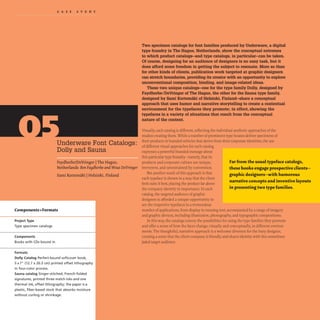
![I
Underware Font Catalogs
Faydherbe/DeVringer IThe Hague, Netherlands
Sami Kortemiiki IHelsinki, Finland
2
-"
-
-
•
•
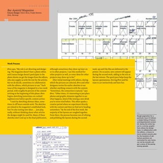
Work Process
ABCDEFGHI]KLMNOP
QRSTUVWXYZCE.lEc; &
abcdefghijklmnopq
rstuvwxyzre~~
{0123456789}
(fiflft);:[~r]? 1*
... , •• ,.._ 0'" , .. " ... " .• ,..
aaaaaaeeeeuuuu
... "' .. ,.. --
000000n
"$£€f¢" «©t@»
........,...........-,-.......... ....
................-.........................
""'-...---......~ ....-
Dolly RD.,..n
DeVringer says, "I started the project with the idea of taking all kinds of objects
from daily life (receipts, manuals, tickets) and replacing the original text with
the same text set in Dolly. I don't really sketch by hand; I go directly to the com-
puter after working out the idea in my head. I thought it looked really great, and
Akiem and Bas agreed that this was an unusual approach. After working on it
for a couple more weeks and showing them my progress, the project began to
move in another direction. Bas thought that using Dolly on all these everyday
items didn't really demonstrate the way the face was meant to be used: Dolly was
a text typeface that should be used in books!" Adapting the found-object idea,
DeVringer scanned reference books as a source, substituting Dolly for the typog-
raphy; the result demonstrates the face's use in book design.
ABCDEFGHgKLMNOP
QRSTUVWXYZCE££g &(
abcdefghijklmnopq
rstuvwxyzcece~
{01234S6789}
(fiflft);:[,,] ?!*
... , • • A _ 0 '" , • • ..--., " • • ,..
aaaaaaeeeeuuuu
... ,..,.. --
000000n
"$£€!¢" «©t@»
Oo"ylul"
Carefully sized, elegantly
spaced character sets show
the full typeface in its vari-
ous weights and postures
in a straightforward, book-
ish presentation.
2
An example from the first
round of concept spreads,
in which DeVringer used
random materials, such as
receipt, labels, packages,
and charts, as a context
for the typeface.](https://image.slidesharecdn.com/timothysamarapublicationdesignworkbookarebookzz-220828062339-223be1a2/85/Timothy_Samara-_Publication_Design_Workbook_A_Re-BookZZ-org-pdf-120-320.jpg)
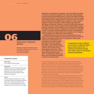
!['... u......... ."" ,&>01 ••• DNA Expression Analysis
~~----~-------------
1-3
•
-
•
A dramatic color system,
evolved from the client's
existing corporate identity,
differentiates four primary
families of product:
DNA analysis, RNA analysis,
instruments, and infor-
matics. At the top level,
instruments and informatics
are combined into one
family brochure for image-
based marketing, but
are represented by their
own brochures at the
next level down.
AFFYMETRIX.
3
,....,...........,._.
1,]
Artwork for the system
uses a textural field of
gridded squares in motion,
an abstract representation
of the gene arrays-photo-
chemical data displays of
genetic sequences-that
are the client's core prod-
uct. Differences in presen-
tation of the grid squares
indicates, to the trained
eyes of the scientific audi-
ence, subtle differences in
data display specific to dif-
ferent aspects of genomic
research. The representa-
tion is specific to the com-
pany's products, but
generic enough to speak
on a more conceptual
level, rather than showing 2
one kind of genetic data.
The family colors are used
to customize the base art-
work for each set of prod-
uct literature.
RNA Exple"sioll An..lysi"
•
AFFYMETRIX•
.J:Y:J":
Publication Design workbookIIFrom Cover to Cover
Informatics Instruments
IIFFYMETRIX.
fi.)CJ":
122 123](https://image.slidesharecdn.com/timothysamarapublicationdesignworkbookarebookzz-220828062339-223be1a2/85/Timothy_Samara-_Publication_Design_Workbook_A_Re-BookZZ-org-pdf-125-320.jpg)


![Stereotype Design New York City, USA
Each issue's cover features
a different historical pho-
tograph, printed in black
and white, against which
the stationary masthead
remains consistent. The
right-angle rotation of the
masthead's elements locks
it almost architecturally
to the upper-left corner of
the format.
3
This newsletter for the Museum of Jewish Heritage organizes an
ever-changing selection of editorial content on a five-column
grid. Its slightly squared tabloid format lends it a newspaper-like
presence and establishes ample ground for vigorous typography
at larger sizes. While a number of pages are given to more con-
ventional newsletter fare- updates on fund-raising campaigns,
donor events, and the like-every issue features essays from
noted contributors and articles focused on curated exhibitions
or material in the museum's archives. The former generally
structures text on two-column configurations derived from the
five-column grid underneath, with heads set large in black-
weight sans-serif type, in a contrasting color. The body copy runs
in a serif face.Heads are in a consistent size throughout, clearly
distinguished in size and spacing from callouts that appear in the
same face, but smaller and more densely leaded. Image captions
appear in the bold-weight sans serif. Within the more engaging
editorial spreads, heads and decks take on a more spirited presen-
2
FRO
__-_E.
-
E
tation, appearing very large and all uppercase in the same sans
serif. The grid is articulated more dramatically; some text compo-
nents run across three columns, while others continue in the
two-column structure.Text components are composed in these
pages with larger images- some inset, some bleeding or interact-
ing with blocks of color. Although the typeface selection is
limited to two families, the use of an oldstyle serif in justified
text columns, contrasted by large, uppercase setting of headlines
in sans serif- especially in conjunction with historical photo-
graphs from the Museum's collections- subtly recalls the design
aesthetic of the early- to mid-twentieth-century Europe. In doing
so, the publication purposely evokes memories of this turbulent
period in the Jewish experience among its mature readership,
resonating with its audience at a deep emotional level despite
the generally neutral presentation of the content.
• !!
r ··l
2,3
A clear system of weights
and sizes helps separate
informational components
in the hierarchy and adds
texture to the pages. Scale
change becomes more
image oriented in the edi-
torial featu res; here, head-
lines and callouts spread
across the gutter, poke in
and out of the column
structure, and appear in
multiple sizes. Combined
with rule details, blocks of
color, and historical photo-
graphs, the typefaces and
their arrangement con-
tribute to an association
with design from turbulent
periods in recent Jewish
memory.
3
The newsletter is some-
times printed in four-color
process, but adheres to a
restrained palette; this lim-
itation keeps the color
feeling in line with those
printed using two colors.
2,]
Big type is not reserved
strictly for headlines: the
folios, set in a bold, con-
densed sans serif, act as
anchors for the spreads.](https://image.slidesharecdn.com/timothysamarapublicationdesignworkbookarebookzz-220828062339-223be1a2/85/Timothy_Samara-_Publication_Design_Workbook_A_Re-BookZZ-org-pdf-192-320.jpg)
![first section is expanded to include the upper and lower margin
areas for a two-column structure that is enclosed, top and bot-
tom, by consistent color banding and a clear hierarchic structure
in text. The financial data is similarly structured on two columns
that are further subdivided into six columns for tabular data,
based on the longest figure set in any given table.A rich, desatu-
rated brown ink differentiates this section from the previous two.
-
--
-..........- .
....--_.",..-.-
--.111....................
......---_........-
__ --...r.....-~
....---................
.........-.__...-
------...".--
~....-.....,..-,........
_ _ _ _ _ 0IIII .... _
__ c-;...._ ......_
......._w.........
.-...---
.,..........- ....-
--_.....-
..~...-"""'-...
--- --
.,..------
""........................,..
.-......-............
---.-......----
..--........--
...-......-.-......
-----._.........
..------.-.......-
..__.-..-.....---
5
._-
-.-
--
--
_.-
--
---
_
.w
--
- ..----......-
_..-.t'......."." .._ _
.................._-.....
_..._....--_.
-.......~~....
-_.....
~ ......."..~....,..
..-............-_...
------..-
........---....._-
-........---.........--
__"_-_""-
.............~lCICIt,--...
_
......-.........
-----...-.~
........... _ ...v.a..... _
.-.........~ .......
ef"'''''__~_'''
.........................
---
--
._.............,.....
..--.----
..._~w __ ,.......
-.,~......-~
1,2,3
Stark, non-brand-specific
treatment of type and
color keeps the individual
brands being represented
subordinate to that of
the parent corporation.
Specific branding messages
are hinted at through the
selection of photographs
and details of their subject
matter-for example, on
the jeans labels.
_._. _.-
-- ---
--
- .- --
--- ----
..- --
- -- ---
_.- -.--
2,]
The image section defines
a simple system of call and
response from left to right
page for the copy. which
runs in a narrow horizontal
yellow bar above the
image area. The relation-
ship of the text on the left
page to the image below
it. and to the text that fol-
lows on the right page, cre-
ates unexpected and subtly
witty branding messages.
._-
Modular three-column and
two-column configurations
appear in the financial sec-
tion, organizing images of
key personnel and finan-
cial data. The text in the
financial section is printed
in one color, with weight
and size change in the text
separating informational
components and helping to
introduce contrast into the
dense typographic texture.
• - _ _ • .:0 . . . . , .
._...__ .
-----
------...
--_....
-----
-
...._
.._-.
.-~-
- -_.
---_
..
._._---
_0-
.-
-
--
-
-
--
--
--
----
---
_.--
----
_.-
-'--..
--
--
---
--
-_.-
-
-
_.-
--
---
.-
•
-
- -
- - -
• ~- • ••
-
- ..
-
.-
-
-
- -
..
- -
- -
.- -
..
-
,-
..
-
- -- ==
-
-
- -
-
- -
• -
-
--
~
.-- .--
4
In the second section,
discussion of activity with-
in brand categories is sys-
tematized in a two-column
structure with a wide
upper margin used to list
individual brands in a
given category. The num-
ber of brands in a category
may differ dramatically;
--..---- ------ -_._------
by creating a large. fixed
area for the brand listing
(two appear in this area
here), the designers are
able to maintain the
column structure and its
hangline in each category.
4
-~ ......-...,
..............._
..,.,..,-
---
....... --
---.--....-
...................-..
---~................
--""..._----
_
..........---
..........._-........
.........-............
---_...-_.....
-- - _
.-
-- --
-
Publication Design WorkbookIIPublications in Action
._-
---
- --
...........-.
- --
_ _ _ _a
- -
_
..-
---
--,
----
---*'-
._..-
--
----
._-
---
._-
---
-.-
--](https://image.slidesharecdn.com/timothysamarapublicationdesignworkbookarebookzz-220828062339-223be1a2/85/Timothy_Samara-_Publication_Design_Workbook_A_Re-BookZZ-org-pdf-199-320.jpg)
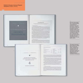
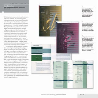
![The gauzy, white cloth
covering the report's case
binding softens the solid
presence of the booklike
structure and, in the
context of the company's
focus in tourism and
similar shipping or travel-
based industries, may
signify sailcloth or other
nautical references as
a physical metaphor.
The company's name is
foil stamped in silver
across the upper third of
the cover.
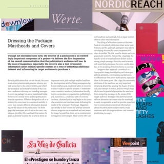
A narrow vertical format, case-bound in white cloth, creates a
strong and graceful vehicle for this business venture's annual
report. The company conducts business in several industries,
among them tobacco and tourism. The international scope and
financial vitality of the operations are quickly conveyed in an
abstract presentation that focuses on key phrases drawn from the
CEO's letter to the shareholders,placed in the context of crisp
photographic images depicting sea, sky, shore, ship, and shelter.
The images become metaphors for the various sectors in which
the company is engaged, as well as for the aspirations described
in the concise selections of text. The text throughout is set in
Didot, the French counterpart to Bodoni's modern serif of the
same time period.Its extreme contrast and modulated strokes
provide rich texture, and it is used at relatively large sizes in the
2
report, even for the blocks of text that appear as insets centered
within the photographs. The central location of these blocks,
given the height of the format, augments the sense of space
depicted in the images, pulling the eye inward while the sky, sea,
and sails soar upward and outward. This sense of focus helps
convey the company's determination and vision as it expands its
holdings and financial reach in foreign markets. In the financial
section,tabular data and charts are similarly focused toward the
central horizon of the format,separated from top and bottom by
enormous margins of white paper. Large headings here, as
throughout the report, appear in the Didot, set upper- and lower-
case in warm gray ink.
1.. -111'1
2,6
Cloudscapes, sails, beaches,
and agricultural land-
environments where the
company's business directs
it-deliver worldly messages
of vision, movement, and
growth. Inset blocks of
type offer a geometric
contrast to the soaring
movement of the images,
creating inward pull while
the format appears to
expand outward.
11
••
3
( ( I
IJ I( )] I I
t.. I( 1
L )
r)( ( ( I
I)() )](https://image.slidesharecdn.com/timothysamarapublicationdesignworkbookarebookzz-220828062339-223be1a2/85/Timothy_Samara-_Publication_Design_Workbook_A_Re-BookZZ-org-pdf-200-320.jpg)


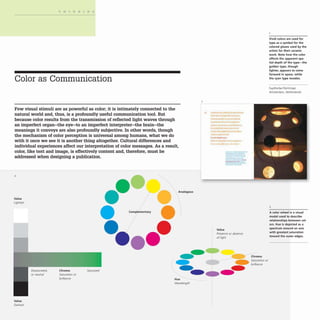
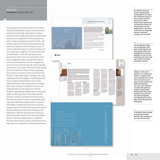
![Arkzin Dejan Krsie IZagreb, Croatia
Mirko llie Studio IMirko llie INew York City, USA
-...
-.-
.....-....:::':-:.
--
iiiIi
--
.-..
.. ~
.._
.......,
--
-
-
.eo= ---
--,--- _
......
~~~~~ ------
-------
-----
- =
.=----=
--
Jes]
3
FORUM::.~__
---
Imeno ~~===
.r:::.-=
odgovomjh - _ - _
sada su ="'-.
ukoricena ~ .:z. -;
- ---- -~ --= -:. ;:;;
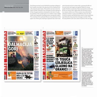
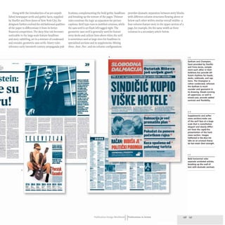
One aspect of this Croatian newspaper that strikes
viewers immediately is the deep blue color of the ink.
In the paper's recent redesign, which took place
during a difficult transition into privatization, the
designers turned financial and technical hardships to
their advantage, creating a new look that referenced
the paper's history- the blue ink being a holdover
from the I950S and a single-color press that necessi-
tated that each section be produced in its own color.
-
..-.-.--
--
---
::..
- -.
27
-----.:.
............ .......--
:-.=.~ -_.....,.
- ....-- -=_.-.
........
----
_ _ 1 -
--
_
.....-
,
--
.,-.
_._-
_.-...--------
~
--~----
-----
-._-
.,- -
loo __ _
---
_
..-_.
..
_.,.-
--
---
:.-=--==
_
...._-...
---.
---.........
---.......[..
---..::: .......
1
1111-·.....-.....1
----......-
=--=:: ......
==,--
::."."::"':: --
==::--
--_._
.
---
f'! : ~
--.
--::
-~
-=----
~~:::
--
-- -
!':t__
..--
a~
-
..._-
---..,...
--"",.,...
........_--.
::
..~....
...'--
---
......-..-
---
..........,.
-
-
--
'--
--
~~g-_-,J;
~~-
::;:
...;.
--
e"--
4
2
-,
-
_.
--
-
....-,
--...
---
-~
1- 7
The deep blue ink creates
an immediate impression
of difference between this
and other newspapers; it
is rich and colorful in text,
but strong enough (and
somewhat desaturated
when it is tinted) to carry
halftones. Occasional
details in red ink are a
dramatic surprise.
28 1m.rv1ew
Slavko Golc
Ustas
u SabOl
.............------
_
...._-_.....-..-
..,.._..._
.. _._-- -
..,..~-- -_..- _
.
...,-"-....--..; --'"-.....-_.
.......-.......- -_...__..... -
-...~ --.- --_..
--.--...-~--- -
....... _ ..... UfIIooIo _ _
.- -._
....._--
.......-~ .. _
..-.....- --
_._----_
.....,
-----_.._-
_ ......__..____ "h•
... 1.-_ _ .. - _ _ _ _ - . _
- - - - - oy - ' -
...--.....--_.....-.....-
----.-~---- -
-"""-...-= t":'..==---=~
_
....-.._-----
---.- _
........__. -
-- -~ ::---........... ~
-- --~~ -
-_..-......._.._... --
--.............. --_._-
....._.......- ..-
--....- ..-_
.._-_
..
---........... -..------
---_._...---
___.._
.-·--1- _
...
----.--.-- -_.
_...- .....-..... --
_ _ _ _ 1_.... _ _ _ _ _
- . -......---...-
- -- _
._-..-
_..._
-
--- .....,_.. ........
-
....__...,' ..........,........ :.:...:
T..........................~ .... ~ ...~ ,
. , r ' . . . . . . . . . . . . . . . . . . . . . . . . . . . . : .
- : .
...................................~T._ =.-:
•~.:p::
....
:..=':.:
'...
:...
:::....
::-:+:=='.-
r , . . . . . 9 1 "'::;
-
-](https://image.slidesharecdn.com/timothysamarapublicationdesignworkbookarebookzz-220828062339-223be1a2/85/Timothy_Samara-_Publication_Design_Workbook_A_Re-BookZZ-org-pdf-238-320.jpg)
![Directory of Contributors
AdamsMorioka, Inc.
8484 Wilshire Boulevard, Suite 600
Beverly Hills, CA 90211 USA
www.adamsmorioka.com
17 1241 57 159
Allemann, Almquist + Jones
124 North Third Street
Philadelphia, PA 19106 USA
www.aajdesign.com
5416711911206-207
And Partners, NY
156 Fifth Avenue, No. 1234
New York, NY 10010 USA
www.andpartnersny.com
671851110-1131196-197
Arkzin
c/oWHW
Baruna Trenka 4
HR-10000 Zagreb, Croatia
dejan_krsic@zg.htnet.hr
218-2191236-237
Blue River Design
The Foundry, Forty Banks
Newcastle-upon-Tyne, NE13PA UK
www.blueriver.co.uk
178
Bruketa & Zinic
Zavrtnica 17
10000 Zagreb, Croatia
www.bruketa-zinic.com
198-1991208-209
C. Harvey Graphic Design
415 West 23rd Street, Suite 4A
New York, NY 10011 USA
www.charvey.com
641172-173
Chen Design Associates
589 Howard Street, 4th Floor
San Francisco, CA 94105 USA
www.chendesign.com
217
Circle K Studio
300 Brannan Street, Suite 308
San Francisco, CA 94107 USA
www.circlekstudio.com
211631200
CODEsign
Via Giordano Bruno 51
47900 Rimini, Italy
leonardosonnoli@libero.it
561811235
Conquest Design, Inc.
226 Massachusetts Avenue, Suite 2A
Arlington, MA 02474 USA
www.conquestdesign.com
571188-189
Creuna Design
Stranden 3A
NO-0250 Oslo, Norway
www.creunadesign.no
561661671144-149
Design: MW
149 Wooster Street
New York, NY 10012 USA
www.designmw.com
181226-227
Designwork SrL
Via Gaeta 88
33100 Udine, Italy
www.designwork.it
231251511731128-1331
162-1631212-213
Eggers + Diaper
Heckmannuferstrasse 6A
10997 Berlin, Germany
www.eggers-diaper.com
181168-1691180-181
Empresa Editora el Comercio SA
Jiron Miro Ql1esada, No. 300
Lima, Peru
www.comerclO.com.pe
152-1531194-195
Ewing Creative, Inc.
P.O. Box 219
Manchester, WA 98353 USA
www.ewingcreative.com
87 [Masthead Close-Up sidebar]
Faydherbe/DeVringer
2E Schuytstraat 76
The Hague, Netherlands
www.ben-wout.nl
261401511831116-121
Flat
391 Broadway, 3rd Floor
New York, NY 10013 USA
www.flat.com
24171 1164-165
Gorska Design
1277 8th Avenue, No. 105
San Francisco, CA 94122 USA
www.gorska.com
191481134-137
Graph Co., Ltd.
228 Moutani-Cho Kasai-Shi
Hyogo, Japan
www.moshi-moshi.jp
96-103
Hutchinson Associates, Inc.
1147 West Ohio Street, No. 305
Chicago, IL 60622 USA
www.hutchinson.com
21 1671224-225
Ideas On Purpose
27 West 20th Street, Suite 1001
New York, NY 10011 USA
www.ideasonpurpose.com
221511204-205
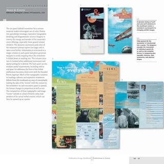
Inpraxis, Konzept + Gestaltung
Nigerstrasse 4
81675 Munich, Germany
. .
www.mprax1s.com
160-161](https://image.slidesharecdn.com/timothysamarapublicationdesignworkbookarebookzz-220828062339-223be1a2/85/Timothy_Samara-_Publication_Design_Workbook_A_Re-BookZZ-org-pdf-240-320.jpg)


![Historical and cultural context prsentation [autosaved]](https://cdn.slidesharecdn.com/ss_thumbnails/historicalandculturalcontextprsentationautosaved-190118081513-thumbnail.jpg?width=640&height=640&fit=bounds)


