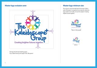
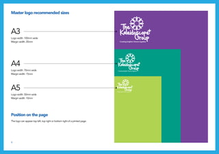
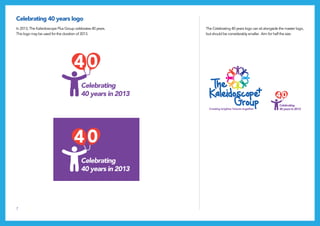
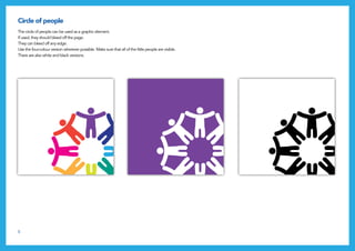
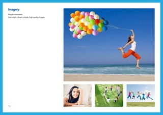
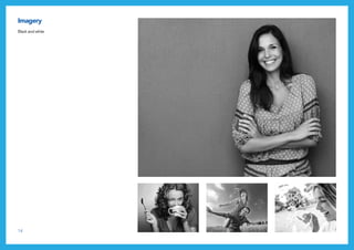
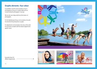
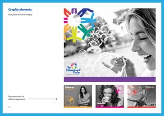
The Kaleidoscope Plus Group is a registered charity established in 1973 and is one of the leading mental health charities in the West Midlands. In 2013 CW Content Works helped them rebrand following a disaffiliation from the national Mind charity. Read more here: http://www.cwcontentworks.com/kaleidoscope-rebrand/
The document is a brand book for Jet Set watches that outlines the brand's positioning, values, products, and branding guidelines. It describes Jet Set as representing a trendy, luxurious lifestyle enjoyed by global citizens who seek fun and glamour. The brand offers a variety of stylish watches in different designs and materials to suit different personalities and styles. The brand book provides advertising materials, logos, and fonts to ensure consistent branding across marketing initiatives.
1) ALTEX S.A. is a family-owned European fashion retailer founded in 2003 in Athens, Greece that designs and distributes fashion products under two brands: Funky Buddha and Fifty Five Garage.
2) Funky Buddha was inspired by a family trip to Asia and launched in 2003. It offers lifestyle clothing for men and women and has become an international retailer known for freedom of expression and unique style.
3) ALTEX aims to be a leading global fashion retailer through international expansion of its Funky Buddha retail stores with a focus on a distinctive shopping experience and brand philosophy of self-expression.
The OCM Winter Collection is all set to become a path breaker in the Industry. The Style Book brings to you this fabric collection – designed by Ms. Cristina Fedriani (Italian Designer).
Let’s go ahead, face life in bold style.
Robin Peralta has over 25 years of experience in educational technology. She currently serves as the Director of Technology at the Islamic Saudi Academy in Alexandria, VA, where she manages the school's technology systems and works to integrate technology into instruction. Previously, she was the Laptop Program Director at Episcopal High School for 16 years, where she established and managed a 1:1 laptop program. She has taught technology courses and provided training to help teachers incorporate technology into their classrooms. Peralta has several technology certifications and has presented at education and computer conferences on technology integration topics.
This document provides guidelines for fashion content and photography on the Jumia marketplace. It outlines standards for product images including using a plain white background, clear high-quality photos, and showing multiple angles of each item. Products should be neatly presented without wrinkles or accessories. Catalog photos must be the same size and uniformly styled. Specific guidelines are provided for different categories of fashion items like shoes, bags, and jewelry. The goal is to present merchandise clearly and professionally to customers.
Tura eyewear wanted to update and refresh their image. Their new direction is feminine and modern with a nod to traditional style and Tura's history of fashion innovation.
From first call to closing the case yankeeXaña Winans
This document provides an overview of branding and marketing strategies for dental practices. It discusses the importance of branding, including developing a branding statement and logo. It also covers various marketing channels such as signage, print advertising, radio, television, direct mail, the internet, and social media. For each channel, it provides tips on effective messaging and examples of campaigns. It emphasizes measuring the results of different marketing tactics and focusing efforts on retaining existing patients through communications like newsletters. The overall goal is to establish trust with patients and get referrals through providing an exceptional customer experience.
Style Star by Moda e Tecnologia- CINEMA FASHION TECHNOLOGY.Andrey Golub
This document provides an overview of Style Star, a new format that aims to promote short fashion films and luxury brands through a series of events combining fashion, cinema, and technology. Some key points:
- Style Star will hold events at film festivals in Venice and Cannes to showcase short films and bring together industry players.
- During Milan Fashion Week, the "Cinema is Fashionable" initiative will screen shorts for press and buyers and hold in-store promotions for younger consumers.
- The goal is to celebrate short fashion films, create opportunities for collaboration, and promote brands through both traditional and new media.
- Style Star aims to be innovative, interactive, and leverage multiple channels to reach
This document outlines the key steps in developing strong brand guidelines. It emphasizes that a brand is defined by all touchpoints and interactions consumers have with it. To ensure consistency across these, clear guidelines are necessary. The steps discussed include defining the brand's mission, values, target consumer, tone, core essence, logo design, and appropriate fonts. Examples are provided for brands like Nike, Kraft, Chanel, eBay, and Dos Equis to illustrate how these elements come together to form a cohesive brand identity. The overall message is that thorough guidelines are essential to build and maintain a brand.
The Style Scout: Style Expert and Retail Style Direction, Content Creation a...Alia Ahmed-Yahia
As The Style Scout, Alia Ahmed-Yahia blends her strong foundation in both editorial (as a previous editor of Vanity Fair and ELLE Magazines) with six years as Chief Style Director of Ann Taylor/LOFT. Partner with Alia as a consultant to drive brand affinity and awareness among women 25-45. Capabilities include spokesperson, speaking engagements (internal and external) as a relevant Style Expert, content creation, internal style/styling eduction and training programs and internal retail style direction.
StyleHaul is a YouTube network focused on fashion, beauty, and style content. It aggregates over 550 fashion and beauty influencer channels and produces original programming. StyleHaul has over 25 million viewers and 16.8 million subscribers globally. It aims to connect brands with this engaged audience through various partnership packages like video ads, branded content, and events.
This document defines the branding guidelines for Grand Strand Health, including guidelines for proper usage of the logo, color palette, typography and other graphic elements. The logo consists of the "Caring Star" icon and wordmark and is available in various options for different contexts. Colors include dark blue, orange, ocean blue and grey. Typography uses the Aller font family primarily with Verdana as an alternate. Detailed guidance is provided for applying these brand standards correctly to various applications like signage, communications and more.
The document provides branding guidelines for IBN Corporation, including rules for logo usage, color palette, typefaces, and templates for stationery, reports, posters, and other collateral. The logo must only be reproduced in full color and not altered or distorted. Specific minimum size requirements are outlined depending on whether the tagline is included. Templates are provided for stationery items like letterhead, business cards, and envelopes with standardized fonts, colors, margins, and layout. Examples of templates for reports, posters, newsletters and other materials are also included with rules on fonts, images and design elements that must be followed.
Axia empowers businesses and institutions with strong brands that get seen. We amplify marketing with compelling messages that get heard. We plan, design and implement wayfinding programs to help people find their way to your destination. We enhance environments with experiential graphics that help create great experiences. Axia provides solutions that move businesses upward and communities onward.
Levi Strauss & Co. conducted a lifecycle assessment in 2007 that revealed the significant environmental impact of their jeans production. This inspired them to innovate more sustainable styles using recycled materials. Their 2013 Waste<Less collection utilized over 3.5 million recycled bottles, with each pair containing at least 20% recycled polyester made from 8 plastic bottles on average. Nike also uses recycled plastics for their uniforms, with their 2010 World Cup jerseys made from 13 million recycled bottles.
The document outlines the brand book for FitnessU, an online fitness education provider. It defines the vision, values, brand platform, and visual identity. The vision is to be the leading provider of online fitness qualifications with a large network of mentors. The values center around being a "compassionate maverick" who challenges the status quo. The brand targets those wanting a career in fitness that allows freedom, independence and making a difference. It positions itself as providing flexibility, choices and support to suit different lifestyles and needs for success.
1. Massimo Dutti is looking to better connect their online and in-store shopping experiences by sending mobile promotions and offers to customers when they are nearby or in their stores.
2. This could include allowing customers to opt-in to receive deals via their phones, as well as implementing a mobile loyalty program to deliver customized content and discounts.
3. Providing customers with inventory availability, pricing, and other local store information online can encourage more in-store visits, with up to 75% of online shoppers more likely to visit a physical location after finding such local details.
Heebee is a denim brand focused on sustainability and longevity. The brand values include character, artistry, industriousness, communication, inspiration, and wisdom. The brand's primary logo features the word "Heebee" and can be displayed in red, gray, or white. The secondary logo more deeply symbolizes the brand's values through an owl judge holding a book of denim designs. Design elements include tags and coins included with jeans that emphasize the brand's community. The brand aims to inspire other industries to focus on sustainability through its methods.
Seldom Seen is a boutique brand that pioneers the Urban Prep lifestyle. They have recently celebrated their one year anniversary of opening an online store and brick-and-mortar location. This brand book was created to cement their clean and classic aesthetic, ensure consistent branding, and resonate more strongly with consumers. It includes sections on their brand identity, values, target customers, visual guidelines, and more.
True Religion jeans is considering expanding into China. A meeting was held to discuss the brand, competitors, potential customers, and recommendations. It was found that True Religion is perceived as between 7 For All Mankind and Diesel in terms of design. Potential customers in China are aged 22-30 with incomes of 200,000-400,000 RMB annually. Competitors like Calvin Klein and DKNY are substitutes due to True Religion's high prices. Recommendations included better price control, celebrity endorsements, pop-up shops, and events to promote the brand in China.
The document criticizes common messages found in advertising. It claims ads often promise that consuming products will solve problems and make people more attractive, while implying human relationships are complicated. Ads also suggest finding identity and transformation through acquiring products rather than personal growth, and they exploit human emotions and relationships by sexualizing people and body parts.
This document provides branding guidelines for BRAC. It outlines the brand voice, vision, values, personality, essence and organizational descriptor. It describes the logo including symbol, logotype, recommended sizes, exclusion zone and incorrect usages. It provides guidelines on using the logo including color, placement, and on different backgrounds. It outlines the typefaces, colors, imagery, identity application and promotional items. It describes co-branding banners and provides instructions for printing materials with the letterhead. The aim is to define a powerful and compelling way to communicate what BRAC stands for to target audiences and ensure the brand identity is consistently represented.
Creating a new, fresh face for our clients is one of the things we do best. LinksIB was looking to rebrand and they came to us to create their image and tone. We built a full brandbook that includes guidelines for future partners of LinksIB.
This document provides branding guidelines for Families Forward, a nonprofit organization that provides housing programs for families in crisis. It outlines the proper uses of the organization's logo, colors, typography, imagery and other design elements to ensure consistent branding across communications. The logo consists of a heart shape with a human body cutout and the organization's name and tagline below. Color palettes, acceptable uses and sizes of the logo, and examples of stationery items are also described. The guidelines are intended to maintain a clear and consistent look for the nonprofit's materials.
Lloyds Online Doctor Ireland Brand Guidelines August 2013Stephen Bourke
Lloyds Online Doctor is rebranding to align with its evolving business. It provides online healthcare services and wants to build trust with patients. The document outlines the company's brand identity, including its values of being welcoming, professional, honest, and pioneering. It describes the logo, colors, typefaces, and guidelines for correctly using these branding elements in communications. The rebranding aims to position Lloyds Online Doctor as the market leader in online healthcare by providing a trusted, accessible, and convenient service.
The document provides brand guidelines for TSA, including:
- Logo construction and usage guidelines to maintain brand integrity.
- Color palette with Pantone, RGB, CMYK and hex values for primary and secondary colors.
- Typography guidelines specifying font family, styles and sizes for headlines, body copy and more.
- Photographic style guidelines recommending black and white or single color images focusing on people.
- Support graphic guidelines and examples of internal documents like presentations and info sheets applying the brand standards.
Senior Market Advisors Brand & Communication Guidelines 2019-2020Ashley McNurlan
Senior Market Advisors has created brand guidelines to ensure consistent marketing and communication that accurately represents the company. The guidelines cover messaging, including using a casual yet professional tone and addressing agents directly. They also cover the logo, colors, typography, and photography style to present a modern perspective of an insurance brokerage. The contact information is provided for questions about the brand guidelines.
The document provides branding guidelines for Healthfirst, including:
- The target audience is primarily single women ages 12-26, with opportunities to expand to men, Hmong, Hispanic, and Black communities.
- The logo should be used in four-color or black and white versions only, with consistent spacing and sizing. Typefaces include Optima, Futura, Minion Pro, and Lato.
- Brand colors are purple (PMS 683c) and 75% black, to be used consistently on the logo and all materials. Photography should be in color and reflect an aspirational, inclusive tone.
This document provides branding guidelines and examples for a rebranding project for a fitness company called Power Systems. It includes:
- A case study describing the situation where Power Systems was struggling in the market until it was purchased and given a rebranding. A new logo, tagline, and visual identity were created to reposition it as a leader in fitness equipment.
- Examples of the new logo and variations for use in different contexts. Guidelines are given for logo spacing, colors, and using parts of the logo individually.
- Additional branding elements are outlined such as typefaces, colors, photography styles, and examples of applying the brand identity to various materials like signage, clothing, and websites.
VisionsLive Style Guide November 2014_v1Barry McLeod
This document provides guidelines for communicating the VisionsLive brand consistently, including:
- The primary and secondary logos in various color versions, with minimum size and exclusion zone requirements.
- Guidelines on using the logo properly and not distorting, stretching, or altering it.
- Information on the brand's tone of voice being simple, engaging, respectful, and plain talking.
- Contact details for the brand guardians responsible for upholding the style guide.
Quintessa Aesthetic Center Brand Guidelines - Nicholas Putz - VP MarketingNicholas Putz
The Quintessa brand guidelines document provides direction for consistently representing the Quintessa brand across marketing and advertising efforts. It outlines the brand's tone of voice, logo standards, color palette, typography, imagery styles, graphic elements, stationery templates, digital standards, and social media guidelines. The document is intended to help ensure the brand is seen and experienced by customers in the way it is intended. It will be updated as needed for reference when creating new marketing materials.
The document provides Infogroup's branding guidelines. It outlines the purpose of having branding guidelines as ensuring brand consistency and recognizability. It then details Infogroup's mission, messaging, logo usage, color palette, typography, iconography, and templates. The logo meaning, variations, and misuse are defined. Approved colors, fonts, and template examples are showcased to maintain a cohesive brand identity.
WD is a creative agency that provides various design and marketing services through four departments: Creative Design, Media Production, Event Management, and Marketing & Communication. The document outlines the services each department provides and includes branding guidelines for clients with sections on logo formats, color palette, typography, and more. It aims to build strategic partnerships by presenting innovative creative ideas.
WD is a creative agency that provides various design and marketing services through four departments: Creative Design, Media Production, Event Management, and Marketing & Communication. The document outlines the agency's portfolio, including descriptions of each service department and examples of work. It also includes sections on the agency's vision, values, and confidentiality policies.
WD is a creative agency that provides various design and marketing services through 4 departments: Creative Design, Media Production, Event Management, and Marketing & Communication. The document outlines each department's services and provides branding guidelines for clients, including the company's vision, values, logo usage, typography, and color palette.
This document provides branding guidelines for the global creative agency "iris". It summarizes the agency as a full-service creative agency with offices around the world. It establishes the iris brand identity, including the logo, fonts, colors, tone and style. It provides guidance on using the brand consistently across all communications and outlines how to represent iris on various social media platforms.
This document outlines the branding guidelines for Kenexa, a company that provides HR solutions. It begins by stating Kenexa's mission to improve lives through meaningful work. It then provides details on the company's logo, colors, fonts and voice to ensure consistent branding across all communications. Specific guidelines cover topics like logo usage, variations, sizing and improper uses. The document aims to clearly define every aspect of Kenexa's visual identity.
The document provides branding guidelines for Blenheim Capital Partners and Blenheim Capital Services. It outlines the approved logo usage, color palettes, typefaces, photography style, and templates for various marketing materials like presentations, emails, and stationery. Adhering to these guidelines ensures a consistent brand identity across all communications.
The document provides branding guidelines for the student-led initiative #DiversifyOurNarrative (DON), which aims to expand school curriculum with diverse and anti-racist texts. The guidelines include the organization's logo, color palette, typography, grid system, approved imagery, and collateral templates. The branding is meant to reflect DON's values of youth empowerment, racial justice, and educational equity through institutional change.
A brand guideline I have created for Modeshift - not for profit membership organisation funded by the public, private and community sectors in the United Kingdom for promoting active and sustainable travel. I was also involved in designing of their identity.
The document provides branding guidelines for "Go Good", including its vision, mission, values, target audience, logo, colors, typefaces, photography style, tone of communication, and sample writing. The key elements are to connect consumers with service providers through mobile marketing in order to help people live better lives while also doing good for the world. The brand aims to be positive, trustworthy, and make a positive social impact through the services it promotes.
Similar to Rebranding one of the leading mental health charities in the West Midlands. (20)
Decormart Studio is widely recognized as one of the best interior designers in Bangalore, known for their exceptional design expertise and ability to create stunning, functional spaces. With a strong focus on client preferences and timely project delivery, Decormart Studio has built a solid reputation for their innovative and personalized approach to interior design.
Revolutionizing the Digital Landscape: Web Development Companies in Indiaamrsoftec1
Discover unparalleled creativity and technical prowess with India's leading web development companies. From custom solutions to e-commerce platforms, harness the expertise of skilled developers at competitive prices. Transform your digital presence, enhance the user experience, and propel your business to new heights with innovative solutions tailored to your needs, all from the heart of India's tech industry.
Storytelling For The Web: Integrate Storytelling in your Design ProcessChiara Aliotta
In this slides I explain how I have used storytelling techniques to elevate websites and brands and create memorable user experiences. You can discover practical tips as I showcase the elements of good storytelling and its applied to some examples of diverse brands/projects..
Technoblade The Legacy of a Minecraft Legend.Techno Merch
Technoblade, born Alex on June 1, 1999, was a legendary Minecraft YouTuber known for his sharp wit and exceptional PvP skills. Starting his channel in 2013, he gained nearly 11 million subscribers. His private battle with metastatic sarcoma ended in June 2022, but his enduring legacy continues to inspire millions.
Fonts play a crucial role in both User Interface (UI) and User Experience (UX) design. They affect readability, accessibility, aesthetics, and overall user perception.
Architectural and constructions management experience since 2003 including 18 years located in UAE.
Coordinate and oversee all technical activities relating to architectural and construction projects,
including directing the design team, reviewing drafts and computer models, and approving design
changes.
Organize and typically develop, and review building plans, ensuring that a project meets all safety and
environmental standards.
Prepare feasibility studies, construction contracts, and tender documents with specifications and
tender analyses.
Consulting with clients, work on formulating equipment and labor cost estimates, ensuring a project
meets environmental, safety, structural, zoning, and aesthetic standards.
Monitoring the progress of a project to assess whether or not it is in compliance with building plans
and project deadlines.
Attention to detail, exceptional time management, and strong problem-solving and communication
skills are required for this role.
Visual Style and Aesthetics: Basics of Visual Design
Visual Design for Enterprise Applications
Range of Visual Styles.
Mobile Interfaces:
Challenges and Opportunities of Mobile Design
Approach to Mobile Design
Patterns
International Upcycling Research Network advisory board meeting 4Kyungeun Sung
Slides used for the International Upcycling Research Network advisory board 4 (last one). The project is based at De Montfort University in Leicester, UK, and funded by the Arts and Humanities Research Council.
ARENA - Young adults in the workplace (Knight Moves).pdfKnight Moves
Presentations of Bavo Raeymaekers (Project lead youth unemployment at the City of Antwerp), Suzan Martens (Service designer at Knight Moves) and Adriaan De Keersmaeker (Community manager at Talk to C)
during the 'Arena • Young adults in the workplace' conference hosted by Knight Moves.
Connect Conference 2022: Passive House - Economic and Environmental Solution...TE Studio
Passive House: The Economic and Environmental Solution for Sustainable Real Estate. Lecture by Tim Eian of TE Studio Passive House Design in November 2022 in Minneapolis.
- The Built Environment
- Let's imagine the perfect building
- The Passive House standard
- Why Passive House targets
- Clean Energy Plans?!
- How does Passive House compare and fit in?
- The business case for Passive House real estate
- Tools to quantify the value of Passive House
- What can I do?
- Resources
2. Our brand
This document is a guide to the brand
style for The Kaleidoscope Plus Group.
It explains how creative elements fit
together in our communications.
The guide should be followed when
commissioning, designing or delivering
any kind of communications.
2
3. 3
Mission Aims Core Values
Quality
we are committed to achieving and maintaining appropriate standards
for the organisation and its services and to building, supporting and
maintaining a skilled high quality workforce to ensure excellent service
delivery and governance.
Access & equality
our commitment to equality is reflected in our policies, practices and
services. This commitment goes beyond our ethos to promote equality and
challenge discrimination. It involves an active commitment to identifying
areas where inequality of access to mental health services and support
exists for diverse communities and to develop structures to address them
wherever possible.
Continuous improvement & development
we will carry out structured and regular review of the organisation and its
services, their quality and their impact in order to inform and influence
development. We will build skills and seek resources to implement new
services and/or facilities in response to identified need.
Partnership
we are accountable to all our stakeholders and are committed to making
sure the views and needs of our service users, funders and other partners
are listened to. We will work with service providers and policy makers to
have influence into the development of services and strategies which
impact the communities we exist to serve.
Sustainability
We have a responsibility to our service users and the communities in which
they live to ensure that the services we develop and deliver are sustainable,
and to ensure that resources and responsibly managed and allocated.
To promote and
support better
mental health
and wellbeing
across our area
of operation.
Recovery
To deliver high quality and appropriate services
for people who experience mental ill health,
promoting recovery, independence and
integration at all times.
Inclusion
To facilitate and support community integration
and participation for people with mental health
problems.
Awareness
To raise awareness of mental health across the
communities we serve; to challenge stigma
associated with mental illness; to promote and
support positive mental across communities.
4. 4
Master logo Variations
2.
1. 3.
4.
1. Wherever possible, use the logo in four colour, with the strapline.
2. Logo in white - use on coloured backgrounds . Always ensure good
legibility of the logo when using it on photographic backgrounds.
3. Single colour - purple
4. Single colour - black
5. 5
Master logo exclusion zone Master logo minimum size
The logo should have breathing space.
This is determined by the height of the ‘little person’.
The minimum recommended size for the logo is 30mm
wide (150 pixels). In exceptional circumstances, where the
logo needs to be smaller, remove the strapline ‘Creating
brighter futures together’.
30mm (150 pixels)
20mm
6. 6
Master logo recommended sizes
Position on the page
A3
Logo width: 100mm wide
Margin width: 20mm
A4
Logo width: 70mm wide
Margin width: 15mm
A5
Logo width: 50mm wide
Margin width: 10mm
The logo can appear top left, top right or bottom right of a printed page.
7. 7
Celebrating 40 years logo
In 2013, The Kaleidoscope Plus Group celebrates 40 years.
This logo may be used for the duration of 2013.
The Celebrating 40 years logo can sit alongside the master logo,
but should be considerably smaller. Aim for half the size.
8. 8
Circle of people
The circle of people can be used as a graphic element.
If used, they should bleed off the page.
They can bleed off any edge.
Use the four-colour version wherever possible. Make sure that all of the little people are visible.
There are also white and black versions.
10. 10
Department logos
The department logos are used to identify different areas of The Kaleidoscope Plus Group.
Each department has its own specific colour, which is strongly used within its identity.
C70 M15 Y0 K0
R39 G170 B225
Pantone 298C
Hexidecimal #27aae1
C85 M16 Y59 K0
R0 G156 B134
Pantone 334C
Hexidecimal #009c86
Support Wellbeing CareTraining Governance Engagement
C0 M100 Y0 K0
R236 G0 B140
Pantone Process Magenta
Hexidecimal #ec008c
C35 M0 Y86 K0
R177 G211 B83
Pantone 375
Hexidecimal #b1d353
C0 M90 Y85 K0
R239 G65 B54
Pantone Red 032C
Hexidecimal #ef4136
C0 M35 Y85 K0
R251 G176 B64
Pantone 143C
Hexidecimal #fbb040
Support
Wellbeing
Care
Training
Governance
Engagement
Training
Governance
Engagement
Support
Wellbeing
Care
Training
Governance
Engagement
Support
Wellbeing
Care
Training
Governance
Engagement
Support
Wellbeing
Care
Training
Governance
Engagement
Support
Wellbeing
Care
G
11. 11
Typefaces
Our brand typeface is Avenir.
Avenir should be used for all applications except typing
letters, PowerPoint, internal documents or online HTML
text. In these cases, use Arial as the default font.
Avenir 45 Book
abcdefghijklmnopqrstuvwxyz
1234567890
Avenir 65 Medium
abcdefghijklmnopqrstuvwxyz
1234567890
Avenir 95 Black
abcdefghijklmnopqrstuvwxyz
1234567890
Avenir 45 Book Oblique
abcdefghijklmnopqrstuvwxyz
1234567890
Avenir 65 Medium Oblique
abcdefghijklmnopqrstuvwxyz
1234567890
Avenir 95 Black Oblique
abcdefghijklmnopqrstuvwxyz
1234567890
12. 12
Typefaces
• For headings, use Avenir Black
• Upper and lowercase letters
• -50 tracking
• Point size changeable - to suit design
• For body copy, use Avenir Book
• Upper and lowercase letters
• -50 tracking
• On an A4 printed document, use 9pt text
on 12pt leading
• Indent paragraphs by 4pt
• First paragraph should be in Avenir Medium
Headings Body copy
This is an example of a
pull quote. Que conet res
alibusam rendandam aut
hariti volupta nime ventunt
eaquo te et fuga
This is an example how the body copy should
appear in an A4 printed document. Que conet
res alibusam rendandam aut hariti volupta nime
ventunt eaquo te et fuga.
Et, nem aut ut hicil excerum re sit ea voluptat
fugiaspidus, as ut que ni corestiumqui doluptam
accum quiasi occum nonsecto eaque des alia
conest, ium etur?
Quis eum atiatectem facium ipiscillam, quidit
doluptatin re eatiorum ratur? Ferferi beribust,
nobist fugiam, eturenitatem autem est aut eniment
vendis dolorendusa consedia cuptatium venditis
dolla santis solupta tatur? Quisquis ende conem
inulpa corepelectio et et aut rate ipsam quo tem
quis sum fuga. Nam sequi abore vendicil erchici
nihicius doluptat.
Te nist audam, am vit et volum vellamet
voluptate pligendae ne sam, corepel iquibusto uis
ende conem inulpa corepelectio et et aut rate.
• For pull quotes, use Avenir Black Oblique
• Upper and lowercase letters
• -50 tracking
• On an A4 printed document, use 12pt text
on 15pt leading
Pull quote
This is an example of a
pull quote. Que conet res
alibusam rendandam aut
hariti volupta nime ventunt
15. 15
Examples shown for
different departments
It is possible to use the circle of people on top of
photography, as long as it is clearly visible and not
compromising the photograph in any way.
We can also use a deep solid line at the bottom of
photographs.
For the Kaleidoscope Group communications, the solid
line shoule be the primary blue or purple.
For department communications, the colour of the solid
line should be consistent with the relevant department’s
specific colour.
Graphic elements - four colour
Support
Wellbeing
Care
Training
Governance
Engagement
Support
Wellbeing
Care
Training
Governance
Engagement
16. 16
Using black and white imagery...
Graphic elements
Examples shown for
different departments
17. 17
Banners and posters
Colour image poster
Department image banner Text bannerColour image banner
Our Mission
To promote and
support better
mental health and
wellbeing across our
area of operation.
19. 19
Examples of printed materials
The Kaleidoscope Plus Group
1st Floor, Hawthorns House,
Halfords Lane, West Bromwich,
West Midlands, B66 1BB
T: 0121 565 5605
F: 0121 565 8340
www.kaleidoscopeplus.org.uk
Kaleidoscope Plus Group
Company Registered in England
and Wales No: 4660523
Registered Charity No: 1096473
We rely on donations to continue
our work. Please help if you can.
Phone 0121 565 5605 or
email info@kaleidoscopeplus.org.uk
to make a donation. Thank you.
The Kaleidoscope Plus Group
1st Floor, Hawthorns House,
Halfords Lane, West Bromwich,
West Midlands, B66 1BB
T: 0121 565 5605
F: 0121 565 8340
www.kaleidoscopeplus.org.uk
Kaleidoscope Plus Group
Company Registered in England
and Wales No: 4660523
Registered Charity No: 1096473
With compliments
www.kaleidoscopeplus.org.uk
The Kaleidoscope Plus Group
1st Floor, Hawthorns House,
Halfords Lane, West Bromwich,
West Midlands, B66 1BB
T: 0121 565 5605
F: 0121 565 8340
www.kaleidoscopeplus.org.uk
Next appointment...
Time Date Venue Agreed
Letterhead Business card - front and back Appointment card - front, back and inside
With compliments slip
Contact:
Tel:
Email:
TheKaleidoscopePlusGroup 1stFloor
HawthornsHouse
HalfordsLane
WestBromwich
B661BB
T:01215655605
www.kaleidoscopeplus.org.uk
KaleidoscopePlusGroup
CompanyRegisteredinEngland andWalesNo:4660523
RegisteredCharityNo:1096473
Contact:
Tel:
Email:
Company Registered in England
and Wales No: 4660523
Registered Charity No: 1096473
21. 21
PowerPoint presentations
Our Aims
• Recovery
To deliver high quality and appropriate services for
people who experience mental ill health, promoting
recovery, independence and integration at all times.
• Inclusion
To facilitate and support community integration and
participation for people with mental health problems.
•Awareness
To raise awareness of mental health across
the communities we serve; to challenge stigma
associated with mental illness; to promote and
support positive mental across communities.
A PowerPoint template is available upon request