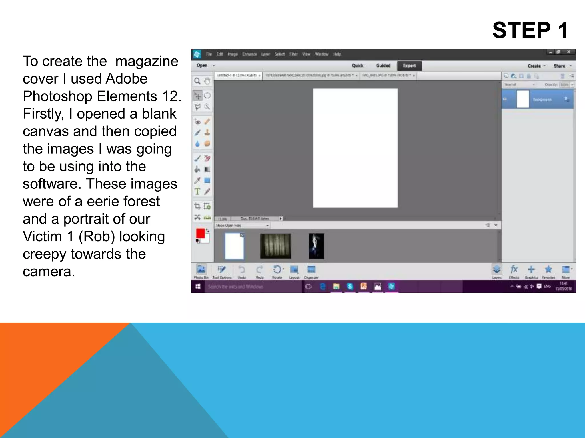
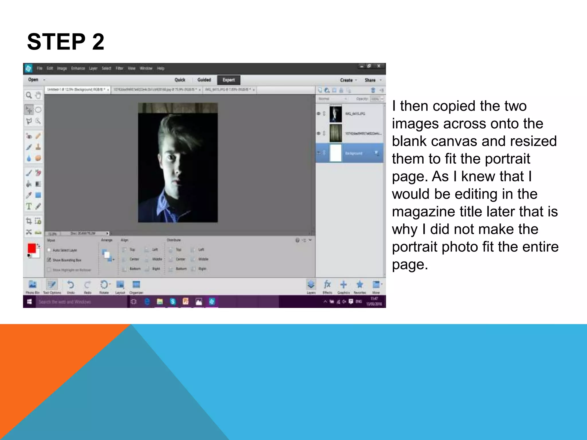
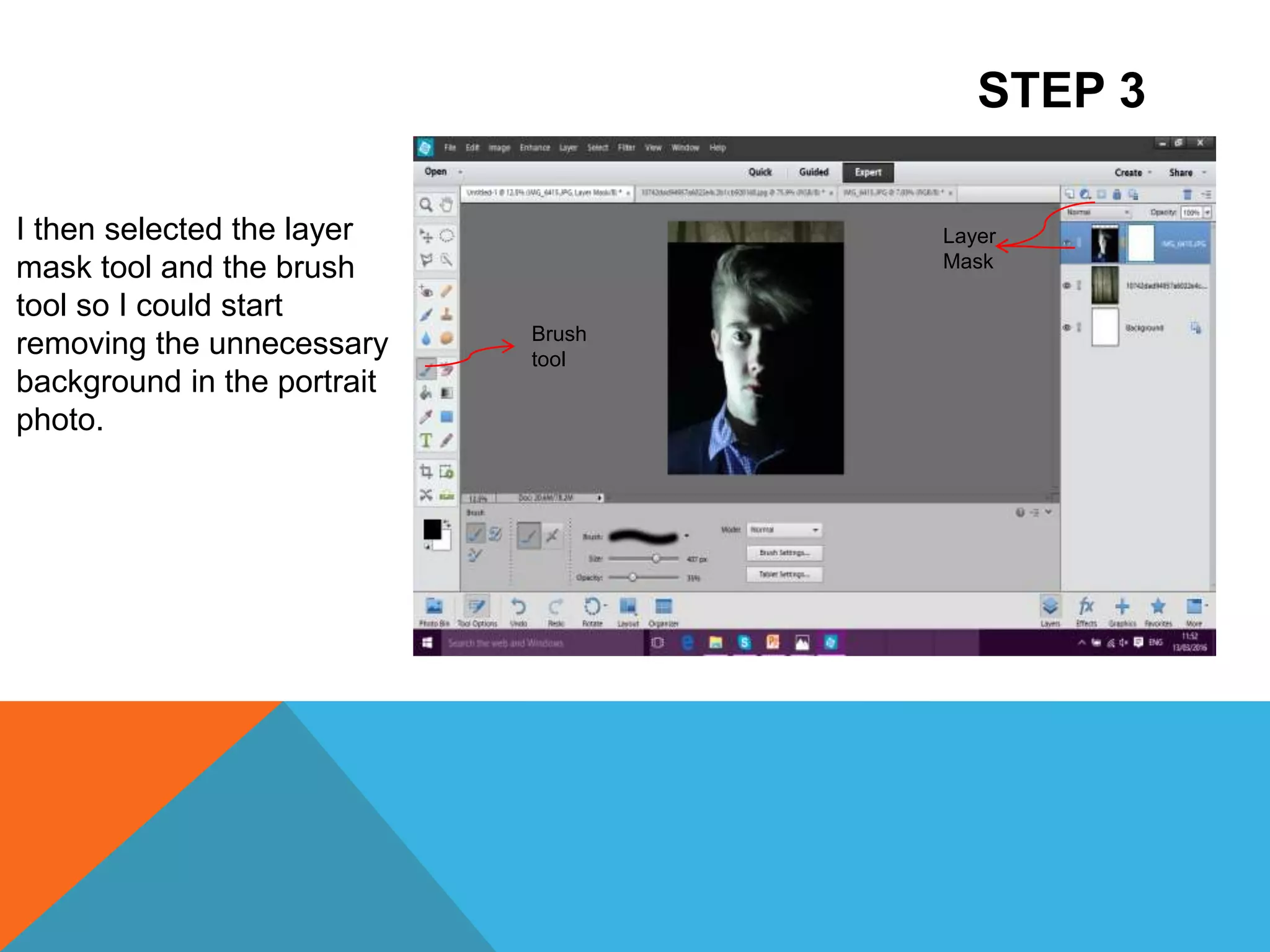
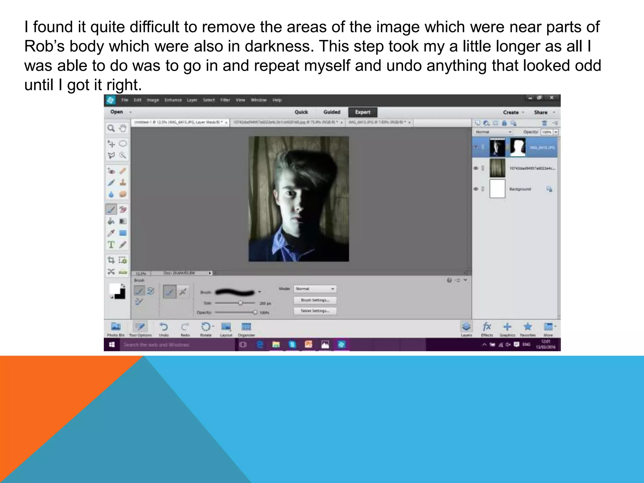
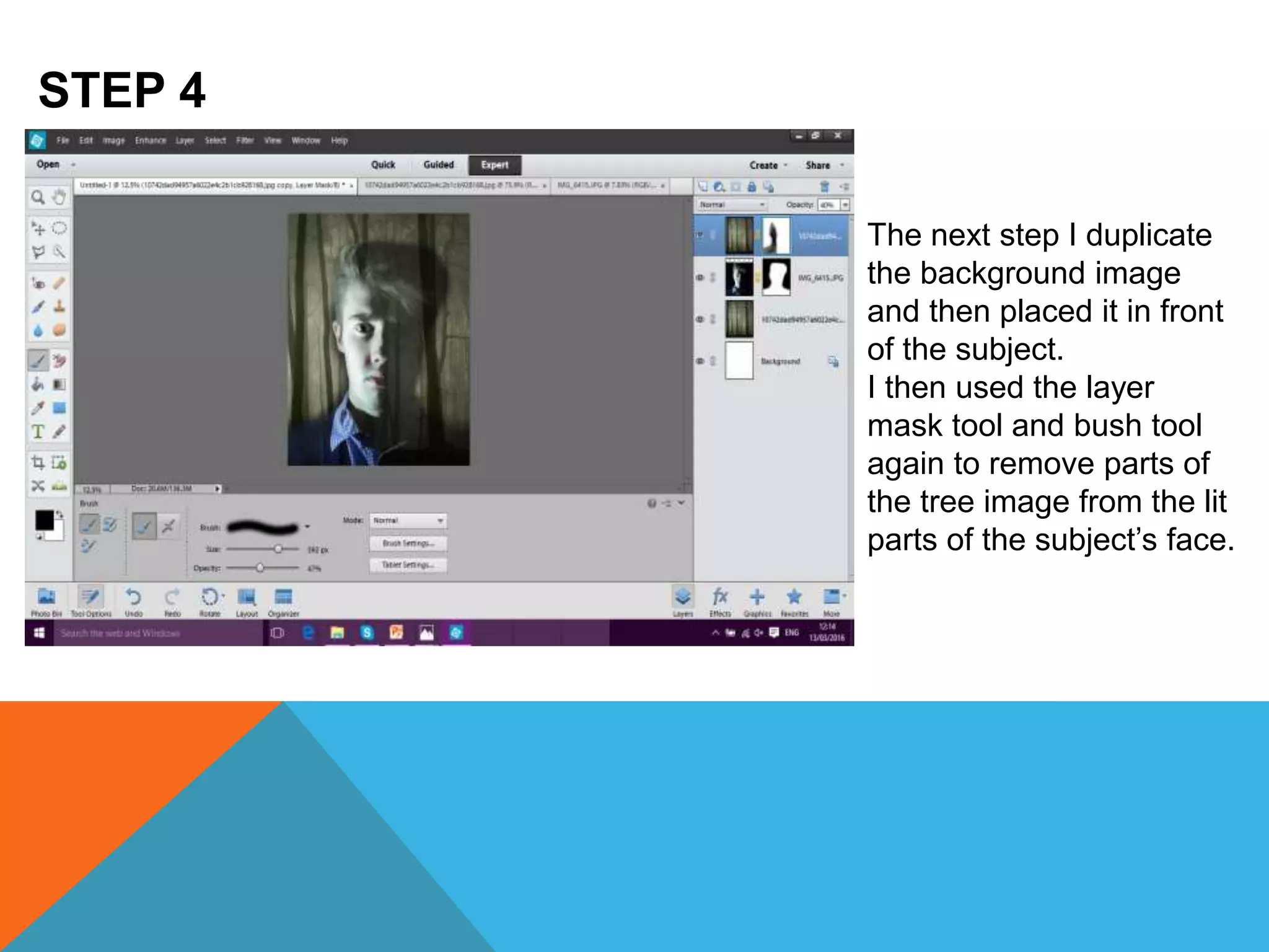
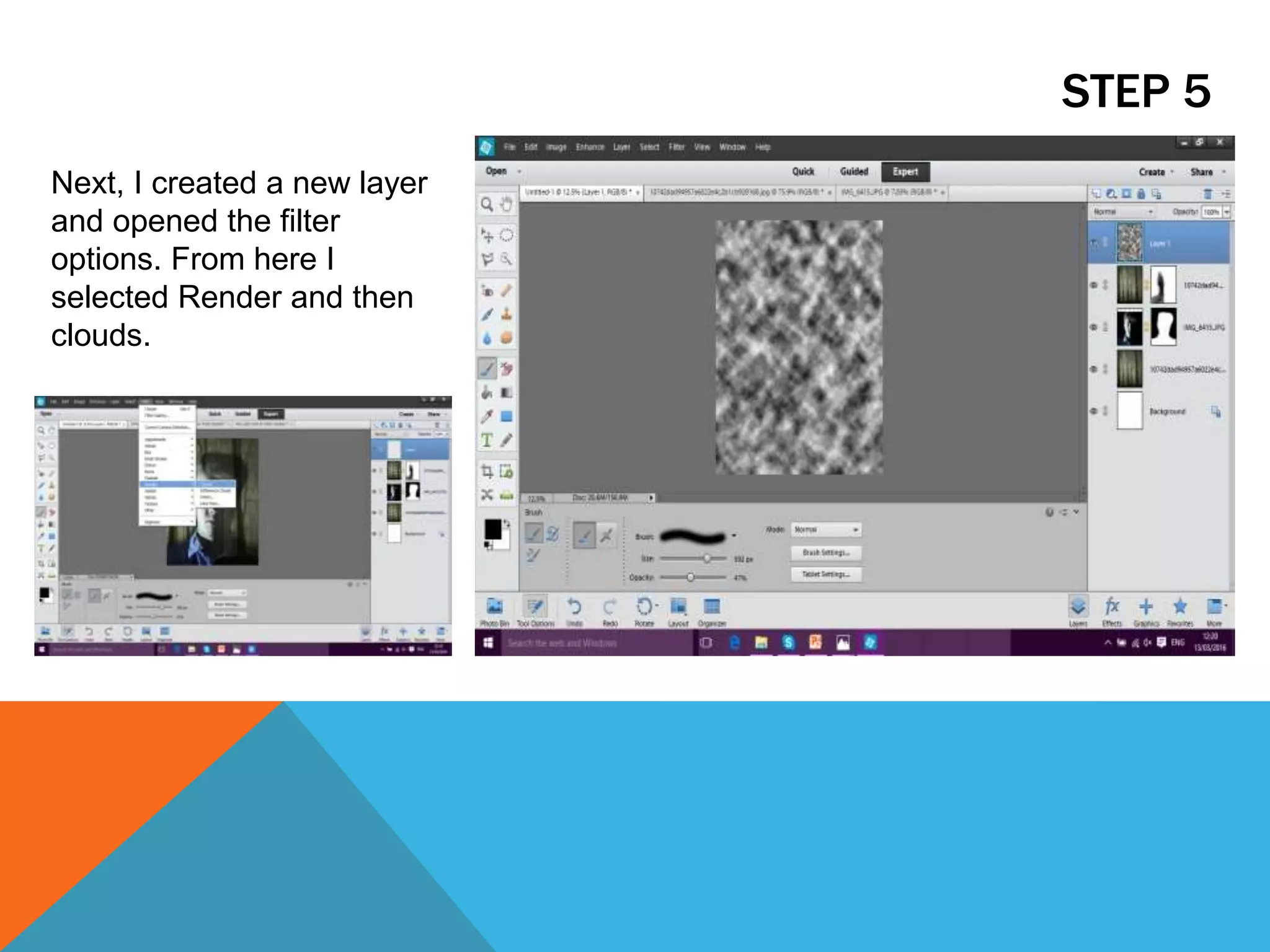
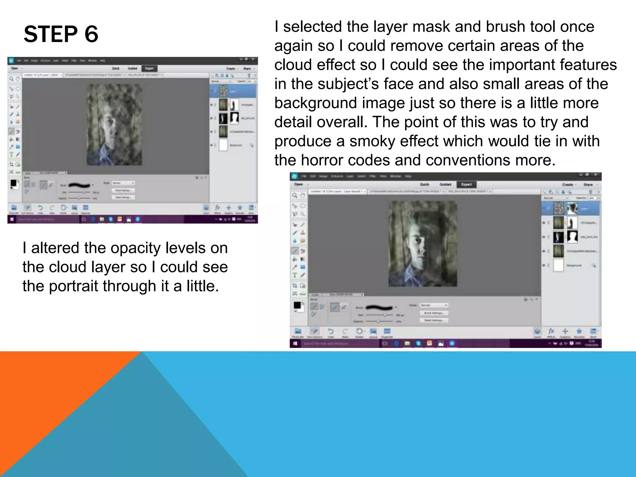
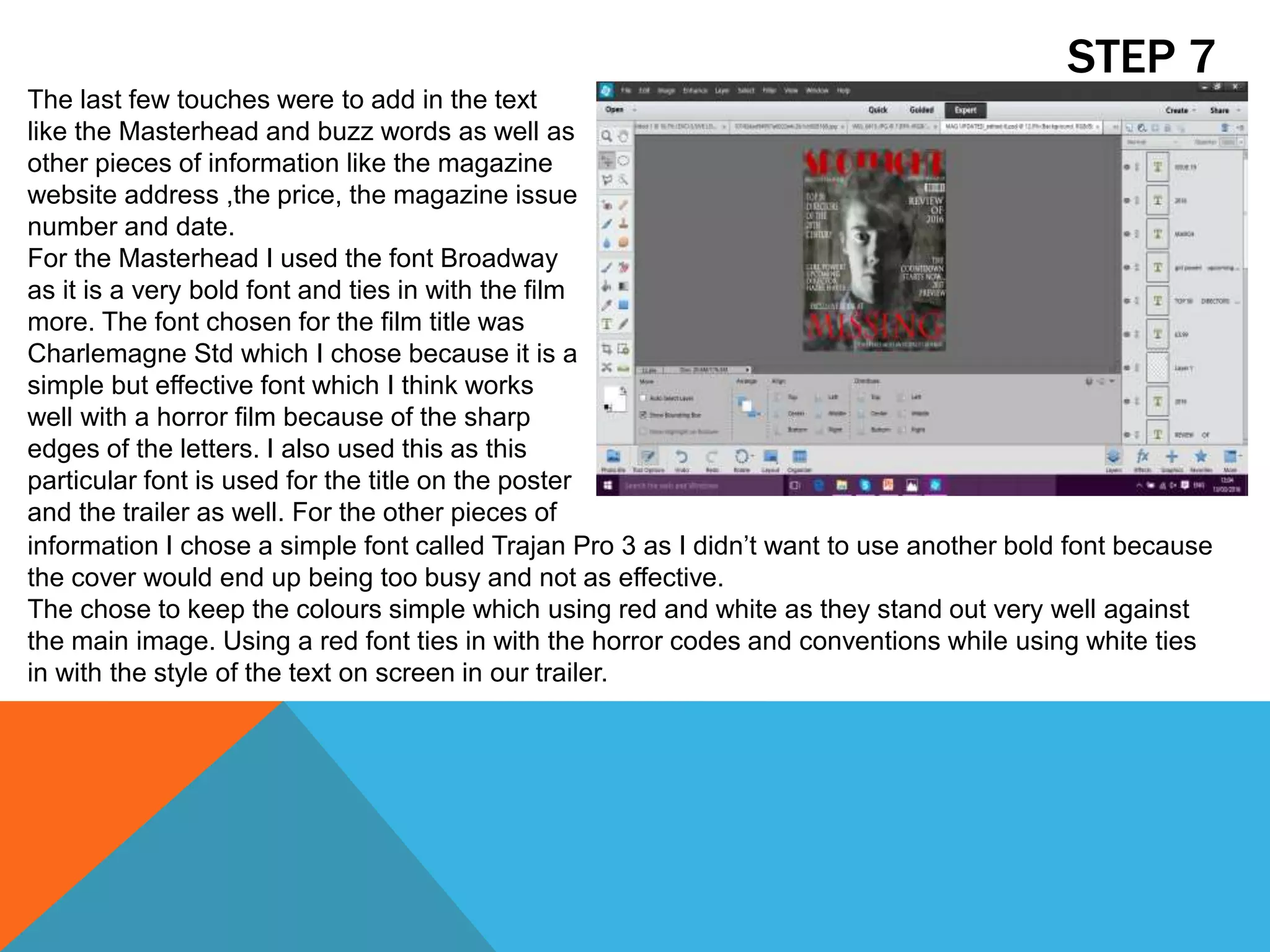
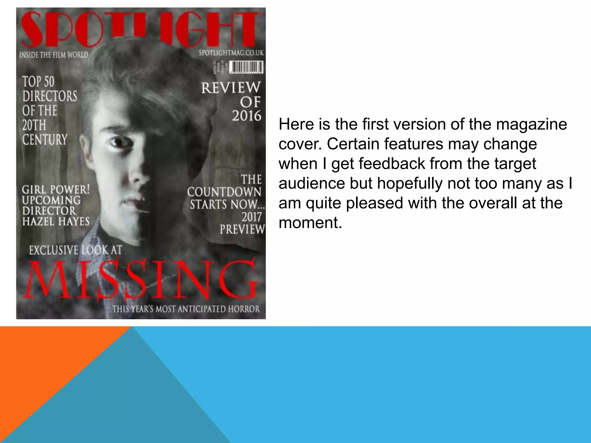
STEP 1
To create the magazine
cover I used Adobe
Photoshop Elements 12.
Firstly, I opened a blank
canvas and then copied
the images I was going
to be using into the
software. These images
were of a eerie forest
and a portrait of our
Victim 1 (Rob) looking
creepy towards the
camera.
STEP 2
I then copied the two
images across onto the
blank canvas and resized
them to fit the portrait
page. As I knew that I
would be editing in the
magazine title later that is
why I did not make the
portrait photo fit the entire
page.
STEP 3
I then selected the layer
mask tool and the brush
tool so I could start
removing the unnecessary
background in the portrait
photo.
Layer
Mask
Brush
tool
I found it quite difficult to remove the areas of the image which were near parts of
Rob’s body which were also in darkness. This step took my a little longer as all I
was able to do was to go in and repeat myself and undo anything that looked odd
until I got it right.
STEP 4
The next step I duplicate
the background image
and then placed it in front
of the subject.
I then used the layer
mask tool and bush tool
again to remove parts of
the tree image from the lit
parts of the subject’s face.
STEP 5
Next, I created a new layer
and opened the filter
options. From here I
selected Render and then
clouds.
STEP 6
I altered the opacity levels on
the cloud layer so I could see
the portrait through it a little.
I selected the layer mask and brush tool once
again so I could remove certain areas of the
cloud effect so I could see the important features
in the subject’s face and also small areas of the
background image just so there is a little more
detail overall. The point of this was to try and
produce a smoky effect which would tie in with
the horror codes and conventions more.
STEP 7
The last few touches were to add in the text
like the Masterhead and buzz words as well as
other pieces of information like the magazine
website address ,the price, the magazine issue
number and date.
For the Masterhead I used the font Broadway
as it is a very bold font and ties in with the film
more. The font chosen for the film title was
Charlemagne Std which I chose because it is a
simple but effective font which I think works
well with a horror film because of the sharp
edges of the letters. I also used this as this
particular font is used for the title on the poster
and the trailer as well. For the other pieces of
information I chose a simple font called Trajan Pro 3 as I didn’t want to use another bold font because
the cover would end up being too busy and not as effective.
The chose to keep the colours simple which using red and white as they stand out very well against
the main image. Using a red font ties in with the horror codes and conventions while using white ties
in with the style of the text on screen in our trailer.
Here is the first version of the magazine
cover. Certain features may change
when I get feedback from the target
audience but hopefully not too many as I
am quite pleased with the overall at the
moment.

The Editing Process of making the Magazine Cover

  • 2.
    STEP 1 To createthe magazine cover I used Adobe Photoshop Elements 12. Firstly, I opened a blank canvas and then copied the images I was going to be using into the software. These images were of a eerie forest and a portrait of our Victim 1 (Rob) looking creepy towards the camera.
  • 3.
    STEP 2 I thencopied the two images across onto the blank canvas and resized them to fit the portrait page. As I knew that I would be editing in the magazine title later that is why I did not make the portrait photo fit the entire page.
  • 4.
    STEP 3 I thenselected the layer mask tool and the brush tool so I could start removing the unnecessary background in the portrait photo. Layer Mask Brush tool
  • 5.
    I found itquite difficult to remove the areas of the image which were near parts of Rob’s body which were also in darkness. This step took my a little longer as all I was able to do was to go in and repeat myself and undo anything that looked odd until I got it right.
  • 6.
    STEP 4 The nextstep I duplicate the background image and then placed it in front of the subject. I then used the layer mask tool and bush tool again to remove parts of the tree image from the lit parts of the subject’s face.
  • 7.
    STEP 5 Next, Icreated a new layer and opened the filter options. From here I selected Render and then clouds.
  • 8.
    STEP 6 I alteredthe opacity levels on the cloud layer so I could see the portrait through it a little. I selected the layer mask and brush tool once again so I could remove certain areas of the cloud effect so I could see the important features in the subject’s face and also small areas of the background image just so there is a little more detail overall. The point of this was to try and produce a smoky effect which would tie in with the horror codes and conventions more.
  • 9.
    STEP 7 The lastfew touches were to add in the text like the Masterhead and buzz words as well as other pieces of information like the magazine website address ,the price, the magazine issue number and date. For the Masterhead I used the font Broadway as it is a very bold font and ties in with the film more. The font chosen for the film title was Charlemagne Std which I chose because it is a simple but effective font which I think works well with a horror film because of the sharp edges of the letters. I also used this as this particular font is used for the title on the poster and the trailer as well. For the other pieces of information I chose a simple font called Trajan Pro 3 as I didn’t want to use another bold font because the cover would end up being too busy and not as effective. The chose to keep the colours simple which using red and white as they stand out very well against the main image. Using a red font ties in with the horror codes and conventions while using white ties in with the style of the text on screen in our trailer.
  • 10.
    Here is thefirst version of the magazine cover. Certain features may change when I get feedback from the target audience but hopefully not too many as I am quite pleased with the overall at the moment.