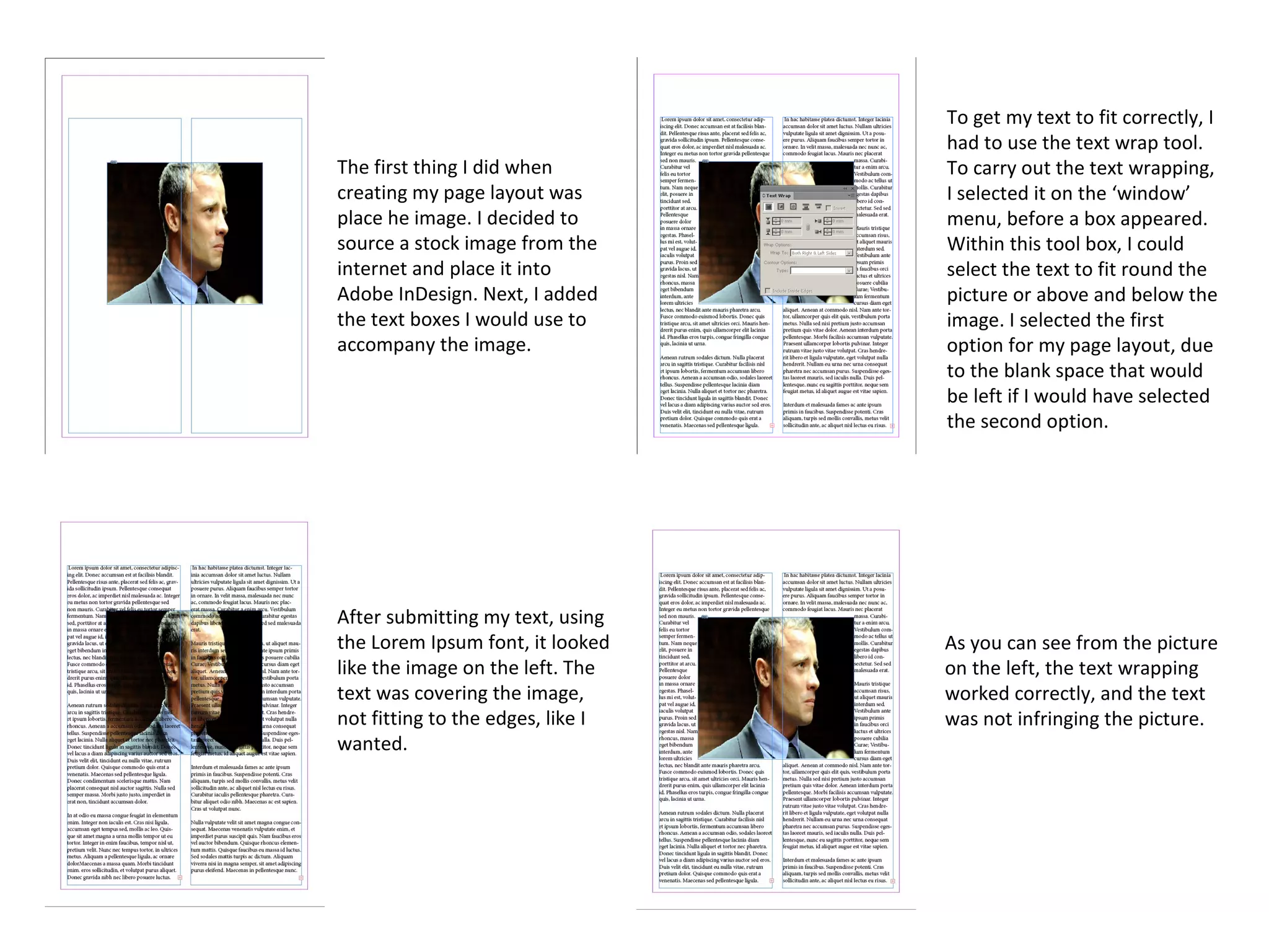
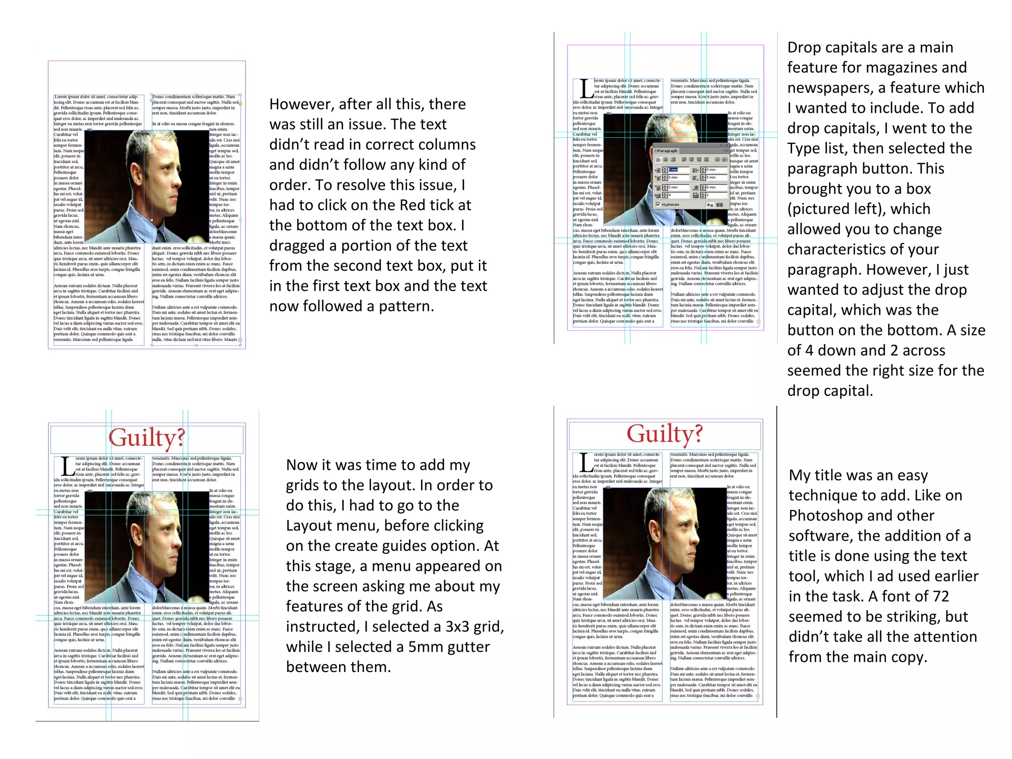
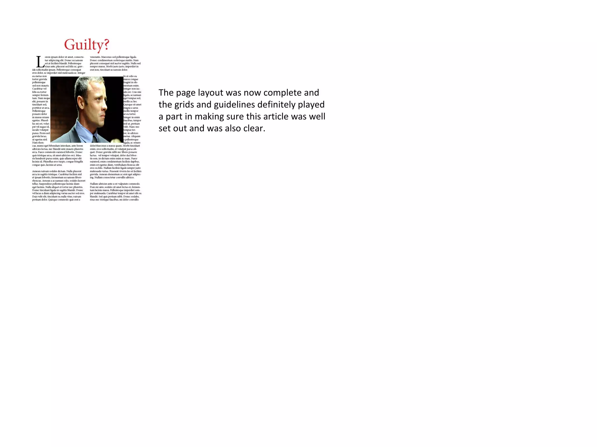
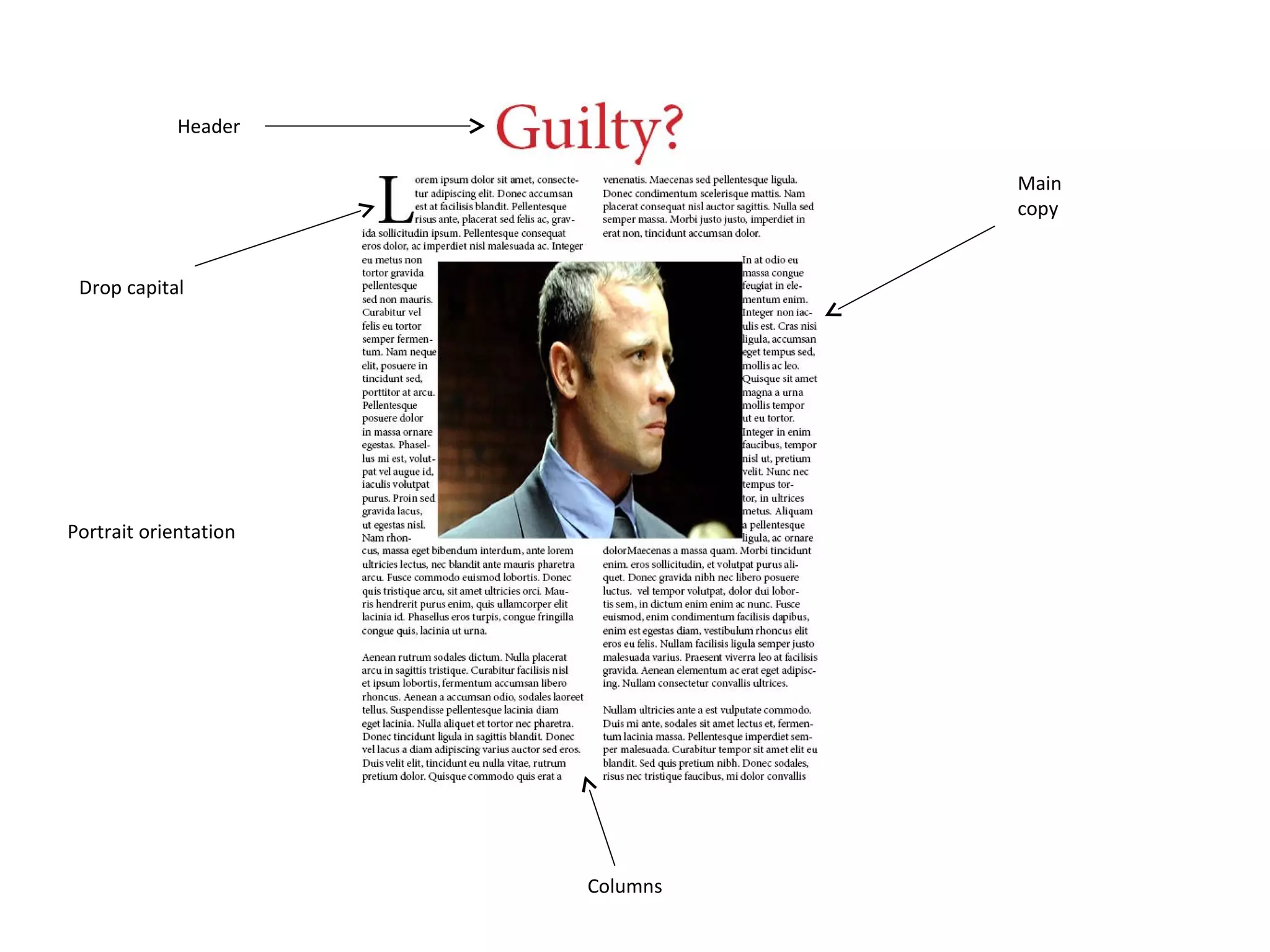
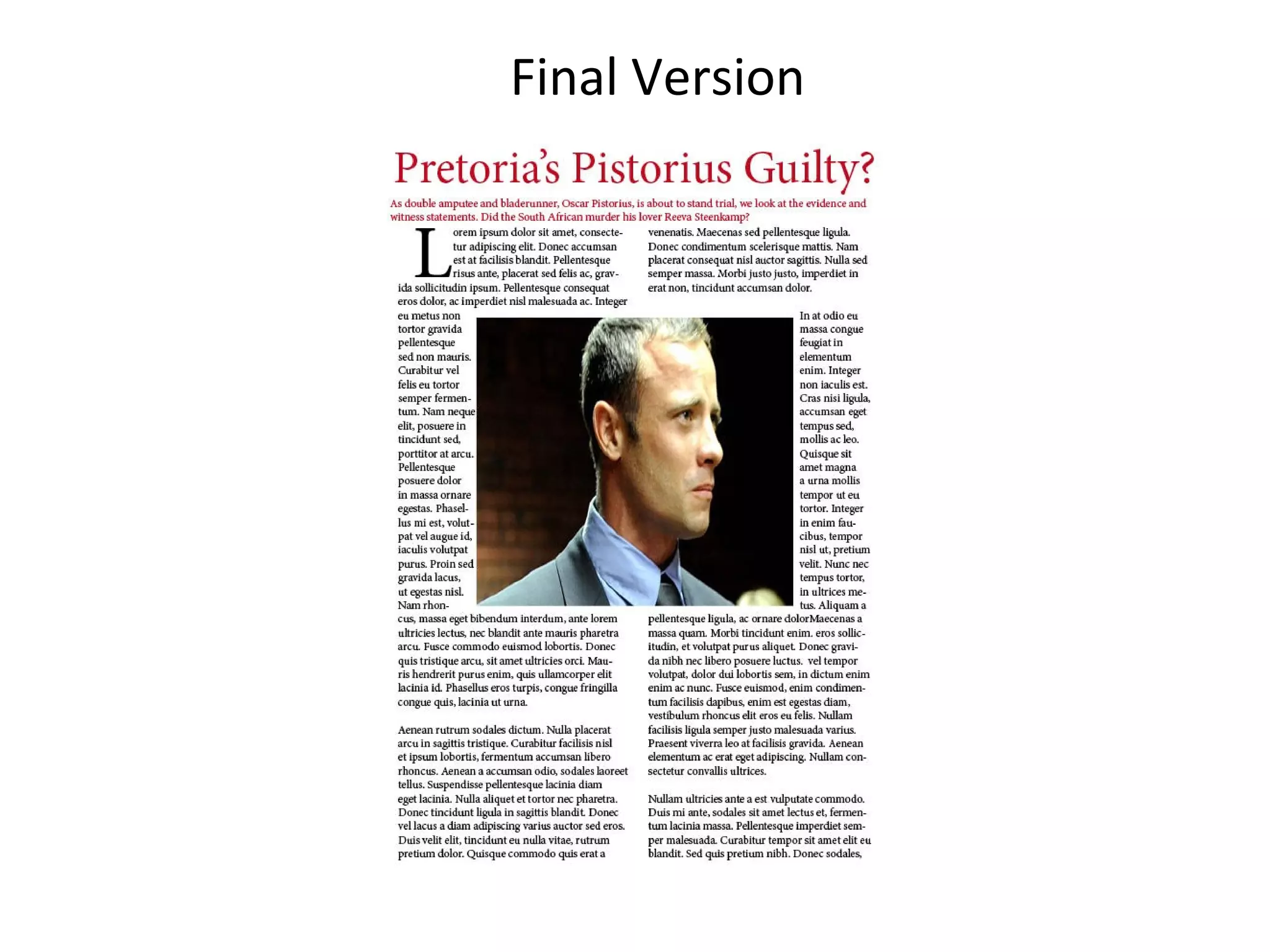
Page Layout
Task 2
Patrick Gouldsbrough
The first thing I did when
creating my page layout was
place he image. I decided to
source a stock image from the
internet and place it into
Adobe InDesign. Next, I added
the text boxes I would use to
accompany the image.
After submitting my text, using
the Lorem Ipsum font, it looked
like the image on the left. The
text was covering the image,
not fitting to the edges, like I
wanted.
To get my text to fit correctly, I
had to use the text wrap tool.
To carry out the text wrapping,
I selected it on the ‘window’
menu, before a box appeared.
Within this tool box, I could
select the text to fit round the
picture or above and below the
image. I selected the first
option for my page layout, due
to the blank space that would
be left if I would have selected
the second option.
As you can see from the picture
on the left, the text wrapping
worked correctly, and the text
was not infringing the picture.
However, after all this, there
was still an issue. The text
didn’t read in correct columns
and didn’t follow any kind of
order. To resolve this issue, I
had to click on the Red tick at
the bottom of the text box. I
dragged a portion of the text
from the second text box, put it
in the first text box and the text
now followed a pattern.
Now it was time to add my
grids to the layout. In order to
do this, I had to go to the
Layout menu, before clicking
on the create guides option. At
this stage, a menu appeared on
the screen asking me about my
features of the grid. As
instructed, I selected a 3x3 grid,
while I selected a 5mm gutter
between them.
Drop capitals are a main
feature for magazines and
newspapers, a feature which
I wanted to include. To add
drop capitals, I went to the
Type list, then selected the
paragraph button. This
brought you to a box
(pictured left), which
allowed you to change
characteristics of your
paragraph. However, I just
wanted to adjust the drop
capital, which was the
button on the bottom. A size
of 4 down and 2 across
seemed the right size for the
drop capital.
My title was an easy
technique to add. Like on
Photoshop and other
software, the addition of a
title is done using the text
tool, which I ad used earlier
in the task. A font of 72
seemed to be striking, but
didn’t take all the attention
from the main copy.
The page layout was now complete and
the grids and guidelines definitely played
a part in making sure this article was well
set out and was also clear.
Header
Drop capital
Main
copy
Columns
Portrait orientation
Final Version
Final Version

Page layout task 2

  • 1.
  • 2.
    The first thingI did when creating my page layout was place he image. I decided to source a stock image from the internet and place it into Adobe InDesign. Next, I added the text boxes I would use to accompany the image. After submitting my text, using the Lorem Ipsum font, it looked like the image on the left. The text was covering the image, not fitting to the edges, like I wanted. To get my text to fit correctly, I had to use the text wrap tool. To carry out the text wrapping, I selected it on the ‘window’ menu, before a box appeared. Within this tool box, I could select the text to fit round the picture or above and below the image. I selected the first option for my page layout, due to the blank space that would be left if I would have selected the second option. As you can see from the picture on the left, the text wrapping worked correctly, and the text was not infringing the picture.
  • 3.
    However, after allthis, there was still an issue. The text didn’t read in correct columns and didn’t follow any kind of order. To resolve this issue, I had to click on the Red tick at the bottom of the text box. I dragged a portion of the text from the second text box, put it in the first text box and the text now followed a pattern. Now it was time to add my grids to the layout. In order to do this, I had to go to the Layout menu, before clicking on the create guides option. At this stage, a menu appeared on the screen asking me about my features of the grid. As instructed, I selected a 3x3 grid, while I selected a 5mm gutter between them. Drop capitals are a main feature for magazines and newspapers, a feature which I wanted to include. To add drop capitals, I went to the Type list, then selected the paragraph button. This brought you to a box (pictured left), which allowed you to change characteristics of your paragraph. However, I just wanted to adjust the drop capital, which was the button on the bottom. A size of 4 down and 2 across seemed the right size for the drop capital. My title was an easy technique to add. Like on Photoshop and other software, the addition of a title is done using the text tool, which I ad used earlier in the task. A font of 72 seemed to be striking, but didn’t take all the attention from the main copy.
  • 4.
    The page layoutwas now complete and the grids and guidelines definitely played a part in making sure this article was well set out and was also clear.
  • 5.
  • 6.
  • 7.