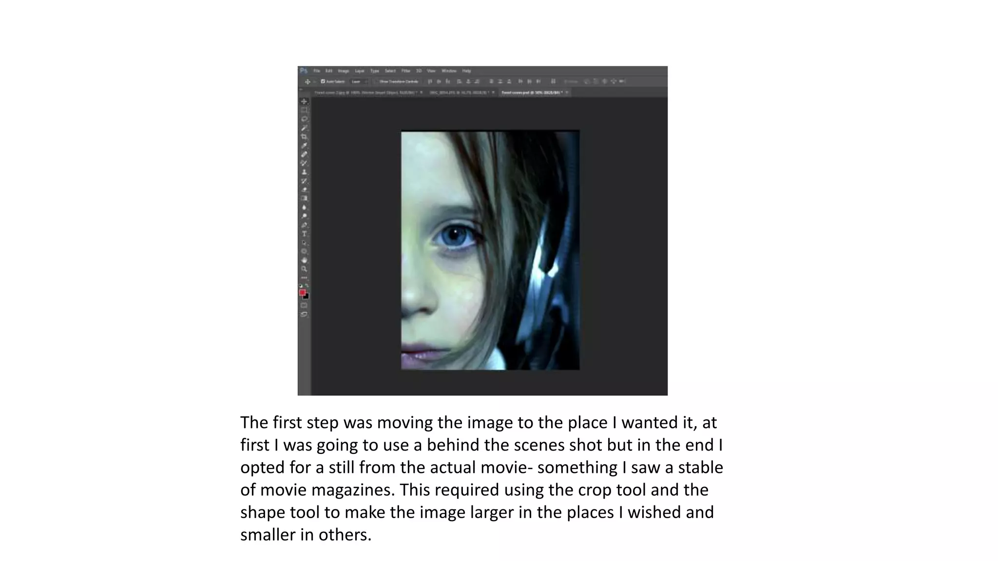
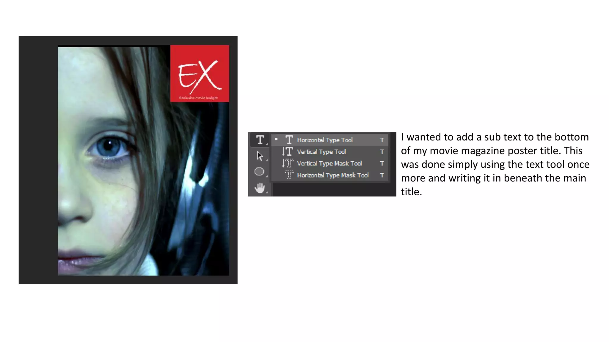
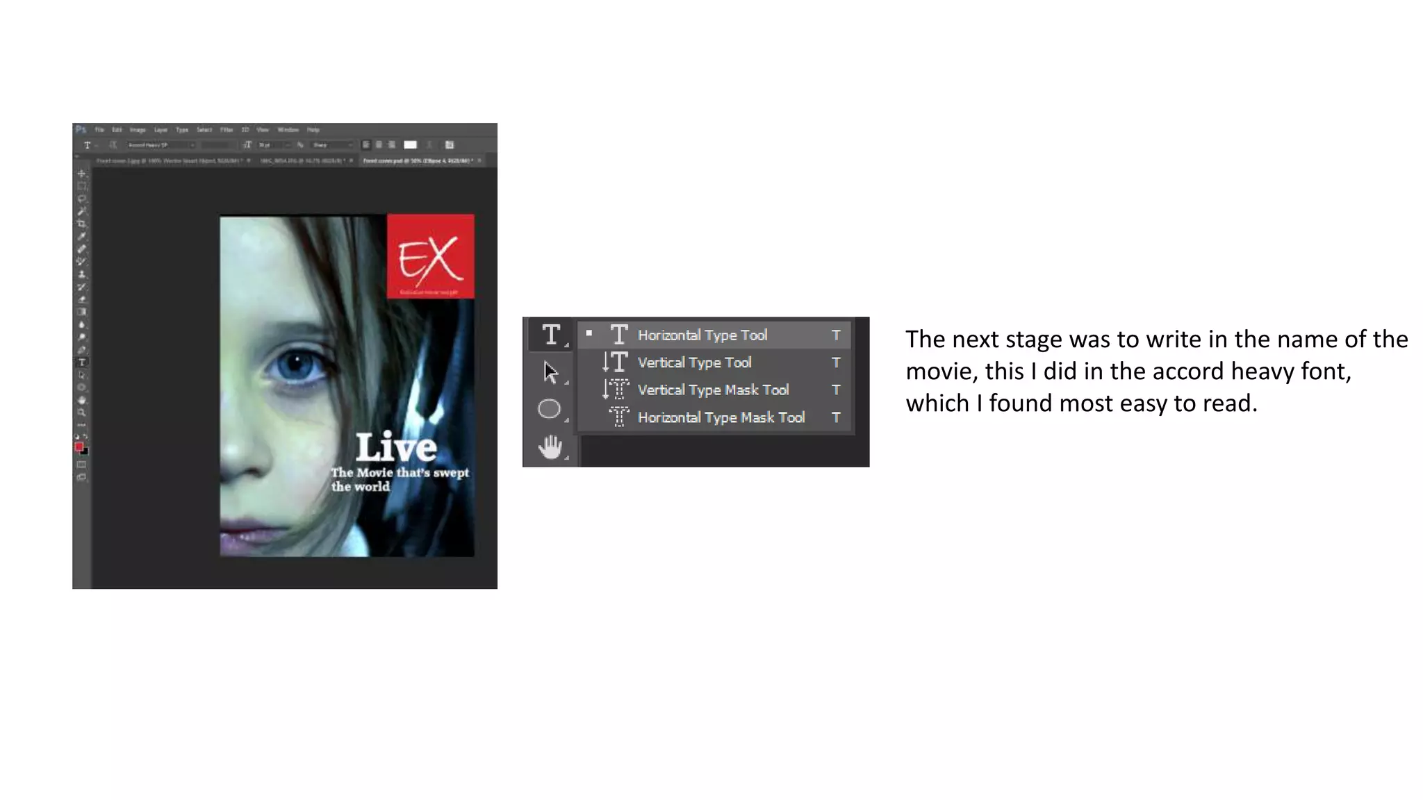
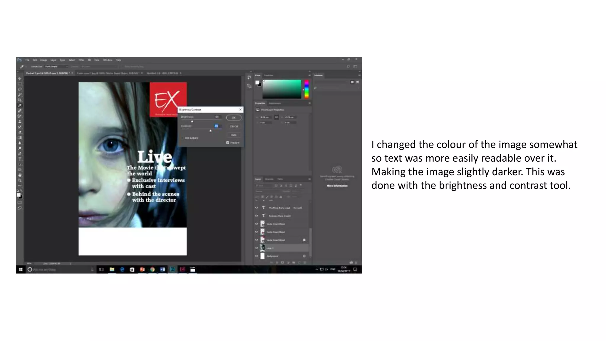
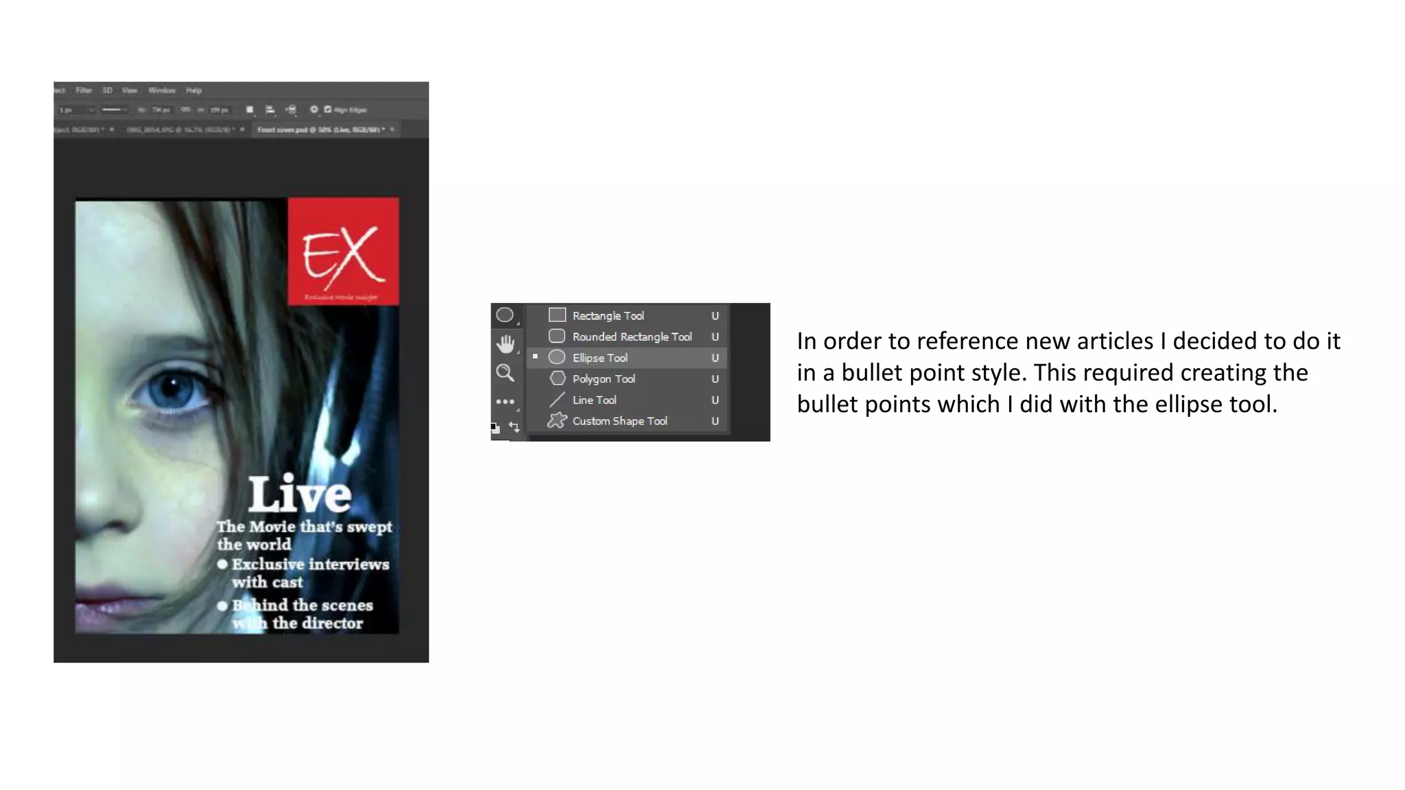
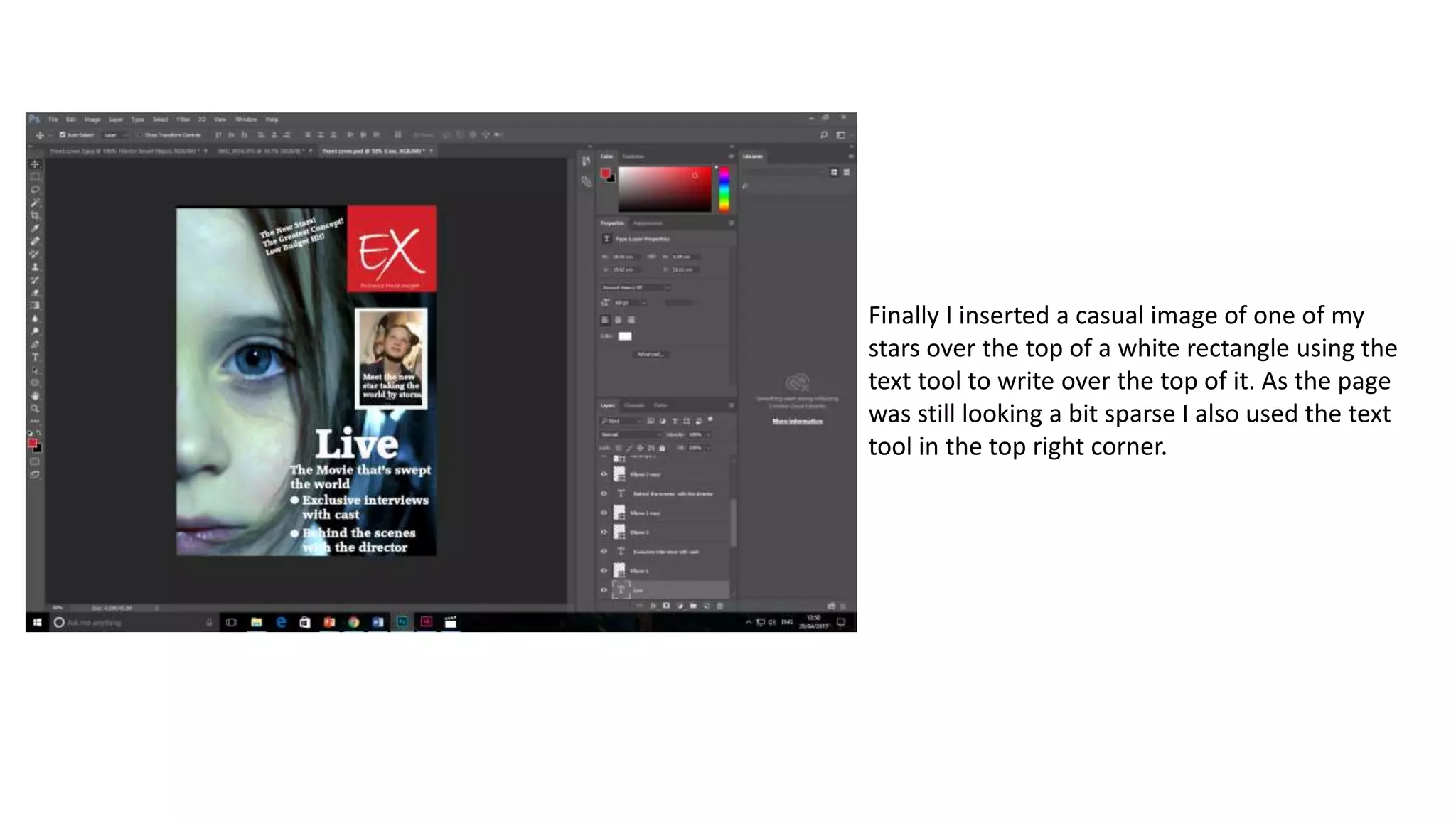
Making the movie magazine
front cover first draft
The first step was moving the image to the place I wanted it, at
first I was going to use a behind the scenes shot but in the end I
opted for a still from the actual movie- something I saw a stable
of movie magazines. This required using the crop tool and the
shape tool to make the image larger in the places I wished and
smaller in others.
The next stage was to insert a red rectangle into
the corner of the image that would become the
base for my movie magazine title. EX. This was
done using the rectangle tool and colour tool
using the red colour.
The next stage was to insert the text of
my movie magazine front cover, this was
done using the text tool. I used the
Bradley hand font for my title: EX. This
was then enlarged and then two letter’s
separated to different layers so they
could be moved closer together than if
written in one text box.
I wanted to add a sub text to the bottom
of my movie magazine poster title. This
was done simply using the text tool once
more and writing it in beneath the main
title.
The next stage was to write in the name of the
movie, this I did in the accord heavy font,
which I found most easy to read.
I changed the colour of the image somewhat
so text was more easily readable over it.
Making the image slightly darker. This was
done with the brightness and contrast tool.
In order to reference new articles I decided to do it
in a bullet point style. This required creating the
bullet points which I did with the ellipse tool.
Finally I inserted a casual image of one of my
stars over the top of a white rectangle using the
text tool to write over the top of it. As the page
was still looking a bit sparse I also used the text
tool in the top right corner.
Finished First Draft:

Making the movie magazine front cover first draft

  • 1.
    Making the moviemagazine front cover first draft
  • 2.
    The first stepwas moving the image to the place I wanted it, at first I was going to use a behind the scenes shot but in the end I opted for a still from the actual movie- something I saw a stable of movie magazines. This required using the crop tool and the shape tool to make the image larger in the places I wished and smaller in others.
  • 3.
    The next stagewas to insert a red rectangle into the corner of the image that would become the base for my movie magazine title. EX. This was done using the rectangle tool and colour tool using the red colour.
  • 4.
    The next stagewas to insert the text of my movie magazine front cover, this was done using the text tool. I used the Bradley hand font for my title: EX. This was then enlarged and then two letter’s separated to different layers so they could be moved closer together than if written in one text box.
  • 5.
    I wanted toadd a sub text to the bottom of my movie magazine poster title. This was done simply using the text tool once more and writing it in beneath the main title.
  • 6.
    The next stagewas to write in the name of the movie, this I did in the accord heavy font, which I found most easy to read.
  • 7.
    I changed thecolour of the image somewhat so text was more easily readable over it. Making the image slightly darker. This was done with the brightness and contrast tool.
  • 8.
    In order toreference new articles I decided to do it in a bullet point style. This required creating the bullet points which I did with the ellipse tool.
  • 9.
    Finally I inserteda casual image of one of my stars over the top of a white rectangle using the text tool to write over the top of it. As the page was still looking a bit sparse I also used the text tool in the top right corner.
  • 10.