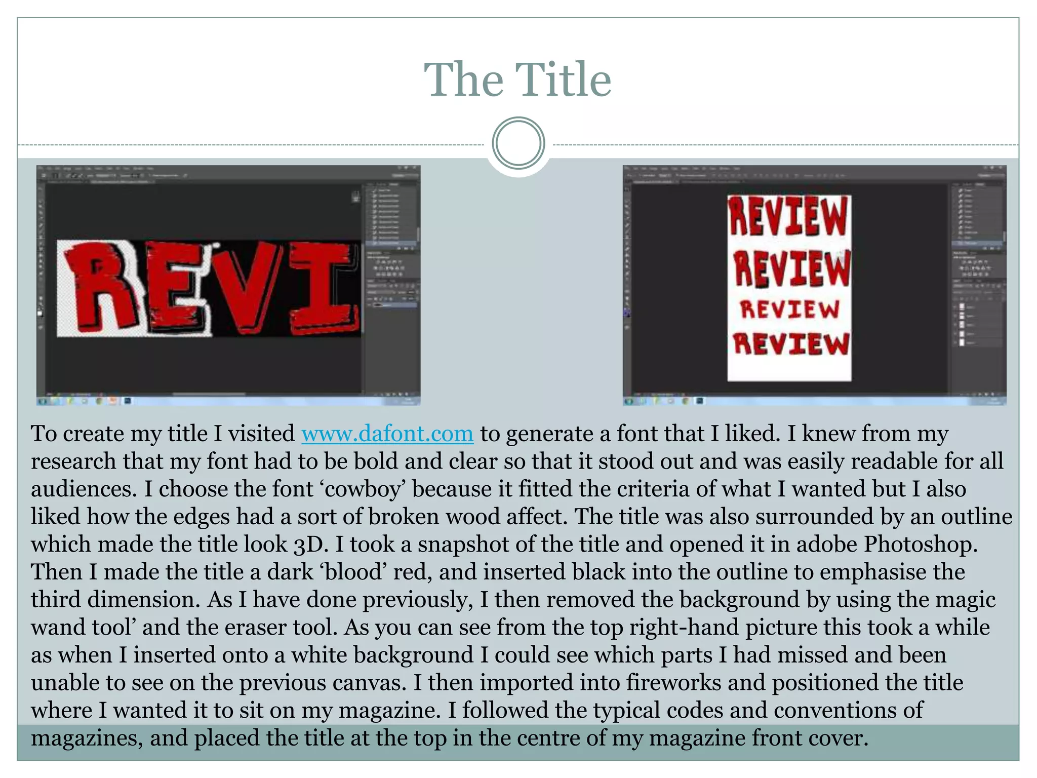
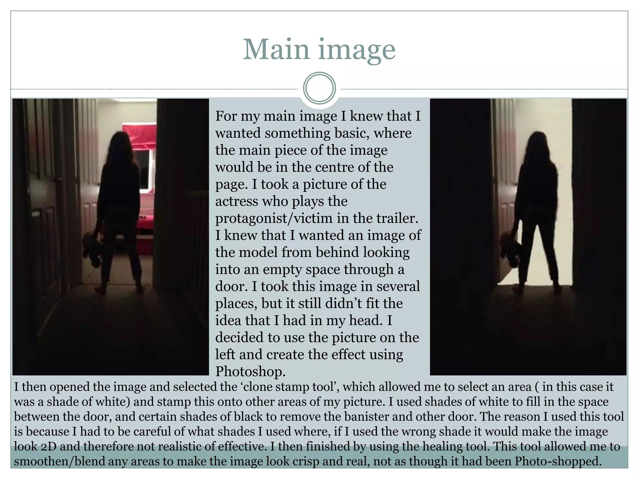
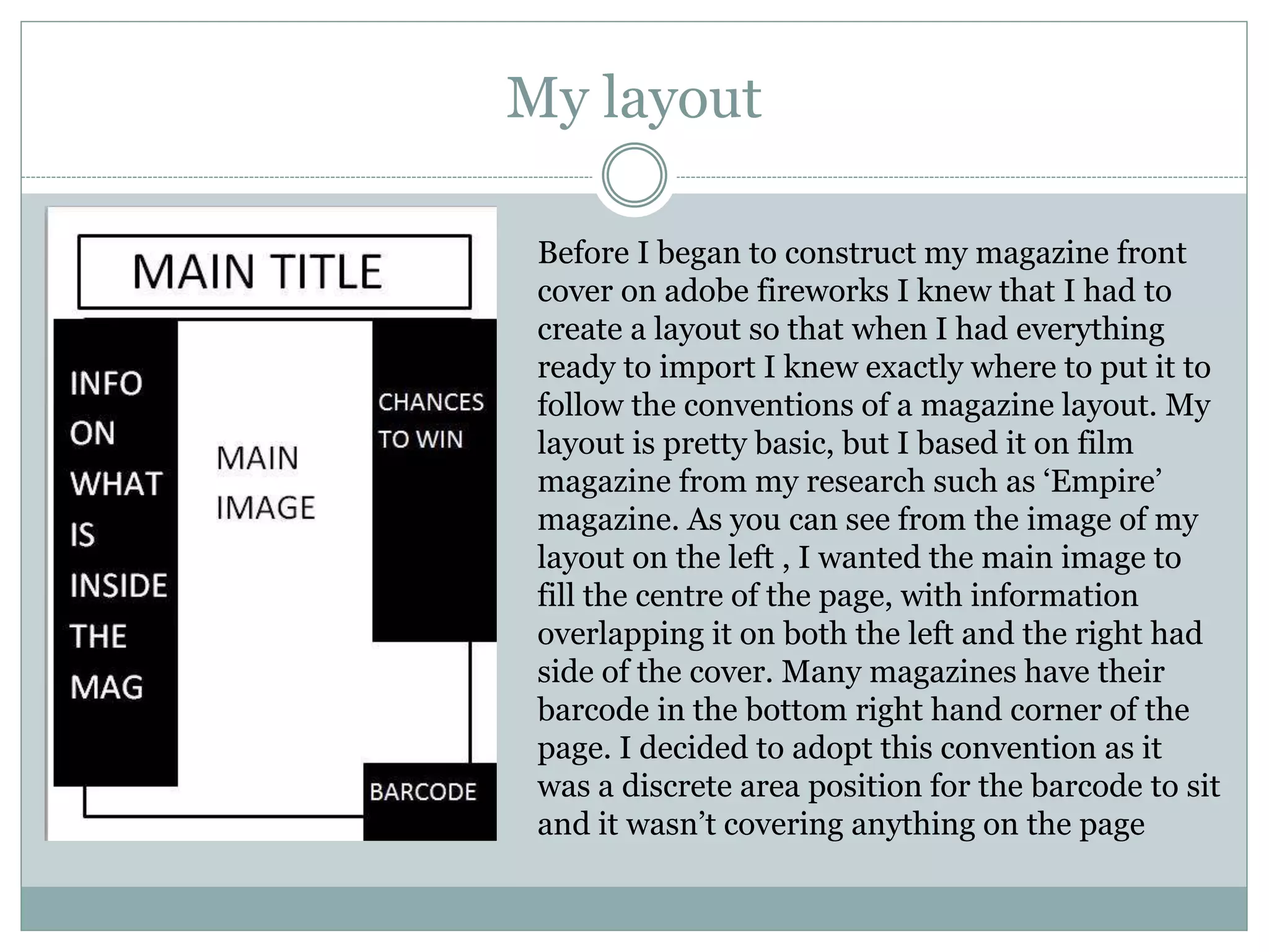
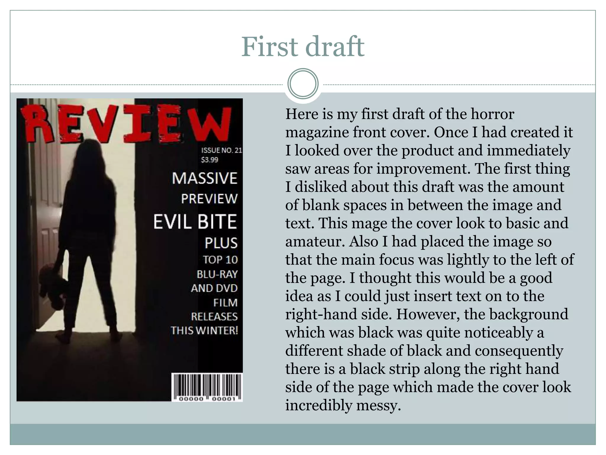
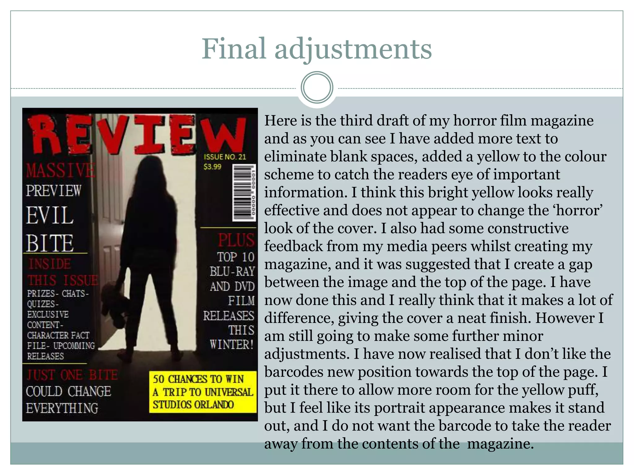
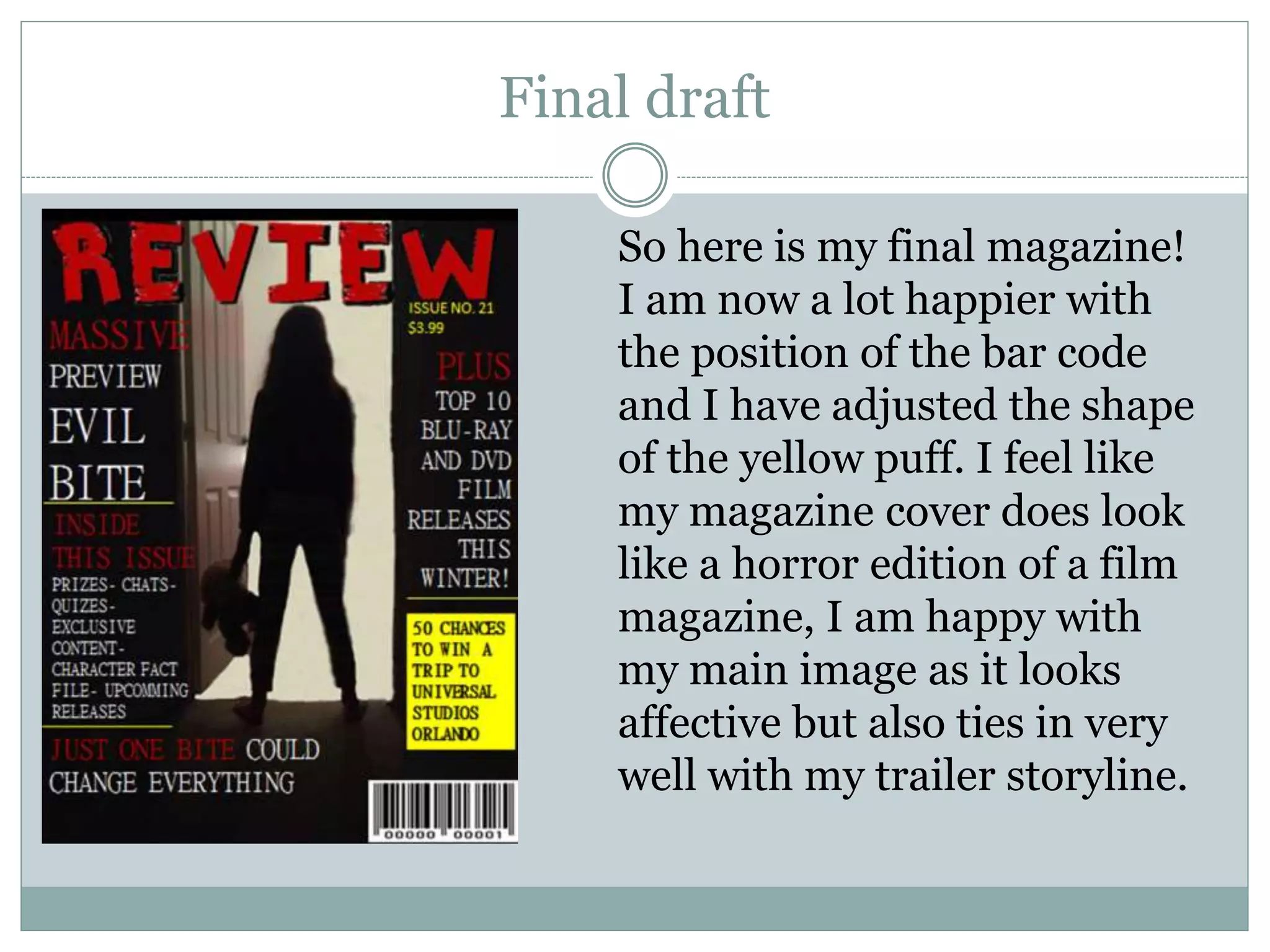
B Y S O P H I E C A N N I N G
Creating My Film Magazine
Front Cover
The Title
To create my title I visited www.dafont.com to generate a font that I liked. I knew from my
research that my font had to be bold and clear so that it stood out and was easily readable for all
audiences. I choose the font ‘cowboy’ because it fitted the criteria of what I wanted but I also
liked how the edges had a sort of broken wood affect. The title was also surrounded by an outline
which made the title look 3D. I took a snapshot of the title and opened it in adobe Photoshop.
Then I made the title a dark ‘blood’ red, and inserted black into the outline to emphasise the
third dimension. As I have done previously, I then removed the background by using the magic
wand tool’ and the eraser tool. As you can see from the top right-hand picture this took a while
as when I inserted onto a white background I could see which parts I had missed and been
unable to see on the previous canvas. I then imported into fireworks and positioned the title
where I wanted it to sit on my magazine. I followed the typical codes and conventions of
magazines, and placed the title at the top in the centre of my magazine front cover.
Main image
For my main image I knew that I
wanted something basic, where
the main piece of the image
would be in the centre of the
page. I took a picture of the
actress who plays the
protagonist/victim in the trailer.
I knew that I wanted an image of
the model from behind looking
into an empty space through a
door. I took this image in several
places, but it still didn’t fit the
idea that I had in my head. I
decided to use the picture on the
left and create the effect using
Photoshop.
I then opened the image and selected the ‘clone stamp tool’, which allowed me to select an area ( in this case it
was a shade of white) and stamp this onto other areas of my picture. I used shades of white to fill in the space
between the door, and certain shades of black to remove the banister and other door. The reason I used this tool
is because I had to be careful of what shades I used where, if I used the wrong shade it would make the image
look 2D and therefore not realistic of effective. I then finished by using the healing tool. This tool allowed me to
smoothen/blend any areas to make the image look crisp and real, not as though it had been Photo-shopped.
My layout
Before I began to construct my magazine front
cover on adobe fireworks I knew that I had to
create a layout so that when I had everything
ready to import I knew exactly where to put it to
follow the conventions of a magazine layout. My
layout is pretty basic, but I based it on film
magazine from my research such as ‘Empire’
magazine. As you can see from the image of my
layout on the left , I wanted the main image to
fill the centre of the page, with information
overlapping it on both the left and the right had
side of the cover. Many magazines have their
barcode in the bottom right hand corner of the
page. I decided to adopt this convention as it
was a discrete area position for the barcode to sit
and it wasn’t covering anything on the page
First draft
Here is my first draft of the horror
magazine front cover. Once I had created it
I looked over the product and immediately
saw areas for improvement. The first thing
I disliked about this draft was the amount
of blank spaces in between the image and
text. This mage the cover look to basic and
amateur. Also I had placed the image so
that the main focus was lightly to the left of
the page. I thought this would be a good
idea as I could just insert text on to the
right-hand side. However, the background
which was black was quite noticeably a
different shade of black and consequently
there is a black strip along the right hand
side of the page which made the cover look
incredibly messy.
Second draft
For the second draft I decided to centralise the
image to eliminate the black strip. Doing this made
the image look more professional as it filled the
page. I also added more text to minimise the
amount of blank spaces I had around the cover.
However I knew that I needed to add even more
text because there were still obvious blank spaces
around the page. I also noticed that there was no
space on the top of the page, and I didn’t like how
the picture ended right at the top of the page, it
needed a small space between the top of the
picture and the top of the page. Also I felt like the
colour scheme looked a bit plain, so I decided to
challenge the typical codes and conventions of
horror colour schemes and use a bright yellow on
small parts of the cover. I also didn’t like the font I
was using so decided to change it from Calibri to
mingLiU-EXtB, to give it a slimmer appearance.
Final adjustments
Here is the third draft of my horror film magazine
and as you can see I have added more text to
eliminate blank spaces, added a yellow to the colour
scheme to catch the readers eye of important
information. I think this bright yellow looks really
effective and does not appear to change the ‘horror’
look of the cover. I also had some constructive
feedback from my media peers whilst creating my
magazine, and it was suggested that I create a gap
between the image and the top of the page. I have
now done this and I really think that it makes a lot of
difference, giving the cover a neat finish. However I
am still going to make some further minor
adjustments. I have now realised that I don’t like the
barcodes new position towards the top of the page. I
put it there to allow more room for the yellow puff,
but I feel like its portrait appearance makes it stand
out, and I do not want the barcode to take the reader
away from the contents of the magazine.
Final draft
So here is my final magazine!
I am now a lot happier with
the position of the bar code
and I have adjusted the shape
of the yellow puff. I feel like
my magazine cover does look
like a horror edition of a film
magazine, I am happy with
my main image as it looks
affective but also ties in very
well with my trailer storyline.

Magazine Creation

  • 1.
    B Y SO P H I E C A N N I N G Creating My Film Magazine Front Cover
  • 2.
    The Title To createmy title I visited www.dafont.com to generate a font that I liked. I knew from my research that my font had to be bold and clear so that it stood out and was easily readable for all audiences. I choose the font ‘cowboy’ because it fitted the criteria of what I wanted but I also liked how the edges had a sort of broken wood affect. The title was also surrounded by an outline which made the title look 3D. I took a snapshot of the title and opened it in adobe Photoshop. Then I made the title a dark ‘blood’ red, and inserted black into the outline to emphasise the third dimension. As I have done previously, I then removed the background by using the magic wand tool’ and the eraser tool. As you can see from the top right-hand picture this took a while as when I inserted onto a white background I could see which parts I had missed and been unable to see on the previous canvas. I then imported into fireworks and positioned the title where I wanted it to sit on my magazine. I followed the typical codes and conventions of magazines, and placed the title at the top in the centre of my magazine front cover.
  • 3.
    Main image For mymain image I knew that I wanted something basic, where the main piece of the image would be in the centre of the page. I took a picture of the actress who plays the protagonist/victim in the trailer. I knew that I wanted an image of the model from behind looking into an empty space through a door. I took this image in several places, but it still didn’t fit the idea that I had in my head. I decided to use the picture on the left and create the effect using Photoshop. I then opened the image and selected the ‘clone stamp tool’, which allowed me to select an area ( in this case it was a shade of white) and stamp this onto other areas of my picture. I used shades of white to fill in the space between the door, and certain shades of black to remove the banister and other door. The reason I used this tool is because I had to be careful of what shades I used where, if I used the wrong shade it would make the image look 2D and therefore not realistic of effective. I then finished by using the healing tool. This tool allowed me to smoothen/blend any areas to make the image look crisp and real, not as though it had been Photo-shopped.
  • 4.
    My layout Before Ibegan to construct my magazine front cover on adobe fireworks I knew that I had to create a layout so that when I had everything ready to import I knew exactly where to put it to follow the conventions of a magazine layout. My layout is pretty basic, but I based it on film magazine from my research such as ‘Empire’ magazine. As you can see from the image of my layout on the left , I wanted the main image to fill the centre of the page, with information overlapping it on both the left and the right had side of the cover. Many magazines have their barcode in the bottom right hand corner of the page. I decided to adopt this convention as it was a discrete area position for the barcode to sit and it wasn’t covering anything on the page
  • 5.
    First draft Here ismy first draft of the horror magazine front cover. Once I had created it I looked over the product and immediately saw areas for improvement. The first thing I disliked about this draft was the amount of blank spaces in between the image and text. This mage the cover look to basic and amateur. Also I had placed the image so that the main focus was lightly to the left of the page. I thought this would be a good idea as I could just insert text on to the right-hand side. However, the background which was black was quite noticeably a different shade of black and consequently there is a black strip along the right hand side of the page which made the cover look incredibly messy.
  • 6.
    Second draft For thesecond draft I decided to centralise the image to eliminate the black strip. Doing this made the image look more professional as it filled the page. I also added more text to minimise the amount of blank spaces I had around the cover. However I knew that I needed to add even more text because there were still obvious blank spaces around the page. I also noticed that there was no space on the top of the page, and I didn’t like how the picture ended right at the top of the page, it needed a small space between the top of the picture and the top of the page. Also I felt like the colour scheme looked a bit plain, so I decided to challenge the typical codes and conventions of horror colour schemes and use a bright yellow on small parts of the cover. I also didn’t like the font I was using so decided to change it from Calibri to mingLiU-EXtB, to give it a slimmer appearance.
  • 7.
    Final adjustments Here isthe third draft of my horror film magazine and as you can see I have added more text to eliminate blank spaces, added a yellow to the colour scheme to catch the readers eye of important information. I think this bright yellow looks really effective and does not appear to change the ‘horror’ look of the cover. I also had some constructive feedback from my media peers whilst creating my magazine, and it was suggested that I create a gap between the image and the top of the page. I have now done this and I really think that it makes a lot of difference, giving the cover a neat finish. However I am still going to make some further minor adjustments. I have now realised that I don’t like the barcodes new position towards the top of the page. I put it there to allow more room for the yellow puff, but I feel like its portrait appearance makes it stand out, and I do not want the barcode to take the reader away from the contents of the magazine.
  • 8.
    Final draft So hereis my final magazine! I am now a lot happier with the position of the bar code and I have adjusted the shape of the yellow puff. I feel like my magazine cover does look like a horror edition of a film magazine, I am happy with my main image as it looks affective but also ties in very well with my trailer storyline.