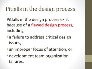
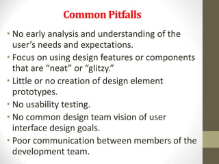
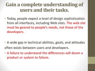
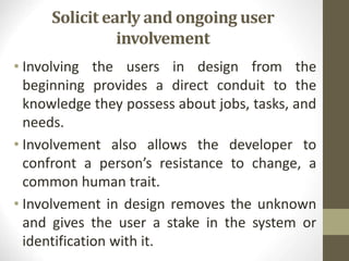
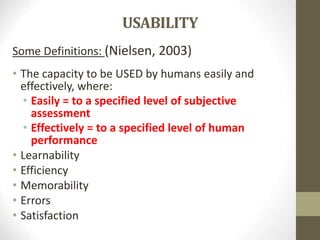
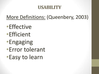
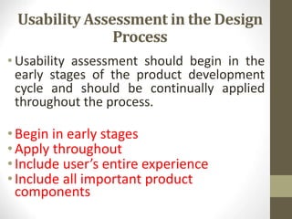
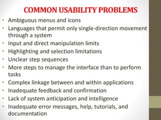
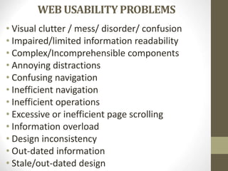
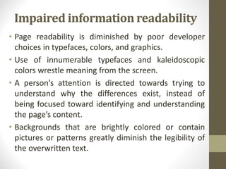
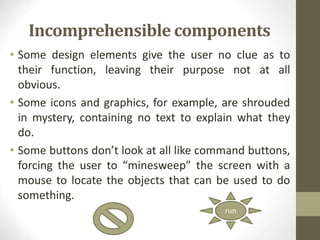
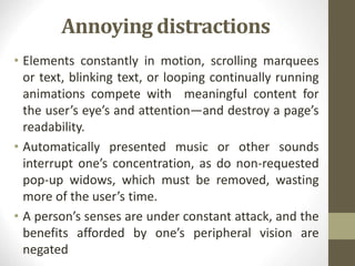
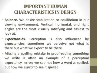
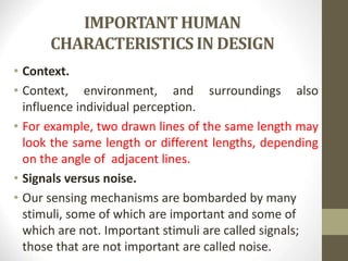
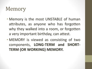
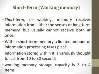
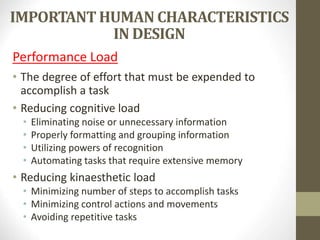
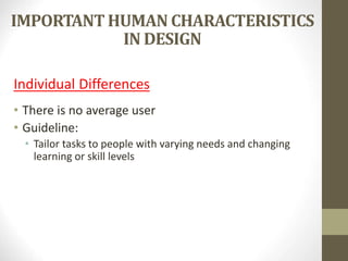
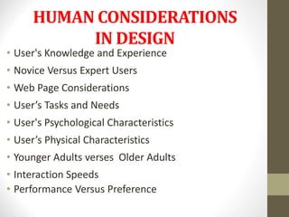
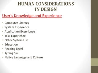
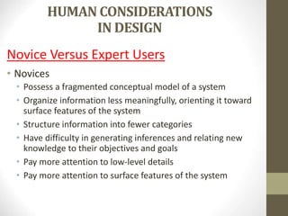
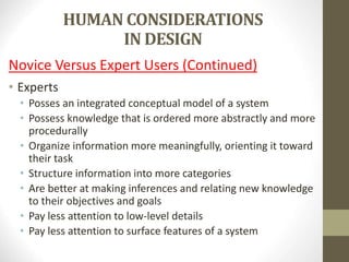
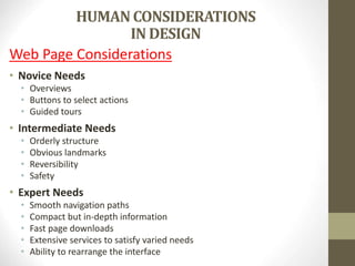
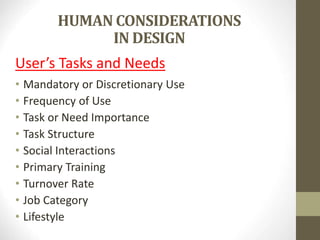
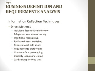
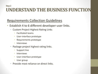
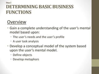
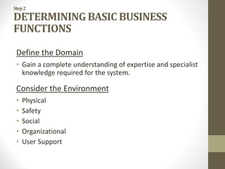
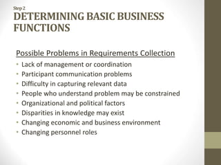
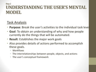
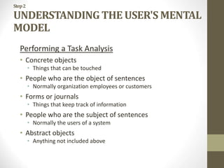
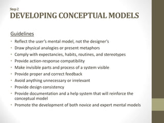
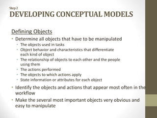
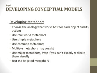
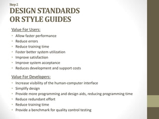
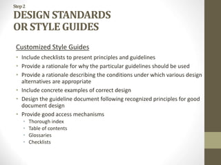
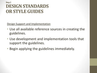
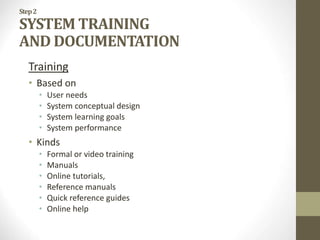
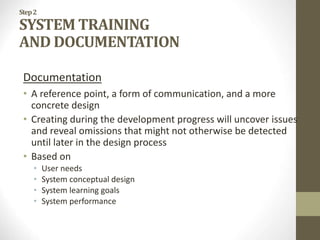
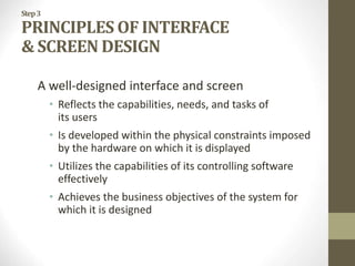
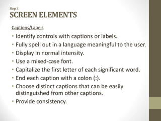
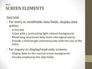
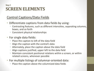
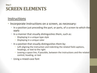
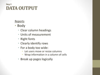
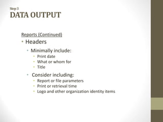
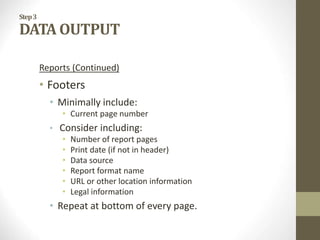
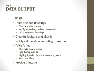
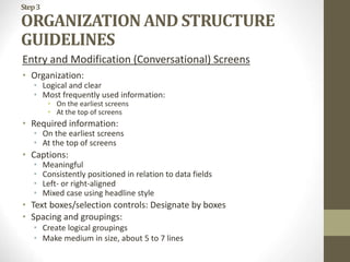
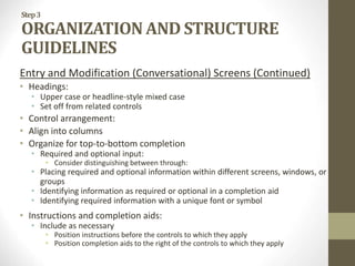
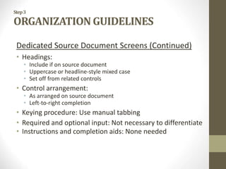
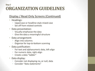
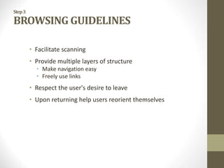
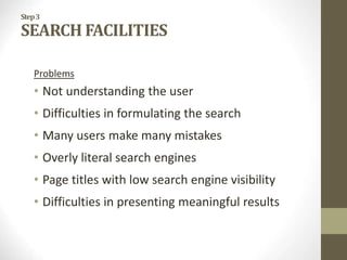
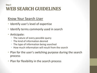
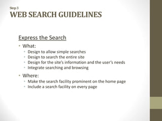
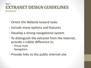
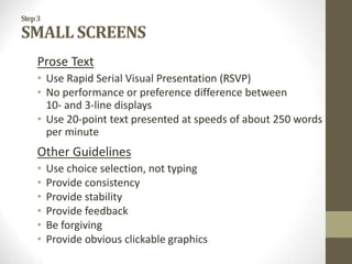
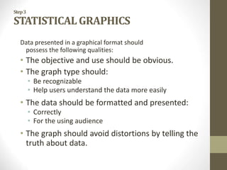
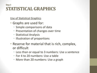
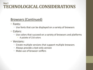
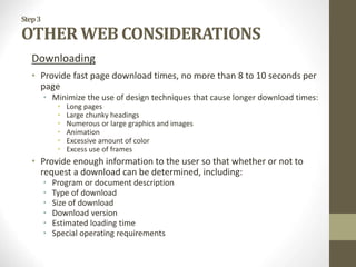
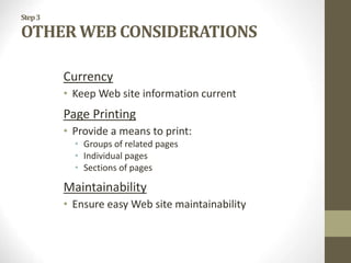
SlideShare a Scribd company logo
1 of 216
THE USER
INTERFACE DESIGN
PROCESS
THE USER INTERFACE DESIGN
PROCESS
Overview
• Obstacles and Pitfalls in the Development Path
• Designing for People: The Five Commandments
• Usability
• Usability Assessment in the Design Process
• Common Usability Problems
• Some Practical Measures of Usability
• Some Objective Measures of Usability
Obstacles and Pitfalls in the
Development Path
• Developing a computer system is never
easy.
• The path is littered with obstacles and
traps, many of them human in nature.
• Gould (1988) has made these general
observations about design:
OBSTACLES AND PITFALLS IN THE
DEVELOPMENT PATH
General Observations
• Nobody ever gets it right the first time.
• Development is chock-full of surprises.
• Good design requires living in a sea of changes.
• Making contracts to ignore change will never
eliminate the need for change.
• Even if you have made the best system humanly
possible, people will still make mistakes when using it.
• Designers need good tools.
• You must have behavioral design goals like
performance design goals.
Pitfalls in the design process
Pitfalls in the design process exist
because of a flawed design process,
including
•a failure to address critical design
issues,
•an improper focus of attention, or
•development team organization
failures.
Common Pitfalls
• No early analysis and understanding of the
user’s needs and expectations.
• Focus on using design features or components
that are “neat” or “glitzy.”
• Little or no creation of design element
prototypes.
• No usability testing.
• No common design team vision of user
interface design goals.
• Poor communication between members of the
development team.
DESIGNING FOR PEOPLE:
THE FIVE COMMANDMENTS
Gain a complete understanding of
users and their tasks.
• Today, people expect a level of design sophistication
from all interfaces, including Web sites. The web site
must be geared to people’s needs, not those of the
developers.
• A wide gap in technical abilities, goals, and attitudes
often exists between users and developers.
• A failure to understand the differences will doom a
product or system to failure.
Solicit early and ongoing user
involvement
• Involving the users in design from the
beginning provides a direct conduit to the
knowledge they possess about jobs, tasks, and
needs.
• Involvement also allows the developer to
confront a person’s resistance to change, a
common human trait.
• Involvement in design removes the unknown
and gives the user a stake in the system or
identification with it.
Perform rapid prototyping and
testing.
• Prototyping and testing the product will quickly
identify problems and allow you to develop solutions.
• The design process is complex and human behavior is
still not well understood. While the design guidelines
that follow go a long way toward achieving ease of
use, all problems cannot possibly be predicted.
• Prototyping and testing must be continually
performed during all stages of development to
uncover all potential defects.
Modify and iterate the design as
much as necessary
• While design will proceed through a series of
stages, problems detected in one stage may
force the developer to revisit a previous stage.
• This is normal and should be expected. Establish
user performance and acceptance criteria and
continue testing and modifying until all design
goals are met.
Integrate the design of all the
system components.
• The software, the documentation, the help function,
and training needs are all important elements of a
graphical system or Web site and all should be
developed concurrently.
• Concurrent development of all pieces will point out
possible problems earlier in the design process,
allowing them to be more effectively addressed.
USABILITY
Bennett (1979) was the first to use the term
USABILITY to describe the effectiveness of
human performance
USABILITY
Some Definitions: (Nielsen, 2003)
• The capacity to be USED by humans easily and
effectively, where:
• Easily = to a specified level of subjective
assessment
• Effectively = to a specified level of human
performance
• Learnability
• Efficiency
• Memorability
• Errors
• Satisfaction
USABILITY
More Definitions: (Queenbery, 2003)
•Effective
•Efficient
•Engaging
•Error tolerant
•Easy to learn
Usability Assessment in the Design
Process
• Usability assessment should begin in the
early stages of the product development
cycle and should be continually applied
throughout the process.
•Begin in early stages
•Apply throughout
•Include user’s entire experience
•Include all important product
components
COMMON USABILITY PROBLEMS
• Ambiguous menus and icons
• Languages that permit only single-direction movement
through a system
• Input and direct manipulation limits
• Highlighting and selection limitations
• Unclear step sequences
• More steps to manage the interface than to perform
tasks
• Complex linkage between and within applications
• Inadequate feedback and confirmation
• Lack of system anticipation and intelligence
• Inadequate error messages, help, tutorials, and
documentation
WEB USABILITY PROBLEMS
• Visual clutter / mess/ disorder/ confusion
• Impaired/limited information readability
• Complex/Incomprehensible components
• Annoying distractions
• Confusing navigation
• Inefficient navigation
• Inefficient operations
• Excessive or inefficient page scrolling
• Information overload
• Design inconsistency
• Out-dated information
• Stale/out-dated design
Visual clutter
• A lack of “white space,” meaningless
graphics, and unnecessary and wasteful
decoration often turn pages into jungles of
visual noise.
• Meaningful content lies hidden within the
unending forest of vines and trees, forcing
the user to waste countless minutes
searching for what is relevant.
• Useless displayed elements are actually a
form of visual noise.
Impaired information readability
• Page readability is diminished by poor developer
choices in typefaces, colors, and graphics.
• Use of innumerable typefaces and kaleidoscopic
colors wrestle meaning from the screen.
• A person’s attention is directed towards trying to
understand why the differences exist, instead of
being focused toward identifying and understanding
the page’s content.
• Backgrounds that are brightly colored or contain
pictures or patterns greatly diminish the legibility of
the overwritten text.
Incomprehensible components
• Some design elements give the user no clue as to
their function, leaving their purpose not at all
obvious.
• Some icons and graphics, for example, are shrouded
in mystery, containing no text to explain what they
do.
• Some buttons don’t look at all like command buttons,
forcing the user to “minesweep” the screen with a
mouse to locate the objects that can be used to do
something.
run
Annoying distractions
• Elements constantly in motion, scrolling marquees
or text, blinking text, or looping continually running
animations compete with meaningful content for
the user’s eye’s and attention—and destroy a page’s
readability.
• Automatically presented music or other sounds
interrupt one’s concentration, as do non-requested
pop-up widows, which must be removed, wasting
more of the user’s time.
• A person’s senses are under constant attack, and the
benefits afforded by one’s peripheral vision are
negated
Confusing navigation
• A site’s structure often resembles a maze of twisting
pages into which the user wanders and is quite soon
lost.
• Poor, little, or no organization exists among pages.
The size and depth of many Web sites can eventually
lead to a “lost in space” feeling as perceived site
structure evaporates as one navigates.
• Navigation links lead to dead-ends from which there
is no return, or boomerang you right back to the
spot where you are standing without you being
aware of it.
Inefficient navigation
• A person must transverse content-free pages to find
what is meaningful.
• One whole screen is used to point to another.
• Large graphics waste screen space and add to the
page count.
• The path through the navigation maze is often long
and tedious.
• Reams of useless data must be sifted through before
a need can be fulfilled.
• Massive use of short pages with little content often
creates the feeling that one is “link drunk.”
Inefficient operations
• Time is wasted doing many things.
• Page download times can be excessive.
• Pages that contain, for example, large graphics
and maps, large chunky headings, or many
colors, take longer to download than text.
• Excessive information fragmentation can
require navigation of long chains of links to
reach relevant material, also accelerating user
disorientation.
Excessive or inefficient page scrolling
• Long pages requiring scrolling frequently lead to the
user’s losing context as related information’s spatial
proximity increases and some information entirely
disappears from view and, therefore, from memory.
• Out of sight is often out of mind. If navigation
elements and important content are hidden below
the page top, they may be missed entirely.
• To have to scroll to do something important or
complete a task can be very annoying; especially if
the scrolling is caused by what the user considers is
an irrelevancy or noise.
Information overload
• Poorly organized or large amounts of
information taxes one’s memory and can be
overwhelming.
• Heavy mental loads can result from making
decisions concerning which links to follow and
which to abandon, given the large number of
choices available. Or from trying to determine
what information is important, and what is not.
Or from trying to maintain one’s place in a
huge forest of information trees.
SOME PRACTICAL MEASURES
OF USABILITY
• Are people asking a lot of questions?
• Are people often reaching for a manual?
• Are frequent exasperation responses
heard?
• Are there many irrelevant actions being
performed?
• Are there many things to ignore?
• Do many people want to use the
product?
KNOW YOUR USER OR CLIENT
The journey into the world of interface design
and the screen design process must begin with
an understanding of the SYSTEM USER
To create a truly usable system, the designer
must always do the following:
• Understand how people interact with computers.
• Understand the human characteristics important
to design.
• Identify the user’s level of knowledge and
experience.
• Identify the characteristics of the user’s needs,
tasks, and jobs.
• Identify the user’s psychological characteristics.
• Identify the user’s physical characteristics.
• Employ recommended methods for gaining
understanding of users.
UNDERSTAND HOW PEOPLE
INTERACT WITH COMPUTERS
some characteristics of computer systems,
past and present, that have caused, and are
causing, people problems
UNDERSTAND HOW PEOPLE
INTERACT WITH COMPUTERS
•Why People Have Trouble with
Computers?
•Psychological Responses to Poor Design
•Physical Responses to Poor Design
Why People Have Trouble with
Computers?
•Use of jargons
• Systems often speak in a strange language. Words that are
completely alien to the office or home environment or used in
different contexts, such as filespec, abend, segment, and boot,
proliferate. Learning to use a system often requires learning a
new language.
•Non-obvious design
• Complex or novel design elements are not obvious or intuitive,
but they must nevertheless be mastered. Operations may have
prerequisite conditions that must be satisfied before they can
be accomplished, or outcomes may not always be immediate,
obvious, or visible.
Why People Have Trouble with
Computers?
• Fine distinctions
• Different actions may accomplish the same thing, depending
upon when they are performed, or different things may result
from the same action.
• Disparity in problem-solving strategies
• People learn best by doing. They have trouble following
directions and do not always read instructions before taking
an action.
• Design inconsistency
• The same action may have different names: for
example, “save” and “keep,” “write” and “list.”
• for example, “not legal” and “not valid.”
Responses to Poor Design
Psychological
•Confusion
Annoyance
Frustration
Panic or Stress
Boredom
Responses to Poor Design
Physical
•Abandonment of system
•Partial Use of system
•Indirect Use of system
•Task Modification
•Compensatory Activity
•System Misuse
•Direct Reprogramming
IMPORTANT HUMAN
CHARACTERISTICS IN
DESIGN
IMPORTANT HUMAN
CHARACTERISTICS IN DESIGN
• Perception
• Perception is our awareness and understanding of
the elements and objects of our environment
through the physical sensation of our various
senses, including sight, sound, smell, and so forth.
Perception is influenced, in part, by experience.
• Comparing the accumulated knowledge of the
child with that of an adult in interpreting the
world is a vivid example of the role of experience
in perception.
IMPORTANT HUMAN CHARACTERISTICS
IN DESIGN
• Proximity. Our eyes and mind see objects as
belonging together if they are near each other in
space.
• Similarity. Our eyes and mind see objects as
belonging together if they share a common visual
property, such as color, size, shape, brightness, or
orientation.
• Matching patterns. We respond similarly to the
same shape in different sizes. The letters of the
alphabet, for example, possess the same meaning,
regardless of physical size.
IMPORTANT HUMAN
CHARACTERISTICS IN DESIGN
• Succinctness. We see an object as having some
perfect or simple shape because perfection or
simplicity is easier to remember.
• Closure. Our perception is synthetic; it establishes
meaningful wholes. If something does not quite close
itself, such as a circle, square, triangle, or word, we
see it as closed anyway.
• Unity. Objects that form closed shapes are perceived
as a group.
• Continuity. Shortened lines may be automatically
extended.
IMPORTANT HUMAN
CHARACTERISTICS IN DESIGN
• Balance. We desire stabilization or equilibrium in our
viewing environment. Vertical, horizontal, and right
angles are the most visually satisfying and easiest to
look at.
• Expectancies. Perception is also influenced by
expectancies; sometimes we perceive not what is
there but what we expect to be there.
• Missing a spelling mistake in proofreading something
we write is often an example of a perceptual
expectancy error; we see not how a word is spelled,
but how we expect to see it spelled.
IMPORTANT HUMAN
CHARACTERISTICS IN DESIGN
• Context.
• Context, environment, and surroundings also
influence individual perception.
• For example, two drawn lines of the same length may
look the same length or different lengths, depending
on the angle of adjacent lines.
• Signals versus noise.
• Our sensing mechanisms are bombarded by many
stimuli, some of which are important and some of
which are not. Important stimuli are called signals;
those that are not important are called noise.
Memory
• Memory is the most UNSTABLE of human
attributes, as anyone who has forgotten
why they walked into a room, or forgotten
a very important birthday, can attest.
• MEMORY is viewed as consisting of two
components, LONG-TERM and SHORT-
TERM (OR WORKING) MEMORY.
Short-Term (Working memory)
• Short-term, or working, memory receives
information from either the senses or long-term
memory, but usually cannot receive both at
once.
• Within short-term memory a limited amount of
information processing takes place.
• Information stored within it is variously thought
to last from 10 to 30 seconds.
• working memory storage capacity is 3 to 4
Items
Long-Term memory
• To illustrate, most native English-speaking
people would find remembering English
words much easier than remembering an
equal number of words in Russian.
• Long-Term (Knowledge)
• Active: 2,000-3,000 Words (Recall)
• Passive: 10,000 Words (Recognition)
IMPORTANT HUMAN CHARACTERISTICS
IN DESIGN
Memory
• Guidelines:
• Present information in an organized, structured, familiar and
meaningful way
• Place all required information for task performance in close
physical proximity
• Give the user control over the pace of information
presentation
• Place important items at the beginning or end of a listing
• Place information that must be compared in close proximity
• Do not require use of working memory if reading speed is
important
• Make important items unique or distinct in some manner
IMPORTANT HUMAN CHARACTERISTICS
IN DESIGN
Sensory Storage
• Buffer where the automatic processing of
information collected from senses takes place
• An unconscious process
• Large, and constantly being replaced by newly
gathered stimuli
• Repeated and excessive stimulation can fatigue it
• Guidelines:
• Avoid unnecessarily stressing it
• Design the interface so that all aspects and elements serve
a definite purpose
IMPORTANT HUMAN CHARACTERISTICS
IN DESIGN
Visual Acuity
• The capacity of the eye to resolve detail
• At normal viewing distance, the area on the screen of
optimum visual acuity is 1.67" in diameter
• Considered a “visual chunk” of a screen
• Guideline:
• Provide screen groupings reflecting visual chunks
3213123
54321212345
6543211123456
765432101234567
6543211123456
54321212345
3213123
IMPORTANT HUMAN CHARACTERISTICS
IN DESIGN
Visual Acuity (Continued)
• The eye is never perfectly still, it trembles slightly
• This tremor improves detection of object edges
• Can cause patterns of closely spaced dots or lines to
appear to shimmer
• Guideline:
• Patterns for fill-in areas of screens (bars, circles, and so on)
must be carefully chosen to avoid this visual distraction
IMPORTANT HUMAN CHARACTERISTICS
IN DESIGN
Foveal Vision
• Used to focus directly on something
• Area of prime visual acuity
Peripheral Vision
• Senses anything in the area surrounding foveal vision
• Cannot be clearly resolved because of acuity limitations
• Can provide clues as to where the eye should go next in
search or use of a screen
• Guideline:
• Create screen patterns, shapes, and alignments to guide the eye in a
systematic way through a screen
IMPORTANT HUMAN CHARACTERISTICS
IN DESIGN
Information Processing
• Higher Level
• Identified with consciousness and working memory
• Limited, slow, and sequential for reading and understanding
• Performs reasoning and problem solving
• Susceptible to interference
• Lower Level
• Processes familiar information rapidly, in parallel with the higher level,
and without conscious effort
• Guidelines:
• Provide visually distinctive screens to foster lower level processing
• Minimize interference by avoiding designs that create conflicting
mental processes
IMPORTANT HUMAN CHARACTERISTICS
IN DESIGN
Mental Models
• A representation of a person’s current understanding
of something
• Gradually developed in order to understand, explain,
make decisions, do, or interact
• Learned mental models are applied to what is newly
encountered
• Guidelines:
• Design new systems conforming to user’s already learned
mental models
• Provide design consistency and standards to aid mental
model development
IMPORTANT HUMAN CHARACTERISTICS
IN DESIGN
Movement Control
• An appropriate physical action to achieve an objective
• Fitt’s Law (1954) Simplified
• The bigger a target is, or the closer a target is, the faster it will
be reached
• Guidelines:
• Provide large target objects for important functions
• Take advantage of the “pinning” actions of the sides, top,
bottom, and corners of a screen
IMPORTANT HUMAN CHARACTERISTICS
IN DESIGN
Learning
• The process of encoding into long-term memory that
which is contained in short-term memory
• Guidelines:
• Allow skills acquired in one situation to be used in another
somewhat like it
• Provide complete and prompt feedback
• Provide phased learning, requiring a person to know only the
information needed at that stage of the learning process
IMPORTANT HUMAN CHARACTERISTICS
IN DESIGN
Skill
• The performance of actions in the correct time
sequence with adequate precision
• Accomplished by increasing mastery of a system
• Characterized by economy of effort to achieve
optimum efficiency
• Guideline:
• Permit development of increasingly skillful performance
IMPORTANT HUMAN CHARACTERISTICS
IN DESIGN
Performance Load
• The degree of effort that must be expended to
accomplish a task
• Reducing cognitive load
• Eliminating noise or unnecessary information
• Properly formatting and grouping information
• Utilizing powers of recognition
• Automating tasks that require extensive memory
• Reducing kinaesthetic load
• Minimizing number of steps to accomplish tasks
• Minimizing control actions and movements
• Avoiding repetitive tasks
IMPORTANT HUMAN CHARACTERISTICS
IN DESIGN
Individual Differences
• There is no average user
• Guideline:
• Tailor tasks to people with varying needs and changing
learning or skill levels
HUMAN CONSIDERATIONS
IN DESIGN
HUMAN CONSIDERATIONS
IN DESIGN
• User's Knowledge and Experience
• Novice Versus Expert Users
• Web Page Considerations
• User’s Tasks and Needs
• User's Psychological Characteristics
• User’s Physical Characteristics
• Younger Adults verses Older Adults
• Interaction Speeds
• Performance Versus Preference
HUMAN CONSIDERATIONS
IN DESIGN
User's Knowledge and Experience
• Computer Literacy
• System Experience
• Application Experience
• Task Experience
• Other System Use
• Education
• Reading Level
• Typing Skill
• Native Language and Culture
HUMAN CONSIDERATIONS
IN DESIGN
Novice Versus Expert Users
• Novices
• Possess a fragmented conceptual model of a system
• Organize information less meaningfully, orienting it toward
surface features of the system
• Structure information into fewer categories
• Have difficulty in generating inferences and relating new
knowledge to their objectives and goals
• Pay more attention to low-level details
• Pay more attention to surface features of the system
HUMAN CONSIDERATIONS
IN DESIGN
Novice Versus Expert Users (Continued)
• Experts
• Posses an integrated conceptual model of a system
• Possess knowledge that is ordered more abstractly and more
procedurally
• Organize information more meaningfully, orienting it toward
their task
• Structure information into more categories
• Are better at making inferences and relating new knowledge
to their objectives and goals
• Pay less attention to low-level details
• Pay less attention to surface features of a system
HUMANCONSIDERATIONS
IN DESIGN
Web Page Considerations
• Novice Needs
• Overviews
• Buttons to select actions
• Guided tours
• Intermediate Needs
• Orderly structure
• Obvious landmarks
• Reversibility
• Safety
• Expert Needs
• Smooth navigation paths
• Compact but in-depth information
• Fast page downloads
• Extensive services to satisfy varied needs
• Ability to rearrange the interface
HUMAN CONSIDERATIONS
IN DESIGN
User’s Tasks and Needs
• Mandatory or Discretionary Use
• Frequency of Use
• Task or Need Importance
• Task Structure
• Social Interactions
• Primary Training
• Turnover Rate
• Job Category
• Lifestyle
HUMAN CONSIDERATIONS
IN DESIGN
User's Psychological Characteristics
•Attitude and motivation
•Patience
•Stress level
•Expectations
•Cognitive style
HUMAN CONSIDERATIONS
IN DESIGN
User’s Physical Characteristics
• Age
• Vision
• Hearing
• Cognitive processing
• Manual dexterity
• Gender
• Handedness
• Disabilities
HUMAN CONSIDERATIONS
IN DESIGN
Younger Adults
• Use computers & ATMs more often
• Read faster
• Possess greater reading capacity and working
memory capacity
• Possess faster choice reaction times
• Possess higher perceptual speed scores
• Complete a perceptual search task at a higher rate
• Use less moves to complete a task
• Are more likely to read a screen a line at a time
HUMAN CONSIDERATIONS
IN DESIGN
Older Adults
• Are more educated
• Possess higher vocabulary scores
• Have more recall difficulties
• Have more problems with tasks requiring
three or more clicks
• Are more likely to scroll a page at a time
• Respond better to full pages than
continuously scrolled pages
HUMAN CONSIDERATIONS
IN DESIGN
Interaction Speeds
•Reading
•Listening
•Speaking
•Keying
•Hand printing
HUMAN CONSIDERATIONS
IN DESIGN
Performance Versus Preference
•Performance and preference do not
always agree
•Preference influenced by things like:
• Familiarity
• Aesthetics
• Novelty
• Perceived effort
HUMAN CONSIDERATIONS
IN DESIGN
Methods for Gaining Understanding of Users
• Visit user locations to gain an understanding of the work
environment.
• Directly talk with users about their problems, difficulties,
wishes, and what works well now.
• Observe users working or performing a task.
• Videotape users working or performing a task.
• Learn about the work organization.
• Have users think aloud as they do something.
• Try the job yourself .
• Prepare surveys and questionnaires.
• Establish testable behavioral target goals.
Step2
UNDERSTAND THE BUSINESS FUNCTION
Step 2 Overview
• Perform a business definition and requirements
analysis.
• Determine basic business functions.
• Describe current activities through task analysis.
• Develop a conceptual model of the system.
• Establish design standards or style guides.
• Establish system usability goals.
• Define training and documentation needs.
Step2
BUSINESS DEFINITION AND
REQUIREMENTS ANALYSIS
Information Collection Techniques
• Direct Methods
• Individual face-to-face interview
• Telephone interview or survey
• Traditional focus group
• Facilitated team workshop
• Observational field study
• Requirements prototyping
• User-Interface prototyping
• Usability laboratory testing
• Card sorting for Web sites
Step2
BUSINESS DEFINITION AND
REQUIREMENTS ANALYSIS
Information Collection Techniques (Continued)
• Indirect Methods
• MIS intermediary
• Paper survey or questionnaire
• Electronic survey or questionnaire
• Electronic focus group
• Marketing and sales
• Support line
E-Mail or bulletin board
• User group
• Competitor analyses
• Trade show
• Other media analysis
• System testing
Step2
UNDERSTAND THE BUSINESS FUNCTION
Requirements Collection Guidelines
• Establish 4 to 6 different developer-user links.
• Custom Project Highest Rating Links
• Facilitated teams
• User-interface prototype
• Requirements prototype
• Interviews
• Package project highest rating links.
• Support line
• Interviews
• User-interface prototype
• User group
• Provide most reliance on direct links.
Step2
DETERMINING BASIC BUSINESS
FUNCTIONS
Overview
• Gain a complete understanding of the user’s mental
model based upon:
• The user’s needs and the user’s profile
• A user task analysis
• Develop a conceptual model of the system based
upon the user’s mental model.
• Define objects
• Develop metaphors
Step2
DETERMINING BASIC BUSINESS
FUNCTIONS
Define the Domain
• Gain a complete understanding of expertise and specialist
knowledge required for the system.
Consider the Environment
• Physical
• Safety
• Social
• Organizational
• User Support
Step2
DETERMINING BASIC BUSINESS
FUNCTIONS
Possible Problems in Requirements Collection
• Lack of management or coordination
• Participant communication problems
• Difficulty in capturing relevant data
• People who understand problem may be constrained
• Organizational and political factors
• Disparities in knowledge may exist
• Changing economic and business environment
• Changing personnel roles
Step2
UNDERSTANDING THE USER'S MENTAL
MODEL
Task Analysis
• Purpose: Break the user’s activities to the individual task level
• Goal: To obtain an understanding of why and how people
currently do the things that will be automated.
• Result: Establishes the major work goals
• Also provides details of actions performed to accomplish
these goals.
• Workflows
• The interrelationships between people, objects, and actions
• The user’s conceptual framework
Step2
UNDERSTANDING THE USER'S MENTAL
MODEL
Performing a Task Analysis
• Concrete objects
• Things that can be touched
• People who are the object of sentences
• Normally organization employees or customers
• Forms or journals
• Things that keep track of information
• People who are the subject of sentences
• Normally the users of a system
• Abstract objects
• Anything not included above
Step2
DEVELOPING CONCEPTUAL MODELS
Guidelines
• Reflect the user’s mental model, not the designer’s
• Draw physical analogies or present metaphors
• Comply with expectancies, habits, routines, and stereotypes
• Provide action-response compatibility
• Make invisible parts and process of a system visible
• Provide proper and correct feedback
• Avoid anything unnecessary or irrelevant
• Provide design consistency
• Provide documentation and a help system that will reinforce the
conceptual model
• Promote the development of both novice and expert mental models
Step2
DEVELOPING CONCEPTUAL MODELS
Defining Objects
• Determine all objects that have to be manipulated
• The objects used in tasks
• Object behavior and characteristics that differentiate
each kind of object
• The relationship of objects to each other and the people
using them
• The actions performed
• The objects to which actions apply
• State information or attributes for each object
• Identify the objects and actions that appear most often in the
workflow
• Make the several most important objects very obvious and
easy to manipulate
Step2
DEVELOPING CONCEPTUAL MODELS
Developing Metaphors
• Choose the analogy that works best for each object and its
actions
• Use real-world metaphors
• Use simple metaphors
• Use common metaphors
• Multiple metaphors may coexist
• Use major metaphors, even if you can’t exactly replicate
them visually
• Test the selected metaphors
Step2
DESIGN STANDARDS
OR STYLE GUIDES
Value For Users:
• Allow faster performance
• Reduce errors
• Reduce training time
• Foster better system utilization
• Improve satisfaction
• Improve system acceptance
• Reduces development and support costs
Value For Developers:
• Increase visibility of the human-computer interface
• Simplify design
• Provide more programming and design aids, reducing programming time
• Reduce redundant effort
• Reduce training time
• Provide a benchmark for quality control testing
Step2
DESIGN STANDARDS
OR STYLE GUIDES
Commercial Style Guides
• Apple
• IBM
• Microsoft
• Sun Microsystems
International User Interface Standards
• ISO
• World Wide Web Consortium
Step2
DESIGN STANDARDS
OR STYLE GUIDES
Customized Style Guides
• Include checklists to present principles and guidelines
• Provide a rationale for why the particular guidelines should be used
• Provide a rationale describing the conditions under which various design
alternatives are appropriate
• Include concrete examples of correct design
• Design the guideline document following recognized principles for good
document design
• Provide good access mechanisms
• Thorough index
• Table of contents
• Glossaries
• Checklists
Step2
DESIGN STANDARDS
OR STYLE GUIDES
Design Support and Implementation
• Use all available reference sources in creating the
guidelines.
• Use development and implementation tools that
support the guidelines.
• Begin applying the guidelines immediately.
Step2
SYSTEM TRAINING
AND DOCUMENTATION
Training
• Based on
• User needs
• System conceptual design
• System learning goals
• System performance
• Kinds
• Formal or video training
• Manuals
• Online tutorials,
• Reference manuals
• Quick reference guides
• Online help
Step2
SYSTEM TRAINING
AND DOCUMENTATION
Documentation
• A reference point, a form of communication, and a more
concrete design
• Creating during the development progress will uncover issues
and reveal omissions that might not otherwise be detected
until later in the design process
• Based on
• User needs
• System conceptual design
• System learning goals
• System performance
Step3
PRINCIPLES OF INTERFACE
& SCREEN DESIGN
A well-designed interface and screen
• Reflects the capabilities, needs, and tasks of
its users
• Is developed within the physical constraints imposed
by the hardware on which it is displayed
• Utilizes the capabilities of its controlling software
effectively
• Achieves the business objectives of the system for
which it is designed
Step3
PRINCIPLES OF INTERFACE
& SCREEN DESIGN
Step 3 Overview
• What users want and do
• Interface design goals
• The test for a good design
• Organizing screen elements
• Navigation and flow
• Visually pleasing composition
• Typography
• Keying procedures
• Data output
• Web sites and Web pages
• Statistical graphics
• Technological considerations
Step3
HOW TO DISTRACT
THE SCREEN USER
Some Common Problems
in Visual Interface Design
• Visual inconsistency
• Lack of restraint in the use of design features and elements
• Overuse of three-dimensional presentations
• Overuse of bright colors
• Poorly designed icons
• Bad typography
• Metaphors either overbearing or too cute, or too literal
thereby restricting design options
Step3
HOW TO DISTRACT
THE SCREEN USER
Some Web Screen Distractions
• Numerous visual and auditory interruptions
• Extensive visual clutter
• Poor information readability
• Incomprehensible screen components
• Confusing and inefficient navigation
• Inefficient operations and extensive waste of user time
• Excessive or inefficient page scrolling
• Information overload
• Design inconsistency
• Outdated information
• Stale design caused by emulation of printed documents
and past systems
Step3
WHAT SCREEN USERS WANT
• An orderly, clean, clutter-free appearance
• An obvious indication of what is being shown and what
should be done with it
• Expected information located where it should be
• A clear indication of what relates to what, including
options, headings, captions, data, and so forth
• Plain, simple English
• A simple way of finding out what is in a system and how to
get it out
• A clear indication of when an action can make a
permanent change in the data or system
Step3
WHAT SCREEN USERS DO
1. Identify a task to be performed or need to be fulfilled.
2. Decide how the task will be completed or the need fulfilled.
3. Manipulate the computer’s controls.
4. Gather the necessary data.
5. Form judgments resulting in decisions relevant to the task or
need.
Step3
INTERFACE DESIGN GOALS
• Reduce visual work
• Reduce intellectual work
• Reduce memory work
• Reduce motor work
• Minimize or eliminate any burdens or instructions imposed by
technology
Step3
THE TEST FOR GOOD DESIGN
Can all screen elements
be identified by cues other
than by reading the words
that make them up?
Step3
MEANING AND PURPOSE
Each screen element...
• Every control
• All text
• The screen organization
• All emphasis
• Each color
• Every graphic
• All screen animation
• Each message
• All forms of feedback
Must...
• Have meaning to screen users
• Serve a purpose in performing tasks
Step3
ORGANIZING SCREEN ELEMENTS
CLEARLY AND MEANINGFULLY
Consistency
• Provide real-world consistency
• Provide internal consistency, including:
• Operational and navigational procedures
• Visual identity or theme
• Component:
• Organization
• Presentation
• Usage
• Locations
• Follow the same conventions and rules across all related
interfaces
• Deviate only when there is a clear benefit for the user
Step3
ORGANIZING SCREENS
Starting Point
• Provide an obvious starting point in the screen’s
upper-left corner.
• Focus user's attention to the most important part of
a screen or page.
Step3
ORGANIZING SCREENS
Starting Point
• Textual Displays
• Start in upper-left corner
• Scan in a counterclockwise direction
• Graphic and Web Displays
• Additional visual cues of weight and composition
• People tend to look at text first, not images
• Larger type dominates over smaller type
• Changing information looked at before non-changing
• F shaped scan – Nielsen, 2006
Step3
ORGANIZING SCREENS
Ordering of Screen Data and Content
• Divide information into units that are logical, meaningful, and sensible.
• Organize by the degree interrelationship between data or information.
• Provide an ordering of screen units of information and elements
that is prioritized according to the user’s expectations and needs.
• Possible ordering schemes include:
Conventional Function
Sequence of Use Importance
Frequency of Use General to specific
• Form groups that cover all possibilities.
• Ensure that information that must be compared is visible at
the same time
• Ensure that only information relative to the users tasks or needs
is presented on the screen
Step3
ORGANIZING SCREENS
Ordering Web Pages
• Establish levels of importance.
• Place critical information near the top of Web site.
• Place important items near the top of a page.
• Organize information clearly.
• Place important items consistently.
• Facilitate scanning.
• Structure for easy comparison.
Step3
ORGANIZING SCREENS
Navigation and Flow
• Provide an ordering of screen information and elements
that:
• Is rhythmic, guiding the eye through the display
• Encourages natural movement sequences
• Minimizes pointer and eye movement distances
• Locate the most important and most frequently used
elements or controls at the top left
• Maintain a top-to-bottom, left-to-right flow
• Assist in navigation through a screen by:
• Aligning elements
• Grouping elements
• Using of line borders
Step3
ORGANIZING SCREENS
Navigation and Flow (Continued)
• Through focus and emphasis, sequentially, direct
attention to items that are:
1. Critical
2. Important
3. Secondary
4. Peripheral
• Tab through window in logical order of displayed
information.
• Locate command buttons at end of the tabbing order
sequence.
• When groups of related information must be broken and
displayed on separate screens, provide breaks at logical
or natural points in the information flow.
Step3
ORGANIZING SCREENS
Qualities of Visually Pleasing Composition
• Balance
• Provide an equal weight of screen elements, left and right, top and
bottom
• Symmetry
• Replicate elements left and right of the screen centerline
• Regularity
• Establish standard and consistently spaced horizontal and vertical
alignment points
• Use similar element sizes, shapes, colors, and spacing
• Predictability
• Be consistent in following conventional orders or arrangements
Step3
ORGANIZING SCREENS
Qualities of Visually Pleasing Composition (Continued)
• Sequentiality
• Arrange elements to guide the eye in an obvious, logical, rhythmic, and
efficient manner
• Economy
• Use as few styles, display techniques, and colors as possible
• Unity
• Use similar sizes, shapes, or colors for related information
• Leave less space between elements of a screen than the space left at
the margins
• Proportion
• Create windows and groupings of data or text with aesthetically
pleasing proportions
Step3
ORGANIZING SCREENS
Qualities of Visually Pleasing Composition (Continued)
• Simplicity
• Optimize the number of elements on a screen, within limits of clarity
• Minimize the alignment points, especially horizontal or columnar
• Provide standard grids of horizontal and vertical lines to position elements
• Groupings
• Provide functional groupings of associated elements
• Create spatial groupings as closely as possible to five degrees
of visual angle (1.67 inches in diameter)
• Evenly space controls within a grouping
• Visually reinforce groupings:
• Separation through use of white space
• Provide line borders around groups
• Provide meaningful groupings
Step3
ORGANIZING SCREENS
Perceptual Principles and Grouping
• Use visual organization to create functional
groupings
• Combine visual organization principles in logical
ways
• Avoid visual organization principles that conflict
Step3
ORGANIZING SCREENS
Grouping Using White Space
• Provide adequate separation between groupings
through liberal use of white space
• For Web pages, carefully consider the trade-off
between screen white space and the need for
scrolling
Step3
ORGANIZING SCREENS
Grouping Using Borders
• Incorporate line borders for:
• Focusing attention on groupings or related information
• Guiding the eye through the screen
• Do not exceed three lines styles or two line thicknesses on a screen
• Use a standard hierarchy for line presentation
• Create lines consistent in height and length
• Leave consistent padding space between the information and the line
borders
• For adjacent groupings align borders left, right, top and bottom
• Use rules and borders sparingly
• In Web page design:
• Be cautious in using horizontal lines as separators between page sections
• Reserve horizontal lines for for situations in which the difference between
adjacent sections must be emphasized
Step3
ORGANIZING SCREENS
Grouping Using Backgrounds
• Consider incorporating a contrasting background for
related information
• The background should not have the emphasis
of the screen component being attended to
• Consider about a 25 percent gray screening
• Reserve higher contrast or emphasizing techniques
for screen components to which attention should be
drawn
Step3
VISUAL STYLE
IN WEB PAGE DESIGN
• Maintain a consistent and unified visual style throughout the pages
of an entire Web site
• Base the visual style on the
• The profile and goals of the Web site owner
• The profile, tastes, and expectations of the site user
Step3
DISTINCTIVENESS
• Individual screen controls, and groups of controls, must be
perceptually distinct
• Screen controls
• Should not touch a window border
• Should not touch each other
• Field and group borders
• Should not touch a window border
• Should not touch each other
• Buttons
• Should not touch a window border
• Should not touch each other
• A button label should not touch the button border
• Adjacent screen elements must be displayed in colors or
shades of sufficient contrast with one another
Step3
FOCUS AND EMPHASIS
• Visually emphasize the
• Most prominent element
• Most important elements
• Central idea or focal point
• To provide emphasis use techniques such as
• Higher brightness
• Reverse polarity or inverse video
• Larger and distinctive font
• Line rulings and surrounding boxes or frames
• Contrasting colors
• White space, etc.
• De-emphasize less important elements
• To ensure emphasized elements stand out, avoid
• Emphasizing too many screen elements
• Using too many emphasis techniques
• Screen clutter
Step3
FOCUS AND EMPHASIS
• In Web page design:
• Call attention to new or changed content.
• Ensure that page text is not overwhelmed by page background.
Step3
DEPTH OF LEVELS
OR 3D APPEARANCE
• Use perspective, highlighting, shading, and other
techniques to achieve a 3D appearance.
• Always assume that a light source is in the upper-left
corner of the screen.
• Display command buttons above the screen plane.
• Display screen-based controls on, or etched or
lowered below, the screen plane.
• Do not overdo things, and avoid:
• Using perspective for noninteractive elements
• Providing too much detail
Step3
PRESENTING INFORMATION SIMPLY
AND MEANINGFULLY
• Provide legibility
• Noticeable and distinguishable information
• Provide readability
• Identifiable, interpretable, and attractive information
• Present information in usable form
• Translations, transpositions, and references to documentation should
not be required to interpret and understand information
• Utilize contrasting display features to attract and call attention
to different screen elements
• Create visual lines
• Implicit and explicit, to guide the eye
• Be consistent in appearance and procedural usage
Step3
TYPOGRAPHY
A font’s characteristics can be used to
• Communicate the organization of screen
elements
• Identify the most important screen elements
• Establish a reading order
• Create a particular mood
Step3
TYPOGRAPHY
Font Types and Families
• Use simple, common, readable fonts.
• Any sans serif such as Helvetica or Verdana
• Times Roman
• Use no more than two families, compatible in
terms of line thicknesses, capital letter height,
and so on.
• Assign a separate purpose to each family
• Allow one family to dominate
Step3
TYPOGRAPHY
Font Size
• Use no more than three sizes
• Consider “X” height
• For graphical systems, use:
• 12 point for menus
• 10 point for windows
• For Web pages, use:
• 12 to 14 points for body text
• 18 to 36 points for titles and headings
• For line spacing, use 1 to 1½ times font size.
• Never change established type sizes to squeeze in
more text.
Step3
TYPOGRAPHY
Font Styles and Weight
• Use no more than:
• Two styles of the same family
• Standard and italic
• Italic is best presented in a serif font
• Two weights
• Regular and bold
• Bold is best presented in a sans serif font
• Use italics when you want to call attention.
• Use bold when you want to call attention or create a
hierarchy.
• In Web pages, use an underline only to indicate a
navigation link.
– Informational messages
– Instructional information
– Menu descriptions
– Button descriptions
– Section headings
– Subsection headings
Step3
TYPOGRAPHY
Font Case
• Use mixed case for:
• Control captions
• Data
• Control choice descriptions
• Text
• Consider using uppercase or capitalization for:
• Title
• Caution and warning messages
• Words or phrases small in point size
• Use all lowercase with caution
Step3
TYPOGRAPHY
Defaults
• For graphical operating systems, use the standard
system fonts.
• For Web page design, use the default browser
fonts.
• Consider that the user may change the fonts.
Step3
TYPOGRAPHY
Consistency
• Establish a consistent hierarchy and convention for
using typefaces, styles, and sizes.
• Decide on a font for each different level of importance in
the hierarchy.
• Communicate hierarchy with changes in:
• Size
• Weight
• Color
Text Background
• For rapid reading and understanding, present black
text on plain, high-contrast backgrounds.
Other
• Always consider the visual capabilities of the user.
• Always verify that the design has succeeded using
the selected fonts.
Step 3
TYPOGRAPHY
Step3
APPLICATION AND PAGE SIZE
Scrolling and Paging
• Scrolling:
• Avoid scrolling to determine a page’s contents.
• Minimize vertical page scrolling.
• When vertical scrolling is necessary to view an entire page:
• Provide contextual cues within the page that it must be scrolled to view
its entire contents.
• Provide short pages if people are looking for specific pieces of
information.
• Facilitate fast scrolling by highlighting important items.
• Provide a unique and consistent “end of page” structure.
• Avoid horizontal page scrolling.
• Use longer scrolling pages when people are reading for
comprehension.
Step3
APPLICATION AND PAGE SIZE
Scrolling and Paging
• Paging:
• Use paging if response time are fast.
• Encourage viewing a page through “paging.”
• Create a second version of a Web site, one consisting of
individual screens that are viewed through “paging.”
Step3
APPLICATION AND PAGE SIZE
Amount of Information to Present
• Present the proper amount of information for the task.
• Too little is inefficient
• Too much is confusing
• Present all information necessary for performing an action
or making a decision on one screen, whenever possible.
• People should not have to remember things from one screen to the
next
• Restrict screen or window density levels to no more than
about 30 percent.
• Local
• Overall
Step3
PAPER VERSUS SCREEN READING
• Provide a simple facility for printing
a hard copy of documents
Step3
SCREEN ELEMENTS
Window Title
• All windows must have a title located at the top.
• Exception: Windows containing messages
• Clearly and concisely describe window purpose.
• Spell out fully in upper- or mixed-case font.
• If truncation is necessary, truncate right to left.
Step3
SCREEN ELEMENTS
Web Page Title
• All Web pages must have a titles located in the
browser bar and on the content pages.
• Browser bar and content page titles must be consistent
• Titles must be:
• Descriptive
• Unique and meaningfully different from other Web pages
• Concise
Step3
SCREEN ELEMENTS
Captions/Labels
• In Web site design, good labels resulted in:
• 90% more efficiency in finding an item
• 25% fewer clicks to complete a task
• Significantly fewer errors
• Significantly more items found
• Significantly higher user satisfaction ratings
— Resnick and Sanchez, 2004
Step3
SCREEN ELEMENTS
Captions/Labels
• Identify controls with captions or labels.
• Fully spell out in a language meaningful to the user.
• Display in normal intensity.
• Use a mixed-case font.
• Capitalize the first letter of each significant word.
• End each caption with a colon (:).
• Choose distinct captions that can be easily
distinguished from other captions.
• Provide consistency.
Step3
SCREEN ELEMENTS
Data Fields
• For entry or modifiable data fields, display data
within:
• A line box
• A box with a contrasting light-colored background
• Break long structured data items into logical pieces
• Provide a field length commensurate with the size of the
entry
• For inquiry or display/read-only screens:
• Display data on the normal screen background
• Visually emphasize the data fields
Step3
SCREEN ELEMENTS
Data Fields
• For temporairly inactive fields, display the data
on the normal screen background with no
borders.
• Visually emphasize the data fields.
Step3
SCREEN ELEMENTS
Control Captions/Data Fields
• Differentiate captions from data fields by using:
• Contrasting features, such as different intensities, separating columns,
boxes, and so forth
• Consistent physical relationships
• For single data fields:
• Place the caption to left of the data field
• Align the caption with the control’s data
• Alternately, place the caption above the data field
• Align captions justified, upper left to the data field
• Maintain consistent positional relations within a screen, or within
related screens, whenever possible
• For multiple listings of columnar-oriented data:
• Place the caption above the columnized data fields
Step3
SCREEN ELEMENTS
Control Captions/Data Field Alignment
 First Approach
• Left-align both captions and data fields
• Leave one space between the longest caption and the
data field column
 Second Approach
• Left-align data fields and right-align captions to data
fields
• Leave one space between each
Step3
SCREEN ELEMENTS
Control Section Headings
• Provide a meaningful heading that clearly describes the relationship
of the grouped controls
• Locate section headings above their related screen controls
• Display in a distinguishable font style and size in mixed-case,
headline style
• Alternately, headings may be located within a border surrounding a
grouping, justified to the upper-left corner
• Indent the control captions to the right of the start of the heading
• Fully spell out in an uppercase font
• Display in normal intensity
• Alternately, if a different font size or style exists, the heading may be
displayed in mixed case, headline style
Step3
SCREEN ELEMENTS
Control Subsection or Row Headings
• Provide a meaningful heading that clearly describes the
relationship of the grouped controls.
• Locate to the left of the:
• Row of associated fields
• Topmost row of a group of associated fields
• Separate from the adjacent caption through the use of a
unique symbol, such as one or two greater than signs or a
filled-in arrow.
• Subsection or row headings may be left- or right-aligned.
• Display in a distinguishable font style and size in mixed-
case, headline style.
Step3
SCREEN ELEMENTS
Field Group Headings
• Provide a meaningful heading that clearly
describes the relationship of the grouped controls.
• Center the field group heading above the captions
to which it applies.
• Relate it to the captions by a solid line.
• Display in a distinguishable font style and size in
mixed-case, headline style.
Step3
SCREEN ELEMENTS
Special Symbols
• Consider special symbols for emphasis.
• Separate symbols from words by a space.
Step3
SCREEN ELEMENTS
Instructions
• Incorporate instructions on a screen, as necessary:
• In a position just preceding the part, or parts, of a screen to which they
apply
• In a manner that visually distinguishes them, such as:
• Displaying in a unique type style
• Displaying in a unique color
• In a position that visually distinguishes them by:
• Left-aligning the instruction and indenting the related field captions,
headings, or text to the right
• Leaving a space line, if possible, between the instructions and the related
control, heading, or text
• Using a mixed-case font
Step3
SCREEN ELEMENTS
Completion Aids
• Incorporate completion aids on a screen, as necessary:
• In a position to the right of the text entry control to which they apply
• In a manner that visually distinguishes them, including:
• Displaying within a parentheses ( )
• Possibly displaying in a unique style
• If the controls are arrayed on the screen in a columnar format, position
the completion aid or aids:
• Far enough to the right so as to not detract from the readability of the
column controls
• But close enough to the related control so that they easily maintain an
association with the related control
• Left-alignment of completion aids in a column of controls is desirable
but not absolutely necessary.
Step3
SCREEN ELEMENTS
Required and Optional Data
• Use required fields sparingly.
• Request information at the necessary point in
the process.
• Provide defaults for previously captured
information.
• Permit unfinished applications to be saved.
• Provide polite feedback to request missing
required information.
Step3
SCREEN ELEMENTS
Lists
• Present a collection of related items in a list.
• Use sentence or headline capitalization in a consistent
manner.
• Provide a heading for each list.
• Order lists in a meaningful way.
• For no equal value or discernable order, list alphabetically or
designate by bullet.
• If important or frequently chosen, put item at top of list.
• For items possessing a particular order, identify each with a
number, beginning with 1.
• Format for easy identification and scanning.
Step3
KEYING PROCEDURES
Keystrokes
• Do not focus on minimizing keystrokes without considering other
factors such as:
• The keying rhythm
• The goals of the system
Tabbing
• Initially, position the cursor in the first field or control in which
information can be entered
• Tab in the order in which the screen’s information is organized
Manual Tab versus Auto Skip
• Define fields to permit manual tabbing
• Consider using auto skip for:
• Expert users
• Easily learned screens
• Screens containing fields always completely filled
• Moving within common fixed length fields segmented into parts
Step3
KEYING PROCEDURES
Keying Rules
• Do not require recoding, changing, omitting, or including
data based on special rules or logical transformations.
• Do not require formatting of data.
• Do not make keyed codes case sensitive.
• Exception: Passwords
• Do not require units of measurement to be keyed.
• Minimize use of the Shift key.
• Ensure that double-clicking will not cause problems.
Step3
DATA OUTPUT
Reports
• Body
• Clear column headings
• Units of measurement
• Right fonts
• Clearly identify rows
• For a body too wide:
• Let users move or resize columns
• Wrap information in a column of cells
• Break up pages logically
Step3
DATA OUTPUT
Reports (Continued)
• Headers
• Minimally include:
• Print date
• What or whom for
• Title
• Consider including:
• Report or file parameters
• Print or retrieval time
• Logo and other organization identity items
Step3
DATA OUTPUT
Reports (Continued)
• Footers
• Minimally include:
• Current page number
• Consider including:
• Number of report pages
• Print date (if not in header)
• Data source
• Report format name
• URL or other location information
• Legal information
• Repeat at bottom of every page.
Step3
DATA OUTPUT
Tables
• Table title and headings
• Clear and descriptive
• Justify according to data presented
• Left justify row headings
• Organize logically and clearly
• Justify column data according to content
• Table format
• Alternate row shading
• Light backgrounds
• Highlight particular cells, columns, rows
• Avoid scrolling
• Provide printouts
Step3
ORGANIZATION AND STRUCTURE
GUIDELINES
Entry and Modification (Conversational) Screens
• Organization:
• Logical and clear
• Most frequently used information:
• On the earliest screens
• At the top of screens
• Required information:
• On the earliest screens
• At the top of screens
• Captions:
• Meaningful
• Consistently positioned in relation to data fields
• Left- or right-aligned
• Mixed case using headline style
• Text boxes/selection controls: Designate by boxes
• Spacing and groupings:
• Create logical groupings
• Make medium in size, about 5 to 7 lines
Step3
ORGANIZATION AND STRUCTURE
GUIDELINES
Entry and Modification (Conversational) Screens (Continued)
• Headings:
• Upper case or headline-style mixed case
• Set off from related controls
• Control arrangement:
• Align into columns
• Organize for top-to-bottom completion
• Required and optional input:
• Consider distinguishing between through:
• Placing required and optional information within different screens, windows, or
groups
• Identifying information as required or optional in a completion aid
• Identifying required information with a unique font or symbol
• Instructions and completion aids:
• Include as necessary
• Position instructions before the controls to which they apply
• Position completion aids to the right of the controls to which they apply
Step3
ORGANIZATION GUIDELINES
Grid Screens
• Usage: To enter large amounts of related data or information
• Design guidelines:
• Provide descriptive headings and, subheadings
• Do not include colons (:) after the headings
• Align column headings according to the cell data
• Left-align headings for columns with text
• Right-align headings for columns with numbers
• Left-align row headings
• Organize the data logically and clearly
• Place similar information together
• Place most important or frequently used information at the top
• Arrange information chronologically or sequentially
• Grid format
• Alternate row shading
• Use light backgrounds
• Avoid scrolling
Step3
ORGANIZATION GUIDELINES
Dedicated Source Document Screens
• Organization: Image of associated source document
• Captions:
• Abbreviations and contractions
• Consistently positioned in relation to data fields
• Right-aligned
• Date fields: Designate by boxes
• Spacing and grouping: Logical groupings found on source
document
Step3
ORGANIZATION GUIDELINES
Dedicated Source Document Screens (Continued)
• Headings:
• Include if on source document
• Uppercase or headline-style mixed case
• Set off from related controls
• Control arrangement:
• As arranged on source document
• Left-to-right completion
• Keying procedure: Use manual tabbing
• Required and optional input: Not necessary to differentiate
• Instructions and completion aids: None needed
Step3
ORGANIZATION GUIDELINES
Display / Read Only Screens
• Organization:
• Logical and clear
• Limit to what is necessary
• Most frequently used information:
• On earliest screens
• At the top of screens
• Captions:
• Meaningful
• Consistently positioned in relation to data fields
• Left- or right-aligned
• Text boxes:
• Do not include a surrounding border or box
• Spacing and grouping:
• Create logical groupings
• Make them medium-sized, about 5 to 7 lines
Step3
ORGANIZATION GUIDELINES
Display / Read Only Screens (Continued)
• Headings:
• Uppercase or headline-style mixed case
• Set off from related controls
• Data presentation:
• Visually emphasize the data
• Give the data a meaningful structure
• Data arrangement:
• Align into columns
• Organize for top-to-bottom scanning
• Data justification:
• For text and alphanumeric data, left-align
• For numeric data, right-align
• Create a data “ladder”
• Data display:
• Consider not displaying no, or null, data
• Consider “data statements”
Step3
ORGANIZATION GUIDELINES
Display / Read Only Screens (Continued)
• Organization
• Only display information necessary to perform actions, make decisions, or
answer questions
• Group information in a logical or orderly manner, with most frequently
requested information in the upper-left corner
• For multiscreen functions, locate the most frequently requested information on
the earliest screens
• Do not pack the screen. Use spaces and lines to balance the screen
perceptually
• Data Presentation
• Provide visual emphasis to the data
• Give the data a meaningful structure
• Spell out any codes in full
• Include natural splits or predefined breaks in displaying data
• Provide multiple data formats when necessary
• Format common items consistently
• For data strings of five or more numbers or alphanumeric characters with no
natural breaks: Display in groups of three or four characters with a blank
between each group
Step3
ORGANIZATION GUIDELINES
Display / Read Only Screens (Continued)
• Data arrangement
• Align data into columns
• Organize for top-to-bottom scanning
• Data alignment
• Left-align text and alphanumeric formats
• Right-align lists of numeric data
• Create a data “ladder”
• Data display
• Consider not displaying data whose values are none, zero, or blank
• Consider creating “data statements,” in which the caption and data are
combined
• Use caution in placing borders around cells
Step3
THE WEB
Web User Interaction Characteristics
• The most sought-after Web commodity is content
• Behavior is often goal-driven
• Reading is no longer a linear activity
• People scan and select
• Impatience
• Frequent switching of purpose
Step3
THE WEB
Dimensions
• Structure
• Navigation
• Information content
Interaction Styles
• Browsing
• Information finding
• Information gathering
Step3
THE WEB EXPERIENCE
Expectations
• Meet user expectations concerning content, organization and navigation
Tasks
• Reflect the user's capabilities and limitations
• Standardize task sequences
• Provide ease of use
Visual Appearance
• Provide a visual appearance that is attractive and consistent
Information Content
• Assure content meets all user needs
• Assure the most important information is positioned prominently and visible
without scrolling
• Assure content is updated frequently
Step3
THE WEB EXPERIENCE
Web Page Headings
• Control Headings
• For groupings of controls, follow the control heading
guidelines
• Content and Information Headings
• Usage
• Create headings to classify and organize information
• Clearly describe the content and nature of the information
• Use as introductory links
• Presentation
• Establish a hierarchy of font styles, sizes and weights
• Settle on as few sizes and styles as necessary to communicate page
content and organization
• Do not randomly mix heading levels or skip heading levels
Step3
THE WEB EXPERIENCE
Platforms
• Design for different platforms and screens
• Specify and image-safe area
Processes
• Do not display unsolicited windows or graphics
• Provide printing options
• Warn of time-outs
Step3
THE WEB EXPERIENCE
• Minimize downloading time
• Heading and navigation information should appear first
• Only include videos, animation, sound if needed
• Make downloading of additional media optional
• If slow download, advise user and indicate file size
• Provide Web applications as necessary
• Design for accessibility
• Provide assistance to users
Step3
THE WEB STRUCTURE
Organize Content Naturally for the Audience
• Reflect the natural organization of the information to
be presented
• Reflect the structure of the tasks people want to
carry out
Step3
WEB SCANNING GUIDELINES
• Organize content in a logical, systematic, and obvious
way
• Highlight and emphasize important information
• Use clear well-located headings and subheadings
• Use short phrases and sentences
• Use small, readable paragraphs
• Include bulleted and numbered lists
• Array information in tables
Step3
WEB WRITING GUIDELINES
• Provide a meaningful title
• Provide meaningful headings and subheadings
• Concisely write the text
• Keep the language simple and avoid jargon
• Write short paragraphs containing only one idea
• Use the inverted pyramid style of writing
• Provide concise summaries
Step3
WEB PRESENTATION GUIDELINES
• Highlight
• Key information-carrying words or phrases
• Important concepts
• Call attention to new or changed content
• Provide comparison tools
Step3
WEB PAGE LENGTH
Minimize Page Length
• Generally, use shorter pages for:
• Home pages
• Navigation pages
• Pages needing to be quickly browsed or read
• Situations where a page will be loading over slow modems and all
pages are not need
• Generally, use longer pages for:
• Situations where uninterrupted reading is desirable
• Situations where an entire concept must be understood without
interruption
• To match the structure of a paper counterpart
• To make pages more convenient to download
• To make pages more convenient to print
• To simplify page maintenance
Step3
WEB PAGE LENGTH
Minimize Page Length (Continued)
• Generally, restrict to two or three screens
• Place critical or important information at the very top so
it is always viewable when the page is opened
• Locate within the top four inches of the page
Step3
THE HOME PAGE
Content
• Show all major options
• Limit prose text
Size
• Limit to one screen
Elements to Include
• Name or logo of Web site owner
• Web site name
• Brief description of site
• Summary of key informational content
• Site overview map and links to major sections
• Summary of latest news or promotions
• Announcement of changes to site
Step3
THE HOME PAGE
Organization and Layout
• Place critical information at the top
• Locate within the top four inches
• Position remaining elements according to importance
• Reduce graphic complexity and textual density toward
page bottom
Access
• Enable access to the home page from any other
site page
Step3
BROWSING AND SEARCHING
Browsing
• Non-specific Web surfing
• Page cues used to try to locate items of interest
• An exercise in use of powers of recognition
Searching
• A more structured “find” mechanism
• Often involves use of keywords in search fields
• Primarily an exercise of powers of recall
Research Conclusion
• Searching seems to aid locating specific and unique items
• Browsing works better for items not specific and unique
• People seem to prefer to browse
Step3
BROWSING GUIDELINES
• Facilitate scanning
• Provide multiple layers of structure
• Make navigation easy
• Freely use links
• Respect the user's desire to leave
• Upon returning help users reorient themselves
Step3
SEARCH FACILITIES
Problems
• Not understanding the user
• Difficulties in formulating the search
• Many users make many mistakes
• Overly literal search engines
• Page titles with low search engine visibility
• Difficulties in presenting meaningful results
Step3
WEB SEARCH GUIDELINES
Know Your Search User
• Identify user's level of expertise
• Identify terms commonly used in search
• Anticipate:
• The nature of every possible query
• The kind of information desired
• The type of information being searched
• How much information will result from the search
• Plan for the user's switching purpose during the search
process
• Plan for flexibility in the search process
Step3
WEB SEARCH GUIDELINES
Express the Search
• What:
• Design to allow simple searches
• Design to search the entire site
• Design for the site’s information and the user’s needs
• Integrate searching and browsing
• Where:
• Make the search facility prominent on the home page
• Include a search facility on every page
Step3
WEB SEARCH GUIDELINES
Express the Search (Continued)
• How:
• Permit users to specify the extent of searches
• Within a section
• Across a site
• Within specified sources
• Globally
• Provide methods of specifying the search, including:
• Templates
• Keywords
• Variants
• Phrases
• Partial matches
• Synonyms
• For large sites include a glossary of terms and a thesaurus
Step3
WEB SEARCH GUIDELINES
Express the Search (Continued)
• How (Continued)
• Provide a spell checker
• Provide search controls, including:
• A text box large enough to enter 20 characters
• Structured controls such as text and list boxes, drop-down lists
• A command button labeled Search located to the right of the search box
• Provide separate interfaces for simple and advanced search
• Provide guidance and assistance
• Present clear instructions
• Offer online help
• Offer a search wizard
Step3
WEB SEARCH GUIDELINES
Launch the Search
• Permit search activation by clicking on the command
button or pressing the Return key
• In search refinement, permit changes to a parameter to
automatically produce a new set of results
Progressive Search Refinement
• Allow the user to control the size of the result set by
providing a simple mechanism to:
• First perform a rapid rough search that reports only:
• The number of items in the result set, or
• A preliminary list of topical matches
• Then perform a refinement phase to narrow the search and retrieve
the desired result set
Step3
WEB SEARCH GUIDELINES
Present Meaningful Results
• Goal:
• Provide exactly the information or answer the user is looking for
• Present it in a language and format that is easy to understand and use
• Criteria Summary:
• Present a summary of the search criteria with the search results
• Explanatory Message:
• Provide a meaningful message to explain search outcomes
• Indicate how many items compose the search result set
Step3
WEB SEARCH GUIDELINES
Present Meaningful Results (Continued)
• Results Presentation:
• Present a textual listing that is:
• Concise
• 10-50 items in length
• Arrayed in order of relevance
• Clear
• Easily scannable
• Permit the user to:
• Modify the result set sequencing
• Cluster the result set by an attribute or value
• For multipage listings, make obvious the link to the next search result
page
• For results with only one item, immediately present the result page
• Present polite and useful messages
Step3
WEB SEARCH GUIDELINES
Remember the Search
• Save the search entries
• Save the search results automatically
• Let the user save the results
Destination Pages
• Describe how the page relates to the search
query
• Provide page summary
• Highlight keywords
Step3
WEB SEARCH GUIDELINES
Locatability
• Provide text-based content
• Repeat keywords frequently throughout
the text
• Provide a page title:
• That possesses meaningful keywords
• Whose first word is its most important descriptor
• That makes sense when viewed out of context
• Is different from other page titles
Step3
INTRANET DESIGN GUIDELINES
• Provide a single home page containing at least:
• A directory hierarchy
• A search facility
• Current news
• Home page layout
• Top horizontal bar
• Left column
• Middle area
• Right column
• Present a visual style that is:
• Different
• Distinguishing
• Unified
Step3
EXTRANET DESIGN GUIDELINES
(Continued)
• Orient the Website toward tasks
• Include many options and features
• Develop a strong navigational system
• To distinguish the extranet from the Internet,
provide a subtle difference in:
• Visual style
• Navigation
• Provide links to the public Internet site
Step3
SMALL SCREENS
Prose Text
• Use Rapid Serial Visual Presentation (RSVP)
• No performance or preference difference between
10- and 3-line displays
• Use 20-point text presented at speeds of about 250 words
per minute
Other Guidelines
• Use choice selection, not typing
• Provide consistency
• Provide stability
• Provide feedback
• Be forgiving
• Provide obvious clickable graphics
Step3
WEBLOGS
• Provide an author biography.
• Provide an author photo.
• Provide for easy scanning.
• Provide meaningful links.
• Link to past important content.
• Categorize postings.
• Publish regularly.
• Avoid mixing topics.
• Remember, you leave an audit trail.
Step3
STATISTICAL GRAPHICS
Data presented in a graphical format should
possess the following qualities:
• The objective and use should be obvious.
• The graph type should:
• Be recognizable
• Help users understand the data more easily
• The data should be formatted and presented:
• Correctly
• For the using audience
• The graph should avoid distortions by telling the
truth about data.
Step3
STATISTICAL GRAPHICS
Use of Statistical Graphics
• Graphs are used for:
• Simple comparisons of data
• Presentation of changes over time
• Statistical Analysis
• Illustration of proportions
• Reserve for material that is rich, complex,
or difficult
• Less than or equal to 3 numbers: Use a sentence
• For 4 to 20 numbers: Use a table
• More than 20 numbers: Use a graph
Step3
STATISTICAL GRAPHICS
Components of a Statistical Graphic
• At least two axes
• Two scales
• Area to present the data
• Title
• Legend or key (optional)
Step3
STATISTICAL GRAPHICS
Data Presentation
• Emphasize the data
• Minimize non-data elements and redundant data
• Show data variation, not design variation
• Provide the proper context for data interpretation
• Restrict number of information-carrying dimensions depicted to
number of data dimensions illustrated
• Employ data in multiple ways, whenever possible
• Maximize data density
• Employ simple data-coding schemes
• Avoid unnecessary embellishment of:
• Grids
• Vibration
• Ornamentation
• Fill the graph’s available area with data
Step3
STATISTICAL GRAPHICS
Axes
• Values on an axis should increase as they move
away from the origin
• Use the horizontal axis (X) to show time or cause
of an event (the independent variable)
• Use the vertical axis (Y) to show a caused effect
(the dependent variable)
• Provide additional axes when appropriate
• Assure the area enclosed by the axes is the proper
size for the displayed data
Step3
STATISTICAL GRAPHICS
Scales and Scrolling
• Place ticks to marks scales on the outside edge of each axis
• Employ a linear scale
• Mark scales at standard or customary intervals
• Keep relatively square grid cells
• Start a numeric scale at zero (0)
• Keep the number of digits in a scale to a minimum
• For scales containing decimals, place zeros in front of the decimal
• If data points are on the zero (0) line, offset the scale
• Display only a single scale on each axis
• For large data matrices, consider displaying duplicate axes
• Provide aids for scale interpretation
• Provide scaling consistency across two or more related graphics
• Clearly label each axis in a left-to-right reading orientation
Step3
STATISTICAL GRAPHICS
Proportion
• Provide accurate proportion of the displayed surfaces to
the data they represent
• Provide proper proportion by:
• Conforming to the shape of the data
• Making the width greater than the height
Lines
• Data lines should be the heaviest
• Axes lines should be of medium weight
• Extend the lines entirely around the graphic
• Grid lines should be very thin or absent
Step3
STATISTICAL GRAPHICS
Labeling
• Employ clear, detailed, and thorough labeling
• Maintain a left-to-right reading orientation
• Integrate the labeling with the drawing
• Do not curve letters to match the shape
of curved lines
• Use only one typeface, font, and weight
• For emphasis, use different type sizes
• Do not separate labeling from data through ruled
lines
Step3
STATISTICAL GRAPHICS
Title
• Create a short, simple, clear, and distinctive title describing
the purpose of the graphic
• Position the title above, centered, or left-aligned to the
rectangle formed by the extended axes
• Spell it out fully, using a mixed-case or uppercase font
Axis Labels
• Center the X-axis label below its scale
• Center the Y-axis label above or adjacent to the scale
• State units of measurement
• Provide information about the source of the data
Step3
STATISTICAL GRAPHICS
Key or Legend
• Incorporate a key or legend for complicated graphs
Data Labels
• Permit data labels to be turned on or off
Aiding Interpretation of Numbers
• Permit the user to change the scale values
• Permit toggling between a graphic and a table
• Display a grid on request
• Permit the viewer to click on a data point to display
actual values
• Show numeric values automatically for each point or bar
• Permit the viewer to zoom in on an area of the graphic
Step3
STATISTICAL GRAPHICS TYPES
Curve and Line Graphs
• Display data curves or lines that must be compared in a single graph
• Display no more than four or five curves in a graph
• Identify each curve or line with an adjacent label whenever possible
• If a legend must be included, order the legend to match the spatial
ordering of the lines
• For tightly packed curves or lines, provide data differentiation with a line-
coding technique, such as different colors or different line composition
types
• Highlight curves or lines representing critical data
• When comparing actual to projected data:
• Use solid curves or lines for actual data
• Use broken curves or lines for projected data
• Display a reference index if the displayed data must be compared to a
standard or critical value
• Display differences between two data sets as a curve or line itself
Step3
STATISTICAL GRAPHICS TYPES
Surface Charts
• Order the data categories so that:
• The least variable is at the bottom, and the most variable at the top
• The largest is at the bottom and the smallest at the top
• Use different texture or shading coding schemes to differentiate the areas
below each curve or line
• Incorporate labels within the bands of data
Scatterplots
• Limit use to two-dimensional displays of data
• Maintain consistent scale size intervals
• Provide distinguishable, equal-sized plot points
• If there is more than one set of data on the plot, use different symbols for
each dataset’s points
• Visually distinguish points of particular significance through a highlighting
technique
Step3
STATISTICAL GRAPHICS TYPES
Bar Graphs
• Orient bars consistently, either horizontally or vertically
• Use vertical bars when the item being counted is of
greatest interest
• Use horizontal bars:
• When the data labels are long
• To highlight the information rather than the count
• Use a meaningful organizing principle
• If none exists, arrange the bars so that the length of bars is in
ascending or descending order
• Make the spacing between bars equal to one-half the width
of the bars or less
• If groupings of bars are presented, leave space between the
groupings only
Step3
STATISTICAL GRAPHICS TYPES
Bar Graphs (Continued)
• If different kinds of bars must be easily distinguished, provide
differentiation through a coding technique
• If possible, use a pattern or color that reinforces the data
• Highlight bars representing important or critical data
• Provide a consistent ordering for related groups of bars
• Display a reference index if displayed data must be compared
to a standard or critical value
• Identify each bar with an adjacent label
• Place labels below, or to the left of, the baseline
• When a great many pieces of data must be compared,
consider using histograms or step charts
Step3
STATISTICAL GRAPHICS TYPES
Segmented or Stacked Bars
• Order the data categories in the same sequence
• Order the data categories so that:
• The least variable is at the bottom
• The most variable is at the top
• Limit the number of segments to those that are large
enough to be seen and labeled
• Use different texture or coding schemes to differentiate the
areas within each bar
• Clearly associate labels with bars or segments
• Place segment labels to the right on a vertical chart or above on a
horizontal chart
Step3
STATISTICAL GRAPHICS TYPES
Pie Charts
• Pie charts should be used with caution because:
• They provide no means of absolute measurement
• They cannot represent totals greater than 100 percent
• They can only represent a fixed point in time
• Human estimation of relationships is more accurate with linear than
with angular representations
• If pie charts are used:
• They must add up to 100 percent
• Use five segments or fewer
• Each segment should take up at least 5 percent (18 degrees) of the
circle
• Place the largest segment starting at 12:00
Step3
STATISTICAL GRAPHICS TYPES
• If pie charts are used (Continued)
• Directly label each segment in the normal reading orientation
• If leaders for labels in small segments are necessary, orient them in as
few angles as possible
• Include numbers with segment labels to indicate percentages of
absolute values
• Texture- or color-coding selected for segments should not
emphasize one segment over another (unless it is intended)
• Highlight segments requiring particular emphasis through a
contrasting display technique or by “exploding” it
• Never tilt a pie
Step3
STATISTICAL GRAPHICS
Choosing a Graph Type
• Determine what kind of information is most
important for the viewer to extract
• Choose the type of graph best suited for
presenting that kind of information
• See Table 3.4
Step3
FLOW CHARTS
• Displayed steps should be designed to:
• Follow some logical order
• Minimize path link
• Orient the chart following common flowchart reading
conventions such as left-to-right and top-to-bottom
• Follow common flowchart coding conventions to
distinguish elements
• Use arrows in conventional ways to indicate directional
relationships
• Highlight elements requiring particular attention through
a contrasting display technique
• Require only one decision at each step
• Be consistent in all option ordering and wording
Step3
TECHNOLOGICAL CONSIDERATIONS
Graphical Systems
• Screen design must be compatible with the
capabilities of the system, including:
• System power
• Screen size
• Screen resolution
• Display colors
• Other display features
• Screen design must be compatible with the
capabilities of the:
• System platform being used
• Development and implementation tools being used
• Platform style guide being used
Step3
TECHNOLOGICAL CONSIDERATIONS
Web Systems
• Understand the current level of Web technology
• Design for system configuration used by most users
• Refrain from haphazard use of leading-edge technology
Step3
TECHNOLOGICAL CONSIDERATIONS
Browsers
• Compatibility:
• Design for the most common browsers
• Account for browser differences
• Operating systems:
• Design for popular operating systems
• Connection speed:
• Design for the most commonly used connection speeds
• Monitor size and resolution:
• Design within the boundaries of an image-safe area for all
browsers
• Design for commonly used screen resolutions
Step3
TECHNOLOGICAL CONSIDERATIONS
Browsers (Continued)
• Fonts:
• Use fonts that can be displayed on a variety of browsers
• Colors:
• Use colors that succeed on a variety of browsers and platforms
• A palatte of 216 colors
• Versions:
• Create multiple versions that support multiple browsers
• Always provide a text-only version
• Make use of browser sniffers
Step3
OTHER WEB CONSIDERATIONS
Downloading
• Provide fast page download times, no more than 8 to 10 seconds per
page
• Minimize the use of design techniques that cause longer download times:
• Long pages
• Large chunky headings
• Numerous or large graphics and images
• Animation
• Excessive amount of color
• Excess use of frames
• Provide enough information to the user so that whether or not to
request a download can be determined, including:
• Program or document description
• Type of download
• Size of download
• Download version
• Estimated loading time
• Special operating requirements
Step3
OTHER WEB CONSIDERATIONS
Currency
• Keep Web site information current
Page Printing
• Provide a means to print:
• Groups of related pages
• Individual pages
• Sections of pages
Maintainability
• Ensure easy Web site maintainability

More Related Content

Similar to Module-2-The UID process- Obstacles, Usability.ppt

Redesigning a Website Using Information Architecture Principals
Redesigning a Website Using Information Architecture PrincipalsRedesigning a Website Using Information Architecture Principals
Redesigning a Website Using Information Architecture PrincipalsJenny Emanuel
 
Get real results from your website
Get real results from your websiteGet real results from your website
Get real results from your websiteFlorizel Media
 
Effective course design
Effective course designEffective course design
Effective course designWCET
 
UXPA 2023: You built it and no one came - why good designs miss and how to re...
UXPA 2023: You built it and no one came - why good designs miss and how to re...UXPA 2023: You built it and no one came - why good designs miss and how to re...
UXPA 2023: You built it and no one came - why good designs miss and how to re...UXPA International
 
unit5_usability.pptx
unit5_usability.pptxunit5_usability.pptx
unit5_usability.pptxSrilekhaK12
 
Usability & Agile Development
Usability & Agile DevelopmentUsability & Agile Development
Usability & Agile Developmentbinuvt
 
What is user experience and why does it matter
What is user experience and why does it matterWhat is user experience and why does it matter
What is user experience and why does it matterSarah Horton
 
Introductiontousability 090407053727-phpapp02
Introductiontousability 090407053727-phpapp02Introductiontousability 090407053727-phpapp02
Introductiontousability 090407053727-phpapp02Techved Consulting
 
UX design for every screen
UX design for every screenUX design for every screen
UX design for every screenFour Kitchens
 
Carl week 5 dont make me think part 2 pp
Carl week 5 dont make me think part 2 ppCarl week 5 dont make me think part 2 pp
Carl week 5 dont make me think part 2 ppwendyr1974
 
Carl week 5 dont make me think part 2 pp
Carl week 5 dont make me think part 2 ppCarl week 5 dont make me think part 2 pp
Carl week 5 dont make me think part 2 ppwendyr1974
 
UDSA Unit 4.pptx
UDSA Unit 4.pptxUDSA Unit 4.pptx
UDSA Unit 4.pptxSrilekhaK12
 
Introduction to User Experience Design 2/15/20
Introduction to User Experience Design 2/15/20Introduction to User Experience Design 2/15/20
Introduction to User Experience Design 2/15/20Robert Stribley
 
Carl week 5 dont make me think pp
Carl week 5 dont make me think ppCarl week 5 dont make me think pp
Carl week 5 dont make me think ppwendyr1974
 
Keep it Simple: Mobile Design for Product Owners
Keep it Simple: Mobile Design for Product OwnersKeep it Simple: Mobile Design for Product Owners
Keep it Simple: Mobile Design for Product Ownersmfbridges
 

Similar to Module-2-The UID process- Obstacles, Usability.ppt (20)

Redesigning a Website Using Information Architecture Principals
Redesigning a Website Using Information Architecture PrincipalsRedesigning a Website Using Information Architecture Principals
Redesigning a Website Using Information Architecture Principals
 
webdesign.ppt
webdesign.pptwebdesign.ppt
webdesign.ppt
 
Get real results from your website
Get real results from your websiteGet real results from your website
Get real results from your website
 
Designing for Everybody Workshop
Designing for Everybody WorkshopDesigning for Everybody Workshop
Designing for Everybody Workshop
 
Effective course design
Effective course designEffective course design
Effective course design
 
UXPA 2023: You built it and no one came - why good designs miss and how to re...
UXPA 2023: You built it and no one came - why good designs miss and how to re...UXPA 2023: You built it and no one came - why good designs miss and how to re...
UXPA 2023: You built it and no one came - why good designs miss and how to re...
 
unit5_usability.pptx
unit5_usability.pptxunit5_usability.pptx
unit5_usability.pptx
 
Usability & Agile Development
Usability & Agile DevelopmentUsability & Agile Development
Usability & Agile Development
 
What is user experience and why does it matter
What is user experience and why does it matterWhat is user experience and why does it matter
What is user experience and why does it matter
 
Introductiontousability 090407053727-phpapp02
Introductiontousability 090407053727-phpapp02Introductiontousability 090407053727-phpapp02
Introductiontousability 090407053727-phpapp02
 
UX design for every screen
UX design for every screenUX design for every screen
UX design for every screen
 
Carl week 5 dont make me think part 2 pp
Carl week 5 dont make me think part 2 ppCarl week 5 dont make me think part 2 pp
Carl week 5 dont make me think part 2 pp
 
Carl week 5 dont make me think part 2 pp
Carl week 5 dont make me think part 2 ppCarl week 5 dont make me think part 2 pp
Carl week 5 dont make me think part 2 pp
 
UDSA Unit 4.pptx
UDSA Unit 4.pptxUDSA Unit 4.pptx
UDSA Unit 4.pptx
 
Introduction to User Experience Design 2/15/20
Introduction to User Experience Design 2/15/20Introduction to User Experience Design 2/15/20
Introduction to User Experience Design 2/15/20
 
Heuristic evaluation principles
Heuristic evaluation principlesHeuristic evaluation principles
Heuristic evaluation principles
 
Web Designing Services
Web Designing Services Web Designing Services
Web Designing Services
 
Carl week 5 dont make me think pp
Carl week 5 dont make me think ppCarl week 5 dont make me think pp
Carl week 5 dont make me think pp
 
Keep it Simple: Mobile Design for Product Owners
Keep it Simple: Mobile Design for Product OwnersKeep it Simple: Mobile Design for Product Owners
Keep it Simple: Mobile Design for Product Owners
 
Usability
UsabilityUsability
Usability
 

Recently uploaded

Sheet Pile Wall Design and Construction: A Practical Guide for Civil Engineer...
Sheet Pile Wall Design and Construction: A Practical Guide for Civil Engineer...Sheet Pile Wall Design and Construction: A Practical Guide for Civil Engineer...
Sheet Pile Wall Design and Construction: A Practical Guide for Civil Engineer...Dr.Costas Sachpazis
 
Architect Hassan Khalil Portfolio for 2024
Architect Hassan Khalil Portfolio for 2024Architect Hassan Khalil Portfolio for 2024
Architect Hassan Khalil Portfolio for 2024hassan khalil
 
Call Girls Delhi {Jodhpur} 9711199012 high profile service
Call Girls Delhi {Jodhpur} 9711199012 high profile serviceCall Girls Delhi {Jodhpur} 9711199012 high profile service
Call Girls Delhi {Jodhpur} 9711199012 high profile servicerehmti665
 
Biology for Computer Engineers Course Handout.pptx
Biology for Computer Engineers Course Handout.pptxBiology for Computer Engineers Course Handout.pptx
Biology for Computer Engineers Course Handout.pptxDeepakSakkari2
 
APPLICATIONS-AC/DC DRIVES-OPERATING CHARACTERISTICS
APPLICATIONS-AC/DC DRIVES-OPERATING CHARACTERISTICSAPPLICATIONS-AC/DC DRIVES-OPERATING CHARACTERISTICS
APPLICATIONS-AC/DC DRIVES-OPERATING CHARACTERISTICSKurinjimalarL3
 
What are the advantages and disadvantages of membrane structures.pptx
What are the advantages and disadvantages of membrane structures.pptxWhat are the advantages and disadvantages of membrane structures.pptx
What are the advantages and disadvantages of membrane structures.pptxwendy cai
 
College Call Girls Nashik Nehal 7001305949 Independent Escort Service Nashik
College Call Girls Nashik Nehal 7001305949 Independent Escort Service NashikCollege Call Girls Nashik Nehal 7001305949 Independent Escort Service Nashik
College Call Girls Nashik Nehal 7001305949 Independent Escort Service NashikCall Girls in Nagpur High Profile
 
Current Transformer Drawing and GTP for MSETCL
Current Transformer Drawing and GTP for MSETCLCurrent Transformer Drawing and GTP for MSETCL
Current Transformer Drawing and GTP for MSETCLDeelipZope
 
IVE Industry Focused Event - Defence Sector 2024
IVE Industry Focused Event - Defence Sector 2024IVE Industry Focused Event - Defence Sector 2024
IVE Industry Focused Event - Defence Sector 2024Mark Billinghurst
 
High Profile Call Girls Nagpur Isha Call 7001035870 Meet With Nagpur Escorts
High Profile Call Girls Nagpur Isha Call 7001035870 Meet With Nagpur EscortsHigh Profile Call Girls Nagpur Isha Call 7001035870 Meet With Nagpur Escorts
High Profile Call Girls Nagpur Isha Call 7001035870 Meet With Nagpur Escortsranjana rawat
 
Study on Air-Water & Water-Water Heat Exchange in a Finned Tube Exchanger
Study on Air-Water & Water-Water Heat Exchange in a Finned Tube ExchangerStudy on Air-Water & Water-Water Heat Exchange in a Finned Tube Exchanger
Study on Air-Water & Water-Water Heat Exchange in a Finned Tube ExchangerAnamika Sarkar
 
power system scada applications and uses
power system scada applications and usespower system scada applications and uses
power system scada applications and usesDevarapalliHaritha
 
Model Call Girl in Narela Delhi reach out to us at 🔝8264348440🔝
Model Call Girl in Narela Delhi reach out to us at 🔝8264348440🔝Model Call Girl in Narela Delhi reach out to us at 🔝8264348440🔝
Model Call Girl in Narela Delhi reach out to us at 🔝8264348440🔝soniya singh
 
Heart Disease Prediction using machine learning.pptx
Heart Disease Prediction using machine learning.pptxHeart Disease Prediction using machine learning.pptx
Heart Disease Prediction using machine learning.pptxPoojaBan
 
VICTOR MAESTRE RAMIREZ - Planetary Defender on NASA's Double Asteroid Redirec...
VICTOR MAESTRE RAMIREZ - Planetary Defender on NASA's Double Asteroid Redirec...VICTOR MAESTRE RAMIREZ - Planetary Defender on NASA's Double Asteroid Redirec...
VICTOR MAESTRE RAMIREZ - Planetary Defender on NASA's Double Asteroid Redirec...VICTOR MAESTRE RAMIREZ
 
microprocessor 8085 and its interfacing
microprocessor 8085  and its interfacingmicroprocessor 8085  and its interfacing
microprocessor 8085 and its interfacingjaychoudhary37
 

Recently uploaded (20)

Call Us -/9953056974- Call Girls In Vikaspuri-/- Delhi NCR
Call Us -/9953056974- Call Girls In Vikaspuri-/- Delhi NCRCall Us -/9953056974- Call Girls In Vikaspuri-/- Delhi NCR
Call Us -/9953056974- Call Girls In Vikaspuri-/- Delhi NCR
 
Sheet Pile Wall Design and Construction: A Practical Guide for Civil Engineer...
Sheet Pile Wall Design and Construction: A Practical Guide for Civil Engineer...Sheet Pile Wall Design and Construction: A Practical Guide for Civil Engineer...
Sheet Pile Wall Design and Construction: A Practical Guide for Civil Engineer...
 
Architect Hassan Khalil Portfolio for 2024
Architect Hassan Khalil Portfolio for 2024Architect Hassan Khalil Portfolio for 2024
Architect Hassan Khalil Portfolio for 2024
 
Call Girls Delhi {Jodhpur} 9711199012 high profile service
Call Girls Delhi {Jodhpur} 9711199012 high profile serviceCall Girls Delhi {Jodhpur} 9711199012 high profile service
Call Girls Delhi {Jodhpur} 9711199012 high profile service
 
Biology for Computer Engineers Course Handout.pptx
Biology for Computer Engineers Course Handout.pptxBiology for Computer Engineers Course Handout.pptx
Biology for Computer Engineers Course Handout.pptx
 
APPLICATIONS-AC/DC DRIVES-OPERATING CHARACTERISTICS
APPLICATIONS-AC/DC DRIVES-OPERATING CHARACTERISTICSAPPLICATIONS-AC/DC DRIVES-OPERATING CHARACTERISTICS
APPLICATIONS-AC/DC DRIVES-OPERATING CHARACTERISTICS
 
What are the advantages and disadvantages of membrane structures.pptx
What are the advantages and disadvantages of membrane structures.pptxWhat are the advantages and disadvantages of membrane structures.pptx
What are the advantages and disadvantages of membrane structures.pptx
 
College Call Girls Nashik Nehal 7001305949 Independent Escort Service Nashik
College Call Girls Nashik Nehal 7001305949 Independent Escort Service NashikCollege Call Girls Nashik Nehal 7001305949 Independent Escort Service Nashik
College Call Girls Nashik Nehal 7001305949 Independent Escort Service Nashik
 
Exploring_Network_Security_with_JA3_by_Rakesh Seal.pptx
Exploring_Network_Security_with_JA3_by_Rakesh Seal.pptxExploring_Network_Security_with_JA3_by_Rakesh Seal.pptx
Exploring_Network_Security_with_JA3_by_Rakesh Seal.pptx
 
Current Transformer Drawing and GTP for MSETCL
Current Transformer Drawing and GTP for MSETCLCurrent Transformer Drawing and GTP for MSETCL
Current Transformer Drawing and GTP for MSETCL
 
IVE Industry Focused Event - Defence Sector 2024
IVE Industry Focused Event - Defence Sector 2024IVE Industry Focused Event - Defence Sector 2024
IVE Industry Focused Event - Defence Sector 2024
 
High Profile Call Girls Nagpur Isha Call 7001035870 Meet With Nagpur Escorts
High Profile Call Girls Nagpur Isha Call 7001035870 Meet With Nagpur EscortsHigh Profile Call Girls Nagpur Isha Call 7001035870 Meet With Nagpur Escorts
High Profile Call Girls Nagpur Isha Call 7001035870 Meet With Nagpur Escorts
 
Study on Air-Water & Water-Water Heat Exchange in a Finned Tube Exchanger
Study on Air-Water & Water-Water Heat Exchange in a Finned Tube ExchangerStudy on Air-Water & Water-Water Heat Exchange in a Finned Tube Exchanger
Study on Air-Water & Water-Water Heat Exchange in a Finned Tube Exchanger
 
young call girls in Rajiv Chowk🔝 9953056974 🔝 Delhi escort Service
young call girls in Rajiv Chowk🔝 9953056974 🔝 Delhi escort Serviceyoung call girls in Rajiv Chowk🔝 9953056974 🔝 Delhi escort Service
young call girls in Rajiv Chowk🔝 9953056974 🔝 Delhi escort Service
 
power system scada applications and uses
power system scada applications and usespower system scada applications and uses
power system scada applications and uses
 
Model Call Girl in Narela Delhi reach out to us at 🔝8264348440🔝
Model Call Girl in Narela Delhi reach out to us at 🔝8264348440🔝Model Call Girl in Narela Delhi reach out to us at 🔝8264348440🔝
Model Call Girl in Narela Delhi reach out to us at 🔝8264348440🔝
 
★ CALL US 9953330565 ( HOT Young Call Girls In Badarpur delhi NCR
★ CALL US 9953330565 ( HOT Young Call Girls In Badarpur delhi NCR★ CALL US 9953330565 ( HOT Young Call Girls In Badarpur delhi NCR
★ CALL US 9953330565 ( HOT Young Call Girls In Badarpur delhi NCR
 
Heart Disease Prediction using machine learning.pptx
Heart Disease Prediction using machine learning.pptxHeart Disease Prediction using machine learning.pptx
Heart Disease Prediction using machine learning.pptx
 
VICTOR MAESTRE RAMIREZ - Planetary Defender on NASA's Double Asteroid Redirec...
VICTOR MAESTRE RAMIREZ - Planetary Defender on NASA's Double Asteroid Redirec...VICTOR MAESTRE RAMIREZ - Planetary Defender on NASA's Double Asteroid Redirec...
VICTOR MAESTRE RAMIREZ - Planetary Defender on NASA's Double Asteroid Redirec...
 
microprocessor 8085 and its interfacing
microprocessor 8085  and its interfacingmicroprocessor 8085  and its interfacing
microprocessor 8085 and its interfacing
 

Module-2-The UID process- Obstacles, Usability.ppt

  • 2. THE USER INTERFACE DESIGN PROCESS Overview • Obstacles and Pitfalls in the Development Path • Designing for People: The Five Commandments • Usability • Usability Assessment in the Design Process • Common Usability Problems • Some Practical Measures of Usability • Some Objective Measures of Usability
  • 3. Obstacles and Pitfalls in the Development Path • Developing a computer system is never easy. • The path is littered with obstacles and traps, many of them human in nature. • Gould (1988) has made these general observations about design:
  • 4. OBSTACLES AND PITFALLS IN THE DEVELOPMENT PATH General Observations • Nobody ever gets it right the first time. • Development is chock-full of surprises. • Good design requires living in a sea of changes. • Making contracts to ignore change will never eliminate the need for change. • Even if you have made the best system humanly possible, people will still make mistakes when using it. • Designers need good tools. • You must have behavioral design goals like performance design goals.
  • 5. Pitfalls in the design process Pitfalls in the design process exist because of a flawed design process, including •a failure to address critical design issues, •an improper focus of attention, or •development team organization failures.
  • 6. Common Pitfalls • No early analysis and understanding of the user’s needs and expectations. • Focus on using design features or components that are “neat” or “glitzy.” • Little or no creation of design element prototypes. • No usability testing. • No common design team vision of user interface design goals. • Poor communication between members of the development team.
  • 7. DESIGNING FOR PEOPLE: THE FIVE COMMANDMENTS
  • 8. Gain a complete understanding of users and their tasks. • Today, people expect a level of design sophistication from all interfaces, including Web sites. The web site must be geared to people’s needs, not those of the developers. • A wide gap in technical abilities, goals, and attitudes often exists between users and developers. • A failure to understand the differences will doom a product or system to failure.
  • 9. Solicit early and ongoing user involvement • Involving the users in design from the beginning provides a direct conduit to the knowledge they possess about jobs, tasks, and needs. • Involvement also allows the developer to confront a person’s resistance to change, a common human trait. • Involvement in design removes the unknown and gives the user a stake in the system or identification with it.
  • 10. Perform rapid prototyping and testing. • Prototyping and testing the product will quickly identify problems and allow you to develop solutions. • The design process is complex and human behavior is still not well understood. While the design guidelines that follow go a long way toward achieving ease of use, all problems cannot possibly be predicted. • Prototyping and testing must be continually performed during all stages of development to uncover all potential defects.
  • 11. Modify and iterate the design as much as necessary • While design will proceed through a series of stages, problems detected in one stage may force the developer to revisit a previous stage. • This is normal and should be expected. Establish user performance and acceptance criteria and continue testing and modifying until all design goals are met.
  • 12. Integrate the design of all the system components. • The software, the documentation, the help function, and training needs are all important elements of a graphical system or Web site and all should be developed concurrently. • Concurrent development of all pieces will point out possible problems earlier in the design process, allowing them to be more effectively addressed.
  • 13. USABILITY Bennett (1979) was the first to use the term USABILITY to describe the effectiveness of human performance
  • 14. USABILITY Some Definitions: (Nielsen, 2003) • The capacity to be USED by humans easily and effectively, where: • Easily = to a specified level of subjective assessment • Effectively = to a specified level of human performance • Learnability • Efficiency • Memorability • Errors • Satisfaction
  • 15. USABILITY More Definitions: (Queenbery, 2003) •Effective •Efficient •Engaging •Error tolerant •Easy to learn
  • 16. Usability Assessment in the Design Process • Usability assessment should begin in the early stages of the product development cycle and should be continually applied throughout the process. •Begin in early stages •Apply throughout •Include user’s entire experience •Include all important product components
  • 17. COMMON USABILITY PROBLEMS • Ambiguous menus and icons • Languages that permit only single-direction movement through a system • Input and direct manipulation limits • Highlighting and selection limitations • Unclear step sequences • More steps to manage the interface than to perform tasks • Complex linkage between and within applications • Inadequate feedback and confirmation • Lack of system anticipation and intelligence • Inadequate error messages, help, tutorials, and documentation
  • 18. WEB USABILITY PROBLEMS • Visual clutter / mess/ disorder/ confusion • Impaired/limited information readability • Complex/Incomprehensible components • Annoying distractions • Confusing navigation • Inefficient navigation • Inefficient operations • Excessive or inefficient page scrolling • Information overload • Design inconsistency • Out-dated information • Stale/out-dated design
  • 19. Visual clutter • A lack of “white space,” meaningless graphics, and unnecessary and wasteful decoration often turn pages into jungles of visual noise. • Meaningful content lies hidden within the unending forest of vines and trees, forcing the user to waste countless minutes searching for what is relevant. • Useless displayed elements are actually a form of visual noise.
  • 20. Impaired information readability • Page readability is diminished by poor developer choices in typefaces, colors, and graphics. • Use of innumerable typefaces and kaleidoscopic colors wrestle meaning from the screen. • A person’s attention is directed towards trying to understand why the differences exist, instead of being focused toward identifying and understanding the page’s content. • Backgrounds that are brightly colored or contain pictures or patterns greatly diminish the legibility of the overwritten text.
  • 21. Incomprehensible components • Some design elements give the user no clue as to their function, leaving their purpose not at all obvious. • Some icons and graphics, for example, are shrouded in mystery, containing no text to explain what they do. • Some buttons don’t look at all like command buttons, forcing the user to “minesweep” the screen with a mouse to locate the objects that can be used to do something. run
  • 22. Annoying distractions • Elements constantly in motion, scrolling marquees or text, blinking text, or looping continually running animations compete with meaningful content for the user’s eye’s and attention—and destroy a page’s readability. • Automatically presented music or other sounds interrupt one’s concentration, as do non-requested pop-up widows, which must be removed, wasting more of the user’s time. • A person’s senses are under constant attack, and the benefits afforded by one’s peripheral vision are negated
  • 23. Confusing navigation • A site’s structure often resembles a maze of twisting pages into which the user wanders and is quite soon lost. • Poor, little, or no organization exists among pages. The size and depth of many Web sites can eventually lead to a “lost in space” feeling as perceived site structure evaporates as one navigates. • Navigation links lead to dead-ends from which there is no return, or boomerang you right back to the spot where you are standing without you being aware of it.
  • 24. Inefficient navigation • A person must transverse content-free pages to find what is meaningful. • One whole screen is used to point to another. • Large graphics waste screen space and add to the page count. • The path through the navigation maze is often long and tedious. • Reams of useless data must be sifted through before a need can be fulfilled. • Massive use of short pages with little content often creates the feeling that one is “link drunk.”
  • 25. Inefficient operations • Time is wasted doing many things. • Page download times can be excessive. • Pages that contain, for example, large graphics and maps, large chunky headings, or many colors, take longer to download than text. • Excessive information fragmentation can require navigation of long chains of links to reach relevant material, also accelerating user disorientation.
  • 26. Excessive or inefficient page scrolling • Long pages requiring scrolling frequently lead to the user’s losing context as related information’s spatial proximity increases and some information entirely disappears from view and, therefore, from memory. • Out of sight is often out of mind. If navigation elements and important content are hidden below the page top, they may be missed entirely. • To have to scroll to do something important or complete a task can be very annoying; especially if the scrolling is caused by what the user considers is an irrelevancy or noise.
  • 27. Information overload • Poorly organized or large amounts of information taxes one’s memory and can be overwhelming. • Heavy mental loads can result from making decisions concerning which links to follow and which to abandon, given the large number of choices available. Or from trying to determine what information is important, and what is not. Or from trying to maintain one’s place in a huge forest of information trees.
  • 28. SOME PRACTICAL MEASURES OF USABILITY • Are people asking a lot of questions? • Are people often reaching for a manual? • Are frequent exasperation responses heard? • Are there many irrelevant actions being performed? • Are there many things to ignore? • Do many people want to use the product?
  • 29. KNOW YOUR USER OR CLIENT The journey into the world of interface design and the screen design process must begin with an understanding of the SYSTEM USER
  • 30. To create a truly usable system, the designer must always do the following: • Understand how people interact with computers. • Understand the human characteristics important to design. • Identify the user’s level of knowledge and experience. • Identify the characteristics of the user’s needs, tasks, and jobs. • Identify the user’s psychological characteristics. • Identify the user’s physical characteristics. • Employ recommended methods for gaining understanding of users.
  • 31. UNDERSTAND HOW PEOPLE INTERACT WITH COMPUTERS some characteristics of computer systems, past and present, that have caused, and are causing, people problems
  • 32. UNDERSTAND HOW PEOPLE INTERACT WITH COMPUTERS •Why People Have Trouble with Computers? •Psychological Responses to Poor Design •Physical Responses to Poor Design
  • 33. Why People Have Trouble with Computers? •Use of jargons • Systems often speak in a strange language. Words that are completely alien to the office or home environment or used in different contexts, such as filespec, abend, segment, and boot, proliferate. Learning to use a system often requires learning a new language. •Non-obvious design • Complex or novel design elements are not obvious or intuitive, but they must nevertheless be mastered. Operations may have prerequisite conditions that must be satisfied before they can be accomplished, or outcomes may not always be immediate, obvious, or visible.
  • 34. Why People Have Trouble with Computers? • Fine distinctions • Different actions may accomplish the same thing, depending upon when they are performed, or different things may result from the same action. • Disparity in problem-solving strategies • People learn best by doing. They have trouble following directions and do not always read instructions before taking an action. • Design inconsistency • The same action may have different names: for example, “save” and “keep,” “write” and “list.” • for example, “not legal” and “not valid.”
  • 35. Responses to Poor Design Psychological •Confusion Annoyance Frustration Panic or Stress Boredom
  • 36. Responses to Poor Design Physical •Abandonment of system •Partial Use of system •Indirect Use of system •Task Modification •Compensatory Activity •System Misuse •Direct Reprogramming
  • 38. IMPORTANT HUMAN CHARACTERISTICS IN DESIGN • Perception • Perception is our awareness and understanding of the elements and objects of our environment through the physical sensation of our various senses, including sight, sound, smell, and so forth. Perception is influenced, in part, by experience. • Comparing the accumulated knowledge of the child with that of an adult in interpreting the world is a vivid example of the role of experience in perception.
  • 39. IMPORTANT HUMAN CHARACTERISTICS IN DESIGN • Proximity. Our eyes and mind see objects as belonging together if they are near each other in space. • Similarity. Our eyes and mind see objects as belonging together if they share a common visual property, such as color, size, shape, brightness, or orientation. • Matching patterns. We respond similarly to the same shape in different sizes. The letters of the alphabet, for example, possess the same meaning, regardless of physical size.
  • 40. IMPORTANT HUMAN CHARACTERISTICS IN DESIGN • Succinctness. We see an object as having some perfect or simple shape because perfection or simplicity is easier to remember. • Closure. Our perception is synthetic; it establishes meaningful wholes. If something does not quite close itself, such as a circle, square, triangle, or word, we see it as closed anyway. • Unity. Objects that form closed shapes are perceived as a group. • Continuity. Shortened lines may be automatically extended.
  • 41. IMPORTANT HUMAN CHARACTERISTICS IN DESIGN • Balance. We desire stabilization or equilibrium in our viewing environment. Vertical, horizontal, and right angles are the most visually satisfying and easiest to look at. • Expectancies. Perception is also influenced by expectancies; sometimes we perceive not what is there but what we expect to be there. • Missing a spelling mistake in proofreading something we write is often an example of a perceptual expectancy error; we see not how a word is spelled, but how we expect to see it spelled.
  • 42. IMPORTANT HUMAN CHARACTERISTICS IN DESIGN • Context. • Context, environment, and surroundings also influence individual perception. • For example, two drawn lines of the same length may look the same length or different lengths, depending on the angle of adjacent lines. • Signals versus noise. • Our sensing mechanisms are bombarded by many stimuli, some of which are important and some of which are not. Important stimuli are called signals; those that are not important are called noise.
  • 43. Memory • Memory is the most UNSTABLE of human attributes, as anyone who has forgotten why they walked into a room, or forgotten a very important birthday, can attest. • MEMORY is viewed as consisting of two components, LONG-TERM and SHORT- TERM (OR WORKING) MEMORY.
  • 44. Short-Term (Working memory) • Short-term, or working, memory receives information from either the senses or long-term memory, but usually cannot receive both at once. • Within short-term memory a limited amount of information processing takes place. • Information stored within it is variously thought to last from 10 to 30 seconds. • working memory storage capacity is 3 to 4 Items
  • 45. Long-Term memory • To illustrate, most native English-speaking people would find remembering English words much easier than remembering an equal number of words in Russian. • Long-Term (Knowledge) • Active: 2,000-3,000 Words (Recall) • Passive: 10,000 Words (Recognition)
  • 46. IMPORTANT HUMAN CHARACTERISTICS IN DESIGN Memory • Guidelines: • Present information in an organized, structured, familiar and meaningful way • Place all required information for task performance in close physical proximity • Give the user control over the pace of information presentation • Place important items at the beginning or end of a listing • Place information that must be compared in close proximity • Do not require use of working memory if reading speed is important • Make important items unique or distinct in some manner
  • 47. IMPORTANT HUMAN CHARACTERISTICS IN DESIGN Sensory Storage • Buffer where the automatic processing of information collected from senses takes place • An unconscious process • Large, and constantly being replaced by newly gathered stimuli • Repeated and excessive stimulation can fatigue it • Guidelines: • Avoid unnecessarily stressing it • Design the interface so that all aspects and elements serve a definite purpose
  • 48. IMPORTANT HUMAN CHARACTERISTICS IN DESIGN Visual Acuity • The capacity of the eye to resolve detail • At normal viewing distance, the area on the screen of optimum visual acuity is 1.67" in diameter • Considered a “visual chunk” of a screen • Guideline: • Provide screen groupings reflecting visual chunks 3213123 54321212345 6543211123456 765432101234567 6543211123456 54321212345 3213123
  • 49. IMPORTANT HUMAN CHARACTERISTICS IN DESIGN Visual Acuity (Continued) • The eye is never perfectly still, it trembles slightly • This tremor improves detection of object edges • Can cause patterns of closely spaced dots or lines to appear to shimmer • Guideline: • Patterns for fill-in areas of screens (bars, circles, and so on) must be carefully chosen to avoid this visual distraction
  • 50. IMPORTANT HUMAN CHARACTERISTICS IN DESIGN Foveal Vision • Used to focus directly on something • Area of prime visual acuity Peripheral Vision • Senses anything in the area surrounding foveal vision • Cannot be clearly resolved because of acuity limitations • Can provide clues as to where the eye should go next in search or use of a screen • Guideline: • Create screen patterns, shapes, and alignments to guide the eye in a systematic way through a screen
  • 51. IMPORTANT HUMAN CHARACTERISTICS IN DESIGN Information Processing • Higher Level • Identified with consciousness and working memory • Limited, slow, and sequential for reading and understanding • Performs reasoning and problem solving • Susceptible to interference • Lower Level • Processes familiar information rapidly, in parallel with the higher level, and without conscious effort • Guidelines: • Provide visually distinctive screens to foster lower level processing • Minimize interference by avoiding designs that create conflicting mental processes
  • 52. IMPORTANT HUMAN CHARACTERISTICS IN DESIGN Mental Models • A representation of a person’s current understanding of something • Gradually developed in order to understand, explain, make decisions, do, or interact • Learned mental models are applied to what is newly encountered • Guidelines: • Design new systems conforming to user’s already learned mental models • Provide design consistency and standards to aid mental model development
  • 53. IMPORTANT HUMAN CHARACTERISTICS IN DESIGN Movement Control • An appropriate physical action to achieve an objective • Fitt’s Law (1954) Simplified • The bigger a target is, or the closer a target is, the faster it will be reached • Guidelines: • Provide large target objects for important functions • Take advantage of the “pinning” actions of the sides, top, bottom, and corners of a screen
  • 54. IMPORTANT HUMAN CHARACTERISTICS IN DESIGN Learning • The process of encoding into long-term memory that which is contained in short-term memory • Guidelines: • Allow skills acquired in one situation to be used in another somewhat like it • Provide complete and prompt feedback • Provide phased learning, requiring a person to know only the information needed at that stage of the learning process
  • 55. IMPORTANT HUMAN CHARACTERISTICS IN DESIGN Skill • The performance of actions in the correct time sequence with adequate precision • Accomplished by increasing mastery of a system • Characterized by economy of effort to achieve optimum efficiency • Guideline: • Permit development of increasingly skillful performance
  • 56. IMPORTANT HUMAN CHARACTERISTICS IN DESIGN Performance Load • The degree of effort that must be expended to accomplish a task • Reducing cognitive load • Eliminating noise or unnecessary information • Properly formatting and grouping information • Utilizing powers of recognition • Automating tasks that require extensive memory • Reducing kinaesthetic load • Minimizing number of steps to accomplish tasks • Minimizing control actions and movements • Avoiding repetitive tasks
  • 57. IMPORTANT HUMAN CHARACTERISTICS IN DESIGN Individual Differences • There is no average user • Guideline: • Tailor tasks to people with varying needs and changing learning or skill levels
  • 59. HUMAN CONSIDERATIONS IN DESIGN • User's Knowledge and Experience • Novice Versus Expert Users • Web Page Considerations • User’s Tasks and Needs • User's Psychological Characteristics • User’s Physical Characteristics • Younger Adults verses Older Adults • Interaction Speeds • Performance Versus Preference
  • 60. HUMAN CONSIDERATIONS IN DESIGN User's Knowledge and Experience • Computer Literacy • System Experience • Application Experience • Task Experience • Other System Use • Education • Reading Level • Typing Skill • Native Language and Culture
  • 61. HUMAN CONSIDERATIONS IN DESIGN Novice Versus Expert Users • Novices • Possess a fragmented conceptual model of a system • Organize information less meaningfully, orienting it toward surface features of the system • Structure information into fewer categories • Have difficulty in generating inferences and relating new knowledge to their objectives and goals • Pay more attention to low-level details • Pay more attention to surface features of the system
  • 62. HUMAN CONSIDERATIONS IN DESIGN Novice Versus Expert Users (Continued) • Experts • Posses an integrated conceptual model of a system • Possess knowledge that is ordered more abstractly and more procedurally • Organize information more meaningfully, orienting it toward their task • Structure information into more categories • Are better at making inferences and relating new knowledge to their objectives and goals • Pay less attention to low-level details • Pay less attention to surface features of a system
  • 63. HUMANCONSIDERATIONS IN DESIGN Web Page Considerations • Novice Needs • Overviews • Buttons to select actions • Guided tours • Intermediate Needs • Orderly structure • Obvious landmarks • Reversibility • Safety • Expert Needs • Smooth navigation paths • Compact but in-depth information • Fast page downloads • Extensive services to satisfy varied needs • Ability to rearrange the interface
  • 64. HUMAN CONSIDERATIONS IN DESIGN User’s Tasks and Needs • Mandatory or Discretionary Use • Frequency of Use • Task or Need Importance • Task Structure • Social Interactions • Primary Training • Turnover Rate • Job Category • Lifestyle
  • 65. HUMAN CONSIDERATIONS IN DESIGN User's Psychological Characteristics •Attitude and motivation •Patience •Stress level •Expectations •Cognitive style
  • 66. HUMAN CONSIDERATIONS IN DESIGN User’s Physical Characteristics • Age • Vision • Hearing • Cognitive processing • Manual dexterity • Gender • Handedness • Disabilities
  • 67. HUMAN CONSIDERATIONS IN DESIGN Younger Adults • Use computers & ATMs more often • Read faster • Possess greater reading capacity and working memory capacity • Possess faster choice reaction times • Possess higher perceptual speed scores • Complete a perceptual search task at a higher rate • Use less moves to complete a task • Are more likely to read a screen a line at a time
  • 68. HUMAN CONSIDERATIONS IN DESIGN Older Adults • Are more educated • Possess higher vocabulary scores • Have more recall difficulties • Have more problems with tasks requiring three or more clicks • Are more likely to scroll a page at a time • Respond better to full pages than continuously scrolled pages
  • 69. HUMAN CONSIDERATIONS IN DESIGN Interaction Speeds •Reading •Listening •Speaking •Keying •Hand printing
  • 70. HUMAN CONSIDERATIONS IN DESIGN Performance Versus Preference •Performance and preference do not always agree •Preference influenced by things like: • Familiarity • Aesthetics • Novelty • Perceived effort
  • 71. HUMAN CONSIDERATIONS IN DESIGN Methods for Gaining Understanding of Users • Visit user locations to gain an understanding of the work environment. • Directly talk with users about their problems, difficulties, wishes, and what works well now. • Observe users working or performing a task. • Videotape users working or performing a task. • Learn about the work organization. • Have users think aloud as they do something. • Try the job yourself . • Prepare surveys and questionnaires. • Establish testable behavioral target goals.
  • 72. Step2 UNDERSTAND THE BUSINESS FUNCTION Step 2 Overview • Perform a business definition and requirements analysis. • Determine basic business functions. • Describe current activities through task analysis. • Develop a conceptual model of the system. • Establish design standards or style guides. • Establish system usability goals. • Define training and documentation needs.
  • 73. Step2 BUSINESS DEFINITION AND REQUIREMENTS ANALYSIS Information Collection Techniques • Direct Methods • Individual face-to-face interview • Telephone interview or survey • Traditional focus group • Facilitated team workshop • Observational field study • Requirements prototyping • User-Interface prototyping • Usability laboratory testing • Card sorting for Web sites
  • 74. Step2 BUSINESS DEFINITION AND REQUIREMENTS ANALYSIS Information Collection Techniques (Continued) • Indirect Methods • MIS intermediary • Paper survey or questionnaire • Electronic survey or questionnaire • Electronic focus group • Marketing and sales • Support line E-Mail or bulletin board • User group • Competitor analyses • Trade show • Other media analysis • System testing
  • 75. Step2 UNDERSTAND THE BUSINESS FUNCTION Requirements Collection Guidelines • Establish 4 to 6 different developer-user links. • Custom Project Highest Rating Links • Facilitated teams • User-interface prototype • Requirements prototype • Interviews • Package project highest rating links. • Support line • Interviews • User-interface prototype • User group • Provide most reliance on direct links.
  • 76. Step2 DETERMINING BASIC BUSINESS FUNCTIONS Overview • Gain a complete understanding of the user’s mental model based upon: • The user’s needs and the user’s profile • A user task analysis • Develop a conceptual model of the system based upon the user’s mental model. • Define objects • Develop metaphors
  • 77. Step2 DETERMINING BASIC BUSINESS FUNCTIONS Define the Domain • Gain a complete understanding of expertise and specialist knowledge required for the system. Consider the Environment • Physical • Safety • Social • Organizational • User Support
  • 78. Step2 DETERMINING BASIC BUSINESS FUNCTIONS Possible Problems in Requirements Collection • Lack of management or coordination • Participant communication problems • Difficulty in capturing relevant data • People who understand problem may be constrained • Organizational and political factors • Disparities in knowledge may exist • Changing economic and business environment • Changing personnel roles
  • 79. Step2 UNDERSTANDING THE USER'S MENTAL MODEL Task Analysis • Purpose: Break the user’s activities to the individual task level • Goal: To obtain an understanding of why and how people currently do the things that will be automated. • Result: Establishes the major work goals • Also provides details of actions performed to accomplish these goals. • Workflows • The interrelationships between people, objects, and actions • The user’s conceptual framework
  • 80. Step2 UNDERSTANDING THE USER'S MENTAL MODEL Performing a Task Analysis • Concrete objects • Things that can be touched • People who are the object of sentences • Normally organization employees or customers • Forms or journals • Things that keep track of information • People who are the subject of sentences • Normally the users of a system • Abstract objects • Anything not included above
  • 81. Step2 DEVELOPING CONCEPTUAL MODELS Guidelines • Reflect the user’s mental model, not the designer’s • Draw physical analogies or present metaphors • Comply with expectancies, habits, routines, and stereotypes • Provide action-response compatibility • Make invisible parts and process of a system visible • Provide proper and correct feedback • Avoid anything unnecessary or irrelevant • Provide design consistency • Provide documentation and a help system that will reinforce the conceptual model • Promote the development of both novice and expert mental models
  • 82. Step2 DEVELOPING CONCEPTUAL MODELS Defining Objects • Determine all objects that have to be manipulated • The objects used in tasks • Object behavior and characteristics that differentiate each kind of object • The relationship of objects to each other and the people using them • The actions performed • The objects to which actions apply • State information or attributes for each object • Identify the objects and actions that appear most often in the workflow • Make the several most important objects very obvious and easy to manipulate
  • 83. Step2 DEVELOPING CONCEPTUAL MODELS Developing Metaphors • Choose the analogy that works best for each object and its actions • Use real-world metaphors • Use simple metaphors • Use common metaphors • Multiple metaphors may coexist • Use major metaphors, even if you can’t exactly replicate them visually • Test the selected metaphors
  • 84. Step2 DESIGN STANDARDS OR STYLE GUIDES Value For Users: • Allow faster performance • Reduce errors • Reduce training time • Foster better system utilization • Improve satisfaction • Improve system acceptance • Reduces development and support costs Value For Developers: • Increase visibility of the human-computer interface • Simplify design • Provide more programming and design aids, reducing programming time • Reduce redundant effort • Reduce training time • Provide a benchmark for quality control testing
  • 85. Step2 DESIGN STANDARDS OR STYLE GUIDES Commercial Style Guides • Apple • IBM • Microsoft • Sun Microsystems International User Interface Standards • ISO • World Wide Web Consortium
  • 86. Step2 DESIGN STANDARDS OR STYLE GUIDES Customized Style Guides • Include checklists to present principles and guidelines • Provide a rationale for why the particular guidelines should be used • Provide a rationale describing the conditions under which various design alternatives are appropriate • Include concrete examples of correct design • Design the guideline document following recognized principles for good document design • Provide good access mechanisms • Thorough index • Table of contents • Glossaries • Checklists
  • 87. Step2 DESIGN STANDARDS OR STYLE GUIDES Design Support and Implementation • Use all available reference sources in creating the guidelines. • Use development and implementation tools that support the guidelines. • Begin applying the guidelines immediately.
  • 88. Step2 SYSTEM TRAINING AND DOCUMENTATION Training • Based on • User needs • System conceptual design • System learning goals • System performance • Kinds • Formal or video training • Manuals • Online tutorials, • Reference manuals • Quick reference guides • Online help
  • 89. Step2 SYSTEM TRAINING AND DOCUMENTATION Documentation • A reference point, a form of communication, and a more concrete design • Creating during the development progress will uncover issues and reveal omissions that might not otherwise be detected until later in the design process • Based on • User needs • System conceptual design • System learning goals • System performance
  • 90. Step3 PRINCIPLES OF INTERFACE & SCREEN DESIGN A well-designed interface and screen • Reflects the capabilities, needs, and tasks of its users • Is developed within the physical constraints imposed by the hardware on which it is displayed • Utilizes the capabilities of its controlling software effectively • Achieves the business objectives of the system for which it is designed
  • 91. Step3 PRINCIPLES OF INTERFACE & SCREEN DESIGN Step 3 Overview • What users want and do • Interface design goals • The test for a good design • Organizing screen elements • Navigation and flow • Visually pleasing composition • Typography • Keying procedures • Data output • Web sites and Web pages • Statistical graphics • Technological considerations
  • 92. Step3 HOW TO DISTRACT THE SCREEN USER Some Common Problems in Visual Interface Design • Visual inconsistency • Lack of restraint in the use of design features and elements • Overuse of three-dimensional presentations • Overuse of bright colors • Poorly designed icons • Bad typography • Metaphors either overbearing or too cute, or too literal thereby restricting design options
  • 93. Step3 HOW TO DISTRACT THE SCREEN USER Some Web Screen Distractions • Numerous visual and auditory interruptions • Extensive visual clutter • Poor information readability • Incomprehensible screen components • Confusing and inefficient navigation • Inefficient operations and extensive waste of user time • Excessive or inefficient page scrolling • Information overload • Design inconsistency • Outdated information • Stale design caused by emulation of printed documents and past systems
  • 94. Step3 WHAT SCREEN USERS WANT • An orderly, clean, clutter-free appearance • An obvious indication of what is being shown and what should be done with it • Expected information located where it should be • A clear indication of what relates to what, including options, headings, captions, data, and so forth • Plain, simple English • A simple way of finding out what is in a system and how to get it out • A clear indication of when an action can make a permanent change in the data or system
  • 95. Step3 WHAT SCREEN USERS DO 1. Identify a task to be performed or need to be fulfilled. 2. Decide how the task will be completed or the need fulfilled. 3. Manipulate the computer’s controls. 4. Gather the necessary data. 5. Form judgments resulting in decisions relevant to the task or need.
  • 96. Step3 INTERFACE DESIGN GOALS • Reduce visual work • Reduce intellectual work • Reduce memory work • Reduce motor work • Minimize or eliminate any burdens or instructions imposed by technology
  • 97. Step3 THE TEST FOR GOOD DESIGN Can all screen elements be identified by cues other than by reading the words that make them up?
  • 98. Step3 MEANING AND PURPOSE Each screen element... • Every control • All text • The screen organization • All emphasis • Each color • Every graphic • All screen animation • Each message • All forms of feedback Must... • Have meaning to screen users • Serve a purpose in performing tasks
  • 99. Step3 ORGANIZING SCREEN ELEMENTS CLEARLY AND MEANINGFULLY Consistency • Provide real-world consistency • Provide internal consistency, including: • Operational and navigational procedures • Visual identity or theme • Component: • Organization • Presentation • Usage • Locations • Follow the same conventions and rules across all related interfaces • Deviate only when there is a clear benefit for the user
  • 100. Step3 ORGANIZING SCREENS Starting Point • Provide an obvious starting point in the screen’s upper-left corner. • Focus user's attention to the most important part of a screen or page.
  • 101. Step3 ORGANIZING SCREENS Starting Point • Textual Displays • Start in upper-left corner • Scan in a counterclockwise direction • Graphic and Web Displays • Additional visual cues of weight and composition • People tend to look at text first, not images • Larger type dominates over smaller type • Changing information looked at before non-changing • F shaped scan – Nielsen, 2006
  • 102. Step3 ORGANIZING SCREENS Ordering of Screen Data and Content • Divide information into units that are logical, meaningful, and sensible. • Organize by the degree interrelationship between data or information. • Provide an ordering of screen units of information and elements that is prioritized according to the user’s expectations and needs. • Possible ordering schemes include: Conventional Function Sequence of Use Importance Frequency of Use General to specific • Form groups that cover all possibilities. • Ensure that information that must be compared is visible at the same time • Ensure that only information relative to the users tasks or needs is presented on the screen
  • 103. Step3 ORGANIZING SCREENS Ordering Web Pages • Establish levels of importance. • Place critical information near the top of Web site. • Place important items near the top of a page. • Organize information clearly. • Place important items consistently. • Facilitate scanning. • Structure for easy comparison.
  • 104. Step3 ORGANIZING SCREENS Navigation and Flow • Provide an ordering of screen information and elements that: • Is rhythmic, guiding the eye through the display • Encourages natural movement sequences • Minimizes pointer and eye movement distances • Locate the most important and most frequently used elements or controls at the top left • Maintain a top-to-bottom, left-to-right flow • Assist in navigation through a screen by: • Aligning elements • Grouping elements • Using of line borders
  • 105. Step3 ORGANIZING SCREENS Navigation and Flow (Continued) • Through focus and emphasis, sequentially, direct attention to items that are: 1. Critical 2. Important 3. Secondary 4. Peripheral • Tab through window in logical order of displayed information. • Locate command buttons at end of the tabbing order sequence. • When groups of related information must be broken and displayed on separate screens, provide breaks at logical or natural points in the information flow.
  • 106. Step3 ORGANIZING SCREENS Qualities of Visually Pleasing Composition • Balance • Provide an equal weight of screen elements, left and right, top and bottom • Symmetry • Replicate elements left and right of the screen centerline • Regularity • Establish standard and consistently spaced horizontal and vertical alignment points • Use similar element sizes, shapes, colors, and spacing • Predictability • Be consistent in following conventional orders or arrangements
  • 107. Step3 ORGANIZING SCREENS Qualities of Visually Pleasing Composition (Continued) • Sequentiality • Arrange elements to guide the eye in an obvious, logical, rhythmic, and efficient manner • Economy • Use as few styles, display techniques, and colors as possible • Unity • Use similar sizes, shapes, or colors for related information • Leave less space between elements of a screen than the space left at the margins • Proportion • Create windows and groupings of data or text with aesthetically pleasing proportions
  • 108. Step3 ORGANIZING SCREENS Qualities of Visually Pleasing Composition (Continued) • Simplicity • Optimize the number of elements on a screen, within limits of clarity • Minimize the alignment points, especially horizontal or columnar • Provide standard grids of horizontal and vertical lines to position elements • Groupings • Provide functional groupings of associated elements • Create spatial groupings as closely as possible to five degrees of visual angle (1.67 inches in diameter) • Evenly space controls within a grouping • Visually reinforce groupings: • Separation through use of white space • Provide line borders around groups • Provide meaningful groupings
  • 109. Step3 ORGANIZING SCREENS Perceptual Principles and Grouping • Use visual organization to create functional groupings • Combine visual organization principles in logical ways • Avoid visual organization principles that conflict
  • 110. Step3 ORGANIZING SCREENS Grouping Using White Space • Provide adequate separation between groupings through liberal use of white space • For Web pages, carefully consider the trade-off between screen white space and the need for scrolling
  • 111. Step3 ORGANIZING SCREENS Grouping Using Borders • Incorporate line borders for: • Focusing attention on groupings or related information • Guiding the eye through the screen • Do not exceed three lines styles or two line thicknesses on a screen • Use a standard hierarchy for line presentation • Create lines consistent in height and length • Leave consistent padding space between the information and the line borders • For adjacent groupings align borders left, right, top and bottom • Use rules and borders sparingly • In Web page design: • Be cautious in using horizontal lines as separators between page sections • Reserve horizontal lines for for situations in which the difference between adjacent sections must be emphasized
  • 112. Step3 ORGANIZING SCREENS Grouping Using Backgrounds • Consider incorporating a contrasting background for related information • The background should not have the emphasis of the screen component being attended to • Consider about a 25 percent gray screening • Reserve higher contrast or emphasizing techniques for screen components to which attention should be drawn
  • 113. Step3 VISUAL STYLE IN WEB PAGE DESIGN • Maintain a consistent and unified visual style throughout the pages of an entire Web site • Base the visual style on the • The profile and goals of the Web site owner • The profile, tastes, and expectations of the site user
  • 114. Step3 DISTINCTIVENESS • Individual screen controls, and groups of controls, must be perceptually distinct • Screen controls • Should not touch a window border • Should not touch each other • Field and group borders • Should not touch a window border • Should not touch each other • Buttons • Should not touch a window border • Should not touch each other • A button label should not touch the button border • Adjacent screen elements must be displayed in colors or shades of sufficient contrast with one another
  • 115. Step3 FOCUS AND EMPHASIS • Visually emphasize the • Most prominent element • Most important elements • Central idea or focal point • To provide emphasis use techniques such as • Higher brightness • Reverse polarity or inverse video • Larger and distinctive font • Line rulings and surrounding boxes or frames • Contrasting colors • White space, etc. • De-emphasize less important elements • To ensure emphasized elements stand out, avoid • Emphasizing too many screen elements • Using too many emphasis techniques • Screen clutter
  • 116. Step3 FOCUS AND EMPHASIS • In Web page design: • Call attention to new or changed content. • Ensure that page text is not overwhelmed by page background.
  • 117. Step3 DEPTH OF LEVELS OR 3D APPEARANCE • Use perspective, highlighting, shading, and other techniques to achieve a 3D appearance. • Always assume that a light source is in the upper-left corner of the screen. • Display command buttons above the screen plane. • Display screen-based controls on, or etched or lowered below, the screen plane. • Do not overdo things, and avoid: • Using perspective for noninteractive elements • Providing too much detail
  • 118. Step3 PRESENTING INFORMATION SIMPLY AND MEANINGFULLY • Provide legibility • Noticeable and distinguishable information • Provide readability • Identifiable, interpretable, and attractive information • Present information in usable form • Translations, transpositions, and references to documentation should not be required to interpret and understand information • Utilize contrasting display features to attract and call attention to different screen elements • Create visual lines • Implicit and explicit, to guide the eye • Be consistent in appearance and procedural usage
  • 119. Step3 TYPOGRAPHY A font’s characteristics can be used to • Communicate the organization of screen elements • Identify the most important screen elements • Establish a reading order • Create a particular mood
  • 120. Step3 TYPOGRAPHY Font Types and Families • Use simple, common, readable fonts. • Any sans serif such as Helvetica or Verdana • Times Roman • Use no more than two families, compatible in terms of line thicknesses, capital letter height, and so on. • Assign a separate purpose to each family • Allow one family to dominate
  • 121. Step3 TYPOGRAPHY Font Size • Use no more than three sizes • Consider “X” height • For graphical systems, use: • 12 point for menus • 10 point for windows • For Web pages, use: • 12 to 14 points for body text • 18 to 36 points for titles and headings • For line spacing, use 1 to 1½ times font size. • Never change established type sizes to squeeze in more text.
  • 122. Step3 TYPOGRAPHY Font Styles and Weight • Use no more than: • Two styles of the same family • Standard and italic • Italic is best presented in a serif font • Two weights • Regular and bold • Bold is best presented in a sans serif font • Use italics when you want to call attention. • Use bold when you want to call attention or create a hierarchy. • In Web pages, use an underline only to indicate a navigation link.
  • 123. – Informational messages – Instructional information – Menu descriptions – Button descriptions – Section headings – Subsection headings Step3 TYPOGRAPHY Font Case • Use mixed case for: • Control captions • Data • Control choice descriptions • Text • Consider using uppercase or capitalization for: • Title • Caution and warning messages • Words or phrases small in point size • Use all lowercase with caution
  • 124. Step3 TYPOGRAPHY Defaults • For graphical operating systems, use the standard system fonts. • For Web page design, use the default browser fonts. • Consider that the user may change the fonts.
  • 125. Step3 TYPOGRAPHY Consistency • Establish a consistent hierarchy and convention for using typefaces, styles, and sizes. • Decide on a font for each different level of importance in the hierarchy. • Communicate hierarchy with changes in: • Size • Weight • Color
  • 126. Text Background • For rapid reading and understanding, present black text on plain, high-contrast backgrounds. Other • Always consider the visual capabilities of the user. • Always verify that the design has succeeded using the selected fonts. Step 3 TYPOGRAPHY
  • 127. Step3 APPLICATION AND PAGE SIZE Scrolling and Paging • Scrolling: • Avoid scrolling to determine a page’s contents. • Minimize vertical page scrolling. • When vertical scrolling is necessary to view an entire page: • Provide contextual cues within the page that it must be scrolled to view its entire contents. • Provide short pages if people are looking for specific pieces of information. • Facilitate fast scrolling by highlighting important items. • Provide a unique and consistent “end of page” structure. • Avoid horizontal page scrolling. • Use longer scrolling pages when people are reading for comprehension.
  • 128. Step3 APPLICATION AND PAGE SIZE Scrolling and Paging • Paging: • Use paging if response time are fast. • Encourage viewing a page through “paging.” • Create a second version of a Web site, one consisting of individual screens that are viewed through “paging.”
  • 129. Step3 APPLICATION AND PAGE SIZE Amount of Information to Present • Present the proper amount of information for the task. • Too little is inefficient • Too much is confusing • Present all information necessary for performing an action or making a decision on one screen, whenever possible. • People should not have to remember things from one screen to the next • Restrict screen or window density levels to no more than about 30 percent. • Local • Overall
  • 130. Step3 PAPER VERSUS SCREEN READING • Provide a simple facility for printing a hard copy of documents
  • 131. Step3 SCREEN ELEMENTS Window Title • All windows must have a title located at the top. • Exception: Windows containing messages • Clearly and concisely describe window purpose. • Spell out fully in upper- or mixed-case font. • If truncation is necessary, truncate right to left.
  • 132. Step3 SCREEN ELEMENTS Web Page Title • All Web pages must have a titles located in the browser bar and on the content pages. • Browser bar and content page titles must be consistent • Titles must be: • Descriptive • Unique and meaningfully different from other Web pages • Concise
  • 133. Step3 SCREEN ELEMENTS Captions/Labels • In Web site design, good labels resulted in: • 90% more efficiency in finding an item • 25% fewer clicks to complete a task • Significantly fewer errors • Significantly more items found • Significantly higher user satisfaction ratings — Resnick and Sanchez, 2004
  • 134. Step3 SCREEN ELEMENTS Captions/Labels • Identify controls with captions or labels. • Fully spell out in a language meaningful to the user. • Display in normal intensity. • Use a mixed-case font. • Capitalize the first letter of each significant word. • End each caption with a colon (:). • Choose distinct captions that can be easily distinguished from other captions. • Provide consistency.
  • 135. Step3 SCREEN ELEMENTS Data Fields • For entry or modifiable data fields, display data within: • A line box • A box with a contrasting light-colored background • Break long structured data items into logical pieces • Provide a field length commensurate with the size of the entry • For inquiry or display/read-only screens: • Display data on the normal screen background • Visually emphasize the data fields
  • 136. Step3 SCREEN ELEMENTS Data Fields • For temporairly inactive fields, display the data on the normal screen background with no borders. • Visually emphasize the data fields.
  • 137. Step3 SCREEN ELEMENTS Control Captions/Data Fields • Differentiate captions from data fields by using: • Contrasting features, such as different intensities, separating columns, boxes, and so forth • Consistent physical relationships • For single data fields: • Place the caption to left of the data field • Align the caption with the control’s data • Alternately, place the caption above the data field • Align captions justified, upper left to the data field • Maintain consistent positional relations within a screen, or within related screens, whenever possible • For multiple listings of columnar-oriented data: • Place the caption above the columnized data fields
  • 138. Step3 SCREEN ELEMENTS Control Captions/Data Field Alignment  First Approach • Left-align both captions and data fields • Leave one space between the longest caption and the data field column  Second Approach • Left-align data fields and right-align captions to data fields • Leave one space between each
  • 139. Step3 SCREEN ELEMENTS Control Section Headings • Provide a meaningful heading that clearly describes the relationship of the grouped controls • Locate section headings above their related screen controls • Display in a distinguishable font style and size in mixed-case, headline style • Alternately, headings may be located within a border surrounding a grouping, justified to the upper-left corner • Indent the control captions to the right of the start of the heading • Fully spell out in an uppercase font • Display in normal intensity • Alternately, if a different font size or style exists, the heading may be displayed in mixed case, headline style
  • 140. Step3 SCREEN ELEMENTS Control Subsection or Row Headings • Provide a meaningful heading that clearly describes the relationship of the grouped controls. • Locate to the left of the: • Row of associated fields • Topmost row of a group of associated fields • Separate from the adjacent caption through the use of a unique symbol, such as one or two greater than signs or a filled-in arrow. • Subsection or row headings may be left- or right-aligned. • Display in a distinguishable font style and size in mixed- case, headline style.
  • 141. Step3 SCREEN ELEMENTS Field Group Headings • Provide a meaningful heading that clearly describes the relationship of the grouped controls. • Center the field group heading above the captions to which it applies. • Relate it to the captions by a solid line. • Display in a distinguishable font style and size in mixed-case, headline style.
  • 142. Step3 SCREEN ELEMENTS Special Symbols • Consider special symbols for emphasis. • Separate symbols from words by a space.
  • 143. Step3 SCREEN ELEMENTS Instructions • Incorporate instructions on a screen, as necessary: • In a position just preceding the part, or parts, of a screen to which they apply • In a manner that visually distinguishes them, such as: • Displaying in a unique type style • Displaying in a unique color • In a position that visually distinguishes them by: • Left-aligning the instruction and indenting the related field captions, headings, or text to the right • Leaving a space line, if possible, between the instructions and the related control, heading, or text • Using a mixed-case font
  • 144. Step3 SCREEN ELEMENTS Completion Aids • Incorporate completion aids on a screen, as necessary: • In a position to the right of the text entry control to which they apply • In a manner that visually distinguishes them, including: • Displaying within a parentheses ( ) • Possibly displaying in a unique style • If the controls are arrayed on the screen in a columnar format, position the completion aid or aids: • Far enough to the right so as to not detract from the readability of the column controls • But close enough to the related control so that they easily maintain an association with the related control • Left-alignment of completion aids in a column of controls is desirable but not absolutely necessary.
  • 145. Step3 SCREEN ELEMENTS Required and Optional Data • Use required fields sparingly. • Request information at the necessary point in the process. • Provide defaults for previously captured information. • Permit unfinished applications to be saved. • Provide polite feedback to request missing required information.
  • 146. Step3 SCREEN ELEMENTS Lists • Present a collection of related items in a list. • Use sentence or headline capitalization in a consistent manner. • Provide a heading for each list. • Order lists in a meaningful way. • For no equal value or discernable order, list alphabetically or designate by bullet. • If important or frequently chosen, put item at top of list. • For items possessing a particular order, identify each with a number, beginning with 1. • Format for easy identification and scanning.
  • 147. Step3 KEYING PROCEDURES Keystrokes • Do not focus on minimizing keystrokes without considering other factors such as: • The keying rhythm • The goals of the system Tabbing • Initially, position the cursor in the first field or control in which information can be entered • Tab in the order in which the screen’s information is organized Manual Tab versus Auto Skip • Define fields to permit manual tabbing • Consider using auto skip for: • Expert users • Easily learned screens • Screens containing fields always completely filled • Moving within common fixed length fields segmented into parts
  • 148. Step3 KEYING PROCEDURES Keying Rules • Do not require recoding, changing, omitting, or including data based on special rules or logical transformations. • Do not require formatting of data. • Do not make keyed codes case sensitive. • Exception: Passwords • Do not require units of measurement to be keyed. • Minimize use of the Shift key. • Ensure that double-clicking will not cause problems.
  • 149. Step3 DATA OUTPUT Reports • Body • Clear column headings • Units of measurement • Right fonts • Clearly identify rows • For a body too wide: • Let users move or resize columns • Wrap information in a column of cells • Break up pages logically
  • 150. Step3 DATA OUTPUT Reports (Continued) • Headers • Minimally include: • Print date • What or whom for • Title • Consider including: • Report or file parameters • Print or retrieval time • Logo and other organization identity items
  • 151. Step3 DATA OUTPUT Reports (Continued) • Footers • Minimally include: • Current page number • Consider including: • Number of report pages • Print date (if not in header) • Data source • Report format name • URL or other location information • Legal information • Repeat at bottom of every page.
  • 152. Step3 DATA OUTPUT Tables • Table title and headings • Clear and descriptive • Justify according to data presented • Left justify row headings • Organize logically and clearly • Justify column data according to content • Table format • Alternate row shading • Light backgrounds • Highlight particular cells, columns, rows • Avoid scrolling • Provide printouts
  • 153. Step3 ORGANIZATION AND STRUCTURE GUIDELINES Entry and Modification (Conversational) Screens • Organization: • Logical and clear • Most frequently used information: • On the earliest screens • At the top of screens • Required information: • On the earliest screens • At the top of screens • Captions: • Meaningful • Consistently positioned in relation to data fields • Left- or right-aligned • Mixed case using headline style • Text boxes/selection controls: Designate by boxes • Spacing and groupings: • Create logical groupings • Make medium in size, about 5 to 7 lines
  • 154. Step3 ORGANIZATION AND STRUCTURE GUIDELINES Entry and Modification (Conversational) Screens (Continued) • Headings: • Upper case or headline-style mixed case • Set off from related controls • Control arrangement: • Align into columns • Organize for top-to-bottom completion • Required and optional input: • Consider distinguishing between through: • Placing required and optional information within different screens, windows, or groups • Identifying information as required or optional in a completion aid • Identifying required information with a unique font or symbol • Instructions and completion aids: • Include as necessary • Position instructions before the controls to which they apply • Position completion aids to the right of the controls to which they apply
  • 155. Step3 ORGANIZATION GUIDELINES Grid Screens • Usage: To enter large amounts of related data or information • Design guidelines: • Provide descriptive headings and, subheadings • Do not include colons (:) after the headings • Align column headings according to the cell data • Left-align headings for columns with text • Right-align headings for columns with numbers • Left-align row headings • Organize the data logically and clearly • Place similar information together • Place most important or frequently used information at the top • Arrange information chronologically or sequentially • Grid format • Alternate row shading • Use light backgrounds • Avoid scrolling
  • 156. Step3 ORGANIZATION GUIDELINES Dedicated Source Document Screens • Organization: Image of associated source document • Captions: • Abbreviations and contractions • Consistently positioned in relation to data fields • Right-aligned • Date fields: Designate by boxes • Spacing and grouping: Logical groupings found on source document
  • 157. Step3 ORGANIZATION GUIDELINES Dedicated Source Document Screens (Continued) • Headings: • Include if on source document • Uppercase or headline-style mixed case • Set off from related controls • Control arrangement: • As arranged on source document • Left-to-right completion • Keying procedure: Use manual tabbing • Required and optional input: Not necessary to differentiate • Instructions and completion aids: None needed
  • 158. Step3 ORGANIZATION GUIDELINES Display / Read Only Screens • Organization: • Logical and clear • Limit to what is necessary • Most frequently used information: • On earliest screens • At the top of screens • Captions: • Meaningful • Consistently positioned in relation to data fields • Left- or right-aligned • Text boxes: • Do not include a surrounding border or box • Spacing and grouping: • Create logical groupings • Make them medium-sized, about 5 to 7 lines
  • 159. Step3 ORGANIZATION GUIDELINES Display / Read Only Screens (Continued) • Headings: • Uppercase or headline-style mixed case • Set off from related controls • Data presentation: • Visually emphasize the data • Give the data a meaningful structure • Data arrangement: • Align into columns • Organize for top-to-bottom scanning • Data justification: • For text and alphanumeric data, left-align • For numeric data, right-align • Create a data “ladder” • Data display: • Consider not displaying no, or null, data • Consider “data statements”
  • 160. Step3 ORGANIZATION GUIDELINES Display / Read Only Screens (Continued) • Organization • Only display information necessary to perform actions, make decisions, or answer questions • Group information in a logical or orderly manner, with most frequently requested information in the upper-left corner • For multiscreen functions, locate the most frequently requested information on the earliest screens • Do not pack the screen. Use spaces and lines to balance the screen perceptually • Data Presentation • Provide visual emphasis to the data • Give the data a meaningful structure • Spell out any codes in full • Include natural splits or predefined breaks in displaying data • Provide multiple data formats when necessary • Format common items consistently • For data strings of five or more numbers or alphanumeric characters with no natural breaks: Display in groups of three or four characters with a blank between each group
  • 161. Step3 ORGANIZATION GUIDELINES Display / Read Only Screens (Continued) • Data arrangement • Align data into columns • Organize for top-to-bottom scanning • Data alignment • Left-align text and alphanumeric formats • Right-align lists of numeric data • Create a data “ladder” • Data display • Consider not displaying data whose values are none, zero, or blank • Consider creating “data statements,” in which the caption and data are combined • Use caution in placing borders around cells
  • 162. Step3 THE WEB Web User Interaction Characteristics • The most sought-after Web commodity is content • Behavior is often goal-driven • Reading is no longer a linear activity • People scan and select • Impatience • Frequent switching of purpose
  • 163. Step3 THE WEB Dimensions • Structure • Navigation • Information content Interaction Styles • Browsing • Information finding • Information gathering
  • 164. Step3 THE WEB EXPERIENCE Expectations • Meet user expectations concerning content, organization and navigation Tasks • Reflect the user's capabilities and limitations • Standardize task sequences • Provide ease of use Visual Appearance • Provide a visual appearance that is attractive and consistent Information Content • Assure content meets all user needs • Assure the most important information is positioned prominently and visible without scrolling • Assure content is updated frequently
  • 165. Step3 THE WEB EXPERIENCE Web Page Headings • Control Headings • For groupings of controls, follow the control heading guidelines • Content and Information Headings • Usage • Create headings to classify and organize information • Clearly describe the content and nature of the information • Use as introductory links • Presentation • Establish a hierarchy of font styles, sizes and weights • Settle on as few sizes and styles as necessary to communicate page content and organization • Do not randomly mix heading levels or skip heading levels
  • 166. Step3 THE WEB EXPERIENCE Platforms • Design for different platforms and screens • Specify and image-safe area Processes • Do not display unsolicited windows or graphics • Provide printing options • Warn of time-outs
  • 167. Step3 THE WEB EXPERIENCE • Minimize downloading time • Heading and navigation information should appear first • Only include videos, animation, sound if needed • Make downloading of additional media optional • If slow download, advise user and indicate file size • Provide Web applications as necessary • Design for accessibility • Provide assistance to users
  • 168. Step3 THE WEB STRUCTURE Organize Content Naturally for the Audience • Reflect the natural organization of the information to be presented • Reflect the structure of the tasks people want to carry out
  • 169. Step3 WEB SCANNING GUIDELINES • Organize content in a logical, systematic, and obvious way • Highlight and emphasize important information • Use clear well-located headings and subheadings • Use short phrases and sentences • Use small, readable paragraphs • Include bulleted and numbered lists • Array information in tables
  • 170. Step3 WEB WRITING GUIDELINES • Provide a meaningful title • Provide meaningful headings and subheadings • Concisely write the text • Keep the language simple and avoid jargon • Write short paragraphs containing only one idea • Use the inverted pyramid style of writing • Provide concise summaries
  • 171. Step3 WEB PRESENTATION GUIDELINES • Highlight • Key information-carrying words or phrases • Important concepts • Call attention to new or changed content • Provide comparison tools
  • 172. Step3 WEB PAGE LENGTH Minimize Page Length • Generally, use shorter pages for: • Home pages • Navigation pages • Pages needing to be quickly browsed or read • Situations where a page will be loading over slow modems and all pages are not need • Generally, use longer pages for: • Situations where uninterrupted reading is desirable • Situations where an entire concept must be understood without interruption • To match the structure of a paper counterpart • To make pages more convenient to download • To make pages more convenient to print • To simplify page maintenance
  • 173. Step3 WEB PAGE LENGTH Minimize Page Length (Continued) • Generally, restrict to two or three screens • Place critical or important information at the very top so it is always viewable when the page is opened • Locate within the top four inches of the page
  • 174. Step3 THE HOME PAGE Content • Show all major options • Limit prose text Size • Limit to one screen Elements to Include • Name or logo of Web site owner • Web site name • Brief description of site • Summary of key informational content • Site overview map and links to major sections • Summary of latest news or promotions • Announcement of changes to site
  • 175. Step3 THE HOME PAGE Organization and Layout • Place critical information at the top • Locate within the top four inches • Position remaining elements according to importance • Reduce graphic complexity and textual density toward page bottom Access • Enable access to the home page from any other site page
  • 176. Step3 BROWSING AND SEARCHING Browsing • Non-specific Web surfing • Page cues used to try to locate items of interest • An exercise in use of powers of recognition Searching • A more structured “find” mechanism • Often involves use of keywords in search fields • Primarily an exercise of powers of recall Research Conclusion • Searching seems to aid locating specific and unique items • Browsing works better for items not specific and unique • People seem to prefer to browse
  • 177. Step3 BROWSING GUIDELINES • Facilitate scanning • Provide multiple layers of structure • Make navigation easy • Freely use links • Respect the user's desire to leave • Upon returning help users reorient themselves
  • 178. Step3 SEARCH FACILITIES Problems • Not understanding the user • Difficulties in formulating the search • Many users make many mistakes • Overly literal search engines • Page titles with low search engine visibility • Difficulties in presenting meaningful results
  • 179. Step3 WEB SEARCH GUIDELINES Know Your Search User • Identify user's level of expertise • Identify terms commonly used in search • Anticipate: • The nature of every possible query • The kind of information desired • The type of information being searched • How much information will result from the search • Plan for the user's switching purpose during the search process • Plan for flexibility in the search process
  • 180. Step3 WEB SEARCH GUIDELINES Express the Search • What: • Design to allow simple searches • Design to search the entire site • Design for the site’s information and the user’s needs • Integrate searching and browsing • Where: • Make the search facility prominent on the home page • Include a search facility on every page
  • 181. Step3 WEB SEARCH GUIDELINES Express the Search (Continued) • How: • Permit users to specify the extent of searches • Within a section • Across a site • Within specified sources • Globally • Provide methods of specifying the search, including: • Templates • Keywords • Variants • Phrases • Partial matches • Synonyms • For large sites include a glossary of terms and a thesaurus
  • 182. Step3 WEB SEARCH GUIDELINES Express the Search (Continued) • How (Continued) • Provide a spell checker • Provide search controls, including: • A text box large enough to enter 20 characters • Structured controls such as text and list boxes, drop-down lists • A command button labeled Search located to the right of the search box • Provide separate interfaces for simple and advanced search • Provide guidance and assistance • Present clear instructions • Offer online help • Offer a search wizard
  • 183. Step3 WEB SEARCH GUIDELINES Launch the Search • Permit search activation by clicking on the command button or pressing the Return key • In search refinement, permit changes to a parameter to automatically produce a new set of results Progressive Search Refinement • Allow the user to control the size of the result set by providing a simple mechanism to: • First perform a rapid rough search that reports only: • The number of items in the result set, or • A preliminary list of topical matches • Then perform a refinement phase to narrow the search and retrieve the desired result set
  • 184. Step3 WEB SEARCH GUIDELINES Present Meaningful Results • Goal: • Provide exactly the information or answer the user is looking for • Present it in a language and format that is easy to understand and use • Criteria Summary: • Present a summary of the search criteria with the search results • Explanatory Message: • Provide a meaningful message to explain search outcomes • Indicate how many items compose the search result set
  • 185. Step3 WEB SEARCH GUIDELINES Present Meaningful Results (Continued) • Results Presentation: • Present a textual listing that is: • Concise • 10-50 items in length • Arrayed in order of relevance • Clear • Easily scannable • Permit the user to: • Modify the result set sequencing • Cluster the result set by an attribute or value • For multipage listings, make obvious the link to the next search result page • For results with only one item, immediately present the result page • Present polite and useful messages
  • 186. Step3 WEB SEARCH GUIDELINES Remember the Search • Save the search entries • Save the search results automatically • Let the user save the results Destination Pages • Describe how the page relates to the search query • Provide page summary • Highlight keywords
  • 187. Step3 WEB SEARCH GUIDELINES Locatability • Provide text-based content • Repeat keywords frequently throughout the text • Provide a page title: • That possesses meaningful keywords • Whose first word is its most important descriptor • That makes sense when viewed out of context • Is different from other page titles
  • 188. Step3 INTRANET DESIGN GUIDELINES • Provide a single home page containing at least: • A directory hierarchy • A search facility • Current news • Home page layout • Top horizontal bar • Left column • Middle area • Right column • Present a visual style that is: • Different • Distinguishing • Unified
  • 189. Step3 EXTRANET DESIGN GUIDELINES (Continued) • Orient the Website toward tasks • Include many options and features • Develop a strong navigational system • To distinguish the extranet from the Internet, provide a subtle difference in: • Visual style • Navigation • Provide links to the public Internet site
  • 190. Step3 SMALL SCREENS Prose Text • Use Rapid Serial Visual Presentation (RSVP) • No performance or preference difference between 10- and 3-line displays • Use 20-point text presented at speeds of about 250 words per minute Other Guidelines • Use choice selection, not typing • Provide consistency • Provide stability • Provide feedback • Be forgiving • Provide obvious clickable graphics
  • 191. Step3 WEBLOGS • Provide an author biography. • Provide an author photo. • Provide for easy scanning. • Provide meaningful links. • Link to past important content. • Categorize postings. • Publish regularly. • Avoid mixing topics. • Remember, you leave an audit trail.
  • 192. Step3 STATISTICAL GRAPHICS Data presented in a graphical format should possess the following qualities: • The objective and use should be obvious. • The graph type should: • Be recognizable • Help users understand the data more easily • The data should be formatted and presented: • Correctly • For the using audience • The graph should avoid distortions by telling the truth about data.
  • 193. Step3 STATISTICAL GRAPHICS Use of Statistical Graphics • Graphs are used for: • Simple comparisons of data • Presentation of changes over time • Statistical Analysis • Illustration of proportions • Reserve for material that is rich, complex, or difficult • Less than or equal to 3 numbers: Use a sentence • For 4 to 20 numbers: Use a table • More than 20 numbers: Use a graph
  • 194. Step3 STATISTICAL GRAPHICS Components of a Statistical Graphic • At least two axes • Two scales • Area to present the data • Title • Legend or key (optional)
  • 195. Step3 STATISTICAL GRAPHICS Data Presentation • Emphasize the data • Minimize non-data elements and redundant data • Show data variation, not design variation • Provide the proper context for data interpretation • Restrict number of information-carrying dimensions depicted to number of data dimensions illustrated • Employ data in multiple ways, whenever possible • Maximize data density • Employ simple data-coding schemes • Avoid unnecessary embellishment of: • Grids • Vibration • Ornamentation • Fill the graph’s available area with data
  • 196. Step3 STATISTICAL GRAPHICS Axes • Values on an axis should increase as they move away from the origin • Use the horizontal axis (X) to show time or cause of an event (the independent variable) • Use the vertical axis (Y) to show a caused effect (the dependent variable) • Provide additional axes when appropriate • Assure the area enclosed by the axes is the proper size for the displayed data
  • 197. Step3 STATISTICAL GRAPHICS Scales and Scrolling • Place ticks to marks scales on the outside edge of each axis • Employ a linear scale • Mark scales at standard or customary intervals • Keep relatively square grid cells • Start a numeric scale at zero (0) • Keep the number of digits in a scale to a minimum • For scales containing decimals, place zeros in front of the decimal • If data points are on the zero (0) line, offset the scale • Display only a single scale on each axis • For large data matrices, consider displaying duplicate axes • Provide aids for scale interpretation • Provide scaling consistency across two or more related graphics • Clearly label each axis in a left-to-right reading orientation
  • 198. Step3 STATISTICAL GRAPHICS Proportion • Provide accurate proportion of the displayed surfaces to the data they represent • Provide proper proportion by: • Conforming to the shape of the data • Making the width greater than the height Lines • Data lines should be the heaviest • Axes lines should be of medium weight • Extend the lines entirely around the graphic • Grid lines should be very thin or absent
  • 199. Step3 STATISTICAL GRAPHICS Labeling • Employ clear, detailed, and thorough labeling • Maintain a left-to-right reading orientation • Integrate the labeling with the drawing • Do not curve letters to match the shape of curved lines • Use only one typeface, font, and weight • For emphasis, use different type sizes • Do not separate labeling from data through ruled lines
  • 200. Step3 STATISTICAL GRAPHICS Title • Create a short, simple, clear, and distinctive title describing the purpose of the graphic • Position the title above, centered, or left-aligned to the rectangle formed by the extended axes • Spell it out fully, using a mixed-case or uppercase font Axis Labels • Center the X-axis label below its scale • Center the Y-axis label above or adjacent to the scale • State units of measurement • Provide information about the source of the data
  • 201. Step3 STATISTICAL GRAPHICS Key or Legend • Incorporate a key or legend for complicated graphs Data Labels • Permit data labels to be turned on or off Aiding Interpretation of Numbers • Permit the user to change the scale values • Permit toggling between a graphic and a table • Display a grid on request • Permit the viewer to click on a data point to display actual values • Show numeric values automatically for each point or bar • Permit the viewer to zoom in on an area of the graphic
  • 202. Step3 STATISTICAL GRAPHICS TYPES Curve and Line Graphs • Display data curves or lines that must be compared in a single graph • Display no more than four or five curves in a graph • Identify each curve or line with an adjacent label whenever possible • If a legend must be included, order the legend to match the spatial ordering of the lines • For tightly packed curves or lines, provide data differentiation with a line- coding technique, such as different colors or different line composition types • Highlight curves or lines representing critical data • When comparing actual to projected data: • Use solid curves or lines for actual data • Use broken curves or lines for projected data • Display a reference index if the displayed data must be compared to a standard or critical value • Display differences between two data sets as a curve or line itself
  • 203. Step3 STATISTICAL GRAPHICS TYPES Surface Charts • Order the data categories so that: • The least variable is at the bottom, and the most variable at the top • The largest is at the bottom and the smallest at the top • Use different texture or shading coding schemes to differentiate the areas below each curve or line • Incorporate labels within the bands of data Scatterplots • Limit use to two-dimensional displays of data • Maintain consistent scale size intervals • Provide distinguishable, equal-sized plot points • If there is more than one set of data on the plot, use different symbols for each dataset’s points • Visually distinguish points of particular significance through a highlighting technique
  • 204. Step3 STATISTICAL GRAPHICS TYPES Bar Graphs • Orient bars consistently, either horizontally or vertically • Use vertical bars when the item being counted is of greatest interest • Use horizontal bars: • When the data labels are long • To highlight the information rather than the count • Use a meaningful organizing principle • If none exists, arrange the bars so that the length of bars is in ascending or descending order • Make the spacing between bars equal to one-half the width of the bars or less • If groupings of bars are presented, leave space between the groupings only
  • 205. Step3 STATISTICAL GRAPHICS TYPES Bar Graphs (Continued) • If different kinds of bars must be easily distinguished, provide differentiation through a coding technique • If possible, use a pattern or color that reinforces the data • Highlight bars representing important or critical data • Provide a consistent ordering for related groups of bars • Display a reference index if displayed data must be compared to a standard or critical value • Identify each bar with an adjacent label • Place labels below, or to the left of, the baseline • When a great many pieces of data must be compared, consider using histograms or step charts
  • 206. Step3 STATISTICAL GRAPHICS TYPES Segmented or Stacked Bars • Order the data categories in the same sequence • Order the data categories so that: • The least variable is at the bottom • The most variable is at the top • Limit the number of segments to those that are large enough to be seen and labeled • Use different texture or coding schemes to differentiate the areas within each bar • Clearly associate labels with bars or segments • Place segment labels to the right on a vertical chart or above on a horizontal chart
  • 207. Step3 STATISTICAL GRAPHICS TYPES Pie Charts • Pie charts should be used with caution because: • They provide no means of absolute measurement • They cannot represent totals greater than 100 percent • They can only represent a fixed point in time • Human estimation of relationships is more accurate with linear than with angular representations • If pie charts are used: • They must add up to 100 percent • Use five segments or fewer • Each segment should take up at least 5 percent (18 degrees) of the circle • Place the largest segment starting at 12:00
  • 208. Step3 STATISTICAL GRAPHICS TYPES • If pie charts are used (Continued) • Directly label each segment in the normal reading orientation • If leaders for labels in small segments are necessary, orient them in as few angles as possible • Include numbers with segment labels to indicate percentages of absolute values • Texture- or color-coding selected for segments should not emphasize one segment over another (unless it is intended) • Highlight segments requiring particular emphasis through a contrasting display technique or by “exploding” it • Never tilt a pie
  • 209. Step3 STATISTICAL GRAPHICS Choosing a Graph Type • Determine what kind of information is most important for the viewer to extract • Choose the type of graph best suited for presenting that kind of information • See Table 3.4
  • 210. Step3 FLOW CHARTS • Displayed steps should be designed to: • Follow some logical order • Minimize path link • Orient the chart following common flowchart reading conventions such as left-to-right and top-to-bottom • Follow common flowchart coding conventions to distinguish elements • Use arrows in conventional ways to indicate directional relationships • Highlight elements requiring particular attention through a contrasting display technique • Require only one decision at each step • Be consistent in all option ordering and wording
  • 211. Step3 TECHNOLOGICAL CONSIDERATIONS Graphical Systems • Screen design must be compatible with the capabilities of the system, including: • System power • Screen size • Screen resolution • Display colors • Other display features • Screen design must be compatible with the capabilities of the: • System platform being used • Development and implementation tools being used • Platform style guide being used
  • 212. Step3 TECHNOLOGICAL CONSIDERATIONS Web Systems • Understand the current level of Web technology • Design for system configuration used by most users • Refrain from haphazard use of leading-edge technology
  • 213. Step3 TECHNOLOGICAL CONSIDERATIONS Browsers • Compatibility: • Design for the most common browsers • Account for browser differences • Operating systems: • Design for popular operating systems • Connection speed: • Design for the most commonly used connection speeds • Monitor size and resolution: • Design within the boundaries of an image-safe area for all browsers • Design for commonly used screen resolutions
  • 214. Step3 TECHNOLOGICAL CONSIDERATIONS Browsers (Continued) • Fonts: • Use fonts that can be displayed on a variety of browsers • Colors: • Use colors that succeed on a variety of browsers and platforms • A palatte of 216 colors • Versions: • Create multiple versions that support multiple browsers • Always provide a text-only version • Make use of browser sniffers
  • 215. Step3 OTHER WEB CONSIDERATIONS Downloading • Provide fast page download times, no more than 8 to 10 seconds per page • Minimize the use of design techniques that cause longer download times: • Long pages • Large chunky headings • Numerous or large graphics and images • Animation • Excessive amount of color • Excess use of frames • Provide enough information to the user so that whether or not to request a download can be determined, including: • Program or document description • Type of download • Size of download • Download version • Estimated loading time • Special operating requirements
  • 216. Step3 OTHER WEB CONSIDERATIONS Currency • Keep Web site information current Page Printing • Provide a means to print: • Groups of related pages • Individual pages • Sections of pages Maintainability • Ensure easy Web site maintainability