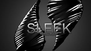
Sleek Production Graphics | Matthew Murphy
•Download as PPTX, PDF•
1 like•419 views

This document appears to be a portfolio or project report for the design of a ballpoint pen. It includes sections on research conducted on how ballpoint pens work and their history. It also includes sketches, drawings, and measurements for the original design of the pen and subsequent modifications. The document discusses justifications for design decisions and describes the creation of brochures and advertisements to market the pen. It indicates the project has evolved over time from initial ideas and acknowledges the complexity involved in completing the design and marketing materials to a high standard.

More Related Content
Similar to Sleek Production Graphics | Matthew Murphy
Similar to Sleek Production Graphics | Matthew Murphy (20)
Recently uploaded
Recently uploaded (20)
Sleek Production Graphics | Matthew Murphy
- 3. 01. Abstract 02. Research: How Does A BallPoint Pen Work? 03. Research: The History of the BallPoint Pen 04. Research: Market Development and Sales Growth 05. Name Justification 06. Initial Ideas and Opinions Date: 27/1/2012 07. Ideas and Opinions Date: 13/2/2012 08. Ideas and Opinions Date: 25/3/2012 09. Ideas and Opinions Date: 7/4/2012 10. Original Pen 11. Logo Justification 12. Logo Tutorial: Step One 13. Logo Tutorial: Step Two 14. Logo Tutorial: Step Three 15. Logo Tutorial: Step Four 16. Logo Tutorial: Step Five 17. Original: Picture 18. Original Drawing: Initial Sketches 19. Original Sketches: Vacuum Piece + Grip 20. Original Drawing: Vacuum Piece + Grip 21. Original Measurements: Vacuum Piece + Grip 22. Original Sketches: Bracket 23. Original Drawing: Bracket 24. Original Measurements: Bracket 25. Original Sketches: Tube 26. Original Drawing: Tube 27. Original Measurements: Tube 28. Original Sketches: Button 29. Original Drawing: Button 30. Original Measurements: Button 31. Original Sketches: Trigger 32. Original Drawing: Trigger 33. Original Measurements: Trigger 34. Original Sketches: Large Clip 35. Original Drawing: Large Clip 36. Original Measurements: Large Clip 37. Original Sketches: Body 38. Original Drawing: Body 39. Original Measurements: Body 40. Original Sketches: Spring 41. Original Drawing: Spring 42. Original Measurements: Spring 43. Original Assembly: Exploded View 44. Original Assembly: Renders
- 4. Contents: Part B (Modified Pen) 1. Part B 2. Prototype 3. Improved Drawing: Vacuum Piece + Grip 4. Modified Drawing: Vacuum Piece + Grip 5. Modified Measurements: Vacuum Piece + Grip 6. Improved Drawing: Button 7. Modified Drawing: Button 8. Modified Drawing: Cap 9. Modified Measurements: Button 10. Modified Measurements: Cap 11. Modified Drawing: Trigger 12. Modified Measurements: Trigger 13: Improved Drawing: Barrel Style 1 14. Modified Drawing: Barrel Style 1 15. Modified Drawing: Barrel Style 2 16. Modified Measurements: Body 17. Improvement Extra: Tie Clip 18. Modified Drawing: Tie Clip 19. Improved Drawing: Exploded View 20. Improved Drawing: Exploded View + Bill of Parts Part B (ADVERTISEMENTS) 21. Brochure One: Planning 22. Brochure One: 23. Brochure One: Front Justification 24. Brochure One: Back Justification 25. Brochure Two: Planning 26. Brochure Two: 27. Brochure Two: Front Justification 28. Brochure Two: Back Justification 29. Brochure Two: Justification 30. Brochure Three: Planning 31. Brochure Three: 32. Brochure Three: Front Justification 33. Website 34. Website Speed Art: 35. Website Speed Art: Justification (Interactive) 36. Conclusion 37. Bibliography 38. Bibliography (cont.) 39. Template 40. Reminder 41. Why Do I Deserve a VHA10? 42. Criteria Sheet 43. Criteria Sheet (cont.)
- 5. Pens are one the dire straight for simplicity at the current point in time. Not many pens are out on the market that has a classy touch to it unless your willing to spend $300+. ACME has hired me to complete an in-depth analysis on how the current market in pen retail stands as well as how it can be improved. Through the guidelines given to me I have create the pen now known as “SLEEK” This presentation will show how a profit could be made and how this could be achieved. Pens are one of the highest economic sellers that only have an major increase in December in January, due to school students returning to school. Knowing this the pen is aimed at the parents buying for the students. Not only is this product aimed at parents its also aimed at the classical businessmen, trying to give them the class they need in their day to day life without having to spend a lot of money.
- 6. Ball point pens are used all over the world. They are widely used as an overall pen that can be used for day to day living or in the workplace. The ball itself is made from one of three materials; brass, steel or tungsten carbide, this rolls the ink from the cartridge to the paper you are writing on. It is held in place by two parts; the reservoir and the socket. The ball works by rolling as you write, although the socket and ball are incredibly tight, the force you apply to the pen as well as gravity pushing the ink down, causes the ink to roll onto the ball and then onto the paper. The ink does not dry as the ball is sealed and stops airflow from going into the reservoir. Another example of a ball point being used in something other than a pen is roll-on deodorant. In image 2 you can see how the ball is held in place by the socket, it also shows you how the ball accesses the reservoir. Source 1 Source 2
- 7. Ballpoint pens, we use them everyday and we assume that they have been around for a long time, however they have were initially introduced in 1888 by John Loud. Although this is when the first WORKING ballpoint pen was made, many in the 20th century had tried before him however failed to keep the ball in place. This may have been the first working ballpoint pen, but it only worked on rough surfaces, such as leather or clothing. Van Vechten Riesburg improved upon the idea, 18 years later in 1916. He put the ink in a thin tube, and then the ball point pen at the end of a tube, with a socket. He did not know it but he created the initial ideas of the ball point pen that we use today. However his pen did not flow properly and was very uneven. In 1941 (during world war II) the Biro brother and their friend Huan Jorge Meyne, escaped Nazi Germany and went to Argentina. They then created and sold the ball point pen name “Birome” (Biro and me from Meyne)[Source 3]. This is what we now call the Biro Ball point pen. Moving on to the 1950’s. The pen was widely renown as the “rocket” and first went on sale at a store named Gimbels. They sold for $9.75 ea Now in 2012 they sell for a minimum of 50-99 cents Drawings such as the one shown, have influenced pens and how comfortable they are to use and how well the ink flows, etc. [Source 4] 1888 1916 1941 1950 2011 Source 3 Source 4
- 8. Using one of Bic’s Shareholder’s prior newsletters, it is shown how dependent the world is on ballpoint pens. They have released 22 million pens were sold in which they made 70% of a 56 million was made (net). After viewing these numbers, I have come to realize that a new type of pen is needed in the market to break Bic’s spree of money. All of Bic’s pens are very simplistic to use, however how many are classy enough for a businessmen? None. I believe the net sale of this pen alone would estimate 1 million dollars plus after the first 4 years and for a pen just breaking the market I feel it is a good number to start at, especially next to companies such as Bic Source 5
- 9. Dictionary.com describes the word sleek as being; “trim and graceful; finely contoured; streamlined: a sleek sports car.” This is the aim I am wanting to achieve with the pen I am recreating. A lot of people want the feel of class in their daily lives, I feel having a pen that can atone for the feeling of not owning a sports care or other valuable items. The word Sleek brings not only a rich feeling but a sex appeal to the pen. With a “sleek” design the pen could achieve maximum selling potential. Using the colours; Black, Red, Blue and Grey. I decided to use grey as it is harder to see on paper and can be used a draft colour or a pen directly for initial drawings. This pen will have an eraser at the top and erasable ink so that it is perfect for any designer or artist.
- 10. Looking at an example of a normal, modern pen (Artline 4 BallPoint Pen), I thought of an idea that develops on the idea, and becomes more “Graphic Drawer” friendly. One of the worst things that can happen when your drawing up a piece of work and you have to use a pen is the ink overflowing, I want this design to have an exact socket to place the ball pen into, to stop the ball from rolling to much and picking to much ink up in the meantime. This idea has been done in pens with only one point, this pen would respectively “break” the market for this style of pen, creating a diverse name for the brand.
- 11. At this point in time I have started to complete all of my sketches and have started to do final renders of the original parts. It has come to my attention that by changing the colours to colours for designers I remove 90% of the target audience, therefore I have decided to change it back to the colours originated for the CLIX 4. This reopens the target audience and gives a bigger selling proposition to the buyers. I want to add vinyl as a grip that starts at the vacuum and ends at the edge of the button, this would give a “sleek” look to the pen in which has style and class, as well as the grip needed to work with it. My ideas are starting to form a shape in which could be sold anywhere from office works to boutique stores.
- 12. At this point in time, all parts for the original and modified have been made, with new ideas and concepts coming through the work with justifiable reasons for all. New ideas such as a magnetic tie clip push the modified pen through current pen styles and start to develop a more modern idealist version of a pen that will hope to achieve high standards in the marketplace. By making these modifications to the pen itself, this hopes to change the idea of cheaper pens, by making them more “classy” or “sleek” feel to not only pens in the future but to concept of pens and other stationary as well.
- 13. Coming close to the due date, ideas on the subject have been changed over time. An example of this would be the brochures and how they will be displayed and presented. Three brochures will be made and one will be chosen as the final product. This will require more planning and more artwork, however it will assure a higher quality of advertising for the product. Other advertisements (such as posters and billboards) have been idealized however, depending on time, may not be finished. To begin with, I though this assignment would have been a lot easier, however in contrast, it is a lot more complex to complete at a high standard.
- 14. The Artline CLIX (seen in the image to the left) was how I got my initial idea from. This pen is one of the more common four point pen in which I believe I can improve on. The design is very simplistic, 4 colours, soft grip, easy to handle, however it does not have an appeal to the user. This design can be improved to make the user feel as if they are adding a “pinch of class” to their daily lives. To do this, I feel changing the plastic to a aluminum finish is important, as it creates “sleek” feel to the pen itself. Changing the clip to a powder coated black would be important as it not only has the sleek logo on it, it can also have the brand name applied to the clip as well. This is where gold or aluminum could also be applied to add a business man touch to the pen. Using the original ideas of the pen, “Sleek” will be a vast improvement from what I believe to be its predecessor, the Artline CLIX. Source 6
- 15. When trying to capture the identity of the pen design, I had to create a symbol for the pen to be represented by. This is when I created the “SLEEK” logo. Initially I wanted to have the S symbolized by as object or by something that people could look at and remember. That is when I thought of creating an S out of two shapes. I have used to tear drop shapes that create a symbolic S that can be easily identified as not only an S but also as an independent, classy brand. This is important as the pens target market is people with an average salary. Creating the classy effect was accomplished by adding a gradient to the inside of the logo. The blue ouster glow on the logo positions the audience to develop a sense of attachment to the logo/brand. This logo gives the brand a “sleek” edge on opponents in the pen / stationary business. I believe that the logo/ identification of a brand or specific item is important to selling it as well as giving the pen a reputation in the marketplace. The grey used along with lighting and shadowing give an in- depth feel to the company, not only providing class, but also given the brand jurisdiction in the marketplace. The outer effect given to the logo, represent the small family feeling of the company, whilst still working as a large distributor. This would provide warmth and a “family” touch to the company, that most companies lack to have. I believe this is a very important step in assuring that customers are satisfied with what they receive The pages below show instructions into remaking the “SLEEK” logo Before Layer Styles Added After Layer Styles Added
- 16. 1.Place the logo into Photoshop cs5-cs6. 2.Add a light grey colour to the logo, and add a drop shadow to your liking.
- 17. 3. Create an Adjustment layer, above the logo and marquee an area, similar to the picture. Using a white brush, add “lighting” to this side of the logo, ensuring that it is an adjustment layer, this can be seen if the brush paints outside the logo
- 18. 4. Create a new adjustment layer and hit “CTRL+SHIFT+I” to inverse the marquee selection. Using a grey or black paint brush, repeat step 3
- 19. 5. Repeat steps 3-4 on the outside edges to complete the same effect given.
- 20. 6. Copy and past the layer style from the first tear drop, rotate it horizontally and vertically and attach to the second tear drop You now have the “SLEEK” logo
- 24. The original concept of this pen is quite smart as it gives good comfort to the user, however it is not elegant. It approaches a large target market and delivers I simple idea very effectively. This idea can be improved by changing the material from rubber and plastic to aluminum and unpolished aluminum (grip). This will make the pen sleeker, classier and overall a lot lighter. Side View (Drawn) Rendered Isometric View
- 27. The bracket is a very simple device that keeps the 4 ink cartridges in place. This is a necessary for a 4 point pen. This part will not be modified as it does not need to be, Artline has made this efficient enough for me to use in my own pen. Side View Rendered Angle View
- 30. The original ink cartridge does not need to be changed, it has good ink flow and the ball rotates smoothly. The ink will be the same in my altered pen, however the ink itself will be changed to a erasable ink, making the pen more designer and engineer friendly.
- 33. Buttons are what you are constantly touching on a pen, especially when it is a 4 point pen when you are always changing colours. The button is very simplified and is easy to touch, however it has no other purpose and it can be improved. By changing the button to an eraser/button and changing the ink to erasable ink, it create a pen consistent with the changing marketplace and challenges other companies trying to continue their reign. By doing this Sleek challenges and creates a good portfolio in the future for the company. By judging the changes in the marketplace, it is easy to see that people want a classy, money wise, trustworthy and useful pen and by adding an eraser and erasable ink to the pen it does all this and give a “sleek” version to the very simple original.
- 36. Traditional colours are used on this pen to create a simplified look that creates a symbol or logo for not only art line but for the rest of pen market place.
- 39. The clip used is an effective design and holds to clothing easily and effectively. However it has no appeal to it. It is a simplistic design that has no flow. The improvements I want to make would create an elegant flow to the pen which emphasizes the importance on the pen in the current agriculture. I would also like for the clip to be a detachable tie clip. This creates a slightly smaller target market however it is the higher earning side of the market, therefore the loss in audience is cancelled out with the salary difference.
- 42. The original Barrel consists of curves and a circular shape to give the pen feel, form and an overall shape. This can be improved by giving the pen more flowing contours. In doing this its recreates the image into a more sleek and classy design, giving it the edge against competition.
- 45. Springs, unlike the rest of the pen are created solely for the mechanics of the pen. This means that although it is a very simple concept, it does not need to be changed or modified, meaning this part will not be changed in the modified pen.
- 49. The Artline “CLIX” is a very simple pen, it uses this to contrast with customers that it is an easy to use pen that can be used in a business or even at home. Unlike the “CLIX”, the “SLEEK” 4 Point pen will be specified to a niche market of business men and woman who want to add “style” to their life. The first modification to help imply this, is the material change, originally the pen was a white plastic, with little to no class. The modification changes the material to a polished aluminum, as metal shows wealth, it automatically shows the market that this pen is classy, sexy and made for business men and women alike. The second change I have made to the pen is creating a tribal pattern to the grip and adding the sleek extended logo to the body of the pen. Unlike the first modification, it does not add class, however it does imply power and show masculinity within the pen. Although this does create a smaller market, it show dedication to a customer, which will useful for periods of the companies sales (explained in later slides) The third change I have made to the pen is the erasable ink , although this cannot be seen in the renders, it is a vey useful add to the pen. Erasable ink is not new to the market place, however it does show a relation from company to client. To go along with this modification, an eraser has been added to the button, this complies with prior pens made and is not innovative, however it is a must if the ink is to be erasable. The idea of having an erasable pen perks most peoples ears, however modifications 3 and 4 will help drawers and designers alike to complete drawings without having to use a pencil. This may not be new to the market, but a comfortable, reliable and attractive pen is hard to find, especially at an affordable price.
- 50. To begin with, I wanted a smooth flowing body, things such as grips and too many parts can interrupt the flow of the pen, making it seem heavy and misguided. I have tried to remove this factor by making only 2 main parts, removing the grip and using an aluminum surface. However the flow is slightly interrupted by the logo design for the pen. This pattern will only be 0.01 mm thick, meaning it will be very un-noticeable and thus hardly changes the flow of the pen.
- 51. The modified drawing of the vacuum piece attempts to place style into the grip while placing textures within the pattern so that the pen will not slip out of the hands of the user. Using tribal patterns to add style to the piece places a more male target market to the pen, in turn the makes the target market more specialized. This can hurt growth however it shows that SLEEK is aimed at satisfying its customers. The material (like the rest of the pen) is aluminum, this persuades customers that it is a sleek, classy pen that with holds values such as being rich and independent.
- 54. The modified button has been changed to include an eraser and cover. This will help identify with users that the ink is erasable. This promotes the pen subconsciously when people look at buying the pen in store. I have also changed the material from plastic to a matte aluminum, to really contrast from the body, as it is polished, aluminum. The cover was placed to not only cover the eraser, but to give something to push, as the button releases an colour if it is in use.
- 56. Although a cap may not be a necessity, It does protect the eraser below it while giving the pen an ample look into a defined market.
- 59. I decided not to change the shape of the trigger, this was due to the fact that the contours give a balanced amount of grip to push on. I felt that the material would not fit the SLEEK however so it was changed to brushed aluminium to give the trigger a textured feel to give it that extra bit of grip. The colour of the pen is highlighted with a single pin stripe close to the top of the trigger, this gives a classy look to something bland and slightly boring on the old trigger.
- 60. As the shape has not changed from the original, please refer to the original measurements CLICK HERE TO BE MOVED TO THE SLIDE
- 62. Although the pen is suppose to be “classy” , the random pattern is not. However this does not change the overall effect of the pen. Design is turning chaos to formed ideas and eventually designs, the pattern may be somewhat abstract, but in turn it does give the pen an overall classy and clean look. It’s looks simple, but the complexity of the shape is hidden within the contours of the pen itself. This style was not picked however as it does not represent the company, in which is a must, especially for the first pen, the logo should be imminent.
- 63. This was the second design I made for the modified piece, I felt this one was the best choice, as it is not only the better design however it also has the sleek logo subtly placed within the design. It changed from the prototype to the render, as it did not assemble correctly with the dimensions. I also changed the colour of the indent to a black grain, as I creates a classier look. I also planned to change the shape of the barrel itself, to end as a point, however that was cancelled after the idea of the eraser being added.
- 65. Most pen companies lack personal development with their target audience, as mine happens to be the “classy businessmen” market, the tie clip is a must have for an everyday user. The tie clip attaches to the original socket of the pen, however the top can be removed and placed onto a second piece, containing two magnets, that will sufficiently keep your shirt and tie together without looking tacky. This is a revolutionary idea that may or may not change the specifications, that manufacturers could achieve by making pens more personal to targeted audiences.
- 71. Leather/Vinyl style with stitching to add to class. This persuades readers that the pen is of fine quality and creates a genuine opinion of the company and the pen itself. Using the logo in the middle of the brochure creates a symbolization of the brand and uses memory to place the image of the logo, and therefore the pen in the mind of the reader. Using shapes such as circles and square, it becomes a simplified way of showing a complex viewing of a new standard of pen. Using colour’s such as light blue (feature colour), multiple greys, and silver, this brochure will attempt to break into the market by acting as a class above pen, in which would be cheap, unlike most classy pens which are overpriced. Using the quote “Adding Style To Your Everyday Stationary List” -This provides the reader with a estimated price, being cheap as it states “Everyday” meaning it wont change their budget too much. -Also implies that it will be on their stationary list. Source 9
- 73. The class of the brand needs to be validated with this brochure. This has been achieved with the leather base. It gives a rich feel that really brings out what the brand stands for. When this brochure is printed, it would be given a vinyl/leather texture to really aspire to the name sleek, and to bring the quality of the brand to the foreground of the viewer. I have used mid tone blues as a vibrant colour on the brochure to give a classy look, it gives a professional look. I have used a linear gradient to make the logo/texts pop on the vinyl. These connections will improve that validation of the company and thus improve sales of the pen Colour Code: Darker Blue Lighter Blue
- 74. Like the front of the brochure, the back uses the same vinyl/leather texture, this is to help connect the to pieces evenly. I have added a “spotlight” looking effect to the middle to encourage the eyes to the centre of attention, the pen, as well as the words “Write, Erase, Create, Simple” These words help viewers identify with the pens ideas. Write and Erase are to do with the accessibility users have as it is an erasable pen. Create helps identify that artwork can be made with this pen as it is classified as a “designer” pen. And finally , Simple is added to show that the pen is simple to use, its not a pen that takes a while to get use to. The hatching on the left and right sides of the brochure show where material would be removed. This makes the brochure innovative as it changes the idea of a “normal” brochure. It creates a shape based on the logo at the from the front of the brochure. I have used a metal gradient on the word “SLEEK” to relate it to the pen. This create common similarities that the reader will pick up subconsciously
- 75. Use vibrant colours on white background to create contrast Use a trail of ink splatter to make the eyes follow a pathway of information Place enough information on the brochure without distracting the reader from the pen itself. Change the logo to suit the rest of the page, i.e. adding splatters to the logo, etc. Weight watchers current advertisement demonstrates the same concepts to define weight, however the same techniques can be used to sell items (such as pens) Colours : Red, Black Blue Green & White (These colours can vary, to lighter or darker tones. Gradients may also be used to emphasize contrast) Source 7 Source 8
- 77. Unlike the first brochure, this brochure foregrounds the class of the SLEEK 4 point pen. Using the business suit on the front of the brochure, gives the brochure immediate class and elegance. This is important due to the lack of reputation in the market place, this brochure alone could help improve this factor, which in turn will improve sales.
- 78. Simplicity brings forth elegance and the idea of sex appeal, the simpler something is, the more attractive it is to the eye. Hence why I have used little to no detail on the back, it gives the brochure sex appeal why still advertising the pen and the brand appropriately. The logo is centered on the brochure to show how makes the pen and to give the pen relevance in the market place.
- 79. Brochure two did not turn out how it was originally planned, I believe I planned the brochure to far ahead, and therefore my ideas on the brand and the pen changed during the planning process. However the final product gave the brand and pen a lot more of a business look, this gives embodiment to the company and will help develop a look for the company. This would hope to give the pen a good placement within the market place. In comparison, if the original planning had gone ahead, it would've given the pen a much different vibe, and would have placed the pen in a much different and broad market. This could have then made it seem as if SLEEK does not know its target audience, thus failing the intended audience.
- 80. Unlike the first two brochures, in which both show the sleek and classy side of the pen, I want the third brochure to show the rough edge and sex appeal the pen brings to the table. This brochure will have a grungy background with the pen being the highlight of the piece. The background will be dark to make it less noticeable. Words such as “Sex Appeal” and “Create / Erase” will be used like the first brochure in the background to highlight these words and help the mind attain them for further reference. A spiral effect will be used to help the words be read in a circular motion, attaching your eyes to each word in a collective circle, building the ideas in your head will still having the pen in sight and being able to relate it back to the pen itself.
- 82. Class can be distinguished easily through the contrasts and complexities shown within a picture/text or object. This one sided advertisement hopes to achieve this. The pen itself is placed in the center of the piece, however it is slanted to create a parallel effect with the lining in the background of the picture. However where this brochure really relays the idea of “SLEEK” is the contrast between the pen and the background, the background itself is grungy and dirty, its look gives a very used and aged feel to the background, however the pen is foregrounded by giving it brighter coloring in comparison. This is then aligned and justified with the words “Class, Engenuity, Sex Appeal and Create/Erase” this places ideals within the readers head subconsciously, in which help them refer to the pen as the words provided
- 86. Although pens seem like such a simple idea, to recreate them and modify them is a bigger task than it seems. Pens are made to the best of the companies ability and prove to customers of what they are capable of, if they cannot provide a good product, it reflects badly. In saying this, Artline created a somewhat “perfect” pen. Its simple, comfortable to use, in flows cleanly. However the one thing they lacked with the pen was a niche target market, doing this mean the sales may be slightly lower, but “customers come first” and this is what SLEEK strives for. Having a smaller target market changes how you design anything, and when it comes to pens it gives you more freedom to not only choose the target market, but to fit all of their needs within your own ideas. Design is old work, renewed and rearranged to change the face of the design itself, whilst keeping the same concepts, this has been achieved on the SLEEK 4 point pen. The ideas from the original creators of the ball point pen made the idea and then have given infinite possibilities for companies and people alike. Ball point pens may seem like such a small thing, but a pen could spark the imagination, make jobs easier and even make you feel happier. By using colours that are modern and “in”, the SLEEK hopes to bring forth all of these goals and then bring forth happy customers. From concept to reality, the SLEEK has had ideas from other pens currently available. Bringing these ideas together, creates the pen itself and puts innovation back into he slightly lacking market place.
- 87. (Organised By Slide) (IMAGE REFERENCE IS IN MLA NOT APA DUE TO NO REFERNCE GUIDE) How Does The A BallPoint Pen Work? -One(Website, Research) HowStuffWorks "How does a ball point pen work?". (n.d.). HowStuffWorks "Science". Retrieved January 26, 2012, from http://science.howstuffworks.com/innovation/science- questions/question683.htm -Two(Image)(Source 1) No, Author. Roll On Deodorant With Ball. 2010. N/A, N/A. HowStuffWorks. Web. 27 Jan. 2012. -Three(Image) (Source 2) No, Author. Roll On Deodorant Without Ball. 2010. N/A, N/A. HowStuffWorks. Web. 27 Jan. 2012. Hirstory of the BallPoint Pen -One (Website, Research) Ballpoint pen - Wikipedia, the free encyclopaedia. (n.d.). Wikipedia, the free encyclopaedia. Retrieved January 31, 2012, from http://en.wikipedia.org/wiki/Ballpoint_pen -Two (Image) (Source 3) N/A, . Birome Pen. N.d. America, Argentina. Wikipedia. Web. 1 Feb. 2012 -Three (Image) (Source 4) N/A,BallPoint Pen Drawing. N.d. America, Argentina. Wikipedia. Web. 1 Feb. 2012. Market Development and Sales Growth -One(Research) (Document) ., B. (2004). Newsletter. Bic Shareholders Newsletter., N/A(N/A), 1. Retrieved February 6, 2012, from http://www.bicworld.com/img/pdf/ShareholdersletterN2 -Two(Image) (Source 5) N/, A. Sales 2004. N.d. Bic, America. Bic Shareholders Newsletter. Web. 6 Feb. 2012. Name Justification -One (Website, Reference)Dictionary | Sleek. (n.d.). Dictionary.com. Retrieved January 27, 2012, from dictionary.reference.com/browse/sleek Original Pen -One (Image) (Source 6) Works, Office. ARTLINE CLIX. N.d. N/A, Australia. Office Works. Web. 30 Jan. 2012.
- 88. (Organised By Slide) (IMAGE REFERENCE IS IN MLA NOT APA DUE TO NO REFERNCE GUIDE) Logo Justification -One (Website, Reference) Color Psychology . (n.d.). Infoplease: Encyclopedia, Almanac, Atlas, Biographies, Dictionary, Thesaurus. Free online reference, research & homework help. — Infoplease.com. Retrieved January 29, 2012, from http://www.infoplease.com/spot/colors1 Brochure One: Planning -One(Image, Source7) Splatter Grunge Splatter Vectors. (n.d.). Free Vector Art & Graphics . Retrieved March 19, 2012, from http://www.freevector.com/grunge- splatter-vectors/ -Two (Image, Source8) Gradient PPT Background: Red Gradient PPT Free » Linear PowerPoint Backgrounds » Powerpoint. (n.d.). PPT Background: Powerpoint. Retrieved March 19, 2012, from http://www.pptbackground.net/powerpoint/linear-powerpoint-backgrounds/red_gradient_ppt_backgrounds Brochure Two: Planning -One (Image, Source9) Vinyl Texutre Free texture library | Texturebits: texture vinyl plastic. (n.d.). Free texture library | Texturebits. Retrieved March 19, 2012, from http://texturebits.blogspot.com/2008/06/texture-vinyl-plastic.html
- 90. Everything that is in this PowerPoint (other than references) are created, developed, designed and written by Matthew Murphy. None of my work is stolen nor plagiarized. Signed: ________________ - Matthew Murphy
- 91. I have completed the task above and beyond what the criteria has asked. I have shown in depth knowledge in the specified field and have communicated my understanding impressively. My terms used are correct and have made the pen to a professional standard. The modifications I have made have been done efficiently to improve on the pen. I have justified the changes I have made to my pen correctly, and believe that the pen could make a profit in the current market standings.
- 92. ASSESSMENT CRITERIA SHEET Student Name : Teacher : Mr. Paterson ASSESSMENT ITEM : Production Graphics Assignment CRITERIA STANDARD - The student work has the following characteristics: Criteria Task +A- +B- +C- +D- +E- Dimensioning techniques (As1100), Engineering symbols Orthographic conventions, Identification of components in sketches, detail and assembly drawings, sectioning conventions, selection of views, layout and marketing range of accurate facts, terminology, standards and conventions applied to all task areas relevant principles, procedures and techniques selected and used effectively in a comprehensive range of familiar or rehearsed situations. Substantial range of accurate facts, Terminology, Standards and conventions Relevant principles, procedures and techniques selected and used proficiently in a substantial range of familiar or rehearsed situations adequate range of accurate facts, terminology, standards and conventions Principles, procedures and techniques used purposefully in a range of familiar or rehearsed situation narrow range of facts, terminology, standards and conventions Procedures and techniques used in familiar or rehearsed situations basic facts and terminology Basic use of fundamental techniques in rehearsed situations 3 Knowledge Reasoning MARK
- 93. ASSESSMENT CRITERIA SHEET ASSESSMENT ITEM : Production Graphics Assignment CRITERIA STANDARD - The student work has the following characteristics: Criteri a Task +A- +B- +C- +D- +E- Sketches of all associated parts of the pen Sketches of proposed refinement of pen. Detailed, effective sketches/ drawings with precise and clear communication Detailed, functional sketches/drawings with precise and clear communication Legible sketches/drawings with adequate clarity of communication Legible sketches and drawings Unclear sketches and drawings 3 6 Arrangement of Working Drawings, pictorial representations and power point slide show. The use of graphic communication in the production and marketing of commercial industry products Effective and resourceful selection, planning and use of a range of appropriate elements of presentation Effective selection, planning and use of a range of appropriate elements of presentation selection, and use of a range of appropriate elements of presentation Use of predetermined elements of presentation Unclear sketches and drawings Presentation