Scream Magazine Cover Analysis
•Download as PPTX, PDF•
0 likes•420 views

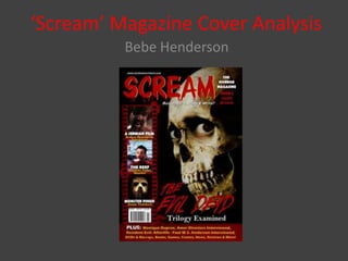
The magazine cover features a realistic skeleton image that takes up the entire front page. The masthead uses a dripping, blood-red font surrounded by a yellow outline. Short phrases like "Horror", "Monster", and "Evil" create a semantic field that reinforces the slasher genre. The tagline "Blood, Guts, Gore & More" is memorable and appropriate. Cover lines are presented in a film reel, identifying the main image of "The Evil Dead". The designer concludes that the cover successfully captures the horror genre through its visuals and language.

Recommended
More Related Content
What's hot
What's hot (20)
Similar to Scream Magazine Cover Analysis
Similar to Scream Magazine Cover Analysis (20)
More from Stratford-upon-Avon College
Scream Magazine Cover Analysis
- 1. ‘Scream’ Magazine Cover Analysis Bebe Henderson
- 3. Design The masthead is placed at the very top of the page which is conventional of all magazines. The font is written in a font that appears to be dripping – almost like blood. This is absolutely perfect for the Slasher genre. Red is the main colour used for the masthead, but it is also surrounded by a yellow outline. Yellow isn’t normally a colour I would associate with the Horror genre however it does look quite affective here. The image takes up the whole page of the front cover with text written over it. Other fonts used on the magazine are; the same as the masthead and a very sharp, standard looking font. The colour used on the front cover is very good for the Horror genre – black and red with a hint of yellow.
- 4. Image The image shows us a very realistic looking skeleton. This may attract people who are more interested in the ‘skeleton aspect’ of Horror. It is a direct mode of address because the skeleton is looking directly at the audience – this would influence the reader to buy the magazine as it creates interaction between the reader and the picture. The picture takes up pretty much the whole page.
- 5. Language A semantic field of language has been created within this poster using words such as; ‘Horror’, ‘Monster’, ‘Evil’ and ‘Dead’. This type of language created reiterates the fact that it is a Slasher/Horror magazine.
- 6. Tagline ‘Blood, Guts, Gore & More’. This is an excellent tagline as everyone will remember it and it works very well under the genre of Horror.
- 7. Cover Lines There are three smaller cover lines presented in a film reel, which I think is a very different and unique way of presenting it. The main cover line is “The Evil Dead” and we automatically know this because it explains the main picture.
- 8. Summary Overall, I do this this magazine cover has many strong points; particularly the masthead and the way the cover lines are presented. It has certainly given me some good ideas for my magazine cover.