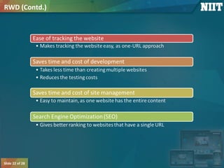
Slide 1 of 28
Introduction to Responsive Web Design
Slide 2 of 28
Course Overview
Use the animation, Course Intro.zip, to provide the overview of the course.
Slide 3 of 28
 In this session, you will learn to:
 Identify Web designing techniques
Objectives
Slide 4 of 28
 Advancement in technology has changed the way
users access online information.
 People are accessing websites through multiple
devices, such as:
 PCs
 Laptops
 Smartphones
 iPads
 To cater to this large user base, organizations adopt
web designing techniques that properly represent
the websites on various devices.
Identifying Web Designing Techniques
Slide 5 of 28
 Some of the Web designing techniques are:
Identifying Web Designing Techniques (Contd.)
Slide 6 of 28
 AWD is the way of representing the same website by using separate Uniform
Resource Locaters (URLs) on different devices. For example:
 URL of Facebook for a PC or laptop is:
 https://www.facebook.com
 URL of Facebook for a smartphone is:
 https://m.facebook.com/
 AWD creates a series of layouts of a website based on various screen sizes of
different devices.
AWD
Slide 7 of 28
 The Web page layout is designed according to the screen size of the device on
which it is rendered.
AWD (Contd.)
Slide 8 of 28
 On a smartphone, the Web design of the same website:
 Becomes compact
 Displays lesser content
AWD (Contd.)
Slide 9 of 28
AWD (Contd.)
Slide 10 of 28
RWD
Slide 11 of 28
 Let us first understand the factors that distinguish a
desktop Web page from a mobile device Web page.
 These factors are:
 Screen size
 Ergonomics or touch capability
 Navigation and widgets
 Content, blank spaces, and whitespaces
 Images
 Advertising
RWD (Contd.)
Slide 12 of 28
RWD (Contd.)
Slide 13 of 28
RWD (Contd.)
Slide 14 of 28
RWD (Contd.)
Slide 15 of 28
RWD (Contd.)
Slide 16 of 28
RWD (Contd.)
Slide 17 of 28
RWD (Contd.)
Slide 18 of 28
 The following table displays the differences between AWD and RWD.
RWD (Contd.)
AWD Technique RWD Technique
It uses separate URLs to represent the
same website on different devices.
It uses a single URL to represent the same
website on different devices.
Different versions of Web pages are
carefully constructed for a varied set of
devices. Based on a request, the
appropriate version of the Web page is
sent as a response.
New concepts, such as media queries,
flexible images, and fluid grids, are
introduced. These new concepts allow you
to create a single Web page that modifies
its layout as per the screen size of the
device.
It is server side. It is client side.
A Web page gets loaded faster because
different designs for different devices are
available on different domains.
A Web page gets loaded slowly compared
to AWD, because the website is available
on the same domain name and the device
is loaded with the entire responsive
codebase, which may make it heavy.
Slide 19 of 28
 Considerations for RWD:
 Design:
 Design the website such that it looks similar on all devices and environment.
 Image size and screen layout:
 Images should be optimized for all screen sizes and resolutions.
RWD (Contd.)
Slide 20 of 28
 Mobile first:
 To optimize a website, present the content best suited for the small screens and then
enhance it for the large screens.
 Website navigation:
 Due to the small screen size of portable devices, keep navigation easy and simple.
RWD (Contd.)
Slide 21 of 28
 Benefits of RWD are:
RWD (Contd.)
Slide 22 of 28
RWD (Contd.)
Slide 23 of 28
 Limitations of RWD are:
 You cannot implement RWD on an existing website.
 You need to overhaul, redesign, and rebuild the website.
 The development time is 20% more than that of a standard website.
 The Web page loads slower than AWD.
RWD (Contd.)
Slide 24 of 28
Group Discussion
Let us discuss which technique is better, AWD or RWD.
Slide 25 of 28
 Once a website is created using the ______ technique, there is no need to
create the separate websites for other devices.
 AWD
 Fixed-width
 RWD
 Flexible Web design
Just a Minute
Slide 26 of 28
 Answer:
 RWD
Just a Minute (Contd.)
Slide 27 of 28
 In this session, you learned that:
 AWD is the way of representing the same website by using separate URLs on different
devices.
 RWD helps designers to create device-independent Web content and neglect device-
specific elements, such as physical attributes, browsers, client-side rendering, and
operating systems.
 Factors distinguishing a desktop Web page from a mobile device Web page are:
 Screen size
 Ergonomics or touch capability
 Navigation and widgets
 Content, blank spaces, and whitespaces
 Images
 Advertising
 Some of the benefits of RWD are minimal maintenance, social sharing, and better
viewing experience to users.
Summary
Slide 28 of 28
 After this session, you need to do the following tasks:
 Read Chapter 1
 Perform the following exercises of chapter 1:
 Exercise 1
 Exercise 2
 Exercise 3
 Exercise 4
 Exercise 5
 Exercise 6
What’s Next?

Responsive web design_session_1

  • 1.
    Slide 1 of28 Introduction to Responsive Web Design
  • 2.
    Slide 2 of28 Course Overview Use the animation, Course Intro.zip, to provide the overview of the course.
  • 3.
    Slide 3 of28  In this session, you will learn to:  Identify Web designing techniques Objectives
  • 4.
    Slide 4 of28  Advancement in technology has changed the way users access online information.  People are accessing websites through multiple devices, such as:  PCs  Laptops  Smartphones  iPads  To cater to this large user base, organizations adopt web designing techniques that properly represent the websites on various devices. Identifying Web Designing Techniques
  • 5.
    Slide 5 of28  Some of the Web designing techniques are: Identifying Web Designing Techniques (Contd.)
  • 6.
    Slide 6 of28  AWD is the way of representing the same website by using separate Uniform Resource Locaters (URLs) on different devices. For example:  URL of Facebook for a PC or laptop is:  https://www.facebook.com  URL of Facebook for a smartphone is:  https://m.facebook.com/  AWD creates a series of layouts of a website based on various screen sizes of different devices. AWD
  • 7.
    Slide 7 of28  The Web page layout is designed according to the screen size of the device on which it is rendered. AWD (Contd.)
  • 8.
    Slide 8 of28  On a smartphone, the Web design of the same website:  Becomes compact  Displays lesser content AWD (Contd.)
  • 9.
    Slide 9 of28 AWD (Contd.)
  • 10.
  • 11.
    Slide 11 of28  Let us first understand the factors that distinguish a desktop Web page from a mobile device Web page.  These factors are:  Screen size  Ergonomics or touch capability  Navigation and widgets  Content, blank spaces, and whitespaces  Images  Advertising RWD (Contd.)
  • 12.
    Slide 12 of28 RWD (Contd.)
  • 13.
    Slide 13 of28 RWD (Contd.)
  • 14.
    Slide 14 of28 RWD (Contd.)
  • 15.
    Slide 15 of28 RWD (Contd.)
  • 16.
    Slide 16 of28 RWD (Contd.)
  • 17.
    Slide 17 of28 RWD (Contd.)
  • 18.
    Slide 18 of28  The following table displays the differences between AWD and RWD. RWD (Contd.) AWD Technique RWD Technique It uses separate URLs to represent the same website on different devices. It uses a single URL to represent the same website on different devices. Different versions of Web pages are carefully constructed for a varied set of devices. Based on a request, the appropriate version of the Web page is sent as a response. New concepts, such as media queries, flexible images, and fluid grids, are introduced. These new concepts allow you to create a single Web page that modifies its layout as per the screen size of the device. It is server side. It is client side. A Web page gets loaded faster because different designs for different devices are available on different domains. A Web page gets loaded slowly compared to AWD, because the website is available on the same domain name and the device is loaded with the entire responsive codebase, which may make it heavy.
  • 19.
    Slide 19 of28  Considerations for RWD:  Design:  Design the website such that it looks similar on all devices and environment.  Image size and screen layout:  Images should be optimized for all screen sizes and resolutions. RWD (Contd.)
  • 20.
    Slide 20 of28  Mobile first:  To optimize a website, present the content best suited for the small screens and then enhance it for the large screens.  Website navigation:  Due to the small screen size of portable devices, keep navigation easy and simple. RWD (Contd.)
  • 21.
    Slide 21 of28  Benefits of RWD are: RWD (Contd.)
  • 22.
    Slide 22 of28 RWD (Contd.)
  • 23.
    Slide 23 of28  Limitations of RWD are:  You cannot implement RWD on an existing website.  You need to overhaul, redesign, and rebuild the website.  The development time is 20% more than that of a standard website.  The Web page loads slower than AWD. RWD (Contd.)
  • 24.
    Slide 24 of28 Group Discussion Let us discuss which technique is better, AWD or RWD.
  • 25.
    Slide 25 of28  Once a website is created using the ______ technique, there is no need to create the separate websites for other devices.  AWD  Fixed-width  RWD  Flexible Web design Just a Minute
  • 26.
    Slide 26 of28  Answer:  RWD Just a Minute (Contd.)
  • 27.
    Slide 27 of28  In this session, you learned that:  AWD is the way of representing the same website by using separate URLs on different devices.  RWD helps designers to create device-independent Web content and neglect device- specific elements, such as physical attributes, browsers, client-side rendering, and operating systems.  Factors distinguishing a desktop Web page from a mobile device Web page are:  Screen size  Ergonomics or touch capability  Navigation and widgets  Content, blank spaces, and whitespaces  Images  Advertising  Some of the benefits of RWD are minimal maintenance, social sharing, and better viewing experience to users. Summary
  • 28.
    Slide 28 of28  After this session, you need to do the following tasks:  Read Chapter 1  Perform the following exercises of chapter 1:  Exercise 1  Exercise 2  Exercise 3  Exercise 4  Exercise 5  Exercise 6 What’s Next?