More Related Content

PDF

PDF

PPTX
AIと代数幾何 ~8分版~/ Artifical Inteligence Parameter Space Transformation using Alg... 
PPT

PDF

PPTX

PPT

PPTX
What's hot

PDF

PDF

PPTX

PDF

PPTX
GRASS × SQLite でベクタを扱ってみる 
PDF

PDF

PPTX

PDF

PPTX

PDF

PDF
Similar to Rでプロット

PDF

PPTX
StanとRでベイズ統計モデリングに関する読書会(Osaka.stan) 第四章 
PPTX

PDF

PDF

PDF

PPTX
Introduction to R Graphics with ggplot2 #1 
PPTX

PPTX

PDF

PDF

PPT

PPTX

PDF

PDF

PPTX

PDF

PDF

PPTX

PPTX
More from Tsukasa Fukunaga

PPTX

PPTX

PPTX

PPTX

PDF

PPTX

PPTX
A survery of topic model in bioinformatics 
PDF
Rck; accurate and efficient inference of sequence and structure-based protei... 
PPTX
Automated detection and tracking of many cells by using 4D live-cell imaging ... Recently uploaded

PDF
自転車ユーザ参加型路面画像センシングによる点字ブロック検出における性能向上方法の模索 (20260123 SeMI研) 
PDF
2025→2026宙畑ゆく年くる年レポート_100社を超える企業アンケート総まとめ!!_企業まとめ_1229_3版 
PDF
第21回 Gen AI 勉強会「NotebookLMで60ページ超の スライドを作成してみた」 
PDF
Starlink Direct-to-Cell (D2C) 技術の概要と将来の展望 
PDF
ST2024_PM1_2_Case_study_of_local_newspaper_company.pdf 
PDF
PMBOK 7th Edition Project Management Process Scrum 
PDF
Team Topology Adaptive Organizational Design for Rapid Delivery of Valuable S... 
PDF
PMBOK 7th Edition_Project Management Context Diagram 
PDF
100年後の知財業界-生成AIスライドアドリブプレゼン イーパテントYouTube配信 
PDF
FY2025 IT Strategist Afternoon I Question-1 Balanced Scorecard 
PDF
Reiwa 7 IT Strategist Afternoon I Question-1 3C Analysis 
PDF
PMBOK 7th Edition_Project Management Process_WF Type Development 
PDF
Reiwa 7 IT Strategist Afternoon I Question-1 Ansoff's Growth Vector Rでプロット
- 1.
- 2.
- 3.
- 4.
- 5.
- 6.
- 7.
生物学で図を描く理由
1.理解するため
– データの基本的性質・特徴を視覚化する事で理解する
– ヒストグラム、スキャッタープロット、バープロット、
etc
2.主張するため
– 結果をクリアに示す図を作る事で、主張を正当化する
– 凝った図
- 8.
- 9.
- 10.
- 11.
- 12.
- 13.
テキストファイルから図を読み込
んでplot
人工的なデータでなく、実際のデータを用いてplot
してみる
Ex) 東京の月ごとの平均降水量
tokyo_rainfall<-scan(“ファイルのパス”)
month<-c(1:12)
plot(month,tokyo_rainfall)
- 14.
- 15.
- 16.
- 17.
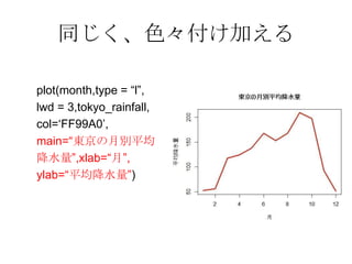
グラフの色を変更する
plot(month,type =“l”,lwd = 3,tokyo_rainfall,col=“red”)
RGB形式で指定する事も可能
(こちらを推奨、理由は後述)
plot(month,type = “l”,lwd = 3,
tokyo_rainfall,col=c(„#FF2800‟))
- 18.
- 19.
- 20.
- 21.
- 22.
- 23.
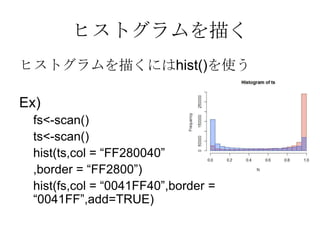
棒グラフを描く
棒グラフを描くにはbarplot()を用いる
Ex)
pt<-matrix(scan(〜),3,10)
color<-heat.colors(3)
par(mar = c(6,6,5,6))
name<-
c(“T17”,”S10”,”S20”,”S30”,”S40”,”S50”,”S60”,”H7”,”H17”,”H22”)
barplot(pt,names.arg = name,col = color,cex.name = 0.6)
par(xpd = TRUE)
legend(par()$use[2], par()$use[4],c(“〜15”,”16〜64”,”65〜”),col =
color, pch = 15)
- 24.
- 25.
- 26.
- 27.


![棒グラフを描く
棒グラフを描くにはbarplot()を用いる
Ex)
pt<-matrix(scan(〜),3,10)
color<-heat.colors(3)
par(mar = c(6,6,5,6))
name<-
c(“T17”,”S10”,”S20”,”S30”,”S40”,”S50”,”S60”,”H7”,”H17”,”H22”)
barplot(pt,names.arg = name,col = color,cex.name = 0.6)
par(xpd = TRUE)
legend(par()$use[2], par()$use[4],c(“〜15”,”16〜64”,”65〜”),col =
color, pch = 15)](https://image.slidesharecdn.com/kashiwar07-130318015440-phpapp02/85/R-23-320.jpg)