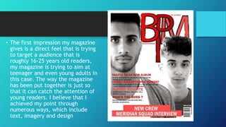
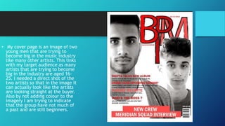
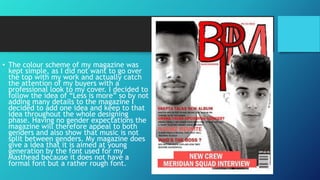
How does your media product
represent particular social group?
• The first impression my magazine
gives is a direct feel that is trying
to target a audience that is
roughly 16-25 years old readers,
my magazine is trying to aim at
teenager and even young adults in
this case. The way the magazine
has been put together is just so
that it can catch the attention of
young readers. I believe that I
achieved my point through
numerous ways, which include
text, imagery and design
• My cover page is an image of two
young men that are trying to
become big in the music industry
like many other artists. This links
with my target audience as many
artists that are trying to become
big in the industry are aged 1625. I needed a direct shot of the
two artists so that in the image it
can actually look like the artists
are looking straight at the buyer.
Also by not adding colour to the
imagery I am trying to indicate
that the group have not much of
a past and are still beginners.
• The colour scheme of my magazine was
kept simple, as I did not want to go over
the top with my work and actually catch
the attention of my buyers with a
professional look to my cover. I decided to
follow the idea of “Less is more” so by not
adding many details to the magazine I
decided to add one idea and keep to that
idea throughout the whole designing
phase. Having no gender expectations the
magazine will therefore appeal to both
genders and also show that music is not
split between genders. My magazine does
give a idea that it is aimed at young
generation by the font used for my
Masthead because it does not have a
formal font but a rather rough font.

Question 2 evaluation

  • 1.
    How does yourmedia product represent particular social group?
  • 2.
    • The firstimpression my magazine gives is a direct feel that is trying to target a audience that is roughly 16-25 years old readers, my magazine is trying to aim at teenager and even young adults in this case. The way the magazine has been put together is just so that it can catch the attention of young readers. I believe that I achieved my point through numerous ways, which include text, imagery and design
  • 3.
    • My coverpage is an image of two young men that are trying to become big in the music industry like many other artists. This links with my target audience as many artists that are trying to become big in the industry are aged 1625. I needed a direct shot of the two artists so that in the image it can actually look like the artists are looking straight at the buyer. Also by not adding colour to the imagery I am trying to indicate that the group have not much of a past and are still beginners.
  • 4.
    • The colourscheme of my magazine was kept simple, as I did not want to go over the top with my work and actually catch the attention of my buyers with a professional look to my cover. I decided to follow the idea of “Less is more” so by not adding many details to the magazine I decided to add one idea and keep to that idea throughout the whole designing phase. Having no gender expectations the magazine will therefore appeal to both genders and also show that music is not split between genders. My magazine does give a idea that it is aimed at young generation by the font used for my Masthead because it does not have a formal font but a rather rough font.