SlideShare a Scribd company logo
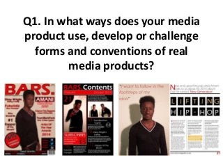
Q1. In what ways does your media
product use, develop or challenge
forms and conventions of real
media products?
Q1. In what ways does your media product use, develop or
challenge forms and conventions of real media products?
Throughout my work, I have always tried to keep the colour style coordinated, by using the
same 3 colours throughout my work. Red, white and black are the three colours I have
used, mainly because they contrast quite nicely. In my double page spread however, I used
gold in some of the work, because there was a certain part I wanted to stand out and also,
as I am focused on the rap genre, gold connotes richness, which many rappers seem to
write about within their lyrics. Within other media products, they always use a specific
colour scheme, and I tried to stick by this conventional way. I also asked the person on my
front cover to wear these specific colours, and luckily he had the perfect jumper for it, black
with red and white stripes to match the colour scheme.
Here you can see that I have used red,
white, and black as a background in my
contents page to keep to the colour
scheme I wanted to keep throughout. On
my double page spread, I put the
background as white and used the other
two colours within the writing and shapes.
Q1. In what ways does your media product use, develop or
challenge forms and conventions of real media products?
I found a font that I liked to use throughout my work, but one of the reasons I used
this font, is because there was a wide variety of the font. There was a normal version,
a slim version, a bold version and an extra bold version, which allowed to use all 4
fonts. I used the extra bold ones when I wanted something to stand out more, and
used the skinny version of the font when I wanted something to not stand out too
much. For example, in the mast head of my front cover I used a bold version of the
font. Media products often use the same font throughout their products, or similar
fonts in their magazine.
All of these are using the
different versions of the same
font. You can see that there is a
fairly large difference between
the boldness of the picture at
the top, and the other text,
although one does have an
outline, which made it look
larger. I had to take this into
consideration when deciding
which version of the font to use.
Q1. In what ways does your media product use, develop or
challenge forms and conventions of real media products?
On my front cover, the image I used was a medium shot, which I wanted to use to use
to show the full top half of the person and a slight bit of the bottom half. Also, I
wanted to be able to see the majority of his arms, so I thought this picture was perfect
for it. I also wanted him to cover most of the page, so I conventionally put the picture
in front of the mast head, as many large magazines do, because people instantly
recognize their mast head without even reading it, so cover parts of it up doesn’t
really matter too much.
These pictures show how I covered part of
the mast head up with my models head
and hair, but not too much that you
couldn’t read it. One of the pictures shows
the full front cover and the right side
shows the full length of the image I used of
my model.

More Related Content

More from RobTate

Evaluation question 3
Evaluation question 3Evaluation question 3
Evaluation question 3RobTate
 
Evaluation Question 1
Evaluation Question 1Evaluation Question 1
Evaluation Question 1RobTate
 
Hypodermic Needle Theory
Hypodermic Needle TheoryHypodermic Needle Theory
Hypodermic Needle TheoryRobTate
 
Stereotypes - Tessa Perkins
Stereotypes - Tessa PerkinsStereotypes - Tessa Perkins
Stereotypes - Tessa PerkinsRobTate
 
Lyric Analysis
Lyric AnalysisLyric Analysis
Lyric AnalysisRobTate
 
Q6 evaluation
Q6 evaluationQ6 evaluation
Q6 evaluationRobTate
 
Q4 evaluation
Q4 evaluationQ4 evaluation
Q4 evaluationRobTate
 

More from RobTate (7)

Evaluation question 3
Evaluation question 3Evaluation question 3
Evaluation question 3
 
Evaluation Question 1
Evaluation Question 1Evaluation Question 1
Evaluation Question 1
 
Hypodermic Needle Theory
Hypodermic Needle TheoryHypodermic Needle Theory
Hypodermic Needle Theory
 
Stereotypes - Tessa Perkins
Stereotypes - Tessa PerkinsStereotypes - Tessa Perkins
Stereotypes - Tessa Perkins
 
Lyric Analysis
Lyric AnalysisLyric Analysis
Lyric Analysis
 
Q6 evaluation
Q6 evaluationQ6 evaluation
Q6 evaluation
 
Q4 evaluation
Q4 evaluationQ4 evaluation
Q4 evaluation
 

Recently uploaded

Extended Reality(XR) Development in immersive design
Extended Reality(XR) Development in immersive designExtended Reality(XR) Development in immersive design
Extended Reality(XR) Development in immersive designGOWSIKRAJA PALANISAMY
 
BIT- Pinal .H. Prajapati Graphic Designer
BIT- Pinal .H. Prajapati  Graphic DesignerBIT- Pinal .H. Prajapati  Graphic Designer
BIT- Pinal .H. Prajapati Graphic Designerbitwgin12
 
The Design Code Google Developer Student Club.pptx
The Design Code Google Developer Student Club.pptxThe Design Code Google Developer Student Club.pptx
The Design Code Google Developer Student Club.pptxadityakushalsaha
 
Redefining Globalization, urbanisation and Localisation
Redefining Globalization, urbanisation and LocalisationRedefining Globalization, urbanisation and Localisation
Redefining Globalization, urbanisation and LocalisationJIT KUMAR GUPTA
 
Research about Venice ppt for grade 6f anas
Research about Venice ppt for grade 6f anasResearch about Venice ppt for grade 6f anas
Research about Venice ppt for grade 6f anasanasabutalha2013
 
Heidi Livengood's Professional CADD Portfolio
Heidi Livengood's Professional CADD PortfolioHeidi Livengood's Professional CADD Portfolio
Heidi Livengood's Professional CADD PortfolioHeidiLivengood
 
Heuristic Evaluation of System & Application
Heuristic Evaluation of System & ApplicationHeuristic Evaluation of System & Application
Heuristic Evaluation of System & ApplicationJaime Brown
 
Common Designing Mistakes and How to avoid them
Common Designing Mistakes and How to avoid themCommon Designing Mistakes and How to avoid them
Common Designing Mistakes and How to avoid themmadhavlakhanpal29
 
National-Learning-Camp 2024 deped....pptx
National-Learning-Camp 2024 deped....pptxNational-Learning-Camp 2024 deped....pptx
National-Learning-Camp 2024 deped....pptxAlecAnidul
 
Spring 2024 wkrm_Enhancing Campus Mobility.pdf
Spring 2024 wkrm_Enhancing Campus Mobility.pdfSpring 2024 wkrm_Enhancing Campus Mobility.pdf
Spring 2024 wkrm_Enhancing Campus Mobility.pdfJon Freach
 
Pitch Presentation for Service Design in Technology
Pitch Presentation for Service Design in TechnologyPitch Presentation for Service Design in Technology
Pitch Presentation for Service Design in TechnologyJaime Brown
 
Claire's designing portfolio presentation
Claire's designing portfolio presentationClaire's designing portfolio presentation
Claire's designing portfolio presentationssuser8fae18
 
Art Nouveau Movement Presentation for Art History.
Art Nouveau Movement Presentation for Art History.Art Nouveau Movement Presentation for Art History.
Art Nouveau Movement Presentation for Art History.rrimika1
 
Design lessons from Singapore | Volume 3
Design lessons from Singapore | Volume 3Design lessons from Singapore | Volume 3
Design lessons from Singapore | Volume 3Remy Rey De Barros
 
FW25-26 Fashion Key Items Trend Book Peclers Paris
FW25-26 Fashion Key Items Trend Book Peclers ParisFW25-26 Fashion Key Items Trend Book Peclers Paris
FW25-26 Fashion Key Items Trend Book Peclers ParisPeclers Paris
 
Dos And Dont's Of Logo Design For 2024..
Dos And Dont's Of Logo Design For 2024..Dos And Dont's Of Logo Design For 2024..
Dos And Dont's Of Logo Design For 2024..GB Logo Design
 

Recently uploaded (16)

Extended Reality(XR) Development in immersive design
Extended Reality(XR) Development in immersive designExtended Reality(XR) Development in immersive design
Extended Reality(XR) Development in immersive design
 
BIT- Pinal .H. Prajapati Graphic Designer
BIT- Pinal .H. Prajapati  Graphic DesignerBIT- Pinal .H. Prajapati  Graphic Designer
BIT- Pinal .H. Prajapati Graphic Designer
 
The Design Code Google Developer Student Club.pptx
The Design Code Google Developer Student Club.pptxThe Design Code Google Developer Student Club.pptx
The Design Code Google Developer Student Club.pptx
 
Redefining Globalization, urbanisation and Localisation
Redefining Globalization, urbanisation and LocalisationRedefining Globalization, urbanisation and Localisation
Redefining Globalization, urbanisation and Localisation
 
Research about Venice ppt for grade 6f anas
Research about Venice ppt for grade 6f anasResearch about Venice ppt for grade 6f anas
Research about Venice ppt for grade 6f anas
 
Heidi Livengood's Professional CADD Portfolio
Heidi Livengood's Professional CADD PortfolioHeidi Livengood's Professional CADD Portfolio
Heidi Livengood's Professional CADD Portfolio
 
Heuristic Evaluation of System & Application
Heuristic Evaluation of System & ApplicationHeuristic Evaluation of System & Application
Heuristic Evaluation of System & Application
 
Common Designing Mistakes and How to avoid them
Common Designing Mistakes and How to avoid themCommon Designing Mistakes and How to avoid them
Common Designing Mistakes and How to avoid them
 
National-Learning-Camp 2024 deped....pptx
National-Learning-Camp 2024 deped....pptxNational-Learning-Camp 2024 deped....pptx
National-Learning-Camp 2024 deped....pptx
 
Spring 2024 wkrm_Enhancing Campus Mobility.pdf
Spring 2024 wkrm_Enhancing Campus Mobility.pdfSpring 2024 wkrm_Enhancing Campus Mobility.pdf
Spring 2024 wkrm_Enhancing Campus Mobility.pdf
 
Pitch Presentation for Service Design in Technology
Pitch Presentation for Service Design in TechnologyPitch Presentation for Service Design in Technology
Pitch Presentation for Service Design in Technology
 
Claire's designing portfolio presentation
Claire's designing portfolio presentationClaire's designing portfolio presentation
Claire's designing portfolio presentation
 
Art Nouveau Movement Presentation for Art History.
Art Nouveau Movement Presentation for Art History.Art Nouveau Movement Presentation for Art History.
Art Nouveau Movement Presentation for Art History.
 
Design lessons from Singapore | Volume 3
Design lessons from Singapore | Volume 3Design lessons from Singapore | Volume 3
Design lessons from Singapore | Volume 3
 
FW25-26 Fashion Key Items Trend Book Peclers Paris
FW25-26 Fashion Key Items Trend Book Peclers ParisFW25-26 Fashion Key Items Trend Book Peclers Paris
FW25-26 Fashion Key Items Trend Book Peclers Paris
 
Dos And Dont's Of Logo Design For 2024..
Dos And Dont's Of Logo Design For 2024..Dos And Dont's Of Logo Design For 2024..
Dos And Dont's Of Logo Design For 2024..
 

Q1. In what ways does your media product use, develop or challenge forms and conventions of real media products?

  • 1. Q1. In what ways does your media product use, develop or challenge forms and conventions of real media products?
  • 2. Q1. In what ways does your media product use, develop or challenge forms and conventions of real media products? Throughout my work, I have always tried to keep the colour style coordinated, by using the same 3 colours throughout my work. Red, white and black are the three colours I have used, mainly because they contrast quite nicely. In my double page spread however, I used gold in some of the work, because there was a certain part I wanted to stand out and also, as I am focused on the rap genre, gold connotes richness, which many rappers seem to write about within their lyrics. Within other media products, they always use a specific colour scheme, and I tried to stick by this conventional way. I also asked the person on my front cover to wear these specific colours, and luckily he had the perfect jumper for it, black with red and white stripes to match the colour scheme. Here you can see that I have used red, white, and black as a background in my contents page to keep to the colour scheme I wanted to keep throughout. On my double page spread, I put the background as white and used the other two colours within the writing and shapes.
  • 3. Q1. In what ways does your media product use, develop or challenge forms and conventions of real media products? I found a font that I liked to use throughout my work, but one of the reasons I used this font, is because there was a wide variety of the font. There was a normal version, a slim version, a bold version and an extra bold version, which allowed to use all 4 fonts. I used the extra bold ones when I wanted something to stand out more, and used the skinny version of the font when I wanted something to not stand out too much. For example, in the mast head of my front cover I used a bold version of the font. Media products often use the same font throughout their products, or similar fonts in their magazine. All of these are using the different versions of the same font. You can see that there is a fairly large difference between the boldness of the picture at the top, and the other text, although one does have an outline, which made it look larger. I had to take this into consideration when deciding which version of the font to use.
  • 4. Q1. In what ways does your media product use, develop or challenge forms and conventions of real media products? On my front cover, the image I used was a medium shot, which I wanted to use to use to show the full top half of the person and a slight bit of the bottom half. Also, I wanted to be able to see the majority of his arms, so I thought this picture was perfect for it. I also wanted him to cover most of the page, so I conventionally put the picture in front of the mast head, as many large magazines do, because people instantly recognize their mast head without even reading it, so cover parts of it up doesn’t really matter too much. These pictures show how I covered part of the mast head up with my models head and hair, but not too much that you couldn’t read it. One of the pictures shows the full front cover and the right side shows the full length of the image I used of my model.