The document discusses the branding strategy for the television production company Blush Free Productions. It proposes the name "Blush Free" to communicate providing family-friendly programming without embarrassing content. It analyzes the name under branding principles, including being unique, descriptive of the content, and protectable. Logo design sketches are presented applying principles of color psychology and shape. Core values of integrity and ethics are outlined in the mission statement. Methods for maintaining corporate culture include employee reviews and celebrations. Potential taglines are proposed emphasizing the clean content suitable for multi-generational viewers.
Big Mouth Productions is a full-service production company that creates visual media content for multi-platform marketing. It has a strong, creative name that conveys the high level of creativity in its products. The company aims to build strong client relationships through high-quality work and customer satisfaction. Its logo uses the colors red and gray in a horizontal layout that follows best practices. It aspires to develop its brand and logo to be as universally recognizable as Nickelodeon's.
Triple E Entertainment is a company focused on helping independent artists stand out through exclusive, exquisite, and extraordinary services. The company name was chosen to represent these qualities. The logo features the name in red, black, and white with an abstract design to portray elegance and quality. The mission is to provide high-quality services and resources to help artists enhance their skills and image. The tagline "Redefine What's Possible" encourages clients to create something new and different with the company's help.
This document is a graphic design portfolio for Brittany Olhoeft that summarizes her education, experience, skills, and a selection of design work from 2012-2015. It includes branding and logo designs, book covers, packaging, posters, illustrations, newsletter and magazine layouts. The portfolio demonstrates her proficiency with Adobe Creative Suite applications and her ability to create visual identities, print collateral, and digital media across multiple industries.
This document provides branding guidelines for Foursquare, including summaries of their logo, icon, colors, copy tone of voice, typography, and trademark usage. The guidelines emphasize maintaining a consistent fun and playful brand identity across all uses of the Foursquare assets and ensuring proper usage of their logo, icon, colors and other trademarks.
Global Strategy provides branding, naming, and design services. They help clients create brand names that have emotional impact through their sound and meaning. Certain consonant sounds like "p," "t," and "k" have been shown to make brands more successful. When naming a brand, it's important to consider the intrinsic meanings that different sounds and linguistic elements carry, as these can influence how consumers perceive the brand. Global Strategy's naming experts rely on these hidden layers of meaning to create unique brand names that resonate with consumers.
This document provides reasoning for slogans and font choices for potential Irn-Bru packaging designs. It discusses using pun-based slogans to appeal to teenagers. It considers several font styles and colors, including Impact, Tall Dark and Handsome, and Cooper Black, settling on Impact and Tall Dark and Handsome for boldness. Four can packaging designs are proposed: 1) uses Impact font around the can, 2) features one line of text on a blue can, 3) uses rounded text similar to Dr Pepper, 4) reverses Irn-Bru colors with blue text on orange background. The designs aim to stand out and attract teenage customers through bold colors and fonts.
The logo represents partnerships and organizations through its simple yet versatile structure. It can recreate functionality within collaborations and represent all ages while promoting economic regeneration through creativity. The website uses iconic elements and simplicity to make navigation easy while maintaining a visually pleasing aesthetic. Examples are provided of how the logo looks on different colored backgrounds and formats, demonstrating its ability to work well both alone and with other representatives.
Clay Telecom provides wireless telecom solutions globally. It has a wide range of international prepaid and postpaid services. Clay uses a monolithic branding strategy with its company name as the core brand. It aims to provide customized, cost-effective services to meet various needs of international travelers. Clay's brand personality is that of a dynamic, innovative, and knowledgeable male professional focused on continuous growth and customization.
El documento habla sobre la percepción negativa de la eyaculación precoz y el exceso de sudoración. Sugiere que para sentirse más seguro y atractivo, una persona debe evitar traspirar en exceso y enfocarse en cambiar su percepción de sí mismo.
5 Hari 5 Kandidat IA ITB (Katapedia.com Report)Deddy Rahman
Laporan ini merangkum hasil monitoring 5 kandidat ketua IA ITB selama 5 hari terakhir menggunakan data dari berita online dan jejaring sosial Twitter. Dilakukan analisis sentimen berita, popularitas kandidat di media sosial, dan konten pembicaraan terkait setiap kandidat untuk mengukur reputasi dan dukungan masyarakat bagi para calon ketua.
This document provides an overview of several Eastern philosophical traditions, including Buddhism, Confucianism, Taoism, and Islam. It describes the key figures, texts, concepts, and beliefs of each tradition. For Buddhism, it discusses Siddhartha Gautama, the Four Noble Truths, karma, ignorance, and the goal of nirvana. For Confucianism, it discusses Confucius, li, tao, righteousness, and humanheartedness. For Taoism, it discusses Laozi, the Tao Te Ching, yin and yang, and virtue. For Islam, it discusses the origins and meaning of the word Islam and core beliefs in one God and the purpose
This document provides an introduction to philosophy and discusses several key topics:
1. It defines philosophy as the love of wisdom and traces the origin of the word to Pythagoras in ancient Greece.
2. It outlines several major branches of philosophy including logic, epistemology, metaphysics, ethics, cosmology, aesthetics, social/political philosophy, and others.
3. It states that philosophical inquiry employs rational inference and is both experiential and rational. It also notes that philosophy makes high demands but can provide great rewards for those with courage, humility, patience and discipline.
This document summarizes philosophical approaches to understanding human existence according to Western philosophy. It discusses:
1) Greek philosophers like Socrates, Plato, and Aristotle who saw reason and virtue as the highest human qualities and soul cultivation as the purpose of life.
2) Medieval philosophers like Augustine and Aquinas who viewed humans as having both rational and irrational elements and believed happiness came from union with God.
3) Modern philosophers like Descartes, who proposed "I think therefore I am" establishing the mind as distinct from the body, and Hobbes who saw humans as equal in a social contract with an absolute sovereign.
http://inarocket.com
Learn BEM fundamentals as fast as possible. What is BEM (Block, element, modifier), BEM syntax, how it works with a real example, etc.
The document discusses how personalization and dynamic content are becoming increasingly important on websites. It notes that 52% of marketers see content personalization as critical and 75% of consumers like it when brands personalize their content. However, personalization can create issues for search engine optimization as dynamic URLs and content are more difficult for search engines to index than static pages. The document provides tips for SEOs to help address these personalization and SEO challenges, such as using static URLs when possible and submitting accurate sitemaps.
Lightning Talk #9: How UX and Data Storytelling Can Shape Policy by Mika Aldabaux singapore
How can we take UX and Data Storytelling out of the tech context and use them to change the way government behaves?
Showcasing the truth is the highest goal of data storytelling. Because the design of a chart can affect the interpretation of data in a major way, one must wield visual tools with care and deliberation. Using quantitative facts to evoke an emotional response is best achieved with the combination of UX and data storytelling.
This document summarizes a study of CEO succession events among the largest 100 U.S. corporations between 2005-2015. The study analyzed executives who were passed over for the CEO role ("succession losers") and their subsequent careers. It found that 74% of passed over executives left their companies, with 30% eventually becoming CEOs elsewhere. However, companies led by succession losers saw average stock price declines of 13% over 3 years, compared to gains for companies whose CEO selections remained unchanged. The findings suggest that boards generally identify the most qualified CEO candidates, though differences between internal and external hires complicate comparisons.
The document provides information on logo design and colour theory. It discusses research showing colours can evoke certain feelings and emotions. When creating branding, colour is an important tool due to its impact on how people think and behave. Examples are given of how colours are used in famous logos like McDonald's, Amazon, and Starbucks to convey specific messages and feelings to influence consumer perceptions. Local media company logos are also examined, identifying positive and negative aspects to help inform the design of the author's own logo. Key lessons are to aim for simplicity, avoid distracting colour use, and ensure the logo stands out professionally.
Raymond fournier brand_identityproject3funkray1967
Raymond Fournier is starting a production company called Royal Oak Productions Inc. based in Royal Oak, MI. The proposed brand identity includes a logo featuring three interlocking circles with a crown, oak tree, and dancer to represent the company name visually without words. The values and mission of the company focus on using the performing arts to create positive entertainment that enriches lives. Two proposed taglines are "Bringing The Arts To Life" and "A Performing Arts Media Company".
Raymond fournier brand_identityproject3funkray1967
Raymond Fournier is starting a production company called Royal Oak Productions Inc. based in his hometown of Royal Oak, MI. The name represents his connection to the arts and roots in Royal Oak. He is developing the brand identity including a logo featuring three interlocking circles with a crown, oak tree, and dancer to represent the company name visually without words. The mission is to enrich lives through positive entertainment utilizing the performing arts. Core values of honesty, respect, integrity, diversity, openness, balance, courage and creativity will guide the corporate culture. The tagline "Bringing The Arts To Life" communicates the focus on performing arts to enrich audiences.
Red Scarf Creative is Ryan Sheehy's production company name. He chose "Red Scarf" because red symbolizes passion and scarves are comforting. The logo will feature a scarf intertwined with the title to signify flexibility. The mission is to provide unique and memorable content for every client by working efficiently.
The document discusses the development of a logo for a film production company called Bubble Productions. They chose a color scheme of dark purple, blue, and hot pink to appear gender neutral and appeal to a wide audience. They designed the logo in the shape of bubbles to represent the company name and added shadows and smoothing to make it look professional. Effects like drop shadows and glows were added to the text within the bubbles to make it stand out as the central part of the logo. The completed logo is shown bringing together the design elements cohesively to represent the company and their work.
The document discusses the development of a logo for the film company Bubble Productions. They chose a color scheme of dark purple, blue, and hot pink to appear gender neutral and appeal to a wide audience. The logo features bubbles to represent the company name, with effects added to make the text and circles look professional. The completed logo is tested and feels like it fits well and achieves the intended look for their company and films.
The document discusses the development of a logo for a film production company called Bubble Productions. They chose a color scheme of dark purple, blue, and hot pink to appear gender neutral and appeal to a wide audience. They designed the logo in the shape of bubbles to represent the company name and added shadows and smoothing to make it look professional. Effects like drop shadows and glows were added to the text within the bubbles to make it stand out as the central part of the logo. The completed logo is shown bringing together the design elements cohesively to represent the company and their work.
The document discusses the development of a logo for a film production company called Bubble Productions. They chose a color scheme of dark purple, blue, and hot pink to appear gender neutral and appeal to a wide audience. They designed the logo in the shape of bubbles to represent the company name and added shadows and smoothing to make it look professional. Effects like drop shadows and glows were added to the text within the bubbles to make it stand out as the central part of the logo. The completed logo is shown bringing together all the design elements to properly represent the company and their work.
The document discusses the importance of branding and creating a memorable and unique brand image. It provides examples of highly recognizable brand logos like the Rolling Stones tongue and explains that a successful brand must provide consistency across products and promotions over time to avoid confusing customers. The document then examines early logo designs for a musician named Alex Johnson, before settling on a consistent font and photo editing style to create a cohesive brand identity.
The document discusses visual communication and symbolism. It provides examples of logos that use mathematical symbols creatively to represent companies and organizations. The document explores how colors can be used to convey different impressions and meanings. It also briefly explains the history and use of the smiley face symbol. At the end, it prompts exercises involving using personal backgrounds and symbols in visual designs.
Electric Productions is a proposed video production company. The brand name refers to electricity powering ideas and creativity. The logo will feature a light bulb as the "i" in Electric. The tagline is "Light up your dreams", referring to bringing clients' visions to life. The mission is to use technology and creativity to realize clients' visions. Main competitors include The Goo and Ear Goo, which offer similar but not identical services.
Mastering YouTube Branding A Comprehensive GuideReviews
Your channel's visual identity is the first thing viewers notice, and today, we're going to transform it into a visual masterpiece! 🎨💻
Join me as we explore the step-by-step process of creating a stunning YouTube banner and logo that not only captures attention but also represents the essence of your content. From color psychology to design elements, we'll cover it all!
No graphic design experience? No problem! I'll walk you through user-friendly tools and pro tips to ensure your banner and logo stand out from the crowd.
Ready to leave a lasting impression on your audience? Let's get started! Don't forget to hit that subscribe button and ring the notification bell, so you never miss out on our creative adventures.
Get ready to Elevate Your Channel with a Professionally Designed YouTube Banner and Logo! 🚀🌟
The document outlines a brand identity project for a production design company called Veiled Staircase. Key points include:
1) The company name and logo concept featuring a girl walking down a staircase.
2) Analysis of competitors' logos and a preferred logo style and colors.
3) Details on the company vision, values, beliefs and objectives.
4) The mission statement of "Imagination has no limits."
5) A proposed tagline of "Storied Passion" to represent the company.
The document summarizes a chocolate bar called Dual that contains both dark and white chocolate halves. It aims to appeal to fans of both types of chocolate. Each half is meant to represent different personalities - the white half for tranquility and the dark half for energy. This represents how people can have multiple personalities. The goal is for the Dual bar to appeal to everyone.
The document summarizes a chocolate bar called Dual that contains both dark and white chocolate halves. It aims to appeal to audiences who prefer different chocolate tastes. Each half is meant to portray distinct personalities - the white half representing tranquility and the dark half representing energy. This represents how people can have multiple personalities. The bar aims to appeal to everyone.
The document describes a chocolate bar called Dual that contains both dark and white chocolate halves. It is designed to appeal to people with different taste preferences for chocolate. Each half is meant to represent different personalities - the white half represents tranquility while the dark half represents energy. The chocolate aims to represent people who have multiple personalities. The goal is for the Dual chocolate bar to appeal to everyone.
Jason Perez is a graphic designer based in New York City. He has 5 years of experience in graphic design, including web design, print design, illustration, and branding. His portfolio includes logo designs, branding projects, and websites he has created for clients in various industries. The document provides examples of his work, including branding projects for breweries, restaurants, and other businesses. He utilizes software like Adobe Photoshop, Illustrator, and InDesign to execute projects ranging from logos and branding to editorial design, posters, and websites.
The document summarizes the branding process for a new social media promotions company called b.link media promotions. Key points include:
- The original name MoJo Media was too generic, so after brainstorming the name b.link media promotions was chosen to focus on social media connections.
- The name b.link is derived from the book "Blink" and implies quick action, while the period separates the "b" and "link" to represent connecting artists and fans.
- A wordmark logo in bright green was selected to be eye-catching without distracting from the name.
- The company culture focuses on creativity, support, and fun to attract customers and employees.
The document provides guidelines for maintaining a consistent Switcher Studio brand identity across various communications. It outlines appropriate uses of the logo, icon system, typefaces, colors, graphic patterns, and photography. Following the style guide helps protect the brand assets and build a cohesive brand message.
2. The name Blush Free Productions comes from the main idea of our company,
which is to provide reality television programming that won’t make viewers
blush. Too often, programming on television is full of situations and story lines
that bring a tinge of red to the cheeks due to inappropriate language/
situations, especially when the kids or Grandma are in the room.
Blush Free is a fun, lighthearted name that communicates a strong message of
sticking to our commitment of providing clean, family-friendly programming.
It falls under the descriptive category, describing the fact that it will not make
you blush because of it’s family-friendly content.
Sunday, January 23, 2011
3. Brand Name Pros and Cons:
Pros: Blush Free is a unique name that does not exist in the entertainment
industry, nor other industries. It distinctly and uniquely describes the intentions
of our programming. It’s fun and memorable.
Cons: It is possible that people may not know exactly what the name Blush
Free means. It could be interpreted as having to do with makeup, rather than
the natural reaction of cheeks flushing because of embarrassment.
Sunday, January 23, 2011
4. Brand Name: Protection
The name “Blush Free” is protectable by the USPTO,
and no other company is currently our name. It is a
fairly unique title so we are in hopes that there will not
be competition with the name.
Sunday, January 23, 2011
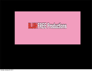
5. Using the color red with the first word practices the Law of Color. As the
law of color states, “red appears to move towards your eyes while looking
at it” (2002). Red also symbolizing the red blush coloring that enters the
cheeks when someone is embarrassed. That is what the word blush, in this
brand name, symbolizes.
Using the color white, for the last two words symbolizes purity. Blush Free
productions is about creating purity in programming while avoiding
producing the blushing effect of embarrassment from inappropriate/non-
family friendly content.
The Law of Shape also comes into play with the Blush Free logo. The logo
follows the horizontal shape, which is a benefit to the eye. The font is also
very legible and clean.
The logo is effective in that it uses bright colors that are symbolic of the
meaning of the company. It’s pleasing to the eye and memorable.
Sunday, January 23, 2011
6. BlushFree3.gifBlushFree3.gif
Brand Reflection:
The logo reflects the brand in that provides a
contrast. In the title there is contrast of color with
the use of red and white. The goal of the company is
to provide a contrast with the norms in the
industry. Blush Free will go against the flow of
industry norms.
Sunday, January 23, 2011
7. Logo: Competitor
Pie Town Productions logo is an emblem and word combination. The emblem is
a city skyline with pie that has a slice taken out, floating over the city. I am not
fully sure what this means. I looked up what Pie Town means, and the only
information I found is that it’s an unincorporated town in New Mexico known
for making pie. Perhaps one of the company founders is from this town and
wanted to carry the name on to the company. I can guess that pie floating over
the city skyline is suggesting that Pie Town is taking over Los Angeles. Clever.
It does follow the law of shape in that read horizontally, though it does take
two lines. The logo is medially effective in my opinion. It is unclear what the
emblem really does mean, and the colors are somewhat dull. It could use a
splash of color to bring a little more life and pizazz.
Sunday, January 23, 2011
8. Logo: Inspiration
Though the MTV brand is really the opposite of what we at Blush Free are
striving to create, I do appreciate the MTV logo. I love that over years the logo
has the same letters and overall concept, but they can get creative with it, much
like Google, and give it different themes. Even changing the theme of the logo
does not mess with the integrity of the overall brand. I love how simple it is, yet
edgy and iconic at the same time.
Sunday, January 23, 2011
9. Corporate Culture/Mission/Vision
Mission Statement
“Our mission at Blush Free Productions is to create family-friendly
programming that highlights major social issues, providing viewers with a call
to action, all the while entertaining through exceptional storytelling.”
Our staff team, who will only work on projects that accomplish the mission
statement, will carry out the mission statement. We will not stray from our
founding principles. We will act in manner of integrity by keeping to our word.
We will conduct ethical business, seeking to go above and beyond what we say
we will do. This includes our interactions with networks, sub-contractors, and
even the people who clean our office space.
Sunday, January 23, 2011
10. Corporate Culture
Blush
Free
will
conduct
quarterly
reviews
with
all
of
employees
in
order
to
communicate
expectations,
corrections
and
praises
in
an
ef:icient
and
consistent
matter.
As
the
CEO,
I
will
have
reviews
with
our
Board
of
Directors
who
I
will
meet
with
on
a
monthly
basis.
Blush Free will also conduct quarterly reviews with all of employees in order to
communicate expectations, corrections and praises in an efficient and consistent
matter. As the CEO, I will have reviews with our Board of Directors who I will
meet with on a monthly basis.
In order to create an atmosphere of fun, creativity, and community, our company
will hold a monthly celebration time in order celebrate birthdays, and our
accomplishments. It could be as simple as having cake for an hour at the end of
the week. It could be as in-depth as having a movie afternoon at the office,
including popcorn, candy and soda. We will strive to bring fun into the office
environment, even incorporating the joke of day first thing in the morning as a
staff. Cheesy? Sure, but it brings the staff together and builds community.
Sunday, January 23, 2011
11. Tag Lines
“Blush Free TV.”
“TV you can watch with Grandma in the
room.”
Sunday, January 23, 2011
12. Tag Lines
The tagline speaks directly to the customers by letting them they can trust our
company to provide them clean programming. They don’t need to be nervous
or skeptical that our programming won’t be family-friendly.
Our tag lines are descriptive in that they describe how you will react/not react
to our programming, and with whom you can watch. The tag lines reinforce a
clean brand image promising we will stick to our mission statement. Our tag
lines set us apart from our competitors. For example, we are the antithesis to
MTV television productions (i.e. Jersey Shore), which could produce a whole lot
of blushing when watching with Grandma in the room.
“Blush Free TV” is incredibly short and easy to remember, giving a quick power-
packed descriptive statement of the type of programming we offer. TV you can
watch with Grandma in the room, while not short, is unique, memorable and
positive. It’s likely when used together, the tag lines will doubly capture the
essence of our company.
Sunday, January 23, 2011
13. “Blush free TV.”
“TV you can watch with Grandma in the
room.”
Sunday, January 23, 2011
14. References:
Ries, A. and Ries, L. (2002) The 22 Immutable
Laws of Branding. New York: Harper Collins.
Sunday, January 23, 2011