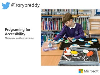
Programming for accessibility

My life is a hilarious roller coaster of miss-intended programming bugs because at 4 foot tall and 65 kilograms I completely fall off your radar. What did my scale call me! Why does facial recognition see me as a child? These are all valid questions I often ask myself as I navigate my weird and different world. Have you heard the phrase “You have to be this tall for Micro-services”? well, what about: “You have to be this tall to operate a mobile phone?”. I am finding it harder and harder to reach any button except for “#” and “9”. Building accessibility into the planning stages of programming can eliminate barriers for participation and create an inclusive environment for people with disabilities. Programming for diversity serves as an unquestionable indicator that your software embraces the diversity of your users and cares about their safety and comfort. Join me on a fascinating and thought-provoking look at how you can program for accessibility.

Recommended
More Related Content
Similar to Programming for accessibility
Similar to Programming for accessibility (20)
More from Rory Preddy
More from Rory Preddy (19)
Recently uploaded
Recently uploaded (20)
Programming for accessibility
- 1. Programing for Accessibility Making our world more inclusive @rorypreddy
- 2. My adapted foot pedals
- 3. I always have maide a plan to overcome my height
- 6. Why I chose this talk
- 10. Inclusive Design
- 11. …the design of products, services, and environments so that everyone, including people with disabilities, can fully experience them. Accessibility compliance Inclusive product and service design Productivity Innovation
- 12. Disability is not a personal health condition
- 13. 1. Recognise exclusion 2. Solve for one, extend to many 3. Learn from diversity
- 15. Site Landing Login Registration Help Search products Help Preferences Add to cart Checkout Shipping Experience Registration Navigation Checkout
- 16. Site Landing Login Registration Help Search products Help Preferences Add to cart Checkout Shipping Experience Registration Navigation Checkout • Font and color options Captur • Accessibility helpdesk Single Sign on Voice Search One button access SMS and Email alertsCallback • Responsive AI adjustment One button access
- 18. Quality of life For most of human history, we’ve put our innovative capacity into improving the quantity of life. Because we’re living longer, our focus is starting to shift toward improving our quality of life --Bill Gates
- 19. US 21st Century Integrated Digital Experience Act EU parliament directive on digital accessibility
- 20. • WCAG 1.0 • Released 1999 • 14 guidelines and 62 checkpoints • WCAG 2.0 • Released 2008 • 4 principles, 12 guidelines, and 61 success criteria • WCAG 2.1 • Release June 2018 • New Criteria for: • Mobile • Low-visibility • Learning disabilities
- 21. Level A— deals with the most basic web accessibility features Level AA— signifies the biggest and most common barriers for disabled users Level AAA— addresses the highest (and most complex) level of web accessibility
- 22. • Perceivable – can you see it • Operable – can you use it • Understandable – can you understand it • Robust – it won’t break future technologies
- 23. Perceivable - Alternative Tags (alt tags)
- 25. Perceivable – Color Contrast http://webaim.org/resources/contrastchecker/
- 26. Perceivable – Color Contrast (Bad) http://webaim.org/resources/contrastchecker/
- 27. Perceivable - Caption Video and Audio files
- 30. Operable - Structure <h1>My heading</h1> <p>This is the first section of my document.</p> <p>I'll add another paragraph here too.</p> <ol> <li>Here is</li> <li>a list for</li> <li>you to read</li> </ol>
- 31. Operable – Structure (Bad) <font size="7">My heading</font> <br><br> This is the first section of my document. <br><br> I'll add another paragraph here too. <br><br> 1. Here is <br><br> 2. a list for <br><br> 3. you to read <br><br>
- 34. (W A I A R I A Role Attributes Live Regions Landmark Roles States & Properties
- 35. Markup Example role <main role="main"> state <input aria-invalid="true"> property <input id="firstName" type="text“ aria-required="true" />
- 36. ARIA HTML5 article <article> header <header> navigation <nav> complementary <aside>
- 37. Fight Club Lego
- 39. 2018-05-30 Web Accessibility Summit, Columbia, MO 39
- 40. Principle 1: A role is a promise Principle 2: ARIA Can Both Cloak and Enhance, Creating Both Power and Danger <button aria-pressed="false">Mute</button> <a role="menuitem">Assistive tech users perceive this element as an item in a menu, not a link.</a> <a aria-label="Assistive tech users can only perceive the contents of this aria-label, not the link text">Link Text</a>
- 44. AI for Good
- 45. In the past, you had to adapt to the world. In the future, the world will adapt to you. In the past, you had to adapt to the world.
- 47. Sentiment is not binary
- 50. 55 Billion 1.6 Billion emoji
- 51. Training each emoji in categories
- 52. Closer look - training each emoji in categories
- 53. Testing Deepmoji with Sarcasm http://deepmoji.mit.edu
- 55. Web based Neural network https://playground.tensorflow.org
- 56. In Browser AI
- 58. 1.Redefine bias as a spectrum 2.Enlist customers to correct bias 3.Cultivate diversity with privacy and conse 4.Balance intelligence with discovery 5.Build inclusive AI teams
- 61. http://aka.ms/devconf Conclusion 1. Inclusive design 2.Website Standards 3.AI @rorypreddy
Editor's Notes
- These are my car pedals on my mid-life crisis BMW. The accelerator and break are hinged to a false floor and bolted onto the actual pedals.
- Adjustments are sometimes ghetto. Plans are made. *Click* Especially if there is coffee involved. I will risk life and limb for coffee.
- Others have also made custom “Bolt on solutions” The Sip and Puff Switch allows for limited movement engagement with computers. *Click* The orbi-touch Keyless Keyboard makes typing a breeze.
- There is the Braille Display Interfaces. *Click* And Screen readers such as the popular “JAWS” screen reader. All these are designed to bolt onto existing media. Kind of like my foot pedals on my car.
- Recently I Bought a BMI scale (Also part of my mid-life crisis) I put in my Height – 4 foot 1. My weight - 65 kilograms and the scale then defined me with some very unflattering words. And I though to myself, someone programmed this without thinking of my accessibility needs. There is nothing I can bolt onto this machine model. What if I couldn’t bolt onto the 4th Industrial revolution with its AI focused innovations? *Click*
- I felt like “Sad Ben Affleck” Because I felt that the future had excluded me.
- So I though to myself “I can do more”. I was going to teach Accessibility, from the start of the design process all the way to the Balancing of the AI. Let's start “SNAP”
- Let's go through the Agenda. I identified 3 simple core learning journeys I needed to know *Click* Inclusive design *Click* Website standards Why Web – it’s the window to the digital world. *Click* And AI
- What is accessibility? Accessibility is when products and services—including electronic media—are designed in a way that everyone, including people with disabilities, can fully experience them. Inclusive product and service design leaved to accessibility compliance which in turn enhances productivity and greater innovation. I like to give the example of your phones. Hold up your phones and dial the number 951. Who here could not dial all the numbers? A keypad that is designed for all of us would be “accessible” By the way - I can only reach “#” . Who here can reach 9? 5? 1?
- There’s no diagnosis called disability. You don’t go to the doctor and the doctor says, “We’ve run the tests and it looks like you have disability.” So if disability isn’t a diagnosis, what is it? According to the Centers for Disease Control and Prevention (CDC): Disability is any condition of the body or mind (impairment) that makes it more difficult for the person with the condition to do certain activities (activity limitation) and interact with the world around them (participation restrictions), that can affect someone’s vision, movement, thinking, remembering, learning, communicating, hearing, mental health, and/or social relationships. The World Health Organization (WHO) helps us understand why disability isn’t just a personal issue, but one in which society plays a role: Disability is not just a health problem. It is a complex phenomenon, reflecting the interaction between features of a person’s body and features of the society in which he or she lives. Microsoft Design explains it more simply: Disability = mismatched human interactions.
- *Click* Recognise exclusion Look at how well a design does or doesn’t meet a person’s needs or preferences. *Click* Solve for one, extend to many. Once we learn how to recognize exclusion, we can begin to see where a product or experience that works well for some might have barriers for someone else. *Click* Learn from diversity Recognizing exclusion sparks a new kind of creativity on how a solution can be better.
- Persona spectrums are more than just a tool for empathy. They also make a business case. Say you’re designing for someone with one arm. There are roughly 26,000 people with one arm. *Click* But if you add up the numbers of people with one arm, people with a temporary wrist injury or a broken arm, and folks with one free hand in a specific circumstance (like new parents lugging a baby around), you’re at 20 million.
- The next step is to map a user journey. We look on how we might decrease the cognitive and/or physical overloads required to use a common website shopping card. We map out the user engagements and start to apply our persons.
- Once we applied our personas, we can innovate our reframed problem and find inclusive opportunity’s. We could also include other mobility limited personas. Notice the end step We look at the customer experience and learn from diversity
- A: Minimum level 1.1.1 – Non-text Content: provide text alternatives for non-text content 1.2.1 – Audio-only and Video-only (Pre-recorded): provide an alternative to video-only and audio only content 1.2.2 – Captions (Pre-recorded): provide captions for videos with audio AA: Medium level, includes A and AA (most used) 1.2.4 – Captions Live: Live videos have captions 1.2.5 – Audio Description (Pre-recorded): Users have access to audio description for video content 1.4.3 – Contrast (Minimum): Contrast ration between text and background is at least 4.5:1 AAA: Highest level, includes A, AA, and AAA (not always achievable) 1.2.6 – Sign Language (Pre-recorded): Provide sign language translations for videos 1.2.7 – Extended Audio Descriptions (Pre-recorded): Provide a text alternative to videos 1.2.8 – Media Alternative (Pre-recorded): Provide a test alternative to videos Level A — deals with the most basic web accessibility features Level AA — signifies the biggest and most common barriers for disabled users Level AAA — addresses the highest (and most complex) level of web accessibility
- Perceivable Provide text alternatives for non-text content. Provide captions and other alternatives for multimedia. Create content that can be presented in different ways , including by assistive technologies, without losing meaning. Make it easier for users to see and hear content . Operable Make all functionality available from a keyboard . Give users enough time to read and use content. Do not use content that causes seizures or physical reactions. Help users navigate and find content . Make it easier to use inputs other than keyboard . Understandable Make text readable and understandable. Make content appear and operate in predictable ways. Help users avoid and correct mistakes. Robust Maximize compatibility with current and future user tools.
- Perceivable Do UI elements have appropriate labels? Does all non-text content (media, figures, tables) have alt text? Prefer native components
- Perceivable – Colour and contrast 1 in 12 men (8%) and 1 in 200 women in the world Is information conveyed through means other than colour?
- Does text meet minimum contrast ratio requirements? WCAG 2 level AA requires a contrast ratio of at least 4.5:1 for normal text and 3:1 for large text, and a contrast ratio of at least 3:1 for graphics and user interface components (such as form input borders). Level AAA requires a contrast ratio of at least 7:1 for normal text and 4.5:1 for large text. Large text is defined as 14 point (typically 18.66px) and bold or larger, or 18 point (typically 24px) or larger.
- Perceivable- Captions Don’t auto-play video or audio files. Allow the user to choose to play.
- Operable - Hyperlinks Keeping Link Styles Simple Isn’t a Bad Thing Style Link States Differently Don’t Remove Outlines on Active and Focused Links Keep Hyperlinks Consistent Reserve Common Hyperlink Styles for Hyperlinks
- Operatable - Keyboard
- HTML is accessible by default. This is true, with the important caveat that when you use semantic HTML properly, what you've built will be accessible. Now, there are lots of ways that you can mess this up
- HTML is accessible by default. This is true, with the important caveat that when you use semantic HTML properly, what you've built will be accessible. Now, there are lots of ways that you can mess this up
- Scalable layout Can your layout accommodate zoom?
- ARIA helps to add semantics and to properly describe components: use role attributes to add semantic use aria-label, aria-labelledby, aria-describedby attributes to add more information follow design patterns to describe any components Although the API is still not entirely supported by modern web-browsers and assistive technologies, it is important to prepare your website and think “forward compatibility”.
- ARIA is powerful. If poorly applied, it will cause more problems and confusion than help. Hence, the first rule of ARIA is: No ARIA is better than bad ARIA! https://www.w3.org/TR/wai-aria-practices/#no_aria_better_bad_aria
- ARIA is powerful. If poorly applied, it will cause more problems and confusion than help. Hence, the first rule of ARIA is: No ARIA is better than bad ARIA! https://www.w3.org/TR/wai-aria-practices/#no_aria_better_bad_aria
- https://www.w3.org/WAI/demos/bad/before/home.html
- AI is a powerful tool and like all tools can be used for good or ill. There is a fundamental question about what disability data identity, or how disability confidence/pride extends to the data of people with disability, means in the age of AI.
- When accessibility is part of the design of products and services – inclusion can be built-in versus be an add-on Take this ramp: When societies and organizations are inclusive in their approach to accessibility, they design products and services that can be seamlessly used by everyone An AI can add a layer to personalize to each person’s individual needs – and have the world adapt to your individual needs and preferences So let’s talk more about what accessibility is and why it so important for every person, every organization to prioritize accessibility. Accessibility is a human imperative Accessibility is a business imperative Accessibility is an imperative for all organizations.
- Its clear that sarcasm is difficult to detect. But why? The reason is that the sentiment of a sarcastic remark cant just have a sentiment of positive or negative.
- Social engagement follow a complex emotional spectrum. Interesting, this emotional spectrum wheel shows boredom as leading to disgust and loathing. Scientists have shown that boredom is a evolutionary reaction to you body feeling distressed it may be poisoned. So if you feel bored you may be poisoned. Please find the nearest paramedic and he will prescribe a series of Netflix to help you out So we have our emotional spectrum what do we do with it?
- Introducing DeepMoji by MIT The worlds most advanced Artificial Emotional Intelligence
- It is trained on 55 billion tweets - sanitised to 1.6 billion tweets, and still learning Categorized into 63 different separate emojis
- Each emoji is then linked to similar ones
- And the ones we care about the most are the not impressed face, dead-pan and angry faces.
- The first thing I did was see if it understood sarcasm I typed in “The electricity is off again. Oh Joy!!” Deepemoji gave me back the emotional sentiment for my sentence and showed that I was not impressed. Oh Joy by itself might be positive but its used here to convey “announce” What about other examples?
- A free app that narrates the world around you. Designed for the low vision community, this research project harnesses the power of AI to describe people, text and objects Short Text Documents Products Scenes - Hear an overall description of the scene captured. Currency Color Handwriting Light
- Happy Affleck
- We have an opportunity explore the great potential and hard questions of how to create the next generation of accessible technology and wave of innovation that comes with it. For more information go to Microsoft.com/accessibility Imagine what we can do together.