Presentation Skills Part 2 - Building Slides
•Download as PPT, PDF•
1 like•994 views

6 ways to build better slides in PowerPoint to give your presentations greater impact.

Recommended
Recommended
More Related Content
Similar to Presentation Skills Part 2 - Building Slides
Similar to Presentation Skills Part 2 - Building Slides (20)
Recently uploaded
Recently uploaded (20)
Presentation Skills Part 2 - Building Slides
- 1. Presentation Skills Part 2 – Building Slides dapted from with content a June 30, 2011
- 2. This presentation uses real slides from real presentations (but all details have been hidden, of course) Please refer to transcript or download to read notes for each slide
- 3. 1 2 3 4 5 6
- 4. Make your main point clear in the headline
- 5. BEFORE
- 6. BEFORE Online Digital will create a customized jump page on website.com driving online users to get more tips and find their match! The campaign will be live for 7 months: • Approximately XXX,000 Leaderboard, Skyscraper and Big Box Impressions (combined) across website.com and the entire network The jump page will redirect viewers to the brand website. It is subject to client approval and includes: • Brand logo, images and product descriptions • Hotlink to Brand website • Hotlink to Brand tool • Posting of tips or checklist of topics that people should think about (based on demo). • Promotional graphics (look and feel adapted from the TV creative) • Stream vignette spots online • Monthly content updates • Brand Index (users encouraged to click on the client’s website to get advice and help raise the index!) 6
- 7. AFTER Your Custom Jump Page (7 Monthly Versions) Digital will create a customized jump page on website.com driving online users to get more tips and find their match! The campaign will be live for 7 months: • Approximately 637,500 Leaderboard, Skyscraper and Big Box Impressions (combined) across website.com and the entire network The jump page will redirect viewers to the brand website. It is subject to client approval and includes: • Brand logo, images and product descriptions • Hotlink to Brand website • Hotlink to Brand tool • Posting of tips or checklist of topics that people should think about (based on demo). • Promotional graphics (look and feel adapted from the TV creative) • Stream vignette spots online • Monthly content updates • Brand Index (users encouraged to click on the client’s website to get advice and help raise the index!) 7
- 8. BEFORE Execution Details… OOH Execution Street level advertising within Tier 1 markets (Toronto, Montreal, Vancouver) Target consumer when she is outside, shopping, eating, and in the ‘looking good’ frame of mind Street columns and posters will be specifically located in the fashion, entertainment, and shopping districts June-August (8 weeks) at XX GRPs
- 9. AFTER Target her when she is outside, shopping, eating, and in the ‘looking good’ frame of mind OOH Execution Street level advertising within Tier 1 markets (Toronto, Montreal, Vancouver) Street columns and posters will be specifically located in the fashion, entertainment, and shopping districts June-August (8 weeks) at XX GRPs
- 10. BEFORE Brand Guarantee Deployment – TV Rationale TV minimum / maximum threshold solutions – TV: 800 – 1200 GRPs per campaign Source – Ipsos-ASI 10
- 11. AFTER TV gains max out at 800-1200 GRPs Source – Ipsos-ASI 11
- 12. 1 Make your main point clear in the headline
- 13. Single slide, single thought
- 14. BEFORE
- 15. BEFORE Phase 1: Invitation Declaration Idea Declaration • Objective: – Introduce the concept and brand’s new positive, empowering idea • What it is: – Petition that exists in multiple distributed digital environments (outreach, social, media, channel), declaring the idea • Declaration will also ask signers to give advice • Advice is collected and used later to empower target • Why it works: – In the absence of global assets, leverages all brand channels to begin seeding the new brand vision – Makes a statement about what the brand stands for, low-barrier mechanism for joining the idea – The submission of advice enriches and personalizes the experience 15
- 16. AFTER Idea Declaration Declaration Objective: Introduce the concept and the brand’s new positive, empowering idea 16
- 17. AFTER It’s a Tactic Declaration Exists in multiple distributed digital environments (outreach, social, media, channels) Declares the tactic’s goal of the idea Asks participants to give advice Advice is collected and used later to empower target 17
- 18. AFTER Why It Works Declaration In the absence of global assets, leverages all brand channels to begin seeding the new brand vision Makes a statement about what the brand stands for, low- barrier mechanism for joining the idea The submission of advice enriches and personalizes the tactic 18
- 19. BEFORE Media Update - Recap The following are media updates that have occurred since 1st Round presentation. •Reduce media partnership dollars from $X,XXXM to $X,XXX M. With this new direction we’ve cut partner1 and partner2 from the media partnership plan Rationale: – To ensure that we are receiving the most out of our partnership dollars while obtaining national appeal against our target both partner1 and partner2 were cut. – Both partners only have one team. Both teams are in region1 with viewership highest in that market. Audience tuning in region2 and the region3 isn’t as strong as our other partner options. •Incremental brand support – Media was given incremental dollars to support a stronger plan for brand – Agendy has recommended to support the launch through television, digital, and newspaper • As part of the original brand plan, OOH was recommended to generate mass awareness in light of no TV asset being available. Since then, brand has agreed to invest in a TV asset in order to launch hair in region4. Given we will have a TV asset for brand, OOH has been cut from the brand recommendation. •Cut OOH from brand plan – Based on client feedback and budget cuts, OOH was removed from the brand strategy
- 20. AFTER Three Media Updates 1. Reduce media partnership dollars from $X,XXXM to $XXXXM (cut partner1 and partner2) 2. Incremental variant support 3. Cut OOH from brand plan
- 22. BEFORE JOBS TO BE DONE & OBJECTIVES JTBD • Get target to choose brand more often Objectives /MMOs • Objective #1: Re-launch the brand format1 in special formula – MMO: Increase brand share by +XX bps • Objective #2: Launch brand variant across formats 1, 2 & 3 – MMO: Increase brand share +XX bps, increase brand format1 share +XX bps, increase format2 penetration +XX% (from XX% to XX%) MCO • Format3: Increase “attribute1” measure +X, increase “attribute2” +X and maintain “attribute3”
- 23. AFTER JOB TO BE DONE Get fresh/fragrance seekers to choose brand more often
- 24. AFTER TWO MARKETING OBJECTIVES 1. Re-launch the brand format1 in special formula – MMO: ↑format1 share by XX+ bps 2. Launch brand variant across formats 1, 2 & 3 – MMO: ↑format1 share +XX bps ↑ format2 share +XX bps ↑format3 penetration +XX% (from XX% to XX%)
- 25. AFTER MCO: DRIVE BRAND SCORES • +X “attribute 1” • +X “attribute 2” • Maintain “attribute 3”
- 26. 1 Make your main point clear in the headline Single slide, single thought 2 3
- 27. Shift detail to the notes area
- 28. Normal View Notes View
- 29. BEFORE Campaign Journey MAY/JUN JUL AUG SEP OCT & Invitation Engagement Payoff Stage 1 Stage 2 Stage 3 ● Articulate brand ● Aggregate advice messages ● Event partner activities commitment idea from Stage 1 ● Celebrity engagement ● Solicit advice messages ● Integrate messages into to drive awareness ● Seed campaign with high creative (where appropriate) ● Paid media profile influencers and ● Engage community and concentration to drive partners encourage further participation reach ● Continue seeding with ● Provide additional influencers/prep for October online activities Cross-sell (August – November) 29
- 30. AFTER An Evolving Campaign Journey MAY/JUN JUL AUG SEP OCT & Invitation Engagement Payoff Stage 2 Stage 3 Stage 1 30
- 32. BEFORE In-show Integration Early Morning Show • Early Morning Show (all markets) will conduct 3 in-show segments over the campaign duration with a brand representative, discussing tips and tricks that consumers can use. • Each segment is approximately 3 minutes, total of 15 segments. • Content is subject to producer approval. Talk Show • Talk Show will conduct 4 taped segments over the campaign duration with a brand representative, discussing issues that are the top concerns for target. • Each segment is a maximum of 90 seconds. • Content is subject to producer approval. News Show • News Show will create a special segment with a brand representative, discussing the main concerns for target on a monthly basis (total 7 segments). This will air in News Show at 6pm. • Each segment is approximately 90 seconds. Special Phone-In Show • Station will create a special 30 minute phone-in show featuring a brand representative. This show will discuss advice and suggestions for actions during the upcoming season. 32
- 33. AFTER 27 In-show Integration Opportunities! MORNING Talk SHOW MS MS Show News Show 33
- 35. 1 Make your main point clear in the headline Single slide, single thought 2 3 Shift detail to the notes area 4 6
- 36. Scale graphic to fit screen
- 37. BEFORE Execution Details… Fashion Publication Advertorials Magazine1- a FP4c advertorial (Fr & Eng) launches the brand campaign with fashion trends and positions brand benefit as summer’s must have! Magazine 2 - advertorial placement wrapping around editorial in June ‘Hot Summer’ issue (which is also the Summer Care guide), and July ‘Cheap & Chic Summer’ issue Magazine3, Magazine4, Magazine5 - custom ‘Reports’ DPS advertorials outlining the latest in fashion, summer events, and styles for moms (designed for each magazine). Images and small write ups of everything new coming for the summer season. Brand Equity Advertisements Run FP4C advertisements in key fashion and beauty magazines to further drive awareness of brand during summer months
- 38. AFTER Achieve Integration with Advertorial Wrapping
- 40. BEFORE Brand Services Booth • Service station on-site • 4 resources providing individual services and consultation • Privacy and space requirements respected 40
- 41. AFTER On-Site Brand Services Station privacy 4 resources
- 42. BEFORE MOBILE UNIT FPO Allows us to be mobile, finding target all around the key areas Enables us to leverage foot traffic in key transit hubs as well as other commuter foot traffic around the city Eye catching – people will want to know what our teams are all about 42
- 43. AFTER FIND TARGET ON FOOT! FPO Eye Catching Transit/Commuter Mobile 43
- 45. 1 Make your main point clear in the headline Single slide, single thought 2 3 Shift detail to the notes area 4 Scale graphic to fit screen 5
- 46. Usual a visual prompt to ask a question
- 47. Have you ever…
- 48. Making your TRANSITION Making your TRANSITION How we can help Tips & tricks Success stories Special cases
- 49. 1 Make your main point clear in the headline Single slide, single thought 2 3 Shift detail to the notes area 4 Scale graphic to fit screen 5 Usual a visual prompt to ask a question Use the B key 6
- 50. 1 Make your main point clear in the headline Single slide, single thought 2 3 Shift detail to the notes area 4 Scale graphic to fit screen 5 Usual a visual prompt to ask a question 6
- 51. Use the B key
- 52. Go from all eyes on the screen…
- 53. To all eyes on you…
- 54. Try it! While in slide show view…
- 55. 1 Make your main point clear in the headline Single slide, single thought 2 3 Shift detail to the notes area 4 Scale graphic to fit screen 5 Usual a visual prompt to ask a question Use the B key 6
Editor's Notes
- Speaker/Reader: Refer to the notes throughout this presentation for details related to each slide.
- There are 6 steps you can take to building better slides. Let’s go through each, one by one…
- The first step to smarter slides is to make them work harder so your audience doesn't have to. A case in point is what you choose to put at the top of your slides. Research conducted by Michael Alley that shows that headlines that summarize your point result in better learning than those that don't.
- Most PowerPoint slides include a heading such as "Results" or "The Future" or "Lessons Learned." Although those words generically describe the content or a slide, they make it harder for your audience to understand the point you're trying to make. The reason? The heading is so vague that their minds are forced to scan to the rest of the information on the slide to figure out, "What about the results?" or "What about the future?" or "What about the lessons learned?" Make your audience's lives - and cognitive processing - easier by summarizing your main point at the top of your slide in a complete sentence, in two lines or fewer. Let’s take these slides and re-work them to show you the difference a good headline can make.
- Original slide. Online…Online what? You’ve got to think “WIFM?” What’s in it for me? This is a page from a presentation a media company did to SELL a brand on investing nearly $1 million in their station!!
- Revised slide. Ah, that’s what’s in it for me! Custom…7 monthly versions…now that’s starting to sound like it’s worth $1 million.
- Original slide. Execution Details. Blah. This is a presentation that a media agency did to sell a brand on a very bold media idea. But the why just isn’t jumping out at you.
- Revised slide. Even though this headline probably seems long, it makes it a lot easier for the audience to get to the most important point right away. It sells the new media approach. Sell vs. Tell.
- Original slide. There’s a big message in this slide, but it’s not immediately obvious what it is, is it?
- Revised slide. Clearer. Tighter. Better.
- If your heading is clear, your slide is clear, and your audience is clear. And with all of that sudden clarity in the room, your audience is free to focus their attention on you, and what you are saying verbally. And that's the main point after all, isn't it?
- It's true that one of the easiest things to do in PowerPoint is to add information, and then to keep on adding more and more and more... It's also true that one of the hardest things to do in PowerPoint is to subtract information, and then to keep subtracting more and more and more... Why is it so easy for us to add, yet so hard to subtract?
- There are many factors that contribute to the situation, including: We've got lots to say, and we need to keep the ideas on the slide so we are sure to cover them. We need to demonstrate our credibility by showing all the backup information that got us to the point we're making. If we delete something, we may not ever have it again. Whatever the reasons, the result is a slide that is so loaded with information, your audience can't see the forest for the (bullet point) trees. Meditate on the situation by adopting a new mantra: "single slide, single thought.“ When you apply Step 1, write out your point in a complete sentence and put it in your headline, you suddenly have focus for your slide. With this focus in place in your headline, only add to your slide the information that will back up your point. If you need to create more slides to make multiple points, so be it. The result should be simpler, more focused slides. Let’s give it a try…
- Original slide. Three thoughts in here…and lots of points supporting each one.
- Revised slides (you’ll now see 3 slides). One thought for each. It makes for more slides, yes, but now the slides are working to support you, and your audience is focused on you.
- Thought #2. Animation can also help manage the flow of info to your audience, instead of bullets.
- Thought #3. Again, use animation to deliver these points one at a time. Now you’ve done justice to all three thoughts.
- Here’s another bullet point splatter. Yikes!!
- What if we got really crazy, and just TALKED to all that extra content?
- The content isn’t gone, it’s in the notes for the presenter. And more importantly, the audience isn’t focused on the words, they’re listening to the presenter.
- Last one. Original slide. Again, 3 thoughts. Lots of copy. This slide might be okay for a leave-behind.
- Revised slides (1 of 3). But in your on-screen presentation, try something that keeps the audience engaged.
- 2 of 3. Try short-handing copy with symbols instead.
- 3 of 3. Challenge yourself (at least in your screen version) to use as few words as possible.
- It's a truism that the less you have on your slide, the more your audience will focus their attention on you. When you apply "single slide, single thought" to the slide you're working on, you'll be on the way to creating singular clarity that both you and your audience will appreciate.
- At first glance, making your slides smarter may appear to be a matter of making your graphics look better. However, your hands are tied when you've got too much information on a slide to begin with. For example, a large photograph or a simple screen capture may be all you need to make your visual point. If that's the case, what do you do with all of that text and other information you have on the slide?
- The notes section at the bottom of your normal view can be expanded to make it easier to add content that you’ll talk to, so you can limit the slide to a powerful visual. You can also print out your slides with your notes at the bottom for your reference when speaking, or as a full leave-behind for your audience.
- Original slide. You likely don't want to get rid of the text on this slide because it's important that you have it, so you may bypass the effective visual approach and leave the graphics small. But it doesn't have to be that way - you can have your information cake and eat it too. To make the best use of PowerPoint, expand thinking that the on-screen slide is the only place to put information.
- Revised slide. The visuals bring more emotion to the plan, and can be revealed one at a time through animation showing passage of time.
- Revised slide. This notes version makes a very nice summary hand-out as well.
- Here’s another example. This is the original slide. But take a look at what it could be…
- Revised slide. Rather than just talking to the shows, using their well-known logos can help get the audience excited about the opportunity while you talk to the details.
- Remember, you can print your presentation in Notes Pages format, so you're sure to have all of the information that was communicated both on-screen and off-screen. Suddenly, you've doubled the available space to place information. When you've got a secure place to put your detailed information, you've got much more freedom to apply effective design techniques in the slide area.
- It's always been a struggle to make PowerPoint work for you to create effective on-screen slides, and at the same time to hold the information you need. When you shift the detail to the notes area, you've solved the problem and are well on the way to much smarter slides.
- Is there a graphic trapped inside your slide, yearning to be free? As you've been applying new approaches to your slides step by step, you're gradually finding more focus for your ideas (making your point clear in the headline, keeping a single thought per single slide) and making more space for your graphics (shifting the detail to the notes area). Next, take a look at an existing slide in your presentation, and see if there's a graphic you already have that you expand in size - and in impact.
- Here’s an example where a media agency is again trying to sell a pretty cool media idea. But it’s really lost on this page. As always, your headline should summarize the point you want to make, and your notes area should contain the detail that you'll explain verbally. When you look at your headline, perhaps it's a single graphic that will best communicate the point you want to make. And perhaps you already have the graphic on your slide. But when your slide was crowded with ideas, you may have made your graphic small to fit amid the bullet points and other details. Let’s take a look at the revised version.
- Revised slide. The text has been moved to the notes section.
- Now that you’re getting comfortable with a big graphic, why not try expanding the graphic to fill the entire slide, and make a bigger impact. Let’s try that with this next one…
- Wow. Lots of graphics on this page. Let’s see if we can get focused on the right one. Here’s a tip. Click on the graphic and hold down the Shift key (to preserve the proportions) while you drag one of the corners of the graphic outward. Scale the graphic as large as you can, filling the screen. If your headline is in the way, or the graphic speaks for itself and doesn't need the headline, then right-click on the graphic and select Bring to Front - your headline remains on the slide, but is just behind the graphic. Review the slide with the graphic, and ask a few questions: Does this graphic make the point described in my headline? Is the graphic clear and crisp, without blurriness or pixelation? Is this graphic a good fit for me and my audiences? If you answer "yes" to all of these questions, then your work on the slide is done. If the answer is "no" to any of these questions, it's time to search your own photo collection, to create your own graphic, or to visit a stock photography site to find a better graphic that's a good match.
- On this slide, I’ve actually hidden the slide background altogether. Your “annotations” don’t always need to be only in the notes section. Look for interesting ways to add them in, and try animation to reveal them when you’re ready to talk to them.
- Not a bad start. But could it be better? I think so…
- Revised slide. The copy was really hard to read, and a bit distracting in the original version.
- Moving copy to the notes section allows the audience to focus on the visual, rather than trying to read tiny copy.
- When you scale a graphic to fill the screen, you've managed to liberate the untapped power of your slide - and create a much smarter kind of slide.
- You've come a long way toward smarter slides in only four steps, and now it's time to do perhaps the smartest thing of all -- use your slides to move from 1-way presentation to 2-way conversation. When we fire up PowerPoint, we automatically go into default 1-way presentation mode, where the screen and the slides are our speaker notes or even a visual aid to accompany our verbal communication. But PowerPoint has much more potential than that. Let's say you're at the start of your presentation - the first crucial moments that you have to make an impact on your audience; the time period when your audience evaluates you and decides whether you and your material are credible. We're often so nervous when we start that we just want to speed through the material and get to a place where we're feeling more comfortable. The result of your race to finish is that your audience is doesn't get to participate in any way, so they shut down. It's no wonder that they don't feel willing to participate later on in your presentation, because you didn't establish early on that you'd like them to be involved. Since speeding up leads to shutting down, try slowing down to open up a new kind of dynamic.
- Try this: use a simple graphic on a slide as a visual prompt to open up dialog with your audience. This is a particularly powerful technique at part of the opening to your presentation when you want to make sure that you're answering for your audience "what's in this presentation for me?"
- Or try putting your audience in the driver’s seat. Give them the choice on which item to discuss first. Use hyperlinks to go to jump from section to section.
- Another way to keep the audience engaged is to give them a hand out at the beginning of the session, and ask them to fill it out as you go along.
- Using techniques like this seem so simple, yet their impact is very sophisticated. With one slide, you're able to open up conversation, demonstrate that your presentation is 2-way, and adapt your material based on your audience’s response. All in all, that's one simple step to one really smart slide.
- Sometimes the smartest slide you can use is the one you can't see. When your presentation is in Slide Show mode, hit the "B" key on your keyboard and it will turn your screen black. (Alternatively, you can display a blank slide with a simple black background.)
- During a presentation, both you and your audience become accustomed to the changing images and words on the big projector screen. The effect is mesmerizing, and a kind of hypnosis is happening that no one notices - until you turn off the screen altogether.
- Suddenly, you've broken the PowerPoint spell and your audience is focused on you. Completely. The effect is jarring, but an extremely effective way to capture attention. Use this technique sparingly, at the moment in your presentation when you want to make your most important point.
- Hit the "B" key, pause, then make your point. When you're finished, hit the "B" key again and the screen will return to the slide that you blacked out. Click to advance to the next slide. (If you want the screen to return from black to the next slide in your presentation, insert a black slide as described earlier.) By the simple step of clicking the "B" key, you'll be making a smart statement, without ever needing to create a slide at all.
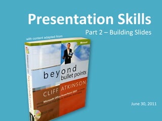
- So that’s it. 6 steps to creating smarter slides. Try them out today and if you’d like to learn more, pick up a copy of Beyond Bullet Points by Cliff Atkinson.