PowerBuilder to Qlik Sense Dashboard
•
0 likes•316 views

Add innovative reporting and business intelligence features to your PowerBuilder applications for free using Qlik Sense Desktop free edition.
Report
Share
Report
Share
Download to read offline

Recommended
Kliq planflyer
KliqPlan is a data entry grid extension for QlikView that allows users to enter numbers and other data within QlikView applications. It supports features like data spread, cell locking, audit trails, and distributed data entry. KliqPlan can be used to build budgeting, planning, and reporting applications where users can initialize budgets from previous data, manage versions, and analyze performance against budgets. Data can be collected from Excel and consolidated within KliqPlan.
Azure Story by Telescope Data Technologies
Azure Story is a productivity tool that delivers Microsoft Azure Cloud's consumption and cost intelligence through business-friendly interactions to allow businesses using Microsoft Azure to leverage and better plan their Azure Cloud usage. It provides businesses with their Azure data, including subscriptions, activities, categories, resources, products, and costs, organized in an intuitive dashboard. Azure Story also features Excel exports and simulation tools to help businesses synchronize, navigate, and plan their cloud data and costs.
RackBuilder Plus
ManageEngine RackBuilder Plus is a 3D data center visual modeling software that helps data center admins and facilities managers to create realistic views of their data centers.
Integrating Web and Business Data
This document discusses how data can be collected from various sources and transformed into useful information using FME. It outlines a three step process: 1) Connect to data from different formats and sources, 2) Clean the data by keeping useful information and filtering out bad data, and 3) Make the data presentable through visualizations, statistics, and reports. Examples of using FME to visualize trial results in PDFs and create dashboards for infrastructure asset management are provided. QlikMaps, Tableau, and other tools for business intelligence and creating visualizations are also mentioned.
Nprinting QlikView/QlikSense Report Distribution
Qlik NPrinting can generate reports in multiple formats like Microsoft Office and HTML. It allows users to create templates that can be used across multiple applications and reports. The drag and drop interface makes report generation easier for different needs. NPrinting also tailors reports according to user roles defined. It can deliver scheduled reports anytime in various formats via email, websites, Qlik Sense Hub, or saved folders. NPrinting serves as a compact reporting and distribution system combined with QlikView and QlikSense business intelligence, reaching many users with few Qlik licenses.
Cortana Analytics Workshop: Building Next-Generation Smart Grids
Yijing Chen, Davide Roverso. Over the past few years, the areas of IoT, alternative energy sources, and big data have emerged to create vast opportunities within the utility/energy domain. Also, with demand flattening out, these sectors are now forced to reinvent themselves, hence utility and energy companies have started pioneering "smart grid" solutions. In this session, we will discuss a customer use case through a demo that illustrates an end-to-end (E2E) energy forecasting solution. This session will delve into the details of the underlying model development and deployment in the cloud using Azure Machine Learning, Azure Data Factory, and Azure Stream Analytics, as well as Power BI for visualization. Go to https://channel9.msdn.com/ to find the recording of this session.
Google charts
The document discusses the Google Charts API, which allows users to visualize data through interactive charts and graphs. It notes that the API uses JavaScript to draw customizable charts from a variety of data sources, supporting decision making. Screenshots show examples of heatmaps created with the API. While it provides a full-featured dashboard tool when combined with Google Apps Script, the API is best for smaller datasets and has limitations for large enterprise data. References are provided for different chart types and enterprise-level usage.
Philly codecamp oct2010
PowerPivot allows business users to integrate massive amounts of data, perform analysis, and create interactive reports in Excel. It includes a new in-memory analysis engine. Data can be sourced from SQL Server, published to SharePoint, and collaborated on. PowerPivot administration is simplified through tools that provide usage insights and content management capabilities. SQL Azure provides a scalable architecture for PowerPivot data with automatic replication and failover.
Big Data 'State of the Union' (BDT101) | AWS re:Invent 2013
Big Data is more than petabytes and capacity. It is the opportunity to use data to your advantage to make smart decisions that increase productivity and grow your business. In this session, you'll learn about the latest advancements in data analytics, databases, storage, and high performance computing (HPC) at AWS and discover how to put data to work in your own organization.
Development of IAC CGM
This a presentation of Data Storage And Representation System developed in IAC CGM by Anatol Salanevich.
Online job support Qlikview Online Training
Online job support Qlikview Online Training
Ashok
Contact numbers : +91 9972971235,
+91-9663233300(India)
Email Id : Madhukar.dwbi@gmail.com
Website:http://www.sapboonlinetrainings.com
1Spatial: Cardiff FME World Tour: Spinning Web and Business Data into Gold
This document discusses how business data can be transformed and analyzed to produce useful business intelligence insights. It provides an overview of common data sources, challenges in analyzing complex data, and how data transformation platforms like FME can be used to connect, clean, prepare, and visualize data in formats like HTML, PDF, Tableau, Power BI, QlikMaps and more to generate metrics, KPIs and dashboards. Specific use cases discussed include visualizing sales performance with QlikMaps, tracking passenger flow at airports with indoor mapping in QlikMaps, and managing SLA compliance for construction projects using BIM data validation and Tableau dashboards.
Reshaping Data Driven Application Development with GraphQL and AppSync
GraphQL is a powerful data querying and manipulation language, presenting itself as an alternative to REST in API development. This session is aimed at introducing the motivation behind GraphQL, and describe how it acts as an alternative to using REST when it comes to building data-driven applications. The importance of GraphQL APIs on serverless architectures will also be introduced, and the session will also demonstrate how GrapQL based APIs can be built with the help of AWS AppSync. This will segue the talk into the benefits of AppSync, specifically talking about the ability to access the AWS software infrastructure services while building your applications. AWS Lambda functions will be highlighted, and the session shall conclude with a demonstration on integrating Lambda functions into the GraphQL schema, a discussion of the problems of using Lambda functions with GraphQL, and the solution to the issues that surface.
The future of Microsoft Dynamics GP - Journey to the cloud - session 4
Microsoft Dynamics GP consultant, Andy Mason, reveals the Microsoft Dynamics GP Roadmap and new features, as well as an introduction to SharperLight
Talk on Google Charts API at GDays Bangladesh
How we can use the Google Charts API to visualize data. With this API, it is possible to produce various kinds of charts, widgets, gauges, geo maps along with customized look&feel and customized branding. This API is publicly available for free. It is the same javascript technology with which google visualizes data in its popular Google Analytics dashboards.
Principal Toolbox Release 6.5
The release includes improvements to Gantt charts, document management, resource management, and reporting. Gantt charts can now be printed and customized. Documents can be uploaded in batches via drag and drop. Resource management includes a new project-focused tab and copy request to allocation. Reporting includes performance updates and new graphical reports like gauges and scatterplots. Projects can now migrate between models and custom fields allow images. Usability is improved with back button functionality, portfolio dashboards, and dependency reports.
qlik geoanalytics-en (3)
Qlik Geoanalytics te permite crear visualizaciones sobre un mapa, a distintos niveles. Puedes analizar tu información de rutas, relaciones entre clientes, agrupar proveedores, flujos, prospección de marketing...
Close up tableau roadmap
Tableau Roadmap summarizes upcoming releases of Tableau's self-service business intelligence software. The document outlines features in the current 10.4 release like improved web authoring and collaborative analytics. The upcoming 10.5 release will feature a new hyper fast data engine and analytical enhancements like additional subscription context and visualizations within tooltips. Longer term, Project Meastro aims to give a complete picture of data through coordinated views and allow fixing data issues instantly.
FlyCharts Presentation
FlyCharts is a chart flash component, which is a set of Adobe Flash (SWF) files that gives you outstanding possibility to visualize your data. FlyCharts help create compact, interactive flash graphs, charts, diagrams fast and easy.
FlyCharts doesn't need installation, runs without using an Active-X component, reduces load on the server, works with any scripting language and can be used in any browser. It is interactive, scalable and flexible, with zooming and scrolling support. The component supports plenty of chart types - column/bar, line/pipe, pie, area, all 3D variations and even has multiple chart types support. The option of missing data support will never let the dataset miss as it's automatically restored as correctly visualized. All these come with really small size of output files (29Kb).
Data and component visual style comes from customizable XML file which gives unlimited possibilities in quick and easy tuning of the chart settings. If the user doesn't want to customize XML file manually, he can use FlyCharts online wizard that lets build charts quickly using user-friendly interface.
External JavaScript interface allows to use all browser development capabilities including Ajax technology. Combination of Ajax and FlyCharts gives an outstanding possibility to generate dynamic charts for different purposes. Besides FlyCharts can be easily integrated with DHTML Grid component.
If you want to create your own interactive and good-looking flash chart download trial version free for non-commercial use or check for FlyCharts buying options at the company's website http://flycharts.net
Realm integration
Realm DB and Real Time data sync features sample implementation when working for building the IEX trading API to mobile delivery
Self service BI overview + Power BI
The document outlines the evolution of business intelligence (BI) from technical BI for IT professionals in 1998 to self-service BI in 2010 and end-user BI in 2015. It describes the key technologies used in each phase, from operational databases and data warehouses in technical BI to Excel, PowerPivot, and Power BI tools that allow direct end-user interaction with live data in end-user BI.
Portfolio
This is a Brief Portfolio of some work I have done, including 3D Design, Renderings and AutoCAD Customizations
Technical description of Map Intelligence
Map Intelligence is a breakthrough product in the world of geographic information systems, enabling the development of dynamic, browser-based mapping applications without the need for programming skills. For more information surf to www.integeo.com or www.localyse.nl
CData Power BI Connectors - MS Business Application Summit
This document advertises CData Power BI connectors which allow users to connect Power BI to over 110 live data sources using DirectQuery. The connectors treat APIs like databases by wrapping SQL queries around them and mapping API resources and objects to tables and views. This provides a uniform SQL experience across different data sources and allows for features like nested JSON values in columns, stored procedures, and relating sub-collections as tables. A demonstration connects to MongoDB and QuickBooks Desktop as examples.
Power BI Workspace Collections Migration
Learn where to get migration support and details for the retirement of Power BI Workspace Collections
Google charts
This document introduces Google Charts, which allows users to create interactive charts and reports from structured data and integrate them directly into websites or gadgets. It describes the technology used, different types of charts that can be created, and how to load and visualize data from sources like JavaScript arrays, Google Docs spreadsheets, JSON, and external data queries. It also provides examples of options for customizing charts, filtering data views, and integrating charts into HTML.
VizEx Edit Datasheet
VizEx Edit has complete support available for the WebCGM 2.0 profile, fully S1000D and ATA compliant. Create overlay hotspots, embedded hyperlinks, and link all your drawings together with this standard technology. The toolset includes a powerful feature enabling revision of existing CGM's. Edit line and fill colors, change fonts, reposition objects, or delete them.
Business intelligence primer
This document provides an overview of business intelligence and analytics. It discusses how transaction data is processed through data warehousing to build multi-dimensional data that can be analyzed using BI tools. Dashboards can then visualize this data through various formats like charts, KPIs, scorecards, and maps. The document traces the evolution of BI from being developed only by experts to now enabling self-service for end users through tools like Excel Power BI, SharePoint Power BI, and SQL Server PowerPivot and Power BI.
prashat resume
The document is a resume for Prashant Sancheti summarizing his experience and qualifications. It includes 2 years of experience as a Data Engineer at Hewlett-Packard Enterprise working on dashboards using QlikView and Qlik Sense. Some key responsibilities included extracting and transforming data, creating data models, developing scripts and applications, and deploying dashboards. It also lists relevant education and certifications.
prashat resume
The document is a resume for Prashant Sancheti summarizing his experience and qualifications. He has 2 years of experience as a Data Engineer at Hewlett-Packard Enterprise working on dashboards using QlikView and Qlik Sense. Some of his responsibilities include data modeling, scripting, security implementation, and dashboard deployment. He also has experience with a proof of concept using Vertica Pulse for sentiment analysis of social media data.
More Related Content
What's hot
Big Data 'State of the Union' (BDT101) | AWS re:Invent 2013
Big Data is more than petabytes and capacity. It is the opportunity to use data to your advantage to make smart decisions that increase productivity and grow your business. In this session, you'll learn about the latest advancements in data analytics, databases, storage, and high performance computing (HPC) at AWS and discover how to put data to work in your own organization.
Development of IAC CGM
This a presentation of Data Storage And Representation System developed in IAC CGM by Anatol Salanevich.
Online job support Qlikview Online Training
Online job support Qlikview Online Training
Ashok
Contact numbers : +91 9972971235,
+91-9663233300(India)
Email Id : Madhukar.dwbi@gmail.com
Website:http://www.sapboonlinetrainings.com
1Spatial: Cardiff FME World Tour: Spinning Web and Business Data into Gold
This document discusses how business data can be transformed and analyzed to produce useful business intelligence insights. It provides an overview of common data sources, challenges in analyzing complex data, and how data transformation platforms like FME can be used to connect, clean, prepare, and visualize data in formats like HTML, PDF, Tableau, Power BI, QlikMaps and more to generate metrics, KPIs and dashboards. Specific use cases discussed include visualizing sales performance with QlikMaps, tracking passenger flow at airports with indoor mapping in QlikMaps, and managing SLA compliance for construction projects using BIM data validation and Tableau dashboards.
Reshaping Data Driven Application Development with GraphQL and AppSync
GraphQL is a powerful data querying and manipulation language, presenting itself as an alternative to REST in API development. This session is aimed at introducing the motivation behind GraphQL, and describe how it acts as an alternative to using REST when it comes to building data-driven applications. The importance of GraphQL APIs on serverless architectures will also be introduced, and the session will also demonstrate how GrapQL based APIs can be built with the help of AWS AppSync. This will segue the talk into the benefits of AppSync, specifically talking about the ability to access the AWS software infrastructure services while building your applications. AWS Lambda functions will be highlighted, and the session shall conclude with a demonstration on integrating Lambda functions into the GraphQL schema, a discussion of the problems of using Lambda functions with GraphQL, and the solution to the issues that surface.
The future of Microsoft Dynamics GP - Journey to the cloud - session 4
Microsoft Dynamics GP consultant, Andy Mason, reveals the Microsoft Dynamics GP Roadmap and new features, as well as an introduction to SharperLight
Talk on Google Charts API at GDays Bangladesh
How we can use the Google Charts API to visualize data. With this API, it is possible to produce various kinds of charts, widgets, gauges, geo maps along with customized look&feel and customized branding. This API is publicly available for free. It is the same javascript technology with which google visualizes data in its popular Google Analytics dashboards.
Principal Toolbox Release 6.5
The release includes improvements to Gantt charts, document management, resource management, and reporting. Gantt charts can now be printed and customized. Documents can be uploaded in batches via drag and drop. Resource management includes a new project-focused tab and copy request to allocation. Reporting includes performance updates and new graphical reports like gauges and scatterplots. Projects can now migrate between models and custom fields allow images. Usability is improved with back button functionality, portfolio dashboards, and dependency reports.
qlik geoanalytics-en (3)
Qlik Geoanalytics te permite crear visualizaciones sobre un mapa, a distintos niveles. Puedes analizar tu información de rutas, relaciones entre clientes, agrupar proveedores, flujos, prospección de marketing...
Close up tableau roadmap
Tableau Roadmap summarizes upcoming releases of Tableau's self-service business intelligence software. The document outlines features in the current 10.4 release like improved web authoring and collaborative analytics. The upcoming 10.5 release will feature a new hyper fast data engine and analytical enhancements like additional subscription context and visualizations within tooltips. Longer term, Project Meastro aims to give a complete picture of data through coordinated views and allow fixing data issues instantly.
FlyCharts Presentation
FlyCharts is a chart flash component, which is a set of Adobe Flash (SWF) files that gives you outstanding possibility to visualize your data. FlyCharts help create compact, interactive flash graphs, charts, diagrams fast and easy.
FlyCharts doesn't need installation, runs without using an Active-X component, reduces load on the server, works with any scripting language and can be used in any browser. It is interactive, scalable and flexible, with zooming and scrolling support. The component supports plenty of chart types - column/bar, line/pipe, pie, area, all 3D variations and even has multiple chart types support. The option of missing data support will never let the dataset miss as it's automatically restored as correctly visualized. All these come with really small size of output files (29Kb).
Data and component visual style comes from customizable XML file which gives unlimited possibilities in quick and easy tuning of the chart settings. If the user doesn't want to customize XML file manually, he can use FlyCharts online wizard that lets build charts quickly using user-friendly interface.
External JavaScript interface allows to use all browser development capabilities including Ajax technology. Combination of Ajax and FlyCharts gives an outstanding possibility to generate dynamic charts for different purposes. Besides FlyCharts can be easily integrated with DHTML Grid component.
If you want to create your own interactive and good-looking flash chart download trial version free for non-commercial use or check for FlyCharts buying options at the company's website http://flycharts.net
Realm integration
Realm DB and Real Time data sync features sample implementation when working for building the IEX trading API to mobile delivery
Self service BI overview + Power BI
The document outlines the evolution of business intelligence (BI) from technical BI for IT professionals in 1998 to self-service BI in 2010 and end-user BI in 2015. It describes the key technologies used in each phase, from operational databases and data warehouses in technical BI to Excel, PowerPivot, and Power BI tools that allow direct end-user interaction with live data in end-user BI.
Portfolio
This is a Brief Portfolio of some work I have done, including 3D Design, Renderings and AutoCAD Customizations
Technical description of Map Intelligence
Map Intelligence is a breakthrough product in the world of geographic information systems, enabling the development of dynamic, browser-based mapping applications without the need for programming skills. For more information surf to www.integeo.com or www.localyse.nl
CData Power BI Connectors - MS Business Application Summit
This document advertises CData Power BI connectors which allow users to connect Power BI to over 110 live data sources using DirectQuery. The connectors treat APIs like databases by wrapping SQL queries around them and mapping API resources and objects to tables and views. This provides a uniform SQL experience across different data sources and allows for features like nested JSON values in columns, stored procedures, and relating sub-collections as tables. A demonstration connects to MongoDB and QuickBooks Desktop as examples.
Power BI Workspace Collections Migration
Learn where to get migration support and details for the retirement of Power BI Workspace Collections
Google charts
This document introduces Google Charts, which allows users to create interactive charts and reports from structured data and integrate them directly into websites or gadgets. It describes the technology used, different types of charts that can be created, and how to load and visualize data from sources like JavaScript arrays, Google Docs spreadsheets, JSON, and external data queries. It also provides examples of options for customizing charts, filtering data views, and integrating charts into HTML.
VizEx Edit Datasheet
VizEx Edit has complete support available for the WebCGM 2.0 profile, fully S1000D and ATA compliant. Create overlay hotspots, embedded hyperlinks, and link all your drawings together with this standard technology. The toolset includes a powerful feature enabling revision of existing CGM's. Edit line and fill colors, change fonts, reposition objects, or delete them.
Business intelligence primer
This document provides an overview of business intelligence and analytics. It discusses how transaction data is processed through data warehousing to build multi-dimensional data that can be analyzed using BI tools. Dashboards can then visualize this data through various formats like charts, KPIs, scorecards, and maps. The document traces the evolution of BI from being developed only by experts to now enabling self-service for end users through tools like Excel Power BI, SharePoint Power BI, and SQL Server PowerPivot and Power BI.
What's hot (20)
Big Data 'State of the Union' (BDT101) | AWS re:Invent 2013
Big Data 'State of the Union' (BDT101) | AWS re:Invent 2013
1Spatial: Cardiff FME World Tour: Spinning Web and Business Data into Gold
1Spatial: Cardiff FME World Tour: Spinning Web and Business Data into Gold
Reshaping Data Driven Application Development with GraphQL and AppSync
Reshaping Data Driven Application Development with GraphQL and AppSync
The future of Microsoft Dynamics GP - Journey to the cloud - session 4
The future of Microsoft Dynamics GP - Journey to the cloud - session 4
CData Power BI Connectors - MS Business Application Summit
CData Power BI Connectors - MS Business Application Summit
Similar to PowerBuilder to Qlik Sense Dashboard
prashat resume
The document is a resume for Prashant Sancheti summarizing his experience and qualifications. It includes 2 years of experience as a Data Engineer at Hewlett-Packard Enterprise working on dashboards using QlikView and Qlik Sense. Some key responsibilities included extracting and transforming data, creating data models, developing scripts and applications, and deploying dashboards. It also lists relevant education and certifications.
prashat resume
The document is a resume for Prashant Sancheti summarizing his experience and qualifications. He has 2 years of experience as a Data Engineer at Hewlett-Packard Enterprise working on dashboards using QlikView and Qlik Sense. Some of his responsibilities include data modeling, scripting, security implementation, and dashboard deployment. He also has experience with a proof of concept using Vertica Pulse for sentiment analysis of social media data.
Building a Dashboard in an hour with Power Pivot and Power BI
This document provides an overview of how to build dashboards in PowerPivot and Power BI. It discusses importing data, preparing the data, and building dashboards with visualizations like pivot tables, pivot charts, and slicers. The presenter has over 25 years of experience in software development and IT training. They will demonstrate importing sample order data, then creating dashboards to show top customers, products, and sales by state and month. The document also introduces Power BI, how to publish reports to the Power BI service, and create dashboards accessible on mobile devices.
KliqPlan
KliqPlan is a data entry grid extension for QlikView that allows users to enter numbers and other data within QlikView applications. It supports features like data spread across hierarchies, locked cells, audit trails, and distributed data entry. KliqPlan can be used to build budgeting, planning, and other applications that involve entering and analyzing data within QlikView.
Getting started-with-qlikview-part-i
The document provides an overview of getting started with QlikView, including:
1) Describing QlikView's in-memory associative model and key features such as rapid analysis of large datasets.
2) Outlining the basic architecture including the developer tool, server, and publisher components.
3) Explaining how to build a data model in QlikView by connecting to data sources, selecting fields, and generating relationships between tables.
Business Objects Vs Qlick view
This document compares the business intelligence tools Business Objects and QlikView. It provides information on their business reporting capabilities, key differences, and strategic analysis. Some key differences noted are that Business Objects requires data warehousing while QlikView does not, QlikView has a lower total cost of ownership, and it can implement analytics in days versus the longer implementation time of Business Objects. The document also notes strengths of each tool in areas like reporting, querying data, and empowering business users.
Associative analytics
The document summarizes key features of the QlikView business intelligence platform. It offers associative analytics that provide instant, one-click answers for all users through an intuitive interface. Users can explore and analyze data without limits through interactive visualizations and associative search. QlikView applications are easy to use, deploy, and manage with quick time to value.
Oh! Session on Introduction to Qlikview
QlikView is a business intelligence platform created in 1993 in Sweden that allows users to explore data visually through simple clicks and selections. It uses in-memory technology to dynamically calculate new views of data instantly based on user inputs. The QlikView workflow involves loading data from various sources into the QlikView server, where users can then access and analyze the data through QlikView clients on desktops and mobile devices. Key competitors include Tableau, TIBCO Spotfire, and SAP BusinessObjects.
QlikView Data Architectures.pdf
The document outlines several data architectures that can be deployed as part of QlikView solutions. Stage 1 Architecture involves direct queries against source databases from presentation layer applications. Stage 2 Architecture introduces a QVD file layer to promote re-use and consistency. Stage 3 Architecture includes normalized base QVD files and a transformed QVD layer optimized for presentation developers. Stage 4 Architecture leverages "QlikMart" applications as shared data models that can be loaded into presentation applications.
manuqlikview
This document provides a summary of Manohar's professional experience as a Software Engineer specializing in Qlikview reporting. He has over 3 years of experience developing and supporting 3 projects in Qlikview. His responsibilities have included creating dashboards, reports, and data visualizations in Qlikview; extracting and transforming data from various sources into Qlikview; and working on the design, development, testing and maintenance of Qlikview applications. He is proficient in Qlikview scripting, data modeling, and utilizing Qlikview functions and components to build interactive reports and dashboards.
Gireesh_Updated_Resume
This document contains a profile summary and work experience for Gireesh.E, who has 3 years of experience as a Qlikview developer. It lists his skills like requirement gathering, data extraction from multiple sources, dashboard building using charts and filters, data modeling, and implementing security features. It also outlines 3 projects where he developed sales and performance analysis, spend analysis, and analytical dashboards for various clients using Qlikview and technologies like SQL and Oracle. His responsibilities included data modeling, report creation, application security, and addressing issues like synthetic keys.
Visual Data Group Corporate Presentation
QlikView is a business intelligence software created by QlikTech. It has over 15,000 customers worldwide and is known for its ease of use and rapid deployment. QlikView loads all data into memory, allowing for real-time associative searches and analysis across multiple data sources. Surveys have shown high customer satisfaction rates and returns on investment with QlikView.
Resume. Update
This document provides a professional summary and experience for Khaleell Shaik. It outlines his 4 years of experience as a QlikView professional, including designing dashboards, extracting and loading data from various sources, creating QVD files, applying transformations, implementing security, and developing reports. It also lists 3 projects for Al Areej Group, Medco Health Solutions, and Ocado Group Ltd where he worked as a QlikView developer, gathering requirements, designing data models, implementing security, and creating dashboards to meet business needs.
Power bi
This document provides an overview of Power BI, including:
- Power BI is a business analytics tool from Microsoft that allows users to visualize, analyze, and share insights from data.
- It offers desktop, service, and mobile platforms. The desktop application allows local data preparation, while the service enables cloud-based sharing of reports and dashboards.
- The document walks through an example of connecting to sample GDP data, cleaning and preparing the data with Power Query, building visualizations with charts and maps, and publishing a report to the Power BI cloud service.
CV
This document is a resume for Mark Anthony Ticoy that summarizes his qualifications and experience. It outlines his expertise in Qlikview and Qlik Sense development, other technologies, and various projects he has worked on developing Qlikview applications for clients in roles such as Solutions Architect and Freelance Programmer. It also lists his educational background and training.
Administration Guide for Risk Insight 1.1
This document provides instructions for administrators on managing key performance indicators (KPIs) in HP ArcSight Risk Insight. It describes how to create a KPI, including making a KPI report in BusinessObjects and defining the KPI in the Risk Insight interface. It also covers editing and deleting KPIs. Other sections cover creating customized dashboards, managing jobs, the audit log, archiving data, updating the vulnerability dictionary, restoring search indexes, managing configuration sets, and security settings.
Power Platform Presentation.pptx
This document provides an overview of the Microsoft Power Platform which includes Power Apps, Power Automate, Power BI, Power Virtual Agents, AI Builder, Power Pages, and other tools. It describes the purpose and key capabilities of each tool, such as allowing users to create custom apps and workflows (Power Apps, Power Automate), building interactive data visualizations and reports (Power BI), creating conversational bots (Power Virtual Agents), adding AI capabilities using pre-built or custom models (AI Builder), and developing external-facing websites (Power Pages). The document also highlights how the tools can be used together for digital transformation and that Power Platform connects to over 900 data sources.
Microsoft Dynamics 365 Business Central
The document provides an overview of Dynamics 365 Business Central (BC), including its history and relationship to Microsoft Dynamics NAV, key features and functionality, development environment and tools, and integration with other Microsoft products and services. It discusses BC's transition to a cloud-first model based on extensions, the new Visual Studio Code development environment using the AL language, and previews upcoming capabilities for BC like the Common Data Model and improved Office 365 integration.
Hvordan få mer ut av qlik
Dette er presentasjonene som ble holdt på RAV Frokostmøte 16. september 2015: Hvordan få mer ut av Qlik.
XBRL Analytics Demo | SQL Power Group
Demonstration of the SQL Power XBRL Analytics mobile Microstrategy business intelligence dashboard application for iPad
Similar to PowerBuilder to Qlik Sense Dashboard (20)
Building a Dashboard in an hour with Power Pivot and Power BI
Building a Dashboard in an hour with Power Pivot and Power BI
Recently uploaded
GreenCode-A-VSCode-Plugin--Dario-Jurisic
Presentation about a VSCode plugin from Dario Jurisic at the GSD Community Stage meetup
LORRAINE ANDREI_LEQUIGAN_HOW TO USE WHATSAPP.pptx
WhatsApp offers simple, reliable, and private messaging and calling services for free worldwide. With end-to-end encryption, your personal messages and calls are secure, ensuring only you and the recipient can access them. Enjoy voice and video calls to stay connected with loved ones or colleagues. Express yourself using stickers, GIFs, or by sharing moments on Status. WhatsApp Business enables global customer outreach, facilitating sales growth and relationship building through showcasing products and services. Stay connected effortlessly with group chats for planning outings with friends or staying updated on family conversations.
ALGIT - Assembly Line for Green IT - Numbers, Data, Facts
Presentation from Ghazal Aakel and Eric Jochum at the GSD Community Stage Meetup on June 6th, 2024
socradar-q1-2024-aviation-industry-report.pdf
SOCRadar's Aviation Industry Q1 Incident Report is out now!
The aviation industry has always been a prime target for cybercriminals due to its critical infrastructure and high stakes. In the first quarter of 2024, the sector faced an alarming surge in cybersecurity threats, revealing its vulnerabilities and the relentless sophistication of cyber attackers.
SOCRadar’s Aviation Industry, Quarterly Incident Report, provides an in-depth analysis of these threats, detected and examined through our extensive monitoring of hacker forums, Telegram channels, and dark web platforms.
Webinar On-Demand: Using Flutter for Embedded
Flutter is a popular open source, cross-platform framework developed by Google. In this webinar we'll explore Flutter and its architecture, delve into the Flutter Embedder and Flutter’s Dart language, discover how to leverage Flutter for embedded device development, learn about Automotive Grade Linux (AGL) and its consortium and understand the rationale behind AGL's choice of Flutter for next-gen IVI systems. Don’t miss this opportunity to discover whether Flutter is right for your project.
UI5con 2024 - Boost Your Development Experience with UI5 Tooling Extensions
The UI5 tooling is the development and build tooling of UI5. It is built in a modular and extensible way so that it can be easily extended by your needs. This session will showcase various tooling extensions which can boost your development experience by far so that you can really work offline, transpile your code in your project to use even newer versions of EcmaScript (than 2022 which is supported right now by the UI5 tooling), consume any npm package of your choice in your project, using different kind of proxies, and even stitching UI5 projects during development together to mimic your target environment.
Unveiling the Advantages of Agile Software Development.pdf
Learn about Agile Software Development's advantages. Simplify your workflow to spur quicker innovation. Jump right in! We have also discussed the advantages.
Automated software refactoring with OpenRewrite and Generative AI.pptx.pdf
https://2024.springio.net/sessions/automated-software-refactoring-with-openrewrite-and-generative-ai/
DDS-Security 1.2 - What's New? Stronger security for long-running systems
DDS Security Version 1.2 was adopted in 2024. This revision strengthens support for long runnings systems adding new cryptographic algorithms, certificate revocation, and hardness against DoS attacks.
Neo4j - Product Vision and Knowledge Graphs - GraphSummit Paris
Dr. Jesús Barrasa, Head of Solutions Architecture for EMEA, Neo4j
Découvrez les dernières innovations de Neo4j, et notamment les dernières intégrations cloud et les améliorations produits qui font de Neo4j un choix essentiel pour les développeurs qui créent des applications avec des données interconnectées et de l’IA générative.
A Study of Variable-Role-based Feature Enrichment in Neural Models of Code
Understanding variable roles in code has been found to be helpful by students
in learning programming -- could variable roles help deep neural models in
performing coding tasks? We do an exploratory study.
- These are slides of the talk given at InteNSE'23: The 1st International Workshop on Interpretability and Robustness in Neural Software Engineering, co-located with the 45th International Conference on Software Engineering, ICSE 2023, Melbourne Australia
Oracle Database 19c New Features for DBAs and Developers.pptx
Oracle Database 19c New Features for DBAs and Developers. This video you can watch from my youtube channel at https://youtu.be/m-F-mZA3MkU
KuberTENes Birthday Bash Guadalajara - Introducción a Argo CD
Charla impartida en el evento de "KuberTENes Birthday Bash Guadalajara" para celebrar el 10mo. aniversario de Kubernetes #kuberTENes #celebr8k8s #k8s
openEuler Case Study - The Journey to Supply Chain Security
openEuler Case Study - The Journey to Supply Chain Security
Why Choose Odoo 17 Community & How it differs from Odoo 17 Enterprise Edition
Why Choose Odoo 17 Community & How it differs from Odoo 17 Enterprise EditionEnvertis Software Solutions
Odoo ERP software
Odoo ERP software, a leading open-source software for Enterprise Resource Planning (ERP) and business management, has recently launched its latest version, Odoo 17 Community Edition. This update introduces a range of new features and enhancements designed to streamline business operations and support growth.
The Odoo Community serves as a cost-free edition within the Odoo suite of ERP systems. Tailored to accommodate the standard needs of business operations, it provides a robust platform suitable for organisations of different sizes and business sectors. Within the Odoo Community Edition, users can access a variety of essential features and services essential for managing day-to-day tasks efficiently.
This blog presents a detailed overview of the features available within the Odoo 17 Community edition, and the differences between Odoo 17 community and enterprise editions, aiming to equip you with the necessary information to make an informed decision about its suitability for your business.SWEBOK and Education at FUSE Okinawa 2024
Takashi Kobayashi and Hironori Washizaki, "SWEBOK Guide and Future of SE Education," First International Symposium on the Future of Software Engineering (FUSE), June 3-6, 2024, Okinawa, Japan
Introducing Crescat - Event Management Software for Venues, Festivals and Eve...
Crescat is industry-trusted event management software, built by event professionals for event professionals. Founded in 2017, we have three key products tailored for the live event industry.
Crescat Event for concert promoters and event agencies. Crescat Venue for music venues, conference centers, wedding venues, concert halls and more. And Crescat Festival for festivals, conferences and complex events.
With a wide range of popular features such as event scheduling, shift management, volunteer and crew coordination, artist booking and much more, Crescat is designed for customisation and ease-of-use.
Over 125,000 events have been planned in Crescat and with hundreds of customers of all shapes and sizes, from boutique event agencies through to international concert promoters, Crescat is rigged for success. What's more, we highly value feedback from our users and we are constantly improving our software with updates, new features and improvements.
If you plan events, run a venue or produce festivals and you're looking for ways to make your life easier, then we have a solution for you. Try our software for free or schedule a no-obligation demo with one of our product specialists today at crescat.io
GraphSummit Paris - The art of the possible with Graph Technology
Sudhir Hasbe, Chief Product Officer, Neo4j
Join us as we explore breakthrough innovations enabled by interconnected data and AI. Discover firsthand how organizations use relationships in data to uncover contextual insights and solve our most pressing challenges – from optimizing supply chains, detecting fraud, and improving customer experiences to accelerating drug discoveries.
Empowering Growth with Best Software Development Company in Noida - Deuglo
Do you want Software for your Business? Visit Deuglo
Deuglo has top Software Developers in India. They are experts in software development and help design and create custom Software solutions.
Deuglo follows seven steps methods for delivering their services to their customers. They called it the Software development life cycle process (SDLC).
Requirement — Collecting the Requirements is the first Phase in the SSLC process.
Feasibility Study — after completing the requirement process they move to the design phase.
Design — in this phase, they start designing the software.
Coding — when designing is completed, the developers start coding for the software.
Testing — in this phase when the coding of the software is done the testing team will start testing.
Installation — after completion of testing, the application opens to the live server and launches!
Maintenance — after completing the software development, customers start using the software.
Artificia Intellicence and XPath Extension Functions
The purpose of this presentation is to provide an overview of how you can use AI from XSLT, XQuery, Schematron, or XML Refactoring operations, the potential benefits of using AI, and some of the challenges we face.
Recently uploaded (20)
ALGIT - Assembly Line for Green IT - Numbers, Data, Facts
ALGIT - Assembly Line for Green IT - Numbers, Data, Facts
UI5con 2024 - Boost Your Development Experience with UI5 Tooling Extensions
UI5con 2024 - Boost Your Development Experience with UI5 Tooling Extensions
Unveiling the Advantages of Agile Software Development.pdf
Unveiling the Advantages of Agile Software Development.pdf
Automated software refactoring with OpenRewrite and Generative AI.pptx.pdf
Automated software refactoring with OpenRewrite and Generative AI.pptx.pdf
DDS-Security 1.2 - What's New? Stronger security for long-running systems
DDS-Security 1.2 - What's New? Stronger security for long-running systems
Neo4j - Product Vision and Knowledge Graphs - GraphSummit Paris
Neo4j - Product Vision and Knowledge Graphs - GraphSummit Paris
A Study of Variable-Role-based Feature Enrichment in Neural Models of Code
A Study of Variable-Role-based Feature Enrichment in Neural Models of Code
Oracle Database 19c New Features for DBAs and Developers.pptx
Oracle Database 19c New Features for DBAs and Developers.pptx
KuberTENes Birthday Bash Guadalajara - Introducción a Argo CD
KuberTENes Birthday Bash Guadalajara - Introducción a Argo CD
openEuler Case Study - The Journey to Supply Chain Security
openEuler Case Study - The Journey to Supply Chain Security
Why Choose Odoo 17 Community & How it differs from Odoo 17 Enterprise Edition
Why Choose Odoo 17 Community & How it differs from Odoo 17 Enterprise Edition
Introducing Crescat - Event Management Software for Venues, Festivals and Eve...
Introducing Crescat - Event Management Software for Venues, Festivals and Eve...
GraphSummit Paris - The art of the possible with Graph Technology
GraphSummit Paris - The art of the possible with Graph Technology
Empowering Growth with Best Software Development Company in Noida - Deuglo
Empowering Growth with Best Software Development Company in Noida - Deuglo
Artificia Intellicence and XPath Extension Functions
Artificia Intellicence and XPath Extension Functions
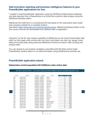
PowerBuilder to Qlik Sense Dashboard
- 1. Add innovative reporting and business intelligence features to your PowerBuilder applications for free. I created a small PowerBuilder application using the EASDemo SqlAnywhere database and data exported from a Datawindow to an Excel file to perform data analysis using the QlikSense Desktop edition. QlikSense from QlikTech is a revolutionary BI tool based on the 'associative data model' (see company website for a complete product description https://www.qlik.com/us/products/qlik-sense), QlikSense Desktop Edition is the free version that can be downloaded from Qliktech after a registration. Using the "on the fly" app creation capability of QlikSense we can show Powerbuilder data within an html page using controls like: bar chart, pivot table, pie chart, kpi, gauge, linear table and browse data using advanced QlikSense functions to search, filter, pivoting and analyze data. You can choose to use browser navigation using Microsoft Ole Web control inside PowerBuilder window object or run external browser using ShellExecute windows api. PowerBuilder application wizard: Datawindow control populated with EASDemo sales orders data:
- 2. Pivot and Linear Table configuration: dimensions and measures obtained parsing Datawindow columns Qlik Sense Extension attributes
- 3. Qlik Sense Web Application result: Kpi, Gauge and Pie objects Treemap Chart object Pivot Table object
- 4. Pivot Table object layout changed moving dimensions, measures and exploring data: Linear Table
- 5. Filter and Search operations: Pivot-Table exported to Excel
- 6. Pdf file composed with html objects