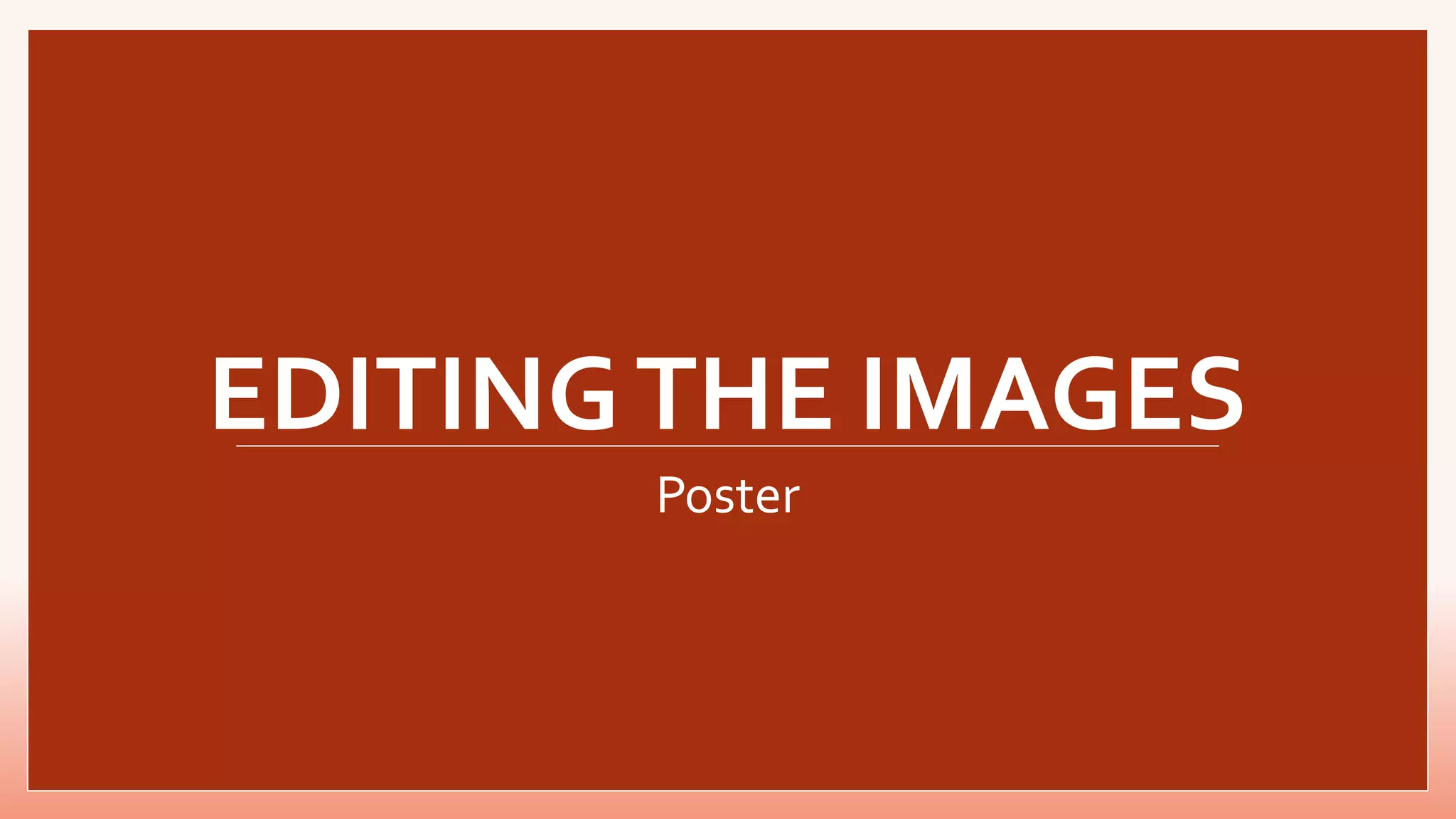
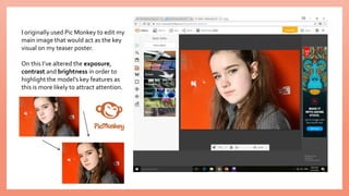
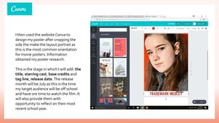
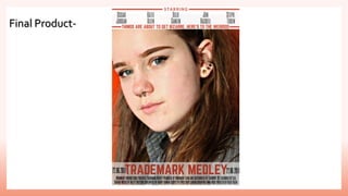
This is the step by step process in which I took when altering the image used as my main visual for my poster task. It details reasons behind the decisions made and makes reference to the websites used during.
The document discusses editing two photos for a magazine cover using Photoshop. For the first photo of Becky, the editor increased brightness, contrast, and vibrance to make the colors more vibrant and eye-catching. Background blur was also added to focus attention on Becky. For the second photo of Emma, brightness and contrast were increased to enhance features and hair color. Background blur was again used to make the subject stand out against the backdrop. The editor believes the edited images now look more conventional and appealing for the magazine cover.
The document summarizes the steps taken to design a magazine cover to promote a horror film. The designer selected the main image from a photoshoot, and then edited it to look like an old video still for consistency with the film's style. Logos, barcodes, prices and coverlines were added highlighting the main film and additional articles. Extra text was included at the top and bottom for wider appeal. A puff was added last to draw attention to exclusive content and incentivize purchase. The designer believes the final cover successfully promotes both the film and magazine in a synergistic way.
The document discusses redesigning a film poster. The original poster was deemed too artistically focused and lacked conventions like a tagline that are common to film posters. The new design idea is to feature the main film image inside a Polaroid photograph with a handwritten tagline, emulating the unique style of the Memento movie poster. This new poster design is intended to better match the quality of the film and capture audience attention.
The student decided to redesign their film poster for "Static" based on feedback. They realized the original poster lacked the artistic flair and uniqueness of the film. The new design features the main film image inside a Polaroid photograph with a handwritten tagline, drawing inspiration from the successful poster for Memento. This style captures the film's unique edge and matches its quality to better promote it.
The document discusses how the media product of a magazine and poster for a horror film called "Adeline" used conventions of real horror magazines and posters to make the products look authentic. Specifically, it discusses how the magazine was styled after Fangoria magazine in terms of colors, layout, and promotional elements. The poster used a dark, mysterious background and font styles seen in other horror films. Both the magazine and poster featured the same title, tagline, and main character to maintain continuity across the media products.
The document discusses the structure and conventions used in creating a magazine and poster for a horror film called "Adeline". For the magazine, the group modeled it after the well-known horror magazine Fangoria, using its color scheme and cover layouts as templates. They placed the masthead, title, and other elements in standard locations. For the poster, they used dark, mysterious backgrounds from horror movie posters as inspiration. The title was placed prominently at the top in a distinctive font to catch viewers' attention. Both the magazine and poster employed common horror media conventions to effectively promote the fictional film.
The document describes the process of designing a magazine advertisement and digipack for a band's debut album. Key steps included:
1. Choosing and editing images, and applying an overall pale green color scheme to the magazine ad image to link it to the digipack design.
2. Including the band's name, the words "The Debut Album" and release date on the ad to grab attention and provide important information.
3. Adding logos for the record label and websites at the bottom to follow conventions of magazine ads.
4. Selecting images for the front and back covers of the digipack and editing them, then adding the album title and song list using a
The student created a poster, magazine cover, and trailer to promote a mysterious media product theme. While the poster was the strongest, the magazine cover image did not fit the dark, mysterious tone of the other works. To improve, a full-body image of the main model could have been used and edited in Photoshop, with better positioning to fill space. Overall, the products were effective individually but did not fully cohere as a group due to the magazine cover design.
Jack Lawlor researched two commercial magazines, Q and NME, to inform the design of his own magazine product. He took inspiration from their conventions, copying elements like fonts, masthead design, use of banners, and page layouts. Specifically, he modeled his front cover design after Q magazine, dividing content sections like NME, and replicating Q's double page spread layout with photo placement, text styling, and additional details. The goal was to develop a magazine that felt professional and commercial like the examples he drew from.
The document summarizes the editing process for a digipak album cover. Key points addressed include inserting text on the front cover to identify the artist and genre, choosing imagery that captures the artist's style and sells them to the target audience, editing photos to look more youthful by removing lines and freckles, highlighting elements like a heart to draw attention, and adding required information like song titles and barcodes to the back cover to make it look authentic. Overall the goal was to entice the target audience through visuals and hinting at the artist's story and music.
This document contains mood boards and analysis of example magazine pages, including the front cover, contents page, and a double page spread. The student notes several effective design elements they want to incorporate in their own magazine, such as using thumbnails on the cover to showcase content, a tagline for brand recognition, close-up feature photos that create connection, and contrasting colors for eye-catching titles. The analysis focuses on visual design principles and targeting the teenage audience.
The document summarizes the editing process for images used in a Katy Perry digipak. Key details include inserting text on the front cover to identify the artist and genre, using an image of the artist to give audiences a feel for their style. The first inlay aims to portray Katy Perry's innocent and cheeky side through a secretive smile. Editing removed smile lines and freckles to look more youthful. The second inlay teases the album's story and finding love through a heart image. Editing tested highlighting and adjusted nail colors. The back cover added song titles, barcodes and symbols for authenticity with touch ups to match Perry's albums.
The student analyzed short film and independent movie posters to understand conventions for layout, font usage, and inclusion of credits. They chose a flowery font that also related to their name and selected a photo from their film shoot to use. Through experimenting with brightness, contrast, and saturation, they edited the photo and mirrored it to fit an A4 size. Text was arranged from largest at the top to smallest at the bottom. Additional details like logos and a tagline were included to provide context without fully revealing the story. The final poster was assessed to have a romantic and slightly aged look that creates mystery around the film.
The document describes the process of designing an advertisement for a music magazine. Several draft designs are discussed and changes are made based on feedback. The final design orients the advertisement landscape instead of portrait, includes a black silhouette of the band members, uses purple and black colors to match the genre, and features a 3D effect on the band photo and CD cover to make them pop more. The designer believes the end result looks professional and suitable for a real music magazine.
The document outlines a student's film marketing project proposal. It includes a bibliography citing sources used for research on the target audience. The proposal then details the weekly tasks planned to complete the project, such as conducting audience surveys and interviews, planning design elements, creating individual character posters, a film logo, billboard, and group poster. It concludes by explaining how the project will be evaluated through a production log, comparison to other works, and discussion of strengths and weaknesses.
The following is an analysis of three chosen movie posters, this was done in order to improve my understanding of successful poster features in order to produce a more advanced promotional campaign.
This second results slideshow details the audience feedback on the second survey released. This is based more around my website task, than the actual feature trailer.
This document provides costume descriptions for the main characters from the movie The Breakfast Club. For John Bender, the document describes keeping his costume similar to the original 1980s version to reflect how that style has become fashionable again. For Claire Standish, it describes her wearing branded, feminine clothes to show her wealth and materialism. For Brian Johnson, it describes changing his nerdy clothes to include a superhero t-shirt to make his nerdy interests more socially acceptable. For Andrew Clark, it describes dressing him in sports clothes to emphasize his athleticism. For Allison Reynolds, it describes her baggy, dark clothes as reflecting her outsider status and lack of interest in attracting attention.
The document analyzes the website designs for three movies - Deadpool, The Jungle Book, and Suicide Squad. For each movie website, key aspects of the design are highlighted that effectively promote the film's plot, genre, and tone. Visual elements like posters, trailers, and color schemes are used to grab attention and provide insights into the movies. Social media links and branding elements increase promotion across platforms. Interactive features also aim to engage audiences. Overall, the website designs strategically emphasize visuals, previews, and information to attract viewers and convey essential details about the films.
The document provides background information on the 1985 film The Breakfast Club, including its release date, genre, director, budget, and company credits. It summarizes the plot about five high school stereotypes who become friends during Saturday detention. The themes explored in the film are identified as coming of age, dissatisfaction, family, friendship, and identity. Plans are outlined to structure a remake trailer around these themes by highlighting key scenes that communicate each theme in order to establish empathy and relatability for the target audience. Two songs from 2016 are proposed for the soundtrack based on their suitability for teens and connection to themes in the original film.
The document discusses various cliques and stereotypes that are commonly portrayed in teen dramas. It identifies typical clique groups such as jocks, nerds, emos/goths, and loners. It also describes some stereotypical characteristics of nerds, cheerleaders, jocks, outsiders, and others. Common settings in teen films like the locker room, cafeteria, and field are mentioned. The document also outlines some typical "teen issues" that are explored in teen dramas, such as peer pressure, conformity, disliking a small town, and feeling like an outcast.
The document discusses how the author used photography and editing skills at various stages of creating a trailer, poster, and magazine for a school project. Photography was used to plan and construct animated sequences for the trailer by capturing stereotypical school scenes and objects. Photos of a classmate in costume were used as the basis for the poster and magazine cover designs. Photoshop skills improved for editing layers and manipulating images, while Illustrator was used to create cartoon drawings from photos and animate sequences for the trailer.
This document provides an overview and reflections on the creation of a music magazine coursework project. It describes the process of developing the front cover, contents page, and double-page spread through taking practice photos, exploring layout designs, and using Photoshop. The author changed designs multiple times before finalizing pieces. Photos were taken of band members to test different poses for the front cover. Examples from real magazines provided inspiration for layout elements. Photoshop allowed editing photos and exploring new fonts. The development process involved both successes and challenges in deciding designs and fully researching elements.
Lucy Morrissey created a first draft magazine cover layout before using Photoshop. This included positioning conventions like the banner, masthead, main image, and other elements. Morrissey then took photos related to the headline for the main image. Feedback was received on the draft to make changes. Photoshop was used to edit images, add text, and finalize the design based on the first draft and feedback. The final cover followed magazine conventions and kept a consistent, professional look.
The document summarizes the student's work on their reflective journal for their final major project (FMP) in film school. In Week 1, the student created an initial proposal and plans presentation, writing about inspirations, research needs, and a production schedule. They completed tasks like setting up a blog to upload work and researching skills required. In Week 2, they researched existing film merchandise like posters and surveyed peers. In Week 3, they analyzed common features of researched products and surveyed results. They created interview questions related to poster preferences. In Week 4, they started pre-production by creating basic layouts and style sheets for planned products like posters and merchandise. In Week 5, they created a production schedule and risk assessment
The document describes the development process of a film poster created by Chloe McDowell. It went through 5 steps: [1] Initial inspiration from the Spotlight poster but deciding against emulating it fully; [2] Creating titles and billing before a photo shoot but realizing the theme did not match; [3] Including character names and awards at the top in keeping with convention; [4] Adding a billing block, release date and social links; [5] Darkening the poster in response to feedback that the original was too light.
Poster development and final poster designTeagle02
This document summarizes the development process for a movie poster design for The Lion King. It describes how the designer began with simple elements and gradually added more detail and characters. Texture was added to the characters to combine aspects of the original film and upcoming remake. Details like eyes, mouths, shadows, and glows were edited. Company logos and credits were included at the bottom following research. The final design aims to be detailed like contemporary posters but also minimalist, incorporating key motifs from the original film in a balanced composition.
This document contains reflections from Daniel Thompson on his work during various stages of production. In the first week, he began filling out initial plans which included strengths/weaknesses, ideas, and potential research topics. The next week focused on conducting and analyzing a survey to learn about his target audience. He also researched similar existing films. The current week involved pre-production planning like developing characters/plots, storyboarding, creating shot lists, and safety planning for the upcoming filming.
The document discusses the skills developed and lessons learned from projects completed for A1 and A2. For A1, the learner created a music magazine cover, contents page, and article using Photoshop. Feedback indicated areas for improvement regarding layout and design. For A2, the learner created a horror movie magazine cover and film poster, conducting more extensive research and planning than for A1. This included analyzing other media texts, surveying audiences, and storyboarding. The learner gained experience with additional Photoshop tools and using multimedia like video for their blog.
The document discusses the effectiveness of combining the author's main short film product with two ancillary texts: a magazine spread and poster.
The author feels they have effectively combined the products through using the same main character across all pieces and a consistent font, though they were unable to use the same font in the film itself. Both the magazine and poster include large, empowering images of the main character to match conventions.
The author refined their magazine spread design to be more eye-catching and link directly to an image from the film. They created a character poster to promote the main protagonist and feel any of the three poster concepts they developed could have been successful.
1) The document describes the process of creating a movie poster mockup for a class project.
2) Several images were edited using Photoshop tools like filters, layers, and selection tools to add effects like blood, blurring, and splitting faces.
3) The edited images and additional text elements like the movie title, taglines, and reviews were arranged on mock magazine pages to create the poster design.
4) Feedback was gathered and the main image was re-edited to improve the realistic appearance of added blood before completing the final poster design.
Josh Bailey reflects on the process of creating a magazine cover and double-page spread for a class project in Photoshop. He began by making a new document in Photoshop and planning a cover celebrating 2019 films. He designed the layouts, adding thin borders and placeholders for film images on the cover. For the double-page spread, he chose to feature Avengers: Endgame, drawing inspiration from the film's imagery. Selecting and inserting the film images took time. Finally, he added design elements like mastheads and finished exporting the files.
In what way does your media product use, develop07AAli
The document discusses how a media product can develop or challenge conventions of real media products. It provides examples of forms such as magazines, books, and newspapers. Conventions are usual ways of doing things in a particular area, such as mastheads, reviews, and main images in magazines. The document then examines how the author's media product challenges conventions for pop magazine forms and layouts. Specifically, the author uses an unusual masthead design featuring a classical music sheet, atypical shot types and image placements in spreads, and an "inside this month" section to encourage future issues. Overall, the author aims to develop magazine conventions to appeal to a broader audience.
The document describes the process of creating a magazine front cover and advertorial for a Canon photography magazine. It details how the creator conducted research on Canon's branding and magazine conventions. They incorporated elements like colors, layout, and promotional features into their own designs. Feedback indicated the final products were visually striking, detailed, and emulated typical magazine styles successfully. The creator felt they achieved their goals of engaging audiences and representing Canon's brand cohesively across formats.
The document provides details on the process of creating the front cover and double page spread for a film magazine. It describes using Photoshop software to experiment with colors, fonts, images and layouts. Feedback from surveys was incorporated to improve the designs. The final covers were created by combining images, text and colors in Photoshop to be visually appealing and draw readers in based on the theme of reviewing new movies and TV shows.
The document summarizes a student's plans for their AS level Media Studies foundation portfolio project. They intend to create a 5-page rock magazine targeting 16-19 year old girls. For their preliminary task, they took photos at their college to use in a mock college magazine cover and contents page. They analyzed the photos and selected some to use, noting some minor edits needed to improve the images.
Jess Marshall researched existing media products like film posters and reviews to ensure their projects looked professional. They analyzed the 'Shutter Island' poster and magazine reviews to identify common conventions. For the film poster, they took inspiration from 'Shutter Island' but made it appropriate for their own film. They paid attention to fonts, images, and layout. For the review page, they replicated magazine styles but added their own elements. Across both, they focused on a consistent dark, mysterious theme and tied the projects together with symbolic imagery of the main character. While replicating conventions, they added their own creative elements to make the projects effective but still unique.
Toby Jackson evaluated their production process for a film magazine and trailer/advert. For existing products research, they analyzed magazine covers, spreads, and contents pages to inform the style of their own magazine. Their audience research through a Google form helped determine what elements appealed most to their target demographic, such as characters and backgrounds. Their planning included layouts, equipment lists, and schedules. Their final products were similar to the initial plans and incorporated techniques seen in existing products research, like featuring characters prominently. They used effects, fonts, and color schemes to make their magazine and trailer aesthetically pleasing.
This document contains summaries of the student's attempts at creating magazine covers, contents pages, double page spreads, and billboards for different media projects using Microsoft Publisher. The student provides self-evaluations and describes how they would improve their work in the future, focusing on incorporating more professional magazine design elements and techniques. They experiment with layouts, images, colors and fonts to develop a brand identity for each media piece and make their work more appealing and informative for audiences.
Editing for film magazine (including all draftsnsherry123
The student created a first draft of a film magazine called "FilmNOW" using layout inspiration from Total Film magazine. Key features included the main character Chelsie on the cover, an orange masthead, the film title and description, and content sections. Feedback will be gathered from peers to improve the magazine in a second draft.
Week 1: The producer created business cards in Photoshop using a neon theme. They experimented with different designs before settling on a professional look. They learned Photoshop techniques like the polar coordinates tool.
Week 2: The producer took landscape photos around Scarborough for their magazine and portfolio. They edited the photos in Photoshop to give them a vintage look by adding filters, scratches and grain. They designed the magazine cover using a faded, worn aesthetic.
Week 3: The producer redesigned the magazine cover with a modern, professional color scheme. They applied the colors consistently across pages. They finished the cover design without tutorials by applying knowledge gained from prior experiments.
❼❷⓿❺❻❷❽❷❼❽ Dpboss Matka ! Fix Satta Matka ! Matka Result ! Matka Guessing ! Final Matka ! Matka Result ! Dpboss Matka ! Matka Guessing ! Satta Matta Matka 143 ! Kalyan Matka ! Satta Matka Fast Result ! Kalyan Matka Guessing ! Dpboss Matka Guessing ! Satta 143 ! Kalyan Chart ! Kalyan final ! Satta guessing ! Matka tips ! Matka 143 ! India Matka ! Matka 420 ! matka Mumbai ! Satta chart ! Indian Satta ! Satta King ! Satta 143 ! Satta batta ! Satta मटका ! Satta chart ! Matka 143 ! Matka Satta ! India Matka ! Indian Satta Matka ! Final ank
❼❷⓿❺❻❷❽❷❼❽ Dpboss Kalyan Satta Matka Guessing Matka Result Main Bazar chart Final Matka Satta Matta Matka 143 Kalyan Chart Satta fix Jodi Kalyan Final ank Matka Boss Satta 143 Matka 420 Golden Matka Final Satta Kalyan Penal Chart Dpboss 143 Guessing Kalyan Night Chart
Heart Touching Romantic Love Shayari In English with ImagesShort Good Quotes
Explore our beautiful collection of Romantic Love Shayari in English to express your love. These heartfelt shayaris are perfect for sharing with your loved one. Get the best words to show your love and care.
KALYAN MATKA | MATKA RESULT | KALYAN MATKA TIPS | SATTA MATKA | MATKA.COM | MATKA PANA JODI TODAY | BATTA SATKA | MATKA PATTI JODI NUMBER | MATKA RESULTS | MATKA CHART | MATKA JODI | SATTA COM | FULL RATE GAME | MATKA GAME | MATKA WAPKA | ALL MATKA RESULT LIVE ONLINE | MATKA RESULT | KALYAN MATKA RESULT | DPBOSS MATKA 143 | MAIN MATKA
Tanjore Painting: Rich Heritage and Intricate Craftsmanship | Cottage9Cottage9 Enterprises
Explore the exquisite art of Tanjore Painting, known for its vibrant colors, gold foil work, and traditional themes. Discover its cultural significance today!
2. I originally used Pic Monkey to edit my
main image that would act as the key
visual on my teaser poster.
On this I’ve altered the exposure,
contrast and brightness in order to
highlight the model’s key features as
this is more likely to attract attention.
3. I then used the website Canva to
design my poster after cropping the
side the make the layout portrait as
this is the most common orientation
for movie posters. Information
obtained my poster research.
This is the stage in which I will add: the
title, starring cast, base credits and
tag line, release date.The release
month will be July as this is the time
my target audience will be off school
and have ore time to watch the film. It
will also provide them with
opportunity to reflect on their most
recent school year.