Step 1 After you have logged in, click on getting started”.docx
Overview
1. Michael Perhats Loras College Center for BusinessAnalytics 4/27/16
Brendan Doyle Legacy Symposium
IOWA ECONOMIC REPORT WITH DUBUQUE FOCUS:
INTERACTIVE INSIGHT:
This Model is a calculation on a line chart, representing the change in the Average annual median salary over
time. The Graphic is an overview of the Annual Median Salaries and how they have changed overtime in a
filterable visualization. The first filterable category is the geographical areas, which were collapsed (the
Bureau of Labor Statistics reports data for 12 separate regions in Iowa) into 5.
This Process was performed in JMP (a SAS product for statistical analysis) as Follows:
Select AREA_NAME (this contains the original Towns in Iowa)
Select ‘Cols’ ‘Utilities’ ‘Recode’
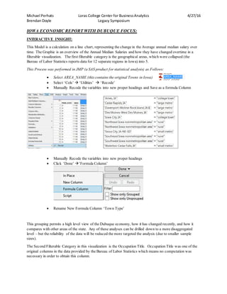
Manually Recode the variables into new proper headings and Save as a formula Column
Manually Recode the variables into new proper headings
Click ‘Done’ ’Formula Column’
Rename New Formula Column ‘Town Type’
This grouping permits a high level view of the Dubuque economy, how it has changed recently, and how it
compares with other areas of the state. Any of these analyses can be drilled down to a more disaggregated
level – but the reliability of the data will be reduced the more targeted the analysis (due to smaller sample
sizes).
The Second Filterable Category in this visualization is the Occupation Title. Occupation Title was one of the
original columns in the data provided by the Bureau of Labor Statistics which means no computation was
necessary in order to obtain this column.
2. Michael Perhats Loras College Center for BusinessAnalytics 4/27/16
Brendan Doyle Legacy Symposium
Here is an example of a visual filtered down to computer and Mathematical Occupations:In Dubuque Vs
College Towns:
*2015 data is highlighted in the white boxes*
IOWA ECONOMIC REPORT WITH DUBUQUE FOCUS:
SALARIES:
What is reported here is more aggregate categories.
Throughout our search for insight from the data given, we noticed that there were some similar trends in the
data in regards to the varying career fields that might provide us with some generalized insight about trends in
employment. In order to dive into this idea in an accurate fashion we performed a principle components
analysis with the salary data provided. When we did this we found that the median salary was the principal
component for analysis. We then proceeded to use JMP’s clustering feature to cluster the occupation titles
based on median salary…
From this procedures findings, we proceeded to collapse the 22 major Occupation Titles provided by the
Bureau of Labor Statistics into just 3 categories.
Professional
Manual Labor
Personal Services
3. Michael Perhats Loras College Center for BusinessAnalytics 4/27/16
Brendan Doyle Legacy Symposium
This Process was performed in JMP (JMP is a SAS product that is marketed as a ‘Statistical Discovery’ tool)
as follows:
And, for geographical areas, collapsed 12 (the Bureau of Labor Statistics reports data for 12 separate regions in
Iowa) into 5 as follows:
These groupings permit a high level view of the Dubuque economy, how it has changed recently, and how it
compares with other areas of the state. Any of these analyses can be drilled down to a more disaggregated
level – but the reliability of the data will be reduced the more targeted the analysis (due to smaller sample
sizes).
4. Michael Perhats Loras College Center for BusinessAnalytics 4/27/16
Brendan Doyle Legacy Symposium
Median incomes are highest for professional occupations, followed by the manual labor category, with
personal services the lowest in Dubuque. In the other categories, the median salaries were almost equivalent in
the last 10 years which is can be shown in the following figure:
For the professional category, there appear to be two groups: the college towns (Ames and Iowa City) and the
large metro areas are on one group, with the rest of the state (including Dubuque) having lower professional
salaries. Notable is the fact that professional salaries in Dubuque appear to have dropped since 2009, unlike
the rest of the state. This would be something we might want to research to find reasons for.
*NOTE: The Visualization for this Analysis was created in Microsoft Power BI, which is an open source,
cloud delivered visualization stack which allows for and promotes engagement from Microsoft users in the
data community and ultimately some fairly unique capabilities that allow for an in depth analysis that
coincides nicely with other Microsoft applications (e.g. excel). *
SHARE OF EMPLOYMENT:
When trying to gather actionable information from our data, we thought that it would be advantageous to
calculate what share of employment was held for each occupation type. We did this with a simple formula,
dividing the Total Employment number provided by the sum of the Total employment across all categories for
the year; leaving us with a percentage.
The Formula in JMP: (TOT_EMP was a provided field in the original data set)
Using the same three occupational categories (Professional, PersonalServices, Manual Labor) that we
calculated for the examples for the Dashboard representing the change in median salaries over time, we have
depicted what share of local employment falls into these three categories and how this ‘share’ has been
changing overtime.
This pattern is shown in the following visualization:
5. Michael Perhats Loras College Center for BusinessAnalytics 4/27/16
Brendan Doyle Legacy Symposium
Note that the share of employment that is “professional” has been rising throughout Iowa – in the college
towns and metro areas it has surpassed the share of employment in manual labor (which has been dropping
throughout the state).
*NOTE: This visualization was also created in Microsoft Power BI.*
SALARY DISTRIBUTION:
It is also useful to explore how the distributions of salaries compare. The next figure shows the 10th
percentile,
median income, and 90th
percentile of income, by occupational category across the regions of Iowa:
6. Michael Perhats Loras College Center for BusinessAnalytics 4/27/16
Brendan Doyle Legacy Symposium
For most areas – and most occupational categories – the 10th
and 90th
percentiles have been spreading apart.
This is part of the more general phenomenon of the growing gap between rich and poor. Not surprisingly, the
gap is the greatest for professional occupations and that is where the gap is growing most quickly. Again,
Dubuque is an exception, showing declining professional salaries, particularly at the highest end of the
distribution. Also, not the relatively high top salaries for manual labor in the college towns. In virtually all
areas and categories, the bottom of the income distribution appears flat.
*NOTE: This visualization was created in the Graph Builder provided by JMP, which is where all of our
analysis was computed.*
DISAGGREGATED OCCUPATIONAL SALARY OVERVIEW:
*NOTE: all visualizations in this section were created in Tableau*
The Following Visualization Required minimal adjustment from the original data obtained through the Bureau
of Labor Statistics. We did, however subset the Column ‘Group’ into just the 22 major categories. In doing
this we obtained the 22 main occupational categories in Iowa in order to get an overview that doesn’t suffer
from faulty results due to small sample sizes.
In order to subset this data we:
Highlighted the title provided by the Bureau of Labor statistics in JMP (statistical
analysis tool) which contained the category of occupation to which each occupation resided in.
We proceeded to Select ‘Rows’ ‘Row Selection’ ‘Select Where’ or ‘Ctrl+Shift+W’ in order to
subset the rather large original data set
We then selected ‘Contains’ Type ‘Major’ and
then click ‘Add condition’ ‘OK’
Once this is complete, you can gaze into the lower corner of the screen
and find that the rows are selected. From here click ‘Tables’
‘Subset’ and JMP will open a new window with the new data set.
We then saved this file as a comma separated value and opened this
new file in tableau where we produced the following visualization
which depicts, out of the 22 major occupation categories, which ones
have the highest salaries in the highest median incomes:
*The Result Shows in descending order, the range of Salaries in this median income category in $’s*
7. Michael Perhats Loras College Center for BusinessAnalytics 4/27/16
Brendan Doyle Legacy Symposium
A simple Switch in Graph Type and Axis Type from ‘A_Median’ ‘A_90’ shows us how these same
occupational categories compare in the 90th
Percentile category of incomes
8. Michael Perhats Loras College Center for BusinessAnalytics 4/27/16
Brendan Doyle Legacy Symposium
What is recognizable from these visualizations is that Management has the highest Median Salaries and the
highest salary for the top 90th
percentile earners within the 22 major categories, and that Food preparation and
serving related occupations has the lowest in both visualizations.
R SquaredSalary Relationships:
When Analyzing our data, we thought it might be interesting to depict the relationship between a change in
different percentile categories of salaries. For example, if when the bottom 10th
percentile of management
occupations increases is there a perfectly proportional relationship with the top 90th
percentile of management
occupations? In order to understand this relationship, you must utilize a graph that depicts the relationship of
two numerical values (one on each axis). We will then be able in create an R squared value.
An R2
is a statistic that will give some information about the goodness of fit of a model. In regression,
the R2
coefficient of determination is a statistical measure of how well the regression line approximates the real
data points. An R2
of 1 indicates that the regression line perfectly fits the data.
In our case, if when there was a change in $X.00 in the bottom 10th
percentile of occupations on one axis this
meant there would also be a $X.00 change in the opposite axis, we would have an R2
value of 1. Essentially,
the higher the R2
value, the stronger the relationship of the two numerical values under analysis.
When we visualize this data, for all occupations for every single year in our data (2006-2015) in every town
type, analyzing the annual median salary compared to the 90th
percentile occupations we find that:
*Note: R-squared is calculated by Tableau*
9. Michael Perhats Loras College Center for BusinessAnalytics 4/27/16
Brendan Doyle Legacy Symposium
As we can see, the R2
Value equals 0.769678. Since this value is fairly high, we can conclude that when
factors affect salaries, the fluctuation amongst the changes across all salary ranges can be fairly similar in
Iowa.
This is a very general overview of all occupations. What is interesting is how these values change in
correspondence with the occupation types that we aggregated from the original 22 major categories given into
our 3 general occupation types.
If we throw the dimensional variable that we calculated of ‘occupational type’ into a filter
in order to analyze how the relationship varies amongst our 3 occupational types
(professional, manual labor, and personal services) we
obtain the following visualizations for our varying
categories of occupations:
*Note: the occupational categories were amassed via*
Professional Category:
10. Michael Perhats Loras College Center for BusinessAnalytics 4/27/16
Brendan Doyle Legacy Symposium
Personal Services:
Manual Labor:
11. Michael Perhats Loras College Center for BusinessAnalytics 4/27/16
Brendan Doyle Legacy Symposium
What is interesting about the R-squared values that we gathered is how much they vary amongst the different
occupational types.
Personal Services R2
: 0.210483
Professional Occupations R2
: 0.552163
Manual Labor R2
: 0.833336
It is evident that amongst the personal service occupations, under economic changes, time changes, or other
potential variables that might affect wages that there is a very low correlation between salary changes with low
wage earners and high wage earners.
Manual Labor on the other hand has an R-squared value that is very close to 1. This means that low wage
earners salaries change at a rate very similar to that of higher wage earners. (i.e.- a change of $1,000.00 in the
90th
percentile earnings means a change of $83,000.00 for low wage earners [this is not an actually calculation
but rather a tool for understanding])
INTERACTIVE BUUBLE PLOT:
One of our favorite visualizations in this graph was the bubble plot. The bubble plot was fairly easy to create
but it does a good job of representing the changes in variables over time and the relationship between two
numerical values.
We analyzed the change of all of our original 22 major occupational titles and how the annual median salary
and total employment for these occupations has changed from 2006-2015. Although we are analyzing the 22
major occupations that we collected from the Bureau of Labor Statistics, we wanted to utilize a coloring
variable of 3 colors by the category ‘Occupation Type’ that we created from our original data. Recall that this
process was performed in JMP (JMP is a SAS product that is marketed as a ‘Statistical Discovery’ tool) as
follows:
Select AREA_NAME (this contains the original Towns in Iowa)
Select ‘Cols’ ‘OCC_TITLE’ ‘Recode’
Manually Recode the variables into new proper headings
Click ‘Done’ ’Formula Column’
Rename New Formula Column ‘Occupational Type’
12. Michael Perhats Loras College Center for BusinessAnalytics 4/27/16
Brendan Doyle Legacy Symposium
After recoding this new formula column, we were ready to create the bubble graph. The bubble graph was
created via the following steps:
Click ‘graph’ ‘bubble plot’
Fill out the preferable
information in the fashion of:
What this will provide us with is an interactive graph that depicts multiple things. If the bubble moves to the
right along the horizontal X-axis it means that, over time, there is an increase in the amount of individuals the
given occupational title. If the bubble moves up on the vertical Y-axis axis it means that there has been an
increase in the annual median salary for the given occupation over time. The opposite holds true for the
bubble moving in the other directions along these two axis. The faded circles that are shown and connected via
line is a depiction of where each occupation has resided in regards to the two axis of analysis in previous years.
The solid bubble is the current state of employment and salary under the year of analysis. Notice; when
looking into the top right hand corner of the graph, you can recognize the year given. The following
screenshot is 2015 with the faded trails representing 2006-2015.
*NOTE: This visualization was created in JMP*
13. Michael Perhats Loras College Center for BusinessAnalytics 4/27/16
Brendan Doyle Legacy Symposium
In order to drill down deeper into a more specific visualization or occupation for this data, you can add a local
data filter. By adding a local data filter and selecting one of the variables that resides in the visual analysis,
you can look more in depth into a particular story that you want to visualize.
Local Data Filter can be employed by:
This Allows us to add a filter to any variable in this set of data.
The Following is an example of how to filter down to just management occupations, architecture and
engineering, computer and mathematical occupations, business and financial operatons, and legal
occupations (the top 5 earners that we found in a previous analysis)
Click the red arrow to the left of the title on the graph ‘Script’ ‘local data filter’
Click ‘OCC_TITLE’ ‘Add’
click ‘management occupations’ +CTRL ‘architecture and
engineering’ +CTRL ‘computer and mathematical occupations’
+CTRL ‘business and financial operatons’ and +CTRL ‘legal
occupations’.
14. Michael Perhats Loras College Center for BusinessAnalytics 4/27/16
Brendan Doyle Legacy Symposium
FROM THESE ACTIONS WE CAN VISUALIZE THE TOP 5 ANNUAL WAGE EARNERS IN 2015 AND
HOW THEIR ANNUAL MEDIAN SALARIES HAVE CHANGED OVERTIME AS WELL AS THE
TOTAL EMPLOYMENT FOR THESE CATEGORIES. THE GRAPH THAT WE UNVEIL IS:
*NOTE: these are all professional occupations and their salaries have all been continuously increasing
throughout the years. Also note that management occupations have shown a significant increase in total
employees in this category*
EDUCATION:
*NOTE THESE EDUCATION VISUALIZATIONS WERE NOT INCLUDED IN THE IOWA NEEDS
ASSESSMENT BUT WAS DECIDED TO BE INCLUDED IN THE DOCUMENT FOR THE LORAS COLLEGE
LEGACY SYMPOSIUM FOR STUDENTS*
SHARE OF UNDERGRADUATE STUDENTS IN DUBUQE, IA BY SCHOOL:
The Following data was gathered and cleaned from data gathered by the Department of education. The data
was subset into the Secondary Schools in Dubuque IA and the amount of graduates from each in the year 2014.
In doing this we unveiled the following set of data in Excel.
And with the simple Formula “=F2/SUM($F$2:$F$8)” copied down, to
calculate the share each college obtains for percentage of undergraduate
students we got the following column:
15. Michael Perhats Loras College Center for BusinessAnalytics 4/27/16
Brendan Doyle Legacy Symposium
We are proud to announce thatLoras has the highestshare by.14%
SHARE OF MAJORS IN DUBUQUEIA:
We thoughtthatit wouldbe intruigingtoindulgeinfinding,outof all of these schools,whatmajors
were the mostpopularinDubuque. Withthe foresightof a tree graph(like the one utilizedinthe
previousvisualization) we wantedtoaggregate the majortitlesintonew categoriesinordertoprovide
some sort of subsectionswithinthe graphtomake the graphicmore interactive andfilterableaswell as
visible bymajorcategoryratherthanone big clusterof majortitles. Inorderto performthistask,we
utilizedjumpsrecodingfeature toaggregate intocategoriesandsave thisnew dataina formulacolumn.
This Process was performed in JMP (a SAS product for statistical analysis) as Follows:
Select Major Name (this contains the original major names in Iowa)
Select ‘Cols’ ‘Utilities’ ‘Recode’
Manually Recode the variables into new proper headings and Save as a formula Column
In which we obtained:
16. Michael Perhats Loras College Center for BusinessAnalytics 4/27/16
Brendan Doyle Legacy Symposium
Which some new subcategories out of the original 63 different types
of majors. Some of the Major names did not fit nicely into any of the
major categories. For these we decided to leave them as is under their
original names.
We then realized that this was slightly overwhelming in the visualization so we decided to make one last
formula change to aggregate the information by Recoding these new categories into:
From this..
The following Visualization was created:
*NOTE: the numbers in these boxes represent the percentage share of total undergraduate degrees granted*
*Note: this visualization was created in Tableau*
17. Michael Perhats Loras College Center for BusinessAnalytics 4/27/16
Brendan Doyle Legacy Symposium
Links to Data Sources for documents withinthis analysis:
http://www.bls.gov/oes/tables.htm,
http://nces.ed.gov/ipeds/
18. Michael Perhats Loras College Center for BusinessAnalytics 4/27/16
Brendan Doyle Legacy Symposium