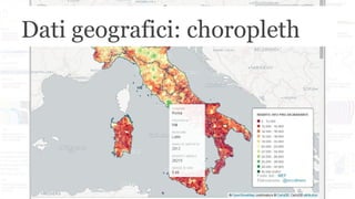
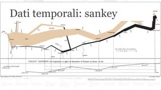
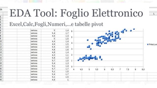
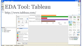
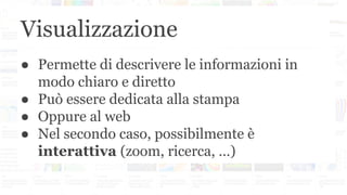
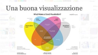
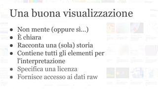
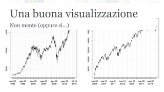
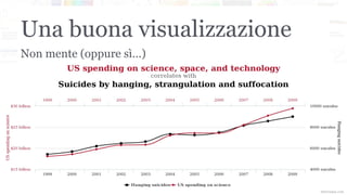
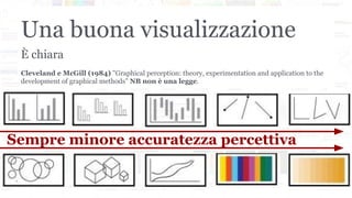
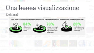
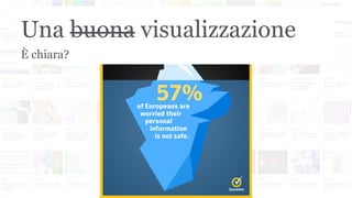
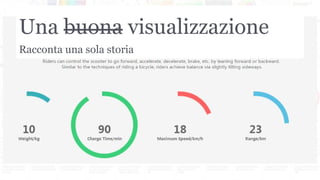
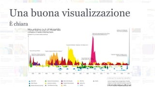
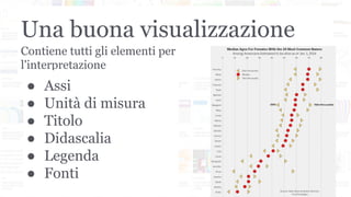
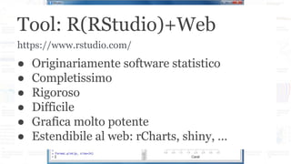
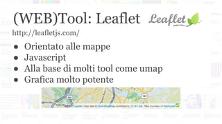
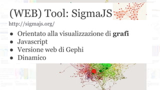
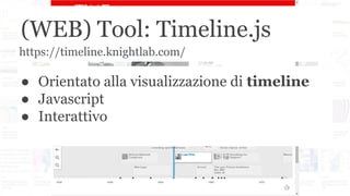
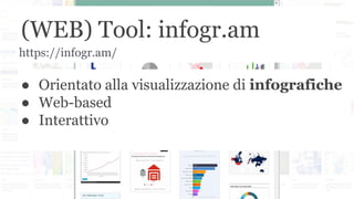
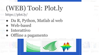
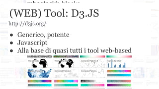
Paolo Guadagni - La visualizzazione di dati e informazioni: Il punto di vista...Cultura Digitale
Il “mercato” dell’infografica: quali sono le modalità creative scelte dalle aziende per spiegare dati e informazioni ai loro target target di riferimento.
Complexity Maps. Representing urban territories and communities.Paolo Ciuccarelli
Urban territories as complex systems and design for representing places and communities. Presentation of the \"Complexity Maps\" workshop for the Summer School \"Designing Connected Places\", Turin - Italy, 2008, 13-29 July
Talk su data visualization e progetto grafico presentato il 5 aprile 2014 in occasione dell'incontro "Il Giornalismo dei dati – esempi, errori e storie", giornata dell'Online News Association Italia dedicata ai dati e al giornalismo.
Mind the Graph! A Discussion on the Design of the NetworkPaolo Ciuccarelli
Arts, Humanities, and Complex Networks — 4th Leonardo satellite symposium at NetSci2013 (http://artshumanities.netsci2013.net/)
As communication designers we are often asked to bring complex scientific issues
in the hands of non-expert stakeholders: people that are neither expert of the domain
of interest nor familiar with the very nature, the structure and the dynamics of
complexity. It’s the case of Controversy Mapping in Social Studies, where the aim is
to preserve the richness of the controversy and, at the same time, to represent it in a
understandable way for the public(s). From one side, network visualization seems to
be the natural device to put Actor-Network Theory in action; on the other, the limits
of network visualizations suddenly emerge in engaging the public: a graph can be
scary, impenetrable and repulsive. Even though the solution is not obvious, it is a
communication problem, and, as such, can be solved.
A deeper issue emerges, even with experts and highly motivated users. Network
visualizations have become a powerful conceptual and cognitive research tool for
many disciplines, including, more recently, those soft sciences that embraced digital
technologies. Digital Humanities is one of these domains trying to exploit the heuristic
potential of network visualizations, often importing and “practicing” the quantitative
methodology —network analysis— embedded in the visualization pattern. If we
accept that humanistic inquiry is based on the recognition of knowledge production
as a constructive process, where ‘making’ is a fundamental step and interpretation
—not truth— is the goal, visualization is more a matter of creation than representation;
it’s about building the pattern, not just finding it. Data and graphs are not objective
representations of pre-existing facts: they are the generative, qualitative and uncertain
processes that allow scholars to craft out novel interpretations from tacit knowledge
spaces. That is where a fruitful and tight collaboration between designers, (soft)
sciences scholars and experts may be established.
Le slide presentate all'Agile UX Italia 2013 in un talk sul mondo della Data Visualization. Cos'è e come funziona la visualizzazione dei dati e come utilizzarla nell' UX design? Daremo uno sguardo all'evoluzione della disciplina, alle pietre miliari e alle nuove tendenze, fino ad arrivare a scoprire come, partendo dai dati, sia possibile costruire un'esperienza utente del tutto nuova.
Nudge by Design (2015 Data Transparency Conference @MIT)Paolo Ciuccarelli
Anybody should be able to understand what kind of personal data are gathered, used and shared by digital services and device she uses. Unfortunately even data transparency initiatives are technology-driven and fail in increasing the awareness of non-expert users.
An immersive workshop at General Assembly, SF. I typically teach this workshop at General Assembly, San Francisco. To see a list of my upcoming classes, visit https://generalassemb.ly/instructors/seth-familian/4813
I also teach this workshop as a private lunch-and-learn or half-day immersive session for corporate clients. To learn more about pricing and availability, please contact me at http://familian1.com
In giro per un mappamondo libero: introduzione ad OpenStreetMapdieterdreist
Introduzione ad OpenStreetMap, tenuto il 20130228 per la conferenza "OpenGeoData Italia, istruzioni per l'uso" presso il Centro Congressi Frentani, Roma
Convegno “Sicurezza informatica e strumenti GIS Free e Open Source per l’Inge...Margherita Di Leo
Convegno “Sicurezza informatica e strumenti GIS Free e Open Source per l’Ingegneria”
Matera, 4 Maggio 2012
Overview sul software libero GRASS GIS e applicazioni per l’analisi di dati territoriali ed ambientali.
Presentazione introduttiva all'aperitivo su startup e coworking nell'ambito della proposta SmartCento delle liste a supporto del candidato Sindaco di Cento Fabrizio Toselli
2015-06-05 SMAU Bologna Digital Champions Academy: Civic HackingMatteo Fortini
SMAU 2015 Bologna: presentazione su Civic Hacking presso Digital Champions Academy di Matteo Fortini, Peter Zullo, Federica Govoni, Franco Morelli, Cristiano Ferrari, Nicola Ghirardi
ZeroMQ e Redis: soluzioni open source per l'integrazione di componentiMatteo Fortini
Realizzare software complessi con componenti semplici che interagiscono in forme ben definite è da sempre il modo per ottenere architetture robuste ed efficienti.
ZeroMQ e Redis permettono di implementare questo paradigma ed estenderlo alle reti, ai diversi linguaggi, alle diverse architetture hardware.
3. Exploratory Data Analysis
● Grafi "grezzi": non curiamo etichette, titoli,
didascalie
● Cerchiamo relazioni o pattern
● Cerchiamo distribuzioni e outliers
● Usiamo la forma, il colore, la
distribuzione spaziale
4. EDA: Relazioni fra grandezze
Anscombe's quartet (1973):
● stessa media
● stessa varianza
● stessa regressione
● molto diverse
"Anscombe's quartet 3" by Anscombe.svg: Schutzderivative work (label using
subscripts): Avenue (talk) - Anscombe.svg. Licensed under CC BY-SA 3.0 via
Commons
5. EDA: Relazioni fra grandezze
"Petal-sepal". Licensed under CC BY-SA 3.0 via Commons
23. Visualizzazione
● Permette di descrivere le informazioni in
modo chiaro e diretto
● Può essere dedicata alla stampa
● Oppure al web
● Nel secondo caso, possibilmente è
interattiva (zoom, ricerca, …)
25. Una buona visualizzazione
● Non mente (oppure sì…)
● È chiara
● Racconta una (sola) storia
● Contiene tutti gli elementi per
l'interpretazione
● Specifica una licenza
● Fornisce accesso ai dati raw
28. Una buona visualizzazione
Cleveland e McGill (1984) "Graphical perception: theory, experimentation and application to the
development of graphical methods" NB non è una legge.
È chiara
Sempre minore accuratezza percettiva