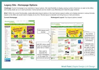
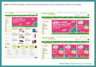
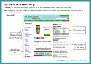
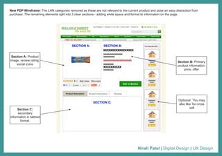
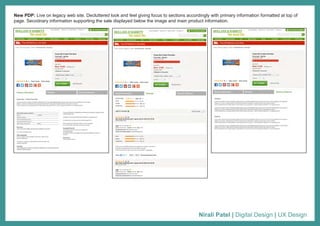
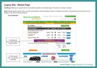
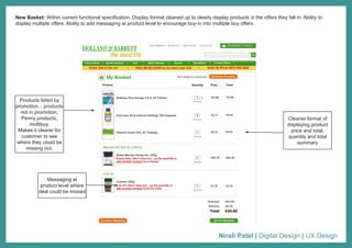
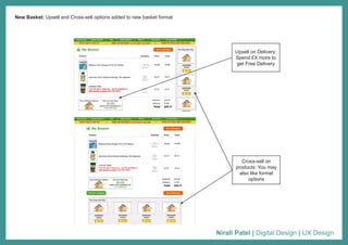
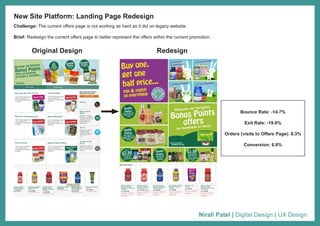
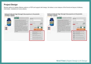
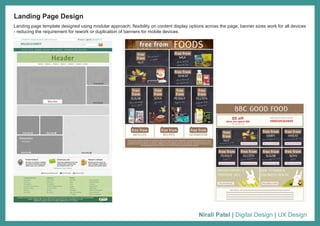
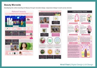
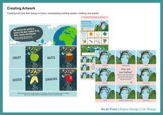
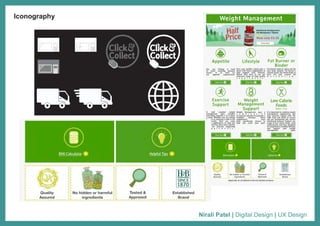
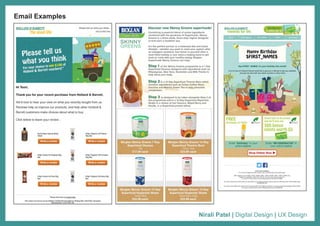
Nirali Patel
Digital Design
Nirali Patel | Digital Design | UX Design
Challenge: Current homepage is too restrictive in layout options. We need flexibility to display varying number of banners; to cater to the offers
and overlay deals we run in each promotion. Some banners are too small to use effectively and make the page cluttered.
Brief: Within the current functionality, create alternative layout options in the main banner space to allow us to display banners in various formats
based on the offers we would need to display at any time. Review layout to declutter and bring focus on main promotions.
Legacy Site - Homepage Options
Current Homepage: Redesigned Layout: Four layout options created
LHN cleaner and
shorter
Light BG colour used
to pull out categories/
active tab on rotator.
Also used to
separate the
service messaging
on the page from
promotional banners
Top section
decluttered to
introduce more
focus on main
promotions.
Clickable tabs
added - users
are able to click
and view the
deal they want
or let the rotator
run on default
Nirali Patel | Digital Design | UX Design
Result: A decluttered homepage, more layout options enabling flexibility to a cater to showcase offers clearly on the homepage.
Nirali Patel | Digital Design | UX Design
Challenge: PDP is cluttered and too many distractions on the page make it easy for users to leave without purchase.
Brief: Redesign the PDP to give more focus to the product. Clearer communication of main product information and offer. Scope to add in
reviews and service information.
Legacy Site - Product Detail Page
Current PDP:
Standard web site
LHN categories - not
relevant to product or
category currently on
Label information as
per the packaging,
not user friendly.
Alternative size
options not clear to
read
Offer not clear to see
Nirali Patel | Digital Design | UX Design
Section A: Product
image, review rating,
social icons
Optional: ‘You may
also like’ for cross
sell
Section C:
secondary
information in tabbed
format.
Section B: Primary
product information,
price, offer
New PDP Wireframe: The LHN categories removed as these are not relevant to the current product and pose an easy distraction from
purchase. The remaining elements split into 3 clear sections - adding white space and format to information on the page.
Nirali Patel | Digital Design | UX Design
New PDP: Live on legacy web site. Decluttered look and feel giving focus to sections accordingly with primary information formatted at top of
page. Secodnary information supporting the sale displayed below the image and main product information.
Nirali Patel | Digital Design | UX Design
Challenge: Missing an opportunity to cross sell and upsell on the basket page. Promotions not clear in basket.
Brief: Design layout options within current functionality to improve display of items in basket by promotion. Showcase how and where we can
display cross sell and upsell products.
Legacy Site - Basket Page
Current Basket:
Limited upsell
area - no dynamic
capability.
messaging to
encourage upsell into
the promotion
Nirali Patel | Digital Design | UX Design
New Basket: Within current functional specification. Display format cleaned up to clearly display products in the offers they fall in. Ability to
display multiple offers. Ability to add messaging at product level to encourage buy-in into multiple buy offers.
Products listed by
promotion... products
not in promotion,
Penny products,
multibuy.
Makes it clearer for
customer to see
where they could be
missing out.
Messaging at
product level where
deal could be missed
Cleaner format of
displaying product
price and total,
quantity and total
summary
Nirali Patel | Digital Design | UX Design
New Basket: Upsell and Cross-sell options added to new basket format
Upsell on Delivery:
Spend £X more to
get Free Delivery
Cross-sell on
products: You may
also like format
options
Nirali Patel | Digital Design | UX Design
Challenge: The current offers page is not working as hard as it did on legacy website.
Brief: Redesign the current offers page to better represent the offers within the current promotion.
New Site Platform: Landing Page Redesign
Original Design Redesign
Bounce Rate: -14.7%
Exit Rate: -19.6%
Orders (visits to Offers Page): 8.3%
Conversion: 6.6%
Nirali Patel | Digital Design | UX Design
Project Design
Review options to display Delivery options on PDP and support with design; the below is one instance of the format and layout of delivery
information. Variations on icons colours.
Nirali Patel | Digital Design | UX Design
Landing page template designed using modular approach; flexibility on content display options across the page, banner sizes work for all devices
- reducing the requirement for rework or duplication of banners for mobile devices.
Landing Page Design
Nirali Patel | Digital Design | UX Design
Developing the online branding for Beauty through microsite design; responsive design to work across devices.
Beauty Microsite
Nirali Patel | Digital Design | UX Design
Creating look and feel; being on brand, manipulating existing assets, creating new assets
Creating Artwork
Nirali Patel | Digital Design | UX Design
Iconography
+
Nirali Patel | Digital Design | UX Design
Defining and documenting Design Team Process and SLAs. Creation of Design Planner for all BAU workload to be used by all ecommerce areas
and design team. Leading digital design dsirection by defining Digital Brand Guidelines.
Process & Documentation
Digital Design Brand Book
Core Look & Feel.
Nirali Patel | Digital Design | UX Design
Web Creative
Nirali Patel | Digital Design | UX Design
Email Examples
Nirali Patel | Digital Design | UX Design
Marketing Activity

Nirali Patel - Portfolio

  • 1.
  • 2.
    Nirali Patel |Digital Design | UX Design Challenge: Current homepage is too restrictive in layout options. We need flexibility to display varying number of banners; to cater to the offers and overlay deals we run in each promotion. Some banners are too small to use effectively and make the page cluttered. Brief: Within the current functionality, create alternative layout options in the main banner space to allow us to display banners in various formats based on the offers we would need to display at any time. Review layout to declutter and bring focus on main promotions. Legacy Site - Homepage Options Current Homepage: Redesigned Layout: Four layout options created LHN cleaner and shorter Light BG colour used to pull out categories/ active tab on rotator. Also used to separate the service messaging on the page from promotional banners Top section decluttered to introduce more focus on main promotions. Clickable tabs added - users are able to click and view the deal they want or let the rotator run on default
  • 3.
    Nirali Patel |Digital Design | UX Design Result: A decluttered homepage, more layout options enabling flexibility to a cater to showcase offers clearly on the homepage.
  • 4.
    Nirali Patel |Digital Design | UX Design Challenge: PDP is cluttered and too many distractions on the page make it easy for users to leave without purchase. Brief: Redesign the PDP to give more focus to the product. Clearer communication of main product information and offer. Scope to add in reviews and service information. Legacy Site - Product Detail Page Current PDP: Standard web site LHN categories - not relevant to product or category currently on Label information as per the packaging, not user friendly. Alternative size options not clear to read Offer not clear to see
  • 5.
    Nirali Patel |Digital Design | UX Design Section A: Product image, review rating, social icons Optional: ‘You may also like’ for cross sell Section C: secondary information in tabbed format. Section B: Primary product information, price, offer New PDP Wireframe: The LHN categories removed as these are not relevant to the current product and pose an easy distraction from purchase. The remaining elements split into 3 clear sections - adding white space and format to information on the page.
  • 6.
    Nirali Patel |Digital Design | UX Design New PDP: Live on legacy web site. Decluttered look and feel giving focus to sections accordingly with primary information formatted at top of page. Secodnary information supporting the sale displayed below the image and main product information.
  • 7.
    Nirali Patel |Digital Design | UX Design Challenge: Missing an opportunity to cross sell and upsell on the basket page. Promotions not clear in basket. Brief: Design layout options within current functionality to improve display of items in basket by promotion. Showcase how and where we can display cross sell and upsell products. Legacy Site - Basket Page Current Basket: Limited upsell area - no dynamic capability. messaging to encourage upsell into the promotion
  • 8.
    Nirali Patel |Digital Design | UX Design New Basket: Within current functional specification. Display format cleaned up to clearly display products in the offers they fall in. Ability to display multiple offers. Ability to add messaging at product level to encourage buy-in into multiple buy offers. Products listed by promotion... products not in promotion, Penny products, multibuy. Makes it clearer for customer to see where they could be missing out. Messaging at product level where deal could be missed Cleaner format of displaying product price and total, quantity and total summary
  • 9.
    Nirali Patel |Digital Design | UX Design New Basket: Upsell and Cross-sell options added to new basket format Upsell on Delivery: Spend £X more to get Free Delivery Cross-sell on products: You may also like format options
  • 10.
    Nirali Patel |Digital Design | UX Design Challenge: The current offers page is not working as hard as it did on legacy website. Brief: Redesign the current offers page to better represent the offers within the current promotion. New Site Platform: Landing Page Redesign Original Design Redesign Bounce Rate: -14.7% Exit Rate: -19.6% Orders (visits to Offers Page): 8.3% Conversion: 6.6%
  • 11.
    Nirali Patel |Digital Design | UX Design Project Design Review options to display Delivery options on PDP and support with design; the below is one instance of the format and layout of delivery information. Variations on icons colours.
  • 12.
    Nirali Patel |Digital Design | UX Design Landing page template designed using modular approach; flexibility on content display options across the page, banner sizes work for all devices - reducing the requirement for rework or duplication of banners for mobile devices. Landing Page Design
  • 13.
    Nirali Patel |Digital Design | UX Design Developing the online branding for Beauty through microsite design; responsive design to work across devices. Beauty Microsite
  • 14.
    Nirali Patel |Digital Design | UX Design Creating look and feel; being on brand, manipulating existing assets, creating new assets Creating Artwork
  • 15.
    Nirali Patel |Digital Design | UX Design Iconography +
  • 16.
    Nirali Patel |Digital Design | UX Design Defining and documenting Design Team Process and SLAs. Creation of Design Planner for all BAU workload to be used by all ecommerce areas and design team. Leading digital design dsirection by defining Digital Brand Guidelines. Process & Documentation Digital Design Brand Book Core Look & Feel.
  • 17.
    Nirali Patel |Digital Design | UX Design Web Creative
  • 18.
    Nirali Patel |Digital Design | UX Design Email Examples
  • 19.
    Nirali Patel |Digital Design | UX Design Marketing Activity