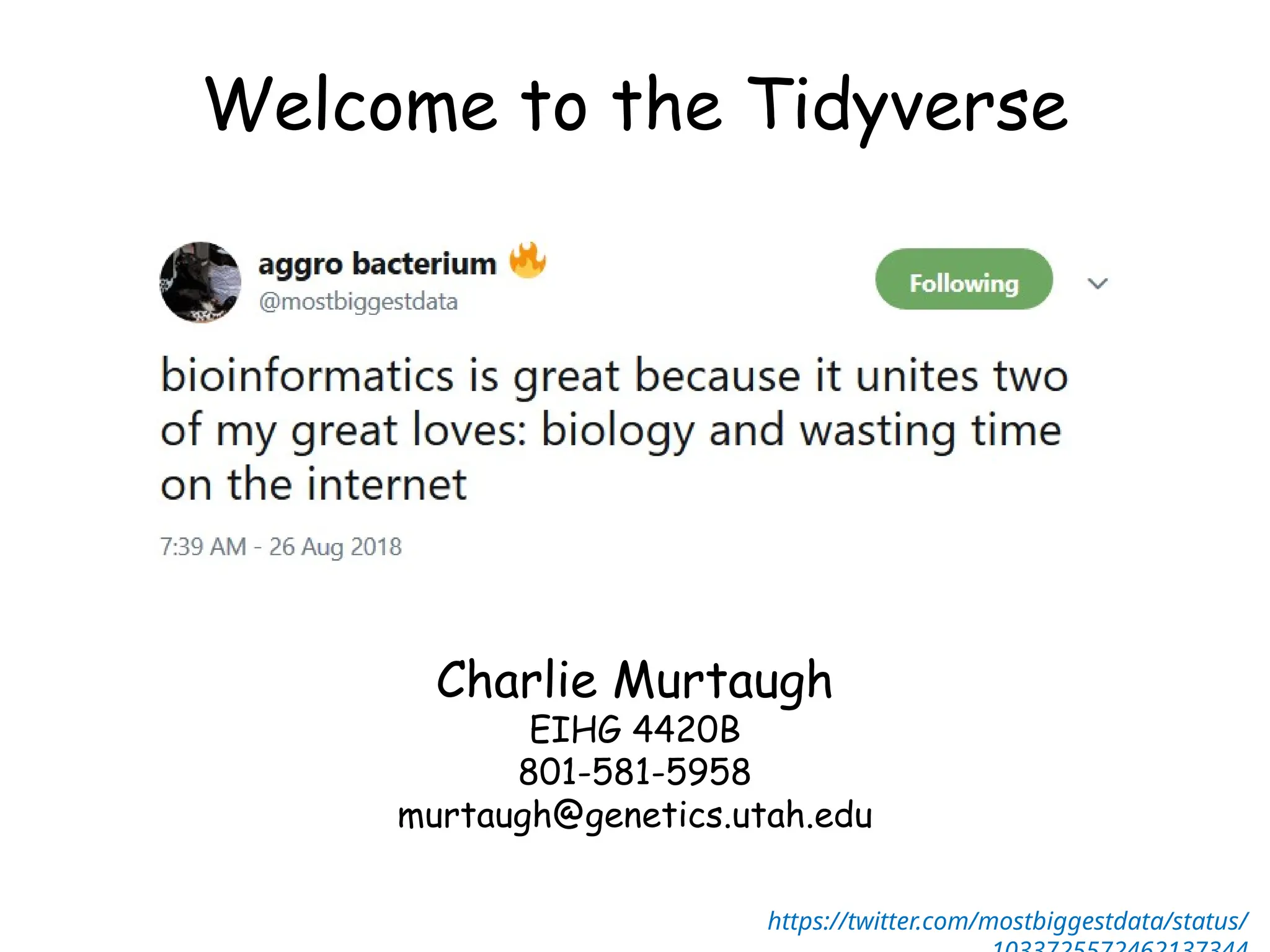
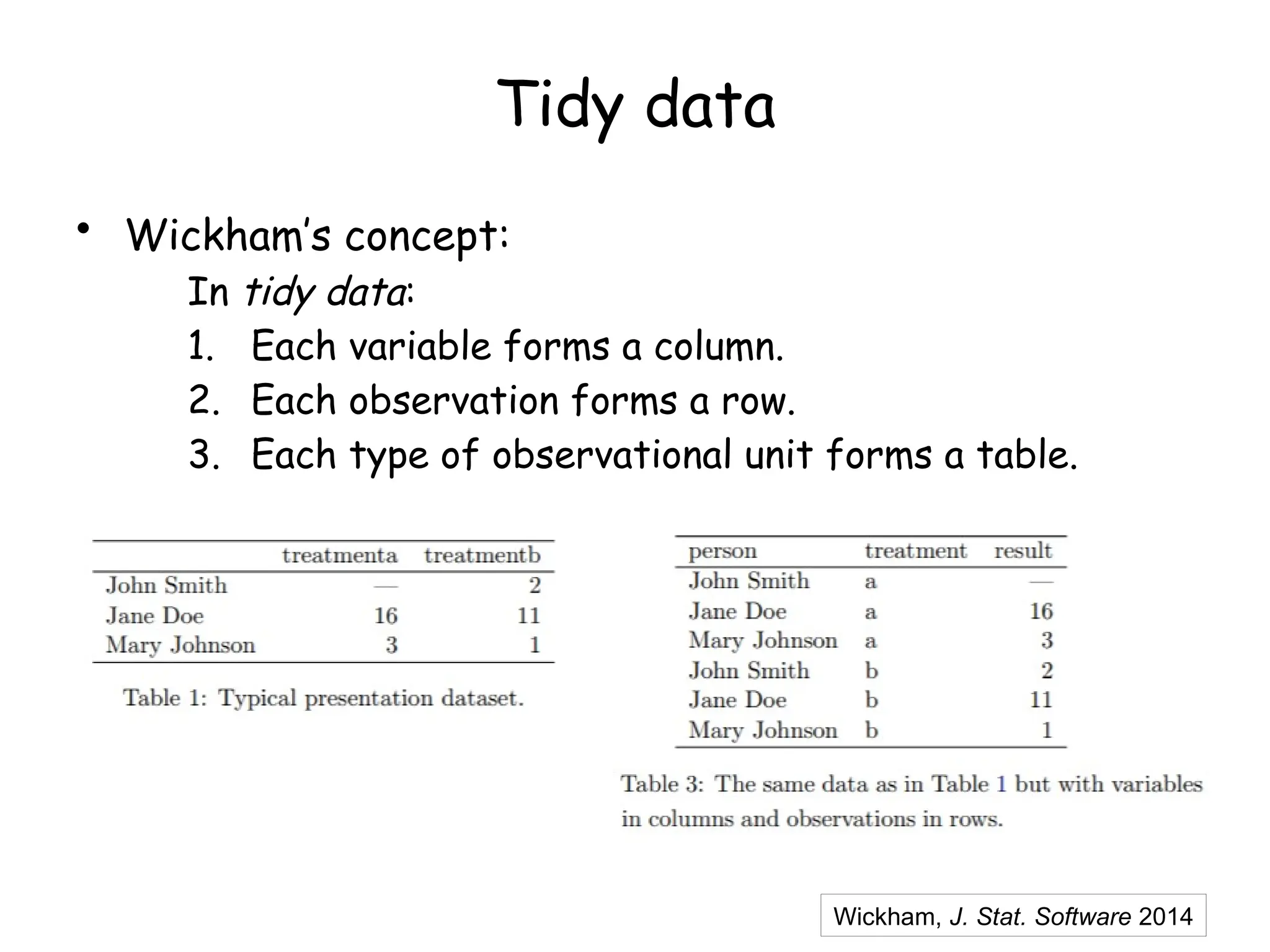
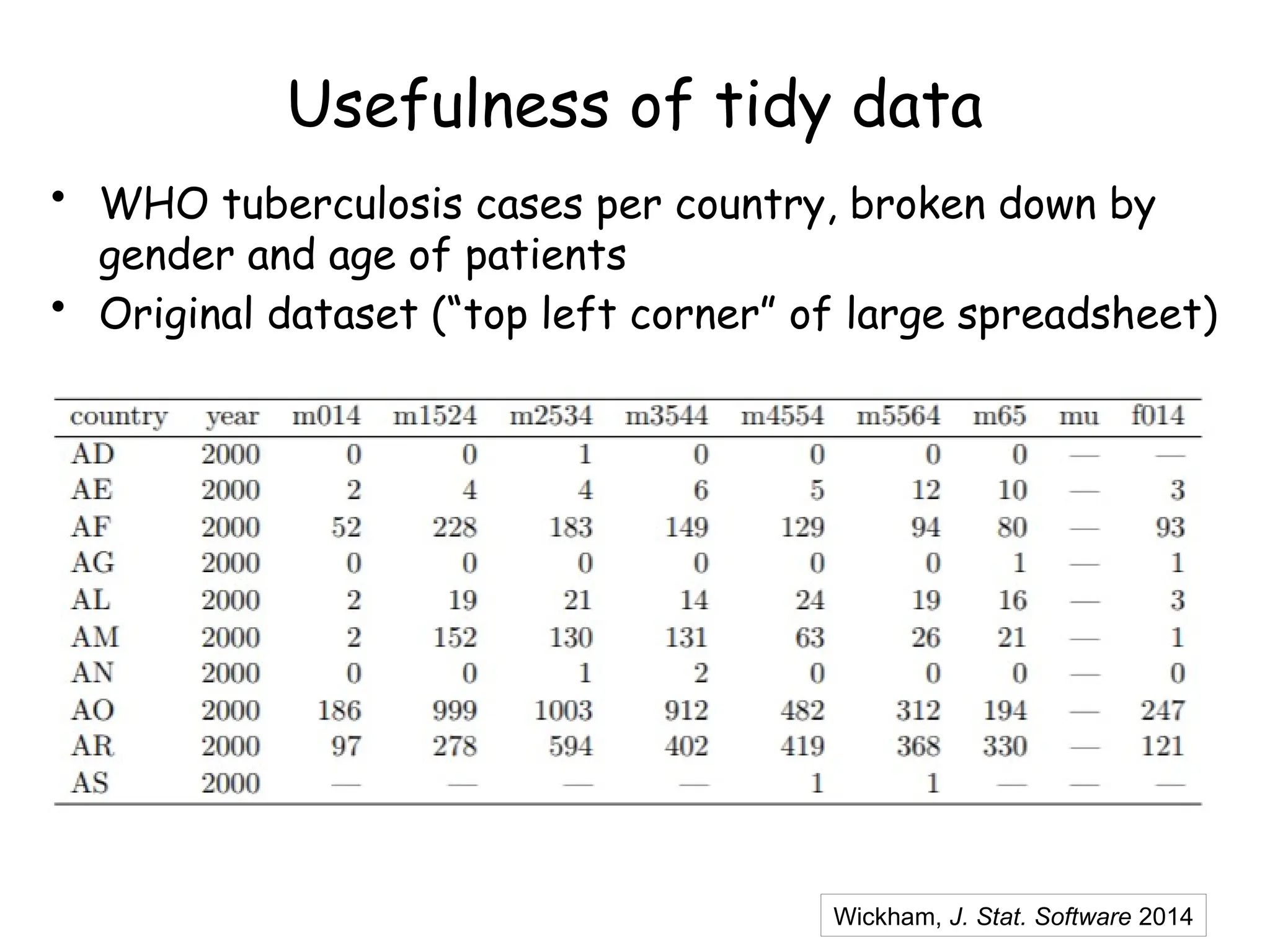
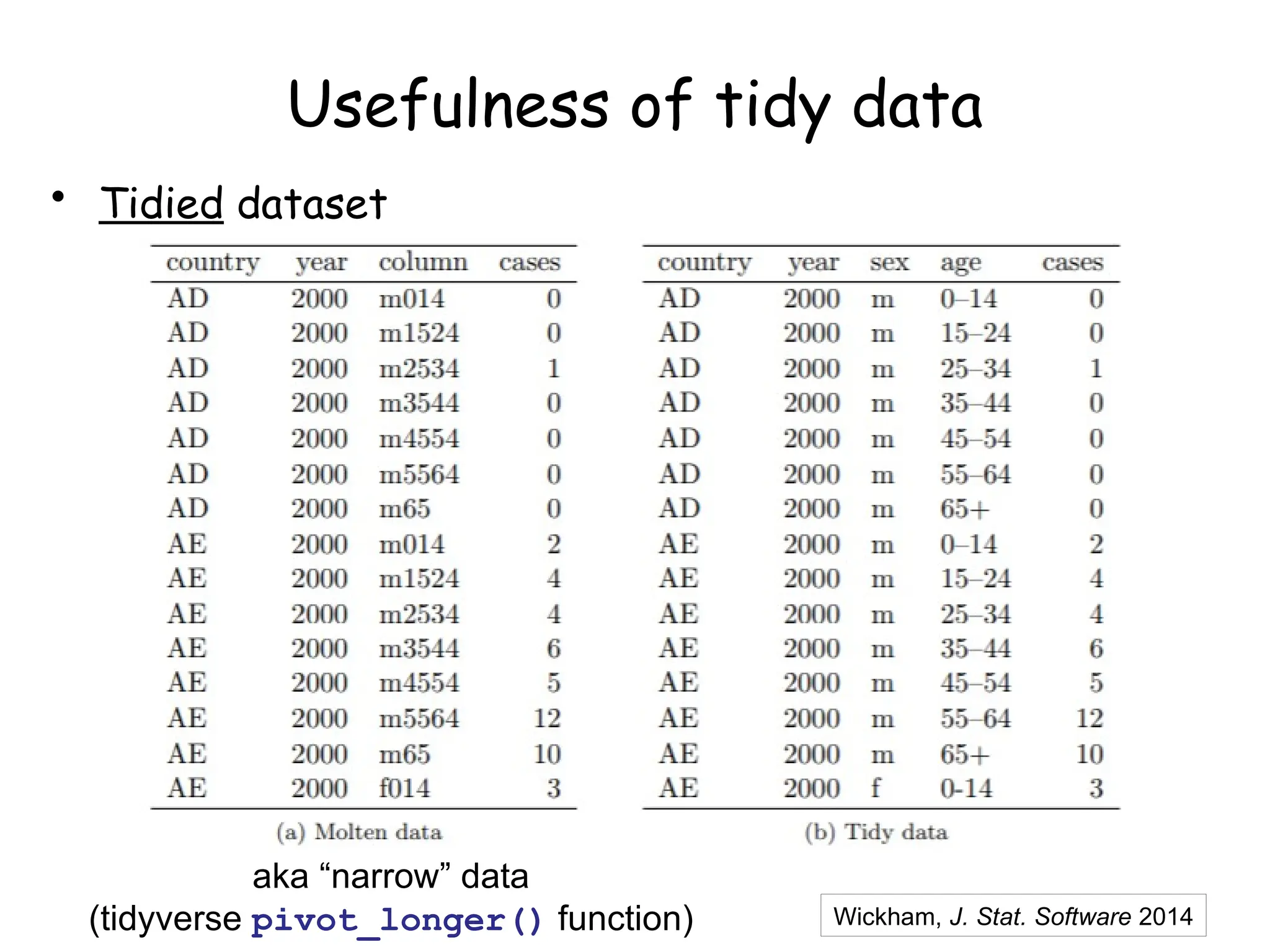
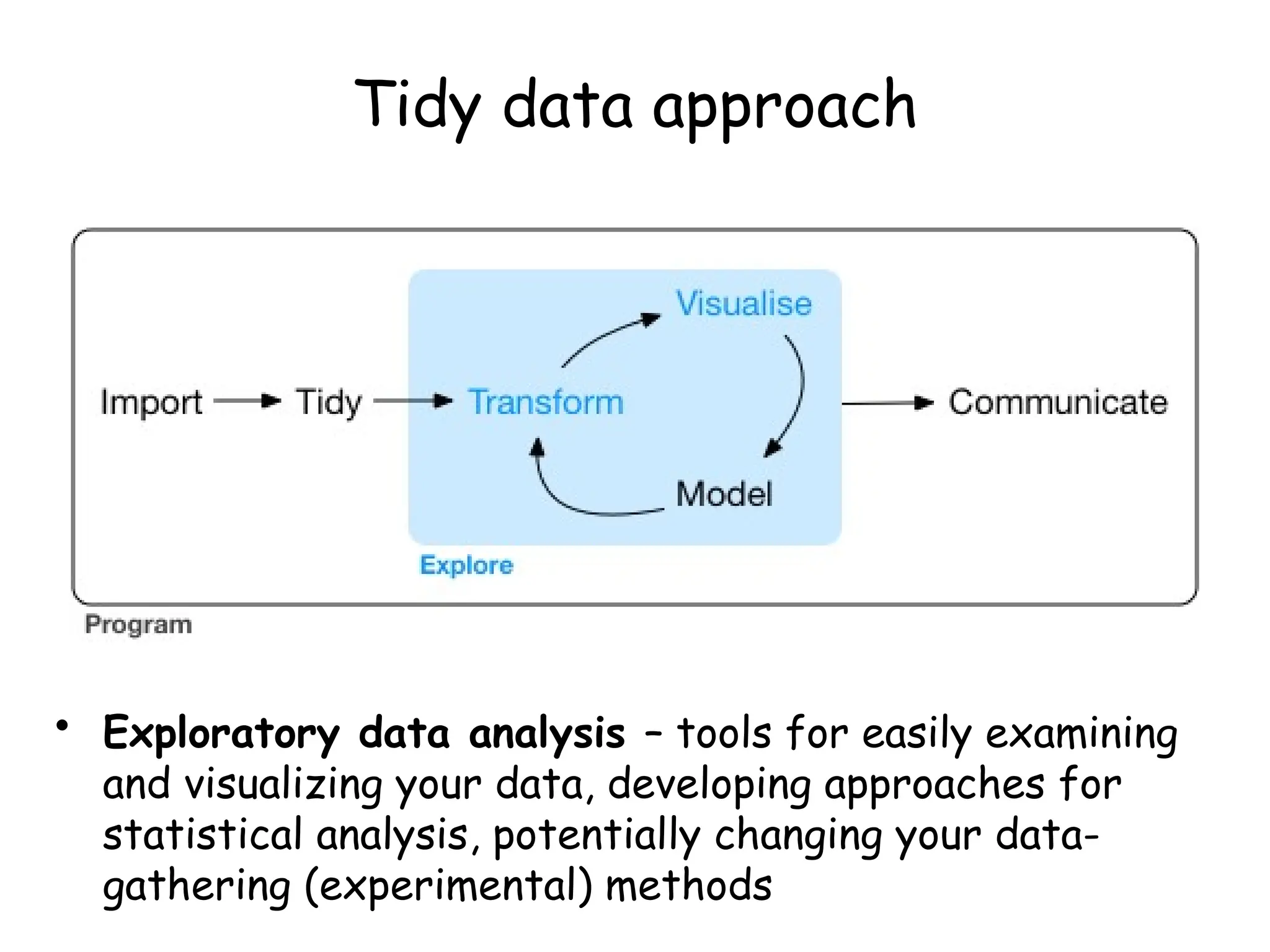
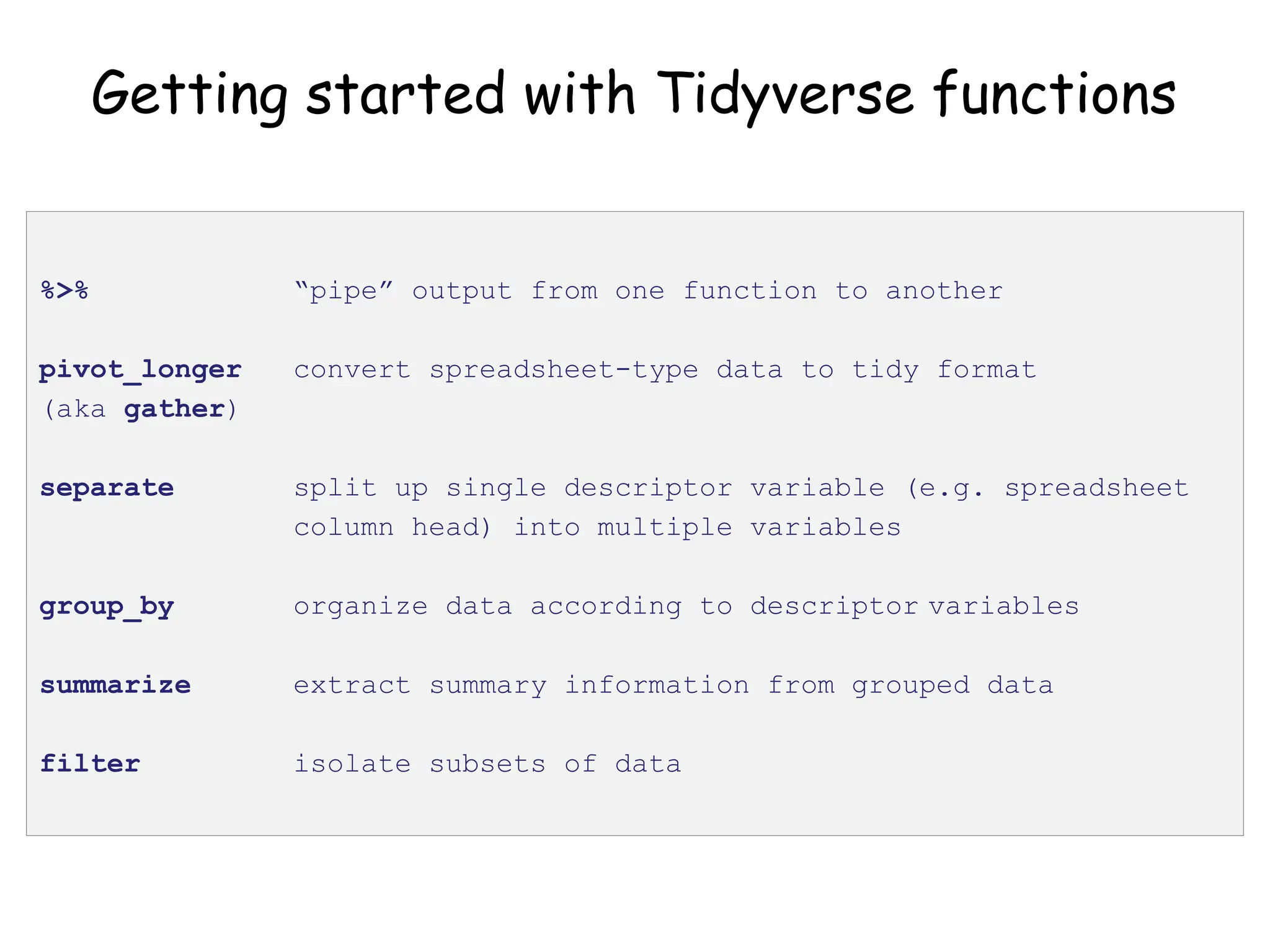
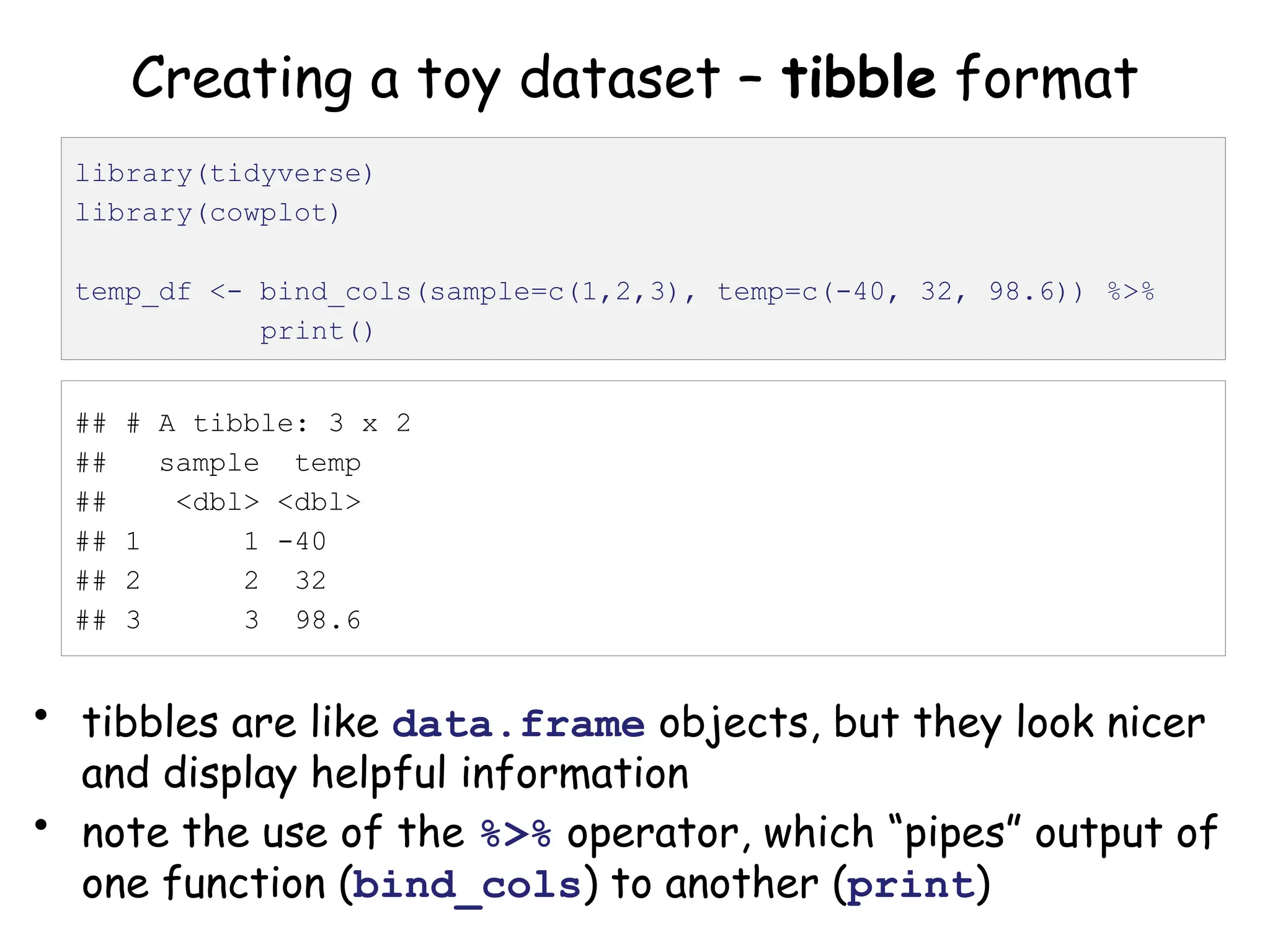
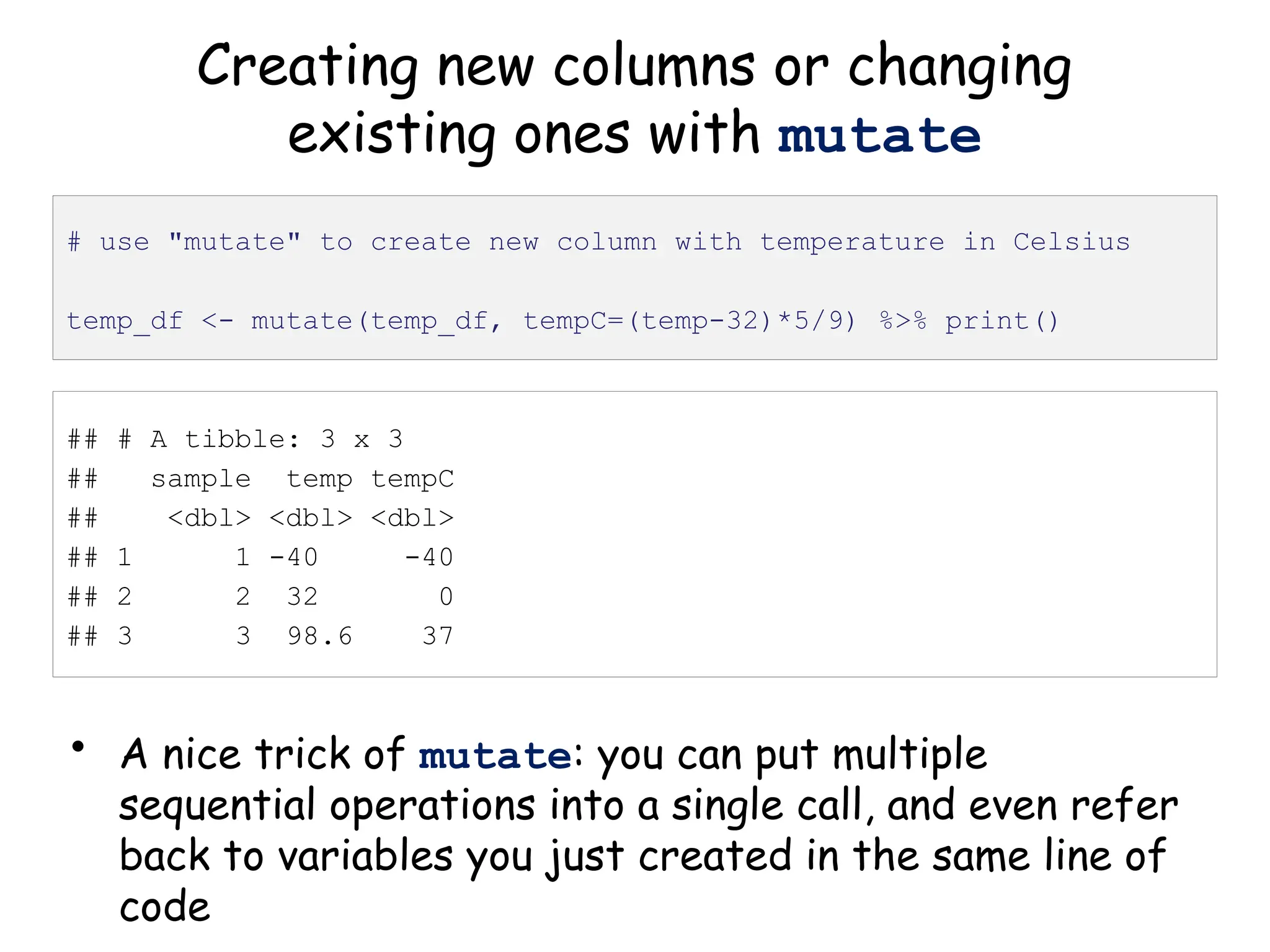
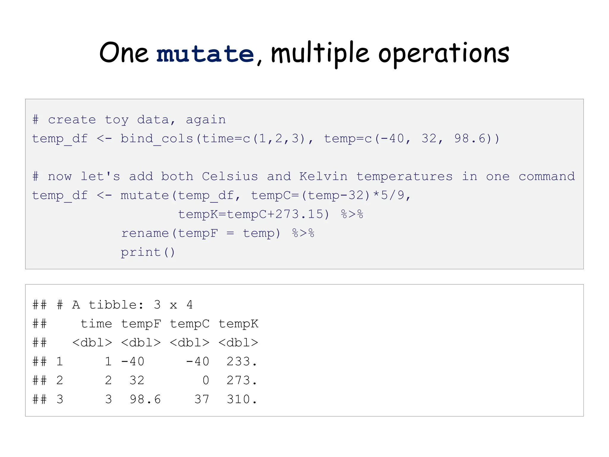
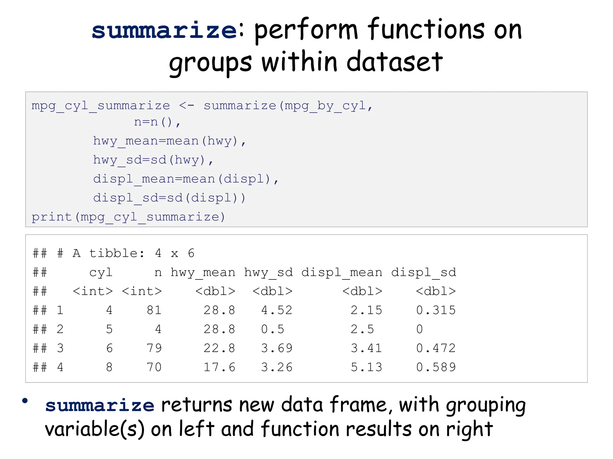
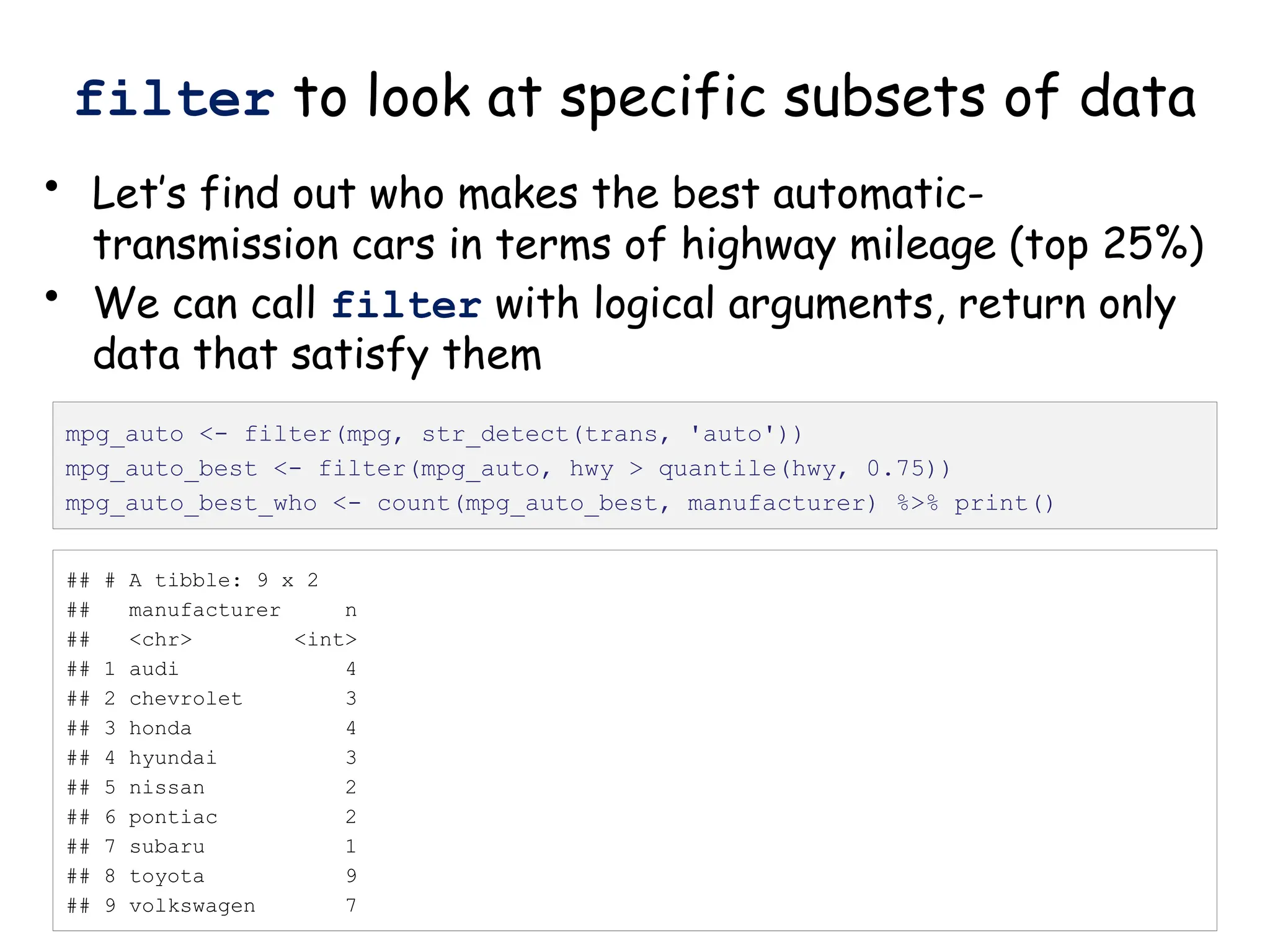
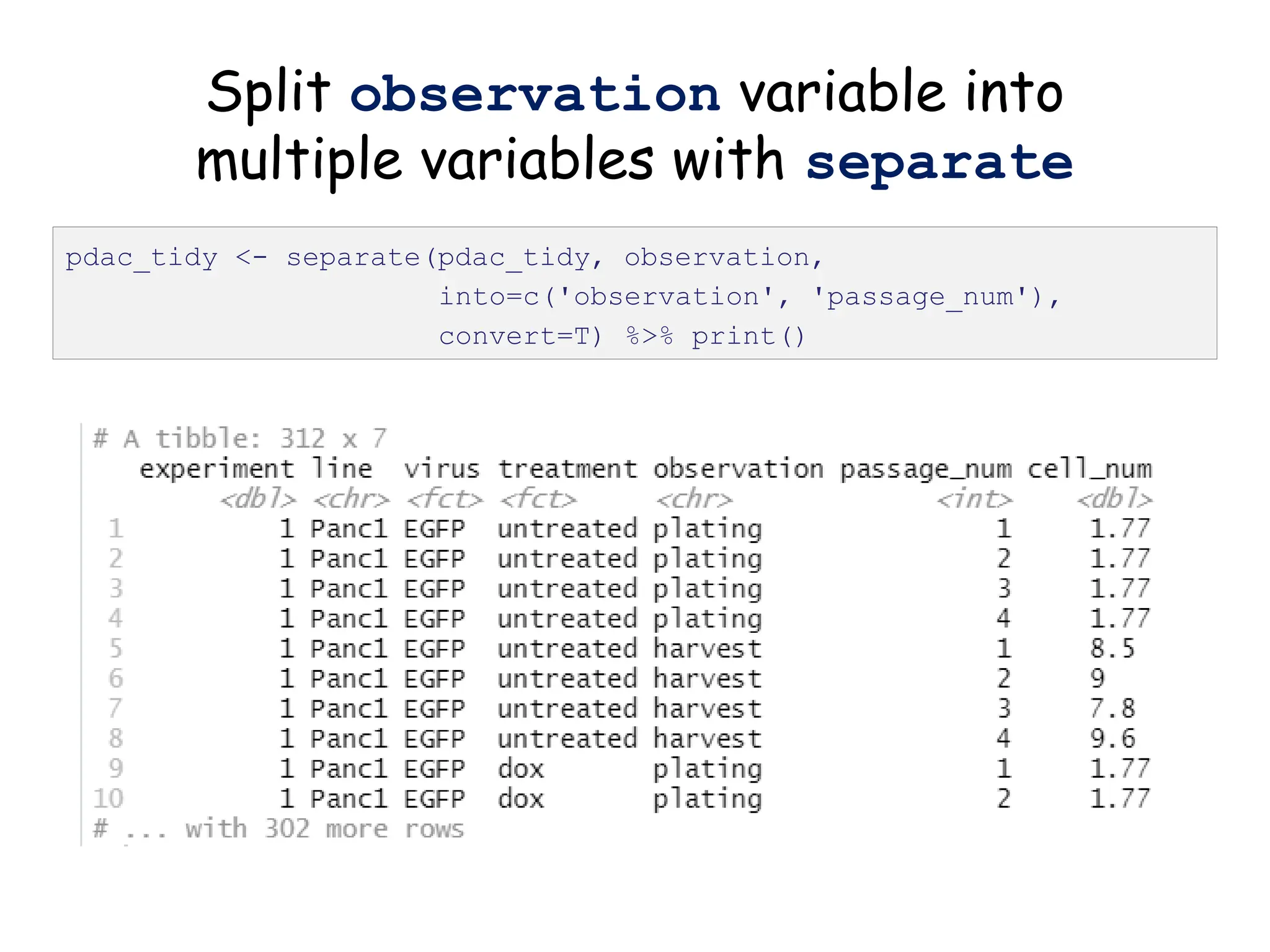
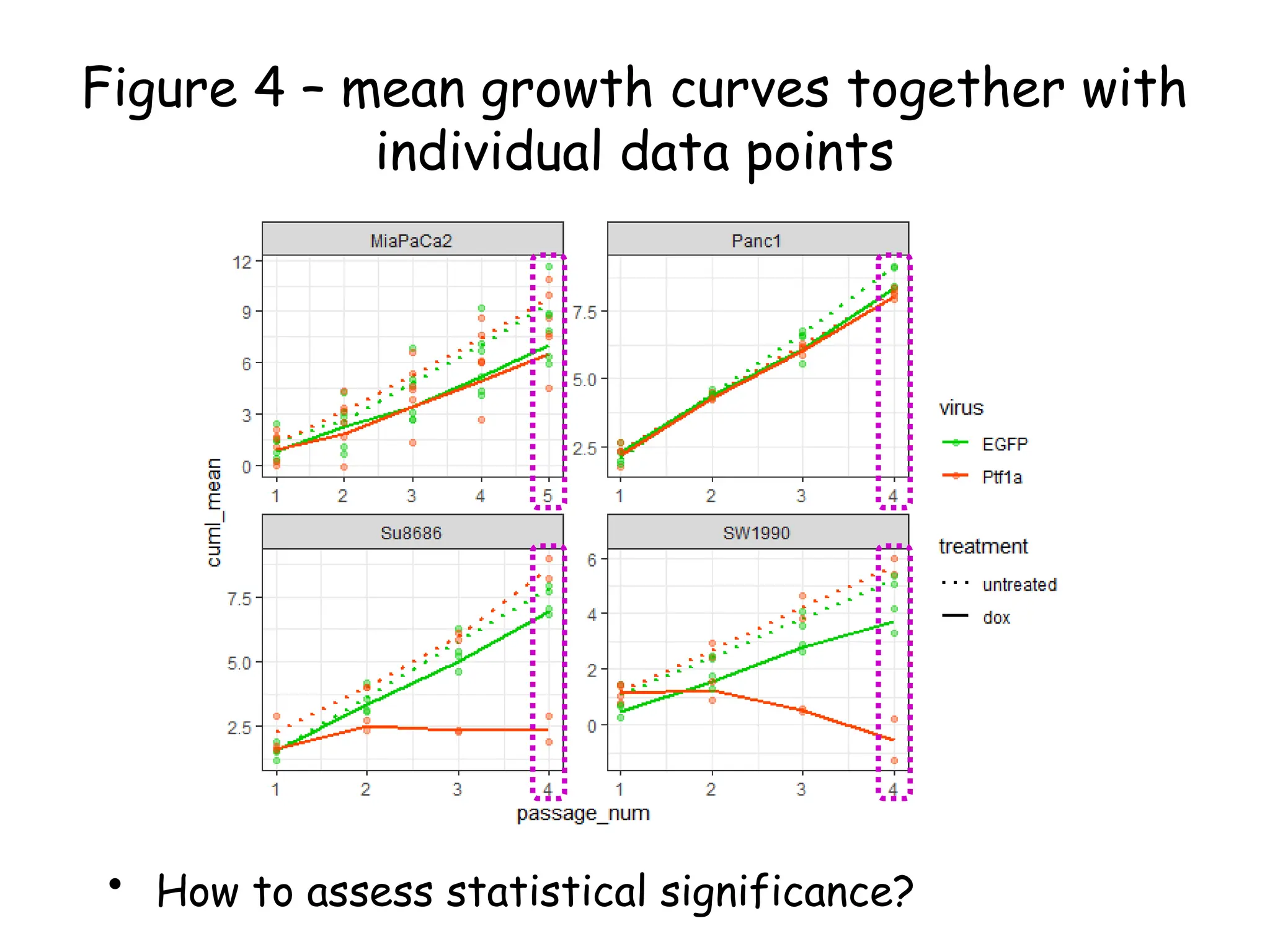
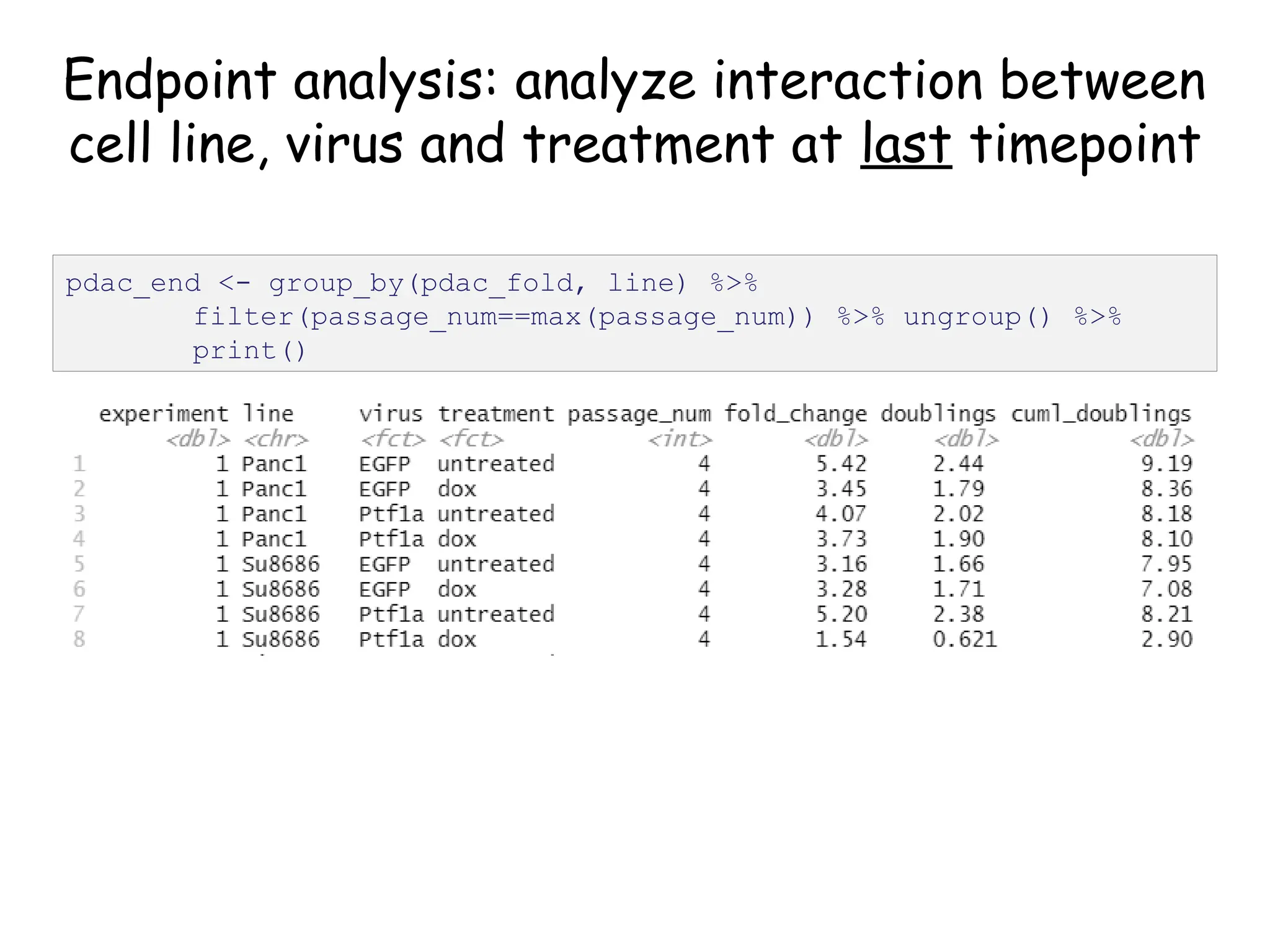
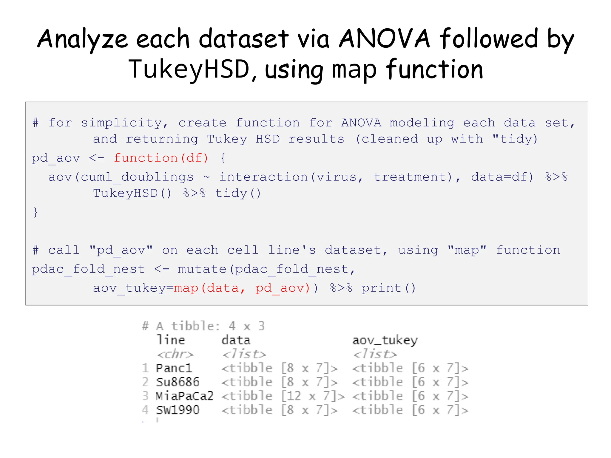
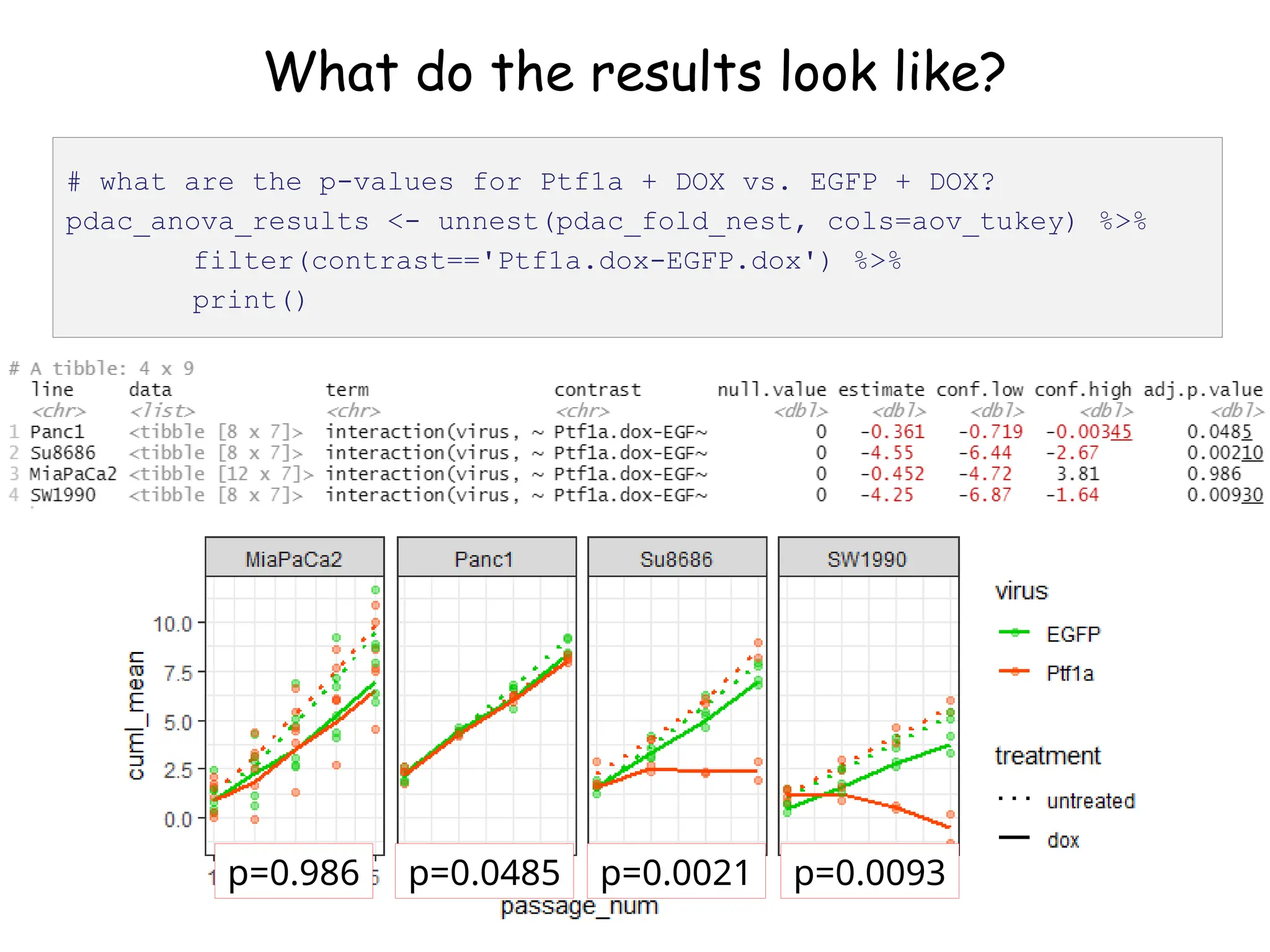
The document provides an introduction to the Tidyverse, a collection of R packages designed for data visualization and analysis. It discusses the concept of 'tidy data' as proposed by Hadley Wickham, emphasizing the importance of organizing data into columns, rows, and tables for effective analysis. Key functions such as 'mutate', 'filter', and 'summarize' from the Tidyverse are highlighted, along with examples relevant to biology and data exploration.
![Piping your code for easier writing and reading
• Code involving sequential operations on the same data
can be much more readable with pipes
• Of particular use: %>% print() at the end of a line
of code will show you what that code produced
# same result, different ways to get there
test <- c(1, 2, 3, 4)
test_sqrt <- sqrt(test)
print(test_sqrt)
c(1, 2, 3, 4) %>% sqrt() %>% print()
[1] 1.000000 1.414214 1.732051 2.000000](https://image.slidesharecdn.com/murtaugh2022applcompgenomicstidyverselecture-241204071122-86022566/75/Murtaugh-2022-Appl-Comp-Genomics-Tidyverse-lecture-pptx-1-pptx-11-2048.jpg)
![Piping your code for easier writing and reading
• Code involving sequential operations on the same data
can be much more readable with pipes
• Of particular use: %>% print() at the end of a line
of code will show you what that code produced
# same result, different ways to get there
test <- c(1, 2, 3, 4)
test_sqrt <- sqrt(test)
print(test_sqrt)
c(1, 2, 3, 4) %>% sqrt() %>% print()
[1] 1.000000 1.414214 1.732051 2.000000
https://twitter.com/strnr/status/1047203915232661505](https://image.slidesharecdn.com/murtaugh2022applcompgenomicstidyverselecture-241204071122-86022566/75/Murtaugh-2022-Appl-Comp-Genomics-Tidyverse-lecture-pptx-1-pptx-12-2048.jpg)
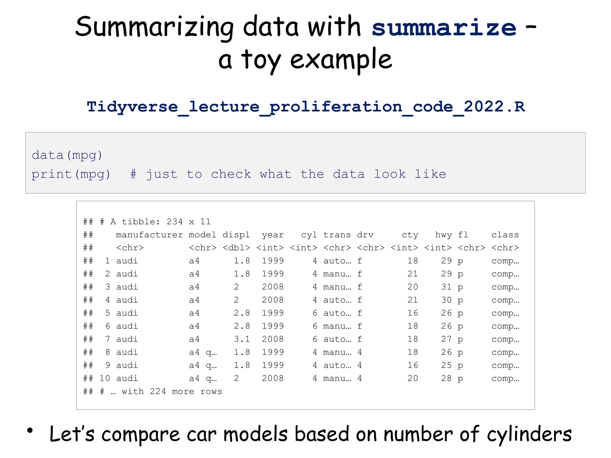
![## # A tibble: 234 x 11
## # Groups: cyl [4]
## manufacturer model displ year cyl trans drv cty hwy fl class
## <chr> <chr> <dbl> <int> <int> <chr> <chr> <int> <int> <chr> <chr>
## 1 audi a4 1.8 1999 4 auto… f 18 29 p comp…
## 2 audi a4 1.8 1999 4 manu… f 21 29 p comp…
## 3 audi a4 2 2008 4 manu… f 20 31 p comp…
## 4 audi a4 2 2008 4 auto… f 21 30 p comp…
## 5 audi a4 2.8 1999 6 auto… f 16 26 p comp…
## 6 audi a4 2.8 1999 6 manu… f 18 26 p comp…
## 7 audi a4 3.1 2008 6 auto… f 18 27 p comp…
## 8 audi a4 q… 1.8 1999 4 manu… 4 18 26 p comp…
## 9 audi a4 q… 1.8 1999 4 auto… 4 16 25 p comp…
## 10 audi a4 q… 2 2008 4 manu… 4 20 28 p comp…
## # … with 224 more rows
group_by: organize data based on
descriptor variable
• Can group data by as many variables as you have
mpg_by_cyl <- group_by(mpg, cyl) %>% print()](https://image.slidesharecdn.com/murtaugh2022applcompgenomicstidyverselecture-241204071122-86022566/75/Murtaugh-2022-Appl-Comp-Genomics-Tidyverse-lecture-pptx-1-pptx-16-2048.jpg)

![Create nested tibble with each cell line’s data
separated out
pdac_fold_nest <- group_by(pdac_end, line) %>% nest() %>%
ungroup() %>% print()
# look inside the first one (Panc1)
print(pdac_fold_nest$data[[1]])](https://image.slidesharecdn.com/murtaugh2022applcompgenomicstidyverselecture-241204071122-86022566/75/Murtaugh-2022-Appl-Comp-Genomics-Tidyverse-lecture-pptx-1-pptx-43-2048.jpg)
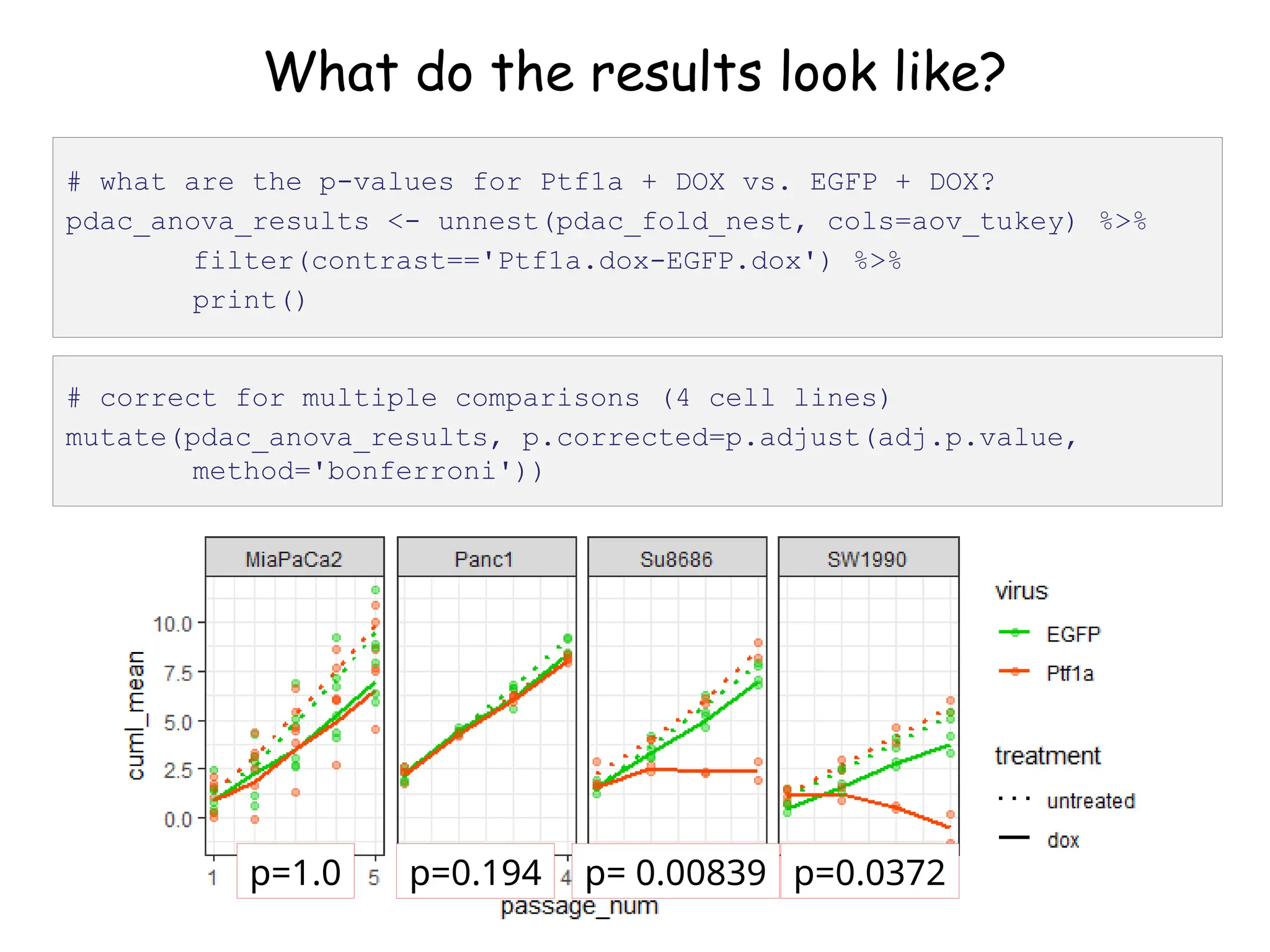
![What do the results look like?
# let's look at the first one (Panc1)
pdac_fold_nest$aov_tukey[[1]]](https://image.slidesharecdn.com/murtaugh2022applcompgenomicstidyverselecture-241204071122-86022566/75/Murtaugh-2022-Appl-Comp-Genomics-Tidyverse-lecture-pptx-1-pptx-45-2048.jpg)


![[系列活動] Data exploration with modern R](https://cdn.slidesharecdn.com/ss_thumbnails/dataexplorationwithmodernr1221-161219044516-thumbnail.jpg?width=640&height=640&fit=bounds)