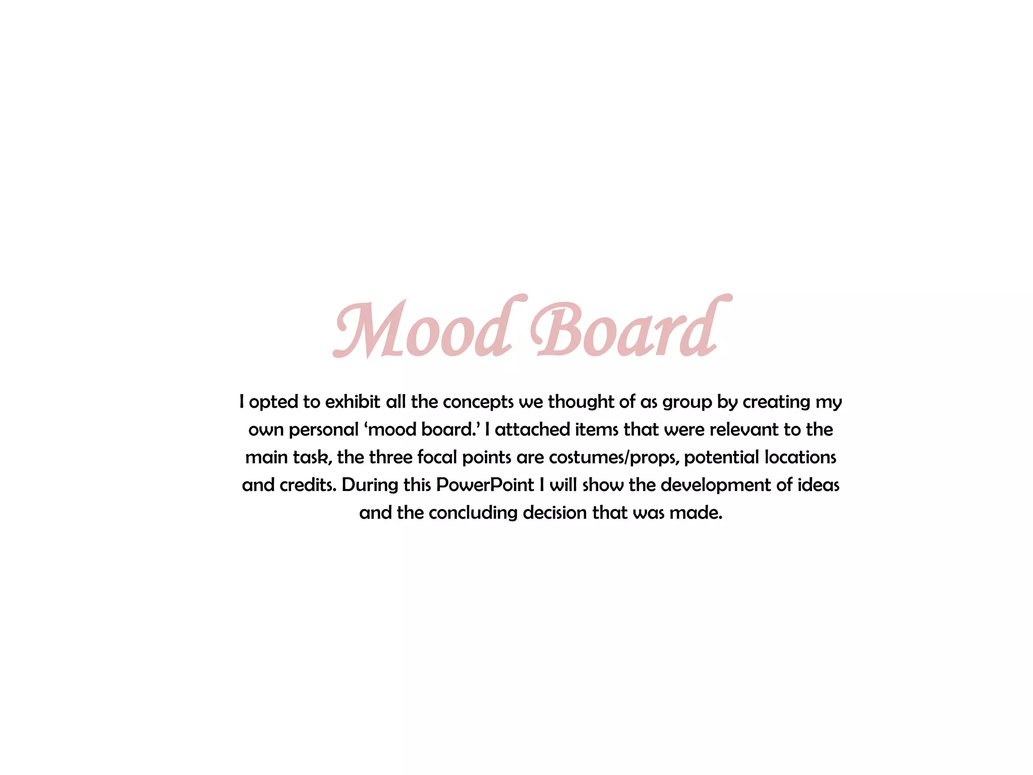
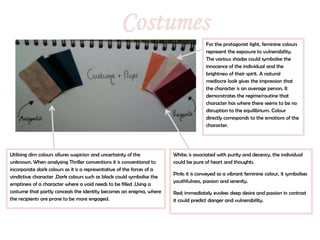
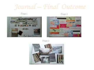
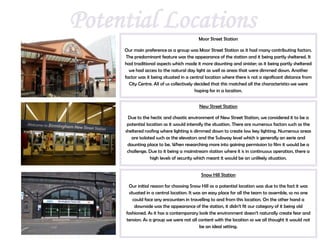
The mood board summarizes costume, location, and credit ideas for a thriller film project. For costumes, light feminine colors represent vulnerability for the protagonist, while darker colors like black could symbolize an empty antagonist. Moor Street Station was selected as the main location because it has traditional aspects that make it sinister yet parts that are dimly lit or sheltered. The credits concept involves a journal the antagonist keeps obsessively documenting the protagonist through newspaper clippings, tickets, and photos, to portray him as deceitful and fanatical.
The killer wears a costume and mask that hides his disfigurement and emotions, suggesting rejection from society led to resentment and a desire to protect himself. He chooses an unorthodox weapon that requires more effort than usual, possibly due to a lack of strength from past injuries. His body language shows he is a prepared, experienced killer who asserts authority over victims.
The film poster uses color, composition, and visual elements to characterize the main female protagonist and provide intrigue around the film's plot. Yellow and black create a moody color scheme, with black conveying mystery, strength, and authority. The woman clutches a gun intimately with both hands, positioned centrally to portray her importance. Contrasting backgrounds of wealthy high-rises and impoverished favelas suggest a double life. Overall, the poster depicts a calm yet vengeful female vigilante through strategic visual design.
The document analyzes the contents page of the Kerrang! magazine. It summarizes that the main image dominates the page to highlight its importance. It shows the band "Hit the Deck" looking directly at the camera to establish a relationship with the reader. The band is looking down to portray power and their rock music genre. Text and layout elements on the page develop ideas of rebellion through references to violence, imprisonment, and dark clothing. Overall, the contents page style is consistent with the magazine's masculine tone and targeted at its audience.
The document provides analysis of different elements of a film poster, including the subtitle, location depicted, mise-en-scene, masthead, main image, color scheme, slogans, credits, and direct address of actors. It examines how each element is used to convey information about the film's genre and target audience. Specific techniques discussed include font choice, sizing, positioning, and color selection for different elements of the poster.
Shutter Island - Poster, Magazine & TrailerJessMarston95
This trailer summarizes the psychological thriller film Shutter Island through a series of shots from the trailer. It establishes the dark, isolated and mysterious setting of the film on Shutter Island through shots of the stormy weather and the protagonist being cut off from authority. It builds tension and mystery around the dangerous secrets of the asylum and hints at the protagonist slowly realizing something is wrong. The shots are presented in a way to unsettle and intrigue the audience to want to learn more about the film's secrets.
This document analyzes thriller conventions shown in the film "Once Upon a Time in America". It lists conventions such as innocent victims, dark colors, gangsters/criminals, noir/chiaroscuro lighting, murder/violence, guns, suspense, conflict, and femmes fatales. Specific scenes from the film are described that demonstrate these conventions through the use of lighting, shots, costumes, and situations that build tension, conflict, and mystery.
The document provides details on the development of a horror film poster. Key elements include:
- The main character's face is illuminated by a light shining through an open book, drawing the viewer into the story.
- Dark colors and an emotionless yet evil facial expression are used to represent the horror genre.
- Photoshop is used to edit the original photo, including darkening the background and eyes to create tension.
- Important text elements like the title, tagline, and release date are incorporated in a clear but unsettling style consistent with the color palette and theme.
This document discusses the use of props in film scenes to convey meaning and establish context. It describes props used in scenes depicting a crime scene, a baby's bedroom, and a teenager's bedroom obsessed with the supernatural. Props like police tape, candles, pictures, toys and a Ouija board help set the scene and tone while adding realism and tension. Continuity of props like a teddy bear and matches between scenes is important to connect characters and story elements.
The magazine uses conventions like a three-column layout, masthead, page numbers, and table of contents. Photographs directly address the audience and use stylistic cues like clothing, poses, and angles to denote the rock music genre. Additional content is promoted using all capital text and exclusive language to excite readers and create a sense of discovery when accessing extras on the magazine's website. Subscription information prominently displays deals in contrasting colors to attract the audience's attention.
The poster depicts a dark, isolated forest background to convey a sense of fear and suspense. A masked figure stands holding a knife to portray the villain as a serial killer and build tension. Dark, low key lighting and colors like black and red are used to represent evil and danger, aligning with horror conventions. The themes shown are good versus evil and nightmares, with the villain appearing threatening through their body language and identity being unknown.
The document summarizes the hero's journey archetype found in stories across different cultures and time periods. It discusses key stages of the hero's journey including the call to adventure, crossing the threshold into a new world of challenges, facing trials and temptations, confronting one's greatest fear, undergoing a transformation, gaining revelation or wisdom, and returning home with experience. The document also provides examples of heroic archetypes and characteristics common to the hero's journey story structure.
The document provides a preliminary task plan and shot list for a film project involving four students: Kaya, Gia, Rahel and Sanel. It includes draft feedback and revisions to the storyboard, script, and shot list. Key details summarized include matching shots on action when characters open a door and have a conversation, considering the 180-degree rule when filming characters, and adding shot numbers and descriptions to the storyboard and shot list.
This document discusses the ways in which the author's opening media sequence uses conventions of the thriller genre to classify the work and engage audiences. Specifically, it uses common thriller elements like red herrings, obscure camera angles, psychological "mind games", and a sense of unease. It also challenges conventions by being shot during the day rather than at night. The sequence represents a middle-class setting and vulnerable child to contrast the disruption. Due to its genre and audience appeal, the work would be distributed in mainstream cinemas. The thriller genre and use of a vulnerable child keep audiences attracted. In creating the work, the author learned new technical skills and the importance of visual storytelling.
The document provides details about the opening of a psychological thriller film titled "Maniacal". The opening sequence introduces the main character, a mentally disturbed school girl, through shots of her in an asylum corridor and classroom. It establishes her fascination with fire and matches through close-ups. The dark cinematography and unsettling music aim to portray the girl's lonely and deranged mental state. The introduction of a mysterious psychiatrist hints at the examination of her condition.
This document discusses ideas for designing a digipak for an existing artist. It considers using split or torn designs on the cover to represent different sides of the artist's personality or merged albums. Font styles are explored that match the artist's edgy personality. Photo ideas show the artist making eye contact to draw in customers and establish dominance. Color schemes involving red are proposed to suggest danger and tie to album titles. Feedback from fans on names like "Fierce" or "Reckless" is gathered via social media to ensure the design matches the target audience's tastes.
This document discusses ideas for designing a digipak for an existing artist. It considers using split or torn designs on the cover to represent different sides of the artist's personality or merged albums. Font styles are explored that match the artist's edgy personality. Photo ideas show the artist making eye contact with the camera to draw in customers and convey dominance. Color schemes involving red are proposed to suggest danger and tie to album titles. Consumer feedback is gathered through social media to help decide the digipak title.
Becoming Whole Finding Meaning In Doodles And CurlsSorabh Gupta
The document discusses the author's doodles and how they have become an important part of their self-discovery journey. The doodles show repetitive patterns of spirals, leaves, and petals that indicate the author's psychological and emotional state. Analyzing the doodles provides clarity and helps the author understand and resolve experiences. Later summaries discuss doodles from different workshops and their interpretations, showing things like a need for logical thinking or feeling more comfortable leaving space. Colorful doodles expressed joy, while plant motifs represented openness.
The magazine cover uses bold colors and text to attract attention. It features a large image of Robert Downey Jr that takes up most of the space. Additional text uses puns, exaggeration, and lists of celebrities to suggest exclusivity and value for readers. Smaller text at the bottom includes publication details.
The document provides details about Ashley Mason's planning and preparation for a soap opera trailer project. It discusses:
1) Initial planning with a group where they researched similar soap operas and drafted script ideas.
2) Developing characters for the soap opera that represented different archetypes and storylines.
3) Planning ancillary materials like a magazine cover and billboard, using conventions from existing examples.
4) Choosing a dramatic song to set the tone for the trailer but removing lyrics to avoid clashing with dialogue.
The document provides details on the development of a horror film poster. Key points:
- The poster features a character's face illuminated by a book, to hint at the story's significance.
- Photoshop was used to edit the original photo, including darkening the background and eyes to create a darker, more ominous tone fitting for horror.
- Text elements like the title, tagline, and date were added in shades of blue and black to match the color scheme and draw attention to important information.
- Element placement aims to clearly present key details while creating intrigue about the character and story.
Music Magazine Double Page Spread Analysiscerihannah
Florence is featured prominently on the two page spread, looking directly at the reader to invite them into an article about her. Her confident pose and tight black clothing suggest a sexy image, though the color black has darker connotations. Red text draws attention to Florence's hair, the only bright colors on the page. The article follows magazine conventions with columns of copy and a drop capital to mark the start of text.
The document provides details about the film opening for a psychological thriller film titled "Maniacal". It summarizes how the film opening uses conventions of the genre through elements like the dark lighting, isolated locations, unsettling music, and mysterious introduction of the main character and psychiatrist. It also highlights how the film opening foreshadows the importance of matches and fire to the story while still leaving the audience with some unanswered questions.
This document provides a summary of key design elements used in magazine layouts. It highlights features like:
1) Using bold colors, fonts, and positioning to draw attention to article titles, headlines, and key information.
2) Including photos and images relevant to the article topic to engage readers.
3) Organizing content into clear columns and sections to make the information easy to navigate.
4) Integrating branding elements like the magazine logo and masthead to maintain identity and guide readers.
The preliminary task plan draft 2 from Kaya, Gia, Rahel and Sanel includes shots of a girl looking around and things walking behind her. They discuss matching shots on action when opening a door and establishing location with camera movement. Consideration is given to the 180 degree rule and facial expressions to convey emotion. Draft storyboards and a shot list are included with descriptions and props/costumes needed.
Voki es un servicio web que permite crear un avatar animado con voz. Los usuarios pueden personalizar la apariencia del avatar seleccionando la cara, ropa y accesorios, y agregar un audio grabado o de texto. Una vez creado, el avatar animado con voz se puede publicar en blogs u otros sitios web.
Wi-Fi es un sistema de transmisión de datos inalámbrico que utiliza ondas de radio en lugar de cables. Ofrece mayor comodidad que las redes cableadas al permitir la conexión desde distintos puntos dentro de un área. Existen dos modos de conexión: modo ad-hoc para comunicación punto a punto y modo infraestructura con un punto de acceso central que enlaza a todos los dispositivos.
Collostructional analysis examines the strength of association between verbs and constructions. It found that verbs like "give", "tell", and "send" have the strongest attraction to the ditransitive construction, while less central verbs like "allocate" and "wish" also show attraction but weaker levels. This statistical method provides a quantitative validation of Goldberg's (1995) classification of verbs into semantic categories based on their compatibility with the ditransitive construction.
Unity is a popular cross-platform game engine that is used to develop video games for web players, desktops, consoles and mobile devices. It allows developers to build a game once and deploy it to multiple platforms using a single code base. Unity provides rapid application development through its C# programming language library and asset store which offers free and low-cost resources to help reduce development time and costs.
Charla lineamientos estudios previos 2013 unidadesLuis Duran
Este documento establece lineamientos generales para la elaboración de estudios previos realizados por el Ministerio de Defensa Nacional y la Policía Nacional de Colombia. Explica la normativa aplicable, el contenido requerido para los estudios como la descripción de la necesidad y el objeto a contratar, y el procedimiento para la presentación, revisión y aprobación de los estudios. Asimismo, ofrece recomendaciones para una adecuada estructuración de los estudios previos y evitar devoluciones.
In What Way does your media product use.developnor challenge forms and conven...kimani3
1. The media product uses conventions of real thrillers by including an establishing shot of a college, using a mysterious obsessed character, and showing a close-up of a threatening phone call.
2. It develops conventions by adding details like a knife prop to provide insight into the character and using white writing on a dark background to set a gloomy tone.
3. The media product challenges conventions by using subtle background music rather than typical thriller music, including a voiceover for the character's thoughts, and differing in its portrayal of college life.
Final Thriller Opening Sequence EvaluationFaith Adamson
The document provides an evaluation of the student's media product "OuiParty PowerPoint", which is a thriller. The student discusses how their media product uses and develops conventions of real thrillers by including elements like flashbacks, a non-human antagonist, themes of voyeurism, and a simplistic title. The student also analyzes how their opening sequence was influenced by the films "Paranormal Activity" and "Final Destination 3". Additionally, the student discusses how their media product represents social groups, specifically focusing on challenging gender stereotypes by having a dominant female protagonist instead of the typical vulnerable female character.
The poster depicts hands trapped behind frosted glass with distressed facial expressions. This establishes the film as violent and disturbing, belonging to the slasher subgenre. The tagline hints that the male villain will exert power over the victims, challenging conventions by portraying a typically masculine role in a submissive light. Visual elements like the hands' position and blurred features behind the glass create intrigue while informing viewers the film will include disturbing scenes and gore through unconventional characterizations and isolation of setting.
The document analyzes the film poster for Freddy Kreuger from the Nightmare on Elm Street franchise. Some key elements analyzed include the use of dark colors like black and red to represent evil, Freddy's signature claw weapon, and the damaged font implying bloodshed and death. Overall, the poster effectively conveys that the film will be a horror through common horror iconography and themes of fear, violence, and supernatural elements.
The document discusses thriller films and provides examples from films to illustrate common conventions of the genre. It analyzes shots, colors, fonts, settings, characters, and plots from films like The Woman in Black, Black Swan, and The Taking of Pelham 1 2 3. Key elements identified include ominous atmospheres, psychological thrills, conflicts between good and evil, danger, violence, and suspenseful storylines.
The document discusses how the media product "Stolen" both used and challenged conventions of real crime/psychological thriller genres. It analyzed conventions around titles, mise-en-scene, framing and editing in films like "Black Swan", "4321", and "Misery" and applied similar techniques. However, it also subverted some conventions, like delaying the title for 80 seconds to build suspense. Overall, the document argues the film successfully represented the genre through familiar conventions while also keeping it fresh with some variations.
Our media product uses several common conventions and forms found in real psychological thriller media. We used ominous non-diegetic music at the beginning to create tension and establish an unsettling tone. Camera angles like high shots were used to make the protagonist feel vulnerable after their friend's death. Various camera shots like close-ups were employed to draw attention to important details and elicit emotion from audiences. Character archetypes like the troubled protagonist with an unsupportive parent were featured. The overall plot involved the protagonist experiencing supernatural events after loss and feeling misunderstood, similar to films like "The Sixth Sense" and "The Invisible".
1) The document discusses how the media product uses conventions of real psychological thriller films through its use of sound/music, camera angles/shots, characters, and plot. Sinister music is used to set the tone and high angle shots show vulnerability.
2) The media product represents teenagers and females in both stereotypical and non-stereotypical ways. The protagonist is emotional but her life is truly hard, challenging expectations. Her mother is self-centered and negligent rather than concerned.
3) In creating the full media product, the filmmakers learned to use a tripod for steadier shots, include all props, and control the mise-en-scene to avoid distractions - improving on
The document provides a detailed summary and analysis of how Emma Bradshaw and her group developed conventions of psychological horror genres in their media project film opening titled "Aura". Key points:
- The title uses font, colors, and placement on an establishing shot to create tension and unease. Locations like woods were chosen to feel isolated and scary.
- Dream sequences and flashbacks were used to explain the disturbed characters. Costumes made the characters seem realistic and relatable.
- Shots like panning mediums were chosen to put the audience in the "villain's view" and make them feel apprehensive.
- Editing in Final Cut Pro allowed many clips and effects to play seam
The poster depicts Freddy Krueger standing in front of a light source, shrouding most of his face in shadow to create a sense of mystery and fear. Dark colors and Freddy's signature bladed glove associate him with evil. The enlarged text highlights the film's horror genre and connection to the A Nightmare on Elm Street franchise.
1) Common camera techniques in thrillers include tracking and panning shots to emphasize important characters, low and high angle shots to make characters seem powerful or vulnerable, and fast pans to create confusion.
2) Elements of mise-en-scene like normal settings and typical clothing are used to give a false sense of security before terror occurs.
3) Fast-paced editing, jump cuts, and flashbacks are employed to build tension and bewilder audiences with fragmented storylines.
The document discusses three poster ideas for a horror film called "Deactivate". Idea 1 involves creating a puzzle-like poster with the film's tagline embedded amongst words related to horror. Idea 2 features a large knife with blood revealing the title. Idea 3 places a character's face in the middle with the title over her head and tagline on either side to imply her thoughts. The document then explores developing Idea 3 further with character posters showing half a face or lips whispering in an ear to generate mystery and intrigue for the audience.
The document discusses three poster ideas for a horror film called "Deactivate". Idea 1 involves embedding the film's tagline amongst other words to create a puzzle-like poster. Idea 2 shows a large knife with blood revealing the title. Idea 3 places a character's face in the middle with the title overhead and tagline on either side. It then explores developing Idea 3 further by showing only half the character's face to create mystery, or showing lips whispering in an ear to hint at a hidden secret.
The document discusses three poster ideas for a horror film called "Deactivate". Idea 1 involves creating a puzzle-like poster with the film's tagline embedded amongst words related to horror. Idea 2 features a large bloody knife with the title revealed by blood falling down the blade. Idea 3 presents a character's face with the title over their head and tagline on either side, to appear as the character's thoughts. Further development of Idea 3 explores positioning half a character's face or lips whispering in an ear to generate mystery and intrigue for the audience.
The document discusses three poster ideas for a horror film called "Deactivate". Idea 1 involves creating a puzzle-like poster with the film's tagline embedded amongst words related to horror. Idea 2 features a large bloody knife with the title revealed by blood falling down the blade. Idea 3 presents a character's face with the title over their head and tagline on either side, intended to look like their thoughts. Further development of Idea 3 explores positioning half a character's face or lips whispering in an ear to generate mystery and intrigue for the audience.
The document discusses how Cher's tattoos reflect her rebellious persona in a feminine way, featuring delicate designs like butterflies and birds. It also analyzes how the magazine article uses design techniques like a large pink letter and Cher's image to draw attention to and reinforce the headline about Cher being blamed for others' rebellious behavior.
Here are some potential filming locations for your horror movie trailer:
- Abandoned buildings - create an eerie atmosphere
- Woods at night - isolated and dark setting
- Old factories/warehouses - large empty spaces
- Tunnels/underpasses - enclosed and creepy
- Remote country lanes - isolate characters
- Derelict houses - interior scenes in run down buildings
- Cemetery - haunting backdrop for scenes
- Cornfields at night - long shots hiding things in the dark
I'd recommend scouting locations that have a sense of isolation, decay or abandonment to help build tension and atmosphere for scary scenes. Mix up outdoor night shoots with interior scenes in dark buildings.
The opening sequence of the film establishes tension through graphic images of blood and fire with Egyptian drawings. It then cuts abruptly to two men in a lab who seem unconcerned with their work. The sequence introduces the main characters, a group of teenagers preparing for a vacation. Rapid transitions between scenes keep the audience unsettled as they wonder what threats may arise. Red is used prominently to symbolize danger and death throughout the opening.
The opening sequence of the film establishes tension through graphic images of blood and fire with Greek drawings. It then cuts abruptly to two men in a lab and their casual demeanor increases unease. The titles that reference the filmmakers appear with splashes of red, symbolizing the blood and death to come. Finally, it introduces typical teenage characters preparing for a retreat, juxtaposing normalcy with the disturbing earlier imagery through its nonlinear storytelling.
1. Mood Board
I opted to exhibit all the concepts we thought of as group by creating my
own personal ‘mood board.’ I attached items that were relevant to the
main task, the three focal points are costumes/props, potential locations
and credits. During this PowerPoint I will show the development of ideas
and the concluding decision that was made.
2. Costumes
For the protagonist light, feminine colours
represent the exposure to vulnerability.
The various shades could symbolise the
innocence of the individual and the
brightness of their spirit. A natural
mediocre look gives the impression that
the character is an average person. It
demonstrates the regime/routine that
character has where there seems to be no
disruption to the equilibrium. Colour
directly corresponds to the emotions of the
character.
Utilising dim colours allures suspicion and uncertainty of the White; is associated with purity and decency, the individual
unknown. When analysing Thriller conventions it is conventional to could be pure of heart and thoughts.
incorporate dark colours as it is a representative of the forces of a
Pink; it is conveyed as a vibrant feminine colour, it symbolises
vindictive character .Dark colours such as black could symbolise the
youthfulness, passion and serenity.
emptiness of a character where a void needs to be filled .Using a
costume that partly conceals the identity becomes an enigma, where Red; immediately evokes deep desire and passion in contrast
the recipients are prone to be more engaged. it could predict danger and vulnerability.
3. Journal – Devising A Plan
When devising a concept for the credits we wanted it to be associated with the antagonist where it revolves around
some form of a journal. The journal’s focal point would be the protagonist where he is pursuing her every movement. It
would be his own personal profile, where he has collated significant items for instance photographs/newspaper
extracts/bus tickets. There is some form of objective for this journal; we wanted the audience to question why is he so
committed to this journal? The fear of the unknown evokes uncertainty; we wanted the journal to signify a mystery,
where there is a hidden meaning. We wanted the antagonist to be depicted as someone who is fanatical over this
specific individual.
INITIAL CONCEPT FINAL CONCEPT
I had taken the role of constructing the
journal however my other team
members played a significant role by
gathering resources and providing any
assistance if required. Below is an
outline of the journal and how my
other team members participated in
constructing the journal.
4. Journal - Initial Ideas
Newspaper Extracts
Without exposing the storyline, we
wanted give numerous hints and Lettering
direction to where film is leading.
Incorporating letter cut outs from
Dominika assembled newspaper
magazines is a conventional way
extracts which were relevant to the
to create a ‘ransom note’ it
location and the concept of the film.
generates a feeling that the
For example there were extracts such
character has murderous traits.
as catastrophe, blood, train, rail
Additionally lettering is used to
journeys we wanted to create the
conceal the identity of the assassin.
feeling of mystery and what is the
We wanted the antagonist to be
initial purpose of it. Newspaper
associated as being deceitful and
clippings often have an emotional
devious as well as having his
link. There could be various
identity remain an enigma.
interpretations for example he could
be gathering ideas from them or it is a
prediction of what is going to occur.
Bus + Train Tickets Photographs
The purpose of the tickets was to show the journeys that he has A common trait of a stalker is to accumulate mounts of photographs, it
been on to follow every movement of the protagonist. is an invasion of privacy and it shows how extensive the person can go.
Assembling all the tickets indicates it has been a long period of Jovita had taken the liability responsibility of capturing photographs
time that he has been pursuing her. He is depicted as a playing the role as the protagonist. Whereas Demi had taken
shadow, tracking every movement that she makes; we see the photographs of Moor Street to establish the location. Incorporating
depth of the situation when we see all the tickets collated photographs conjures up fear and uncertainty of what is going to occur.
together.
6. Potential Locations Moor Street Station
Our main preference as a group was Moor Street Station as it had many contributing factors.
The predominant feature was the appearance of the station and it being partly sheltered. It
had traditional aspects which made it more daunting and sinister; as it being partly sheltered
we had access to the natural day light as well as areas that were dimmed down. Another
factor was it being situated in a central location where there is not a significant distance from
City Centre. All of us collectively decided that this matched all the characteristics we were
hoping for in a location.
New Street Station
Due to the hectic and chaotic environment of New Street Station, we considered it to be a
potential location as it would intensify the situation. There are numerous factors such as the
sheltered roofing where lighting is dimmed down to create low key lighting. Numerous areas
are isolated such as the elevators and the Subway level which is generally an eerie and
daunting place to be. When researching more into gaining permission to film it would be a
challenge. Due to it being a mainstream station where it is in continuous operation, there a
high levels of security which meant it would be an unlikely situation.
Snow Hill Station
Our initial reason for choosing Snow Hill as a potential location was due to the fact it was
situated in a central location. It was an easy place for all the team to assemble, so no one
could face any encounters in travelling to and from this location. On the other hand a
downside was the appearance of the station, it didn’t fit our category of it being old
fashioned. As it has a contemporary look the environment doesn’t naturally create fear and
tension. As a group we were not all content with the location so we all thought it would not
be an ideal setting.