Download as PDF, PPTX


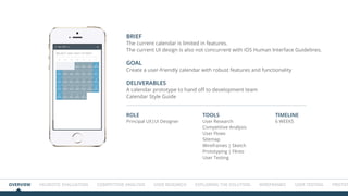
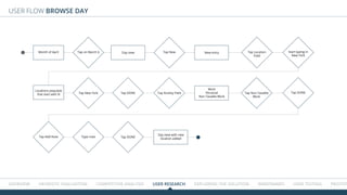
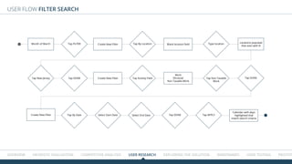
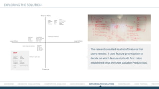
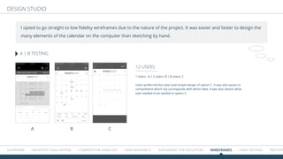
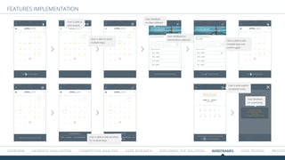
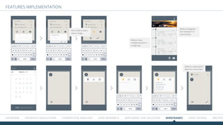
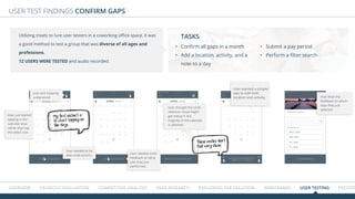
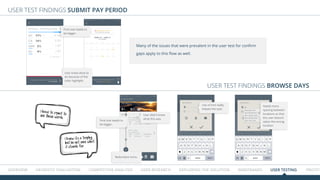

The document outlines the design process for a user-friendly calendar app aimed at enterprises and high net-worth individuals to manage tax exposures from business travel. It includes user research, competitive analysis, and wireframe development over a timeline of six weeks, highlighting key findings and necessary features to enhance usability. The proposal emphasizes a clean, intuitive interface while addressing current app shortcomings and user pain points.


