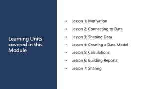
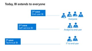
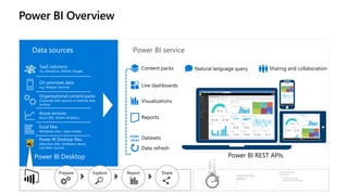
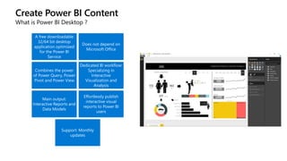
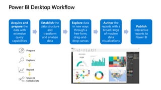
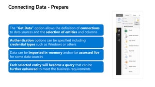
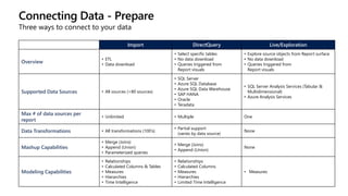
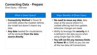
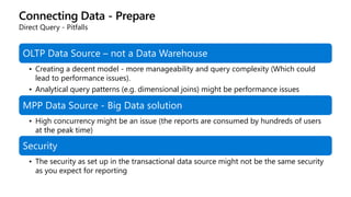
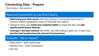
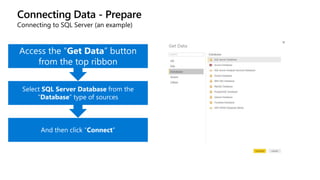
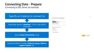
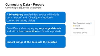
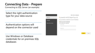
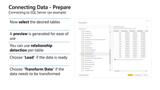
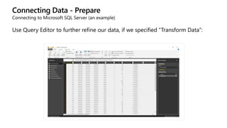
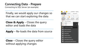
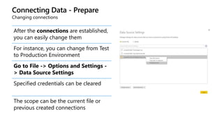
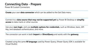
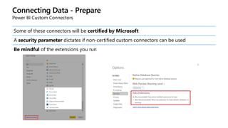
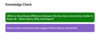
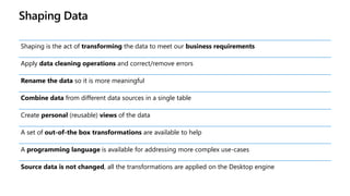
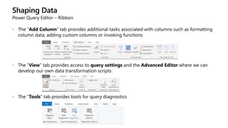
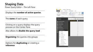
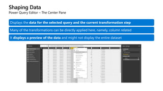
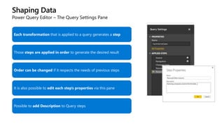
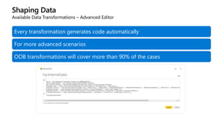
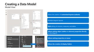
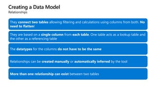
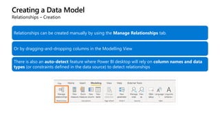
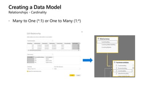
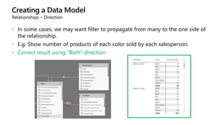
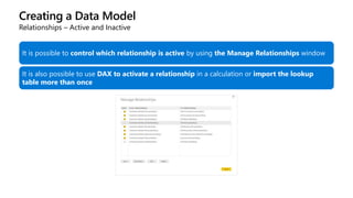
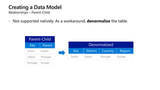
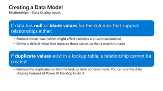
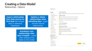
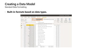
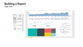
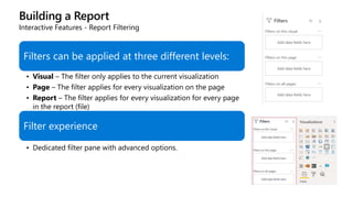
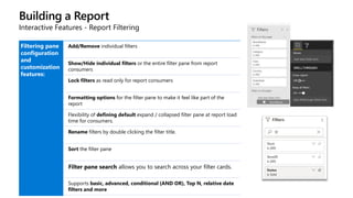
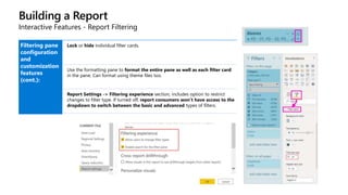
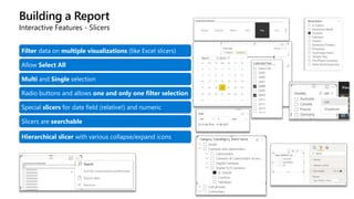
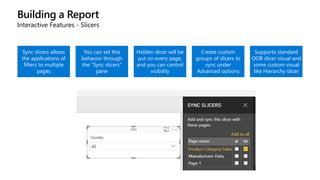
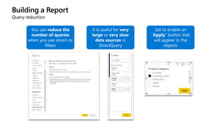
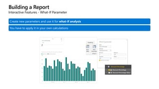
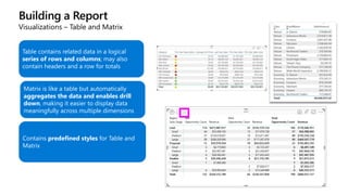
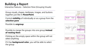
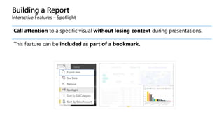
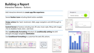
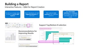
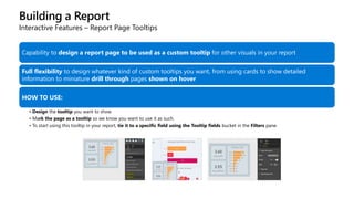
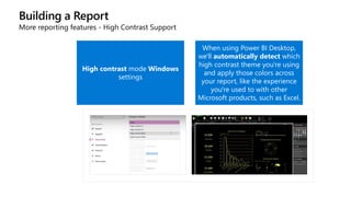
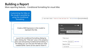
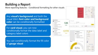
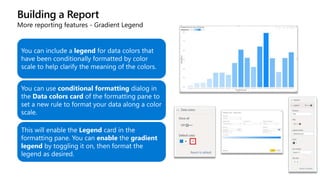
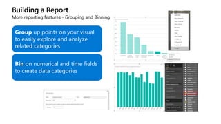
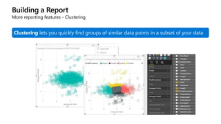
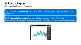
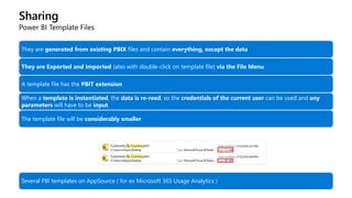
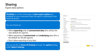
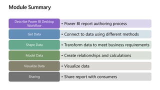
The document outlines the terms of use for the workshopplus data AI training materials by Microsoft, stating they are for personal internal reference only and cannot be shared or sold without permission. It covers the structure of the Power BI training module, including lessons on motivation, data connection, shaping data, and various data sources supported by Power BI. Additionally, it details how to connect to and transform data using Power BI Desktop, emphasizing the significance of different connectivity modes and data transformation capabilities.


![Shaping Data
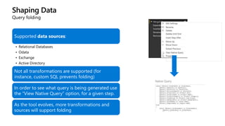
Query folding
In some cases, Power BI Desktop will be able to push the transformation work to the data source
This is important from an optimization perspective.
If query folding doesn’t happen, all the data has to be loaded into the tool
SELECT
[salesordernumber] as [Sales Order Number],
[salesorderlinenumber] AS
[SalesOrderLineNumber],
[salesreasonkey] AS [SalesReasonKey]
FROM
[dbo].[factinternetsalesreason]
WHERE
[salesorderlinenumber] = 2](https://image.slidesharecdn.com/m01-powerbidesktop-240603000920-794d90b7/85/Module_01_formation-PowerBI-Desktop-pptx-53-320.jpg)


![Calculations
Advanced Calculations
CALCULATE(<measure expression>, <filter1>, <filter2>, …) allows us to
change the filter context
No Discount Sales =
CALCULATE (
SUM ( FactResellerSales[SalesAmount] );
DimPromotion[EnglishPromotionName] = "No Discount"
)](https://image.slidesharecdn.com/m01-powerbidesktop-240603000920-794d90b7/85/Module_01_formation-PowerBI-Desktop-pptx-124-320.jpg)
![Calculations
Advanced Calculations
Sales with Big Discount =
CALCULATE (
SUM ( FactResellerSales[SalesAmount] );
DimPromotion[DiscountPct] > 0.1
)
Sales with Big Discount FILTER =
CALCULATE (
SUM ( FactResellerSales[SalesAmount] );
FILTER ( DimPromotion; DimPromotion[DiscountPct] > 0.1 )
)](https://image.slidesharecdn.com/m01-powerbidesktop-240603000920-794d90b7/85/Module_01_formation-PowerBI-Desktop-pptx-126-320.jpg)
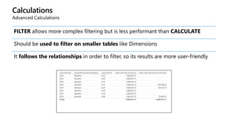
![Calculations
Advanced Calculations
ALL removes the filter applied to a table or column.
Useful for ratio-to-parent calculations
Percentage of Product Net Revenue =
DIVIDE (
SUM (Sales[Net Revenue]);
CALCULATE (
SUM (Sales[Net Revenue]);
ALL ( Product[Product Name] )
)
)](https://image.slidesharecdn.com/m01-powerbidesktop-240603000920-794d90b7/85/Module_01_formation-PowerBI-Desktop-pptx-127-320.jpg)
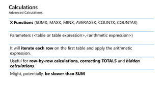
![Calculations
Advanced Calculations
X Functions - Row-by-row
SalesAmountwithSUMX =
SUMX (
FactResellerSales;
FactResellerSales[OrderQuantity] * FactResellerSales[UnitPrice]
)](https://image.slidesharecdn.com/m01-powerbidesktop-240603000920-794d90b7/85/Module_01_formation-PowerBI-Desktop-pptx-129-320.jpg)
![Calculations
Advanced Calculations
RANKX(<table expression>;<arithmetic expression>;<sort order>;<tie
handler>)
Gets an ordinal position for the selected column
ProductRank =
RANKX ( ALL ( DimProduct[ProductAlternateKey] ); [Sales];; DESC; SKIP )](https://image.slidesharecdn.com/m01-powerbidesktop-240603000920-794d90b7/85/Module_01_formation-PowerBI-Desktop-pptx-130-320.jpg)
![Calculations
Advanced Calculations
HASONEVALUE lets us test if only a single element is selected for a column
ProductRankEnhanced =
IF (
HASONEVALUE ( DimProduct[ProductAlternateKey] );
RANKX ( ALL ( DimProduct[ProductAlternateKey] ); [Sales];; DESC; SKIP );
BLANK ()
)](https://image.slidesharecdn.com/m01-powerbidesktop-240603000920-794d90b7/85/Module_01_formation-PowerBI-Desktop-pptx-131-320.jpg)
![Calculations
Advanced Calculations
TOPN(<n>;<table>;<order by expression>) returns the top N rows for a table
TOPN ( 10; VALUES ( DimProduct[ProductAlternateKey] ); [Sales]; DESC )
The VALUES function is required to remove duplicates, if they exist. Not
needed if they don’t](https://image.slidesharecdn.com/m01-powerbidesktop-240603000920-794d90b7/85/Module_01_formation-PowerBI-Desktop-pptx-132-320.jpg)
![Calculations
Advanced Calculations
TOPN does not return a scalar
It should be then used as context to return a scalar
TOP10Products =
CALCULATE (
[Sales];
TOPN ( 10; VALUES ( DimProduct[ProductAlternateKey] );
[Sales]; DESC )](https://image.slidesharecdn.com/m01-powerbidesktop-240603000920-794d90b7/85/Module_01_formation-PowerBI-Desktop-pptx-133-320.jpg)
![Calculations
Advanced Calculations – Time Intelligence
Many DAX functions exist to support time calculations. There are two types:
Functions that require a CALCULATE
SalesYTD =
CALCULATE ( [Sales]; DATESYTD ( DimDate[FullDateAlternateKey] ) )
• Functions that return a scalar (syntactic sugar)
SalesYTDNoCalculate =
TOTALYTD ( [Sales]; DimDate[FullDateAlternateKey] )](https://image.slidesharecdn.com/m01-powerbidesktop-240603000920-794d90b7/85/Module_01_formation-PowerBI-Desktop-pptx-135-320.jpg)
![Calculations
Advanced Calculations – Time Intelligence
SalesLastMonth =
CALCULATE ( [Sales];
DATEADD ( DimDate[FullDateAlternateKey]; -1; MONTH ) )
SalesSamePeriodLastYear =
CALCULATE ( [Sales];
SAMEPERIODLASTYEAR ( DimDate[FullDateAlternateKey] ) )
MonthOverMonth =
DIVIDE ( ( [Sales] - [SalesLastMonth] ); [SalesLastMonth] )
SalesSinceEver =
CALCULATE (
[Sales];
DATESBETWEEN (
DimDate[FullDateAlternateKey];
FIRSTDATE ( ALL ( DimDate[FullDateAlternateKey] ) );
LASTDATE ( DimDate[FullDateAlternateKey] )
)
)](https://image.slidesharecdn.com/m01-powerbidesktop-240603000920-794d90b7/85/Module_01_formation-PowerBI-Desktop-pptx-136-320.jpg)
![Calculations
Advanced Calculations – Time Intelligence with Auto Date/Time
A hierarchy is automatically generated for each date field on each table
Calculations need to be done with the “in-line” notation
SalesAmountYTD =
CALCULATE (
SUM ( FactInternetSales[SalesAmount] );
DATESYTD ( FactInternetSales[OrderDate].[Date] )
)](https://image.slidesharecdn.com/m01-powerbidesktop-240603000920-794d90b7/85/Module_01_formation-PowerBI-Desktop-pptx-138-320.jpg)
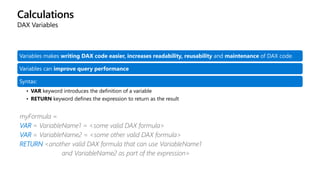
![Calculations
DAX Variables
Can have as many variables in an expression as required, and each one has its own definition
Variables can contain scalar values or tables
DAX evaluates variables in the context of their definition, not in the one where they are used.
Once the variable has been assigned a value, that value cannot change during the execution of the RETURN portion of
the formula
The results of the variable calculations are cached for reuse inside the formula
Variables can refer other variables, measures or calculated columns
VAR myScalarValue = SUM(Sales[Extended Amount])
VAR myTable = FILTER(Customer, Customer[Post Code] = 50210)](https://image.slidesharecdn.com/m01-powerbidesktop-240603000920-794d90b7/85/Module_01_formation-PowerBI-Desktop-pptx-141-320.jpg)
![Calculations
DAX Variables (example)
To calculate a percentage of year-over-year growth without using a variable, we could create three separate
measures:
• Sum of SalesAmount = SUM(SalesTable[SalesAmount])
• SalesAmount PreviousYear=CALCULATE([Sum of SalesAmount], SAMEPERIODLASTYEAR(Calendar[Date]))
• Sum of SalesAmount YoY%=DIVIDE(([Sum of SalesAmount] – [SalesAmount PreviousYear]), [Sum of SalesAmount]))
Using a variable, we can create a single measure that calculates the same result
• YOY% = VAR CurrentSales = SUM(Sales[Net Revenue])
• VAR SalesLastYear = CALCULATE(SUM(Sales[Net Revenue]), SAMEPERIODLASTYEAR('Date'[Date]))
• RETURN IF(CurrentSales, DIVIDE(CurrentSales - SalesLastYear, CurrentSales))
Advantages:
• More readable code
• Better query performance (result of expression is stored in the variable upon declaration and doesn’t have to be recalculated each time it is
used)](https://image.slidesharecdn.com/m01-powerbidesktop-240603000920-794d90b7/85/Module_01_formation-PowerBI-Desktop-pptx-142-320.jpg)


![[DSC Europe 25] Elena Menshikova - AI-Powered Operational Excellence: Revolut...](https://cdn.slidesharecdn.com/ss_thumbnails/es6nholbqy3zaao2c2yd-2-elena-menshikova-data-ai-in-decision-making-260115093812-4fba8b38-thumbnail.jpg?width=640&height=640&fit=bounds)


