Mock ups for merge
•Download as DOCX, PDF•
0 likes•276 views
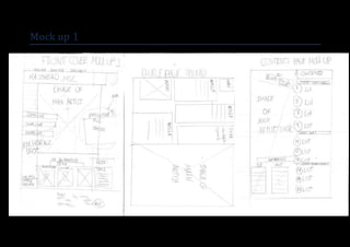
This document contains a list of three mock ups. Mock up 1, 2, and 3 are listed without any additional context or details provided about each mock up.
Report
Share
Report
Share

Recommended
Mock ups for merge
This document contains a list of three mock ups. Mock up 1 is listed first, followed by Mock up 3, and then Mock up 2. The document provides a brief listing of three different mock up designs or prototypes without any additional context.
Sketches
This document contains a list of 3 sketches. The list includes the terms "Sketch 1", "Sketch 2", and "Sketch 3" with no additional context or details provided about the sketches.
Sketches
This document contains a list of 3 sketches. The list includes the terms "Sketch 1", "Sketch 2", and "Sketch 3" with no additional context or details provided about the sketches.
Screenshots for Paging problem
This document contains 3 screenshots without any additional context or explanation. The screenshots are unlabeled and it is unclear what program, website or app they are from based on the limited information provided. No meaningful summary can be generated from the screenshots alone without more background or details provided about the images.
Analysis of existing titles
This document discusses potential magazine titles and designs. It considers titles like "Vibe", "The Source", "Howl", "Euphoria", "RadioGR8", "MSC", "#POP", and "Crunk". It analyzes the meanings and appeals of each title, targeting audiences like teenagers. Combining words or using initials to make titles unique and memorable is also discussed. In the end, the author decides "#POP" is the most appealing title as it references hashtags on social media that teenagers engage with.
Genre research media
Electroacoustic music originated in the mid-20th century following the incorporation of electric sound production into compositions. Early developments included musique concrète created at the Groupe de Recherches Musicales in Paris using tape music, elektronische Musik created at the NWDR studio in Cologne, and tape music, electronic music, and computer music explored at Columbia-Princeton Electronic Music Center in New York. Practical electronic musical instruments began appearing in the early 1900s, and animation techniques were also used to create "electronic sounds".
Colour palette
The document discusses color palettes used in different music magazines and how colors can be used to target specific audiences. It analyzes the color schemes of magazines like Q, Vibe and Pop and how they appeal to their readers. The author is considering colors like blue, pink, purple, white, yellow and ocean colors for their own music magazine to convey a relaxed yet cool style that would appeal to a male audience. In conclusion, the document suggests that while many music magazines use bold colors like red and yellow, a calm color palette could also be effective in attracting readers.
Test shots
Michael Siscar took several test shots to use for his media foundation coursework cover and spreads. The first shot was of himself sitting with a guitar, which he thought was too plain for the cover but might work on an inside spread. The second shot showed him posing rebelliously like smashing a guitar, which he felt focused too much on the background. The third close-up shot of his face he felt wouldn't work well when cropped for the cover. In the fourth shot, he looked downwards at a 3/4 angle which he thought brought out the seriousness needed for the cover. The fifth wide shot showed his full body standing with a guitar balanced on his knee, which he thought could work in black and
Flat plans
This document contains flat plans for a publication. It includes a front cover, table of contents, and double page spread flat plan. The flat plans provide layout designs for the different sections and pages within the publication without text or images, focusing only on the structural elements.
Research photographers, graphic designers and magazine creators
This document summarizes and provides examples of the work of several influential photographers, graphic designers, and magazine creators including:
- Linda McCartney, known for her photographs of celebrities like John Lennon and fashion shoots.
- Ernst Haas, a pioneering color photographer who saturated his photos to achieve realistic effects.
- David Carson, known for his unique magazine covers combining typography, layout, and "grunge" fonts.
- Milton Glaser, famous for designs like the "I Love NY" logo and using colors to convey feelings in his work.
- Krissi Murison, the first female NME editor who used various fonts and colors in her magazine covers
Research photographers, graphic designers and magazine creators
This document provides information about several photographers, graphic designers, and magazine creators that could serve as inspirations for a music magazine design. It briefly profiles Linda McCartney, Ernst Haas, David Carson, Milton Glaser, Krissi Murison, and Tony Gervino. For each, it highlights some of their representative works and design elements, such as their use of color, composition, typography, and layout techniques. The document aims to expose the reader to diverse styles that effectively convey mood and grab attention.
Analysis of existing titles
here is my analysis of existing magazine titles. Also, my own idea of titles are also there with discussion
Language analysis in music magazines
This document summarizes and analyzes three magazine articles about music artists. The Rolling Stone article describes Stevie Nicks using expressive language to portray her uniqueness and storytelling abilities. The Q Magazine article about Lana Del Rey uses dark and descriptive language to portray her emotional state and appearance. The DJ Magazine biography of Per Martinsen uses expressive language like "legendary" and "godfather" to portray his influence in electronic music and status as a legend in an informal tone appealing to younger readers.
Evaluation
The document discusses the design and target audience of a school magazine cover created by the author. Key points:
- The author asked peers for design suggestions and chose a blue and green color theme to appear "cool" to students.
- The cover features a photo of the author and friends to look professional but fun. The title is "In the News" to seem interesting.
- The target audience is students aged 12-18. Elements like layout and style aim to attract this wider audience beyond just adults.
- The magazine would be distributed through the school and website/app to easily reach the audience of students and parents.
- Designing the cover taught the author skills in photo editing software
Evaluation
The document discusses the design and target audience of a school magazine cover created by the author. Key points:
- The author gathered input from peers on colors, fonts, and images to make the cover look professional but fun. A photo of the author and friends was used.
- The title "In the News" was chosen to make the school magazine seem more interesting than just news. Too much text on the cover was avoided.
- The target audience of students aged 12-18 was aimed for with colorful design and stories relevant to students.
- The magazine would be distributed through the school and website/app to easily provide news to students, parents, and readers.
- Photoshop
School magazine annotations powerpoint
The document provides guidance for designing a school magazine cover and contents page. It analyzes various design elements of sample magazine covers such as mastheads, slogans, images, colors, fonts, and layouts. It also examines content page features like pictures, languages, and links to social media. The document concludes with an action plan for creating a mock school magazine cover and contents page independently over the course of the week.
Timeless Principles of Good Design
Timeless Principles of Good Design from my 2015 Presentation at TYPO SF
Mohannad Abdullah portfolio _ V2 _22-24
Mohannad Abdullah
Architecture | Interior Design
portoflio_V2_22-24
Practical eLearning Makeovers for Everyone
Welcome to Practical eLearning Makeovers for Everyone. In this presentation, we’ll take a look at a bunch of easy-to-use visual design tips and tricks. And we’ll do this by using them to spruce up some eLearning screens that are in dire need of a new look.
Impact of Fonts: in Web and Apps Design
Fonts play a crucial role in both User Interface (UI) and User Experience (UX) design. They affect readability, accessibility, aesthetics, and overall user perception.
Technoblade The Legacy of a Minecraft Legend.
Technoblade, born Alex on June 1, 1999, was a legendary Minecraft YouTuber known for his sharp wit and exceptional PvP skills. Starting his channel in 2013, he gained nearly 11 million subscribers. His private battle with metastatic sarcoma ended in June 2022, but his enduring legacy continues to inspire millions.
哪里办理美国中央华盛顿大学毕业证双学位证书原版一模一样
原版一模一样【微信:741003700 】【美国中央华盛顿大学毕业证双学位证书】【微信:741003700 】学位证,留信认证(真实可查,永久存档)offer、雅思、外壳等材料/诚信可靠,可直接看成品样本,帮您解决无法毕业带来的各种难题!外壳,原版制作,诚信可靠,可直接看成品样本。行业标杆!精益求精,诚心合作,真诚制作!多年品质 ,按需精细制作,24小时接单,全套进口原装设备。十五年致力于帮助留学生解决难题,包您满意。
本公司拥有海外各大学样板无数,能完美还原海外各大学 Bachelor Diploma degree, Master Degree Diploma
1:1完美还原海外各大学毕业材料上的工艺:水印,阴影底纹,钢印LOGO烫金烫银,LOGO烫金烫银复合重叠。文字图案浮雕、激光镭射、紫外荧光、温感、复印防伪等防伪工艺。材料咨询办理、认证咨询办理请加学历顾问Q/微741003700
留信网认证的作用:
1:该专业认证可证明留学生真实身份
2:同时对留学生所学专业登记给予评定
3:国家专业人才认证中心颁发入库证书
4:这个认证书并且可以归档倒地方
5:凡事获得留信网入网的信息将会逐步更新到个人身份内,将在公安局网内查询个人身份证信息后,同步读取人才网入库信息
6:个人职称评审加20分
7:个人信誉贷款加10分
8:在国家人才网主办的国家网络招聘大会中纳入资料,供国家高端企业选择人才
Heuristics Evaluation - How to Guide.pdf
This guide helps identify potential issues related to navigation, clarity, consistency, and other factors that can affect user experience.
一比一原版(Columbia毕业证)哥伦比亚大学毕业证如何办理
Columbia毕业证offer【微信95270640】☀《哥伦比亚大学毕业证购买》Q微信95270640《Columbia毕业证文凭补》文凭、本科、硕士、研究生学历都可以做,留信认证的作用:
1:该专业认证可证明留学生真实留学身份。
2:同时对留学生所学专业等级给予评定。
3:国家专业人才认证中心颁发入库证书
4:这个入网证书并且可以归档到地方
5:凡是获得留信网入网的信息将会逐步更新到个人身份内,将在网内查询个人身份证信息后,同步读取人才网入库信息。
6:个人职称评审加20分。
7:个人信誉贷款加10分。
8:在国家人才网主办的全国网络招聘大会中纳入资料,供国家500强等高端企业选择人才《文凭Columbia毕业证书原版制作Columbia成绩单》仿制Columbia毕业证成绩单哥伦比亚大学学位证书pdf电子图》。
办国外哥伦比亚大学哥伦比亚大学毕业证录取书教育部学历学位认证留信认证大使馆认证留学回国人员证明修改成绩单信封申请学校offer录取通知书在读证明offer letter。
快速办理高仿国外毕业证成绩单:
1哥伦比亚大学毕业证+成绩单+留学回国人员证明+教育部学历认证(全套留学回国必备证明材料给父母及亲朋好友一份完美交代);
2雅思成绩单托福成绩单OFFER在读证明等留学相关材料(申请学校转学甚至是申请工签都可以用到)。
3.毕业证 #成绩单等全套材料从防伪到印刷从水印到钢印烫金高精仿度跟学校原版100%相同。
专业服务请勿犹豫联系我!联系人微信号:95270640诚招代理:本公司诚聘当地代理人员如果你有业余时间有兴趣就请联系我们。
国外哥伦比亚大学哥伦比亚大学毕业证录取书办理过程:
1客户提供办理信息:姓名生日专业学位毕业时间等(如信息不确定可以咨询顾问:我们有专业老师帮你查询);
2开始安排制作毕业证成绩单电子图;
3毕业证成绩单电子版做好以后发送给您确认;
4毕业证成绩单电子版您确认信息无误之后安排制作成品;
5成品做好拍照或者视频给您确认;
6快递给客户(国内顺丰国外DHLUPS等快读邮寄)。我们的亲人生我养我的父母您们的年迈的苍老换来了我们新一代的新鲜与活力无论我们在哪里父母对我们的爱和思念为我们的生命增加了光彩给予我们自由追求的力量生活的力量我们也不忘感恩正因为这股感恩的线牵着我们使我们在一年的结束时刻义无反顾的踏上了回家的旅途人们常说父母恩最难回报愿我能以当年爸爸妈妈对待小时候的我们那样耐心温柔地对待我将渐渐老去的父母体谅他们以反哺之心奉敬父母以感恩之心孝顺父母哪怕只为父母换洗的
Storytelling For The Web: Integrate Storytelling in your Design Process
In this slides I explain how I have used storytelling techniques to elevate websites and brands and create memorable user experiences. You can discover practical tips as I showcase the elements of good storytelling and its applied to some examples of diverse brands/projects..
Game Concept Presentation for Ukrainian Mythology Based Game With Designs
The Game Concept created as a Final Project piece for college. Creative Media year 2 student
Connect Conference 2022: Passive House - Economic and Environmental Solution...
Passive House: The Economic and Environmental Solution for Sustainable Real Estate. Lecture by Tim Eian of TE Studio Passive House Design in November 2022 in Minneapolis.
- The Built Environment
- Let's imagine the perfect building
- The Passive House standard
- Why Passive House targets
- Clean Energy Plans?!
- How does Passive House compare and fit in?
- The business case for Passive House real estate
- Tools to quantify the value of Passive House
- What can I do?
- Resources
More Related Content
More from Msiscar76
Test shots
Michael Siscar took several test shots to use for his media foundation coursework cover and spreads. The first shot was of himself sitting with a guitar, which he thought was too plain for the cover but might work on an inside spread. The second shot showed him posing rebelliously like smashing a guitar, which he felt focused too much on the background. The third close-up shot of his face he felt wouldn't work well when cropped for the cover. In the fourth shot, he looked downwards at a 3/4 angle which he thought brought out the seriousness needed for the cover. The fifth wide shot showed his full body standing with a guitar balanced on his knee, which he thought could work in black and
Flat plans
This document contains flat plans for a publication. It includes a front cover, table of contents, and double page spread flat plan. The flat plans provide layout designs for the different sections and pages within the publication without text or images, focusing only on the structural elements.
Research photographers, graphic designers and magazine creators
This document summarizes and provides examples of the work of several influential photographers, graphic designers, and magazine creators including:
- Linda McCartney, known for her photographs of celebrities like John Lennon and fashion shoots.
- Ernst Haas, a pioneering color photographer who saturated his photos to achieve realistic effects.
- David Carson, known for his unique magazine covers combining typography, layout, and "grunge" fonts.
- Milton Glaser, famous for designs like the "I Love NY" logo and using colors to convey feelings in his work.
- Krissi Murison, the first female NME editor who used various fonts and colors in her magazine covers
Research photographers, graphic designers and magazine creators
This document provides information about several photographers, graphic designers, and magazine creators that could serve as inspirations for a music magazine design. It briefly profiles Linda McCartney, Ernst Haas, David Carson, Milton Glaser, Krissi Murison, and Tony Gervino. For each, it highlights some of their representative works and design elements, such as their use of color, composition, typography, and layout techniques. The document aims to expose the reader to diverse styles that effectively convey mood and grab attention.
Analysis of existing titles
here is my analysis of existing magazine titles. Also, my own idea of titles are also there with discussion
Language analysis in music magazines
This document summarizes and analyzes three magazine articles about music artists. The Rolling Stone article describes Stevie Nicks using expressive language to portray her uniqueness and storytelling abilities. The Q Magazine article about Lana Del Rey uses dark and descriptive language to portray her emotional state and appearance. The DJ Magazine biography of Per Martinsen uses expressive language like "legendary" and "godfather" to portray his influence in electronic music and status as a legend in an informal tone appealing to younger readers.
Evaluation
The document discusses the design and target audience of a school magazine cover created by the author. Key points:
- The author asked peers for design suggestions and chose a blue and green color theme to appear "cool" to students.
- The cover features a photo of the author and friends to look professional but fun. The title is "In the News" to seem interesting.
- The target audience is students aged 12-18. Elements like layout and style aim to attract this wider audience beyond just adults.
- The magazine would be distributed through the school and website/app to easily reach the audience of students and parents.
- Designing the cover taught the author skills in photo editing software
Evaluation
The document discusses the design and target audience of a school magazine cover created by the author. Key points:
- The author gathered input from peers on colors, fonts, and images to make the cover look professional but fun. A photo of the author and friends was used.
- The title "In the News" was chosen to make the school magazine seem more interesting than just news. Too much text on the cover was avoided.
- The target audience of students aged 12-18 was aimed for with colorful design and stories relevant to students.
- The magazine would be distributed through the school and website/app to easily provide news to students, parents, and readers.
- Photoshop
School magazine annotations powerpoint
The document provides guidance for designing a school magazine cover and contents page. It analyzes various design elements of sample magazine covers such as mastheads, slogans, images, colors, fonts, and layouts. It also examines content page features like pictures, languages, and links to social media. The document concludes with an action plan for creating a mock school magazine cover and contents page independently over the course of the week.
More from Msiscar76 (10)
Research photographers, graphic designers and magazine creators
Research photographers, graphic designers and magazine creators
Research photographers, graphic designers and magazine creators
Research photographers, graphic designers and magazine creators
Recently uploaded
Timeless Principles of Good Design
Timeless Principles of Good Design from my 2015 Presentation at TYPO SF
Mohannad Abdullah portfolio _ V2 _22-24
Mohannad Abdullah
Architecture | Interior Design
portoflio_V2_22-24
Practical eLearning Makeovers for Everyone
Welcome to Practical eLearning Makeovers for Everyone. In this presentation, we’ll take a look at a bunch of easy-to-use visual design tips and tricks. And we’ll do this by using them to spruce up some eLearning screens that are in dire need of a new look.
Impact of Fonts: in Web and Apps Design
Fonts play a crucial role in both User Interface (UI) and User Experience (UX) design. They affect readability, accessibility, aesthetics, and overall user perception.
Technoblade The Legacy of a Minecraft Legend.
Technoblade, born Alex on June 1, 1999, was a legendary Minecraft YouTuber known for his sharp wit and exceptional PvP skills. Starting his channel in 2013, he gained nearly 11 million subscribers. His private battle with metastatic sarcoma ended in June 2022, but his enduring legacy continues to inspire millions.
哪里办理美国中央华盛顿大学毕业证双学位证书原版一模一样
原版一模一样【微信:741003700 】【美国中央华盛顿大学毕业证双学位证书】【微信:741003700 】学位证,留信认证(真实可查,永久存档)offer、雅思、外壳等材料/诚信可靠,可直接看成品样本,帮您解决无法毕业带来的各种难题!外壳,原版制作,诚信可靠,可直接看成品样本。行业标杆!精益求精,诚心合作,真诚制作!多年品质 ,按需精细制作,24小时接单,全套进口原装设备。十五年致力于帮助留学生解决难题,包您满意。
本公司拥有海外各大学样板无数,能完美还原海外各大学 Bachelor Diploma degree, Master Degree Diploma
1:1完美还原海外各大学毕业材料上的工艺:水印,阴影底纹,钢印LOGO烫金烫银,LOGO烫金烫银复合重叠。文字图案浮雕、激光镭射、紫外荧光、温感、复印防伪等防伪工艺。材料咨询办理、认证咨询办理请加学历顾问Q/微741003700
留信网认证的作用:
1:该专业认证可证明留学生真实身份
2:同时对留学生所学专业登记给予评定
3:国家专业人才认证中心颁发入库证书
4:这个认证书并且可以归档倒地方
5:凡事获得留信网入网的信息将会逐步更新到个人身份内,将在公安局网内查询个人身份证信息后,同步读取人才网入库信息
6:个人职称评审加20分
7:个人信誉贷款加10分
8:在国家人才网主办的国家网络招聘大会中纳入资料,供国家高端企业选择人才
Heuristics Evaluation - How to Guide.pdf
This guide helps identify potential issues related to navigation, clarity, consistency, and other factors that can affect user experience.
一比一原版(Columbia毕业证)哥伦比亚大学毕业证如何办理
Columbia毕业证offer【微信95270640】☀《哥伦比亚大学毕业证购买》Q微信95270640《Columbia毕业证文凭补》文凭、本科、硕士、研究生学历都可以做,留信认证的作用:
1:该专业认证可证明留学生真实留学身份。
2:同时对留学生所学专业等级给予评定。
3:国家专业人才认证中心颁发入库证书
4:这个入网证书并且可以归档到地方
5:凡是获得留信网入网的信息将会逐步更新到个人身份内,将在网内查询个人身份证信息后,同步读取人才网入库信息。
6:个人职称评审加20分。
7:个人信誉贷款加10分。
8:在国家人才网主办的全国网络招聘大会中纳入资料,供国家500强等高端企业选择人才《文凭Columbia毕业证书原版制作Columbia成绩单》仿制Columbia毕业证成绩单哥伦比亚大学学位证书pdf电子图》。
办国外哥伦比亚大学哥伦比亚大学毕业证录取书教育部学历学位认证留信认证大使馆认证留学回国人员证明修改成绩单信封申请学校offer录取通知书在读证明offer letter。
快速办理高仿国外毕业证成绩单:
1哥伦比亚大学毕业证+成绩单+留学回国人员证明+教育部学历认证(全套留学回国必备证明材料给父母及亲朋好友一份完美交代);
2雅思成绩单托福成绩单OFFER在读证明等留学相关材料(申请学校转学甚至是申请工签都可以用到)。
3.毕业证 #成绩单等全套材料从防伪到印刷从水印到钢印烫金高精仿度跟学校原版100%相同。
专业服务请勿犹豫联系我!联系人微信号:95270640诚招代理:本公司诚聘当地代理人员如果你有业余时间有兴趣就请联系我们。
国外哥伦比亚大学哥伦比亚大学毕业证录取书办理过程:
1客户提供办理信息:姓名生日专业学位毕业时间等(如信息不确定可以咨询顾问:我们有专业老师帮你查询);
2开始安排制作毕业证成绩单电子图;
3毕业证成绩单电子版做好以后发送给您确认;
4毕业证成绩单电子版您确认信息无误之后安排制作成品;
5成品做好拍照或者视频给您确认;
6快递给客户(国内顺丰国外DHLUPS等快读邮寄)。我们的亲人生我养我的父母您们的年迈的苍老换来了我们新一代的新鲜与活力无论我们在哪里父母对我们的爱和思念为我们的生命增加了光彩给予我们自由追求的力量生活的力量我们也不忘感恩正因为这股感恩的线牵着我们使我们在一年的结束时刻义无反顾的踏上了回家的旅途人们常说父母恩最难回报愿我能以当年爸爸妈妈对待小时候的我们那样耐心温柔地对待我将渐渐老去的父母体谅他们以反哺之心奉敬父母以感恩之心孝顺父母哪怕只为父母换洗的
Storytelling For The Web: Integrate Storytelling in your Design Process
In this slides I explain how I have used storytelling techniques to elevate websites and brands and create memorable user experiences. You can discover practical tips as I showcase the elements of good storytelling and its applied to some examples of diverse brands/projects..
Game Concept Presentation for Ukrainian Mythology Based Game With Designs
The Game Concept created as a Final Project piece for college. Creative Media year 2 student
Connect Conference 2022: Passive House - Economic and Environmental Solution...
Passive House: The Economic and Environmental Solution for Sustainable Real Estate. Lecture by Tim Eian of TE Studio Passive House Design in November 2022 in Minneapolis.
- The Built Environment
- Let's imagine the perfect building
- The Passive House standard
- Why Passive House targets
- Clean Energy Plans?!
- How does Passive House compare and fit in?
- The business case for Passive House real estate
- Tools to quantify the value of Passive House
- What can I do?
- Resources
Graphic Design Tools and Software .pptx
Explore the essential graphic design tools and software that can elevate your creative projects. Discover industry favorites and innovative solutions for stunning design results.
EASY TUTORIAL OF HOW TO USE CAPCUT BY: FEBLESS HERNANE
CapCut is an easy-to-use video editing app perfect for beginners. To start, download and open CapCut on your phone. Tap "New Project" and select the videos or photos you want to edit. You can trim clips by dragging the edges, add text by tapping "Text," and include music by selecting "Audio." Enhance your video with filters and effects from the "Effects" menu. When you're happy with your video, tap the export button to save and share it. CapCut makes video editing simple and fun for everyone!
原版定做(penn毕业证书)美国宾夕法尼亚大学毕业证文凭学历证书原版一模一样
原版纸张【微信:741003700 】【(penn毕业证书)美国宾夕法尼亚大学毕业证、文凭学历证书】【微信:741003700 】学位证,留信认证(真实可查,永久存档)offer、雅思、外壳等材料/诚信可靠,可直接看成品样本,帮您解决无法毕业带来的各种难题!外壳,原版制作,诚信可靠,可直接看成品样本。行业标杆!精益求精,诚心合作,真诚制作!多年品质 ,按需精细制作,24小时接单,全套进口原装设备。十五年致力于帮助留学生解决难题,包您满意。
本公司拥有海外各大学样板无数,能完美还原海外各大学 Bachelor Diploma degree, Master Degree Diploma
1:1完美还原海外各大学毕业材料上的工艺:水印,阴影底纹,钢印LOGO烫金烫银,LOGO烫金烫银复合重叠。文字图案浮雕、激光镭射、紫外荧光、温感、复印防伪等防伪工艺。材料咨询办理、认证咨询办理请加学历顾问Q/微741003700
留信网认证的作用:
1:该专业认证可证明留学生真实身份
2:同时对留学生所学专业登记给予评定
3:国家专业人才认证中心颁发入库证书
4:这个认证书并且可以归档倒地方
5:凡事获得留信网入网的信息将会逐步更新到个人身份内,将在公安局网内查询个人身份证信息后,同步读取人才网入库信息
6:个人职称评审加20分
7:个人信誉贷款加10分
8:在国家人才网主办的国家网络招聘大会中纳入资料,供国家高端企业选择人才
一比一原版(BU毕业证)波士顿大学毕业证如何办理
BU毕业证学位证【微信95270640】办理BU毕业证【Q微信95270640】波士顿大学毕业证书原版↑制作波士顿大学学历认证文凭办理波士顿大学留信网认证,留学回国办理毕业证成绩单文凭学历认证【Q微信95270640】专业为海外学子办理毕业证成绩单、文凭制作,学历仿制,回国人员证明、做文凭,研究生、本科、硕士学历认证、留信认证、结业证、学位证书样本、美国教育部认证百分百真实存档可查】
【实体公司】办波士顿大学波士顿大学本科毕业证成绩单学历认证学位证文凭认证办留信网认证办留服认证办教育部认证(网上可查实体公司专业可靠)
— — — 留学归国服务中心 — — -
【主营项目】
一.波士顿大学毕业证成绩单使馆认证教育部认证成绩单等!
二.真实使馆公证(即留学回国人员证明,不成功不收费)
三.真实教育部学历学位认证(教育部存档!教育部留服网站永久可查)
四.办理各国各大学文凭(一对一专业服务,可全程监控跟踪进度)
国外毕业证学位证成绩单办理流程:
1客户提供波士顿大学波士顿大学本科毕业证成绩单办理信息:姓名生日专业学位毕业时间等(如信息不确定可以咨询顾问:我们有专业老师帮你查询);
2开始安排制作毕业证成绩单电子图;
3毕业证成绩单电子版做好以后发送给您确认;
4毕业证成绩单电子版您确认信息无误之后安排制作成品;
5成品做好拍照或者视频给您确认;
6快递给客户(国内顺丰国外DHLUPS等快读邮寄)。
专业服务请勿犹豫联系我!本公司是留学创业和海归创业者们的桥梁。一次办理终生受用一步到位高效服务。详情请在线咨询办理,欢迎有诚意办理的客户咨询!洽谈。
招聘代理:本公司诚聘英国加拿大澳洲新西兰美国法国德国新加坡各地代理人员如果你有业余时间有兴趣就请联系我们咨询顾问:+微信:95270640知道母亲身体不好家里盖新房也欠了不少钱总想趁假期赚点钱在校寄宿时用不着老向爷爷奶奶要盛夏的乡村仍旧清凉清清爽爽的山娃也过得自由自在不知为啥山娃总情不自禁地思念起城里的父亲每年暑假瞅见远乡近邻的小伙伴都争先恐后地往城里跑山娃就更思念父亲了老想着进父亲的城看看每次从城里洋里洋气地回来小伙伴们总争论着各自到过的城比试比试谁父亲的城最大最美他们大谈城里的新鲜事大谈父亲携他们逛城的快乐事在孩子们幼小的心中地
PDF SubmissionDigital Marketing Institute in Noida
https://www.safalta.com/online-digital-marketing/advance-digital-marketing-training-in-noidaTop Digital Marketing Institute in Noida: Boost Your Career Fast
[3:29 am, 30/05/2024] +91 83818 43552: Safalta Digital Marketing Institute in Noida also provides advanced classes for individuals seeking to develop their expertise and skills in this field. These classes, led by industry experts with vast experience, focus on specific aspects of digital marketing such as advanced SEO strategies, sophisticated content creation techniques, and data-driven analytics.
一比一原版(UW毕业证)西雅图华盛顿大学毕业证如何办理
UW毕业证学历书【微信95270640】做UW文凭、办UW文凭、买UW文凭Q微信95270640买办国外文凭UW毕业证买学历咨询/代办美国毕业证成绩单文凭、办澳洲文凭毕业证、办加拿大大学毕业证文凭英国毕业证学历认证-毕业证文凭成绩单、假文凭假毕业证假学历书制作仿制、改成绩、教育部学历学位认证、毕业证、成绩单、文 凭、UW学历文凭、UW假学位证书、毕业证文凭、、文凭毕业证、毕业证认证、留服认证、使馆认证、使馆证明 、使馆留学回国人员证明、留学生认证、学历认证、文凭认证、学位认证
(诚招代理)办理国外高校毕业证成绩单文凭学位证,真实使馆公证(留学回国人员证明)真实留信网认证国外学历学位认证雅思代考国外学校代申请名校保录开请假条改GPA改成绩ID卡
1.高仿业务:【本科硕士】毕业证,成绩单(GPA修改),学历认证(教育部认证),大学Offer,,ID,留信认证,使馆认证,雅思,语言证书等高仿类证书;
2.认证服务: 学历认证(教育部认证),大使馆认证(回国人员证明),留信认证(可查有编号证书),大学保录取,雅思保分成绩单。
3.技术服务:钢印水印烫金激光防伪凹凸版设计印刷激凸温感光标底纹镭射速度快。
办理西雅图华盛顿大学西雅图华盛顿大学毕业证假文凭流程:
1客户提供办理信息:姓名生日专业学位毕业时间等(如信息不确定可以咨询顾问:我们有专业老师帮你查询);
2开始安排制作毕业证成绩单电子图;
3毕业证成绩单电子版做好以后发送给您确认;
4毕业证成绩单电子版您确认信息无误之后安排制作成品;
5成品做好拍照或者视频给您确认;
6快递给客户(国内顺丰国外DHLUPS等快读邮寄)
-办理真实使馆公证(即留学回国人员证明)
-办理各国各大学文凭(世界名校一对一专业服务,可全程监控跟踪进度)
-全套服务:毕业证成绩单真实使馆公证真实教育部认证。让您回国发展信心十足!
(详情请加一下 文凭顾问+微信:95270640)欢迎咨询!实伙伴平时山娃上学阿黑也摇头晃脑地跟去暑假用不着上学阿黑更是天天围着山娃转山娃上山除了察看埋下的野兽铁夹子看护早上逐上山的大黄牛外也觅着采草药摘红菇积攒起来拿到镇上卖山娃知道母亲身体不好家里盖新房也欠了不少钱总想趁假期赚点钱在校寄宿时用不着老向爷爷奶奶要盛夏的乡村仍旧清凉清清爽爽的山娃也过得自由自在不知为啥山娃总情不自禁地思念起城里的父亲每年暑假瞅见远乡近邻的小伙伴都争先恐后地往城里跑山娃就更思片
Maximize Your Content with Beautiful Assets : Content & Asset for Landing Page
Figma is a cloud-based design tool widely used by designers for prototyping, UI/UX design, and real-time collaboration. With features such as precision pen tools, grid system, and reusable components, Figma makes it easy for teams to work together on design projects. Its flexibility and accessibility make Figma a top choice in the digital age.
Recently uploaded (20)
Storytelling For The Web: Integrate Storytelling in your Design Process
Storytelling For The Web: Integrate Storytelling in your Design Process
Game Concept Presentation for Ukrainian Mythology Based Game With Designs
Game Concept Presentation for Ukrainian Mythology Based Game With Designs
Connect Conference 2022: Passive House - Economic and Environmental Solution...
Connect Conference 2022: Passive House - Economic and Environmental Solution...
Virtual Tour Application Powerpoint for museum of edinburgh
Virtual Tour Application Powerpoint for museum of edinburgh
EASY TUTORIAL OF HOW TO USE CAPCUT BY: FEBLESS HERNANE
EASY TUTORIAL OF HOW TO USE CAPCUT BY: FEBLESS HERNANE
PDF SubmissionDigital Marketing Institute in Noida
PDF SubmissionDigital Marketing Institute in Noida
Maximize Your Content with Beautiful Assets : Content & Asset for Landing Page
Maximize Your Content with Beautiful Assets : Content & Asset for Landing Page