Downloaded 23 times


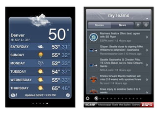

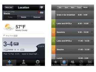


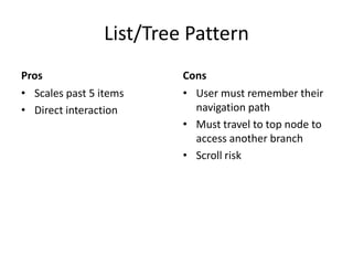

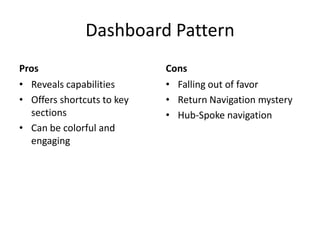


Flat Card Pattern provides quick focused content in a varied layout but can be difficult to traverse from beginning to end and does not scale well. Tab/Nav Bar Pattern allows easy access and overview but is limited in the number of tabs that can be used. List/Tree Pattern scales well and allows direct interaction but requires the user to remember their path and return to the top. Dashboard Pattern can be engaging but is falling out of favor due to navigation difficulties. Combination Patterns integrate features of multiple patterns to address individual limitations.
![[UX Series] 5 - Navigation](https://cdn.slidesharecdn.com/ss_thumbnails/navigation-150911112601-lva1-app6891-thumbnail.jpg?width=640&height=640&fit=bounds)


