1. 56 www.busesmag.com March 2016
T
illingbourne was one of the
pre-deregulation independents
that seemed to thrive in the years
immediately after deregulation in
October 1986, serving the mainly rural areas
around Guildford in Surrey.
It began life in 1924 in Cranleigh as
Tillingbourne Valley and painted its buses
maroon until 1972, when a new owner
relocated the base to Gomsall, expanded
its geographical coverage, renamed it
Tillingbourne Bus and changed its livery
to blue, yellow and grey. In 1963/64, it had
replaced its entire fleet with eight of London
Transport’s GS-class Guy Special 26-seaters
and kept them until the early 1970s.
Relatively modest expansion from 1972
was followed by much more rapid growth
after deregulation, especially with successful
bids for tendered services on behalf of local
authorities; among other places, this took its
buses regularly as far afield as Reading.
Its vehicles included several Optare buses
supplied new, including the MetroRider,
Excel, Vecta-bodied MAN and Prisma-bodied
Mercedes-Benz O405.
It had grown to operate 70 buses and
employ 140 staff by 19 March 2001 when
operations ceased abruptly and the business
was placed in administration. It had racked
up a six-figure trading loss over the previous
two years and the fleet turned out to be worth
more than any potential buyer was prepared
to bid for the company.
When imagining a new identity and livery
design for Tillingbourne, MHD Partnership’s
account director, Mike Fletcher, says it started
where its founders began 92 years ago.
‘Tillingbourne is a bus company that owes
its name to the local river — The Tilling
Bourne — so it seemed fitting to take
inspiration from the waterways,’ he says.
‘Unfortunately, when it came to the name
itself, it came across as an awkward mouthful
– and definitely something that users were
unlikely to say in full.
‘Abbreviating to just TBC was something
we considered initially (and subsequently
rejected for being too corporate), so
shortening it to a more user-friendly ‘tilling
bus’ was decided on to help the project move
on.
‘The identity itself comes in the form of a
strong lower case ‘t’ shape — a graphic that
has been crafted to flow like the river by
which it is influenced. The chosen typeface
has a nice balance
of softened edges
to complement
the livery but not
so much so that it
looks too comical
or would lose
legibility when
scaled.
‘The identity
can be used on its
own as an icon
in advertising
and also with the
descriptive ‘tilling
bus’ wording in
more design- or
corporate-led
communication. It also incorporates a very
subtle arc of darker blue shading to add a
little depth to the logo mark.
‘This relatively simple livery execution is
an evolvement of the existing application,
primarily seen through keeping the original
recognisable colour palette of blue and
yellow,’ he adds.
‘The yellow really pops out against the
darker background, while the organic lines
transform the bus from its usual angular
shape to something more welcoming. The
windows and door areas have been used
to create the flowing ‘river’ shape that runs
through the vehicle’s body.’
Fletcher says the livery ties in nicely with
the ‘go with the flow…’ strapline, supporting
the waterways theme and further helps to
build an identity for a bus that he believes
promises to deliver a smooth and relaxed
journey.
Those who know their British bus history,
however, might expect a Tilling bus to be
green or red. ■
■ To see all of the other rebranding
projects by The MHD Partnership, visit
www.mhdpartnership.co.uk.
IDENTITY PARADE
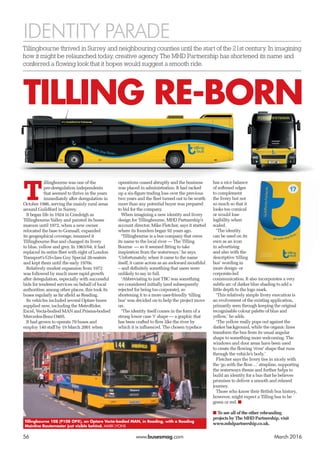
Tillingbourne 108 (P108 OPX), an Optare Vecta-bodied MAN, in Reading, with a Reading
Mainline Routemaster just visible behind. MARK LYONS
TILLING RE-BORN
Tillingbourne thrived in Surrey and neighbouring counties until the start of the 21st century. In imagining
how it might be relaunched today, creative agency The MHD Partnership has shortened its name and
conferred a flowing look that it hopes would suggest a smooth ride.