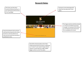
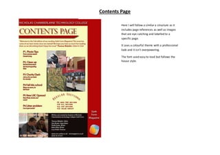
Research Notes 
This Cover uses the colour 
scheme of black and yellow it is 
eye catching yet professional as 
it isn’t too bright. 
Focal point is the school logo which 
shows that they take pride in their 
school, 
The images used are carefully selected 
as it they all send different positive 
messages, for example all the children 
are smiling which shows that school 
life is enjoyable at the school. 
They finish off with a short sentence 
that they think represents the school 
the best it’s short but effective as 
they use three words that any parent 
would want to hear. 
Overall the school provides a slick simple 
design that promotes the school in a good way 
as it is doesn’t cram loads of images and text. 
However I would make the images slightly 
bigger as there is a lot of free space.
Contents Page 
Here I will follow a similar a structure as it 
includes page references as well as images 
that are eye catching and labelled to a 
specific page. 
It uses a colourful theme with a professional 
look and it isn’t overpowering. 
The font used easy to read but follows the 
house style.

Media Research

  • 1.
    Research Notes ThisCover uses the colour scheme of black and yellow it is eye catching yet professional as it isn’t too bright. Focal point is the school logo which shows that they take pride in their school, The images used are carefully selected as it they all send different positive messages, for example all the children are smiling which shows that school life is enjoyable at the school. They finish off with a short sentence that they think represents the school the best it’s short but effective as they use three words that any parent would want to hear. Overall the school provides a slick simple design that promotes the school in a good way as it is doesn’t cram loads of images and text. However I would make the images slightly bigger as there is a lot of free space.
  • 2.
    Contents Page HereI will follow a similar a structure as it includes page references as well as images that are eye catching and labelled to a specific page. It uses a colourful theme with a professional look and it isn’t overpowering. The font used easy to read but follows the house style.