Download to read offline

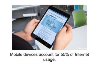
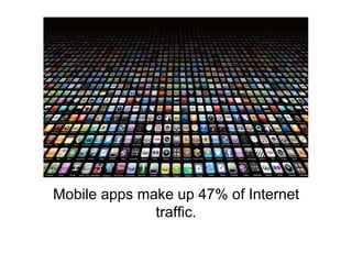
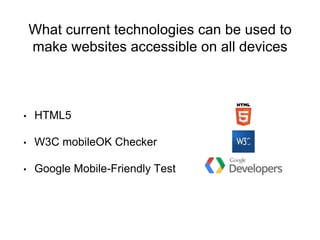
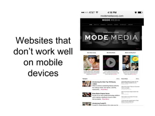
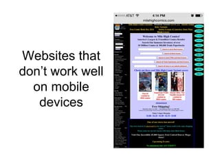
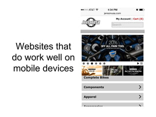
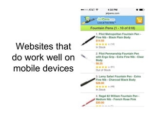
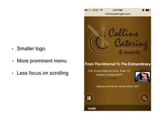

Mobile devices now account for 55% of internet usage in the U.S., with apps generating 47% of internet traffic. The document discusses the rise of mobile and tablet usage, emphasizing the need for responsive web design and technologies like HTML5 to enhance accessibility. Recommendations for Collins Catering and Events include simplifying the logo and improving menu visibility on mobile devices.


