Download as PDF, PPTX
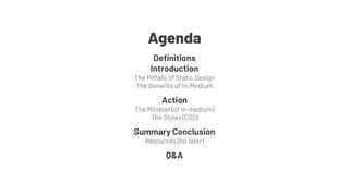

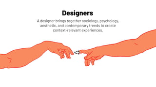
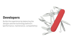
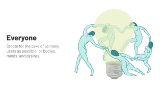

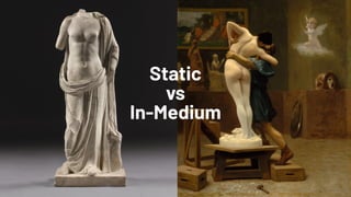
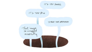
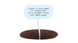
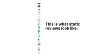


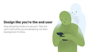
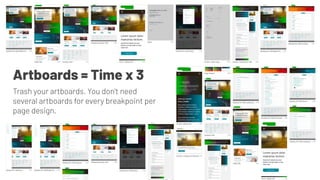

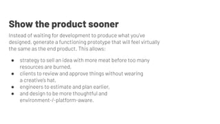

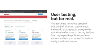

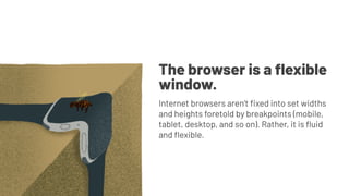
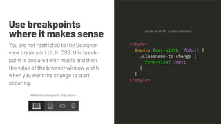
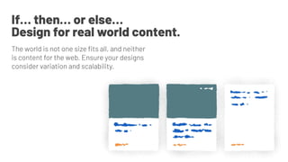
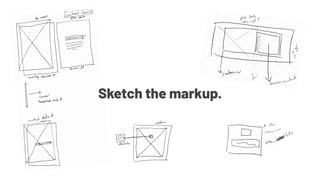
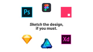

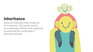
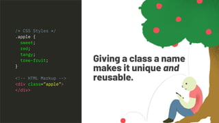
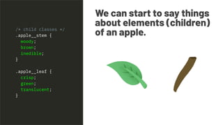
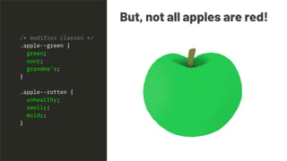
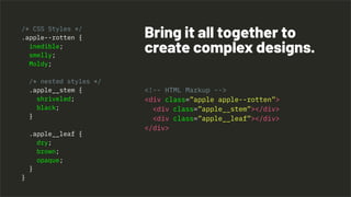
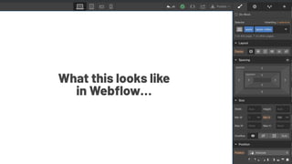


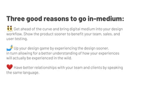


This presentation discusses the benefits of evolving design workflows to be more dynamic using in-medium design in Webflow rather than static designs. Some key benefits include stopping the practice of designing in a vacuum and instead taking the user's perspective, reducing the need for multiple artboards, and creating functioning prototypes earlier to test with users. The presentation covers adopting a mindset of flexible, fluid designs using techniques like responsive breakpoints and CSS. It emphasizes building reusable and scalable designs through semantic HTML and CSS practices like inheritance, modifiers, and child/parent relationships.


