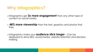
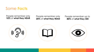
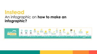
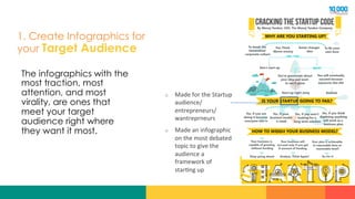
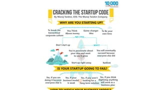
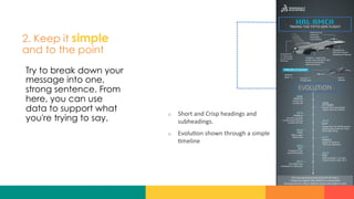
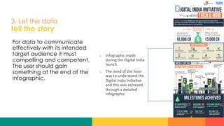
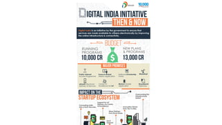
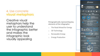
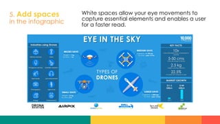
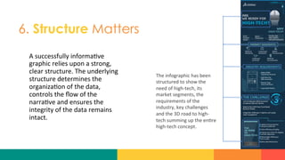
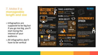
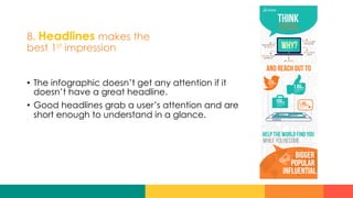
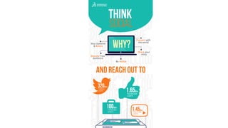
FrogIdeas
An approach to Infographics
	
  
Presented by: Jatin Modi CEO, FrogIdeas
#DMAICMC
FrogIdeas	
  
Why Infographics?
o Infographics get 3x more engagement than any other type of
content on social media
o  48% more viewership than the text, graphics and photos that
they
o Infographics make your audience stick longer – Can be
deployed to drive SEO, social media, website retention and decision
making
Some Facts
People remember only
10% of what they HEAR
People remember only
20% of what they READ
People remember up to
80% of what they SEE
Now, I can go on and on
with these facts…
Instead
An infographic on how to make an
infographic?
Quick Questions…
What is the biggest challenge
when it comes to infographics?
Quick Questions…
If you had to make an infographic
for your brand, what would that
be about?
Quick Questions…
Describe your infographic
requirement in one sentence.
1. Create Infographics for
your Target Audience
The infographics with the
most traction, most
attention, and most
virality, are ones that
meet your target
audience right where
they want it most.
o  Made	
  for	
  the	
  Startup	
  
audience/
entrepreneurs/	
  
wantreprneurs	
  
o  Made	
  an	
  infographic	
  
on	
  the	
  most	
  debated	
  
topic	
  to	
  give	
  the	
  
audience	
  a	
  
framework	
  of	
  
star?ng	
  up	
  	
  
2. Keep it simple
and to the point
Try to break down your
message into one,
strong sentence. From
here, you can use
data to support what
you're trying to say.
o  Short	
  and	
  Crisp	
  headings	
  and	
  
subheadings.	
  
o  Evolu?on	
  shown	
  through	
  a	
  simple	
  
?meline	
  	
  
3. Let the data
tell the story
For data to communicate
effectively with its intended
target audience it must
compelling and competent.
The user should gain
something at the end of the
infographic.
o  Infographic	
  made	
  
during	
  the	
  Digital	
  India	
  
launch.	
  	
  
o  The	
  need	
  of	
  the	
  hour	
  
was	
  to	
  understand	
  the	
  
Digital	
  India	
  Ini?a?ve	
  
and	
  this	
  was	
  achieved	
  
through	
  a	
  detailed	
  
infographic	
  
4. Use concrete
visual metaphors
Creative visual
metaphors help the
user to understand
the infographic better
and makes the
infographic look
visually appealing
Pictographically	
  represen?ng	
  key	
  
elements	
  of	
  the	
  infographic:	
  
o  The	
  Road	
  Ahead	
  for	
  Energy	
  
o  3D	
  Technology	
  
o  Renewable	
  Energy	
  
o  Energy	
  Produc?on	
  
5. Add spaces
in the infographic
White spaces allow your eye movements to
capture essential elements and enables a user
for a faster read.
6. Structure Matters
A	
  successfully	
  informa?ve	
  
graphic	
  relies	
  upon	
  a	
  strong,	
  
clear	
  structure.	
  The	
  underlying	
  
structure	
  determines	
  the	
  
organiza?on	
  of	
  the	
  data,	
  
controls	
  the	
  flow	
  of	
  the	
  
narra?ve	
  and	
  ensures	
  the	
  
integrity	
  of	
  the	
  data	
  remains	
  
intact.	
  
The	
  infographic	
  has	
  been	
  
structured	
  to	
  show	
  the	
  
need	
  of	
  high-­‐tech,	
  its	
  
market	
  segments,	
  the	
  
requirements	
  of	
  the	
  
industry,	
  key	
  challenges	
  
and	
  the	
  3D	
  road	
  to	
  high-­‐
tech	
  summing	
  up	
  the	
  en?re	
  
high-­‐tech	
  concept.	
  
7. Make it a
manageable
length and size
o Infographics	
  are	
  
supposed	
  to	
  be	
  big	
  but	
  
if	
  you	
  go	
  too	
  big,	
  you’ll	
  
start	
  losing	
  the	
  
interest	
  of	
  your	
  
audience.	
  
o All	
  infographics	
  don’t	
  
have	
  to	
  be	
  ver?cal	
  
8. Headlines makes the
best 1st impression
•  The infographic doesn’t get any attention if it
doesn’t have a great headline.
•  Good headlines grab a user’s attention and are
short enough to understand in a glance.
Online  tools  to  get  you  started!
o Canva: https://www.canva.com/
o PicMonkey: https://www.picmonkey.com/design
o Piktochart: https://piktochart.com
o Befunky: https://www.befunky.com/features/graphic-designer/
o Snappa: https://snappa.io
Thank you
Connect with me
Twitter: @poornviram
E-mail: jatinmodi@frogideas.com	
  

Killer Infographic by Jatin Modi

  • 1.
    FrogIdeas An approach toInfographics   Presented by: Jatin Modi CEO, FrogIdeas #DMAICMC FrogIdeas  
  • 2.
    Why Infographics? o Infographics get3x more engagement than any other type of content on social media o  48% more viewership than the text, graphics and photos that they o Infographics make your audience stick longer – Can be deployed to drive SEO, social media, website retention and decision making
  • 3.
    Some Facts People rememberonly 10% of what they HEAR People remember only 20% of what they READ People remember up to 80% of what they SEE
  • 4.
    Now, I cango on and on with these facts…
  • 5.
    Instead An infographic onhow to make an infographic?
  • 10.
    Quick Questions… What isthe biggest challenge when it comes to infographics?
  • 11.
    Quick Questions… If youhad to make an infographic for your brand, what would that be about?
  • 12.
    Quick Questions… Describe yourinfographic requirement in one sentence.
  • 13.
    1. Create Infographicsfor your Target Audience The infographics with the most traction, most attention, and most virality, are ones that meet your target audience right where they want it most. o  Made  for  the  Startup   audience/ entrepreneurs/   wantreprneurs   o  Made  an  infographic   on  the  most  debated   topic  to  give  the   audience  a   framework  of   star?ng  up    
  • 15.
    2. Keep itsimple and to the point Try to break down your message into one, strong sentence. From here, you can use data to support what you're trying to say. o  Short  and  Crisp  headings  and   subheadings.   o  Evolu?on  shown  through  a  simple   ?meline    
  • 17.
    3. Let thedata tell the story For data to communicate effectively with its intended target audience it must compelling and competent. The user should gain something at the end of the infographic. o  Infographic  made   during  the  Digital  India   launch.     o  The  need  of  the  hour   was  to  understand  the   Digital  India  Ini?a?ve   and  this  was  achieved   through  a  detailed   infographic  
  • 19.
    4. Use concrete visualmetaphors Creative visual metaphors help the user to understand the infographic better and makes the infographic look visually appealing Pictographically  represen?ng  key   elements  of  the  infographic:   o  The  Road  Ahead  for  Energy   o  3D  Technology   o  Renewable  Energy   o  Energy  Produc?on  
  • 21.
    5. Add spaces inthe infographic White spaces allow your eye movements to capture essential elements and enables a user for a faster read.
  • 22.
    6. Structure Matters A  successfully  informa?ve   graphic  relies  upon  a  strong,   clear  structure.  The  underlying   structure  determines  the   organiza?on  of  the  data,   controls  the  flow  of  the   narra?ve  and  ensures  the   integrity  of  the  data  remains   intact.   The  infographic  has  been   structured  to  show  the   need  of  high-­‐tech,  its   market  segments,  the   requirements  of  the   industry,  key  challenges   and  the  3D  road  to  high-­‐ tech  summing  up  the  en?re   high-­‐tech  concept.  
  • 24.
    7. Make ita manageable length and size o Infographics  are   supposed  to  be  big  but   if  you  go  too  big,  you’ll   start  losing  the   interest  of  your   audience.   o All  infographics  don’t   have  to  be  ver?cal  
  • 25.
    8. Headlines makesthe best 1st impression •  The infographic doesn’t get any attention if it doesn’t have a great headline. •  Good headlines grab a user’s attention and are short enough to understand in a glance.
  • 27.
    Online  tools  to get  you  started! o Canva: https://www.canva.com/ o PicMonkey: https://www.picmonkey.com/design o Piktochart: https://piktochart.com o Befunky: https://www.befunky.com/features/graphic-designer/ o Snappa: https://snappa.io
  • 28.
    Thank you Connect withme Twitter: @poornviram E-mail: jatinmodi@frogideas.com