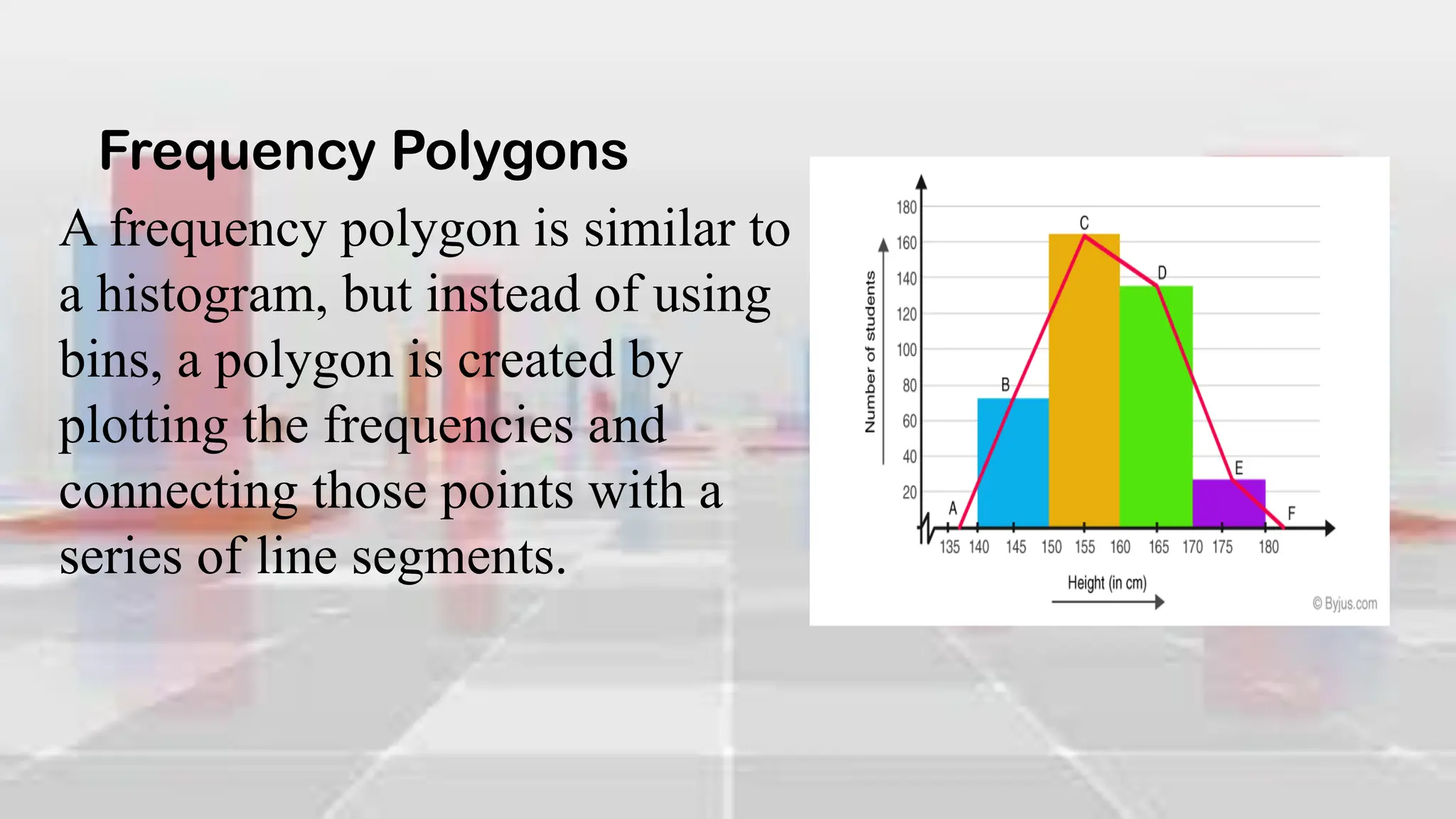
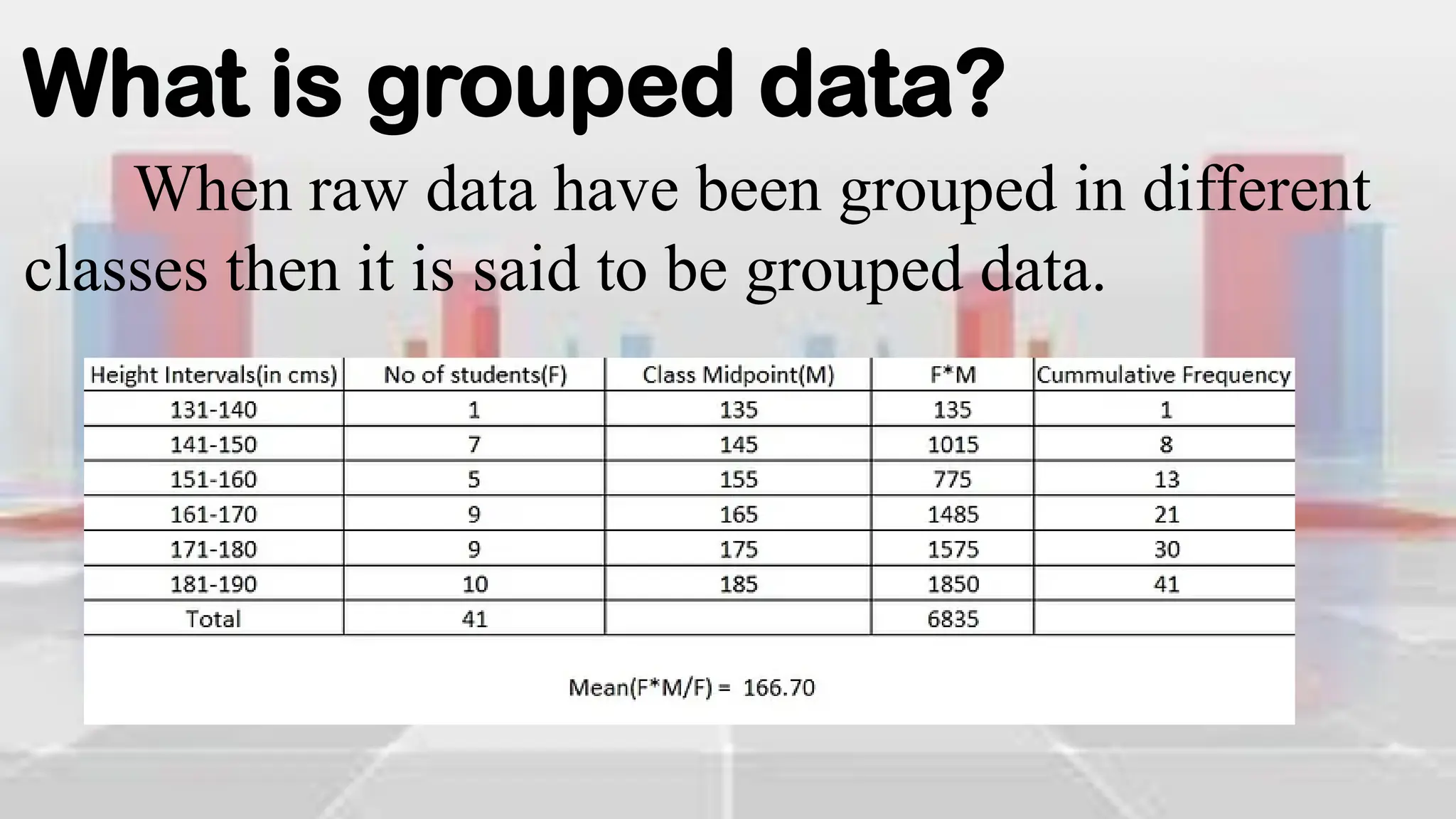
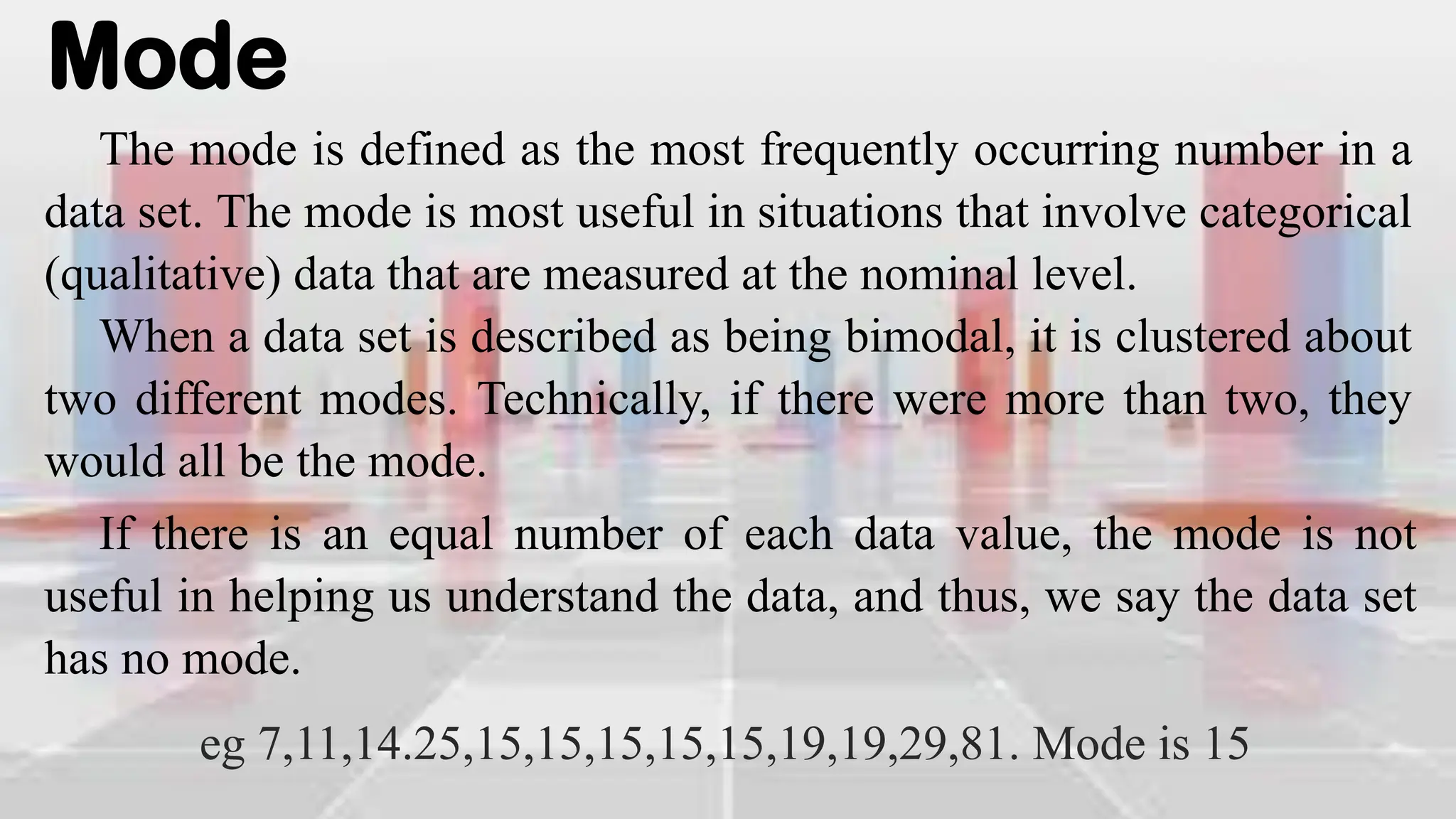
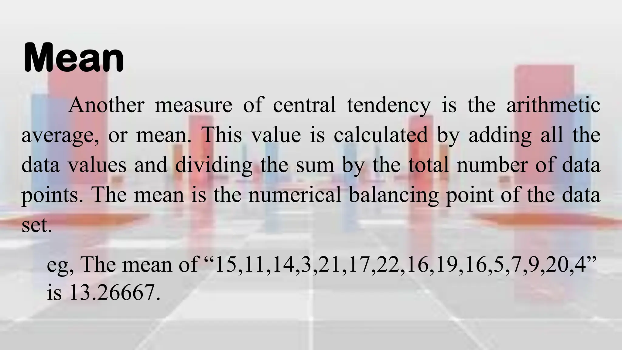
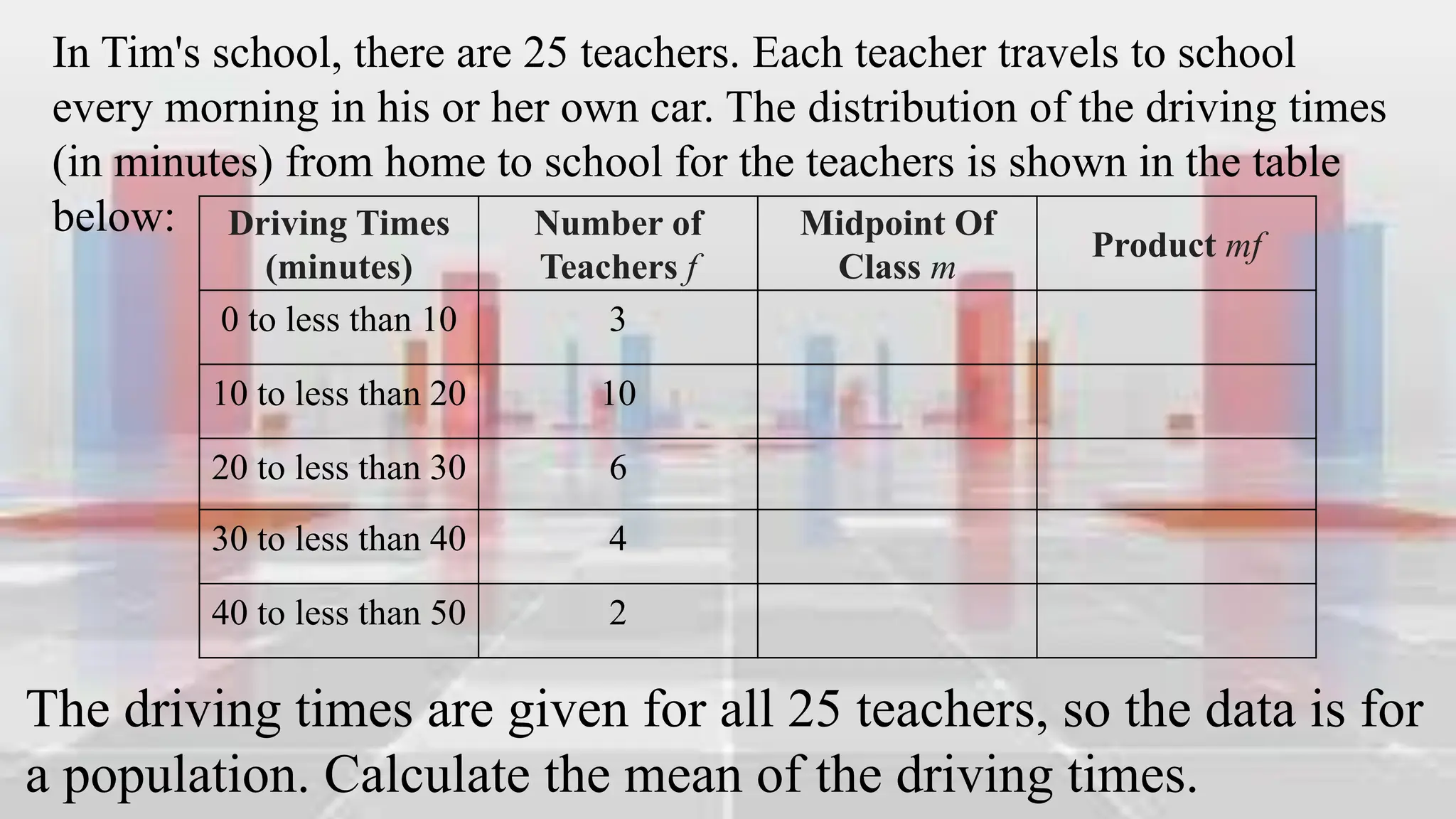
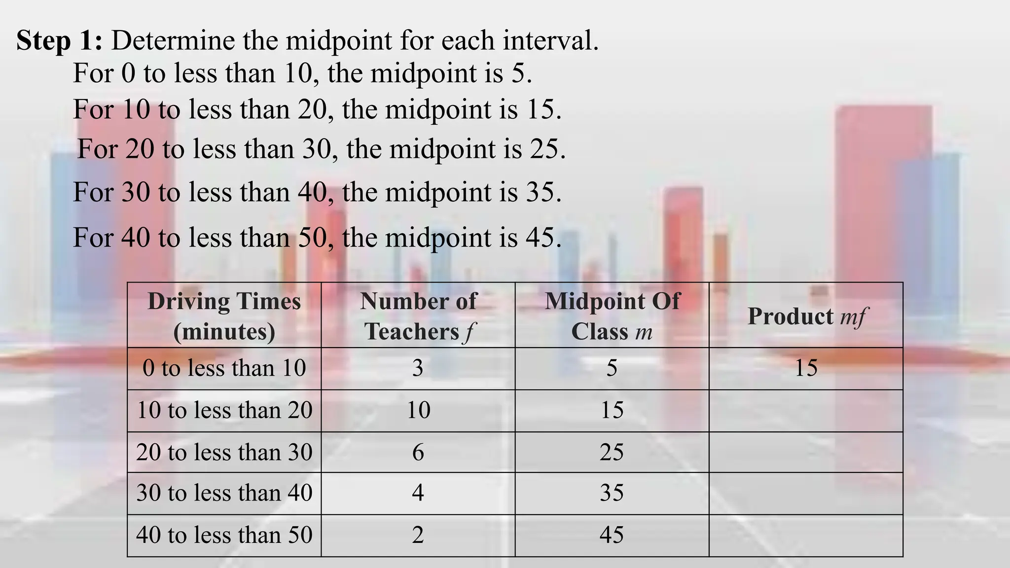
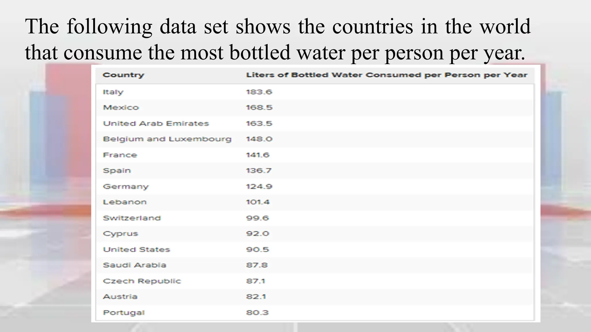
This document provides an introduction to statistical analysis and key concepts such as populations, samples, measures of central tendency (mean, median, mode), and grouped vs. ungrouped data. It explains that a population is the entire set being studied, while a sample is a subset used to make inferences about the population. It also defines nominal, ordinal, interval, and ratio levels of measurement for variables. The document demonstrates how to calculate the mean, median, and mode for both ungrouped and grouped data sets. It provides examples of finding the mean, median, and midpoint of intervals for grouped driving time and height data.


![A bracket, '[' or ']', indicates that the
endpoint of the interval is included in the
class. A parenthesis, '(' or ')', indicates that
the endpoint is not included. It is common
practice in statistics to include a number
that borders two classes as the larger of the
two numbers in an interval. For example,
[80−90) means this classification includes
everything from 80 and gets infinitely close
to, but not equal to, 90. 90 is included in
the next class, [90−100).
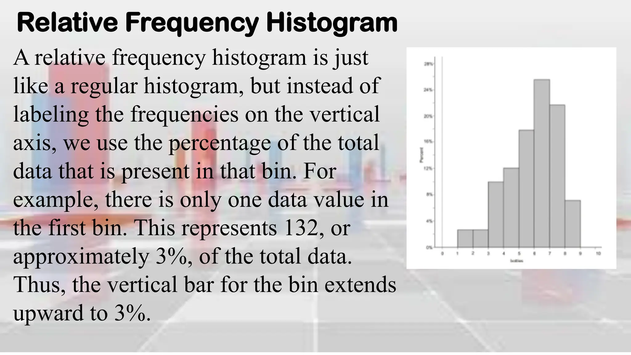
Figure: Completed Frequency Table for World Bottled Water
Consumption Data (2004)](https://image.slidesharecdn.com/introduction-to-analyzing-statistical-data-240302003651-ca1657c6/75/Introduction-to-Analyzing-Statistical-Data-pdf-46-2048.jpg)