Presented by: Ermilo John D. Gialogo, Jr. BSCS-IST, De La Salle University-Manila Ermilo John D. Gialogo, Jr. ● CIIT: Introduction to Web Design 08/06/09
08/06/09 Ermilo John D. Gialogo, Jr. ● CIIT: Introduction to Web Design HOW DO I START?
Know the purpose of your site Business? Organizational? Hobbyist? Personal? Ermilo John D. Gialogo, Jr. ● CIIT: Introduction to Web Design 08/06/09
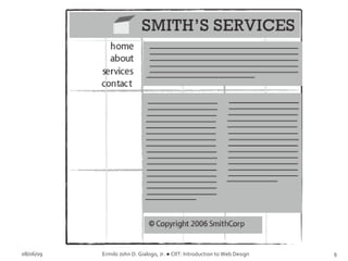
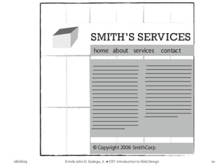
Set up the website anatomy Containing Block Logo Navigation Content White Space Footer 08/06/09 Ermilo John D. Gialogo, Jr. ● CIIT: Introduction to Web Design
08/06/09 Ermilo John D. Gialogo, Jr. ● CIIT: Introduction to Web Design
Layout using Rule of Thirds Application of the “divine proportion” Generally makes the site aesthetically appealing 08/06/09 Ermilo John D. Gialogo, Jr. ● CIIT: Introduction to Web Design
08/06/09 Ermilo John D. Gialogo, Jr. ● CIIT: Introduction to Web Design
Common layout examples Left-column navigation http://www.thinkgeek.com/index.shtml Right-column navigation http://www.audi.com Three-column navigation http://store.apple.com/ 08/06/09 Ermilo John D. Gialogo, Jr. ● CIIT: Introduction to Web Design
08/06/09 Ermilo John D. Gialogo, Jr. ● CIIT: Introduction to Web Design Done with the basic stuff.  WHAT’S NEXT?
C o l o r s   One of the designer's  best tools  Look and Feel Branding Highlight or group content 08/06/09 Ermilo John D. Gialogo, Jr. ● CIIT: Introduction to Web Design
C o l o r s   08/06/09 Ermilo John D. Gialogo, Jr. ● CIIT: Introduction to Web Design
C o l o r s   Red to yellow, including orange, pink, brown, and burgundy  Associated with the sun and fire Represents both heat and motion When placed near a cool color, a warm color will tend to pop out, dominate 08/06/09 Ermilo John D. Gialogo, Jr. ● CIIT: Introduction to Web Design
Green to blue, can include violet  Cooler violet is closer to blue Cool colors can calm people down and reduce tension  In a design, cool colors tend to recede Great for backgrounds and larger elements on a page,  Wont overpower your content 08/06/09 Ermilo John D. Gialogo, Jr. ● CIIT: Introduction to Web Design
Monochromatic Scheme One color, different hues 08/06/09 Ermilo John D. Gialogo, Jr. ● CIIT: Introduction to Web Design
08/06/09 Ermilo John D. Gialogo, Jr. ● CIIT: Introduction to Web Design Monochromatic Color Scheme - http://haveamint.com/
Analogous Colors Adjacent colors in the color wheel 08/06/09 Ermilo John D. Gialogo, Jr. ● CIIT: Introduction to Web Design
08/06/09 Ermilo John D. Gialogo, Jr. ● CIIT: Introduction to Web Design Analogous Color Scheme - http://regines.net.au/
Complementary Colors Colors located opposite to each other in the color wheel 08/06/09 Ermilo John D. Gialogo, Jr. ● CIIT: Introduction to Web Design
08/06/09 Ermilo John D. Gialogo, Jr. ● CIIT: Introduction to Web Design Complementary Color Scheme http://www.ufl.edu/
Complementary Colors Watch out for simultaneous contrast 08/06/09 Ermilo John D. Gialogo, Jr. ● CIIT: Introduction to Web Design
Colors in Nature 08/06/09 Ermilo John D. Gialogo, Jr. ● CIIT: Introduction to Web Design
Color Scheme 2   http://wellstyled.com/tools/colorscheme2/index-en.html
Color Blender  http://www.colorblender.com/
Contrast makes things  stand out Things with higher contrast will be more noticeable.
 
 
Creating a document for the web or print, information should be organized and readable If you are using background graphics on a web page, keep text and other information readable
Don't use too many font sizes  2-3 Fonts in all Headers / headlines Body Text Highlights
Serif  This is Times New Roman, one of the most common serif typefaces In print, serif type is easier to read Sans serif  This is Arial, a sans serif  typeface On a computer screen, sans serif type is easier to read
 
 
Keep lines short Paragraphs: 4-8 lines  Use wider margins to increase white space
T o o  m a n y   c o l o r s Too   Many   Fonts   and   Styles ALL CAPITAL LETTERS ARE DIFFICULT TO READ Upper and lower case letters are easier
Do you prefer to read Verdana online? Do you prefer to read Arial online?  Do you prefer to read Georgia online?  Do you prefer to read Times online?
 
 
Use text when possible Searched and indexed by web crawlers Can be selected and copy-pasted Decreases page load time Effective text 351 B (Text) 1290 B (GIF)
Users often read Web pages in an  F-shaped pattern : two horizontal stripes followed by a vertical stripe.  F for  fast .
 
Users won't read your text thoroughly in a word-by-word manner.  Scanning Exhaustive reading is rare The first two paragraphs must state the most important information.  Start subheads, paragraphs, and bullet points with information Carrying words that users will notice when scanning
08/06/09 Ermilo John D. Gialogo, Jr. ● CIIT: Introduction to Web Design That’s a lot of stuff.  HOW DO I REMEMBER  THEM ALL?
http://www.havenworks.com/ http://www.5safepoints.com/ http://www.samanzerin.com/ http://www.alternativetransportservices.co.uk/ http://www.brillpublications.com/ 08/06/09 Ermilo John D. Gialogo, Jr. ● CIIT: Introduction to Web Design
CSS Zen Garden http://www.csszengarden.com 08/06/09 Ermilo John D. Gialogo, Jr. ● CIIT: Introduction to Web Design
08/06/09 Ermilo John D. Gialogo, Jr. ● CIIT: Introduction to Web Design WRAP UP THE STUFF.

Introduction To Web Design

  • 1.
    Presented by: ErmiloJohn D. Gialogo, Jr. BSCS-IST, De La Salle University-Manila Ermilo John D. Gialogo, Jr. ● CIIT: Introduction to Web Design 08/06/09
  • 2.
    08/06/09 Ermilo JohnD. Gialogo, Jr. ● CIIT: Introduction to Web Design HOW DO I START?
  • 3.
    Know the purposeof your site Business? Organizational? Hobbyist? Personal? Ermilo John D. Gialogo, Jr. ● CIIT: Introduction to Web Design 08/06/09
  • 4.
    Set up thewebsite anatomy Containing Block Logo Navigation Content White Space Footer 08/06/09 Ermilo John D. Gialogo, Jr. ● CIIT: Introduction to Web Design
  • 5.
    08/06/09 Ermilo JohnD. Gialogo, Jr. ● CIIT: Introduction to Web Design
  • 6.
    Layout using Ruleof Thirds Application of the “divine proportion” Generally makes the site aesthetically appealing 08/06/09 Ermilo John D. Gialogo, Jr. ● CIIT: Introduction to Web Design
  • 7.
    08/06/09 Ermilo JohnD. Gialogo, Jr. ● CIIT: Introduction to Web Design
  • 8.
    08/06/09 Ermilo JohnD. Gialogo, Jr. ● CIIT: Introduction to Web Design
  • 9.
    08/06/09 Ermilo JohnD. Gialogo, Jr. ● CIIT: Introduction to Web Design
  • 10.
    08/06/09 Ermilo JohnD. Gialogo, Jr. ● CIIT: Introduction to Web Design
  • 11.
    08/06/09 Ermilo JohnD. Gialogo, Jr. ● CIIT: Introduction to Web Design
  • 12.
    Common layout examplesLeft-column navigation http://www.thinkgeek.com/index.shtml Right-column navigation http://www.audi.com Three-column navigation http://store.apple.com/ 08/06/09 Ermilo John D. Gialogo, Jr. ● CIIT: Introduction to Web Design
  • 13.
    08/06/09 Ermilo JohnD. Gialogo, Jr. ● CIIT: Introduction to Web Design Done with the basic stuff. WHAT’S NEXT?
  • 14.
    C o lo r s One of the designer's best tools Look and Feel Branding Highlight or group content 08/06/09 Ermilo John D. Gialogo, Jr. ● CIIT: Introduction to Web Design
  • 15.
    C o lo r s 08/06/09 Ermilo John D. Gialogo, Jr. ● CIIT: Introduction to Web Design
  • 16.
    C o lo r s Red to yellow, including orange, pink, brown, and burgundy Associated with the sun and fire Represents both heat and motion When placed near a cool color, a warm color will tend to pop out, dominate 08/06/09 Ermilo John D. Gialogo, Jr. ● CIIT: Introduction to Web Design
  • 17.
    Green to blue,can include violet Cooler violet is closer to blue Cool colors can calm people down and reduce tension In a design, cool colors tend to recede Great for backgrounds and larger elements on a page, Wont overpower your content 08/06/09 Ermilo John D. Gialogo, Jr. ● CIIT: Introduction to Web Design
  • 18.
    Monochromatic Scheme Onecolor, different hues 08/06/09 Ermilo John D. Gialogo, Jr. ● CIIT: Introduction to Web Design
  • 19.
    08/06/09 Ermilo JohnD. Gialogo, Jr. ● CIIT: Introduction to Web Design Monochromatic Color Scheme - http://haveamint.com/
  • 20.
    Analogous Colors Adjacentcolors in the color wheel 08/06/09 Ermilo John D. Gialogo, Jr. ● CIIT: Introduction to Web Design
  • 21.
    08/06/09 Ermilo JohnD. Gialogo, Jr. ● CIIT: Introduction to Web Design Analogous Color Scheme - http://regines.net.au/
  • 22.
    Complementary Colors Colorslocated opposite to each other in the color wheel 08/06/09 Ermilo John D. Gialogo, Jr. ● CIIT: Introduction to Web Design
  • 23.
    08/06/09 Ermilo JohnD. Gialogo, Jr. ● CIIT: Introduction to Web Design Complementary Color Scheme http://www.ufl.edu/
  • 24.
    Complementary Colors Watchout for simultaneous contrast 08/06/09 Ermilo John D. Gialogo, Jr. ● CIIT: Introduction to Web Design
  • 25.
    Colors in Nature08/06/09 Ermilo John D. Gialogo, Jr. ● CIIT: Introduction to Web Design
  • 26.
    Colors in Nature08/06/09 Ermilo John D. Gialogo, Jr. ● CIIT: Introduction to Web Design
  • 27.
    Color Scheme 2 http://wellstyled.com/tools/colorscheme2/index-en.html
  • 28.
    Color Blender http://www.colorblender.com/
  • 29.
    Contrast makes things stand out Things with higher contrast will be more noticeable.
  • 30.
  • 31.
  • 32.
    Creating a documentfor the web or print, information should be organized and readable If you are using background graphics on a web page, keep text and other information readable
  • 33.
    Don't use toomany font sizes 2-3 Fonts in all Headers / headlines Body Text Highlights
  • 34.
    Serif Thisis Times New Roman, one of the most common serif typefaces In print, serif type is easier to read Sans serif This is Arial, a sans serif typeface On a computer screen, sans serif type is easier to read
  • 35.
  • 36.
  • 37.
    Keep lines shortParagraphs: 4-8 lines Use wider margins to increase white space
  • 38.
    T o o m a n y c o l o r s Too Many Fonts and Styles ALL CAPITAL LETTERS ARE DIFFICULT TO READ Upper and lower case letters are easier
  • 39.
    Do you preferto read Verdana online? Do you prefer to read Arial online? Do you prefer to read Georgia online? Do you prefer to read Times online?
  • 40.
  • 41.
  • 42.
    Use text whenpossible Searched and indexed by web crawlers Can be selected and copy-pasted Decreases page load time Effective text 351 B (Text) 1290 B (GIF)
  • 43.
    Users often readWeb pages in an F-shaped pattern : two horizontal stripes followed by a vertical stripe. F for fast .
  • 44.
  • 45.
    Users won't readyour text thoroughly in a word-by-word manner. Scanning Exhaustive reading is rare The first two paragraphs must state the most important information. Start subheads, paragraphs, and bullet points with information Carrying words that users will notice when scanning
  • 46.
    08/06/09 Ermilo JohnD. Gialogo, Jr. ● CIIT: Introduction to Web Design That’s a lot of stuff. HOW DO I REMEMBER THEM ALL?
  • 47.
    http://www.havenworks.com/ http://www.5safepoints.com/ http://www.samanzerin.com/http://www.alternativetransportservices.co.uk/ http://www.brillpublications.com/ 08/06/09 Ermilo John D. Gialogo, Jr. ● CIIT: Introduction to Web Design
  • 48.
    CSS Zen Gardenhttp://www.csszengarden.com 08/06/09 Ermilo John D. Gialogo, Jr. ● CIIT: Introduction to Web Design
  • 49.
    08/06/09 Ermilo JohnD. Gialogo, Jr. ● CIIT: Introduction to Web Design WRAP UP THE STUFF.

Editor's Notes

  • #4 It enables you to limit your designs in mind. Limit in terms of, it’ll give you what sense of design you will be implementing.
  • #20 One color, varied hues
  • #22 Colors adjacent to one another in the color wheel