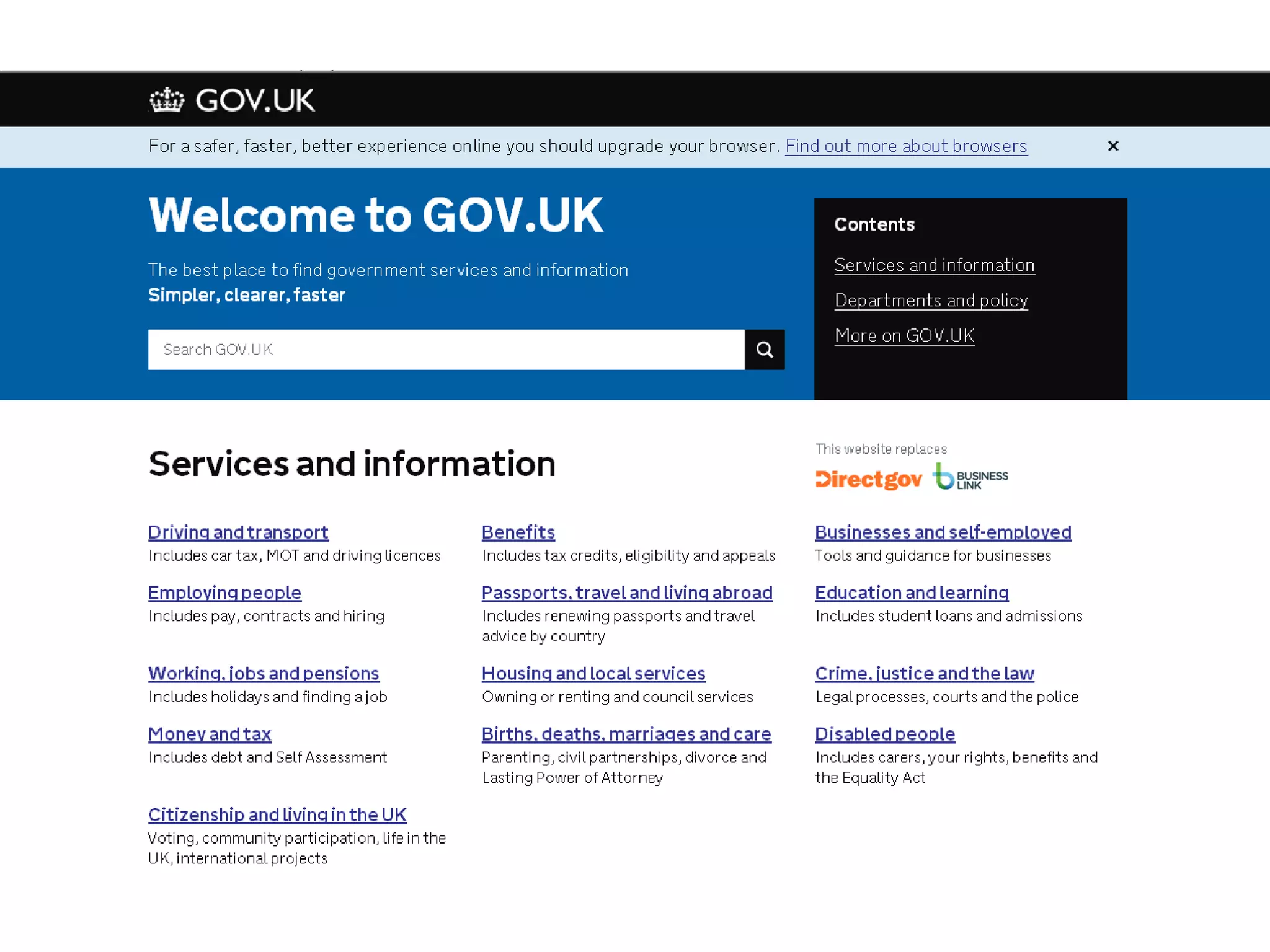
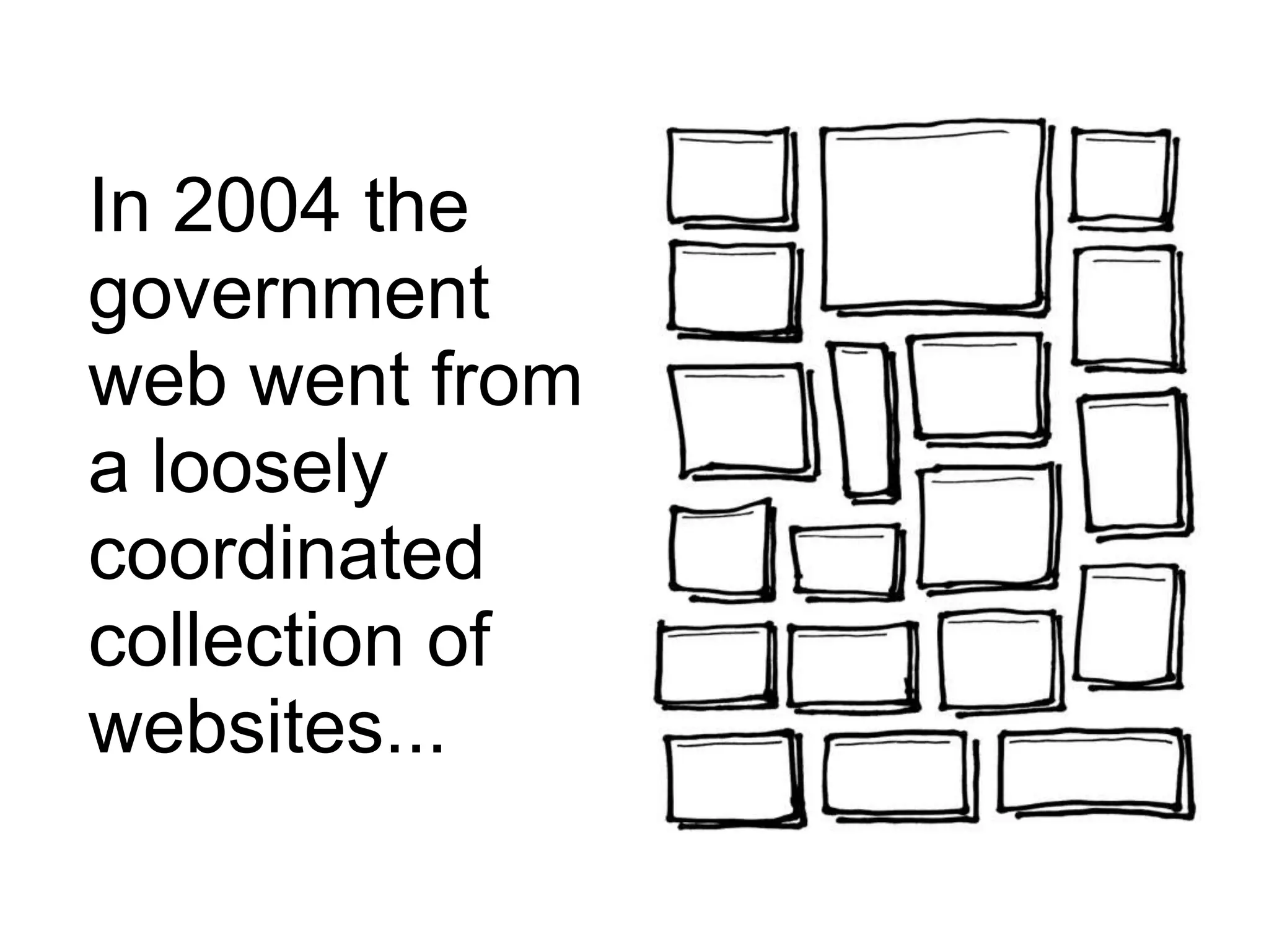
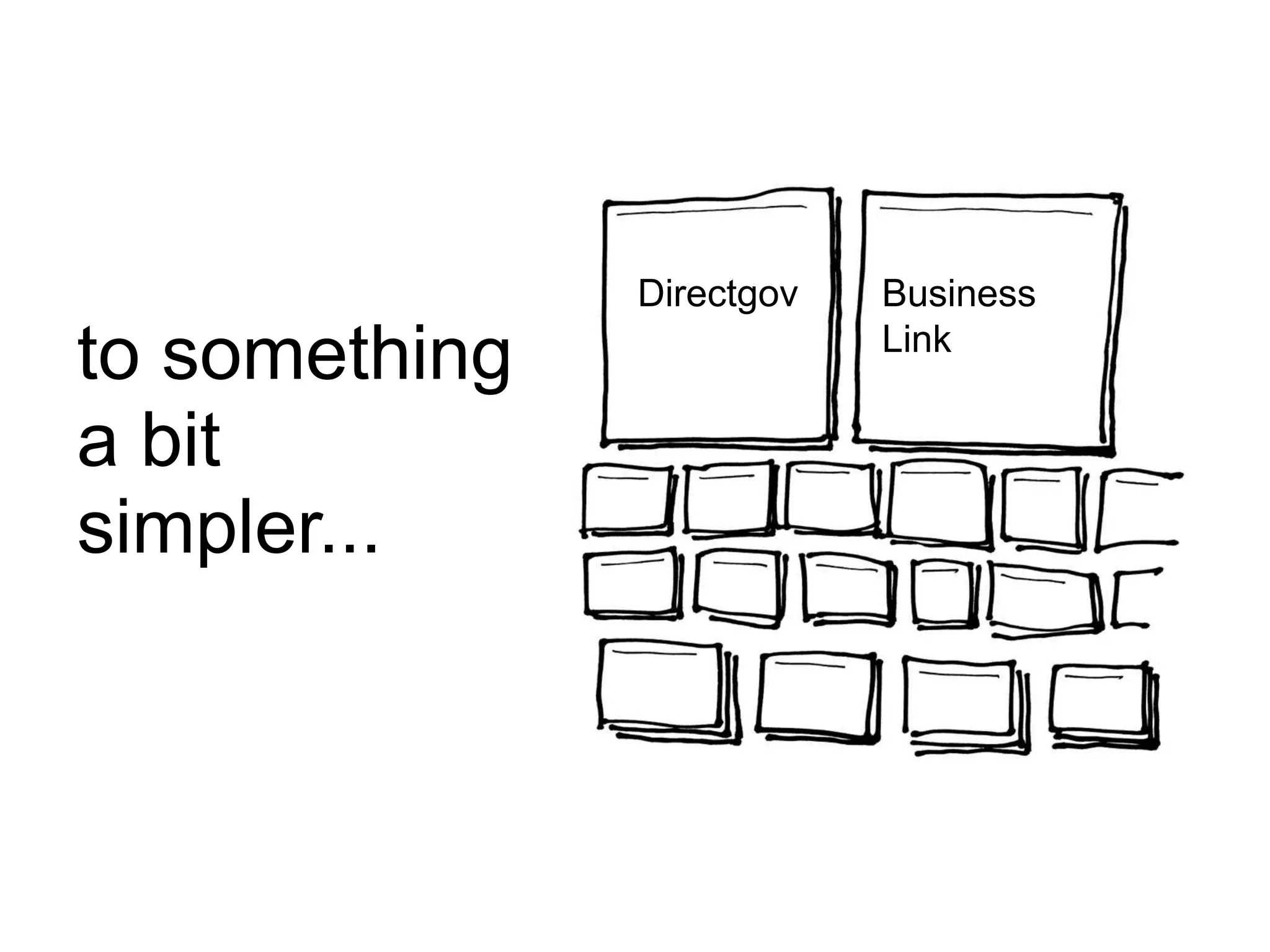
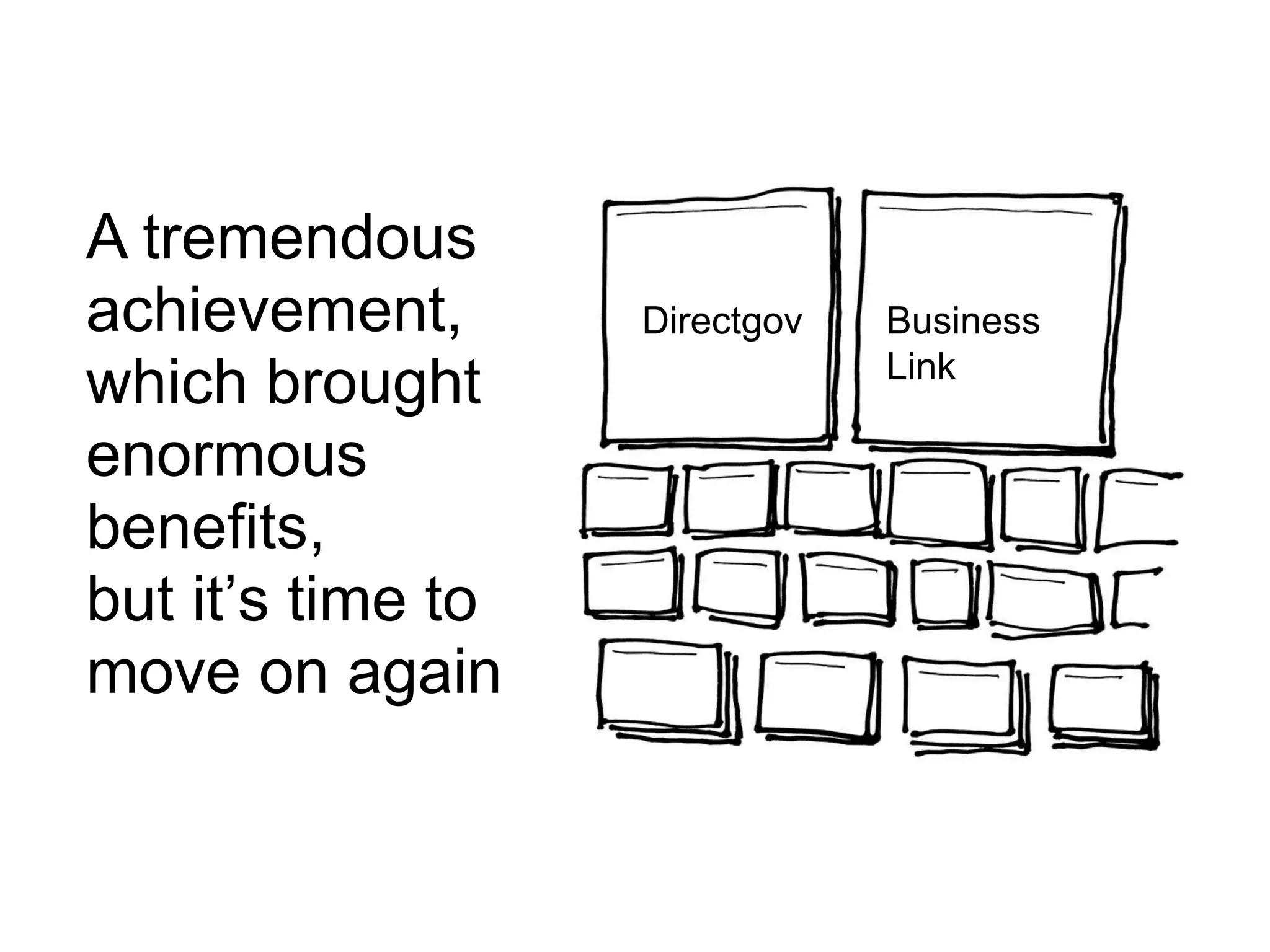
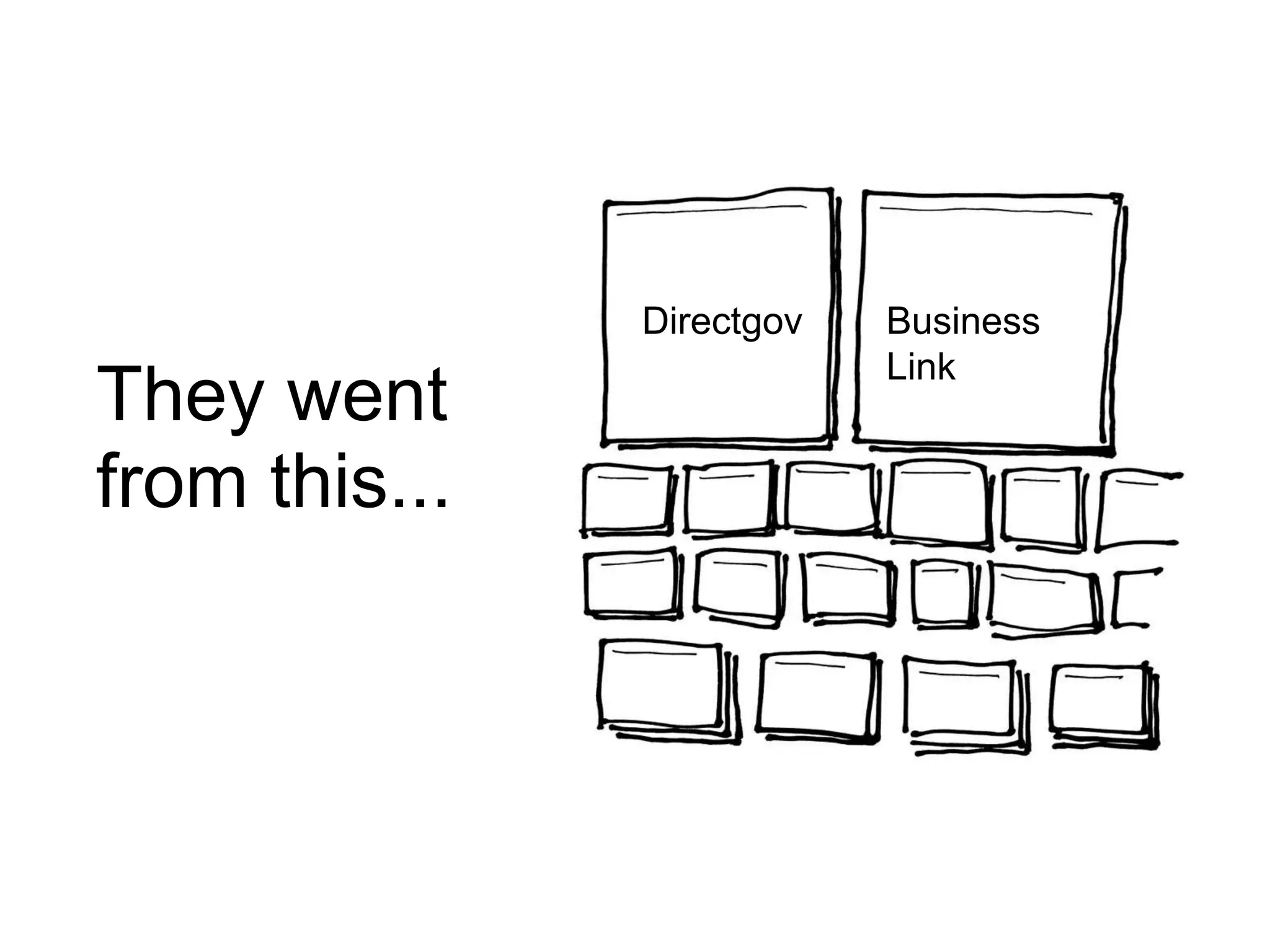
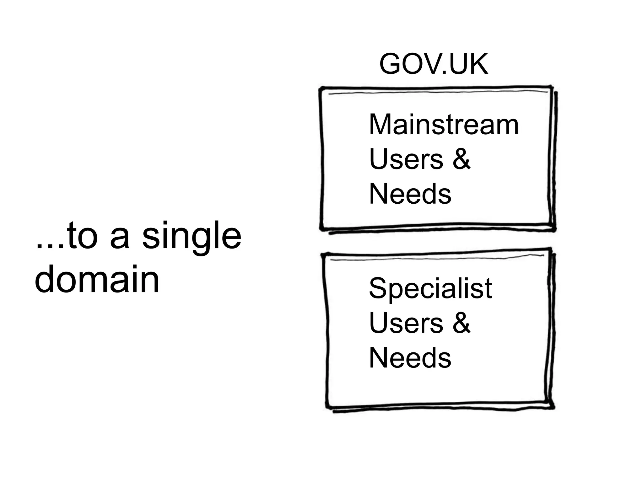
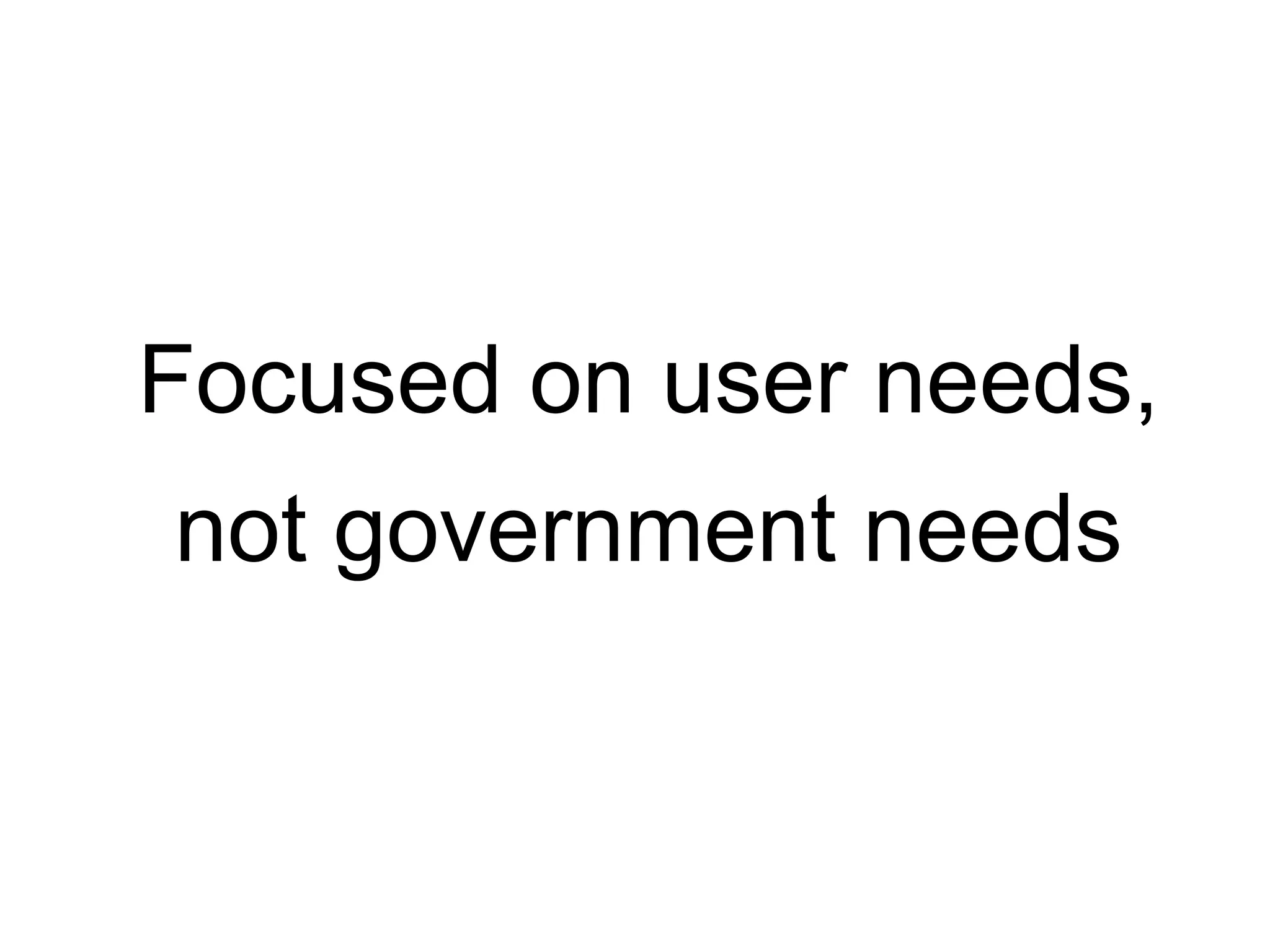
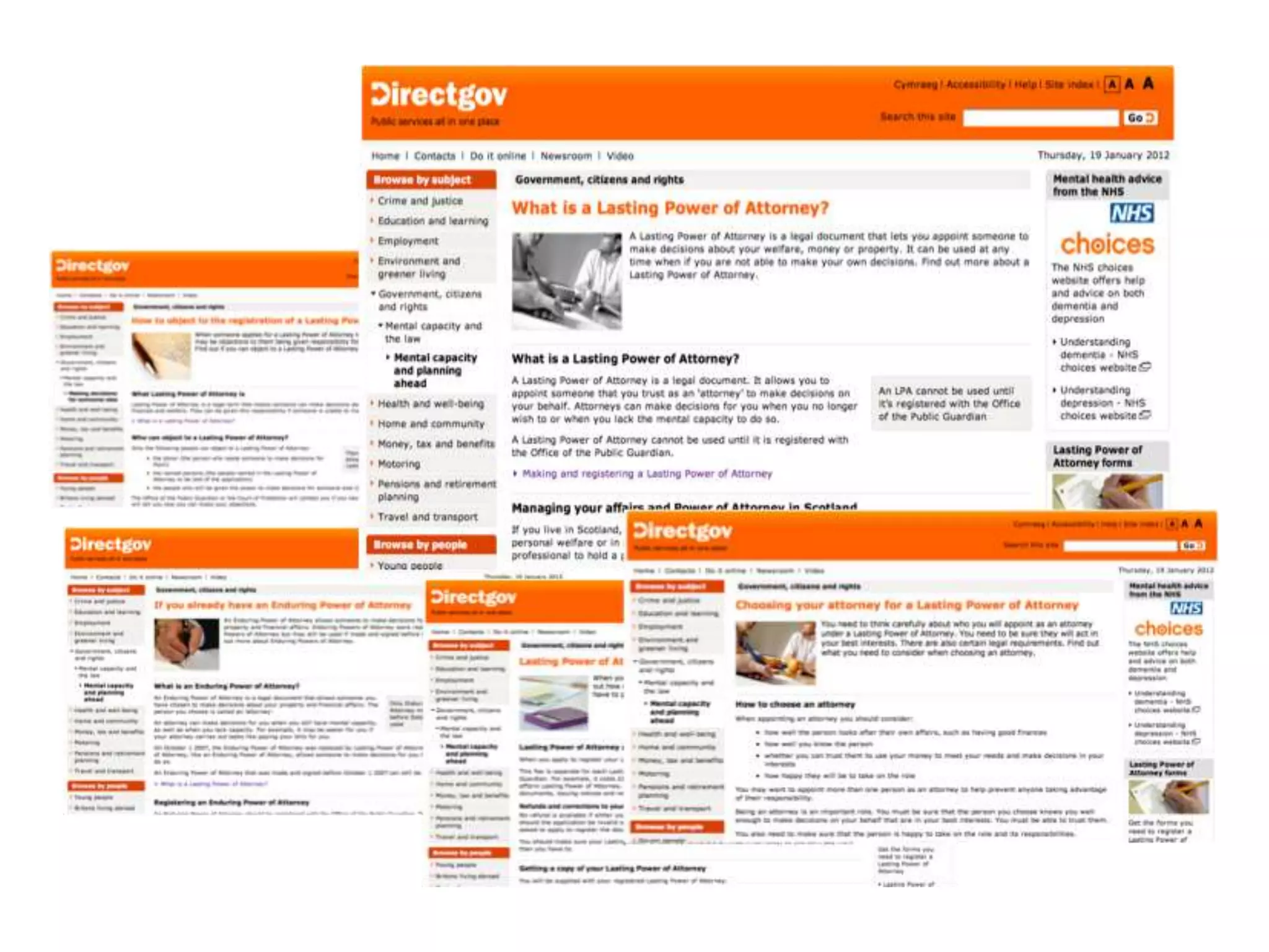
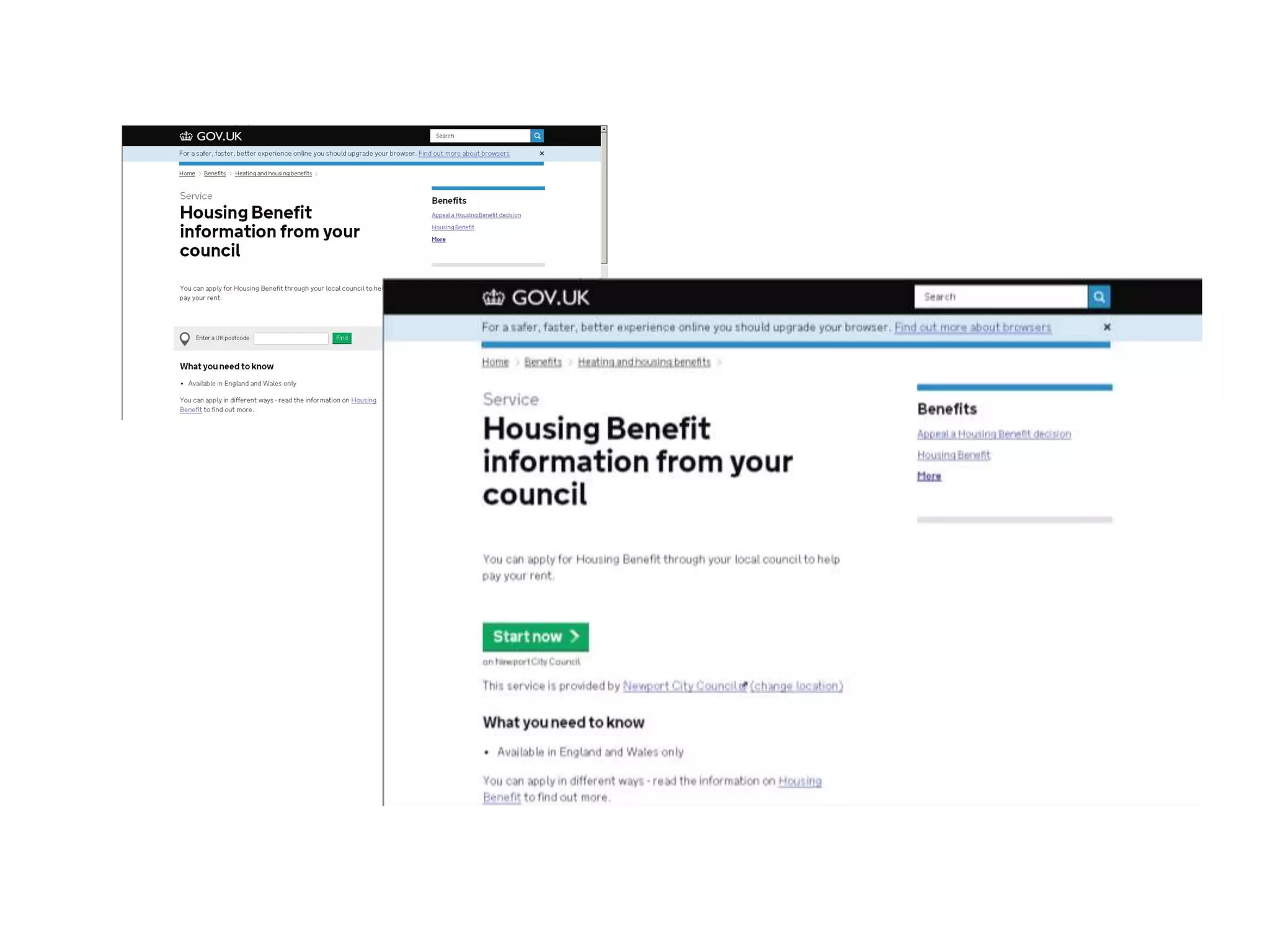
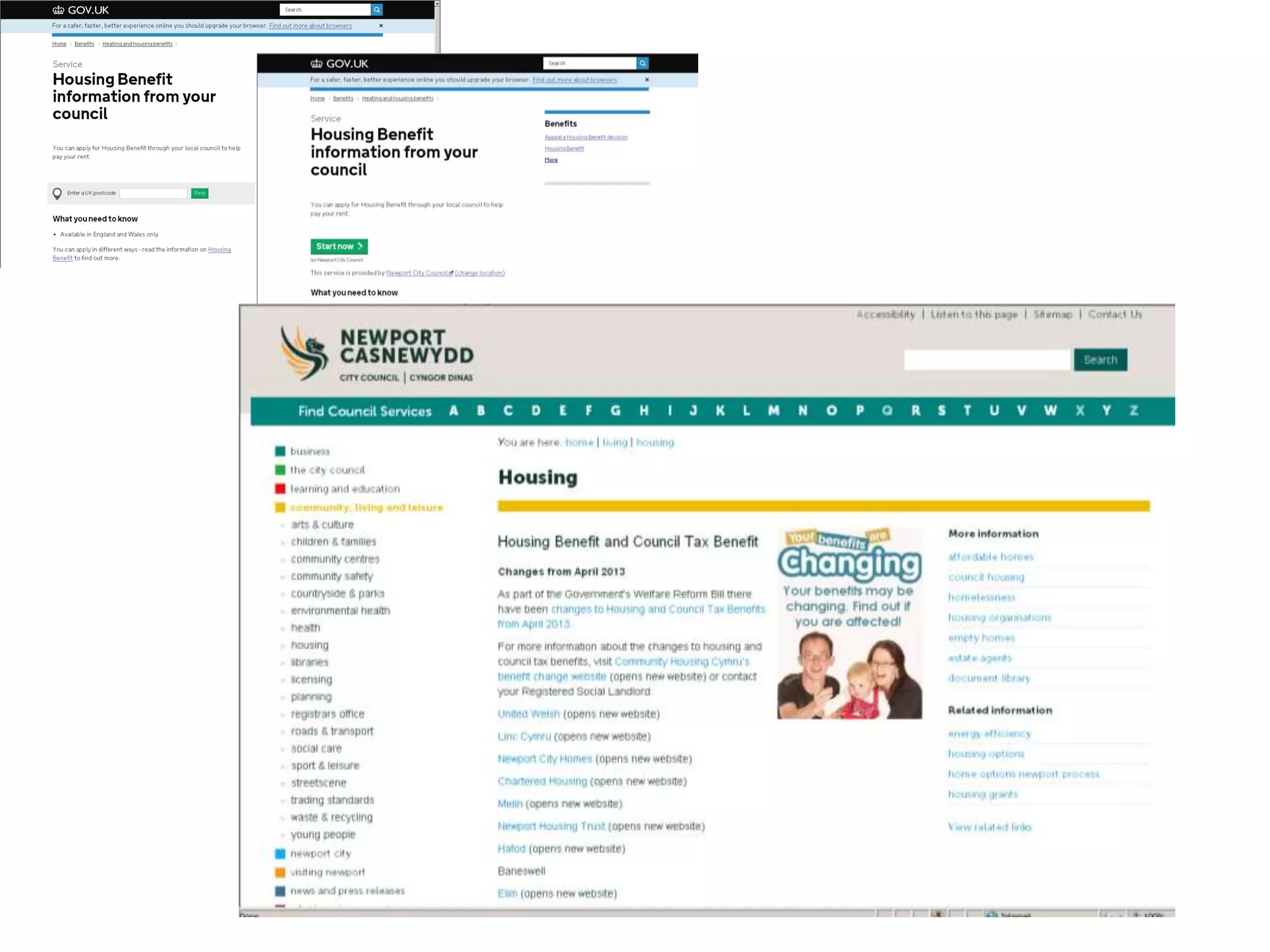
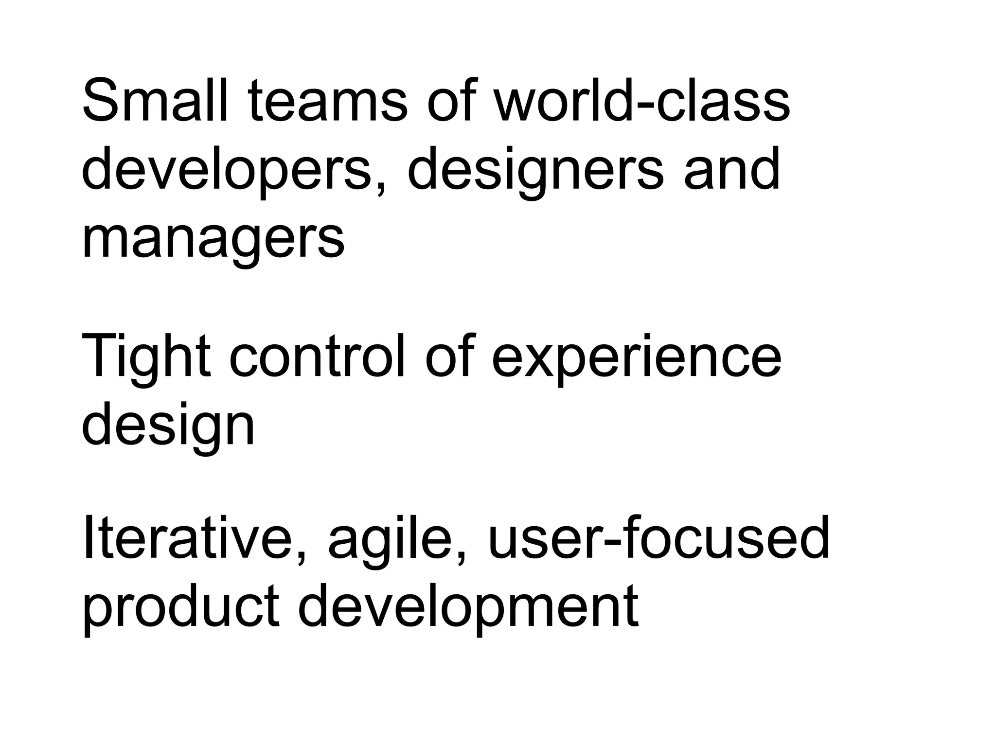
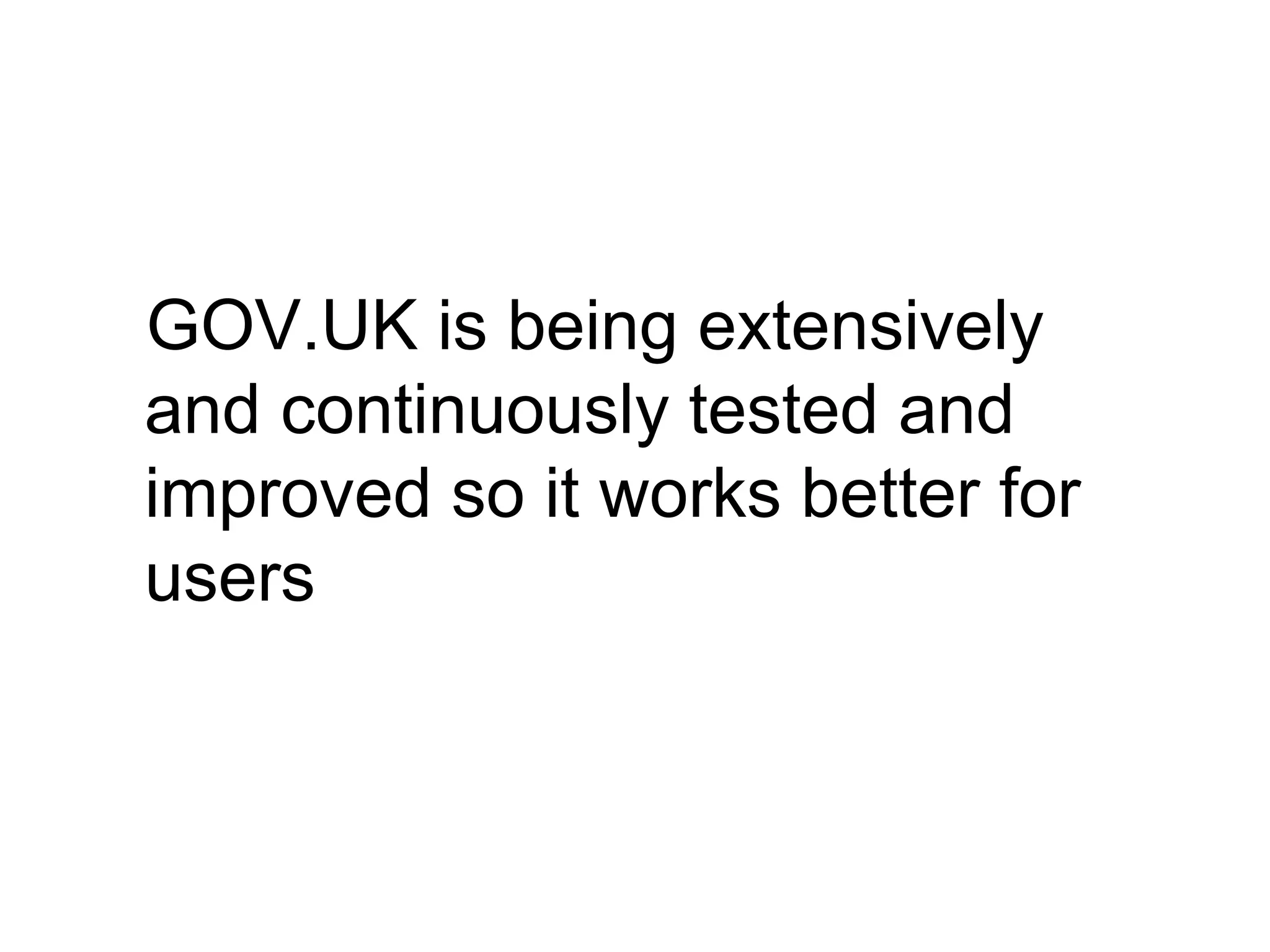
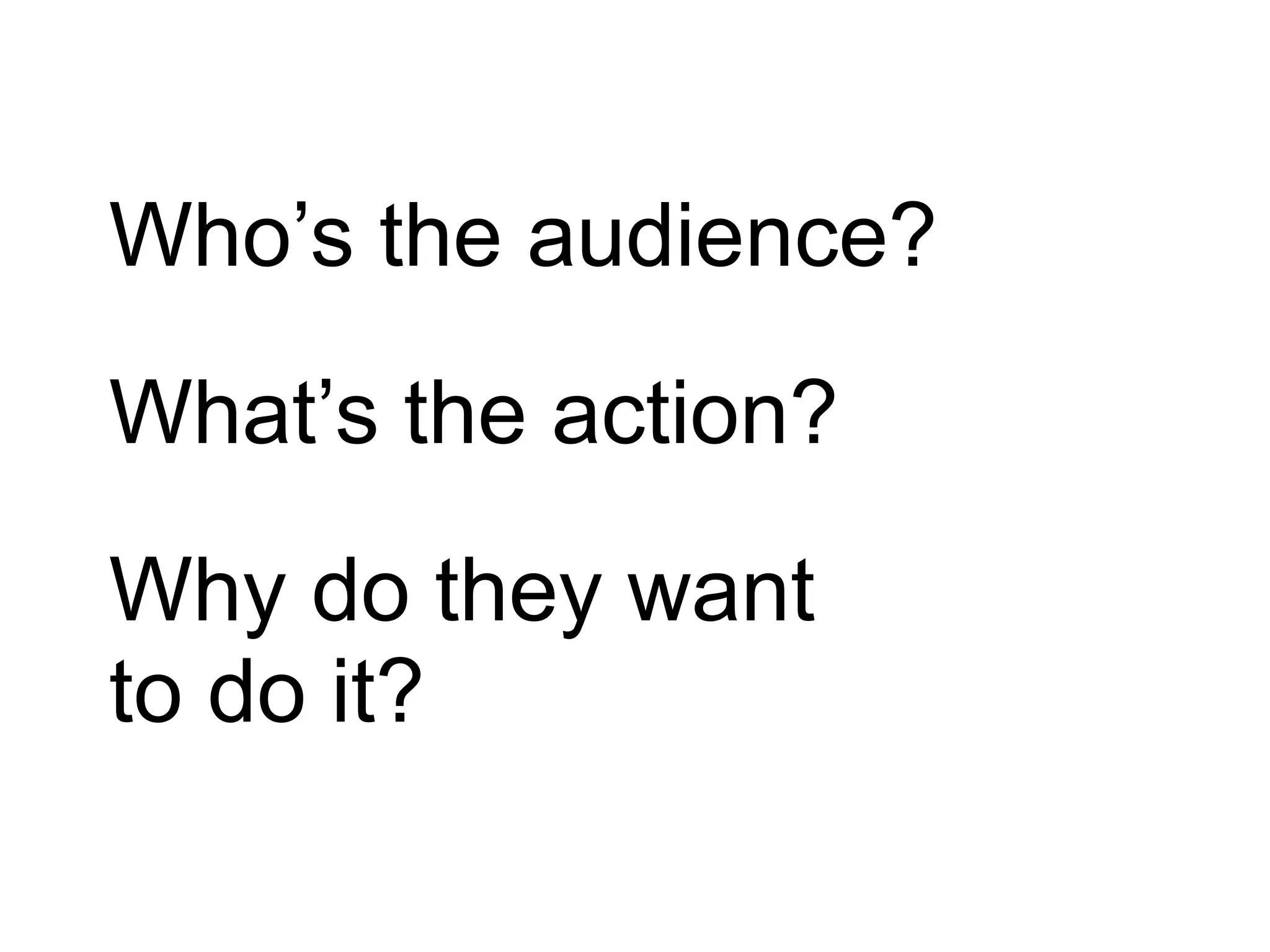
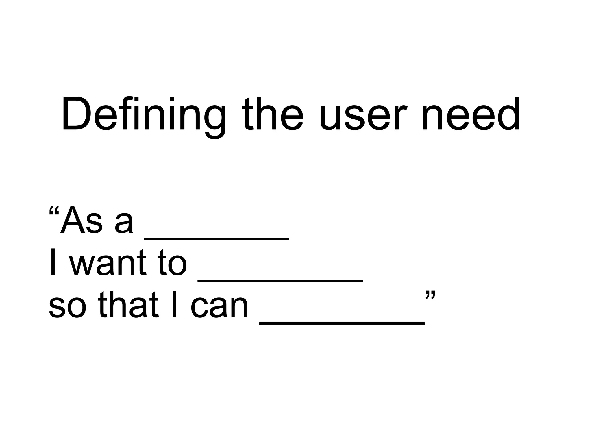
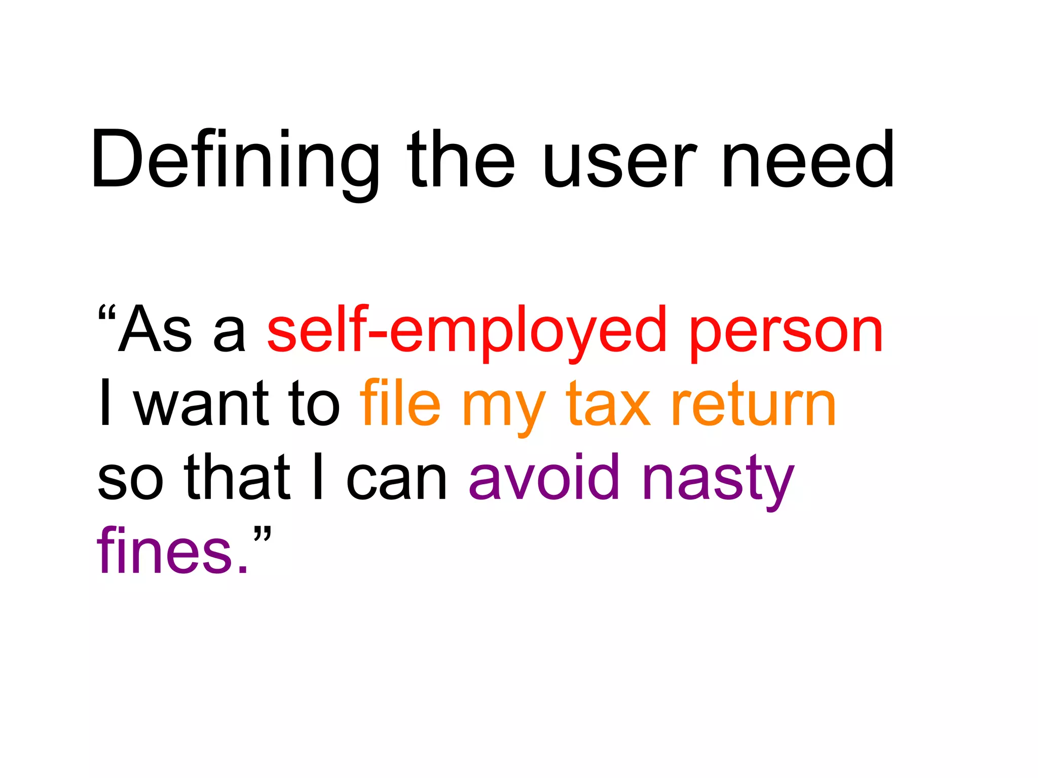
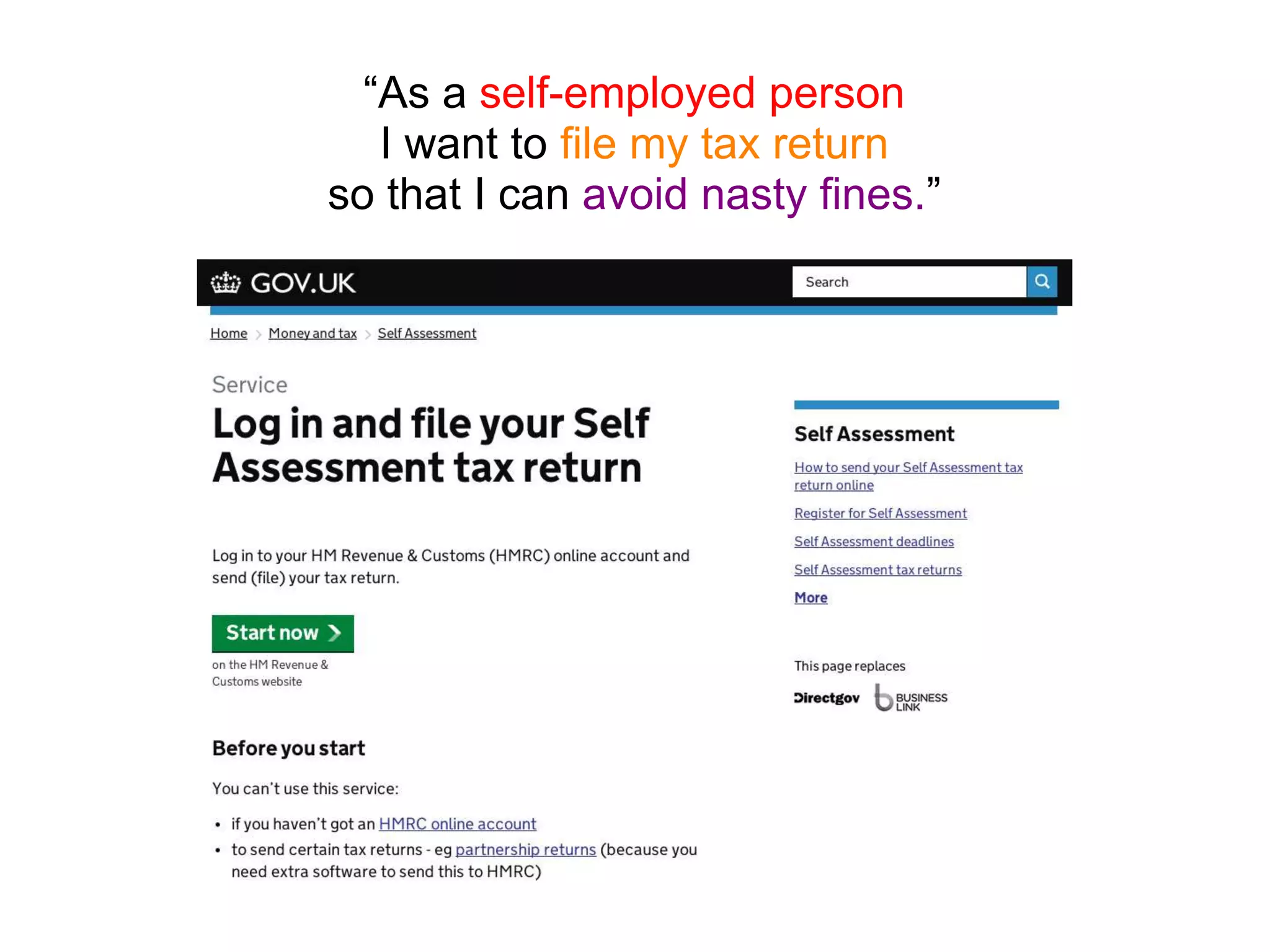
How did we get here?
In 2004 the
government
web went from
a loosely
coordinated
collection of
websites...
to something
a bit
simpler...
Directgov Business
Link
A tremendous
achievement,
which brought
enormous
benefits,
but it’s time to
move on again
Directgov Business
Link
The web is now mainstream
Users expect high quality
service experiences
And businesses know how to
deliver them
Revolution
not
evolution
They went
from this...
directgov businesslink
Directgov Business
Link
...to a single
domain
Mainstream
Users &
Needs
Specialist
Users &
Needs
GOV.UK
Focused on user needs,
not government needs
Simpler
Clearer
Faster
Simpler
Clearer
Faster…….
Simpler
Clearer
Faster…….
…..and loads cheaper
It’s saved money..
£42 million
(2012/2013)
by replacing Directgov, BusinessLink,
departmental sites and related
organisation sites with GOV.UK
E.g.
Online: 22p
Phone: £4.11
Post: £6.62
Digital by default
20 x cheaper than phone, 30 x cheaper than post
50 x cheaper than face-to-face
It does less
It does less
It’s focussed on tasks - getting to the
“quick do”
It optimises for the common case but
doesn’t ignore the edge case
GOV.UK is big…
It’s won awards
Design of the Year
2013
D&Ad Awards
2013
What does this mean
for local government?
There are 134
journeys from GOV.UK
to local government
Let’s talk technical
But not for long!
Small teams of world-class
developers, designers and
managers
Tight control of experience
design
Iterative, agile, user-focused
product development
They’re building GOV.UK
the way Google build
Google and Amazon build
Amazon
They’re using open source
and making that source freely
available
GOV.UK is being extensively
and continuously tested and
improved so it works better for
users
GOV.UK –
putting user needs
at the heart of
content design
What is a
user need?
Who’s the audience?
What’s the action?
Why do they want
to do it?
Defining the user need
“As a _______
I want to ________
so that I can ________”
Defining the user need
“As a self-employed person
I want to file my tax return
so that I can avoid nasty
fines.”
“As a self-employed person
I want to file my tax return
so that I can avoid nasty fines.”
Designing Content
Content should be as short,
simple and specific as
possible
Users won’t read your content -
so don’t make them!
Front-load sentences with the important
stuff
If it’s not essential, leave it out
Break it up. Use
- short sentences and paragraphs
- subheads
- lists
- active voice

Introduction to GOV.UK and user needs

Editor's Notes

  • #6 more than 30 million visits a month
  • #18 beta – task completion from c60% to c70%
  • #21 DirectGov - c 120 seconds GOV.UK - c 80 seconds 100,000 days a year
  • #43 But what is a user need? And how do you work out what the needs of your users are?
  • #44 These 3 simple lines help you think about 1 who the user is 2 what the action is 3 why the user wants to do the action
  • #45 GOV.UK uses a simple formula. As a blank, I want to blank so that I can blank.
  • #46 So for example, “As a self-employed person, I want to file my tax return so that I can avoid nasty fines.”
  • #50 Here’s a reason why you should keep things short and simple: Most people read webpages in an F-shape pattern. Ie they read the top few lines, then scan down, looking at the beginnings of lines and subheadings By halfway down the page, they’ve stopped reading!
  • #51 To deal with this style of reading… (see slide)