Explore Data: Data Science + VisualizationRoelof Pieters
Talk on Data Visualization for Data Scientist at Stockholm NLP Meetup June 2015: http://www.meetup.com/Stockholm-Natural-Language-Processing-Meetup/events/222609869/
Video recording at https://www.youtube.com/watch?v=3Li_xIQ1K84
This slide deck gives a general overview of Data Visualization, with inspiring examples, the strength and weaknesses of the human visual system, a few technical frameworks that may be used for creating your own visualizations and some design concepts from the data visualization field.
Presentation given at the CBS (Central Bureau of Statistics) by CEDAR members on 06-11-2014 for the Studiemiddag "Digitalisering historische CBS-collectie" (digitisation of the CBS historical collection). All things on converting Excel spreadsheets to RDF Data Cube, harmonisation, and using Linked Data for standardizing statistical data on the Web.
ICC2017 Washington - http://icc2017.org/
5504.1
Introducing MapStudy: An Open-Source Cartographic Research Tool
Carl Sack
University of Wisconsin-Madison
Robert Roth
Department of Geography, University of Wisconsin-Madison
Kristen Vincent
Department of Geography, University of Wisconsin-Madison
Data Visualisation Design Workshop #UXbneCam Taylor
In this workshop we’ll explore both the art and science of communicating information graphically in the digital world.
With lots of great examples and a hands-on team exercise, the session is intended to make us think about how we can convey information more clearly and efficiently in our apps, presentations, reports, emails and other forms of communication.
Visualisation - techniques, interaction dynamics, big dataJoris Klerkx
Module 3 - cursus Big Data - Visualisation - deel 2
Instituut voor Permanente Vorming
Various visualisation techniques
(adapted from Heer, J., Bostock, M., & Ogievetsjy, V. (2010, May). A Tour through the Visualization Zoo - A survey of powerful visualisation techniques, from the obvious to the obscure. ACM Graphics , 8 (5), https://queue.acm.org/detail.cfm?id=1805128 )
Various interaction techniques
(adapted from Heer, J., & Shneiderman, B. (2012, February). Interactive Dynamics for Visual Analysis. Magazine Queue - Microprocessors , 10 (2), p. 30. http://queue.acm.org/detail.cfm?id=2146416 )
Big data to big to visualize?
Introduction to information visualisation for humanities PhDsMia
Training workshop for the CHASE Arts and Humanities in the Digital Age programme. (
This session will give you an overview of a variety of techniques and tools available for data visualisation and analysis in the humanities. You will learn about common types of visualisations and the role of exploratory and explanatory visualisations, explore examples of scholarly visualisations, try some visualisation tools, and know where to find further information about analysing and building data visualisations.
For Beyond the Black Box, University of Edinburgh, February 2017
As the datasets used by humanists become ever larger and more readily accessible, the ability to render and interpret overwhelmingly large amounts of information in graphically literate ways has become an increasingly important part of the researcher’s skillset. In this workshop, participants will be introduced to the core principles of scholarly data visualisation and shown how to use a variety of visualisation tools.
Visualisations may sound like the opposite of a black box, as they display the data provided. However, aside from 'truthiness' of things on a screen, lots of invisible algorithmic decisions affect what appears on the screen. Data used in visualisations is increasingly generated algorithmically rather than manually. What choices is software making for you, and whose world view do they reflect? Algorithms are choices - if you can't read the source code or access the learned model, how can you understand them?
environmental scivis via dynamic and thematc mappingNeale Misquitta
January 2010 Presentation for industry group regarding environmental scivis - scientific visualization using techniques such as dynamic and thematic graphing and mapping.
Data Curation and Debugging for Data Centric AIPaul Groth
It is increasingly recognized that data is a central challenge for AI systems - whether training an entirely new model, discovering data for a model, or applying an existing model to new data. Given this centrality of data, there is need to provide new tools that are able to help data teams create, curate and debug datasets in the context of complex machine learning pipelines. In this talk, I outline the underlying challenges for data debugging and curation in these environments. I then discuss our recent research that both takes advantage of ML to improve datasets but also uses core database techniques for debugging in such complex ML pipelines.
Presented at DBML 2022 at ICDE - https://www.wis.ewi.tudelft.nl/dbml2022
Presentation given at DMZ about Data Structure Graphs.
Also known as Applying Social Network Analysis Techniques to Data Modeling and Data Architecture
06-04-2024 - NYC Tech Week - Discussion on Vector Databases, Unstructured Data and AI
Round table discussion of vector databases, unstructured data, ai, big data, real-time, robots and Milvus.
A lively discussion with NJ Gen AI Meetup Lead, Prasad and Procure.FYI's Co-Found
Presentation given at the CBS (Central Bureau of Statistics) by CEDAR members on 06-11-2014 for the Studiemiddag "Digitalisering historische CBS-collectie" (digitisation of the CBS historical collection). All things on converting Excel spreadsheets to RDF Data Cube, harmonisation, and using Linked Data for standardizing statistical data on the Web.
ICC2017 Washington - http://icc2017.org/
5504.1
Introducing MapStudy: An Open-Source Cartographic Research Tool
Carl Sack
University of Wisconsin-Madison
Robert Roth
Department of Geography, University of Wisconsin-Madison
Kristen Vincent
Department of Geography, University of Wisconsin-Madison
Data Visualisation Design Workshop #UXbneCam Taylor
In this workshop we’ll explore both the art and science of communicating information graphically in the digital world.
With lots of great examples and a hands-on team exercise, the session is intended to make us think about how we can convey information more clearly and efficiently in our apps, presentations, reports, emails and other forms of communication.
Visualisation - techniques, interaction dynamics, big dataJoris Klerkx
Module 3 - cursus Big Data - Visualisation - deel 2
Instituut voor Permanente Vorming
Various visualisation techniques
(adapted from Heer, J., Bostock, M., & Ogievetsjy, V. (2010, May). A Tour through the Visualization Zoo - A survey of powerful visualisation techniques, from the obvious to the obscure. ACM Graphics , 8 (5), https://queue.acm.org/detail.cfm?id=1805128 )
Various interaction techniques
(adapted from Heer, J., & Shneiderman, B. (2012, February). Interactive Dynamics for Visual Analysis. Magazine Queue - Microprocessors , 10 (2), p. 30. http://queue.acm.org/detail.cfm?id=2146416 )
Big data to big to visualize?
Introduction to information visualisation for humanities PhDsMia
Training workshop for the CHASE Arts and Humanities in the Digital Age programme. (
This session will give you an overview of a variety of techniques and tools available for data visualisation and analysis in the humanities. You will learn about common types of visualisations and the role of exploratory and explanatory visualisations, explore examples of scholarly visualisations, try some visualisation tools, and know where to find further information about analysing and building data visualisations.
For Beyond the Black Box, University of Edinburgh, February 2017
As the datasets used by humanists become ever larger and more readily accessible, the ability to render and interpret overwhelmingly large amounts of information in graphically literate ways has become an increasingly important part of the researcher’s skillset. In this workshop, participants will be introduced to the core principles of scholarly data visualisation and shown how to use a variety of visualisation tools.
Visualisations may sound like the opposite of a black box, as they display the data provided. However, aside from 'truthiness' of things on a screen, lots of invisible algorithmic decisions affect what appears on the screen. Data used in visualisations is increasingly generated algorithmically rather than manually. What choices is software making for you, and whose world view do they reflect? Algorithms are choices - if you can't read the source code or access the learned model, how can you understand them?
environmental scivis via dynamic and thematc mappingNeale Misquitta
January 2010 Presentation for industry group regarding environmental scivis - scientific visualization using techniques such as dynamic and thematic graphing and mapping.
Data Curation and Debugging for Data Centric AIPaul Groth
It is increasingly recognized that data is a central challenge for AI systems - whether training an entirely new model, discovering data for a model, or applying an existing model to new data. Given this centrality of data, there is need to provide new tools that are able to help data teams create, curate and debug datasets in the context of complex machine learning pipelines. In this talk, I outline the underlying challenges for data debugging and curation in these environments. I then discuss our recent research that both takes advantage of ML to improve datasets but also uses core database techniques for debugging in such complex ML pipelines.
Presented at DBML 2022 at ICDE - https://www.wis.ewi.tudelft.nl/dbml2022
Presentation given at DMZ about Data Structure Graphs.
Also known as Applying Social Network Analysis Techniques to Data Modeling and Data Architecture
Similar to Introduction to Data Visualization (20)
06-04-2024 - NYC Tech Week - Discussion on Vector Databases, Unstructured Data and AI
Round table discussion of vector databases, unstructured data, ai, big data, real-time, robots and Milvus.
A lively discussion with NJ Gen AI Meetup Lead, Prasad and Procure.FYI's Co-Found
Quantitative Data AnalysisReliability Analysis (Cronbach Alpha) Common Method...2023240532
Quantitative data Analysis
Overview
Reliability Analysis (Cronbach Alpha)
Common Method Bias (Harman Single Factor Test)
Frequency Analysis (Demographic)
Descriptive Analysis
Chatty Kathy - UNC Bootcamp Final Project Presentation - Final Version - 5.23...John Andrews
SlideShare Description for "Chatty Kathy - UNC Bootcamp Final Project Presentation"
Title: Chatty Kathy: Enhancing Physical Activity Among Older Adults
Description:
Discover how Chatty Kathy, an innovative project developed at the UNC Bootcamp, aims to tackle the challenge of low physical activity among older adults. Our AI-driven solution uses peer interaction to boost and sustain exercise levels, significantly improving health outcomes. This presentation covers our problem statement, the rationale behind Chatty Kathy, synthetic data and persona creation, model performance metrics, a visual demonstration of the project, and potential future developments. Join us for an insightful Q&A session to explore the potential of this groundbreaking project.
Project Team: Jay Requarth, Jana Avery, John Andrews, Dr. Dick Davis II, Nee Buntoum, Nam Yeongjin & Mat Nicholas
Data Centers - Striving Within A Narrow Range - Research Report - MCG - May 2...pchutichetpong
M Capital Group (“MCG”) expects to see demand and the changing evolution of supply, facilitated through institutional investment rotation out of offices and into work from home (“WFH”), while the ever-expanding need for data storage as global internet usage expands, with experts predicting 5.3 billion users by 2023. These market factors will be underpinned by technological changes, such as progressing cloud services and edge sites, allowing the industry to see strong expected annual growth of 13% over the next 4 years.
Whilst competitive headwinds remain, represented through the recent second bankruptcy filing of Sungard, which blames “COVID-19 and other macroeconomic trends including delayed customer spending decisions, insourcing and reductions in IT spending, energy inflation and reduction in demand for certain services”, the industry has seen key adjustments, where MCG believes that engineering cost management and technological innovation will be paramount to success.
MCG reports that the more favorable market conditions expected over the next few years, helped by the winding down of pandemic restrictions and a hybrid working environment will be driving market momentum forward. The continuous injection of capital by alternative investment firms, as well as the growing infrastructural investment from cloud service providers and social media companies, whose revenues are expected to grow over 3.6x larger by value in 2026, will likely help propel center provision and innovation. These factors paint a promising picture for the industry players that offset rising input costs and adapt to new technologies.
According to M Capital Group: “Specifically, the long-term cost-saving opportunities available from the rise of remote managing will likely aid value growth for the industry. Through margin optimization and further availability of capital for reinvestment, strong players will maintain their competitive foothold, while weaker players exit the market to balance supply and demand.”
Techniques to optimize the pagerank algorithm usually fall in two categories. One is to try reducing the work per iteration, and the other is to try reducing the number of iterations. These goals are often at odds with one another. Skipping computation on vertices which have already converged has the potential to save iteration time. Skipping in-identical vertices, with the same in-links, helps reduce duplicate computations and thus could help reduce iteration time. Road networks often have chains which can be short-circuited before pagerank computation to improve performance. Final ranks of chain nodes can be easily calculated. This could reduce both the iteration time, and the number of iterations. If a graph has no dangling nodes, pagerank of each strongly connected component can be computed in topological order. This could help reduce the iteration time, no. of iterations, and also enable multi-iteration concurrency in pagerank computation. The combination of all of the above methods is the STICD algorithm. [sticd] For dynamic graphs, unchanged components whose ranks are unaffected can be skipped altogether.
Influence of Marketing Strategy and Market Competition on Business Plan
Introduction to Data Visualization
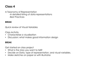
1. Class 4
A Taxonomy of Representation
-A detailed listing of data representations
-Best Practices
BREAK
Quick review of Visual Variables
Class Activity
• Characterize a visualization
• Discussion: what makes good information design
BREAK
Get started on class project
• What is the story you want to tell?
• Decide on Data, type of representation, and visual variables.
• Make sketches on paper or with illustrator.
2. DATA
Quantitative
(Numerical)
Qualitative
(Descriptive)
Nominal
Data has no
natural order.
Includes objects,
names, and
concepts.
Examples:
gender, race,
religion, sport
Ordinal
Data can be
arranged in
order or rank
Examples: sizes
(small, medium,
large), attitudes
(strongly
disagree,
disagree,
neutral, agree,
strongly agree),
house number.
Continuous
Data is
measured on a
continuous
scale.
Examples:
Temperature,
length, height
Discrete
Data is
countable, and
exists only in
whole numbers
Examples:
Number of
people taking
this class,
Number of
candy bars
collected on
Halloween.
3.
4.
5. Quantitative Comparison
Pie Chart
Use sparingly
No more than six components.
Not useful when values of each component are similar
Image source: https://eagereyes.org/techniques/pie-charts
7. Quantitative Comparison
Bar graph
Best for comparing categories.
Best Practices
Make bars and columns
wider than the space
between them.
Do not allow grid lines to
pass through columns or
bars.
Use a single font type on a
graph.
Image source: https://www.mathsisfun.com/data/bar-graphs.html
8. Quantitative Comparison
Stacked bar graph
Order your shade pattern from darkest to lightest on stacked bar graphs.
Avoid patterns.
Image Source:
http://www.extendoffice.com/documents/excel/2370-excel-show-percentages-in-stacked-column.html
18. Quantitative Relational
Surface plots
Topography, Density
Functions that have two dependent variables
Image Source:
https://www.wavemetrics.com/products/igorpro/creatinggraphs/3dandvolume/surface.htm
21. Quantitative Relational and Comparison
Area Graph
"US and USSR nuclear stockpiles" by Created by User:Fastfission first by mapping the lines using OpenOffice.org's Calc
program, then exporting a graph to SVG, and the performing substantial aesthetic modifications in Inkscape. - Own work
Source data from: Robert S. Norris and Hans M. Kristensen, "Global nuclear stockpiles, 1945-2006," Bulletin of the Atomic
Scientists 62, no. 4 (July/August 2006), 64-66. Online at http://thebulletin.metapress.com/content/c4120650912x74k7/
fulltext.pdf. Licensed under Public Domain via Commons - https://commons.wikimedia.org/wiki/
File:US_and_USSR_nuclear_stockpiles.svg#/media/File:US_and_USSR_nuclear_stockpiles.svg
28. Qualitative Data: Textual Structures
Word Tree
Image Source:
https://developers.google.com/chart/interactive/docs/gallery/wordtree
Also see:
http://www.chrisharrison.net/index.php/Visualizations/WebTrigrams
34. Hierarchical Structures
Figurative Trees
Image Source:
http://visualoop.com/blog/16793/vintage-infodesign-53
See Book:
The Book of Trees
Visualizing Branches of Knowledge
Manuel Lima
Loyset Liédet
Tree of cosanguinity
1471
35. Hierarchical Structures
Vertical Trees
First level of abstraction.
Flow charts, hierarchies
Image from: http://software.clearlake.ibm.com/CMVC/4.0/infocenter/htdocs/help/whatis/content/09.gif
36. Hierarchical Structures
Horizontal Trees
Image Source:
https://developers.google.com/chart/interactive/docs/gallery/wordtree
Also see:
http://www.chrisharrison.net/index.php/Visualizations/WebTrigrams
61. Spatial-Temporal Structures
Charles Minard's map of Napoleon's disastrous Russian campaign of 1812. The
graphic is notable for its representation in two dimensions of six types of data: the
number of Napoleon's troops; distance; temperature; the latitude and longitude;
direction of travel; and location relative to specific dates
65. Beyond Visualizations
Fundament, Andreas Nicolas Fischer. 2008.
http://anf.nu/fundament/
Tokyo earthquake data sculpture. Luke Jerram
http://www.lukejerram.com/projects/t%C5%8Dhoku_earthquake
http://dl.acm.org/citation.cfm?id=2481359
Jansen, Yvonne, Pierre Dragicevic, and Jean-Daniel
Fekete. "Evaluating the efficiency of physical
visualizations." Proceedings of the SIGCHI Conference
on Human Factors in Computing Systems. ACM, 2013.
Keyboard frequency sculpture. Michael Knuepfel
aviz.fr/Research/PassivePhysicalVisualizations
http://dataphys.org/list/tag/data-sculpture/
http://dataphys.org/list/
67. Visual variables for quantitative data (used to represent quantities)
Position
Size
Value
Time
Distance
68. Visual variables for qualitative data (used to represent a category)
Texture
Colour
Orientation
Shape
69. Class Activity:
Find a visualization online, or from a link in a previous class.
Answer the following questions:
In one or two sentences, what story does it tell?
Identify the data. What type of data is it?
How many dimensions are being visually mapped?
Identify the visual variables used.
Identify the type of visualization, or methods used.
If it is interactive, describe the interaction, and the data revealed.
70. Some examples from Class 1
http://www.ted.com/talks/david_mccandless_the_beauty_of_data_visualization#t-576041
http://www.informationisbeautiful.net/
https://public.tableau.com/s/gallery
https://github.com/mbostock/d3/wiki/Gallery
http://labratrevenge.com/nation-of-poverty/
http://demographics.coopercenter.org/DotMap/
http://www.davidmccandless.com/
http://www.iadb.org/en/topics/energy/energy-database/energy-database,19144.html
http://www.informationisbeautiful.net/visualizations/billion-dollar-o-gram-2013/
http://infobeautiful4.s3.amazonaws.com/2015/05/1276_left_right_usa.png
Gapminder!
http://www.on-broadway.nyc/
71.
72. Class Project:
Today:
• What is the story you want to tell?
• Decide on Data, type of representation, and visual variables.
• Make sketches on paper or with illustrator.
Next Class:
• Decide on tool(s) to use.
• Work on your visualization.
• Finish it.
Final Class:
• Each person presents their visualization.
• Tell the story.
• Justify your design choices, and choice of visual variables.