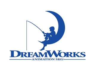
Institutional Research -
DreamWorks Animation
Joshua Parkinson
• Considering that the character sitting on the moon in
the logo is of young age. You can assume that the
large majority of the films produced by DreamWorks
are aimed at the younger audience. I know that the
character in logo is young due to the shape and
build of the character.
• The use of colours are quite inviting, baby blue is a
rather innocent colour since it usually has
connotations to new born babies. Once again, this
shows that DreamWorks films are aimed at young
children.
History of logo
• The logo has the initials ‘SKG’ at the running across the
bottom, these are there since they are the first letter of
Spielberg, Katzenberg and Geffen; the founders of
DreamWorks.
• Originally, Spielberg wanted the logo to be reminiscent of
Hollywood’s golden age. Spielberg also wanted the logo to
be computer generated, but Spielberg’s supervisor of light
suggested that a hand-painted logo would look much better.
• The logo we all see today, is the hand-painted version since
Spielberg thought it was actually a good idea.

Institutional Research - Dream Works Animation

  • 1.
    Institutional Research - DreamWorksAnimation Joshua Parkinson
  • 3.
    • Considering thatthe character sitting on the moon in the logo is of young age. You can assume that the large majority of the films produced by DreamWorks are aimed at the younger audience. I know that the character in logo is young due to the shape and build of the character. • The use of colours are quite inviting, baby blue is a rather innocent colour since it usually has connotations to new born babies. Once again, this shows that DreamWorks films are aimed at young children.
  • 4.
    History of logo •The logo has the initials ‘SKG’ at the running across the bottom, these are there since they are the first letter of Spielberg, Katzenberg and Geffen; the founders of DreamWorks. • Originally, Spielberg wanted the logo to be reminiscent of Hollywood’s golden age. Spielberg also wanted the logo to be computer generated, but Spielberg’s supervisor of light suggested that a hand-painted logo would look much better. • The logo we all see today, is the hand-painted version since Spielberg thought it was actually a good idea.