
Recommended
More Related Content
What's hot
What's hot (20)
Similar to Indie magazine analysis
Similar to Indie magazine analysis (20)
More from tyrachuck12
Indie magazine analysis
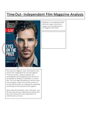
- 1. Sight and Sound Little White Lies# Time Out- Independent Film Magazine Analysis This masculine magazine cover, dominated by hues of blue, from independent film focused magazine ‘Time Out: London’, utilises an extreme mid shot/headshot, of the established actor by-lined to be identified as ‘Benedict Cumberbatch’ in minute text. This focal image dominating just off the central of the magazine, draws the consumer audience in, but also uses the actors as a selling point, captivating and driving any of his fan base to the magazine. White and bold the headline ‘eyes on the prize’ uses the technique of a pun, referencing the intense blue eye colour of the actor’s eyes depicting him as solely focused on success. Masthead is concealed behind the dominant image, as the actor’s image is the most significant on the magazine front cover.
- 2. Independent Film Magazine Review Page Analysis- Time Out Verdict & Star Rating: Visual star ratings out of five indicates to the reader prior to reading the depths the review, the magazine’s overall opinion on how well they perceived the following film. Here, the film, ‘The Cave’ has been given a 2/5 review rating this is established to the audience through the bold red filling of the minuet star shape. Writer by line Masthead, permitted through large, bold san serif font indicates to the audience in conjunction with image from a frame of the movie to the left, of what the review is above prior to reading. Furthermore exploits the name of the film to the audience. Quotes are used in the text body/Quote reference: An extracted section of text, in the form of a quote emphasises significant information regarding the diverse inspiration and themes of the movie that, “borrows so many ideas from previous genre films.’ Focal image/selling point: image dominates the left of the review page; capturing a headshot to entice the attention of the reader to give an visual insight/reflect visually what the movie looks like. The acquainted caption ‘Katherine (Headey) takes an ill-advised dip” captures a live action description of what it happening in the shot to the reader, while also emitting a unimpressed tone suggesting the film to be foolish and actions of characters, “ill - advised.” This attitude is reflected in the mediocre/poor star rating film review of 2/5. Minor substantial details about the film- the star actors, screen play, directors, distributor; in small font highlights although it does not dominate the entire film review page, it holds substantial importance for the production of detail of how the film was made/who was involved. Brief writing columns