Tillbaka till 2009…
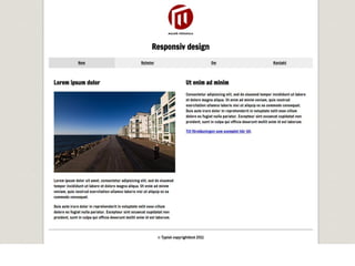
•Webbplatser hade fasta bredder, så var det.
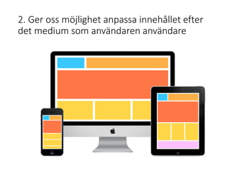
• Vad hände sedan?
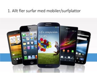
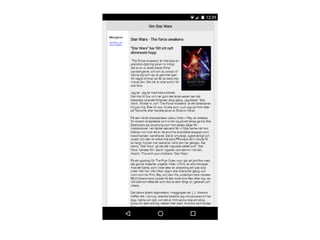
• Våra skärmar blev större och större
• Användare med mobiltelefoner började alltmer besöka våra webbplatser
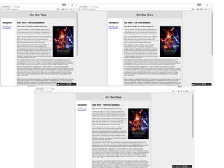
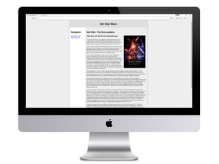
• Resan från 960px breda webbplatser, till responsiva
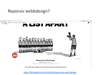
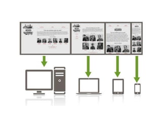
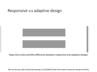
Responsive v.s adaptivedesign
https://css-tricks.com/the-difference-between-responsive-and-adaptive-design/
Mer bra läsning: https://www.fastcodesign.com/3038367/9-gifs-that-explain-responsive-design-brilliantly
10.
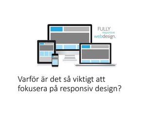
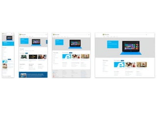
Varför är detså viktigt att
fokusera på responsiv design?
Once your pageloads, users form an opinion
in .05 seconds.
— Kinesis Inc.
20.
40% of peoplewill choose a different search result
if the first is not mobile friendly.
–Skillcrush
21.
40% of peoplewill leave a website if it takes
more than 3 seconds to load.
— Econsultancy
22.
You have 10seconds to leave an impression and tell them what
they’ll get out of your website and company. After this time
(and oftentimes before), they’ll leave.
— NN Group
http://alistapart.com/article/dao
The web’s greateststrength, I believe, is often
seen as a limitation, as a defect. It is the
nature of the web to be flexible, and it should
be our role as designers and developers to
embrace this flexibility, and produce pages
which, by being flexible, are accessible to all.
—John Allsopp, 2000
31.
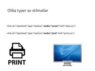
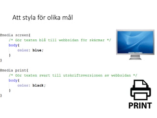
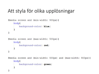
Nyckelord för responsivwebbdesign
• CSS 3 Media Queries
• Flexible layout
• Flexible media
• Breakpoints
• Mobile viewport sizes
• Compatibility
"Start with thesmall screen first, then expand until it
looks like *crap*. Time to insert a breakpoint!“
http://www.peachpit.com/articles/article.aspx?p=1945831
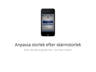
47.
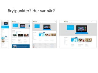
Att jobba medbrytpunkter
Vilka enheter ska vi anpassa oss till?
Tankeverkstad!
48.
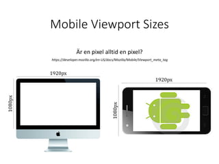
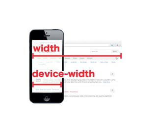
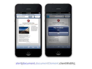
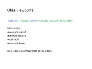
Mobile Viewport Sizes
Ären pixel alltid en pixel?
https://developer.mozilla.org/en-US/docs/Mozilla/Mobile/Viewport_meta_tag