Download to read offline


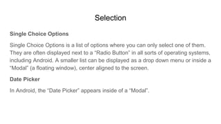
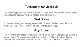


The document outlines mobile UI design principles for Android, focusing on the structured layout of components within the system UI. It covers key elements such as navigation layouts, action menus, selection options, typography, and app icon sizing. Adhering to these design guidelines ensures a consistent and familiar user experience across Android applications.


